前言:c# winform UI控件系列,做不到最好用,但愿是更好用!
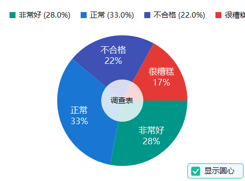
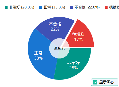
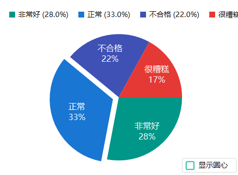
一、效果图
二、使用说明
PieChart 饼状图控件
控件名称
PieChart
中文名称
饼状图控件
控件优点
PieChart 是一个功能丰富的饼状图控件,支持点击偏移动画、百分比显示、图例显示等功能。适用于数据可视化、比例分析等场景。
主要特性
- 点击交互:支持点击扇区偏移动画
- 百分比显示:支持显示扇区百分比
- 图例显示:支持多种位置的图例显示
- 动画效果:支持扇区偏移动画
- 数据绑定:支持数据集合绑定
- 中心圆:支持在饼图中心显示同心圆和说明文本
重要参数说明
基本属性
| 属性名 | 类型 | 默认值 | 说明 |
|---|---|---|---|
Data |
List | - | 饼图数据集合 |
ShowPercentage |
bool | true | 是否显示百分比 |
ShowLabels |
bool | true | 是否显示标签 |
LegendPosition |
LegendPosition | TopRight | 图例位置 |
图例位置(LegendPosition)
| 位置值 | 说明 |
|---|---|
None |
不显示图例 |
Top |
顶部横向 |
Bottom |
底部横向 |
TopRight |
右上角纵向 |
BottomRight |
右下角纵向 |
PieSlice 属性
| 属性名 | 类型 | 默认值 | 说明 |
|---|---|---|---|
Label |
string | "" | 扇区标签 |
Value |
double | 0 | 扇区数值 |
Color |
Color | Gray | 扇区颜色 |
IsExploded |
bool | false | 是否偏移 |
ExplodeOffset |
float | 15f | 偏移距离 |
外观属性
| 属性名 | 类型 | 默认值 | 说明 |
|---|---|---|---|
ChartSize |
int | 200 | 饼图大小 |
BorderWidth |
int | 2 | 边框宽度 |
BorderColor |
Color | White | 边框颜色 |
TextColor |
Color | Black | 文本颜色 |
Font |
Font | 微软雅黑 | 字体 |
中心圆属性
| 属性名 | 类型 | 默认值 | 说明 |
|---|---|---|---|
ShowCenterCircle |
bool | false | 是否显示中心圆 |
CenterCircleColor |
Color | White | 中心圆背景色 |
CenterCircleAlpha |
int | 204 | 中心圆背景透明度(0-255,默认204即80%) |
CenterCircleText |
string | "" | 中心圆文本内容(支持换行) |
CenterCircleRadiusRatio |
float | 0.33f | 中心圆半径比例(相对于饼图半径,0.1-0.5) |
重要事件
| 事件名 | 说明 |
|---|---|
SliceClicked |
点击扇区时触发 |
PropertyChanged |
属性值改变时触发 |
使用示例
基本使用
csharp
// 创建饼状图
PieChart pieChart = new PieChart();
pieChart.Size = new Size(400, 300);
this.Controls.Add(pieChart);

// 添加数据
pieChart.Data.Add(new PieChart.PieSlice
{
    Label = "产品A",
    Value = 30,
    Color = Color.FromArgb(255, 99, 132)
});

pieChart.Data.Add(new PieChart.PieSlice
{
    Label = "产品B",
    Value = 25,
    Color = Color.FromArgb(54, 162, 235)
});

pieChart.Data.Add(new PieChart.PieSlice
{
    Label = "产品C",
    Value = 45,
    Color = Color.FromArgb(255, 206, 86)
});
图例位置
csharp
// 不显示图例
pieChart.LegendPosition = LegendPosition.None;

// 顶部图例
pieChart.LegendPosition = LegendPosition.Top;

// 底部图例
pieChart.LegendPosition = LegendPosition.Bottom;

// 右上角图例(默认)
pieChart.LegendPosition = LegendPosition.TopRight;
点击交互
csharp
// 点击扇区事件
pieChart.SliceClicked += (sender, e) =>
{
    Console.WriteLine($"点击了:{e.Slice.Label},占比:{e.Slice.Percentage:F1}%");

    // 切换偏移状态
    e.Slice.IsExploded = !e.Slice.IsExploded;
    pieChart.Invalidate();
};
自定义外观
csharp
// 设置外观
pieChart.ShowPercentage = true;  // 显示百分比
pieChart.ShowLabels = true;      // 显示标签
pieChart.BorderWidth = 3;
pieChart.BorderColor = Color.White;
pieChart.TextColor = Color.DarkGray;
动态更新数据
csharp
// 清空数据
pieChart.Data.Clear();

// 添加新数据
pieChart.Data.Add(new PieChart.PieSlice
{
    Label = "新数据1",
    Value = 50,
    Color = Color.Green
});

pieChart.Data.Add(new PieChart.PieSlice
{
    Label = "新数据2",
    Value = 50,
    Color = Color.Red
});

pieChart.Invalidate();
数据绑定
csharp
// 属性改变事件
pieChart.PropertyChanged += (sender, e) =>
{
    Console.WriteLine($"属性 {e.PropertyName} 已更改");
};
中心圆显示
csharp
// 启用中心圆
pieChart.ShowCenterCircle = true;

// 设置中心圆背景色(默认白色)
pieChart.CenterCircleColor = Color.White;

// 设置中心圆透明度(0-255,默认204即80%)
pieChart.CenterCircleAlpha = 204;

// 设置中心圆文本(用于说明饼图用途,支持换行)
pieChart.CenterCircleText = "销售数据\n2024年度";

// 设置中心圆半径比例(默认1/3,范围0.1-0.5)
pieChart.CenterCircleRadiusRatio = 0.33f;

// 设置文本颜色和字体(使用控件的 ForeColor 和 Font 属性)
pieChart.ForeColor = Color.Black;
pieChart.Font = new Font("Microsoft YaHei", 12f, FontStyle.Bold);
注意事项
- 数据要求:所有扇区的 Value 总和应该大于 0
- 颜色分配:未指定颜色时会自动分配默认颜色
- 偏移动画:点击扇区时会触发偏移动画效果
- 百分比计算:百分比根据各扇区 Value 占总和的比例自动计算
- 中心圆文本 :中心圆文本使用控件的
ForeColor和Font属性设置样式 - 中心圆层级:中心圆绘制在扇区之上,标签之下,形成环形图效果
- 文本换行 :
CenterCircleText支持使用\n换行,文本会自动适应中心圆大小 - 透明度 :
CenterCircleAlpha范围 0-255,0完全透明,255完全不透明,默认204(80%)
三、后记
陆续补充完善中,如有需求,请留言(xue5zhijing)