💡 控件选择决策树
文本
单行
多行
普通文本
密码
邮箱
电话
选择
单选
多选
少于5个
较多
数字
精确值
范围
日期时间
文件
颜色
需要用户输入
输入类型?
单行还是多行?
特殊格式?
textarea
type=text
type=password
type=email
type=tel
单选还是多选?
选项多少?
checkbox
radio
select
精确值还是范围?
type=number
type=range
type=date/time
type=file
type=color
3.2.1 文本输入框(text)
语义: 单行文本输入,默认类型。
html
<!-- 基础用法 -->
<input type="text">

<!-- type 默认值就是 text,可省略 -->
<input>

<!-- 常用属性 -->
<input
  type="text"
  name="username"
  value="默认值"
  placeholder="请输入用户名"
  maxlength="20"
  required>
常用属性:
name- 数据名称(提交时的键名)value- 默认值placeholder- 占位提示文字maxlength- 最大字符数required- 必填项readonly- 只读disabled- 禁用
3.2.2 密码输入框(password)
语义: 输入的字符会被掩码(显示为圆点或星号)。
html
<label for="pwd">密码:</label>
<input
  type="password"
  id="pwd"
  name="password"
  maxlength="20"
  placeholder="6-20位密码"
  required>
3.2.3 单选框(radio)
语义: 多个选项中只能选择一个。
html
<form>
  <p>请选择性别:</p>
  <input type="radio" name="gender" value="male" id="male">
  <label for="male">男</label>

  <input type="radio" name="gender" value="female" id="female">
  <label for="female">女</label>

  <input type="radio" name="gender" value="other" id="other" checked>
  <label for="other">其他</label>
</form>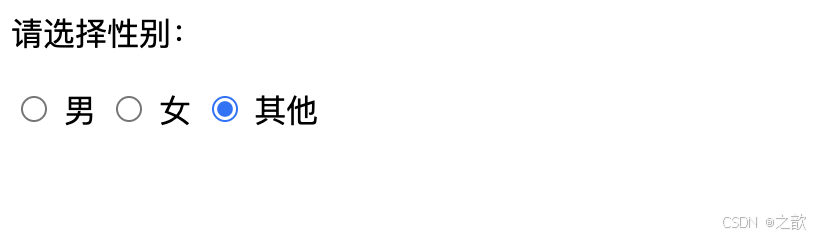
关键点:
- ✅ 同组单选框必须设置相同的
name值 - ✅ 必须设置
value属性(提交时的实际值) - ✅ 使用
checked属性设置默认选中(无需赋值) - ✅ 使用
<label>标签提升体验(点击文字也能选中)
label 的两种关联方式:
html
<!-- 方式1:for 属性关联 id -->
<input type="radio" name="gender" value="male" id="male">
<label for="male">男</label>

<!-- 方式2:label 包裹 input -->
<label>
  <input type="radio" name="gender" value="female">
  女
</label>
3.2.4 复选框(checkbox)
语义: 多个选项中可以选择多个。
html
<form>
  <p>请选择你的爱好:</p>
  <label>
    <input type="checkbox" name="hobby" value="sing">
    唱歌
  </label>

  <label>
    <input type="checkbox" name="hobby" value="dance">
    跳舞
  </label>

  <label>
    <input type="checkbox" name="hobby" value="rap" checked>
    RAP
  </label>

  <label>
    <input type="checkbox" name="hobby" value="basketball">
    打篮球
  </label>

  <label>
    <input type="checkbox" name="hobby" value="coding" checked>
    敲代码
  </label>
</form>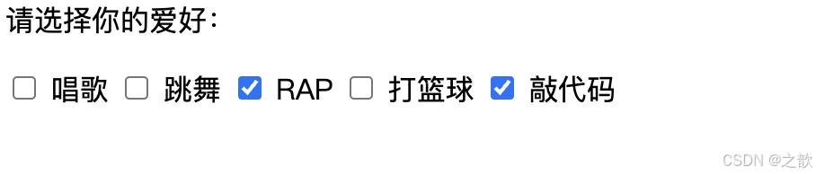
提交的数据格式:
hobby=rap&hobby=coding3.2.5 文本域(textarea)
语义: 多行文本输入。
html
<label for="desc">个人简介:</label>
<textarea
  id="desc"
  name="description"
  rows="10"
  cols="60"
  placeholder="请输入个人简介(不超过500字)"
  maxlength="500"></textarea>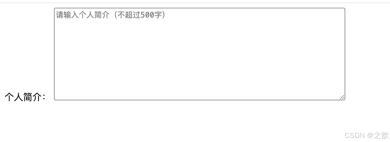
属性说明:
rows- 默认显示的行数(影响高度)cols- 默认显示的列数(影响宽度)placeholder- 占位提示maxlength- 最大字符数
注意: <textarea> 不使用 value 属性,内容写在标签之间:
html
<textarea name="desc">这是默认内容</textarea>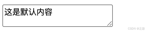
3.2.6 下拉选项(select & option)
语义: 从下拉菜单中选择一个或多个选项。
html
<!-- 单选下拉 -->
<label for="city">城市:</label>
<select id="city" name="city">
  <option value="city1">A市</option>
  <option value="city2">B市</option>
  <option value="city3">C市</option>
  <option value="city4" selected>D市</option>
  <option value="city5">E市</option>
  <option value="city6">F市</option>
</select>
多选下拉(按住 Ctrl/Cmd 键):
html
<label for="skills">技能(可多选):</label>
<select id="skills" name="skills" multiple size="5">
  <option value="html">HTML</option>
  <option value="css">CSS</option>
  <option value="js" selected>JavaScript</option>
  <option value="vue" selected>Vue.js</option>
  <option value="react">React</option>
</select>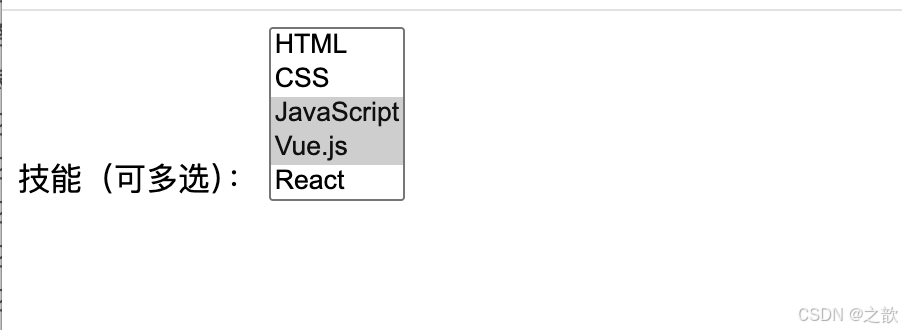
分组下拉:
html
<select name="course">
  <optgroup label="前端课程">
    <option value="html">HTML基础</option>
    <option value="css">CSS布局</option>
    <option value="js">JavaScript高级</option>
  </optgroup>

  <optgroup label="后端课程">
    <option value="node">Node.js</option>
    <option value="python">Python</option>
    <option value="java">Java</option>
  </optgroup>
</select>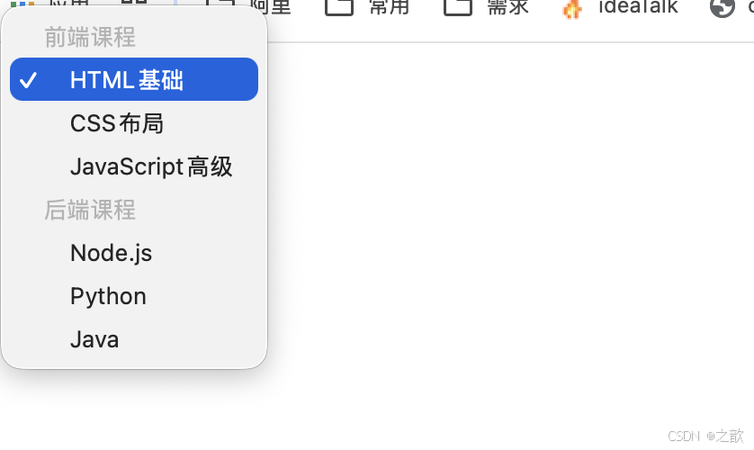
关键点:
- ✅
name属性设置在<select>上 - ✅
value属性设置在<option>上 - ✅ 如果
<option>没有value,则提交标签内的文本 - ✅ 使用
selected设置默认选中
3.2.7 提交按钮(submit)
语义: 提交表单数据。
html
<!-- 方式1:input 实现 -->
<input type="submit" value="提交">
<input type="submit" value="免费注册">

<!-- 方式2:button 实现(推荐) -->
<button type="submit">提交</button>
<button>登录</button> <!-- type 默认值是 submit -->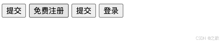
两种方式的区别:
| 特性 | <input> |
<button> |
|---|---|---|
| 文字设置 | 通过 value 属性 |
写在标签内容中 |
| 样式自由度 | 较低 | 较高,可包含其他元素 |
| 兼容性 | 更好 | 现代浏览器完全支持 |
按钮中包含图标(button 的优势):
html
<button type="submit">
  <img src="icon.png" alt=""> 立即注册
</button>
3.2.8 重置按钮(reset)
语义: 将表单所有控件恢复为初始值。
html
<!-- 方式1 -->
<input type="reset" value="重置">

<!-- 方式2 -->
<button type="reset">重置</button>
⚠️ 注意: 重置按钮会导致用户辛苦填写的数据丢失,实际开发中很少使用。
3.2.9 普通按钮(button)
语义: 没有默认行为的按钮,需配合 JavaScript 使用。
html
<!-- 方式1 -->
<input type="button" value="点击我">

<!-- 方式2 -->
<button type="button">点击我</button>
使用场景:
html
<button type="button" onclick="alert('你点击了按钮!')">
  点击有惊喜
</button>
3.2.10 隐藏域(hidden)
语义: 不显示在页面上,但会随表单提交的数据。
html
<form action="/api/submit">
  <input type="hidden" name="user_id" value="12345">
  <input type="hidden" name="token" value="abc123xyz">

  <input type="text" name="comment" placeholder="请输入评论">
  <button>提交评论</button>
</form>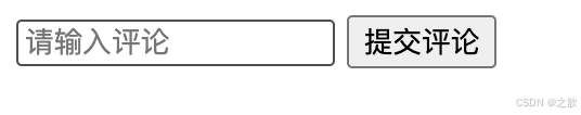
使用场景:
- 传递用户 ID
- 传递 CSRF 令牌
- 传递页面来源标识
3.2.11 邮箱输入框(email)
语义: 自动验证邮箱格式,移动端显示专用键盘。
html
<label for="email">邮箱:</label>
<input
  type="email"
  id="email"
  name="email"
  placeholder="example@domain.com"
  required>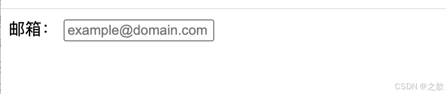
验证规则: 必须包含 @ 符号,格式如 user@example.com
3.2.12 数字输入框(number)
语义: 只允许输入数字,显示增减按钮。
html
<label for="age">年龄:</label>
<input
  type="number"
  id="age"
  name="age"
  min="1"
  max="150"
  step="1"
  value="18"
  required>

<label for="price">价格:</label>
<input
  type="number"
  name="price"
  min="0"
  step="0.01"
  placeholder="0.00">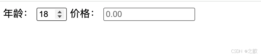
属性说明:
min- 最小值max- 最大值step- 步进值(每次增减的数量)value- 默认值
3.2.13 电话输入框(tel)
语义: 移动端显示数字键盘,但不做格式验证。
html
<label for="phone">手机号:</label>
<input
  type="tel"
  id="phone"
  name="phone"
  pattern="[0-9]{11}"
  placeholder="请输入11位手机号"
  required>
自定义验证:
html
<input
  type="tel"
  name="phone"
  pattern="[0-9]{3}-[0-9]{3}-[0-9]{4}"
  placeholder="123-456-7890">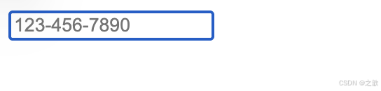
3.2.14 URL 输入框(url)
语义: 自动验证 URL 格式。
html
<label for="website">个人网站:</label>
<input
  type="url"
  id="website"
  name="website"
  placeholder="https://example.com">
验证规则: 必须是完整的 URL,如 http://example.com 或 https://example.com
3.2.15 日期选择器(date)
语义: 显示日期选择器。
html
<label for="birthday">生日:</label>
<input
  type="date"
  id="birthday"
  name="birthday"
  min="1900-01-01"
  max="2026-12-31"
  value="2000-01-01">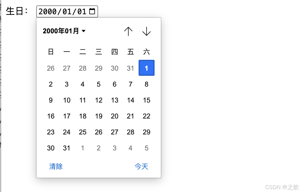
3.2.16 时间选择器(time)
语义: 选择时间(小时:分钟)。
html
<label for="meeting-time">会议时间:</label>
<input
  type="time"
  id="meeting-time"
  name="meeting_time"
  min="09:00"
  max="18:00"
  value="13:00">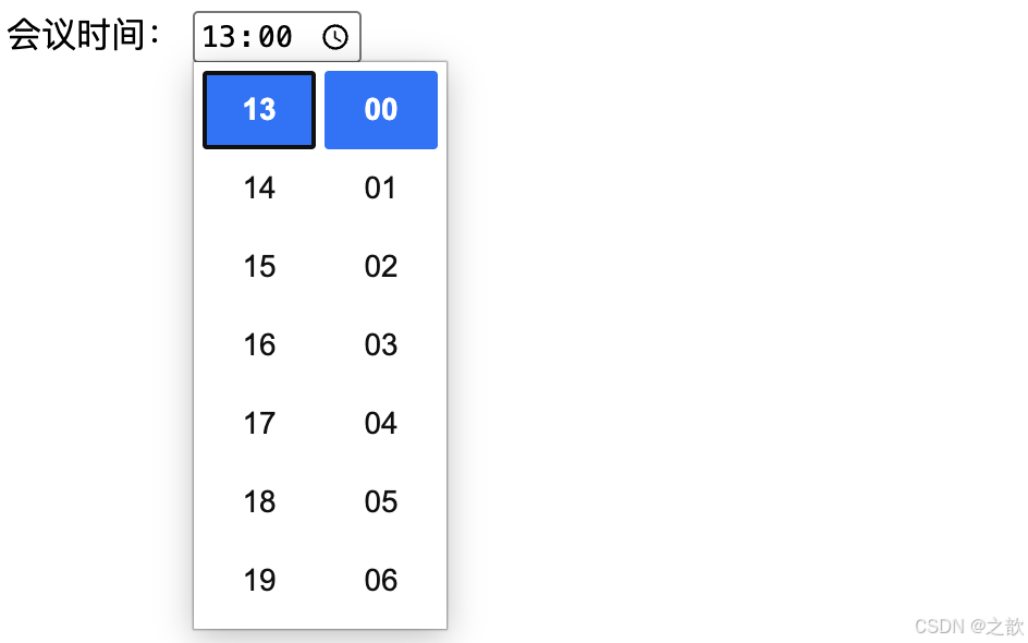
3.2.17 日期时间选择器(datetime-local)
语义: 同时选择日期和时间(不含时区)。
html
<label for="appointment">预约时间:</label>
<input
  type="datetime-local"
  id="appointment"
  name="appointment"
  value="2026-04-23T14:30">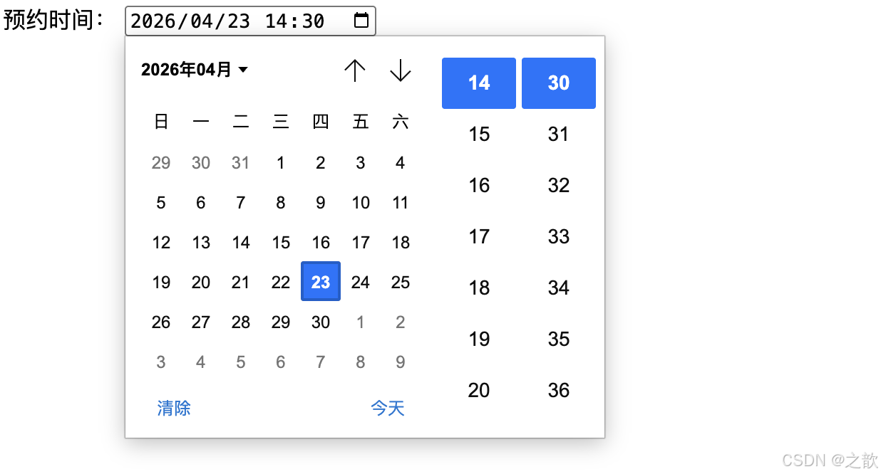
3.2.18 颜色选择器(color)
语义: 显示颜色选择器。
html
<label for="theme-color">主题色:</label>
<input
  type="color"
  id="theme-color"
  name="theme_color"
  value="#3498db">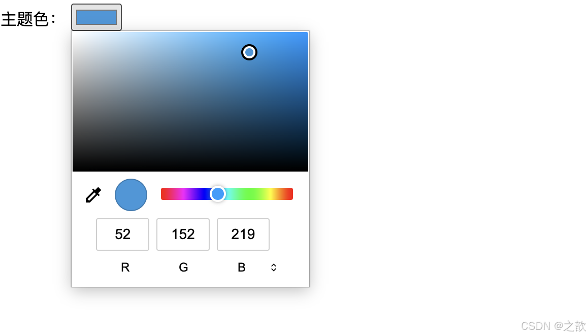
3.2.19 滑动条(range)
语义: 滑动选择数值。
html
<label for="volume">音量:</label>
<input
  type="range"
  id="volume"
  name="volume"
  min="0"
  max="100"
  step="1"
  value="50">
<output>50</output>

<script>
  const range = document.getElementById('volume');
  const output = document.querySelector('output');
  range.addEventListener('input', () => {
    output.textContent = range.value;
  });
</script>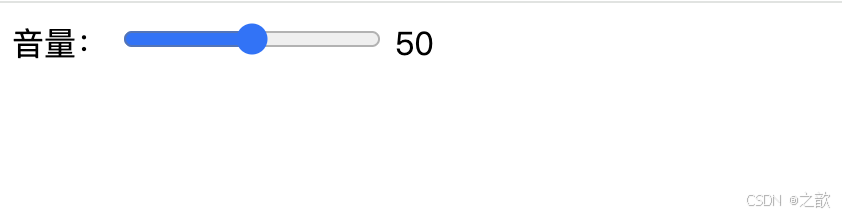
3.2.20 文件上传(file)
语义: 选择并上传文件。
html
<!-- 单文件上传 -->
<label for="avatar">头像:</label>
<input
  type="file"
  id="avatar"
  name="avatar"
  accept="image/*">

<!-- 多文件上传 -->
<label for="photos">相册:</label>
<input
  type="file"
  id="photos"
  name="photos"
  accept="image/png, image/jpeg"
  multiple>

<!-- 限制文件类型 -->
<label for="document">文档:</label>
<input
  type="file"
  name="document"
  accept=".pdf,.doc,.docx">
accept 属性值:
image/*- 所有图片类型video/*- 所有视频类型audio/*- 所有音频类型.pdf- PDF 文件image/png, image/jpeg- 指定多个类型
⚠️ 重要: 文件上传表单必须设置 enctype="multipart/form-data":
html
<form action="/upload" method="post" enctype="multipart/form-data">
  <input type="file" name="file">
  <button type="submit">上传</button>
</form>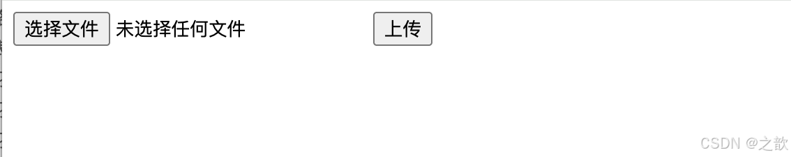
3.2.21 搜索框(search)
语义: 搜索输入框,部分浏览器显示清除按钮。
html
<form action="/search">
  <input
    type="search"
    name="q"
    placeholder="搜索..."
    autocomplete="off">
  <button type="submit">搜索</button>
</form>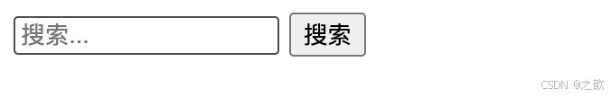
3.3 表单控件的通用属性
| 属性 | 作用 | 适用控件 | 示例 |
|---|---|---|---|
name |
数据名称(键名) | 几乎所有 | name="username" |
value |
默认值或提交值 | text, radio, checkbox 等 | value="默认值" |
placeholder |
占位提示文字 | text, textarea, email 等 | placeholder="请输入" |
required |
必填项 | 几乎所有 | required |
disabled |
禁用控件 | 所有 | disabled |
readonly |
只读(可提交) | text, textarea 等 | readonly |
maxlength |
最大字符数 | text, textarea 等 | maxlength="100" |
min / max |
数值范围 | number, date, range 等 | min="1" max="100" |
step |
步进值 | number, range 等 | step="0.01" |
pattern |
正则验证 | text, tel 等 | pattern="[0-9]{11}" |
autocomplete |
自动完成 | text, email 等 | autocomplete="off" |
autofocus |
自动聚焦 | 所有输入类 | autofocus |
multiple |
允许多选 | select, file | multiple |
accept |
文件类型 | file | accept="image/*" |
🎨 表单属性关系图
表单属性
数据相关
验证相关
交互相关
样式相关
name 数据名
value 数据值
required 必填
pattern 正则
min/max 范围
maxlength 长度
disabled 禁用
readonly 只读
autofocus 聚焦
autocomplete 自动完成
placeholder 提示
size 尺寸
💡 常用验证属性组合
验证场景
用户名验证
邮箱验证
手机号验证
密码验证
required + pattern + minlength
required + type=email
required + type=tel + pattern
required + type=password + minlength
3.4 表单标签总结
| 标签名 | 语义和功能 | 常用属性 | 单/双标签 |
|---|---|---|---|
<form> |
表单容器 | action, method, target, enctype |
双标签 |
<input> |
输入控件(多种类型) | type, name, value, placeholder, required 等 |
单标签 |
<textarea> |
多行文本输入 | name, rows, cols, placeholder, maxlength |
双标签 |
<select> |
下拉选择 | name, multiple, size |
双标签 |
<option> |
下拉选项 | value, selected |
双标签 |
<optgroup> |
选项分组 | label |
双标签 |
<button> |
按钮 | type (submit/reset/button) |
双标签 |
<label> |
表单标签 | for |
双标签 |
🚀 表单最佳实践流程
开始设计表单
确定数据需求
选择合适的控件
添加 label 标签
设置验证规则
添加错误提示
优化用户体验
移动端适配
无障碍优化
后端验证
完成
自动聚焦
Tab键导航
实时验证
响应式布局
触摸友好
虚拟键盘优化
ARIA 属性
键盘可访问
屏幕阅读器
💡 表单验证层次图
提升体验
保证安全
表单验证体系
前端验证
后端验证
HTML5 原生验证
JavaScript 自定义验证
第三方库验证
required
pattern
type 验证
自定义规则
实时反馈
跨字段验证
数据格式验证
业务逻辑验证
安全性验证
用户体验
数据安全
四、实战案例
4.1 用户注册表单(综合案例)
html
<!DOCTYPE html>
<html lang="zh-CN">
<head>
  <meta charset="UTF-8">
  <title>用户注册</title>
  <style>
    body {
      font-family: Arial, sans-serif;
      max-width: 600px;
      margin: 50px auto;
      padding: 20px;
      background-color: #f5f5f5;
    }
    form {
      background: white;
      padding: 30px;
      border-radius: 8px;
      box-shadow: 0 2px 10px rgba(0,0,0,0.1);
    }
    .form-group {
      margin-bottom: 20px;
    }
    label {
      display: block;
      margin-bottom: 5px;
      font-weight: bold;
      color: #333;
    }
    input, select, textarea {
      width: 100%;
      padding: 10px;
      border: 1px solid #ddd;
      border-radius: 4px;
      font-size: 14px;
      box-sizing: border-box;
    }
    input:focus, select:focus, textarea:focus {
      outline: none;
      border-color: #4CAF50;
    }
    .radio-group, .checkbox-group {
      display: flex;
      gap: 20px;
      align-items: center;
    }
    .radio-group input, .checkbox-group input {
      width: auto;
    }
    .btn-group {
      display: flex;
      gap: 10px;
      margin-top: 30px;
    }
    button {
      flex: 1;
      padding: 12px;
      border: none;
      border-radius: 4px;
      font-size: 16px;
      cursor: pointer;
    }
    button[type="submit"] {
      background-color: #4CAF50;
      color: white;
    }
    button[type="reset"] {
      background-color: #f44336;
      color: white;
    }
    button:hover {
      opacity: 0.9;
    }
    .hint {
      font-size: 12px;
      color: #999;
      margin-top: 5px;
    }
  </style>
</head>
<body>
  <form action="/api/register" method="post" enctype="multipart/form-data">
    <h2 style="text-align: center; color: #333;">用户注册</h2>

    <!-- 用户名 -->
    <div class="form-group">
      <label for="username">用户名 *</label>
      <input
        type="text"
        id="username"
        name="username"
        placeholder="请输入用户名(4-16位字母或数字)"
        pattern="[A-Za-z0-9]{4,16}"
        required>
      <div class="hint">只能包含字母和数字,4-16位</div>
    </div>

    <!-- 密码 -->
    <div class="form-group">
      <label for="password">密码 *</label>
      <input
        type="password"
        id="password"
        name="password"
        placeholder="请输入密码(6-20位)"
        minlength="6"
        maxlength="20"
        required>
      <div class="hint">密码长度为6-20位</div>
    </div>

    <!-- 确认密码 -->
    <div class="form-group">
      <label for="confirm-password">确认密码 *</label>
      <input
        type="password"
        id="confirm-password"
        name="confirm_password"
        placeholder="请再次输入密码"
        required>
    </div>

    <!-- 性别 -->
    <div class="form-group">
      <label>性别 *</label>
      <div class="radio-group">
        <label>
          <input type="radio" name="gender" value="male" checked>
          男
        </label>
        <label>
          <input type="radio" name="gender" value="female">
          女
        </label>
        <label>
          <input type="radio" name="gender" value="other">
          其他
        </label>
      </div>
    </div>

    <!-- 生日 -->
    <div class="form-group">
      <label for="birthday">生日 *</label>
      <input
        type="date"
        id="birthday"
        name="birthday"
        min="1900-01-01"
        max="2026-12-31"
        required>
    </div>

    <!-- 邮箱 -->
    <div class="form-group">
      <label for="email">邮箱 *</label>
      <input
        type="email"
        id="email"
        name="email"
        placeholder="example@domain.com"
        required>
    </div>

    <!-- 手机号 -->
    <div class="form-group">
      <label for="phone">手机号 *</label>
      <input
        type="tel"
        id="phone"
        name="phone"
        pattern="[0-9]{11}"
        placeholder="请输入11位手机号"
        required>
    </div>

    <!-- 所在地 -->
    <div class="form-group">
      <label for="city">所在城市 *</label>
      <select id="city" name="city" required>
        <option value="">请选择</option>
        <option value="city1">A市</option>
        <option value="city2">B市</option>
        <option value="city3">C市</option>
        <option value="city4">D市</option>
        <option value="city5">E市</option>
      </select>
    </div>

    <!-- 爱好 -->
    <div class="form-group">
      <label>兴趣爱好</label>
      <div class="checkbox-group">
        <label>
          <input type="checkbox" name="hobby" value="reading">
          阅读
        </label>
        <label>
          <input type="checkbox" name="hobby" value="sports">
          运动
        </label>
        <label>
          <input type="checkbox" name="hobby" value="music">
          音乐
        </label>
        <label>
          <input type="checkbox" name="hobby" value="travel">
          旅游
        </label>
        <label>
          <input type="checkbox" name="hobby" value="coding">
          编程
        </label>
      </div>
    </div>

    <!-- 个人简介 -->
    <div class="form-group">
      <label for="bio">个人简介</label>
      <textarea
        id="bio"
        name="bio"
        rows="5"
        placeholder="请简单介绍一下自己..."
        maxlength="500"></textarea>
      <div class="hint">不超过500字</div>
    </div>

    <!-- 头像上传 -->
    <div class="form-group">
      <label for="avatar">头像上传</label>
      <input
        type="file"
        id="avatar"
        name="avatar"
        accept="image/png, image/jpeg">
      <div class="hint">支持 JPG、PNG 格式</div>
    </div>

    <!-- 按钮组 -->
    <div class="btn-group">
      <button type="submit">立即注册</button>
      <button type="reset">重置表单</button>
    </div>
  </form>
</body>
</html>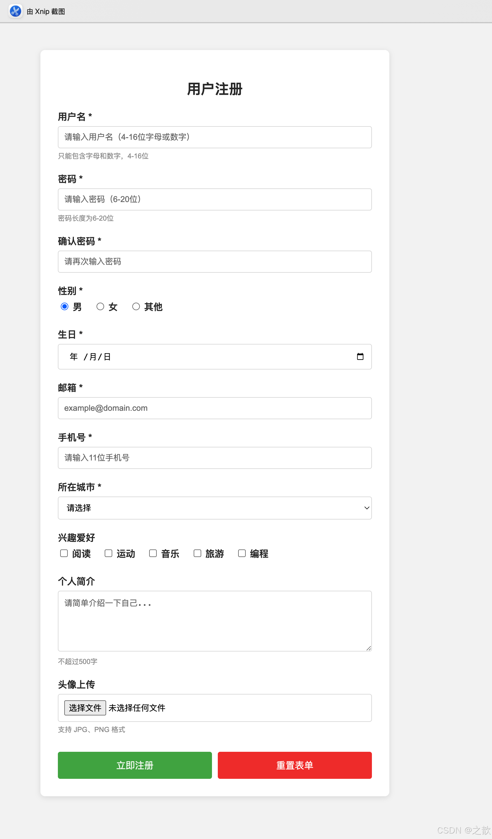
4.2 课程表(表格案例)
html
<!DOCTYPE html>
<html lang="zh-CN">
<head>
  <meta charset="UTF-8">
  <title>课程表</title>
  <style>
    body {
      font-family: "Microsoft YaHei", Arial, sans-serif;
      padding: 20px;
      background: linear-gradient(135deg, #667eea 0%, #764ba2 100%);
    }
    table {
      width: 90%;
      max-width: 1200px;
      margin: 20px auto;
      background: white;
      border-collapse: collapse;
      box-shadow: 0 10px 30px rgba(0,0,0,0.3);
      border-radius: 8px;
      overflow: hidden;
    }
    caption {
      padding: 20px;
      font-size: 28px;
      font-weight: bold;
      color: white;
      text-shadow: 2px 2px 4px rgba(0,0,0,0.3);
    }
    th, td {
      padding: 15px;
      text-align: center;
      border: 1px solid #e0e0e0;
    }
    thead th {
      background: linear-gradient(135deg, #667eea 0%, #764ba2 100%);
      color: white;
      font-size: 16px;
      font-weight: bold;
    }
    tbody td {
      font-size: 14px;
      transition: background-color 0.3s;
    }
    tbody tr:nth-child(even) {
      background-color: #f8f9fa;
    }
    tbody tr:hover {
      background-color: #e3f2fd;
    }
    .time-col {
      background-color: #fff3e0;
      font-weight: bold;
    }
    .lunch {
      background-color: #c8e6c9;
      font-weight: bold;
      color: #2e7d32;
    }
  </style>
</head>
<body>
  <table>
    <caption>高三(1)班课程表 - 2026年春季学期</caption>
    <thead>
      <tr>
        <th rowspan="2">时间</th>
        <th colspan="5">星期</th>
      </tr>
      <tr>
        <th>一</th>
        <th>二</th>
        <th>三</th>
        <th>四</th>
        <th>五</th>
      </tr>
    </thead>
    <tbody>
      <tr>
        <td class="time-col">8:00-8:45</td>
        <td>语文</td>
        <td>数学</td>
        <td>英语</td>
        <td>物理</td>
        <td>化学</td>
      </tr>
      <tr>
        <td class="time-col">8:55-9:40</td>
        <td>数学</td>
        <td>语文</td>
        <td>物理</td>
        <td>化学</td>
        <td>英语</td>
      </tr>
      <tr>
        <td class="time-col">9:50-10:35</td>
        <td>英语</td>
        <td>物理</td>
        <td>数学</td>
        <td>语文</td>
        <td>生物</td>
      </tr>
      <tr>
        <td class="time-col">10:45-11:30</td>
        <td>历史</td>
      <td>地理</td>
      <td>计算机</td>
      <td>生物</td>
        <td>信息技术</td>
      </tr>
      <tr>
        <td class="time-col">11:30-13:30</td>
        <td colspan="5" class="lunch">午休时间</td>
      </tr>
      <tr>
        <td class="time-col">13:30-14:15</td>
        <td>物理</td>
        <td>化学</td>
        <td>生物</td>
        <td>数学</td>
        <td>语文</td>
      </tr>
      <tr>
        <td class="time-col">14:25-15:10</td>
        <td>化学</td>
        <td>生物</td>
        <td>历史</td>
        <td>地理</td>
        <td>体育</td>
      </tr>
      <tr>
        <td class="time-col">15:20-16:05</td>
        <td>体育</td>
        <td>音乐</td>
        <td>美术</td>
        <td>班会</td>
        <td>自习</td>
      </tr>
    </tbody>
  </table>
</body>
</html>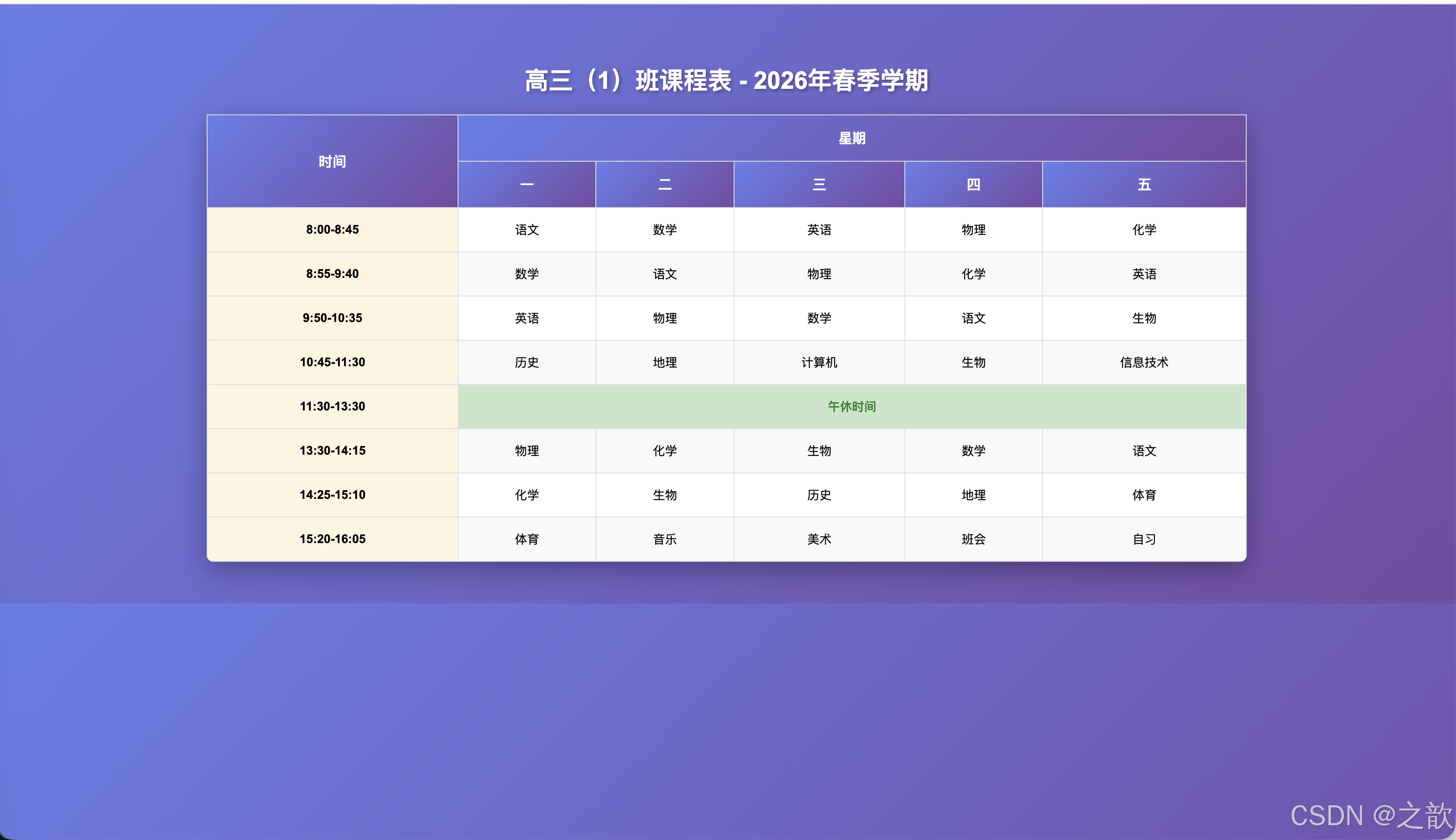
五、最佳实践与技巧
📊 三大标签对比总览
🎯 使用场景决策矩阵
5.1 列表最佳实践
✅ 正确的嵌套方式
html
<!-- ✅ 正确:嵌套列表在 li 内 -->
<ul>
  <li>
    父项
    <ul>
      <li>子项1</li>
      <li>子项2</li>
    </ul>
  </li>
</ul>

<!-- ❌ 错误:直接在 ul 中嵌套 ul -->
<ul>
  <ul>
    <li>错误的嵌套</li>
  </ul>
</ul>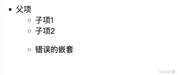
✅ 使用语义化的列表类型
html
<!-- ✅ 适合用有序列表 -->
<h3>蛋糕制作步骤</h3>
<ol>
  <li>准备材料</li>
  <li>混合面糊</li>
  <li>烘烤30分钟</li>
</ol>

<!-- ❌ 不适合用有序列表 -->
<h3>购物清单</h3>
<ul>
  <li>苹果</li>
  <li>牛奶</li>
  <li>面包</li>
</ul>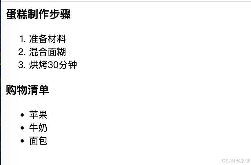
5.2 表格最佳实践
✅ 使用完整的表格结构
html
<!-- ✅ 推荐:使用 thead、tbody、tfoot -->
<table>
  <thead>
    <tr><th>标题</th></tr>
  </thead>
  <tbody>
    <tr><td>数据</td></tr>
  </tbody>
  <tfoot>
    <tr><td>总计</td></tr>
  </tfoot>
</table>

<!-- ❌ 不推荐:直接使用 tr -->
<table>
  <tr><td>数据</td></tr>
</table>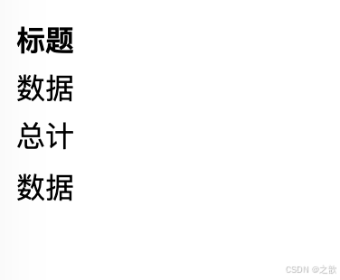
✅ rowspan 和 colspan 的计算技巧
示例:
目标效果:
┌───────┬───┬───┐
│   A   │ B │ C │  第1行:A跨2列,共3个逻辑列
├───┬───┼───┼───┤
│ D │ E │ F │ G │  第2行:正常4列
└───┴───┴───┴───┘
代码:
html
<table border="1">
  <tr>
    <!-- A 跨2列,所以删除一个单元格 -->
    <td colspan="2">A</td>
    <td>B</td>
    <td>C</td>
  </tr>
  <tr>
    <!-- 正常4个单元格 -->
    <td>D</td>
    <td>E</td>
    <td>F</td>
    <td>G</td>
  </tr>
</table>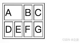
计算规则:
- 每行的实际单元格数 = 总列数 - 被 colspan 占用的额外列数
- 每列的实际单元格数 = 总行数 - 被 rowspan 占用的额外行数
5.3 表单最佳实践
✅ 使用 label 提升可访问性
html
<!-- ✅ 推荐:使用 label -->
<label for="username">用户名:</label>
<input type="text" id="username" name="username">

<!-- 或者 -->
<label>
  用户名:
  <input type="text" name="username">
</label>

<!-- ❌ 不推荐:没有 label -->
用户名:<input type="text" name="username">
优势:
- 点击文字也能聚焦输入框
- 屏幕阅读器能正确朗读
- 提升用户体验
✅ 合理使用 placeholder 和 label
html
<!-- ✅ 推荐:label + placeholder -->
<label for="email">邮箱:</label>
<input type="email" id="email" placeholder="example@domain.com">

<!-- ❌ 不推荐:只用 placeholder -->
<input type="email" placeholder="邮箱">
原因:
- placeholder 会在输入时消失
- 仅靠 placeholder 不符合无障碍标准
✅ 提供清晰的错误提示
html
<form>
  <label for="phone">手机号:</label>
  <input
    type="tel"
    id="phone"
    name="phone"
    pattern="[0-9]{11}"
    title="请输入11位数字手机号"
    required>
  <span class="error-msg">请输入正确的手机号格式</span>
</form>
✅ 表单验证的层次
html
<form>
  <!-- 1. HTML5 原生验证 -->
  <input type="email" required>

  <!-- 2. pattern 正则验证 -->
  <input type="tel" pattern="[0-9]{11}">

  <!-- 3. JavaScript 自定义验证 -->
  <input type="password" id="pwd" onblur="validatePassword()">

  <!-- 4. 后端验证(必须!) -->
</form>
原则:
- 前端验证提升体验
- 后端验证保证安全
- 两者缺一不可
5.4 通用技巧
✅ 语义化 HTML 的重要性
html
<!-- ✅ 语义化 -->
<nav>
  <ul>
    <li><a href="#">首页</a></li>
  </ul>
</nav>

<table>
  <caption>数据表</caption>
  <thead>...</thead>
</table>

<form>
  <label>用户名</label>
  <input type="text">
</form>

<!-- ❌ 非语义化 -->
<div>
  <div>
    <div><a href="#">首页</a></div>
  </div>
</div>
✅ 移动端优化
html
<!-- 移动端数字键盘 -->
<input type="tel">
<input type="number">

<!-- 移动端日期选择器 -->
<input type="date">

<!-- 移动端邮箱键盘 -->
<input type="email">
🚀 性能优化建议
性能优化
列表优化
表格优化
表单优化
虚拟滚动
处理大列表
懒加载
图片和内容
避免深层嵌套
最多3-4层
固定表头
position: sticky
分页显示
避免千行表格
虚拟表格
只渲染可见行
防抖节流
实时验证
延迟验证
失焦时触发
禁用自动完成
敏感信息
🎨 浏览器兼容性速查
HTML5 表单类型
现代浏览器
老旧浏览器
Chrome ✅
Firefox ✅
Safari ✅
Edge ✅
IE11 ⚠️
部分支持
解决方案
Polyfill
Modernizr
webshim
总结
📊 知识体系总览
HTML核心标签
列表 Lists
无序列表 ul
应用: 导航菜单
应用: 功能列表
应用: 新闻列表
有序列表 ol
应用: 操作步骤
应用: 排行榜
应用: 目录索引
定义列表 dl
应用: 术语表
应用: FAQ
应用: 元数据
表格 Tables
基础结构
thead 表头
tbody 表体
tfoot 表脚
高级特性
rowspan 跨行
colspan 跨列
对齐控制
应用场景
数据报表
课程表
价格对比
表单 Forms
输入控件
文本类
选择类
日期类
文件类
验证机制
HTML5原生
JS自定义
后端验证
应用场景
用户注册
搜索功能
数据录入
🎯 核心要点总结
本文详细介绍了 HTML 中的三大核心结构:
1. 列表(Lists) - 组织信息的基础
| 类型 | 标签 | 核心特点 | 典型场景 |
|---|---|---|---|
| 无序列表 | <ul> |
项目无序,可嵌套 | 导航菜单、功能列表、新闻列表 |
| 有序列表 | <ol> |
项目有序,支持自定义编号 | 操作步骤、排行榜、目录索引 |
| 定义列表 | <dl> |
术语-描述配对 | 词汇表、FAQ、元数据 |
2. 表格(Tables) - 展示二维数据
表格核心
结构语义化
单元格合并
样式控制
thead/tbody/tfoot
rowspan/colspan
align/valign
完整结构: <table> → <thead> → <tbody> → <tfoot>
单元格合并: rowspan(跨行)、colspan(跨列)
对齐方式: align(横向)、valign(纵向)
3. 表单(Forms) - 用户交互核心
表单系统
21种输入类型
核心属性
提交方式
文本: text/email/tel
选择: radio/checkbox
特殊: file/date/color
name: 数据标识
value: 数据值
required: 必填验证
GET: URL参数
POST: 请求体
✨ 关键原则速查
HTML最佳实践
语义化
可访问性
用户体验
安全性
选择正确标签
结构清晰
ARIA支持
键盘导航
屏幕阅读器
清晰提示
即时反馈
移动优化
前端验证
后端验证
数据加密
五大核心原则:
- ✅ 语义化: 使用正确的标签表达正确的含义
- ✅ 可访问性: 支持屏幕阅读器和键盘导航
- ✅ 用户体验: 清晰的标签、提示和即时反馈
- ✅ 移动优化: 响应式布局和触摸友好
- ✅ 安全验证: 前后端验证相结合
🎓 学习进阶路线
基础阶段 第1周 列表基础 ul/ol/li 基本使用 简单嵌套 第2周 表格基础 table/tr/td 结构 基础样式 进阶阶段 第3周 表单控件 21种输入类型 基础验证 第4周 高级特性 单元格合并 复杂表单设计 实战阶段 第5周 综合项目 完整注册表单 数据展示表格 第6周 优化提升 性能优化 可访问性优化 HTML 标签学习进阶路线
📖 快速参考卡片
列表速查
| 需求 | 标签选择 | 关键属性 |
|---|---|---|
| 菜单导航 | <ul> |
嵌套在 <li> 内 |
| 操作步骤 | <ol> |
start, reversed |
| 术语解释 | <dl> |
<dt> + <dd> |
表格速查
| 需求 | 实现方式 | 注意事项 |
|---|---|---|
| 表头样式 | <thead> + <th> |
使用 scope 属性 |
| 横向合并 | colspan="n" |
删除右侧单元格 |
| 纵向合并 | rowspan="n" |
删除下方单元格 |
表单速查
| 输入类型 | 使用场景 | 移动端优化 |
|---|---|---|
type="email" |
邮箱输入 | 显示 @键盘 |
type="tel" |
电话号码 | 数字键盘 |
type="date" |
日期选择 | 原生日期选择器 |
参考资源
官方文档
- 📚 MDN Web Docs - HTML Lists
- 📚 MDN Web Docs - HTML Tables
- 📚 MDN Web Docs - HTML Forms
- 📚 W3C HTML 标准
- 📚 web.dev - Learn HTML
工具推荐
在线练习
- 💻 CodePen - 在线代码编辑
- 💻 JSFiddle - 代码测试平台
- 💻 HTML Validator - HTML 验证工具
📝 版本信息
main feature v1.0 初始版本 添加基础示例 添加 Mermaid 图表 添加特色总结 添加使用场景 v2.0 完整版 当前版本