import { FiChevronDown, FiCheck } from "react-icons/fi";
import { useState } from "react";
function CustomSelect() {
const [selected, setSelected] = useState("");
const [isOpen, setIsOpen] = useState(false);
const options = [
{ value: "apple", label: "苹果" },
{ value: "banana", label: "香蕉" },
{ value: "orange", label: "橙子" },
];
return (
<div className="relative w-52">
<div
className={`border border-gray-300 rounded-lg px-4 py-2 cursor-pointer flex items-center justify-between transition-all duration-200 text-sm
${isOpen ? "border-blue-500 ring-2 ring-blue-500" : "hover:border-gray-400"}`}
onClick={() => setIsOpen(!isOpen)}
>
<span className={selected ? "text-black" : "text-gray-400"}>
{selected
? options.find((opt) => opt.value === selected)?.label
: "请选择水果"}
</span>
<FiChevronDown
size={16}
className={`text-gray-500 transition-transform duration-200 ${isOpen ? "rotate-180" : ""}`}
/>
</div>
{isOpen && (
<div className="absolute top-full left-0 right-0 mt-1 bg-white border border-gray-200 rounded-lg shadow-lg z-10 overflow-hidden">
{options.map((option) => (
<div
key={option.value}
className={`px-4 py-2 cursor-pointer transition-colors duration-150 text-sm
${selected === option.value ? "bg-blue-50 text-blue-600" : "hover:bg-gray-50 text-gray-700"}`}
onClick={(e) => {
e.stopPropagation();
setSelected(option.value);
setIsOpen(false);
}}
>
{option.label}
</div>
))}
</div>
)}
</div>
);
}
function CustomCheckbox() {
const [checked, setChecked] = useState(false);
return (
<label className="flex items-center gap-2 cursor-pointer">
<div className="relative">
<input
type="checkbox"
className="sr-only"
checked={checked}
onChange={() => setChecked(!checked)}
/>
<div
className={`w-4 h-4 rounded border-2 transition-all duration-200 flex items-center justify-center
${checked ? "bg-blue-500 border-blue-500" : "border-gray-300 bg-white"}`}
>
{checked && <FiCheck size={10} className="text-white" />}
</div>
</div>
<span className="text-gray-700 text-sm">同意协议</span>
</label>
);
}
function CustomRadio() {
const [selected, setSelected] = useState("");
const options = [
{ value: "option1", label: "选项一" },
{ value: "option2", label: "选项二" },
{ value: "option3", label: "选项三" },
];
return (
<div className="flex flex-col gap-2">
{options.map((option) => (
<label
key={option.value}
className="flex items-center gap-2 cursor-pointer"
>
<div className="relative">
<input
type="radio"
className="sr-only"
name="custom-radio-group"
checked={selected === option.value}
onChange={() => setSelected(option.value)}
/>
<div
className={`w-4 h-4 rounded-full border-2 transition-all duration-200
${selected === option.value ? "border-blue-500" : "border-gray-300"}`}
>
{selected === option.value && (
<div className="absolute top-1/2 left-1/2 -translate-x-1/2 -translate-y-1/2 w-2 h-2 rounded-full bg-blue-500" />
)}
</div>
</div>
<span className="text-gray-700 text-sm">{option.label}</span>
</label>
))}
</div>
);
}
function CustomInput() {
const [value, setValue] = useState("");
return (
<div className="w-52">
<input
type="text"
value={value}
onChange={(e) => setValue(e.target.value)}
placeholder="请输入内容"
className="w-full px-4 py-1.5 bg-gray-50 border-0 rounded-lg text-sm
focus:outline-none focus:ring-2 focus:ring-blue-500 focus:bg-white
placeholder:text-gray-400 transition-all duration-200"
/>
</div>
);
}
function FormExamples() {
const [nativeSelect, setNativeSelect] = useState("");
const [nativeCheckbox, setNativeCheckbox] = useState(false);
const [nativeRadio, setNativeRadio] = useState("");
const [nativeInput, setNativeInput] = useState("");
return (
<div className="py-8 px-4">
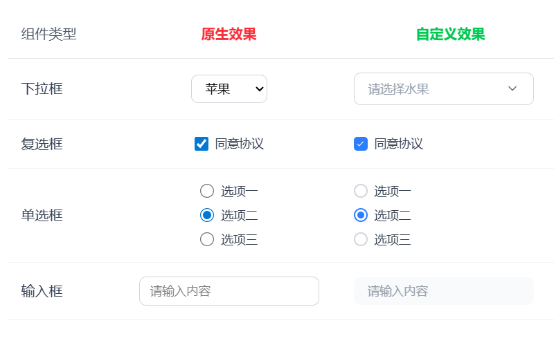
<h2 className="text-2xl font-bold mb-8 text-center">表单组件对比</h2>
<div className="flex justify-center">
<table className="border-collapse">
<thead>
<tr>
<th className="text-left p-4 w-32 text-gray-600 font-medium border-b border-gray-200">
组件类型
</th>
<th className="text-center p-4 w-64 text-red-500 font-semibold border-b border-gray-200">
原生效果
</th>
<th className="text-center p-4 w-64 text-green-500 font-semibold border-b border-gray-200">
自定义效果
</th>
</tr>
</thead>
<tbody>
{/* 下拉框对比 */}
<tr className="hover:bg-gray-50">
<td className="p-4 text-gray-700 font-medium border-b border-gray-100">
下拉框
</td>
<td className="p-4 text-center border-b border-gray-100">
<select
value={nativeSelect}
onChange={(e) => setNativeSelect(e.target.value)}
className="border border-gray-300 px-3 py-1.5 rounded-lg text-sm focus:outline-none focus:ring-2 focus:ring-blue-500"
>
<option value="">请选择</option>
<option value="apple">苹果</option>
<option value="banana">香蕉</option>
<option value="orange">橙子</option>
</select>
</td>
<td className="p-4 text-center border-b border-gray-100">
<CustomSelect />
</td>
</tr>
{/* 复选框对比 */}
<tr className="hover:bg-gray-50">
<td className="p-4 text-gray-700 font-medium border-b border-gray-100">
复选框
</td>
<td className="p-4 text-center border-b border-gray-100">
<label className="flex items-center justify-center gap-2 cursor-pointer">
<input
type="checkbox"
checked={nativeCheckbox}
onChange={() => setNativeCheckbox(!nativeCheckbox)}
className="w-4 h-4"
/>
<span className="text-gray-700 text-sm">同意协议</span>
</label>
</td>
<td className="p-4 text-center border-b border-gray-100">
<CustomCheckbox />
</td>
</tr>
{/* 单选框对比 */}
<tr className="hover:bg-gray-50">
<td className="p-4 text-gray-700 font-medium border-b border-gray-100">
单选框
</td>
<td className="p-4 text-center border-b border-gray-100">
<div className="flex flex-col gap-2 items-center">
{["选项一", "选项二", "选项三"].map((label, i) => (
<label
key={i}
className="flex items-center gap-2 cursor-pointer"
>
<input
type="radio"
name="native-radio"
value={label}
checked={nativeRadio === label}
onChange={() => setNativeRadio(label)}
className="w-4 h-4"
/>
<span className="text-gray-700 text-sm">{label}</span>
</label>
))}
</div>
</td>
<td className="p-4 text-center border-b border-gray-100">
<CustomRadio />
</td>
</tr>
{/* 输入框对比 */}
<tr className="hover:bg-gray-50">
<td className="p-4 text-gray-700 font-medium border-b border-gray-100">
输入框
</td>
<td className="p-4 text-center border-b border-gray-100">
<input
type="text"
value={nativeInput}
onChange={(e) => setNativeInput(e.target.value)}
placeholder="请输入内容"
className="w-52 px-3 py-1.5 border border-gray-300 rounded-lg text-sm focus:outline-none focus:ring-2 focus:ring-blue-500"
/>
</td>
<td className="p-4 text-center border-b border-gray-100">
<CustomInput />
</td>
</tr>
</tbody>
</table>
</div>
</div>
);
}
function App() {
return <FormExamples />;
}
export default App;