五、CSS3 渐变
🔤 名词解释
| 术语 | 解释 |
|---|---|
| 渐变(Gradient) | 两种或多种颜色之间的平滑过渡,本质是 CSS 生成的图像(image),不是颜色值 |
| 线性渐变 | 沿直线方向渐变,颜色沿渐变轴均匀过渡 |
| 径向渐变 | 从中心点向外辐射的圆形/椭圆形渐变 |
| 重复渐变 | 将一段渐变规律循环重复铺满整个区域 |
| 颜色停止点(Color Stop) | 渐变中明确指定某种颜色位置的值,如 red 30% |
| 硬停止(Hard Stop) | 两个颜色停止点位置相同(如 red 50%, blue 50%),产生无过渡的硬边界,用于绘制条纹 |
| 渐变轴 | 线性渐变颜色变化的方向轴 |
渐变是图像:
CSS 渐变本质
是 CSS 生成的图像
可用于所有需要 image 的属性:
• background-image ✅
• list-style-image ✅
• border-image ✅
linear-gradient()
radial-gradient()
repeating-linear-gradient()
repeating-radial-gradient()
5.1 线性渐变 --- linear-gradient()
完整语法:
css
background-image: linear-gradient(方向, 颜色停止点1, 颜色停止点2, ...);渐变方向:两种写法
| 写法 | 示例 | 对应角度 |
|---|---|---|
| 关键字 | to bottom |
180deg |
| 关键字 | to right |
90deg |
| 关键字 | to right bottom |
135deg |
| 角度值 | 0deg |
to top(向上) |
| 角度值 | 90deg |
to right(向右) |
| 角度值 | 45deg |
to right bottom 方向 |
0deg = to top ↑
90deg = to right →
180deg = to bottom ↓(默认)
270deg = to left ←
45deg ↗ / 135deg ↘
颜色停止点详解:
css
/* 1. 不指定位置 → 颜色平均分布 */
linear-gradient(to right, red, green, blue);
/* red: 0%, green: 50%, blue: 100% */

/* 2. 指定位置 → 精确控制 */
linear-gradient(to right, red 0%, green 40%, blue 100%);

/* 3. 硬停止(两点同位置)→ 无过渡的条纹 */
linear-gradient(90deg, #e74c3c 50%, #3498db 50%);

/* 4. 混合使用 */
linear-gradient(90deg, #900 100px, #080 200px);
/* 从起点到100px是纯红色,100~200px是过渡区,200px后是纯绿色 */
完整可运行示例:
html
<!DOCTYPE html>
<html lang="zh-CN">
<head>
  <meta charset="UTF-8">
  <title>线性渐变完全示例</title>
  <style>
    * { box-sizing: border-box; margin: 0; padding: 0; }
    body { padding: 30px; background: #f5f5f5; font-family: sans-serif; }
    h2 { color: #2c3e50; margin: 20px 0 12px; }
    .grid { display: grid; grid-template-columns: repeat(3, 1fr); gap: 14px; margin-top: 12px; }
    .card {
      height: 110px; border-radius: 10px;
      display: flex; align-items: flex-end; padding: 10px;
      color: white; font-size: 12px;
      text-shadow: 0 1px 3px rgba(0,0,0,0.5);
      box-shadow: 0 4px 12px rgba(0,0,0,0.1);
    }

    /* 方向控制 */
    .g1 { background: linear-gradient(to bottom, #f093fb, #f5576c); }
    .g2 { background: linear-gradient(to right, #4facfe, #00f2fe); }
    .g3 { background: linear-gradient(135deg, #43e97b, #38f9d7); }

    /* 多色 */
    .g4 { background: linear-gradient(90deg, #f7971e, #ffd200); }
    .g5 { background: linear-gradient(90deg, #667eea, #764ba2, #f5576c); }
    .g6 { background: linear-gradient(90deg, #ff0000 0%, #ff7700 17%, #ffff00 33%, #00ff00 50%, #0000ff 67%, #8b00ff 83%, #ff0000 100%); }

    /* 颜色停止点精确控制 */
    .g7 { background: linear-gradient(90deg, #e74c3c 33.3%, #f1c40f 33.3%, #f1c40f 66.6%, #2ecc71 66.6%); }
    .g8 { background: linear-gradient(90deg, #900 100px, #080 200px); } /* 指定px */

    /* 硬停止条纹 */
    .g9 {
      background: linear-gradient(45deg,
        #333 25%, transparent 25%, transparent 75%, #333 75%),
        linear-gradient(45deg, #333 25%, transparent 25%, transparent 75%, #333 75%);
      background-size: 20px 20px;
      background-position: 0 0, 10px 10px;
      background-color: #fff;
    }

    /* 按钮 */
    .btn-group { display: flex; gap: 12px; flex-wrap: wrap; margin-top: 12px; }
    .btn {
      padding: 12px 28px; border: none; border-radius: 30px;
      color: white; font-size: 14px; font-weight: bold;
      cursor: pointer; transition: transform 0.2s, box-shadow 0.2s;
    }
    .btn:hover { transform: translateY(-2px); box-shadow: 0 8px 20px rgba(0,0,0,0.2); }
    .btn1 { background: linear-gradient(135deg, #667eea, #764ba2); }
    .btn2 { background: linear-gradient(135deg, #f093fb, #f5576c); }
    .btn3 { background: linear-gradient(135deg, #43e97b, #38f9d7); }
    .btn4 { background: linear-gradient(135deg, #f7971e, #ffd200); }
    .btn5 { background: linear-gradient(135deg, #4facfe, #00f2fe); }
  </style>
</head>
<body>
  <h2>线性渐变方向与颜色控制</h2>
  <div class="grid">
    <div class="card g1">↓ to bottom</div>
    <div class="card g2">→ to right</div>
    <div class="card g3">↘ 135deg</div>
    <div class="card g4">双色渐变</div>
    <div class="card g5">三色渐变</div>
    <div class="card g6">彩虹色环</div>
    <div class="card g7">硬停止三色块</div>
    <div class="card g8">指定px停止点</div>
    <div class="card g9"></div>
  </div>

  <h2>渐变按钮实战</h2>
  <div class="btn-group">
    <button class="btn btn1">主色调</button>
    <button class="btn btn2">活力红</button>
    <button class="btn btn3">清新绿</button>
    <button class="btn btn4">暖橙色</button>
    <button class="btn btn5">科技蓝</button>
  </div>
</body>
</html>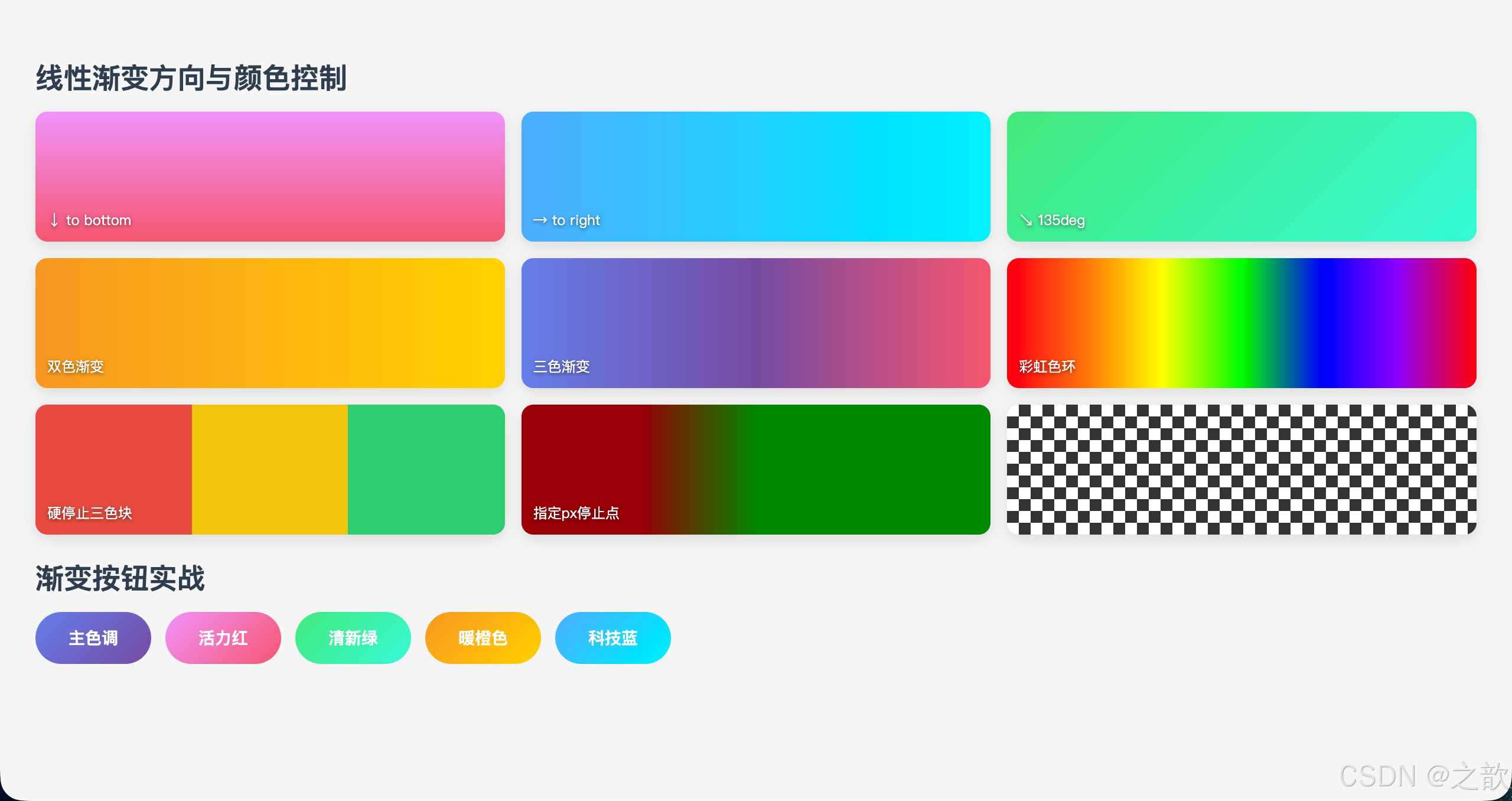
代码解说:
- g1~g3(方向控制) :
to bottom(向下)、to right(向右)、135deg(右下斜角),三种写法展示关键字与角度值的对应关系;0deg= to top,顺时针递增,90deg= to right,180deg= to bottom。- g4~g6(多色渐变):颜色数量不限,不指定位置时浏览器自动均分;g6 的彩虹渐变通过 7 个精确停止点(每隔约 17%)复现可见光谱顺序。
- g7(硬停止条纹) :
#e74c3c 33.3%, #f1c40f 33.3%--- 同一位置写两个颜色,中间没有过渡区,形成硬边界,三色块均占三分之一。这是纯 CSS 绘制图形的核心技巧。- g8(px 停止点) :
#900 100px, #080 200px--- 第一个颜色从起点到 100px 是纯红色,100~200px 是红到绿的过渡,200px 之后是纯绿色。混合 px 和默认推算时,两端颜色会各自向两侧延伸。- g9(棋盘格) :两层
45deg硬停止渐变叠加,每层在单元格的对角画两个三角形;第二层用background-position: 10px 10px偏移半格,与第一层交错拼出棋盘效果,background-size: 20px 20px控制格子大小。- 渐变按钮 :用
135deg斜向渐变赋予按钮立体光照感;:hover时translateY(-2px)上移 + 加深box-shadow模拟「抬起」的按压反馈,是当前最流行的按钮交互写法。
5.2 径向渐变 --- radial-gradient()
完整语法:
css
background-image: radial-gradient(形状 大小 at 圆心位置, 颜色列表);size 关键字详解(四个):
radial-gradient size 关键字
closest-side
渐变结束于距圆心最近的边
closest-corner
渐变结束于距圆心最近的角
farthest-side
渐变结束于距圆心最远的边
farthest-corner
渐变结束于距圆心最远的角
⭐ 默认值
| size 关键字 | 渐变半径到达位置 | 效果 |
|---|---|---|
closest-side |
最近的边 | 渐变范围小,周边颜色延伸 |
closest-corner |
最近的角 | 渐变范围更小 |
farthest-side |
最远的边 | 渐变范围大 |
farthest-corner |
最远的角(默认) | 渐变铺满整个元素 |
完整可运行示例:
html
<!DOCTYPE html>
<html lang="zh-CN">
<head>
  <meta charset="UTF-8">
  <title>径向渐变完整示例</title>
  <style>
    * { box-sizing: border-box; margin: 0; padding: 0; }
    body { padding: 30px; background: #0d1117; font-family: sans-serif; color: white; }
    h2 { margin: 20px 0 14px; }
    .grid { display: grid; grid-template-columns: repeat(4, 1fr); gap: 14px; }
    .card {
      height: 140px; border-radius: 10px; position: relative;
      border: 1px solid rgba(255,255,255,0.08);
    }
    .label {
      position: absolute; bottom: 8px; left: 8px;
      font-size: 10px; color: rgba(255,255,255,0.75);
      background: rgba(0,0,0,0.5); padding: 3px 7px; border-radius: 4px;
    }

    /* 基础 */
    .r1 { background: radial-gradient(circle, #f093fb, #764ba2); }
    .r2 { background: radial-gradient(circle at left top, #4facfe, #00f2fe); }
    .r3 { background: radial-gradient(ellipse, #43e97b, #0d1117); }
    .r4 { background: radial-gradient(100px circle at center, #f5576c 50%, #764ba2 50%); }

    /* size 关键字 */
    .r5 { background: radial-gradient(closest-side circle at 30% 40%, #f7971e, #0d1117); }
    .r6 { background: radial-gradient(closest-corner circle at 30% 40%, #f7971e, #0d1117); }
    .r7 { background: radial-gradient(farthest-side circle at 30% 40%, #f7971e, #0d1117); }
    .r8 { background: radial-gradient(farthest-corner circle at 30% 40%, #f7971e, #0d1117); }

    /* 3D 球体 */
    .balls { display: flex; gap: 30px; justify-content: center; margin-top: 20px; }
    .ball  { width: 140px; height: 140px; border-radius: 50%; }
    .ball-blue  { background: radial-gradient(circle at 35% 35%, #87ceeb, #1a237e); }
    .ball-gold  { background: radial-gradient(circle at 35% 35%, #ffd700, #8b6914); }
    .ball-ruby  { background: radial-gradient(circle at 35% 35%, #ff6b6b, #8b0000); }
    .ball-glass {
      background: radial-gradient(circle at 35% 35%, rgba(255,255,255,0.8), rgba(100,150,200,0.3));
      border: 1px solid rgba(255,255,255,0.3);
      box-shadow: inset 0 0 30px rgba(255,255,255,0.1), 0 10px 30px rgba(0,0,0,0.5);
    }
  </style>
</head>
<body>
  <h2>径向渐变 --- 基础形态与圆心位置</h2>
  <div class="grid">
    <div class="card r1"><div class="label">circle 默认居中</div></div>
    <div class="card r2"><div class="label">circle at left top</div></div>
    <div class="card r3"><div class="label">ellipse 椭圆</div></div>
    <div class="card r4"><div class="label">100px circle 硬停止</div></div>
  </div>

  <h2 style="margin-top:24px">size 关键字对比(圆心均在 30% 40%)</h2>
  <div class="grid">
    <div class="card r5"><div class="label">closest-side</div></div>
    <div class="card r6"><div class="label">closest-corner</div></div>
    <div class="card r7"><div class="label">farthest-side</div></div>
    <div class="card r8"><div class="label">farthest-corner(默认)</div></div>
  </div>

  <h2 style="margin-top:24px">径向渐变实现 3D 球体</h2>
  <div class="balls">
    <div class="ball ball-blue"></div>
    <div class="ball ball-gold"></div>
    <div class="ball ball-ruby"></div>
    <div class="ball ball-glass"></div>
  </div>
</body>
</html>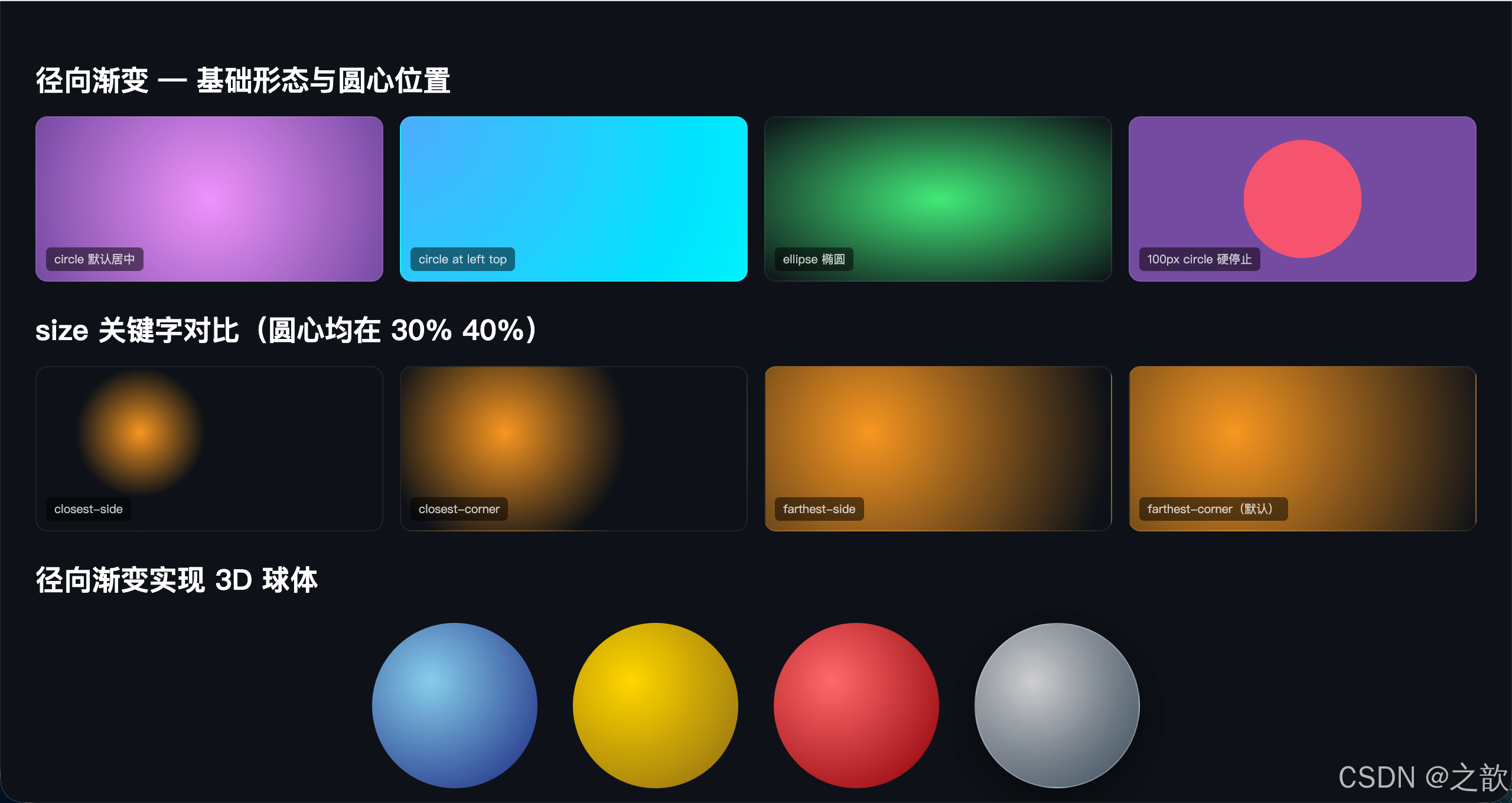
代码解说:
- r1(默认居中) :不指定圆心时默认为
center,渐变从中心向四周辐射,颜色在最远角处(farthest-corner,默认 size)结束。- r2(圆心偏移) :
at left top将圆心移到左上角,颜色从左上角向外扩散,常用于模拟光源从角落照射的效果。- r3(硬停止边界) :
100px circle at center固定圆形半径为 100px,配合50% 50%的硬停止产生一个实心圆嵌套在另一个颜色上的效果,类似图标设计中的「徽章」样式。- size 关键字对比(r5~r8) :四个盒子圆心都在同一位置(
30% 40%),只改变 size 关键字,渐变填充范围明显不同:closest-side渐变在最近的边结束后颜色向外延伸(纯色填充),farthest-corner(默认)渐变正好铺满整个元素。- 3D 球体 :关键是将圆心偏移到
35% 35%(左上偏内侧),模拟光源从左上方照射;从高光色(如浅蓝#87ceeb)渐变到暗部色(深蓝#1a237e),形成立体球面感;ball-glass额外使用box-shadow: inset在球体内部添加光晕增强玻璃质感。
5.3 重复渐变 --- repeating-gradient()
语法:
css
repeating-linear-gradient(方向, 颜色1 起点, 颜色1 终点, 颜色2 起点, ...);
repeating-radial-gradient(形状 大小, 颜色1 起点, 颜色1 终点, ...);
普通渐变
整个容器只有一个完整渐变
从容器一端到另一端
重复渐变
定义一小段颜色规律
在整个容器内无缝重复铺满
用于:条纹 / 稿纸 / 警示带 / 进度条 / 棋盘
完整可运行示例:
html
<!DOCTYPE html>
<html lang="zh-CN">
<head>
  <meta charset="UTF-8">
  <title>重复渐变 --- 典型用途大全</title>
  <style>
    * { box-sizing: border-box; }
    body { padding: 30px; background: #f5f5f5; font-family: 'Microsoft YaHei', sans-serif; }
    .section { background: white; border-radius: 12px; padding: 20px; margin-bottom: 20px; }
    h3 { color: #2c3e50; margin-bottom: 14px; font-size: 15px; }

    /* 1. 发廊灯条纹柱 */
    .barber {
      width: 70px; height: 280px; border-radius: 35px;
      border: 3px solid #ccc;
      background: repeating-linear-gradient(
        45deg,
        #e74c3c 0, #e74c3c 10px,
        #fff    10px, #fff    20px,
        #3498db 20px, #3498db 30px,
        #fff    30px, #fff    40px
      );
      box-shadow: 0 4px 12px rgba(0,0,0,0.15);
    }

    /* 2. 稿纸横线 */
    .notebook {
      width: 100%; height: 180px;
      padding: 8px 30px;
      background: repeating-linear-gradient(
        #fff 0, #fff 29px, #9de4ff 30px
      ) content-box;
      border: 1px solid #ddd; border-radius: 8px;
      line-height: 30px; font-size: 14px; color: #555;
    }

    /* 3. 警示条纹 */
    .danger {
      height: 56px; border-radius: 8px;
      background: repeating-linear-gradient(
        -45deg,
        #f1c40f 0, #f1c40f 10px,
        #2c3e50 10px, #2c3e50 20px
      );
    }

    /* 4. 进度条(带条纹动效)*/
    .progress-wrap {
      height: 22px; border-radius: 11px;
      overflow: hidden; background: #eee; margin: 8px 0;
    }
    .progress-bar {
      height: 100%; border-radius: 11px;
      background: repeating-linear-gradient(
        -45deg,
        #3498db 0, #3498db 8px, #2980b9 8px, #2980b9 16px
      );
      background-size: 22.6px 100%;
      animation: barFlow 1s linear infinite;
    }
    @keyframes barFlow { to { background-position: 22.6px 0; } }

    /* 5. 棋盘格 */
    .chess {
      height: 100px; border-radius: 8px;
      background-color: #eee;
      background-image:
        repeating-linear-gradient(45deg, rgba(0,0,0,0.1) 25%, transparent 25%, transparent 75%, rgba(0,0,0,0.1) 75%),
        repeating-linear-gradient(45deg, rgba(0,0,0,0.1) 25%, transparent 25%, transparent 75%, rgba(0,0,0,0.1) 75%);
      background-size: 20px 20px;
      background-position: 0 0, 10px 10px;
    }

    /* 6. 重复径向渐变 --- 波纹 */
    .ripple {
      height: 120px; border-radius: 8px;
      background: repeating-radial-gradient(
        circle at center,
        transparent 0, transparent 20px,
        rgba(102,126,234,0.3) 20px, rgba(102,126,234,0.3) 22px
      );
      background-color: #f0f4ff;
    }
  </style>
</head>
<body>
  <div class="section">
    <h3>1. 发廊灯条纹柱(repeating-linear-gradient 45deg)</h3>
    <div style="display:flex; gap:30px; align-items:center">
      <div class="barber"></div>
      <div style="font-size:14px; color:#666; line-height:1.8">
        通过 <code>repeating-linear-gradient</code> + 硬色停止点制作条纹<br>
        配合 CSS Animation 的 background-position 可实现滚动动效
      </div>
    </div>
  </div>

  <div class="section">
    <h3>2. 稿纸 / 笔记本横线</h3>
    <div class="notebook">在这里输入内容,背景自动生成整齐的横线。每 30px 重复一次:29px 白色 + 1px 蓝色线。</div>
  </div>

  <div class="section">
    <h3>3. 工地警示条纹</h3>
    <div class="danger"></div>
  </div>

  <div class="section">
    <h3>4. 流动条纹进度条</h3>
    <div class="progress-wrap">
      <div class="progress-bar" style="width:72%"></div>
    </div>
    <div class="progress-wrap">
      <div class="progress-bar" style="width:45%; background-image: repeating-linear-gradient(-45deg,#e74c3c 0,#e74c3c 8px,#c0392b 8px,#c0392b 16px)"></div>
    </div>
  </div>

  <div class="section">
    <h3>5. 棋盘格(两层 repeating 叠加)</h3>
    <div class="chess"></div>
  </div>

  <div class="section">
    <h3>6. 重复径向渐变 --- 同心圆波纹</h3>
    <div class="ripple"></div>
  </div>
</body>
</html>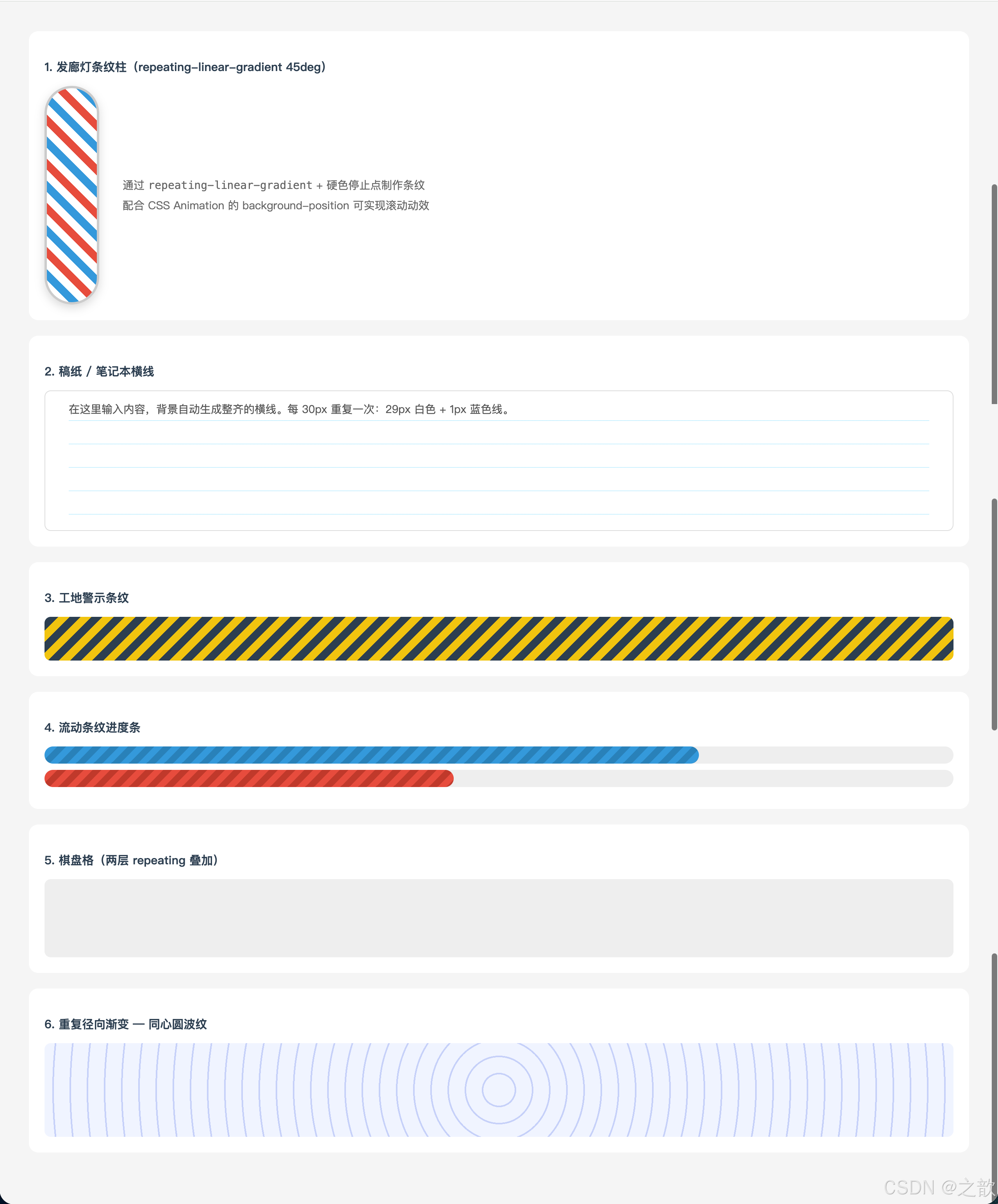
代码解说:
- 发廊灯(条纹柱) :每一段重复单元为 40px,由红 10px + 白 10px + 蓝 10px + 白 10px 构成,
45deg方向使条纹斜向排列。关键点是颜色停止点要首尾紧接 (如红色0~10px,白色10px~20px),没有过渡区才能产生硬边条纹;配合background-position动画可实现滚动旋转效果。- 稿纸横线 :每 30px 重复一次,前 29px 是白色、最后 1px 是浅蓝色,极细的线条形成标准方格纸效果;加
content-box确保横线从内容区开始绘制,左侧的padding: 30px留出「页边距」。- 警示条纹 :
-45deg反斜线条纹,黄色 + 深色交替,常用于施工警告区、表单禁用区等需要强烈视觉警示的场景。- 流动进度条 :
repeating-linear-gradient绘制条纹,再用@keyframes动画不断移动background-position,制造出条纹向左流动的视觉效果,模拟进度流动感。- 棋盘格 :用两层相同的
repeating-linear-gradient(45deg, ...)叠加,第二层相对第一层偏移半个单元(background-position: 0 0, 10px 10px),两层交叉后形成棋盘图案,这是纯 CSS 实现棋盘格的经典技巧。- 同心圆波纹 :
repeating-radial-gradient定义「透明 0~20px + 蓝色半透明 20~22px」的循环,形成均匀间距的同心圆环,适合目标定位、雷达扫描等视觉效果。
💡 真实场景:
| 效果 | 技术 | 使用网站 |
|---|---|---|
| 渐变 Hero Banner | linear-gradient |
Stripe、各大 SaaS |
| 图片遮罩层 | linear-gradient(transparent, rgba(0,0,0,0.7)) |
淘宝、京东 |
| 稿纸/便签 | repeating-linear-gradient |
各类笔记应用 |
| 施工警示区 | repeating-linear-gradient |
工程/建设类网站 |
| CSS 绘制球体 | radial-gradient |
游戏、动效展示 |
| 流光进度条 | repeating + animation |
各类 Dashboard |
六、Filter 滤镜
🔤 名词解释
| 术语 | 解释 |
|---|---|
| filter | CSS 滤镜属性,对元素及其所有子元素应用图形效果 |
| backdrop-filter | 背景滤镜,对元素背后的区域应用模糊等效果(毛玻璃) |
| blur() | 高斯模糊,值越大越模糊(单位 px,百分比无效) |
| grayscale() | 灰度,0=彩色,1=纯灰,用于哀悼模式 |
| brightness() | 亮度,0=全黑,1=原图,>1=更亮 |
| saturate() | 饱和度,0=灰色,1=原图,>1=更鲜艳 |
| contrast() | 对比度,0=全灰,1=原图,>1=强对比 |
| sepia() | 深褐色/复古色调,0=原图,1=完全复古 |
| hue-rotate() | 色相旋转,整体色调偏移,0deg~360deg |
| invert() | 颜色反转(负片效果),0=原图,1=完全反转 |
| drop-shadow() | 形状投影,跟随元素实际形状(不同于 box-shadow) |
滤镜函数总表
| 函数 | 描述 | 默认值 | 典型参数 |
|---|---|---|---|
blur(px) |
高斯模糊 | 0 |
blur(4px) |
brightness(%) |
亮度 | 1 |
brightness(1.3) 增亮 |
saturate(%) |
饱和度 | 1 |
saturate(2) 鲜艳 |
contrast(%) |
对比度 | 1 |
contrast(1.5) 增强 |
grayscale(%) |
灰度 | 0 |
grayscale(1) 全灰 |
sepia(%) |
复古棕色 | 0 |
sepia(0.8) 老照片 |
hue-rotate(deg) |
色相旋转 | 0deg |
hue-rotate(90deg) |
invert(%) |
颜色反转 | 0 |
invert(1) 负片 |
opacity(%) |
透明度 | 1 |
opacity(0.5) 半透明 |
drop-shadow() |
形状投影 | 无 | drop-shadow(2px 4px 8px #000) |
drop-shadow() vs box-shadow 核心区别
box-shadow
⬜ 始终是矩形阴影
透明区域也有阴影
支持 inset 内阴影
支持 spread 扩展半径
filter: drop-shadow()
🎭 跟随元素实际形状
透明区域无阴影
不支持 inset
不支持 spread
⭐ 透明PNG图标使用 drop-shadow
才能获得正确形状的阴影
完整可运行示例 --- 滤镜大全:
html
<!DOCTYPE html>
<html lang="zh-CN">
<head>
  <meta charset="UTF-8">
  <title>CSS Filter 滤镜完整示例</title>
  <style>
    * { box-sizing: border-box; margin: 0; padding: 0; }
    body { padding: 30px; background: #f0f0f0; font-family: sans-serif; }
    h2 { color: #2c3e50; margin: 20px 0 12px; font-size: 16px; }

    /* 滤镜对比网格 */
    .filter-grid {
      display: grid; grid-template-columns: repeat(5, 1fr); gap: 12px; margin-bottom: 30px;
    }
    .filter-card { background: white; border-radius: 10px; overflow: hidden; box-shadow: 0 2px 8px rgba(0,0,0,0.1); }
    .filter-card img { width: 100%; height: 110px; object-fit: cover; display: block; }
    .filter-label { padding: 7px; font-size: 11px; color: #666; text-align: center; }

    .f-none       { filter: none; }
    .f-blur       { filter: blur(3px); }
    .f-brightness { filter: brightness(1.5); }
    .f-saturate   { filter: saturate(3); }
    .f-contrast   { filter: contrast(2.5); }
    .f-grayscale  { filter: grayscale(1); }
    .f-sepia      { filter: sepia(1); }
    .f-hue        { filter: hue-rotate(120deg); }
    .f-invert     { filter: invert(1); }
    .f-multiple   { filter: brightness(1.1) contrast(1.3) saturate(1.5); }

    /* 悬停效果 */
    .hover-demo { display: flex; gap: 16px; flex-wrap: wrap; margin-bottom: 24px; }
    .hcard { width: 170px; border-radius: 10px; overflow: hidden; box-shadow: 0 4px 12px rgba(0,0,0,0.1); }
    .hcard img { width: 100%; height: 130px; object-fit: cover; display: block; transition: filter 0.4s ease; }
    .hcard p { padding: 8px; font-size: 12px; text-align: center; color: #555; }
    .hover-gray img  { filter: grayscale(1); }
    .hover-gray img:hover { filter: grayscale(0); }
    .hover-bright img:hover { filter: brightness(1.2) saturate(1.3); }
    .hover-blur img:hover   { filter: blur(3px); }

    /* 毛玻璃卡片 */
    .glass-demo {
      position: relative; height: 180px; border-radius: 12px;
      overflow: hidden; margin-bottom: 24px;
    }
    .glass-demo .bg { position: absolute; inset: 0; background: url(课堂案例/images/bg04.jpg) center/cover; }
    .glass-card {
      position: absolute; top: 50%; left: 50%;
      transform: translate(-50%, -50%);
      width: 260px; padding: 18px 24px;
      background: rgba(255,255,255,0.18);
      backdrop-filter: blur(14px);
      -webkit-backdrop-filter: blur(14px);
      border: 1px solid rgba(255,255,255,0.35);
      border-radius: 14px; text-align: center;
      color: white; text-shadow: 0 1px 3px rgba(0,0,0,0.4);
    }

    /* 哀悼模式 */
    .mourning {
      padding: 20px; border-radius: 10px; background: white;
      filter: grayscale(100%);
      display: flex; align-items: center; gap: 16px;
    }
    .mourning img { width: 100px; height: 80px; object-fit: cover; border-radius: 6px; }
  </style>
</head>
<body>
  <h2>CSS Filter 十大效果对比</h2>
  <div class="filter-grid">
    <div class="filter-card"><img src="课堂案例/images/bg04.jpg" class="f-none" alt=""><div class="filter-label">原图</div></div>
    <div class="filter-card"><img src="课堂案例/images/bg04.jpg" class="f-blur" alt=""><div class="filter-label">blur(3px)</div></div>
    <div class="filter-card"><img src="课堂案例/images/bg04.jpg" class="f-brightness" alt=""><div class="filter-label">brightness(1.5)</div></div>
    <div class="filter-card"><img src="课堂案例/images/bg04.jpg" class="f-saturate" alt=""><div class="filter-label">saturate(3)</div></div>
    <div class="filter-card"><img src="课堂案例/images/bg04.jpg" class="f-contrast" alt=""><div class="filter-label">contrast(2.5)</div></div>
    <div class="filter-card"><img src="课堂案例/images/bg04.jpg" class="f-grayscale" alt=""><div class="filter-label">grayscale(1)</div></div>
    <div class="filter-card"><img src="课堂案例/images/bg04.jpg" class="f-sepia" alt=""><div class="filter-label">sepia(1) 复古</div></div>
    <div class="filter-card"><img src="课堂案例/images/bg04.jpg" class="f-hue" alt=""><div class="filter-label">hue-rotate(120deg)</div></div>
    <div class="filter-card"><img src="课堂案例/images/bg04.jpg" class="f-invert" alt=""><div class="filter-label">invert(1) 反色</div></div>
    <div class="filter-card"><img src="课堂案例/images/bg04.jpg" class="f-multiple" alt=""><div class="filter-label">多重叠加</div></div>
  </div>

  <h2>悬停交互效果(hover 触发滤镜变化)</h2>
  <div class="hover-demo">
    <div class="hcard hover-gray">
      <img src="课堂案例/images/bg04.jpg" alt="">
      <p>默认灰度 → 悬停彩色</p>
    </div>
    <div class="hcard hover-bright">
      <img src="课堂案例/images/bg04.jpg" alt="">
      <p>悬停增亮 + 增饱和</p>
    </div>
    <div class="hcard hover-blur">
      <img src="课堂案例/images/bg04.jpg" alt="">
      <p>悬停模糊虚化</p>
    </div>
  </div>

  <h2>毛玻璃效果(backdrop-filter)</h2>
  <div class="glass-demo">
    <div class="bg"></div>
    <div class="glass-card">
      <strong style="font-size:16px">毛玻璃卡片</strong><br>
      <span style="font-size:13px; opacity:0.9">backdrop-filter: blur(14px)</span>
    </div>
  </div>

  <h2>经典场景:全站灰度(网站哀悼模式)</h2>
  <div class="mourning">
    <img src="课堂案例/images/00-小乐.jpg" alt="">
    <div>
      <p style="font-weight:bold; margin-bottom:8px">全站置灰</p>
      <p style="font-size:13px; color:#666">在 <code>html</code> 或 <code>body</code> 上设置<br>
      <code>filter: grayscale(100%)</code>,一行代码实现全站灰度。</p>
    </div>
  </div>
</body>
</html>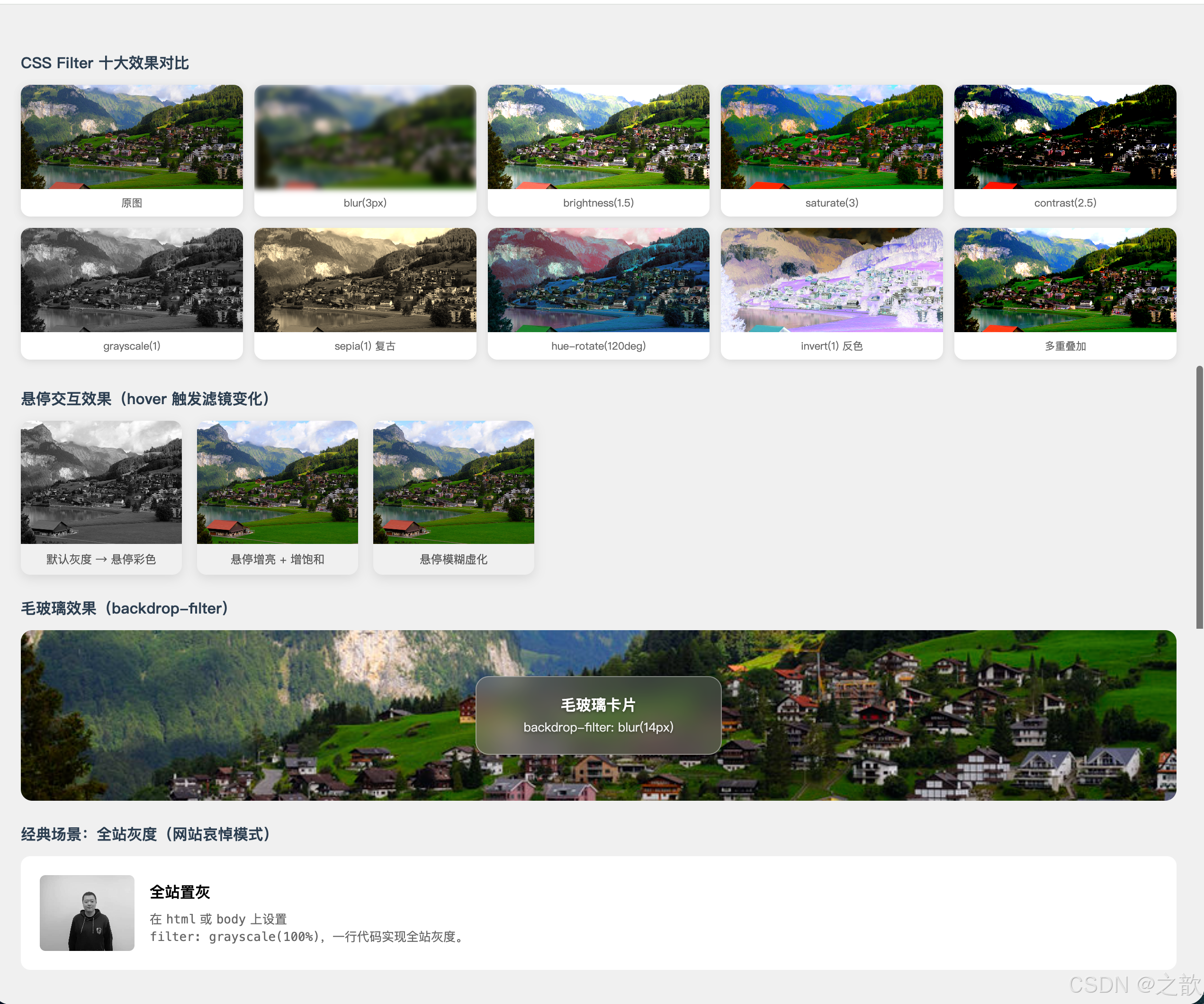
代码解说:
- 滤镜对比网格 :十张相同的图片,只修改
filter属性,直观展示每个函数的视觉效果;filter: none作为参照基准,便于对比其他效果的变化幅度。- 悬停交互效果 :
.hover-gray默认设置filter: grayscale(1)使图片灰白,:hover时重置为grayscale(0)恢复彩色,配合transition: filter 0.4s ease产生平滑过渡。这种「默认灰 → 悬停彩色」的交互模式常见于图片画廊,视觉引导用户注意被悬停的图片。- 毛玻璃效果 :
.frosted-glass-demo使用绝对定位将背景层(.bg)和毛玻璃卡片(.glass-card)分别叠放;卡片上用backdrop-filter: blur(14px)对其背后 的背景层施加模糊,background: rgba(255,255,255,0.18)提供半透明白色基底,border: 1px solid rgba(255,255,255,0.35)增加高光边框,三者共同模拟磨砂玻璃质感。注意:backdrop-filter要求元素不能是完全不透明的背景。- 哀悼模式 :把
filter: grayscale(100%)作用在html元素上,它会作用于所有子元素(包括图片、文字、按钮),实现一行 CSS 让整个页面变灰,无需修改任何 HTML 和子元素的样式,是 CSS 滤镜继承特性的最典型应用。
💡 真实场景:
| 场景 | 技术实现 | 代表网站 |
|---|---|---|
| 哀悼/纪念模式 | html { filter: grayscale(100%) } |
各大门户网站 |
| 图片悬停高亮 | :hover { filter: brightness(1.15) saturate(1.2) } |
图片社区 |
| 毛玻璃导航 | backdrop-filter: blur(12px) |
Apple、macOS |
| 禁用状态 UI | filter: grayscale(1) opacity(0.5) |
各类 UI 框架 |
| 渐进加载占位 | filter: blur(20px) 低清预览先显示 |
Medium、Pinterest |
| 老照片滤镜 | filter: sepia(0.8) contrast(1.1) |
摄影类应用 |
七、Web 字体与字体图标
🔤 名词解释
| 术语 | 解释 |
|---|---|
| @font-face | CSS 规则,声明并引入自定义字体文件 |
| font-family(在@font-face中) | 为引入的字体起一个名字,后续用该名字引用 |
| TTF/OTF | TrueType / OpenType 字体,通用格式,文件较大 |
| WOFF | Web Open Font Format,专为 Web 压缩的格式,推荐 |
| WOFF2 | WOFF 第二版,压缩率比 WOFF 提升约30%,现代浏览器首选 |
| EOT | Embedded OpenType,IE 专用格式,已过时 |
| SVG Font | SVG 格式的字体,仅 iOS 4.1 以下需要,已过时 |
| font-display | 控制字体加载期间的文字显示策略 |
| FOUT | Flash of Unstyled Text,字体加载前短暂显示系统字体的闪烁 |
| FOIT | Flash of Invisible Text,字体加载期间文字不可见 |
| 字体图标 | 用字体文件承载矢量图标,可用 CSS 控制颜色、大小 |
| unicode-range | 指定字体适用的 Unicode 字符范围,用于字体子集化 |
7.1 字体格式与兼容性
字体格式优先级
- WOFF2 ⭐首选
最小体积
Chrome40+ Firefox36+ Edge Safari12+
2. WOFF
IE9+
广泛支持
3. TTF/OTF
大多数浏览器
文件较大
4. EOT ⚠️过时
仅IE6~IE8需要
5. SVG Font ⚠️过时
仅iOS 4.1-需要
推荐的 @font-face 写法:
css
@font-face {
    font-family: 'MyFont';                         /* 自定义名称 */
    src: url('font.woff2') format('woff2'),         /* 1. 优先 WOFF2 */
         url('font.woff')  format('woff'),          /* 2. 其次 WOFF */
         url('font.ttf')   format('truetype'),      /* 3. 后备 TTF */
         url('font.eot')   format('embedded-opentype'); /* 4. IE 兼容 */
    font-weight: normal;
    font-style: normal;
    font-display: swap;                             /* 加载策略:先显示备用字体 */
}
font-display 加载策略详解:
| 值 | 阶段1(等待期) | 阶段2(替换期) | 适用场景 |
|---|---|---|---|
auto |
浏览器自决 | 浏览器自决 | 默认 |
swap |
立即显示备用字体 | 字体加载完就替换 | 内容优先,有 FOUT |
block |
短暂不显示(FOIT) | 无限等待 | 品牌字体,严重 FOIT |
fallback |
极短暂不显示 | 有限时间内替换 | 平衡方案 |
optional |
极短暂不显示 | 网络好才替换 | 性能优先 |
推荐: 通常选用
font-display: swap,先用系统字体渲染内容,字体下载完后再替换,用户体验最佳。
7.2 字体子集化 --- unicode-range
对于大型字体(尤其是中文字体),可以用 unicode-range 指定该字体文件对应的字符范围,浏览器只有在页面实际使用了该范围内的字符时才下载字体文件,大幅减少无效加载。
css
/* 英文基础字符 */
@font-face {
  font-family: 'OptimizedFont';
  src: url('font-latin.woff2') format('woff2');
  unicode-range: U+0020-007F; /* ASCII 可打印字符 */
}

/* 中文扩展 */
@font-face {
  font-family: 'OptimizedFont';
  src: url('font-chinese.woff2') format('woff2');
  unicode-range: U+4E00-9FFF; /* CJK 基本汉字 */
}
常用 Unicode 范围:
| 字符集 | Unicode 范围 |
|---|---|
| ASCII 可打印字符 | U+0020-007F |
| 中文(基本汉字) | U+4E00-9FFF |
| 中文标点 | U+3000-303F |
| 全角字母数字 | U+FF00-FFEF |
| 拉丁扩展 | U+00A0-00FF |
7.3 完整可运行示例 --- Web 字体
html
<!DOCTYPE html>
<html lang="zh-CN">
<head>
  <meta charset="UTF-8">
  <title>Web 字体 @font-face 完整示例</title>
  <style>
    /* 声明自定义 Web 字体 */
    @font-face {
      font-family: "CustomFont";
      src: url("课堂案例/sources/fonts/FZSJ-WSMQSJW.woff2") format("woff2"),
           url("课堂案例/sources/fonts/FZSJ-WSMQSJW.woff")  format("woff"),
           url("课堂案例/sources/fonts/FZSJ-WSMQSJW.ttf")   format("truetype");
      font-weight: normal;
      font-style: normal;
      font-display: swap;
    }

    body { padding: 30px; background: #f9f9f9; font-family: 'Microsoft YaHei', sans-serif; }
    .compare {
      display: grid; grid-template-columns: 1fr 1fr; gap: 20px; margin-top: 20px;
    }
    .font-card {
      background: white; padding: 24px; border-radius: 12px;
      box-shadow: 0 4px 12px rgba(0,0,0,0.08);
    }
    .font-card h4 { color: #888; font-size: 13px; margin-bottom: 12px; }
    .sys { font-family: 'Microsoft YaHei', sans-serif; font-size: 26px; }
    .web { font-family: "CustomFont", sans-serif; font-size: 26px; }

    .size-demo { margin-top: 20px; background: white; padding: 24px; border-radius: 12px; }
    .size-demo p { font-family: "CustomFont", sans-serif; margin: 8px 0; line-height: 1.6; }
  </style>
</head>
<body>
  <h2>Web 字体对比演示</h2>
  <div class="compare">
    <div class="font-card">
      <h4>系统默认字体</h4>
      <div class="sys">前端开发工程师</div>
      <div class="sys" style="font-size:16px; margin-top:10px; color:#666">
        The quick brown fox jumps over the lazy dog.
      </div>
    </div>
    <div class="font-card">
      <h4>自定义 Web 字体(FZSJ 方正字体)</h4>
      <div class="web">前端开发工程师</div>
      <div class="web" style="font-size:16px; margin-top:10px; color:#666">
        The quick brown fox jumps over the lazy dog.
      </div>
    </div>
  </div>
  <div class="size-demo">
    <h4 style="color:#888; font-size:13px; margin-bottom:12px">自定义字体各尺寸展示</h4>
    <p style="font-size:48px">字体就是风格</p>
    <p style="font-size:28px">好的字体设计能让页面产生独特的品牌气质</p>
    <p style="font-size:18px">Web 字体让设计师的字体选择不再受限于用户系统</p>
    <p style="font-size:14px; color:#888">@font-face 引入自定义字体,font-display: swap 保障加载体验</p>
  </div>
</body>
</html>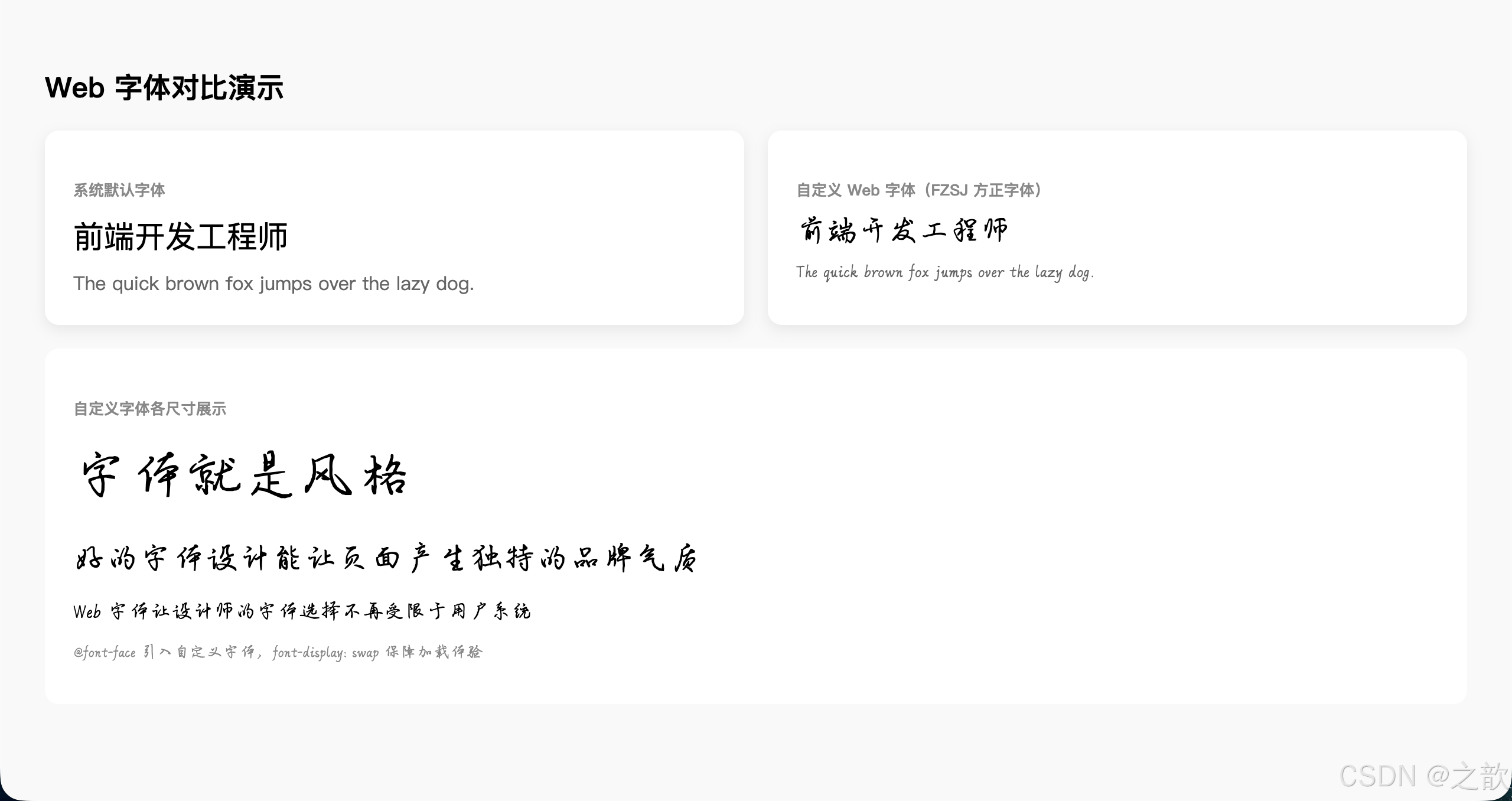
代码解说:
@font-face块在<style>的最前面声明,优先级不影响后续使用,但声明必须在使用前(或放在外部 CSS 文件中)。font-family: "CustomFont"是自定义名称,与文件名无关,后续font-family: "CustomFont"引用时必须完全匹配这个名字(包括大小写)。src中多个格式用逗号连接,浏览器会从上到下选择第一个支持的格式下载,因此把 WOFF2(最小)写在最前,EOT(最大,仅 IE)写在最后。font-display: swap:字体文件下载完成之前,浏览器先用系统备用字体渲染文字(FOUT),文件下载完成后立即替换。这样用户不会看到空白文字,提升了首屏体验。- 对比展示区(
.compare)使用grid: 1fr 1fr并排显示系统字体和自定义字体,同样的文字在不同字体下的视觉差异一目了然,便于理解字体替换的效果。
7.4 字体图标(Icon Fonts)
字体图标 vs 图片图标:
字体图标优势
矢量图形
任意缩放不失真
CSS 直接控制
颜色/大小/阴影
一次请求
所有图标共用一个文件
支持全部 CSS 效果
渐变/transform/animation
图片图标劣势
PNG 放大模糊
修改颜色需重新切图
N个图标 = N次请求(无 Sprite)
阿里 iconfont 三种使用方式:
html
<!-- 方式一:Unicode(最兼容,支持 IE6+)-->
<link rel="stylesheet" href="iconfont.css">
<span class="iconfont" style="font-size:24px; color:#e74c3c;"></span>
<!-- 方式二:font-class(推荐,语义清晰)-->
<link rel="stylesheet" href="iconfont.css">
<i class="iconfont icon-home" style="font-size:24px"></i>
<i class="iconfont icon-user" style="font-size:24px"></i>
<!-- 方式三:Symbol SVG(支持多色,现代浏览器推荐)-->
<script src="iconfont.js"></script>
<style>
.icon { width: 1em; height: 1em; vertical-align: -0.15em; fill: currentColor; }
</style>
<svg class="icon" aria-hidden="true">
<use xlink:href="#icon-home"></use>
</svg>字体图标完整示例:
html
<!DOCTYPE html>
<html lang="zh-CN">
<head>
  <meta charset="UTF-8">
  <title>字体图标使用示例(阿里图标第一种方式)</title>
  <link rel="stylesheet" href="课堂案例/sources/icon_fonts/iconfont.css">
  <style>
    body { padding: 30px; background: #f5f5f5; font-family: sans-serif; }
    .icon-demo {
      display: flex; gap: 20px; flex-wrap: wrap; margin-top: 20px;
    }
    .icon-item {
      display: flex; flex-direction: column; align-items: center;
      gap: 8px; background: white; padding: 20px;
      border-radius: 10px; min-width: 80px; text-align: center;
      box-shadow: 0 2px 8px rgba(0,0,0,0.08);
    }
    .iconfont { font-size: 32px; }
    .icon-name { font-size: 11px; color: #888; }

    /* CSS 控制颜色 */
    .color-red   { color: #e74c3c; }
    .color-blue  { color: #3498db; }
    .color-green { color: #2ecc71; }
    .color-gold  { color: #f1c40f; }
  </style>
</head>
<body>
  <h2>字体图标 --- font-class 方式</h2>
  <p style="color:#666; font-size:14px; margin:10px 0">字体图标可以直接通过 CSS 控制颜色、大小、阴影等所有样式属性</p>
  <div class="icon-demo">
    <div class="icon-item">
      <i class="iconfont icon-home color-blue"></i>
      <div class="icon-name">首页</div>
    </div>
    <div class="icon-item">
      <i class="iconfont icon-user color-green"></i>
      <div class="icon-name">用户</div>
    </div>
    <div class="icon-item">
      <i class="iconfont icon-search color-red"></i>
      <div class="icon-name">搜索</div>
    </div>
    <div class="icon-item">
      <i class="iconfont icon-star color-gold"></i>
      <div class="icon-name">收藏</div>
    </div>
  </div>
</body>
</html>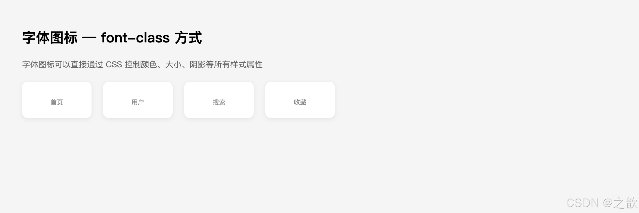
代码解说:
- 引入
iconfont.css后,这个 CSS 文件内部包含了@font-face声明和.iconfont基础类(设置font-family、font-style: normal等),以及每个图标的类名(如.icon-home::before { content: "\e001"; })。- 使用时只需在元素上添加
iconfont(基础类)+icon-xxx(图标类)两个类名,图标就会以字体形式渲染出来,本质上是通过::before伪元素插入特定 Unicode 字符,再由 iconfont 字体将该字符渲染为对应图标。- 直接用
color属性就能改变图标颜色,用font-size改变大小,用text-shadow加阴影,这是字体图标相比 PNG 图标的最大优势------完全用 CSS 控制外观。font-size: 32px设置在.iconfont类上,图标会随之等比放大,边缘始终清晰(矢量特性),不像 PNG 图片放大后会出现模糊锯齿。
八、综合案例
8.1 渐变文字效果
html
<!DOCTYPE html>
<html lang="zh-CN">
<head>
  <meta charset="UTF-8">
  <title>渐变文字 --- CSS3 综合效果</title>
  <style>
    * { margin: 0; padding: 0; box-sizing: border-box; }
    body {
      min-height: 100vh; background: #0a0a12;
      display: flex; flex-direction: column;
      align-items: center; justify-content: center; gap: 40px;
    }
    /* 粉紫渐变 */
    .tg1 {
      font-size: 72px; font-weight: 900;
      color: transparent; letter-spacing: 6px;
      background-image: linear-gradient(135deg, #f093fb 0%, #f5576c 50%, #fda085 100%);
      -webkit-background-clip: text; background-clip: text;
    }
    /* 科技蓝 */
    .tg2 {
      font-size: 72px; font-weight: 900; color: transparent;
      background-image: linear-gradient(90deg, #4facfe, #00f2fe, #43e97b);
      -webkit-background-clip: text; background-clip: text;
    }
    /* 金色 */
    .tg3 {
      font-size: 56px; font-weight: 900; color: transparent;
      background-image: linear-gradient(180deg, #d4a843 0%, #f5d783 25%, #c8912f 50%, #f5d783 75%, #d4a843 100%);
      -webkit-background-clip: text; background-clip: text;
    }
    /* 发光文字 */
    .tg4 {
      font-size: 56px; font-weight: 900; color: #fff;
      text-shadow: 0 0 5px #fff, 0 0 15px #0ff, 0 0 30px #0ff, 0 0 60px #0ff;
      animation: glow 2s ease-in-out infinite alternate;
    }
    @keyframes glow {
      from { text-shadow: 0 0 5px #fff, 0 0 15px #0ff, 0 0 30px #0ff; }
      to   { text-shadow: 0 0 10px #fff, 0 0 30px #f0f, 0 0 60px #f0f; }
    }
  </style>
</head>
<body>
  <div class="tg1">渐变文字效果</div>
  <div class="tg2">CSS3 Gradient Text</div>
  <div class="tg3">金属质感标题</div>
  <div class="tg4">霓虹发光字</div>
</body>
</html>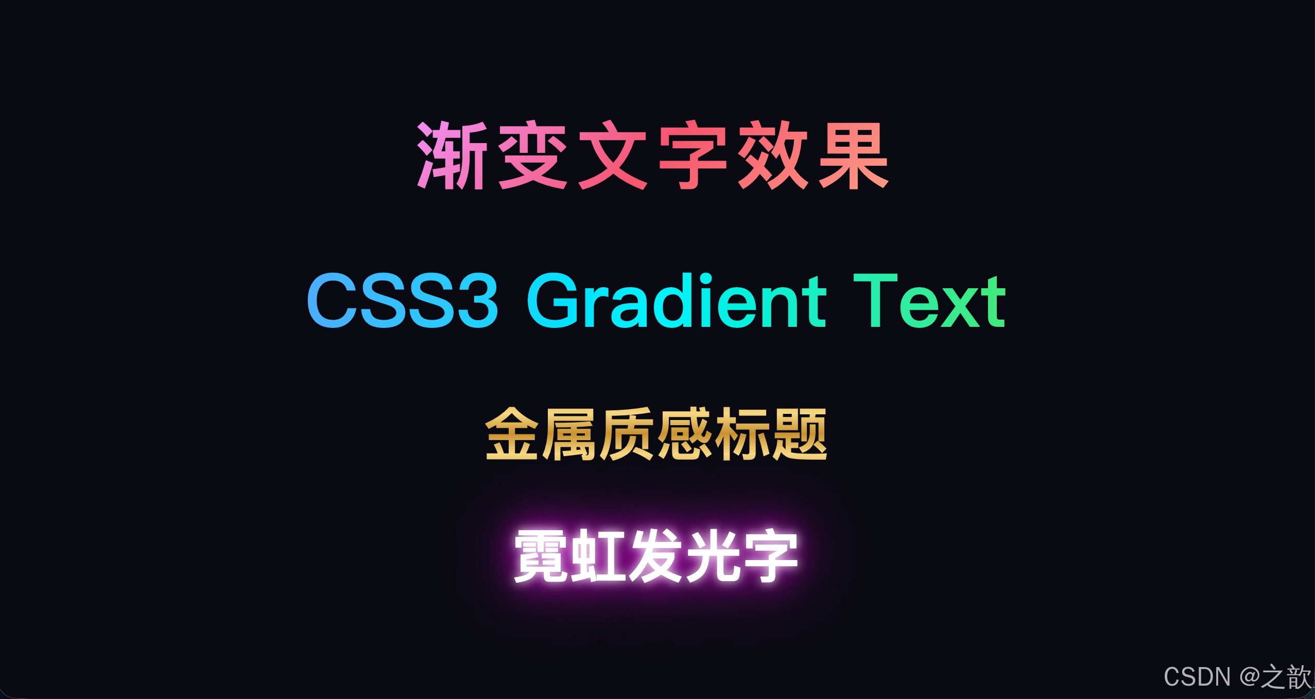
代码解说:
- 本案例综合运用了
background-clip: text、linear-gradient、text-shadow、@keyframes四个核心知识点,展示它们组合使用的效果。- 渐变文字(tg1~tg3) :三者原理相同,区别只在渐变颜色和方向:tg1 用
135deg斜向,tg2 用90deg水平三色,tg3 用180deg竖向金色反光。所有渐变文字都必须设置color: transparent,否则文字颜色会遮住背景。- 金属反光(tg3) :
180deg竖向渐变模拟金属表面的光泽:深金 → 浅金高光 → 深金再 → 浅金 → 深金,这种对称的明暗变化是金属材质的典型光影规律。- 霓虹发光(tg4) :
@keyframes glow在「青色光晕」和「紫色光晕」之间以 2 秒为周期alternate(交替往返)切换,ease-in-out缓动使切换更自然流畅;letter-spacing可以为文字增加字间距,视觉上更大气。
8.2 发廊灯效果
html
<!DOCTYPE html>
<html lang="zh-CN">
<head>
  <meta charset="UTF-8">
  <title>发廊灯效果 --- repeating-linear-gradient</title>
  <style>
    * { margin: 0; padding: 0; box-sizing: border-box; }
    body {
      min-height: 100vh; background: #2a2a2a;
      display: flex; align-items: center; justify-content: center; gap: 60px;
    }
    .pole-wrap {
      display: flex; flex-direction: column; align-items: center;
    }
    .pole-cap {
      width: 86px; height: 18px;
      background: linear-gradient(to bottom, #ddd, #999);
    }
    .pole-cap.top  { border-radius: 6px 6px 0 0; }
    .pole-cap.bot  { border-radius: 0 0 6px 6px; }

    /* 黑白条纹 */
    .barber-bw {
      width: 80px; height: 300px;
      border-left: 3px solid #666; border-right: 3px solid #666;
      background: repeating-linear-gradient(
        45deg, #000 0, #000 10px, #fff 10px, #fff 20px
      );
      overflow: hidden;
    }

    /* 经典红白蓝(带动画)*/
    .barber-rwb {
      width: 80px; height: 300px;
      border-left: 3px solid #999; border-right: 3px solid #999;
      background: repeating-linear-gradient(
        45deg,
        #e74c3c 0,  #e74c3c 10px,
        #fff    10px, #fff    20px,
        #3498db 20px, #3498db 30px,
        #fff    30px, #fff    40px
      );
      overflow: hidden;
      animation: poleScroll 2s linear infinite;
    }
    @keyframes poleScroll {
      from { background-position: 0 0; }
      to   { background-position: 0 56px; }
    }

    .label {
      color: #aaa; font-size: 13px;
      margin-top: 10px; text-align: center;
    }
  </style>
</head>
<body>
  <div class="pole-wrap">
    <div class="pole-cap top"></div>
    <div class="barber-bw"></div>
    <div class="pole-cap bot"></div>
    <div class="label">黑白条纹</div>
  </div>
  <div class="pole-wrap">
    <div class="pole-cap top"></div>
    <div class="barber-rwb"></div>
    <div class="pole-cap bot"></div>
    <div class="label">红白蓝(动态滚动)</div>
  </div>
</body>
</html>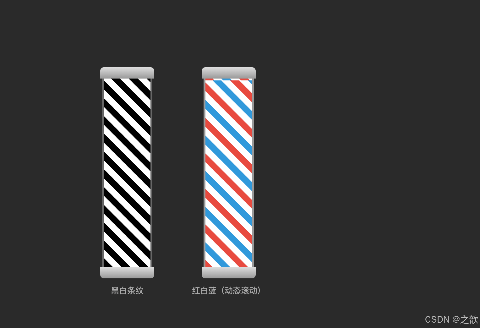
代码解说:
- 顶部/底部帽盖 :
.pole-cap用linear-gradient(to bottom, #ddd, #999)模拟金属圆盖的纵向光泽;border-radius: 6px 6px 0 0(顶部)和0 0 6px 6px(底部)分别使两端圆角,拼在柱体两侧形成完整的发廊灯外形。- 黑白条纹柱 :
repeating-linear-gradient(45deg, #000 0, #000 10px, #fff 10px, #fff 20px)每 20px 为一个单元,黑白各占 10px,斜向 45° 排列。overflow: hidden将超出圆角的背景裁掉,配合border-radius: 40px形成圆柱截面效果。- 红白蓝动态柱 :四色段(红/白/蓝/白)各 10px,一个完整单元 40px。
@keyframes poleScroll让background-position从0 0移到0 56px(56px ≈ 40px × √2,沿 45° 方向移动一个完整单元),使条纹看起来像在旋转滚动。- 动画参数 :
2s linear infinite--- 2 秒匀速(linear)无限循环,linear避免了缓入缓出导致条纹看起来忽快忽慢,匀速才符合真实发廊灯的物理感。
8.3 CSS3 精品商城综合页
html
<!DOCTYPE html>
<html lang="zh-CN">
<head>
  <meta charset="UTF-8">
  <title>CSS3 精品商城 --- 综合案例</title>
  <style>
    * { box-sizing: border-box; margin: 0; padding: 0; }
    body {
      font-family: 'Microsoft YaHei', sans-serif;
      background: linear-gradient(135deg, #f5f7fa, #c3cfe2);
      min-height: 100vh; padding: 40px;
    }
    /* 渐变标题 */
    .page-title {
      text-align: center; font-size: 36px; font-weight: 900;
      color: transparent;
      background: linear-gradient(135deg, #667eea, #764ba2);
      -webkit-background-clip: text; background-clip: text;
      margin-bottom: 40px;
    }
    /* 商品网格 */
    .product-grid {
      display: grid; grid-template-columns: repeat(3, 1fr);
      gap: 24px; max-width: 1000px; margin: 0 auto;
    }
    /* 商品卡片 */
    .product-card {
      background: white; border-radius: 16px; overflow: hidden;
      box-shadow: 0 8px 24px rgba(0,0,0,0.1);
      transition: transform 0.3s, box-shadow 0.3s;
    }
    .product-card:hover {
      transform: translateY(-8px);
      box-shadow: 0 20px 40px rgba(0,0,0,0.15);
    }
    /* 图片区 */
    .p-img { position: relative; height: 200px; overflow: hidden; }
    .p-img img {
      width: 100%; height: 100%; object-fit: cover;
      transition: filter 0.3s;
    }
    .product-card:hover .p-img img { filter: brightness(1.1) saturate(1.2); }
    /* 渐变遮罩 */
    .p-img::after {
      content: ''; position: absolute;
      bottom: 0; left: 0; right: 0; height: 60px;
      background: linear-gradient(transparent, rgba(0,0,0,0.3));
    }
    /* 徽章 */
    .badge {
      position: absolute; top: 12px; right: 12px;
      padding: 4px 10px; border-radius: 20px;
      font-size: 12px; font-weight: bold; color: white;
      background: linear-gradient(135deg, #f093fb, #f5576c);
      z-index: 1;
    }
    /* 信息区 */
    .p-info { padding: 16px; }
    .p-name {
      font-size: 14px; font-weight: bold; color: #2c3e50;
      overflow: hidden; display: -webkit-box;
      -webkit-box-orient: vertical; -webkit-line-clamp: 2;
      line-height: 1.5; height: 42px; margin-bottom: 10px;
    }
    .p-price { display: flex; align-items: baseline; gap: 8px; }
    .p-price-cur { font-size: 22px; font-weight: 900; color: #e74c3c; }
    .p-price-ori { font-size: 13px; color: #bbb; text-decoration: line-through; }
    .p-tags { display: flex; gap: 6px; margin-top: 10px; }
    .tag { padding: 3px 8px; border-radius: 4px; font-size: 11px; color: white; }
    .tag-hot  { background: linear-gradient(135deg, #f093fb, #f5576c); }
    .tag-new  { background: linear-gradient(135deg, #4facfe, #00f2fe); }
    .tag-sale { background: linear-gradient(135deg, #43e97b, #38f9d7); }
    .add-btn {
      margin-top: 12px; width: 100%; padding: 10px; border: none;
      border-radius: 25px; font-size: 14px; font-weight: bold; color: white;
      background: linear-gradient(135deg, #667eea, #764ba2);
      cursor: pointer; outline: none;
      transition: opacity 0.2s, transform 0.2s;
    }
    .add-btn:hover { opacity: 0.9; transform: scale(1.02); }
    .add-btn:focus { box-shadow: 0 0 0 3px rgba(102,126,234,0.4); }
  </style>
</head>
<body>
  <h1 class="page-title">CSS3 精品商城</h1>
  <div class="product-grid">
    <div class="product-card">
      <div class="p-img">
        <div class="badge">热卖</div>
        <img src="课堂案例/images/jd001.jpg" alt="商品">
      </div>
      <div class="p-info">
        <div class="p-name">无线蓝牙耳机,主动降噪,续航30小时超长待机</div>
        <div class="p-price">
          <span class="p-price-cur">¥299</span>
          <span class="p-price-ori">¥599</span>
        </div>
        <div class="p-tags">
          <span class="tag tag-hot">热卖</span>
          <span class="tag tag-sale">5折</span>
        </div>
        <button class="add-btn">加入购物车</button>
      </div>
    </div>
    <div class="product-card">
      <div class="p-img">
        <div class="badge">新品</div>
        <img src="课堂案例/images/jd002.jpg" alt="商品">
      </div>
      <div class="p-info">
        <div class="p-name">智能手表运动健康监测,心率血氧全天候守护</div>
        <div class="p-price">
          <span class="p-price-cur">¥899</span>
          <span class="p-price-ori">¥1299</span>
        </div>
        <div class="p-tags">
          <span class="tag tag-new">新品</span>
        </div>
        <button class="add-btn">加入购物车</button>
      </div>
    </div>
    <div class="product-card">
      <div class="p-img">
        <img src="课堂案例/images/jd003.jpg" alt="商品">
      </div>
      <div class="p-info">
        <div class="p-name">4K高清摄像头,广角85°,内置降噪麦克风</div>
        <div class="p-price">
          <span class="p-price-cur">¥199</span>
          <span class="p-price-ori">¥399</span>
        </div>
        <div class="p-tags">
          <span class="tag tag-sale">限时</span>
        </div>
        <button class="add-btn">加入购物车</button>
      </div>
    </div>
  </div>
</body>
</html>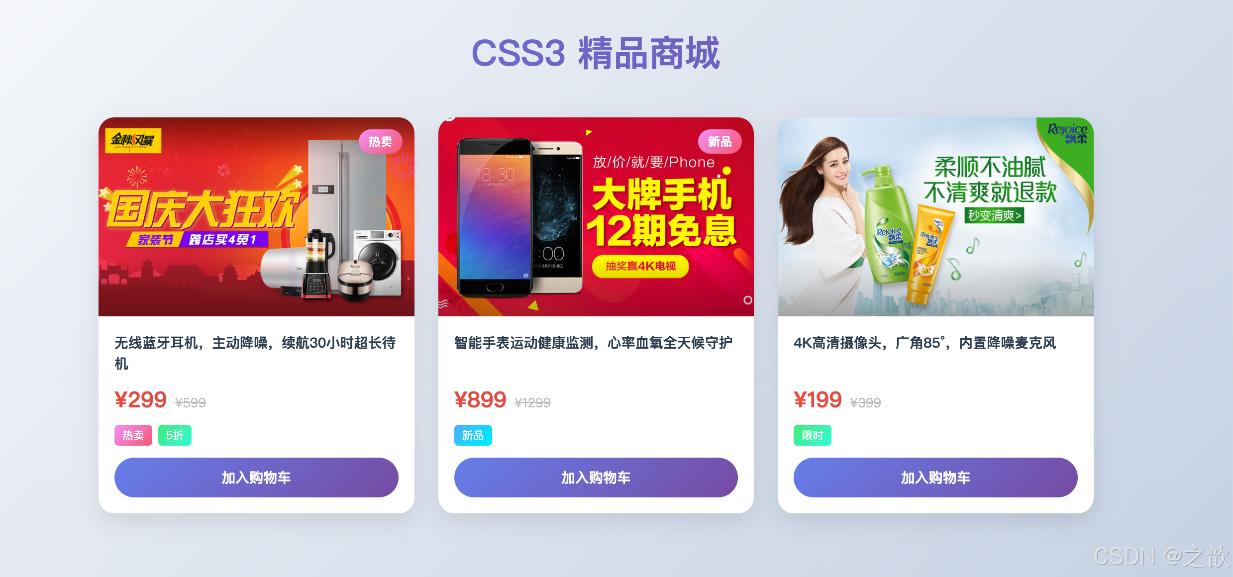
代码解说:
本案例是 Day13 所有知识点的综合运用,梳理其中用到的技术:
效果 使用的 CSS3 知识点 页面渐变背景 linear-gradient(135deg, ...)渐变标题文字 background-clip: text+linear-gradient卡片圆角 border-radius: 16px+overflow: hidden悬停上浮动效 transition+:hover { transform: translateY(-8px) }图片悬停增亮 :hover img { filter: brightness(1.1) saturate(1.2) }图片渐变遮罩 ::after+linear-gradient(transparent, rgba(...))渐变徽章/标签 background: linear-gradient(...)+border-radius: 9999px商品名两行省略 -webkit-line-clamp: 2多行省略划线原价 text-decoration: line-through渐变购买按钮 linear-gradient+ 圆角 + 焦点box-shadow
.p-img::after是渐变遮罩层的关键:用position: absolute绝对定位覆盖在图片上方,content: ''产生空内容占位,linear-gradient(transparent, rgba(0,0,0,0.3))实现从透明到半透明的渐变遮罩,让图片底部产生暗部过渡,提升文字可读性。- 卡片设置
overflow: hidden后,内部图片的border-radius才会被截断,使图片上方不出现多余的直角。transition: transform 0.3s, box-shadow 0.3s同时过渡两个属性,悬停时卡片「浮起」的同时阴影扩大加深,共同模拟物理上「纸牌离桌面」的立体感。
九、知识点总结与速查表
9.1 背景属性速查
背景相关需求
具体需求?
控制背景图定位起点
background-origin
控制背景显示区域
background-clip
控制背景图大小
background-size
背景固定/视差
background-attachment
多个背景图叠加
background: 用逗号分隔多组
padding-box 默认
border-box
content-box
border-box 默认
padding-box
content-box
text → 渐变文字⭐
cover 铺满⭐
contain 完整
具体数值
scroll 默认
fixed 视差效果⭐
local 随内容滚动
9.2 圆角常用速查
| 效果 | CSS 写法 | 场景 |
|---|---|---|
| 圆形 | border-radius: 50% |
头像、图标 |
| 胶囊(任意宽高) | border-radius: 9999px |
按钮、标签 |
| iOS 图标风格 | border-radius: 22%~28% |
App 图标 |
| 圆角卡片(轻) | border-radius: 4~8px |
表格、列表 |
| 圆角卡片(重) | border-radius: 12~20px |
弹窗、卡片 |
| 右侧聊天气泡 | border-radius: 20px 0 20px 20px |
消息 |
| 左侧聊天气泡 | border-radius: 0 20px 20px 20px |
消息 |
| 叶子形 | border-radius: 0 50% |
装饰元素 |
| 水滴/地图标记 | border-radius: 50% 50% 50% 0 |
地图 |
9.3 文本处理速查
省略号三件套口诀:
"强制单行不换行,溢出内容要藏起,最后省略号收尾"
  white-space: nowrap;         → 不换行
  overflow: hidden;             → 藏起来
  text-overflow: ellipsis;      → 省略号

多行省略(3行):
  overflow: hidden;
  display: -webkit-box;
  -webkit-box-orient: vertical;
  -webkit-line-clamp: 3;
9.4 渐变选择速查
渐变类型选择
linear-gradient
适合:背景、按钮、分隔线
radial-gradient
适合:圆形元素、聚光、球体
repeating-linear
适合:条纹、稿纸、警示
repeating-radial
适合:波纹、圆圈图案
9.5 filter 滤镜速查
| 效果 | 代码 | 典型场景 |
|---|---|---|
| 整站置灰 | filter: grayscale(100%) |
哀悼/纪念模式 |
| 背景虚化 | filter: blur(4px) |
背景弱化突出前景 |
| 悬停增亮 | filter: brightness(1.2) |
图片卡片交互 |
| 老照片 | filter: sepia(0.8) contrast(1.1) |
摄影滤镜 |
| 毛玻璃 | backdrop-filter: blur(12px) |
导航栏、弹窗 |
| 禁用状态 | filter: grayscale(1) opacity(0.5) |
UI 禁用组件 |
9.6 @font-face 最佳实践
css
@font-face {
  font-family: 'MyFont';
  src: url('font.woff2') format('woff2'),   /* 优先:体积最小 */
       url('font.woff')  format('woff'),    /* 次选:IE9+ */
       url('font.ttf')   format('truetype'); /* 备用:通用 */
  font-weight: normal;
  font-style: normal;
  font-display: swap;      /* 先显示备用字体,加载完后替换 */
  unicode-range: U+4E00-9FFF; /* 可选:指定字符范围,实现子集化 */
}
9.7 知识体系总结
CSS3 进阶技能树
背景增强
origin/clip/size 三兄弟
background-clip:text 渐变文字
background-attachment 视差滚动
多背景图叠加装饰
边框设计
border-radius 万能圆角
各种 CSS 形状
outline 无障碍焦点
文本排版
省略号三件套必背
多行省略 -webkit-line-clamp
text-align-last 两端对齐
word-wrap/break 断行控制
text-shadow 六大特效
渐变艺术
线性渐变 UI 渐变按钮
硬停止绘制条纹
径向渐变 3D 球体
重复渐变 发廊灯/稿纸
图像处理
10大滤镜函数
哀悼模式一行实现
backdrop-filter 毛玻璃
drop-shadow 形状阴影
字体定制
@font-face 标准引入
WOFF2 优先
font-display: swap
unicode-range 子集化
iconfont 字体图标
附:本章案例文件索引
| 目录 | 文件名(关键词) | 知识点 |
|---|---|---|
| 01-作业讲解 | 属性选择器练习 | 属性选择器综合复习 |
| 01-作业讲解 | 点击切换图片-target | :target 伪类实战 |
| 01-作业讲解 | 点击切换图片-checked | :checked 伪类实战 |
| 01-作业讲解 | 鼠标悬停显示阴影 | box-shadow 动态效果 |
| 02-背景 | 背景图像定位原点 | background-origin |
| 02-背景 | 背景图像显示区域 | background-clip |
| 02-背景 | 背景图像尺寸 | background-size |
| 02-背景 | 背景复合属性 | background 简写规则 |
| 02-背景 | 多背景图 | 多背景叠加 |
| 03-边框 | 边框圆角 | border-radius |
| 03-边框 | 外轮廓 | outline / outline-offset |
| 04-文本样式 | 文本对齐方式 | text-align-last |
| 04-文本样式 | 文本修饰线 | text-decoration |
| 04-文本样式 | 短词内部断行 | word-wrap / overflow-wrap |
| 04-文本样式 | 文本显示格式 | white-space |
| 04-文本样式 | 溢出文本省略号 | text-overflow + 三件套 |
| 04-文本样式 | 文本阴影 | text-shadow |
| 05-渐变 | 线性渐变 | linear-gradient |
| 05-渐变 | 径向渐变 | radial-gradient |
| 05-渐变 | 重复渐变 | repeating-gradient |
| 06-滤镜和Web字体 | 滤镜 | filter 全部函数 |
| 06-滤镜和Web字体 | Web字体 | @font-face |
| 06-滤镜和Web字体 | 定制字体 | @font-face + 阿里Web字体 |
| 06-滤镜和Web字体 | 阿里图标-第一种方式 | Unicode 方式 |
| 06-滤镜和Web字体 | 阿里图标-第二种方式 | font-class 方式 |
| 综合练习-作业 | 渐变文字 | background-clip: text |
| 综合练习-作业 | 发廊灯黑白条纹 | repeating-linear-gradient |
参考资料
- MDN --- background-origin
- MDN --- background-clip
- MDN --- background-size
- MDN --- background-attachment
- MDN --- border-radius
- MDN --- outline
- MDN --- text-align-last
- MDN --- overflow-wrap
- MDN --- text-shadow
- MDN --- linear-gradient
- MDN --- radial-gradient
- MDN --- filter
- MDN --- @font-face
- MDN --- unicode-range
- Can I use --- 浏览器兼容性查询
- CSS Tricks --- A Complete Guide to CSS Gradients
- web.dev --- Shadows --- 阴影权威指南
- 阿里 iconfont 图标库
- FontSquirrel 字体转换工具
- CSS Gradient 在线生成器
- uiGradients 渐变配色库
实践建议:
- 每个属性单独建一个 HTML 文件动手练习,不看代码自己默写
- 打开浏览器 DevTools 的 Elements 面板,实时修改 CSS 值观察效果
background-size: cover和省略号三件套是日常开发频率最高的,务必熟练掌握- 渐变文字(
background-clip: text)是面试高频考点,理解其原理比记语法更重要- 打开喜欢的网站,用 DevTools 查看它用了哪些滤镜、渐变和字体效果,做到学以致用