前言:记录项目中使用的两种圆形进度条,一切尽在不言中
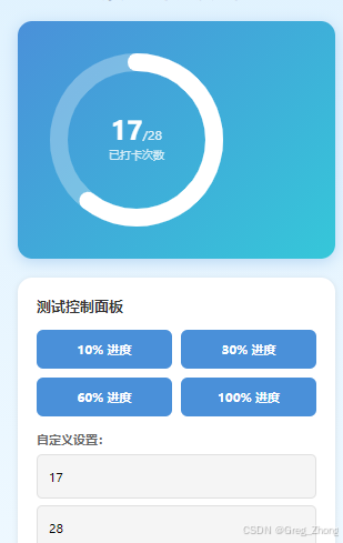
案例一:圆内按百分比展示【完整代码及注释】
>
javascript
// pages/demo_checkin_progress/demo_checkin_progress.js

/**
 * 康复打卡进度圆形进度条示例页面
 *
 * 功能说明:
 * 1. 使用 Canvas 绘制圆形进度条(背景圆环 + 进度圆环)
 * 2. 中心显示"当前次数/总次数"格式(如:17/28)
 * 3. 右侧显示"还需 X 次打卡"说明文字
 * 4. 支持动态更新进度,通过控制面板测试不同进度
 *
 * 适用场景:
 * - 打卡进度展示
 * - 任务完成度展示
 * - 目标进度可视化
 */

Page({
  /**
   * 页面数据配置
   */
  data: {
    // 打卡次数配置
    currentCount: 17,    // 当前打卡次数
    totalCount: 28,      // 总打卡次数
    targetCount: 20,     // 目标打卡次数
    remainingCount: 3,   // 还需打卡次数(自动计算)

    // Canvas 配置(单位:px)
    canvasSize: 180,     // Canvas 画布尺寸(宽高相等)- 减小尺寸
    circleRadius: 70,    // 圆环半径 - 减小半径
    lineWidth: 16,       // 圆环线条宽度 - 减小线宽

    // 输入框数据
    inputCurrent: '17',
    inputTotal: '28'
  },

  /**
   * 页面加载完成后的回调
   * 用于初始化 Canvas 绘制
   */
  onReady() {
    // 延迟绘制,确保 Canvas 已经渲染完成
    setTimeout(() => {
      this.drawCheckinCircle();
    }, 300);
  },

  /**
   * 页面显示时重新绘制
   * 确保数据已更新后重新绘制圆环
   */
  onShow() {
    setTimeout(() => {
      this.drawCheckinCircle();
    }, 200);
  },

  /**
   * 绘制打卡圆形进度条
   * 核心方法:使用 Canvas API 绘制圆环
   */
  drawCheckinCircle() {
    // 获取当前打卡数据
    const { currentCount, totalCount } = this.data;

    /**
     * 计算进度百分比
     * 公式:percentage = currentCount / totalCount
     * 例如:17 / 28 ≈ 0.607 (60.7%)
     */
    const percentage = totalCount > 0 ? (currentCount / totalCount) : 0;

    console.log('开始绘制圆形进度条,当前进度:', percentage);

    /**
     * 创建 Canvas 绘图上下文
     * canvas-id 对应 wxml 中 canvas 标签的 canvas-id 属性
     */
    const ctx = wx.createCanvasContext('checkinCanvas');

    /**
     * Canvas 基础配置
     * 注意:这里使用像素(px)为单位,不是 rpx
     */
    const size = this.data.canvasSize;        // 画布尺寸
    const centerX = size / 2;                 // 圆心 X 坐标(画布中心)
    const centerY = size / 2;                 // 圆心 Y 坐标(画布中心)
    const radius = this.data.circleRadius;    // 圆环半径
    const lineWidth = this.data.lineWidth;    // 线条宽度

    /**
     * 第一步:清空画布
     * 清除之前绘制的内容,避免重叠
     */
    ctx.clearRect(0, 0, size, size);

    /**
     * 第二步:绘制背景圆环(灰色底环)
     * 绘制一个完整的圆形作为背景
     */
    ctx.beginPath();  // 开始新的路径
    ctx.arc(centerX, centerY, radius, 0, 2 * Math.PI, false);  // 绘制完整圆形
    ctx.setStrokeStyle('rgba(255, 255, 255, 0.3)');  // 设置边框颜色(半透明白色)
    ctx.setLineWidth(lineWidth);     // 设置线条宽度
    ctx.setLineCap('round');         // 设置线条端点为圆形
    ctx.stroke();  // 描边绘制

    /**
     * 第三步:绘制进度圆环(白色进度)
     * 根据进度百分比计算需要绘制的弧度
     *
     * 角度说明:
     * - 起始角度:-Math.PI / 2(-90 度,即 12 点钟方向)
     * - 结束角度:起始角度 + (进度百分比 × 360 度)
     *
     * 例如:
     * - 进度 0% → 结束角度 = 起始角度
     * - 进度 50% → 结束角度 = 起始角度 + π(180 度)
     * - 进度 100% → 结束角度 = 起始角度 + 2π(360 度)
     */
    const startAngle = -Math.PI / 2;  // 从 12 点钟方向开始
    const endAngle = startAngle + (percentage * 2 * Math.PI);

    // 绘制进度圆弧
    ctx.beginPath();  // 开始新的路径
    ctx.arc(centerX, centerY, radius, startAngle, endAngle, false);  // 绘制圆弧
    ctx.setStrokeStyle('#ffffff');  // 设置边框颜色(白色)
    ctx.setLineWidth(lineWidth);     // 设置线条宽度
    ctx.setLineCap('round');         // 设置线条端点为圆形
    ctx.stroke();  // 描边绘制

    /**
     * 第四步:提交绘制到画布
     * 将之前所有的绘制操作真正渲染到 Canvas 上
     *
     * ctx.draw(reserve, callback)
     * - reserve: 是否保留之前的绘制内容(false 表示清空重绘)
     * - callback: 绘制完成后的回调函数
     */
    ctx.draw(false, () => {
      console.log('Canvas 绘制完成!进度:', percentage);
    });
  },

  /**
   * 更新打卡数据
   * 根据新的打卡次数重新计算并绘制
   */
  updateCheckinData(current, total) {
    // 计算还需打卡次数
    const remaining = Math.max(0, this.data.targetCount - current);

    // 更新页面数据
    this.setData({
      currentCount: current,
      totalCount: total,
      remainingCount: remaining,
      inputCurrent: String(current),
      inputTotal: String(total)
    }, () => {
      // 数据更新完成后重新绘制圆环
      this.drawCheckinCircle();
    });
  },

  /**
   * 控制面板按钮事件:设置进度为 10%
   */
  setProgress10() {
    const current = Math.round(this.data.totalCount * 0.1);
    this.updateCheckinData(current, this.data.totalCount);
  },

  /**
   * 控制面板按钮事件:设置进度为 30%
   */
  setProgress30() {
    const current = Math.round(this.data.totalCount * 0.3);
    this.updateCheckinData(current, this.data.totalCount);
  },

  /**
   * 控制面板按钮事件:设置进度为 60%
   */
  setProgress60() {
    const current = Math.round(this.data.totalCount * 0.6);
    this.updateCheckinData(current, this.data.totalCount);
  },

  /**
   * 控制面板按钮事件:设置进度为 100%
   */
  setProgress100() {
    this.updateCheckinData(this.data.totalCount, this.data.totalCount);
  },

  /**
   * 输入框事件:监听当前打卡次数输入
   */
  onInputCurrent(e) {
    this.setData({
      inputCurrent: e.detail.value
    });
  },

  /**
   * 输入框事件:监听总打卡次数输入
   */
  onInputTotal(e) {
    this.setData({
      inputTotal: e.detail.value
    });
  },

  /**
   * 应用自定义设置
   */
  applyCustom() {
    const current = parseInt(this.data.inputCurrent) || 0;
    const total = parseInt(this.data.inputTotal) || 28;

    if (current < 0 || total <= 0) {
      wx.showToast({
        title: '请输入有效数字',
        icon: 'none'
      });
      return;
    }

    this.updateCheckinData(current, total);

    wx.showToast({
      title: '已更新',
      icon: 'success'
    });
  }
});
html
<!--pages/demo_checkin_progress/demo_checkin_progress.wxml-->
<!--
  康复打卡进度圆形进度条示例页面
  功能:展示打卡进度的圆环,中心显示"当前次数/总次数"格式
-->

<view class="page-container">
  <!-- 页面标题 -->
  <view class="page-header">
    <text class="page-title">康复打卡进度示例</text>
  </view>

  <!-- 打卡进度卡片 -->
  <view class="progress-card">
    <!-- 卡片内容:圆形进度条 -->
    <view class="card-content">
      <!-- 圆形进度条 -->
      <view class="circle-wrapper">
        <!-- Canvas 画布:绘制圆环背景和进度 -->
        <canvas
          canvas-id="checkinCanvas"
          class="checkin-canvas"
          style="width: 180px; height: 180px;">
        </canvas>

        <!-- 中心文字:显示打卡次数 -->
        <view class="circle-center-text">
          <view class="count-wrapper">
            <text class="current-count">{{currentCount}}</text>
            <text class="total-count">/{{totalCount}}</text>
          </view>
          <text class="count-label">已打卡次数</text>
        </view>
      </view>
    </view>
  </view>

  <!-- 控制面板:用于测试不同进度 -->
  <view class="control-section">
    <text class="section-title">测试控制面板</text>

    <view class="control-buttons">
      <button class="control-btn" bindtap="setProgress10">10% 进度</button>
      <button class="control-btn" bindtap="setProgress30">30% 进度</button>
      <button class="control-btn" bindtap="setProgress60">60% 进度</button>
      <button class="control-btn" bindtap="setProgress100">100% 进度</button>
    </view>

    <view class="custom-input">
      <text class="input-label">自定义设置:</text>
      <input
        class="input-field"
        type="number"
        placeholder="当前打卡次数"
        value="{{inputCurrent}}"
        bindinput="onInputCurrent"
      />
      <input
        class="input-field"
        type="number"
        placeholder="总打卡次数"
        value="{{inputTotal}}"
        bindinput="onInputTotal"
      />
      <button class="apply-btn" bindtap="applyCustom">应用</button>
    </view>
  </view>


</view>
css
/* pages/demo_checkin_progress/demo_checkin_progress.wxss */
/**
* 页面容器样式
* 使用渐变背景,模拟真实页面效果
*/
.page-container {
min-height: 100vh;
background: linear-gradient(180deg, #e0f2fe 0%, #f0f9ff 100%);
padding: 40rpx;
box-sizing: border-box;
}
/**
* 页面头部样式
*/
.page-header {
margin-bottom: 40rpx;
text-align: center;
}
.page-title {
font-size: 40rpx;
font-weight: bold;
color: #1e293b;
}
/**
* 打卡进度卡片样式
* 使用蓝色渐变背景,与【我的】页面保持一致
*/
.progress-card {
background: linear-gradient(135deg, #4a90d9 0%, #35c7d9 100%);
border-radius: 32rpx;
padding: 40rpx;
margin-bottom: 40rpx;
box-shadow: 0 8rpx 32rpx rgba(74, 144, 217, 0.3);
display: flex;
align-items: center;
justify-content: center;
}
/**
* 卡片头部样式
* 包含标题和目标标签
*/
.card-header {
display: flex;
justify-content: space-between;
align-items: center;
flex-shrink: 0;
margin-bottom: 20rpx;
}
/**
* 卡片标题样式
*/
.card-title {
font-size: 32rpx;
font-weight: bold;
color: #ffffff;
}
/**
* 目标标签样式
* 半透明白色背景
*/
.card-tag {
font-size: 24rpx;
color: rgba(255, 255, 255, 0.85);
background-color: rgba(255, 255, 255, 0.2);
padding: 8rpx 20rpx;
border-radius: 32rpx;
}
/**
* 卡片内容区域样式
* 使用 flex 布局,左侧圆环,右侧文字
*/
.card-content {
flex: 1;
display: flex;
align-items: center;
justify-content: flex-start;
}
/**
* 圆形进度条外层容器
* 相对定位,用于内部绝对定位
*/
.circle-wrapper {
position: relative;
width: 180px;
height: 180px;
flex-shrink: 0;
}
/**
* Canvas 画布样式
* 绝对定位,铺满整个容器
*/
.checkin-canvas {
position: absolute;
top: 0;
left: 0;
width: 100%;
height: 100%;
z-index: 1;
}
/**
* 圆环中心文字样式
* 绝对定位居中,显示打卡次数
*/
.circle-center-text {
position: absolute;
top: 50%;
left: 50%;
transform: translate(-50%, -50%);
display: flex;
flex-direction: column;
align-items: center;
justify-content: center;
z-index: 2;
pointer-events: none;
text-align: center;
}
/**
* 次数显示容器
* 横向排列当前次数和总次数
*/
.count-wrapper {
display: flex;
align-items: baseline;
justify-content: center;
}
/**
* 当前打卡次数样式
* 大号字体,加粗显示
*/
.current-count {
font-size: 56rpx;
font-weight: bold;
color: #ffffff;
line-height: 1;
}
/**
* 总打卡次数样式
* 较小字体,半透明白色
*/
.total-count {
font-size: 28rpx;
color: rgba(255, 255, 255, 0.85);
line-height: 1;
}
/**
* 次数标签样式
* 显示"已打卡次数"文字
*/
.count-label {
font-size: 24rpx;
color: rgba(255, 255, 255, 0.8);
margin-top: 8rpx;
}
/**
* 右侧进度说明文字样式
* 距离左侧三分之一间距
*/
.progress-text {
flex: 2;
padding-left: 60rpx;
display: flex;
flex-direction: column;
gap: 16rpx;
}
/**
* 主要文字行样式
* "还需 X 次打卡"
*/
.text-main {
display: flex;
align-items: baseline;
gap: 8rpx;
}
/**
* "还需"文字样式
*/
.text-prefix {
font-size: 32rpx;
font-weight: bold;
color: #ffffff;
}
/**
* 高亮数字样式
* 大号字体显示剩余次数
*/
.text-highlight {
font-size: 56rpx;
font-weight: bold;
color: #ffffff;
}
/**
* "次打卡"文字样式
*/
.text-suffix {
font-size: 32rpx;
font-weight: bold;
color: #ffffff;
}
/**
* 次要说明文字样式
* "即可完成打卡"
*/
.text-sub {
font-size: 28rpx;
color: rgba(255, 255, 255, 0.85);
}
/**
* 控制面板区域样式
*/
.control-section {
background-color: #ffffff;
border-radius: 32rpx;
padding: 40rpx;
margin-bottom: 40rpx;
box-shadow: 0 4rpx 12rpx rgba(0, 0, 0, 0.1);
}
.section-title {
display: block;
font-size: 32rpx;
font-weight: bold;
color: #333;
margin-bottom: 32rpx;
}
/**
* 控制按钮区域样式
*/
.control-buttons {
display: flex;
gap: 20rpx;
flex-wrap: wrap;
margin-bottom: 32rpx;
}
.control-btn {
flex: 1;
min-width: 200rpx;
background-color: #4a90d9;
color: #fff;
font-size: 28rpx;
padding: 24rpx 32rpx;
border-radius: 16rpx;
border: none;
}
.control-btn:active {
opacity: 0.8;
}
/**
* 自定义输入区域样式
*/
.custom-input {
display: flex;
flex-direction: column;
gap: 16rpx;
}
.input-label {
font-size: 28rpx;
color: #666;
font-weight: bold;
}
.input-field {
background-color: #f5f5f5;
border-radius: 12rpx;
padding: 20rpx 24rpx;
font-size: 28rpx;
border: 2rpx solid #e0e0e0;
}
.input-field:focus {
border-color: #4a90d9;
}
.apply-btn {
background-color: #35c7d9;
color: #fff;
font-size: 28rpx;
padding: 24rpx 32rpx;
border-radius: 16rpx;
border: none;
margin-top: 8rpx;
}
.apply-btn:active {
opacity: 0.8;
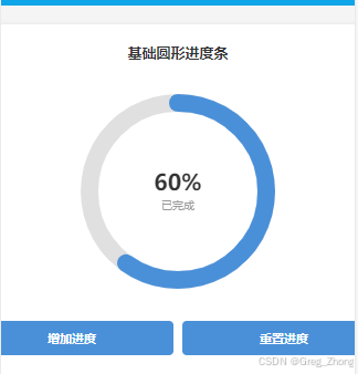
}案例二:圆内展示 当前任务数 / 总任务数量【完整代码及注释】
javascript
// pages/demo_circle_progress/demo_circle_progress.js

/**
 * 圆形进度条示例页面
 *
 * 功能说明:
 * 1. 使用 Canvas 绘制圆形进度条
 * 2. 支持动态更新进度
 * 3. 包含背景圆环和进度圆环两层
 * 4. 中心显示当前进度百分比
 */

Page({
  /**
   * 页面数据
   */
  data: {
    currentProgress: 60  // 当前进度百分比(0-100)
  },

  /**
   * 页面加载完成后的回调
   * 用于初始化 Canvas 绘制
   */
  onReady() {
    // 延迟绘制,确保 Canvas 已经渲染完成
    setTimeout(() => {
      this.drawCircleProgress();
    }, 500);
  },

  /**
   * 页面显示时重新绘制(确保数据已更新)
   */
  onShow() {
    setTimeout(() => {
      this.drawCircleProgress();
    }, 300);
  },

  /**
   * 绘制圆形进度条
   * 核心方法:使用 Canvas API 绘制圆环
   */
  drawCircleProgress() {
    console.log('开始绘制圆形进度条,当前进度:', this.data.currentProgress);

    // 获取当前进度值
    const progress = this.data.currentProgress;

    /**
     * 创建 Canvas 绘图上下文
     * canvas-id 对应 wxml 中 canvas 标签的 canvas-id 属性
     */
    const ctx = wx.createCanvasContext('progressCanvas');

    console.log('Canvas 上下文创建成功:', ctx);

    /**
     * 画布基础配置
     * 注意:这里使用像素(px)为单位,不是 rpx
     */
    const size = 200;        // 画布尺寸(宽高相等,正方形)
    const centerX = size / 2; // 圆心 X 坐标(画布中心)
    const centerY = size / 2; // 圆心 Y 坐标(画布中心)
    const radius = 80;        // 圆环半径(决定圆的大小)
    const lineWidth = 16;     // 线条宽度(决定圆环粗细)

    /**
     * 第一步:清空画布
     * 清除之前绘制的内容,避免重叠
     */
    ctx.clearRect(0, 0, size, size);

    /**
     * 第二步:绘制背景圆环(灰色底环)
     * 绘制一个完整的圆形作为背景
     */
    ctx.beginPath();  // 开始新的路径
    ctx.arc(centerX, centerY, radius, 0, 2 * Math.PI, false);  // 绘制完整圆形
    ctx.setStrokeStyle('#e0e0e0');  // 设置边框颜色(浅灰色)
    ctx.setLineWidth(lineWidth);     // 设置线条宽度
    ctx.setLineCap('round');         // 设置线条端点为圆形
    ctx.stroke();  // 描边绘制

    /**
     * 第三步:绘制进度圆环(彩色进度)
     * 根据进度百分比计算需要绘制的弧度
     */

    // 计算起始角度(-90 度,即 12 点钟方向)
    const startAngle = -Math.PI / 2;

    // 计算结束角度(根据进度百分比)
    // 进度 0% → 结束角度 = 起始角度
    // 进度 100% → 结束角度 = 起始角度 + 360 度(2π)
    const endAngle = startAngle + (progress / 100 * 2 * Math.PI);

    // 绘制进度圆弧
    ctx.beginPath();  // 开始新的路径
    ctx.arc(centerX, centerY, radius, startAngle, endAngle, false);  // 绘制圆弧
    ctx.setStrokeStyle('#4a90d9');  // 设置边框颜色(蓝色)
    ctx.setLineWidth(lineWidth);     // 设置线条宽度
    ctx.setLineCap('round');         // 设置线条端点为圆形
    ctx.stroke();  // 描边绘制

    /**
     * 第四步:提交绘制到画布
     * 将之前所有的绘制操作真正渲染到 Canvas 上
     */
    ctx.draw(false, () => {
      console.log('Canvas 绘制完成!');
    });
  },

  /**
   * 增加进度
   * 每次点击增加 10%,超过 100% 后重置为 0
   */
  increaseProgress() {
    let newProgress = this.data.currentProgress + 10;

    // 如果超过 100%,重置为 0
    if (newProgress > 100) {
      newProgress = 0;
    }

    // 更新数据并重新绘制
    this.setData({
      currentProgress: newProgress
    }, () => {
      // 数据更新完成后重新绘制圆环
      this.drawCircleProgress();
    });
  },

  /**
   * 重置进度
   * 将进度重置为 0
   */
  resetProgress() {
    this.setData({
      currentProgress: 0
    }, () => {
      // 数据更新完成后重新绘制圆环
      this.drawCircleProgress();
    });
  }
});
html
<!--pages/demo_circle_progress/demo_circle_progress.wxml-->
<!-- 圆形进度条示例页面 -->

<view class="container">
  <view class="section">
    <text class="section-title">基础圆形进度条</text>

    <!-- 圆形进度条容器 -->
    <view class="progress-wrapper">
      <!-- Canvas 画布:用于绘制圆环 -->
      <canvas
        canvas-id="progressCanvas"
        class="progress-canvas"
        style="width: 200px; height: 200px;">
      </canvas>

      <!-- 中心文字内容:显示进度数值 -->
      <view class="center-text">
        <text class="progress-num">{{currentProgress}}%</text>
        <text class="progress-label">已完成</text>
      </view>
    </view>

    <!-- 控制按钮 -->
    <view class="control-panel">
      <button class="btn" bindtap="increaseProgress">增加进度</button>
      <button class="btn" bindtap="resetProgress">重置进度</button>
    </view>
  </view>
</view>
css
/* pages/demo_circle_progress/demo_circle_progress.wxss */
/* 页面容器样式 */
.container {
  padding: 40rpx;
  background-color: #f5f5f5;
  min-height: 100vh;
}

/* 区块样式 */
.section {
  background-color: #ffffff;
  border-radius: 20rpx;
  padding: 40rpx;
  margin-bottom: 40rpx;
  box-shadow: 0 4rpx 12rpx rgba(0, 0, 0, 0.1);
}

/* 区块标题样式 */
.section-title {
  font-size: 32rpx;
  font-weight: bold;
  color: #333;
  display: block;
  margin-bottom: 40rpx;
  text-align: center;
}

/* 圆形进度条外层容器 */
.progress-wrapper {
  position: relative;
  width: 200px;
  height: 200px;
  margin: 0 auto 40rpx;
}

/* Canvas 画布样式 */
.progress-canvas {
  position: absolute;
  top: 0;
  left: 0;
  width: 100%;
  height: 100%;
  z-index: 1;
}

/* 中心文字容器样式 */
.center-text {
  position: absolute;
  top: 50%;
  left: 50%;
  transform: translate(-50%, -50%);
  display: flex;
  flex-direction: column;
  align-items: center;
  justify-content: center;
  z-index: 2;
  pointer-events: none;
}

/* 进度百分比数字样式 */
.progress-num {
  font-size: 48rpx;
  font-weight: bold;
  color: #333;
  line-height: 1;
}

/* 进度标签样式 */
.progress-label {
  font-size: 24rpx;
  color: #999;
  margin-top: 10rpx;
}

/* 控制面板样式 */
.control-panel {
  display: flex;
  gap: 20rpx;
  justify-content: center;
}

/* 按钮样式 */
.btn {
  background-color: #4a90d9;
  color: #fff;
  font-size: 28rpx;
  padding: 20rpx 40rpx;
  border-radius: 10rpx;
  border: none;
}

.btn:active {
  opacity: 0.8;
}