目录
一、创建项目
Expo官网:Expo Documentation (中文官网:教程:介绍 - Expo 中文网)
创建一个文件夹,在VS Code的终端下输入命令:**npx create-expo-app@latest --template blank ./**创建出一个空白模板的app
二、组件介绍
2.1、Text、View和Image组件
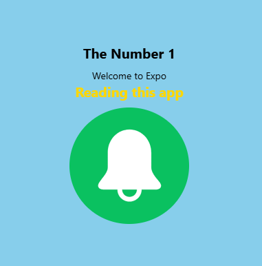
效果展示:
javascript
import { StyleSheet, Text, View, Image } from "react-native";
import Logo from "../assets/system.png";
export default function Page() {
  return (
    <View style={styles.container}>
      {/* 文本 */}
      <Text style={styles.title}>The Number 1</Text>
      {/* 内联样式 */}
      <Text style={{ marginTop: 10 }}>Welcome to Expo</Text>
      {/* 外部样式+内联样式 */}
      <Text style={[styles.title,{color:'gold'}]}>Reading this app</Text>
      {/* 图片 */}
      <Image style={styles.img} source={Logo} />
    </View>
  );
}
const styles = StyleSheet.create({
  container: {
    flex: 1,
    backgroundColor: "skyblue",
    alignItems: "center",
    justifyContent: "center",
  },
  title: {
    fontSize: 20,
    fontWeight: "bold",
  },
  img: {
    borderRadius: "50%",
    marginVertical: 10,
  },
});
2.2、文件式导航(Link)
javascript
import { Link } from "expo-router";
{/* 跳转 相当于HTML中的a标签 */}
<Link href="/about">跳转到about页面</Link>
2.3、堆栈导航(Stack)
为了产生页面的返回键和页面标题,前提:在app文件夹下建立_layout.jsx文件。

javascript
import { Stack } from "expo-router";
const RootLayout = () => {
  return (
    <Stack
      screenOptions={{
        headerStyle: { backgroundColor: "#ddd" },
        headerTintColor: "#333",
      }}
    >
      <Stack.Screen name="index" options={{title: "Home"}}/>
      <Stack.Screen name="about" options={{title: "About"}}/>
      <Stack.Screen name="contact" options={{title: "Contact"}}/>
    </Stack>
  );
};
export default RootLayout;
// 如果第一步安装路由启动失败,加上_layout.jsx这个文件
// 可以重新安装依赖:rm -rf node_modules package-lock.json  npm install
// 想在web端查看页面:npx expo install react-dom react-native-web
// 再重新运行:npx expo start
2.4、浅色与深色主题
javascript
import { useColorScheme } from "react-native";
import { Colors } from "../constants/Color";
import { StatusBar } from "expo-status-bar";
const RootLayout = () => {
  const colorScheme = useColorScheme();
  const theme = Colors[colorScheme] ?? Colors.light;
  return (
    <>
      <StatusBar value="auto" />
    </>
  );
};
2.5、主题化UI组件
以View为例:
javascript
import { View, useColorScheme } from "react-native";
import {Colors} from "../constants/Color";
const ThemeView = ({ style, children, ...props }) => {
  const colorScheme = useColorScheme();
  const theme = Colors[colorScheme] ?? Colors.light;
  return (
    <View style={[style, { backgroundColor: theme.background }]} {...props}>
      {children}
    </View>
  );
};
export default ThemeView;
其实可以自己选组件库:
React Native Elements、 React Native Paper和UI Kitten的文档如下(兼容IOS和安卓,后面两个可以搭配使用):
Overview | React Native Elements
2.6、路由分组与嵌套布局
路由分组:将功能相关的路由归类,统一管理配置(如认证路由和主应用路由分离)
在app文件夹下再建一个文件夹,命名时用()括起来,此时页面title会变为"(auth/login)",此时想要取消页面的Header显示,则需要在(auth)文件夹下再建立一个_layout.jsx
javascript
import { Stack } from "expo-router";
import { StatusBar } from "expo-status-bar";
const AuthLayout = () => {
  return (
    <>
      <StatusBar value="auto" />
      <Stack
        screenOptions={{
          headerShown: false,
          animation: "none",
        }}
      ></Stack>
    </>
  );
};
export default AuthLayout;
在RootLayout.jsx里
javascript
<Stack.Screen name="(auth)" options={{headerShown: false}}/>或者使用createNativeStackNavigator 分组
javascript
// App.js
import { createNativeStackNavigator } from '@react-navigation/native-stack';
const AuthStack = createNativeStackNavigator();
const MainStack = createNativeStackNavigator();
function AuthGroup() {
  return (
    <AuthStack.Navigator>
      <AuthStack.Screen name="Login" component={LoginScreen} />
      <AuthStack.Screen name="Register" component={RegisterScreen} />
    </AuthStack.Navigator>
  );
}
function MainGroup() {
  return (
    <MainStack.Navigator>
      <MainStack.Screen name="Home" component={HomeScreen} />
      <MainStack.Screen name="Profile" component={ProfileScreen} />
    </MainStack.Navigator>
  );
}
// 根导航器整合分组
const RootStack = createNativeStackNavigator();
function App() {
  return (
    <NavigationContainer>
      <RootStack.Navigator>
        <RootStack.Screen
          name="Auth"
          component={AuthGroup}
          options={{ headerShown: false }}
        />
        <RootStack.Screen
          name="Main"
          component={MainGroup}
          options={{ headerShown: false }}
        />
      </RootStack.Navigator>
    </NavigationContainer>
  );
}
拓展:
- 路由参数传递
javascript
// 父路由传递参数给子路由
<Stack.Screen
  name="Profile"
  component={ProfileScreen}
  initialParams={{ userId: 123 }}
/>

// 子路由获取参数
function ProfileScreen({ route }) {
  const { userId } = route.params;
}- 统一导航选项
javascript
// 分组统一配置
<Stack.Navigator
  screenOptions={{
    headerStyle: { backgroundColor: '#4CAF50' },
    headerTintColor: 'white'
  }}
>
  {/* 所有子路由继承此样式 */}
</Stack.Navigator>3、动态隐藏Header:headerShown: false
2.7、Pressable组件
用于检测各种按压交互(点击、长按等)
自定义组件ThemeBtn.jsx:
javascript
import { StyleSheet, Pressable } from "react-native";
const ThemeBtn = ({ style, ...props }) => {
  return (
    <Pressable
      style={({ pressed }) => [
        styles.button,
        pressed && styles.buttonPressed,
        style,
      ]}
      {...props}
    />
  );
};
export default ThemeBtn;
const styles = StyleSheet.create({
  button: {
    padding: 18,
    marginVertical: 10,
    borderRadius: 6,
    backgroundColor: "#6849a7",
  },
  buttonPressed: {
    opacity: 0.5,
  },
});
父组件引用
javascript
import ThemeBtn from "../../components/ThemeBtn";
const Login = () => {
  const handleSubmit = () => {
    console.log("submit");
  };
  return (
    <View>
      <ThemeBtn onPress={handleSubmit}>
        <Text style={{ color: "#f2f2f2", textAlign: "center" }}>Press Me</Text>
      </ThemeBtn>
    </View>
  );
};
export default Login;
列表项按压效果
javascript
function ListItem({ item }) {
  return (
    <Pressable
      onPress={() => navigate('Detail', { id: item.id })}
      style={({ pressed }) => ({
        padding: 16,
        backgroundColor: pressed ? '#f0f0f0' : 'white',
      })}
    >
      <Text>{item.name}</Text>
    </Pressable>
  );
}
2.8、标签栏导航(Tabs)
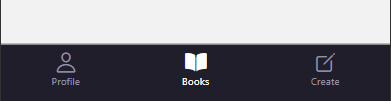
建立(dashboard)文件夹,分别建立三个.jsx文件:profile、books、create
javascript
import { Tabs } from "expo-router";
import { useColorScheme } from "react-native";
import { Colors } from "../../constants/Color";
// 下载图标 npm i @expo/vector-icons , 默认自带
import { Ionicons } from "@expo/vector-icons";
const DashboardLayout = () => {
  const colorScheme = useColorScheme();
  const theme = colorScheme === "dark" ? Colors.dark : Colors.light;
  return (
    <Tabs
      screenOptions={{
        headerShown: false,
        tabBarStyle: {
          backgroundColor: theme.navBackground,
          paddingTop: theme.iconColor,
          height: 90,
        },
        tabBarActiveTintColor: theme.iconColorFocused,
        tabBarInactiveTintColor: theme.iconColor,
      }}
    >
      {/* 自定义底部导航栏标题和图标 */}
      <Tabs.Screen
        name="profile"
        options={{
          title: "Profile",
          tabBarIcon: ({ focused }) => (
            <Ionicons
              name={focused ? "person" : "person-outline"}
              size={24}
              color={focused ? theme.iconColorFocused : theme.iconColor}
            />
          ),
        }}
      />
      <Tabs.Screen name="books" options={{ title: "Books" }} />
      <Tabs.Screen name="create" options={{ title: "Create" }} />
    </Tabs>
  );
};
export default DashboardLayout;
2.9、安全区域适配(SafeAreaView)
SafeAreaView:直接包裹当前页面,但是无法灵活控制具体哪一侧需要安全边距,所以选择以下HOOk
useSafeAreaInsets() :可以手动获取安全区域的 top、bottom、left、right 值,并应用到样式中
javascript
import { View, useColorScheme } from "react-native";
import { Colors } from "../constants/Color";
import { useSafeAreaInsets } from "react-native-safe-area-context";
const ThemeView = ({ style, safe = false, ...props }) => {
  const colorScheme = useColorScheme();
  const theme = Colors[colorScheme] ?? Colors.light;
  if (!safe)
    return (
      <View style={[style, { backgroundColor: theme.background }]} {...props} />
    );
  const insets = useSafeAreaInsets();
  return (
    <View
      style={[
        style,
        {
          backgroundColor: theme.background,
          paddingTop: insets.top,     // 避开刘海
          paddingBottom: insets.bottom, // 避开底部横条
        },
      ]}
      {...props}
    />
  );
};
export default ThemeView;