1、安装vite-plugin-svg-icons和fast-glob
bash
npm install vite-plugin-svg-icons fast-glob -D2、在 vite.config.js 中配置插件参数
iconDirs是svg文件存储路径,symbolId是图标ID生成规则。
javascript
import { defineConfig } from 'vite'
import vue from '@vitejs/plugin-vue'
import { createSvgIconsPlugin } from 'vite-plugin-svg-icons'
import path from 'path'

export default defineConfig({
  plugins: [
    vue(),
    createSvgIconsPlugin({
      iconDirs: [path.resolve(process.cwd(), 'src/assets/icons')],
      symbolId: 'icon-[name]'
    })
  ]
})
3、创建可复用的 SvgIcon.vue 组件
javascript
<template>
  <svg :style="{ width: size + 'px', height: size + 'px' }">
    <use :href="`#icon-${name}`" :fill="color" />
  </svg>
</template>

<script setup>
defineProps({
  name: { type: String, required: true },
  color: { type: String, default: '#ff0000' },
  size: { type: [String, Number], default: 24 }
})
</script>
4、虚拟模块引入
在main.js里注册svg图标,这句话非常重要,一定要加。
javascript
import 'virtual:svg-icons-register'5、全局注册(可选)
如果不想全局注册组件,也可以单独在需要使用svgicon的页面引入。
javascript
import { createApp } from 'vue'
import 'virtual:svg-icons-register' //非常重要,一定要加
import App from './App.vue'
import SvgIcon from '@/components/SvgIcon.vue'

const app = createApp(App)
app.component('SvgIcon', SvgIcon)
app.mount('#app')
6、在页面中使用
html
<SvgIcon name="fire" color="#00ff00" :size="36"></SvgIcon>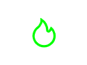
7、问题整理
(1)color失效
我发现,并不是每个svg都能设置color,经过一番查找,使用记事本打开svg代码后发现有的svg有fill属性,而有的没有,有fill属性的svg,color设置会失效。

解决办法,在SvgIconsPlugin里设置移除fill stroke等属性,特别注意,由于我们移除了fill和stroke属性,所以本文的svg icon封装方法只能用于纯色svg文件,多色svg文件不可使用这个方法。
javascript
import { defineConfig } from 'vite'
import vue from '@vitejs/plugin-vue'
import { createSvgIconsPlugin } from 'vite-plugin-svg-icons'
import path from 'path'

export default defineConfig({
  plugins: [
    vue(),
    createSvgIconsPlugin({
      iconDirs: [path.resolve(process.cwd(), 'src/assets/icons')],
      symbolId: 'icon-[name]',
      svgoOptions: {
        plugins: [
          {
            name: 'removeAttrs',
            params: { attrs: ['fill', 'stroke'] }
          }
        ]
      }
    })
  ],
  resolve: {
    alias: {
      '@': path.resolve(__dirname, './src')
    }
  }
})
(2)color异常值处理
比如color设置为1234,undefined,null,""等异常值,或者没设置color,我们需要优化代码,使用默认颜色。
html
<SvgIcon name="fire" color="1234" :size="36"></SvgIcon>
<SvgIcon name="fire" :size="36"></SvgIcon>
javascript
<template>
  <svg :style="{ width: size + 'px', height: size + 'px' }">
    <use :href="`#icon-${name}`" :fill="safeColor" />
  </svg>
</template>

<script setup>
import { computed } from 'vue'

const DEFAULT_COLOR = '#ff0000'

const props = defineProps({
  name: { type: String, required: true },
  color: { type: String},
  size: { type: [String, Number], default: 24 }
})

const safeColor = computed(() => {
  const colorValue = props.color

  if (!colorValue || typeof colorValue !== 'string') {
    return DEFAULT_COLOR
  }

  const trimmedColor = colorValue.trim()
  return trimmedColor || DEFAULT_COLOR
})
</script>
(3)name异常值处理
比如name没设置,或者设置的值在icons目录下找不到,我们需要优化代码,使用默认图标。
当name等于undefined,null,""等异常值,或者没设置color,name设置为默认值default,提前要在icons目录下放default.svg文件,比如<SvgIcon name="123"></SvgIcon>,则显示这个提前放置的default.svg。(如果忘记提前准备default.svg,则也会显示为默认图形)
当设置的值在icons目录下找不到,这种情况的处理,我花了一点时间,最后观察到这种情况发生的时候use标签的长宽都是0,所以最后使用的是检测use标签长宽来确定svg是否加载成功。
比如<SvgIcon name="123"></SvgIcon> 本地目录不存在123这个svg文件,那么就会显示一个默认颜色的默认图形,比如我这里设置为五角星。
html
<SvgIcon name="123"></SvgIcon>
   <SvgIcon></SvgIcon>
javascript
<template>
  <svg :style="{ width: size + 'px', height: size + 'px' }">
    <use
      ref="useRef"
      :href="`#icon-${safeName}`"
      :fill="safeColor"
    />
	<polygon
	  v-if="iconLoadFailed"
	  points="16,2 20,10 29,11 22,18 24,27 16,22 8,27 10,18 3,11 12,10"
	  :fill="safeColor"
	/>
  </svg>
</template>

<script setup>
import { computed, ref, watch, nextTick } from 'vue'

const DEFAULT_COLOR = '#ff0000'
const DEFAULT_ICON_NAME = 'default'

const props = defineProps({
  name: { type: String },
  color: { type: String },
  size: { type: [String, Number], default: 30 }
})

const useRef = ref(null)
const iconLoadFailed = ref(false)

const safeName = computed(() => {
  const iconName = props.name
  if (!iconName || typeof iconName !== 'string') {
    return DEFAULT_ICON_NAME
  }
  const trimmedName = iconName.trim()
  return trimmedName || DEFAULT_ICON_NAME
})

const safeColor = computed(() => {
  const colorValue = props.color
  if (!colorValue || typeof colorValue !== 'string') {
    return DEFAULT_COLOR
  }
  const trimmedColor = colorValue.trim()
  return trimmedColor || DEFAULT_COLOR
})

// 检测 use 元素是否加载成功
const checkIconLoaded = () => {
  if (!useRef.value) return

  // 获取 use 元素的 bounding client rect
  const rect = useRef.value.getBoundingClientRect()

  // 如果宽高都是 0,说明图标加载失败
  if (rect.width === 0 && rect.height === 0) {
     iconLoadFailed.value = true
  } else {
    iconLoadFailed.value = false
  }
}

// 监听 safeName 变化,重新检测
watch(safeName, async () => {
  iconLoadFailed.value = false
  await nextTick()
  checkIconLoaded()
}, { immediate: true })
</script>
(4)name大小写不敏感处理
<SvgIcon name="CAMERA"></SvgIcon>
<SvgIcon name="camera"></SvgIcon> 这两种写法,都能匹配到camera.svg,CAMERA.svg,容错性更高。
javascript
<template>
  <svg :style="{ width: size + 'px', height: size + 'px' }">
    <use
      ref="useRef"
      :href="`#icon-${safeName}`"
      :fill="safeColor"
    />
	<polygon
	  v-if="iconLoadFailed"
	  points="16,2 20,10 29,11 22,18 24,27 16,22 8,27 10,18 3,11 12,10"
	  :fill="safeColor"
	/>
  </svg>
</template>

<script setup>
import { computed, ref, watch, nextTick } from 'vue'

const DEFAULT_COLOR = '#ff0000'
const DEFAULT_ICON_NAME = 'default'

const props = defineProps({
  name: { type: String },
  color: { type: String },
  size: { type: [String, Number], default: 30 }
})

const useRef = ref(null)
const iconLoadFailed = ref(false)

// 保存原始名称(用于尝试不同大小写)
const originalName = ref('')

const safeName = computed(() => {
  const iconName = props.name
  if (!iconName || typeof iconName !== 'string') {
    return DEFAULT_ICON_NAME
  }
  const trimmedName = iconName.trim()
  if (!trimmedName) {
    return DEFAULT_ICON_NAME
  }

  // 保存原始名称
  originalName.value = trimmedName

  // 先返回原始名称(保留大小写)
  return trimmedName
})

const safeColor = computed(() => {
  const colorValue = props.color
  if (!colorValue || typeof colorValue !== 'string') {
    return DEFAULT_COLOR
  }
  const trimmedColor = colorValue.trim()
  return trimmedColor || DEFAULT_COLOR
})

// 尝试不同大小写组合来检测图标是否存在
const checkIconWithCase = () => {
  if (!useRef.value) return false

  const rect = useRef.value.getBoundingClientRect()

  // 如果当前大小写能正常显示,返回 true
  if (rect.width !== 0 || rect.height !== 0) {
    return true
  }

  return false
}

// 尝试切换大小写重新加载图标
const tryDifferentCase = async (originalNameValue) => {
  // 定义需要尝试的大小写变体
  const variants = [
    originalNameValue,                        // 原始大小写
    originalNameValue.toLowerCase(),          // 全小写
    originalNameValue.toUpperCase(),          // 全大写
    originalNameValue.charAt(0).toUpperCase() + originalNameValue.slice(1).toLowerCase(), // 首字母大写
    originalNameValue.charAt(0).toLowerCase() + originalNameValue.slice(1).toUpperCase()  // 首字母小写其余大写
  ]

  // 去重
  const uniqueVariants = [...new Set(variants)]

  for (const variant of uniqueVariants) {
    if (variant === originalNameValue) continue // 跳过已经尝试过的原始名称

    // 动态修改 href
    const useElement = useRef.value
    if (useElement) {
      useElement.setAttribute('href', `#icon-${variant}`)
      await nextTick()

      // 检查是否加载成功
      const rect = useElement.getBoundingClientRect()
      if (rect.width !== 0 || rect.height !== 0) {
        // 找到可用的变体,更新 safeName 的逻辑
        console.warn(`SvgIcon: 图标 "${originalNameValue}" 使用变体 "${variant}" 加载成功`)
        return true
      }
    }
  }

  return false
}

// 检测 use 元素是否加载成功
const checkIconLoaded = async () => {
  if (!useRef.value) return

  // 获取 use 元素的 bounding client rect
  const rect = useRef.value.getBoundingClientRect()

  // 如果宽高都是 0,说明图标加载失败,尝试其他大小写
  if (rect.width === 0 && rect.height === 0) {
    // 尝试其他大小写变体
    const found = await tryDifferentCase(originalName.value)

    if (!found) {
      iconLoadFailed.value = true
      if (import.meta.env.DEV) {
        console.warn(`SvgIcon: 图标 "${originalName.value}" 不存在(已尝试多种大小写),使用后备五角星`)
      }
    } else {
      iconLoadFailed.value = false
    }
  } else {
    iconLoadFailed.value = false
  }
}

// 监听 safeName 变化,重新检测
watch(safeName, async () => {
  iconLoadFailed.value = false
  await nextTick()
  checkIconLoaded()
}, { immediate: true })
</script>
(5)配置多个图标源目录
当svg文件较多,想放在不同文件夹里的时候,可以设置多个图标源目录,页面里使用组件的方法不变。
javascript
createSvgIconsPlugin({
iconDirs: [
path.resolve(process.cwd(), 'src/assets/svgs'),
path.resolve(process.cwd(), 'src/assets/icons')
],
symbolId: 'icon-[name]',
svgoOptions: {
plugins: [{
name: 'removeAttrs',
params: {
attrs: ['fill', 'stroke']
}
}]
}
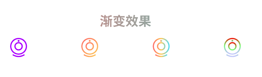
})(6)增加渐变色属性
javascript
<template>
  <svg :style="{ width: size + 'px', height: size + 'px' }">
    <defs v-if="isGradient && gradient">
      <linearGradient
        :id="gradient.id || 'svg-gradient'"
        :x1="gradient.x1 || '0%'"
        :y1="gradient.y1 || '0%'"
        :x2="gradient.x2 || '100%'"
        :y2="gradient.y2 || '100%'"
      >
        <stop
          v-for="(stop, index) in gradient.stops"
          :key="index"
          :offset="stop.offset"
          :stop-color="stop.color"
          :stop-opacity="stop.opacity !== undefined ? stop.opacity : 1"
        />
      </linearGradient>
    </defs>

    <use
      ref="useRef"
      :href="`#icon-${safeName}`"
      :fill="finalFillColor"
    />

    <polygon
      v-if="iconLoadFailed"
      points="16,2 20,10 29,11 22,18 24,27 16,22 8,27 10,18 3,11 12,10"
      :fill="finalFillColor"
    />
  </svg>
</template>

<script setup>
import { computed, ref, watch, nextTick } from 'vue'

const DEFAULT_COLOR = '#ff0000'
const DEFAULT_ICON_NAME = 'default'

const props = defineProps({
  name: { type: String },
  color: { type: String },
  size: { type: [String, Number], default: 30 },
  isGradient: { type: Boolean, default: false },
  gradient: {
    type: Object,
    default: null,
    // 示例格式:
    // {
    //   id: 'myGradient',
    //   x1: '0%', y1: '0%', x2: '100%', y2: '100%',
    //   stops: [
    //     { offset: '0%', color: '#ff6b6b', opacity: 1 },
    //     { offset: '100%', color: '#4ecdc4', opacity: 1 }
    //   ]
    // }
  }
})

const useRef = ref(null)
const iconLoadFailed = ref(false)

const safeName = computed(() => {
  const iconName = props.name
  if (!iconName || typeof iconName !== 'string') {
    return DEFAULT_ICON_NAME
  }
  const trimmedName = iconName.trim()
  return trimmedName || DEFAULT_ICON_NAME
})

const safeColor = computed(() => {
  const colorValue = props.color
  if (!colorValue || typeof colorValue !== 'string') {
    return DEFAULT_COLOR
  }
  const trimmedColor = colorValue.trim()
  return trimmedColor || DEFAULT_COLOR
})

// 最终填充颜色
const finalFillColor = computed(() => {
  if (props.isGradient && props.gradient && props.gradient.stops && props.gradient.stops.length >= 2) {
    const gradientId = props.gradient.id || 'svg-gradient'
    return `url(#${gradientId})`
  }
  return safeColor.value
})

// 检测 use 元素是否加载成功
const checkIconLoaded = () => {
  if (!useRef.value) return

  // 获取 use 元素的 bounding client rect
  const rect = useRef.value.getBoundingClientRect()

  // 如果宽高都是 0,说明图标加载失败
  if (rect.width === 0 && rect.height === 0) {
    iconLoadFailed.value = true
  } else {
    iconLoadFailed.value = false
  }
}

// 监听 safeName 变化,重新检测
watch(safeName, async () => {
  iconLoadFailed.value = false
  await nextTick()
  checkIconLoaded()
}, { immediate: true })
</script>
使用案例:
javascript
<template>
	<h1 class="gradient-text">渐变效果</h1>
	<div class="icon-container">
		<!-- 纯色 -->
		<SvgIcon name="CAMERA" color="#aa00ff" :size="iconSize"></SvgIcon>
		<!-- 渐变色图标 -->
		<SvgIcon
			name="CAMERA"
			:is-gradient="true"
			:gradient="{
				id: 'starGradient',
				x1: '0%',
				y1: '0%',
				x2: '100%',
				y2: '100%',
				stops: [
					{ offset: '0%', color: '#ff6b6b' },
					{ offset: '100%', color: '#feca57' }
				]
			}"
			:size="iconSize"
		/>

		<!-- 三色渐变 -->
		<SvgIcon
			name="CAMERA"
			:is-gradient="true"
			:gradient="{
				id: 'heartGradient',
				x1: '0%',
				y1: '0%',
				x2: '100%',
				y2: '0%',
				stops: [
					{ offset: '0%', color: '#ff6b6b' },
					{ offset: '50%', color: '#feca57' },
					{ offset: '100%', color: '#48dbfb' }
				]
			}"
			:size="iconSize"
		/>

		<!-- 带透明度的渐变 -->
		<SvgIcon
			name="CAMERA"
			:is-gradient="true"
			:gradient="{
				id: 'logoGradient',
				x1: '0%',
				y1: '0%',
				x2: '0%',
				y2: '100%',
				stops: [
					{ offset: '0%', color: '#ff0000', opacity: 1 },
					{ offset: '50%', color: '#00ff00', opacity: 0.5 },
					{ offset: '100%', color: '#0000ff', opacity: 0.2 }
				]
			}"
			:size="iconSize"
		/>
	</div>
</template>

<script setup>
import { ref } from 'vue';
const iconSize = ref(48);
</script>

<style>
.icon-container {
	display: flex;
	justify-content: space-around;
	align-items: center;
	gap: 20px;
}
#app {
	font-family: Avenir, Helvetica, Arial, sans-serif;
	-webkit-font-smoothing: antialiased;
	-moz-osx-font-smoothing: grayscale;
	text-align: center;
	color: #2c3e50;
	margin-top: 60px;
}
.gradient-text {
	/* 设置渐变背景 */
	background-image: linear-gradient(90deg, #ff6b6b, #4ecdc4);
	/* 背景仅裁剪到文字区域 */
	background-clip: text;
	/* 让文字原本的颜色透明,露出渐变背景 */
	color: transparent;
}
</style>
效果: