引言
响应式布局是现代应用开发的重要组成部分,能够让应用在不同屏幕尺寸和设备上都有良好的显示效果。本文将介绍如何在HarmonyOS应用中实现响应式布局,包括:
- 自适应屏幕尺寸
- 多设备适配
- 断点设计
- 动态布局调整
通过本文,你将掌握如何设计响应式的HarmonyOS应用界面。
学习目标
完成本文后,你将能够:
- ✅ 理解响应式布局的基本原则
- ✅ 实现自适应屏幕尺寸
- ✅ 添加断点设计
- ✅ 处理多设备适配
- ✅ 优化不同屏幕尺寸的显示效果
需求分析
响应式设计需求
| 需求 | 描述 | 技术要点 |
|---|---|---|
| 屏幕适配 | 适配不同屏幕尺寸 | 使用百分比、弹性布局 |
| 断点设计 | 根据屏幕宽度调整布局 | mediaQuery |
| 字体适配 | 根据屏幕尺寸调整字体大小 | 动态字体计算 |
| 图片适配 | 根据屏幕密度加载不同图片 | 资源限定符 |
| 布局切换 | 在不同屏幕尺寸下切换布局 | 条件渲染 |
核心实现
步骤1: 使用百分比和弹性布局
typescript
// responsive_layout.ets

@Entry
@Component
struct ResponsiveLayoutPage {
  build() {
    Column({ space: 12 }) {
      // 顶部导航栏 - 占满宽度
      Row({ space: 16 }) {
        Image($r('app.media.ic_back'))
          .width(24)
          .height(24)

        Text('响应式布局')
          .fontSize(18)
          .fontWeight(FontWeight.Bold)

        Blank()
      }
      .width('100%')
      .height(56)
      .padding({ left: 16, right: 16 })
      .backgroundColor('#FFFFFF')

      // 内容区域 - 占满剩余高度
      Scroll() {
        Column({ space: 12 }) {
          // 卡片区域 - 使用弹性布局
          Grid() {
            GridItem() {
              this.buildCard('卡片1', '#4A9B6D')
            }
            GridItem() {
              this.buildCard('卡片2', '#FF5722')
            }
            GridItem() {
              this.buildCard('卡片3', '#E91E63')
            }
            GridItem() {
              this.buildCard('卡片4', '#00BCD4')
            }
          }
          .columnsTemplate('1fr 1fr') // 两列布局
          .rowsGap(12)
          .width('92%')

          // 图文区域
          Row({ space: 12 }) {
            Image($r('app.media.ic_default_cover'))
              .width('35%')
              .height(120)
              .objectFit(ImageFit.Cover)
              .borderRadius(8)

            Column({ space: 8 }) {
              Text('响应式设计原则')
                .fontSize(16)
                .fontWeight(FontWeight.Bold)
                .fontColor('#333333')

              Text('使用弹性布局和百分比宽度,让界面能够自适应不同屏幕尺寸。')
                .fontSize(14)
                .fontColor('#666666')
                .lineHeight(22)
            }
            .flexGrow(1)
          }
          .width('92%')
        }
      }
      .width('100%')
      .flexGrow(1)
    }
    .width('100%')
    .height('100%')
    .backgroundColor('#F8F7F2')
  }

  @Builder
  buildCard(title: string, color: string) {
    Column({ space: 8 }) {
      Circle()
        .width(40)
        .height(40)
        .fillColor(color)

      Text(title)
        .fontSize(14)
        .fontColor('#333333')
    }
    .width('100%')
    .height(100)
    .backgroundColor('#FFFFFF')
    .borderRadius(12)
    .padding(16)
    .alignItems(HorizontalAlign.Center)
    .justifyContent(FlexAlign.Center)
  }
}设计要点:
- 使用百分比宽度(
width('100%')) - 使用弹性布局(
flexGrow) - 使用Grid实现自适应网格
步骤2: 使用mediaQuery实现断点设计
typescript
// media_query_example.ets

@Entry
@Component
struct MediaQueryPage {
  // 监听屏幕宽度
  @State screenWidth: number = 0;

  // 断点定义
  private breakpoints = {
    small: 320,
    medium: 480,
    large: 768
  };

  aboutToAppear() {
    // 获取屏幕宽度
    const display = window.getDefaultWindowSync();
    const size = display.getWindowSize();
    this.screenWidth = size.width;
  }

  /**
   * 获取当前布局类型
   */
  private getLayoutType(): 'small' | 'medium' | 'large' {
    if (this.screenWidth >= this.breakpoints.large) return 'large';
    if (this.screenWidth >= this.breakpoints.medium) return 'medium';
    return 'small';
  }

  build() {
    Column({ space: 12 }) {
      // 布局类型显示
      Text('当前布局: ' + this.getLayoutType())
        .fontSize(14)
        .fontColor('#999999')
        .padding({ left: 16 })

      // 根据屏幕尺寸调整布局
      if (this.getLayoutType() === 'large') {
        // 大屏幕:三列布局
        this.buildLargeLayout();
      } else if (this.getLayoutType() === 'medium') {
        // 中屏幕:两列布局
        this.buildMediumLayout();
      } else {
        // 小屏幕:单列布局
        this.buildSmallLayout();
      }
    }
    .width('100%')
    .height('100%')
    .backgroundColor('#F8F7F2')
  }

  @Builder
  buildSmallLayout() {
    List({ space: 12 }) {
      ForEach([1, 2, 3, 4, 5, 6], (index) => {
        ListItem() {
          Text('项目 ' + index)
            .fontSize(16)
            .fontColor('#333333')
            .width('100%')
            .height(60)
            .backgroundColor('#FFFFFF')
            .borderRadius(8)
            .padding({ left: 16 })
            .justifyContent(FlexAlign.Center)
        }
      })
    }
    .width('92%')
  }

  @Builder
  buildMediumLayout() {
    Grid() {
      ForEach([1, 2, 3, 4, 5, 6], (index) => {
        GridItem() {
          Text('项目 ' + index)
            .fontSize(16)
            .fontColor('#333333')
            .width('100%')
            .height(80)
            .backgroundColor('#FFFFFF')
            .borderRadius(8)
            .padding({ left: 16 })
            .justifyContent(FlexAlign.Center)
        }
      })
    }
    .columnsTemplate('1fr 1fr')
    .rowsGap(12)
    .width('92%')
  }

  @Builder
  buildLargeLayout() {
    Grid() {
      ForEach([1, 2, 3, 4, 5, 6], (index) => {
        GridItem() {
          Text('项目 ' + index)
            .fontSize(16)
            .fontColor('#333333')
            .width('100%')
            .height(100)
            .backgroundColor('#FFFFFF')
            .borderRadius(8)
            .padding({ left: 16 })
            .justifyContent(FlexAlign.Center)
        }
      })
    }
    .columnsTemplate('1fr 1fr 1fr')
    .rowsGap(12)
    .width('92%')
  }
}设计要点:
- 使用mediaQuery监听屏幕尺寸
- 根据断点切换布局(单列/两列/三列)
- 动态调整组件尺寸
步骤3: 动态字体大小
typescript
// dynamic_font_size.ets

@Entry
@Component
struct DynamicFontSizePage {
  @State screenWidth: number = 0;

  aboutToAppear() {
    const display = window.getDefaultWindowSync();
    const size = display.getWindowSize();
    this.screenWidth = size.width;
  }

  /**
   * 根据屏幕宽度计算字体大小
   */
  private getFontSize(baseSize: number): number {
    // 基础宽度为360px
    const baseWidth = 360;
    const scale = this.screenWidth / baseWidth;
    return Math.max(baseSize * scale, baseSize * 0.8);
  }

  build() {
    Column({ space: 16 }) {
      Text('动态字体大小')
        .fontSize(this.getFontSize(24))
        .fontWeight(FontWeight.Bold)
        .fontColor('#333333')

      Text('这是一段示例文本,字体大小会根据屏幕宽度自动调整。')
        .fontSize(this.getFontSize(16))
        .fontColor('#666666')
        .lineHeight(this.getFontSize(24))

      Text('小标题')
        .fontSize(this.getFontSize(18))
        .fontWeight(FontWeight.Medium)
        .fontColor('#333333')

      Text('普通文本')
        .fontSize(this.getFontSize(14))
        .fontColor('#999999')
    }
    .width('100%')
    .height('100%')
    .padding(16)
    .justifyContent(FlexAlign.Center)
    .backgroundColor('#F8F7F2')
  }
}设计要点:
- 根据屏幕宽度动态计算字体大小
- 设置最小字体大小限制
- 保持字体比例协调
步骤4: 资源限定符适配
typescript
// resource_qualifier_example.ets

@Entry
@Component
struct ResourceQualifierPage {
  build() {
    Column({ space: 16 }) {
      // 根据屏幕密度加载不同分辨率的图片
      Image($r('app.media.ic_banner'))
        .width('100%')
        .height(200)
        .objectFit(ImageFit.Cover)

      // 根据语言加载不同文字
      Text($r('app.string.hello_world'))
        .fontSize(20)
        .fontWeight(FontWeight.Bold)
        .fontColor('#333333')

      // 根据主题加载不同颜色
      Text('主题色文本')
        .fontSize(16)
        .fontColor($r('app.color.primary'))
    }
    .width('100%')
    .height('100%')
    .padding(16)
    .justifyContent(FlexAlign.Center)
    .backgroundColor($r('app.color.background'))
  }
}资源目录结构:
resources/
├── base/
│   ├── media/
│   │   ├── ic_banner.png
│   ├── string/
│   │   ├── strings.json
│   └── color/
│       └── colors.json
├── zh_CN/
│   └── string/
│       └── strings.json
├── en_US/
│   └── string/
│       └── strings.json
└── hdpi/
    └── media/
└── ic_banner.png设计要点:
- 使用资源限定符加载不同资源
- 支持多语言、多分辨率
- 主题颜色统一管理
本章小结
核心知识点
本文完成了响应式布局设计的学习:
1. 弹性布局
- 使用百分比宽度
- 使用flexGrow实现弹性扩展
- Grid布局自动适配
2. 断点设计
- 根据屏幕宽度切换布局
- 支持小/中/大屏幕
- 使用mediaQuery监听
3. 动态字体
- 根据屏幕宽度计算字体大小
- 保持字体比例
4. 资源适配
- 使用资源限定符
- 多语言、多分辨率支持
系列总结
🎉 "节气通"应用开发系列文章第二篇圆满完成!
通过第二篇文章,你已经学会了:
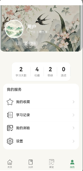
页面开发:
- 个人中心页
- 设置页
- 隐私设置
- 收藏功能
- 学习记录
- 知识问答
- 意见反馈
- 关于页面
- 空态设计
组件封装:
- ArticleCard组件
- CategoryGrid组件
- HolidayCard组件
- Timeline组件
高级主题:
- 响应式布局设计
相关链接
- 项目源码 : Atomgit仓库