鸿蒙原生应用实战(三):设置与统计页面开发 --- 数据驱动的功能模块
前言
前两篇我们完成了首页和游戏核心页面。本篇将聚焦于两个功能性页面------设置(SettingsPage) 和 统计(StatsPage),它们共同构成了游戏的配置与数据展示层。
通过本篇你将学到:
- Toggle 开关组件与表单布局
- Scroll 滚容器在内容长页面中的应用
- 数据统计的可视化展示技巧
- 卡片式 UI 设计模式
- 资源引用与多态样式的组合运用
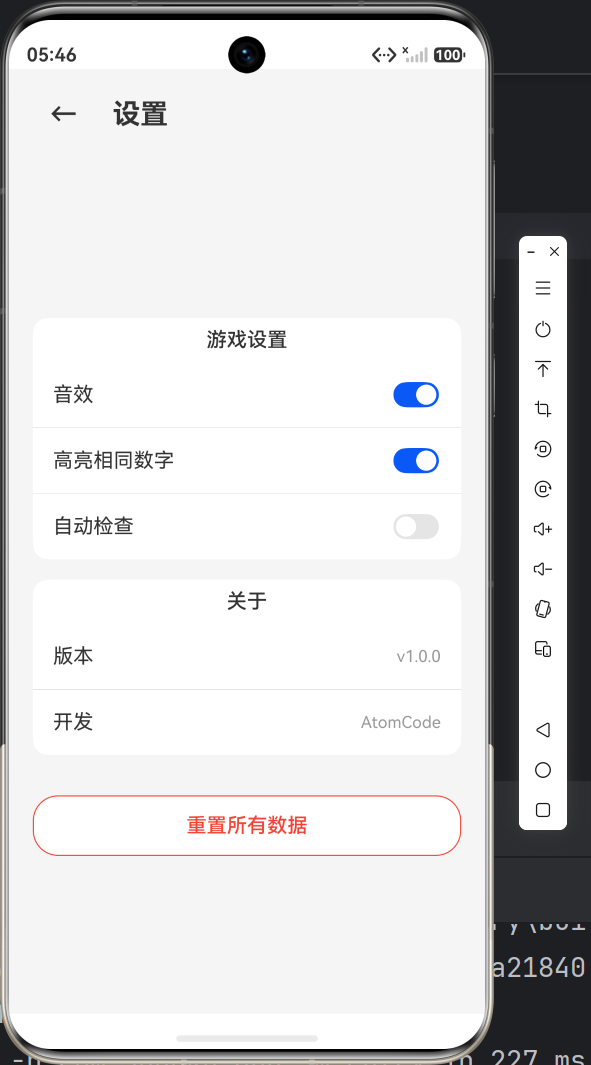
一、设置页面 --- SettingsPage
设置页面是用户自定义游戏体验的地方。我们设计了三组设置项:游戏设置、关于信息、数据重置。
1.1 页面结构规划
SettingsPage
├── 标题栏(返回按钮 + 标题)
├── Scroll 滚容器
│   ├── 游戏设置(卡片)
│   │   ├── 音效开关
│   │   ├── 高亮相同数字开关
│   │   └── 自动检查开关
│   ├── 关于(卡片)
│   │   ├── 版本号
│   │   └── 开发信息
│   └── 重置按钮
1.2 完整代码实现
typescript
import router from '@ohos.router';

@Entry
@Component
struct SettingsPage {
  @State soundEnabled: boolean = true;      // 音效
  @State highlightEnabled: boolean = true;  // 高亮相同数字
  @State autoCheckEnabled: boolean = false; // 自动检查

  build() {
    Column() {
      // === 标题栏 ===
      Row() {
        Button('←')
          .fontSize(22)
          .fontColor($r('app.color.text_primary'))
          .backgroundColor(Color.Transparent)
          .onClick(() => { router.back(); })
        Text($r('app.string.title_settings'))
          .fontSize($r('app.float.page_title_font_size'))
          .fontWeight(FontWeight.Bold)
          .fontColor($r('app.color.text_primary'))
          .margin({ left: 12 })
      }
      .width('100%')
      .padding($r('app.float.padding_medium'))

      Scroll() {
        Column() {
          // === 游戏设置卡片 ===
          this.settingCard()

          // === 关于卡片 ===
          this.aboutCard()

          // === 重置按钮 ===
          Button('重置所有数据')
            .width('100%')
            .height(48)
            .backgroundColor(Color.White)
            .borderRadius($r('app.float.btn_corner_radius'))
            .fontColor($r('app.color.status_exception'))
            .fontSize($r('app.float.body_font_size'))
            .border({ width: 1, color: $r('app.color.status_exception') })
            .margin({ top: 32 })
        }
        .width('90%')
      }
      .width('100%')
      .layoutWeight(1)
    }
    .width('100%')
    .height('100%')
    .backgroundColor($r('app.color.background'))
  }
}
1.3 Toggle 开关组件详解
ArkTS 提供了 Toggle 组件来实现开关效果,语法如下:
typescript
Toggle({ type: ToggleType.Switch, isOn: this.soundEnabled })
  .onChange((value: boolean) => {
    this.soundEnabled = value;
})参数说明:
| 参数 | 说明 |
|---|---|
type |
开关类型:ToggleType.Switch(滑动开关)或 ToggleType.Checkbox(复选框) |
isOn |
初始状态:true(开)或 false(关) |
onChange |
状态变化回调,接收当前值 |
每个设置项采用"标签 + 开关"的左右布局:
typescript
Row() {
  Text($r('app.string.sound_effect'))    // 左侧:标签
    .fontSize($r('app.float.body_font_size'))
    .fontColor($r('app.color.text_primary'))
  Blank()                                  // 中间:弹性空间
  Toggle({ type: ToggleType.Switch, isOn: this.soundEnabled })  // 右侧:开关
    .onChange((value: boolean) => { this.soundEnabled = value; })
}
.width('100%')
.height(52)
.padding({ left: 16, right: 16 })
Blank() 在这里发挥了关键作用------它会尽可能占据中间空间,把文字推到左边,开关推到右边,实现两端对齐的效果。
1.4 Divider 分割线
设置项之间使用 Divider 分隔:
typescript
Divider()
  .width('100%')
默认 Divider 是横跨全屏的,但在卡片内我们想让它在左右留一些边距。可以在外层控制宽度,或者给 Divider 添加 margin。
1.5 卡片式设计
所有设置分组都被包裹在圆角白色卡片中:
typescript
Column() {
  Text('游戏设置')
    .fontSize($r('app.float.body_font_size'))
    .fontWeight(FontWeight.Medium)
    .fontColor($r('app.color.text_primary'))
    .margin({ bottom: 8 })

  // ... 设置项 ...
}
.width('100%')
.padding({ top: 8 })
.backgroundColor($r('app.color.card_bg'))
.borderRadius($r('app.float.card_corner_radius'))
这种卡片设计在鸿蒙应用中非常普遍,好处是:
- 视觉上自然分组,提升可读性
- 统一的圆角半径
12vp和白色背景,形成设计规范 - 多张卡片之间用
margin({ top: 16 })保持间距
1.6 关于信息与重置按钮
"关于"卡片采用"标签-值"的列表形式,展示只读信息:
typescript
Row() {
  Text('版本')
    .fontSize($r('app.float.body_font_size'))
    .fontColor($r('app.color.text_primary'))
  Blank()
  Text('v1.0.0')
    .fontSize($r('app.float.small_font_size'))
    .fontColor($r('app.color.text_hint'))
}
.width('100%')
.height(52)
.padding({ left: 16, right: 16 })重置按钮采用描边红色样式,警示用户这是一个危险操作:
typescript
Button('重置所有数据')
  .backgroundColor(Color.White)
  .fontColor($r('app.color.status_exception'))   // 红色文字
  .border({ width: 1, color: $r('app.color.status_exception') })  // 红色边框
二、Scroll 滚容器
设置内容和统计内容都比较长,需要使用 Scroll 组件实现滚:
typescript
Scroll() {
  Column() {
    // 所有内容放在 Column 中
  }
  .width('90%')
}
.width('100%')
.layoutWeight(1)关键设计点:
- 外层 Column (
Scroll的外层):占满剩余空间(layoutWeight(1)) - Scroll:占据可用高度,内容溢出时显示滚条
- 内层 Column :内容容器,宽度为
90%(左右留边距),高度自适应
layoutWeight(1) 的含义是"占据剩余空间中的 1 份(权重为 1)"。因为外层 Column 中标题栏占固定高度,剩下的空间全部分配给 Scroll。
三、统计页面 --- StatsPage
统计页面展示玩家的游戏数据,包括总览、难度分布和最佳成绩。
3.1 页面布局
StatsPage
├── 标题栏
└── Scroll
    ├── 游戏总览卡片
    │   ├── 完成局数
    │   ├── 平均用时
    │   └── 完成率
    ├── 难度统计卡片
    │   ├── 简单(局数 + 平均用时 + 进度条)
    │   ├── 中等
    │   └── 困难
    └── 最佳成绩卡片
        ├── 简单最快
        ├── 中等最快
        └── 困难最快
3.2 总览统计
使用三列等比分栏展示:
typescript
Row() {
  // 完成局数
  Column() {
    Text('12')
      .fontSize(32)
      .fontWeight(FontWeight.Bold)
      .fontColor($r('app.color.primary'))
    Text($r('app.string.games_completed'))
      .fontSize($r('app.float.small_font_size'))
      .fontColor($r('app.color.text_hint'))
      .margin({ top: 4 })
  }
  .layoutWeight(1)
  .alignItems(HorizontalAlign.Center)

  // 平均用时
  Column() {
    Text('15:32')
      .fontSize(24)
      .fontWeight(FontWeight.Bold)
      .fontColor($r('app.color.primary'))
    Text($r('app.string.avg_time'))
      .fontSize($r('app.float.small_font_size'))
      .fontColor($r('app.color.text_hint'))
      .margin({ top: 4 })
  }
  .layoutWeight(1)
  .alignItems(HorizontalAlign.Center)

  // 完成率
  Column() {
    Text('85%')
      .fontSize(24)
      .fontWeight(FontWeight.Bold)
      .fontColor($r('app.color.status_delivered'))  // 绿色
    Text('完成率')
      .fontSize($r('app.float.small_font_size'))
      .fontColor($r('app.color.text_hint'))
      .margin({ top: 4 })
  }
  .layoutWeight(1)
  .alignItems(HorizontalAlign.Center)
}三个设计细节:
layoutWeight(1)让三列均分宽度- 数字字体大小不同(32/24),主次分明
- 完成率用绿色
status_delivered表示正面数据
3.3 进度条模拟
目前项目使用 ASCII 字符 █ 来模拟进度条(后续可改为自定义进度组件):
typescript
// 简单:满进度
Row() {
  Text('██████████')
    .fontSize(14)
    .fontColor($r('app.color.status_delivered'))  // 绿色
}

// 中等:80% 进度
Row() {
  Text('████████')
    .fontSize(14)
    .fontColor($r('app.color.rating_star'))  // 黄色
}

// 困难:60% 进度
Row() {
  Text('██████')
    .fontSize(14)
    .fontColor($r('app.color.status_exception'))  // 红色
}
这是一个临时方案。实际应用中可以用 Column + overlay 组合来模拟真正的进度条,就像我们在成就系统中做的:
typescript
Row() {
  Column()
    .width('100%')
    .height(8)
    .backgroundColor('#FFF0F0F0')
    .borderRadius(4)
    .overlay(() => {
      Column()
        .width('60%')  // 进度百分比
        .height(8)
        .backgroundColor($r('app.color.primary'))
        .borderRadius(4)
    })
}
3.4 最佳成绩列表
typescript
Row() {
  Text('🏆 简单')
    .fontSize($r('app.float.body_font_size'))
    .fontColor($r('app.color.text_primary'))
  Blank()
  Text('03:25')
    .fontSize(18)
    .fontWeight(FontWeight.Bold)
    .fontColor($r('app.color.rating_star'))  // 金色
}
每个难度一行,用 Blank() 实现左右对齐,时间数字用金色表示荣誉感。
四、通用设计模式总结
通过 SettingsPage 和 StatsPage 的开发,我们可以总结出几个鸿蒙 ArkTS 的通用设计模式:
4.1 页面标题栏模式
typescript
Row() {
  Button('←')
    .fontSize(22)
    .fontColor($r('app.color.text_primary'))
    .backgroundColor(Color.Transparent)
    .onClick(() => { router.back(); })
  Text('页面标题')
    .fontSize($r('app.float.page_title_font_size'))
    .fontWeight(FontWeight.Bold)
    .fontColor($r('app.color.text_primary'))
    .margin({ left: 12 })
  Blank()  // 如果右侧也需要元素,可以在 Blank 之后添加
}
.width('100%')
.padding($r('app.float.padding_medium'))
4.2 卡片式内容分组
typescript
Column() {
  Text('分组标题')
    .fontSize($r('app.float.body_font_size'))
    .fontWeight(FontWeight.Medium)
    // ...

  // 内容项...
}
.width('100%')
.padding(16)
.backgroundColor($r('app.color.card_bg'))
.borderRadius($r('app.float.card_corner_radius'))
4.3 标签-值列表项
typescript
Row() {
  Text('标签')
    .fontColor($r('app.color.text_primary'))
  Blank()
  Text('值')
    .fontColor($r('app.color.text_hint'))
}
.width('100%')
.height(52)
.padding({ left: 16, right: 16 })
4.4 危险操作按钮
typescript
Button('危险操作')
  .backgroundColor(Color.White)
  .fontColor($r('app.color.status_exception'))
  .border({ width: 1, color: $r('app.color.status_exception') })
五、资源文件的复用
在整个项目中,颜色/字号/字符串都通过 $r 引用资源文件,保证了一致性:
| 资源引用 | 实际值 | 使用位置 |
|---|---|---|
$r('app.color.primary') |
#FF5C6BC0(靛蓝) |
按钮、标题、数值 |
$r('app.color.background') |
#FFF5F5F5(浅灰) |
页面背景 |
$r('app.color.card_bg') |
#FFFFFF(白) |
卡片背景 |
$r('app.color.text_primary') |
#FF333333 |
主文字 |
$r('app.color.text_hint') |
#FF999999 |
辅助文字 |
$r('app.color.status_delivered') |
#FF4CAF50(绿) |
正面数据 |
$r('app.color.status_exception') |
#FFF44336(红) |
警告/错误数据 |
$r('app.float.page_title_font_size') |
22fp |
页面标题 |
$r('app.float.body_font_size') |
16fp |
正文 |
$r('app.float.small_font_size') |
13fp |
小字注释 |
$r('app.float.card_corner_radius') |
12vp |
卡片圆角 |
这种集中管理的方式,在需要调整视觉风格时只需修改资源文件,无需遍历所有页面。
六、小结与预告
本篇我们完成了:
- ✅ SettingsPage 设置页面(Toggle 开关 + 卡片布局 + Scroll 滚)
- ✅ StatsPage 统计页面(总览数据 + 难度分布 + 最佳成绩)
- ✅ 通用的页面设计模式总结
- ✅ 资源文件的规范复用
值得一提的是,这些页面的数据目前都是静态写死的。在实际应用中,应该通过 AppStorage 或 PersistentStorage 实现数据持久化------这会在后续篇章中介绍。
下一篇我们将开发成就系统 和排行榜两个非常有趣的页面:
- 12 个精心设计的成就,带进度追踪
- 排行榜的分难度排名展示
- 分类筛选与列表渲染优化
敬请期待!