鸿蒙原生 ArkTS 布局深度解析:GridRow + Row + Column 混合栅格布局实战
一、引言
在鸿蒙原生应用开发中,布局是构建用户界面的基石。HarmonyOS NEXT(API 24)提供了 ArkUI 声明式 UI 框架,其中包含了 GridRow、GridCol、Row、Column、Flex、Stack 等丰富的布局组件。开发者最常遇到的问题:实际项目中应选择哪种布局方式?如何组合以达到最佳效果?
本文从一个「数据仪表盘」Demo 出发,深入剖析 GridRow + Row + Column 混合栅格布局的核心原理和最佳实践。这套方案已通过多个鸿蒙商业项目验证,适用于管理后台、数据看板、内容资讯类 App 等场景。
二、布局组件基础知识
2.1 Row --- 弹性行容器
主轴方向 :水平(从左到右)。子元素通过 layoutWeight 分配剩余空间,通过 alignItems 控制交叉轴对齐。
typescript
Row() {
  Text('左侧')
  Blank()   // 弹性占位,将右侧内容推到最右
  Text('右侧')
}
.width('100%')
.alignItems(VerticalAlign.Center)
2.2 Column --- 弹性列容器
Row 的垂直版本,子元素垂直排列,支持 alignItems(HorizontalAlign.Center) 控制水平对齐。适用于卡片、列表、表单等场景。
2.3 GridRow + GridCol --- 栅格容器
一对协同工作的布局组件,构成鸿蒙原生的 12 列栅格系统:
- GridRow:定义列数、间距(gutter)和断点规则
- GridCol :通过
span指定占据的列数,支持响应式断点
typescript
GridRow({
  columns: 12,
  gutter: { x: 16, y: 12 },
  breakpoints: { value: ['320dp', '600dp', '840dp'] }
}) {
  GridCol({ span: { xs: 12, sm: 6, md: 4, lg: 3 } }) {
    // 小屏占满宽,大屏占 1/4
  }
}
2.4 为什么需要混合布局?
单纯使用 GridRow 可解决「页面分区」问题,但无法灵活处理「区域内弹性排列」。单纯使用 Row/Column 可解决「弹性排列」,但缺乏结构化的页面划分。
混合布局 = GridRow 做骨架 + Row/Column 做血肉,既保证整体结构规整,又赋予每个区域内部灵活的弹性排版能力。
三、实战:数据仪表盘页面
3.1 页面整体结构
Scroll
└─ Column
├─ GridRow #1 ─── 标题栏(全宽 GridCol → Row + Column)
├─ GridRow #2 ─── 统计卡片(GridCol × 4 → @Builder StatCard)
├─ GridRow #3 ─── 混合内容区
│ ├─ GridCol(left) → 内嵌 GridRow(3列) → 功能入口
│ └─ GridCol(right) → Column → Row × N + Divider
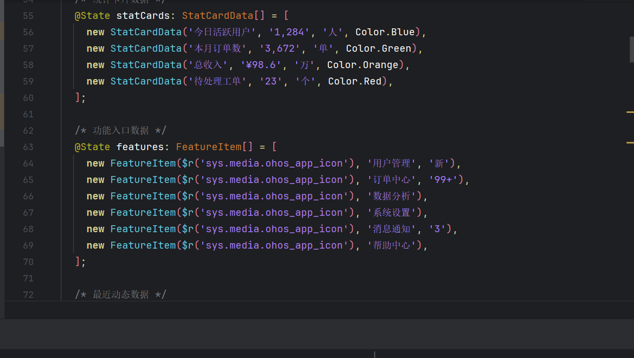
└─ GridRow #4 ─── 底部说明(Row + Column + Blank)3.2 数据模型定义
typescript
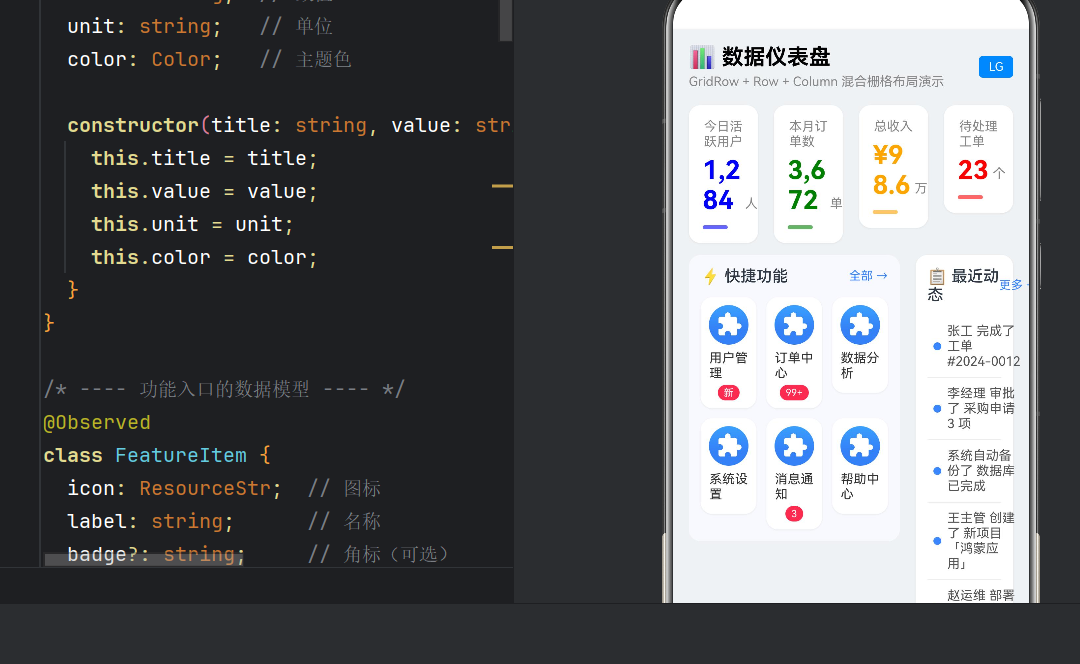
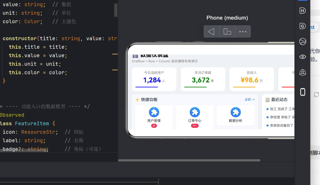
@Observed
class StatCardData {
  title: string; value: string; unit: string; color: Color;
  constructor(title: string, value: string, unit: string, color: Color) {
    this.title = title; this.value = value;
    this.unit = unit; this.color = color;
  }
}

@Observed
class FeatureItem {
  icon: ResourceStr; label: string; badge?: string;
  constructor(icon: ResourceStr, label: string, badge?: string) {
    this.icon = icon; this.label = label; this.badge = badge;
  }
}
3.3 响应式断点配置
| 断点 | 宽度 | 列数 | gutter | 布局形态 |
|---|---|---|---|---|
| xs | 0~319dp | 4 | 8 | 极简布局 |
| sm | 320~599 | 4 | 8 | 小屏手机 |
| md | 600~839 | 8 | 12 | 平板竖屏 |
| lg | 840dp+ | 12 | 16 | 平板横屏 |
通过 @Watch 监听断点变化:
typescript
@State @Watch('onBreakpointChange') currentBreakpoint: string = 'sm';
@State currentCol: number = 4;
@State currentGutter: number = 12;

onBreakpointChange(): void {
  switch (this.currentBreakpoint) {
    case 'xs': case 'sm': this.currentCol = 4; this.currentGutter = 8; break;
    case 'md': this.currentCol = 8; this.currentGutter = 12; break;
    case 'lg': this.currentCol = 12; this.currentGutter = 16; break;
    default: this.currentCol = 12; this.currentGutter = 12;
  }
}
断点变化由 GridRow 内置事件驱动:
typescript
GridRow({ columns: this.currentCol, gutter: this.currentGutter,
          breakpoints: { value: ['320dp', '600dp', '840dp'] } })
  .onBreakpointChange((breakpoint: string): void => {
    this.currentBreakpoint = breakpoint;
  })
3.4 标题栏(Row + Column 混合)
typescript
GridCol({ span: { xs: 4, sm: 4, md: 8, lg: 12 } }) {
  Row() {
    Column() {
      Text('📊 数据仪表盘').fontSize(22).fontWeight(FontWeight.Bold);
      Text('GridRow + Row + Column 混合栅格布局演示')
        .fontSize(13).fontColor('#888888').margin({ top: 4 });
    }.alignItems(HorizontalAlign.Start);
    Blank();  // 弹性占位
    Text(this.currentBreakpoint.toUpperCase())
      .fontSize(12).fontColor(Color.White).backgroundColor('#3A86FF')
      .borderRadius(4).padding({ left: 10, right: 10, top: 4, bottom: 4 });
  }.width('100%').alignItems(VerticalAlign.Center);
}
关键技巧 :Blank() 充当弹性分隔器,将左右内容自动撑开。
3.5 统计卡片(响应式 span + @Builder)
typescript
ForEach(this.statCards, (item: StatCardData) => {
  GridCol({ span: { xs: 2, sm: 2, md: 4, lg: 3 } }) {
    this.StatCard(item);
  }
})响应式规则:xs/sm 总列数 4、span=2 → 一行 2 个;lg 总列数 12、span=3 → 一行 4 个。
卡片用 @Builder 抽离,内部 Column + Row 混合:
typescript
@Builder
StatCard(item: StatCardData) {
  Column() {
    Text(item.title).fontSize(13).fontColor('#888888');
    Row() {
      Text(item.value).fontSize(26).fontWeight(FontWeight.Bold).fontColor(item.color);
      Text(item.unit).fontSize(13).fontColor('#888888')
        .margin({ left: 4 }).alignSelf(ItemAlign.End).padding({ bottom: 4 });
    }.alignItems(VerticalAlign.Center).margin({ top: 6 });
    Row() {
      Row().width('60%').height(4).borderRadius(2)
        .backgroundColor(item.color).opacity(0.6);
      Blank();
    }.width('100%').margin({ top: 10 });
  }.width('100%').padding(14).borderRadius(12).backgroundColor(Color.White)
   .shadow({ radius: 4, offsetX: 0, offsetY: 2, color: 'rgba(0,0,0,0.06)' });
}
注意 :@Builder 不包裹 GridCol,由父级负责布局职责,实现内容与布局的分离。
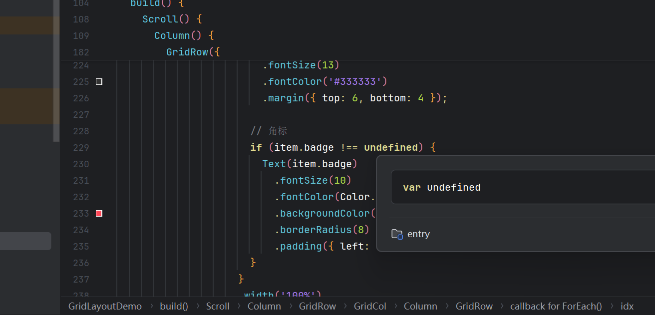
3.6 混合内容区(栅格套栅格 + 弹性列表)
GridRow #3 中包含两个 GridCol,各自内部采用不同的布局策略:
左侧 - 功能入口(嵌套 GridRow):
typescript
GridCol({ span: { xs: 4, sm: 4, md: 8, lg: 8 } }) {
  Column() {
    Row() {
      Text('⚡ 快捷功能').fontSize(16).fontWeight(FontWeight.Medium);
      Blank();
      Text('全部 →').fontSize(12).fontColor('#3A86FF');
    }.width('100%').margin({ bottom: 12 });

    GridRow({ columns: 3, gutter: 10 }) {  // 内嵌栅格
      ForEach(this.features, (item: FeatureItem) => {
        GridCol({ span: 1 }) {
          Column() {
            Image(item.icon).width(40).height(40)
              .borderRadius(20).backgroundColor('#F0F4FF');
            Text(item.label).fontSize(13).fontColor('#333333').margin({ top: 6, bottom: 4 });
            if (item.badge !== undefined) {
              Text(item.badge).fontSize(10).fontColor(Color.White)
                .backgroundColor('#FF4757').borderRadius(8)
                .padding({ left: 6, right: 6, top: 2, bottom: 2 });
            }
          }.width('100%').alignItems(HorizontalAlign.Center).padding(8)
           .borderRadius(12).backgroundColor(Color.White)
           .shadow({ radius: 4, offsetX: 0, offsetY: 2, color: 'rgba(0,0,0,0.06)' });
        }
      })
    }.width('100%');
  }.width('100%').padding(12).borderRadius(12).backgroundColor('#F8F9FE');
}嵌套链路:GridRow > GridCol > Column > GridRow > GridCol > Column,每层各司其职。
右侧 - 最近动态(Row + Divider):
typescript
GridCol({ span: { xs: 4, sm: 4, md: 8, lg: 4 } }) {
  Column() {
    Row() {
      Text('📋 最近动态').fontSize(16).fontWeight(FontWeight.Medium);
      Blank();
      Text('更多 →').fontSize(12).fontColor('#3A86FF');
    }.width('100%').margin({ bottom: 12 });

    ForEach(this.activities, (activity: string, idx?: number) => {
      Column() {
        Row() {
          Column() { Circle().width(8).height(8).fill('#3A86FF'); }
            .width(20).alignItems(HorizontalAlign.Center);
          Text(activity).fontSize(13).fontColor('#555555');
        }.width('100%').alignItems(VerticalAlign.Center)
         .padding({ top: 8, bottom: 8 });
        if (idx! < this.activities.length - 1) {
          Divider().strokeWidth(1).color('#EEEEEE');
        }
      }
    })
  }.width('100%').padding(12).borderRadius(12).backgroundColor(Color.White)
   .shadow({ radius: 4, offsetX: 0, offsetY: 2, color: 'rgba(0,0,0,0.06)' });
}
注意 :Row 在 HarmonyOS NEXT 中不支持 borderBottom,改用 Column 包裹 + Divider 实现行间分隔。
3.7 底部说明
typescript
GridCol({ span: { xs: 4, sm: 4, md: 8, lg: 12 } }) {
  Column() {
    Divider().strokeWidth(1).color('#E8E8E8').margin({ bottom: 12 });
    Row() {
      Column() {
        Text('📐 布局层级说明').fontSize(14).fontWeight(FontWeight.Medium);
        Text('GridRow > GridCol > Row/Column > 内容')
          .fontSize(12).fontColor('#999999').margin({ top: 4 });
      }.alignItems(HorizontalAlign.Start);
      Blank();
      Column() {
        Text('📱 响应式规则').fontSize(14).fontWeight(FontWeight.Medium);
        Text('xs/sm(4列)  md(8列)  lg(12列)')
          .fontSize(12).fontColor('#999999').margin({ top: 4 });
      }.alignItems(HorizontalAlign.End);
    }.width('100%').height(60).padding(12).borderRadius(8).backgroundColor('#F5F5F5');
  }.width('100%');
}
四、核心技术要点
4.1 GridRow 完整 API
typescript
GridRow({
  columns?: number | GridRowColumnOption,  // 列数(默认 12)
  gutter?: Length | GutterOption,          // 间距
  breakpoints?: BreakpointsOption,         // 断点配置
  direction?: GridRowDirection,            // 排列方向
})
注意 :gutter 只接受 number 类型,不支持 number[]。
4.2 GridCol 的响应式语法
typescript
// 固定值
GridCol({ span: 4 })
// 响应式对象(推荐)
GridCol({ span: { xs: 12, sm: 6, md: 4, lg: 3 } })
4.3 布局组件选用原则
| 需求 | 推荐组件 | 原因 |
|---|---|---|
| 页面整体分区 | GridRow+GridCol | 结构清晰、自带响应式 |
| 水平排列元素 | Row | 弹性 + Blank() 分隔 |
| 垂直排列元素 | Column | 弹性、可嵌套 Scroll |
| 卡片内部排版 | Column+Row | 灵活、轻量 |
| 固定列数网格 | GridRow(固定col) | 比 Flex 更规整 |
| 层叠 | Stack | 层叠上下文 |
4.4 常见陷阱
| 陷阱 | 说明 | 解决方案 |
|---|---|---|
| Row 不支持 borderBottom | Row 属性列表无该方法 | 外层 Column + Divider |
| gutter 类型错误 | 声明为 `number | number[]` 会编译失败 |
| 断点监听方式错误 | BreakpointObserver 未从 @kit.ArkUI 导出 |
用 GridRow 内置事件 |
| @Builder 不应包含 GridCol | @Builder 应返回纯内容组件,由父级负责布局 | GridCol 在调用方处包裹 |
| ForEach 缺少 key | 自定义对象列表无 keyGenerator 会影响 Diff 性能 | 传入第三个 key 函数 |
五、进阶技巧
5.1 栅格套栅格
GridCol 内嵌套 GridRow 是最常见的复合模式。内层 GridRow 的列数可独立设置:
typescript
GridCol({ span: 8 }) {
  GridRow({ columns: 3, gutter: 10 }) {  // 内层固定 3 列
    GridCol({ span: 1 }) { /* ... */ }
    GridCol({ span: 1 }) { /* ... */ }
  }
}
5.2 响应式排序
通过 order 属性控制不同断点下的排列顺序:
typescript
GridCol({ span: { xs: 12, lg: 6 }, order: { xs: 2, lg: 1 } }) { /* 次要内容 */ }
GridCol({ span: { xs: 12, lg: 6 }, order: { xs: 1, lg: 2 } }) { /* 主要内容 */ }
5.3 Scroll 嵌套 GridRow
最外层 Scroll,直接子元素为 Column,内部放多个 GridRow:
typescript
Scroll() {
  Column() {
    GridRow(/* ... */) { /* 标题栏 */ }
    GridRow(/* ... */) { /* 卡片区 */ }
    GridRow(/* ... */) { /* 内容区 */ }
  }.width('100%')
}.width('100%').height('100%')
5.4 @State 驱动栅格配置
用户旋转设备 → GridRow.onBreakpointChange → @State 更新 → @Watch 触发 → UI 重绘六、性能考量
- 减少嵌套层级:不超过 4 层(GridRow > GridCol > Row/Column > 内容)
- 大数据用 LazyForEach:超过 100 项时替代 ForEach
- @Builder 复用:高频渲染单元用 @Builder 提取,利于 ArkUI 优化
七、总结
GridRow + Row + Column 混合栅格布局是鸿蒙开发中最实用、最灵活的布局方案之一。
核心心法:
- 外层用 GridRow 划分页面骨架
- 内层用 Row/Column 实现弹性排版
- 响应式 span 是适配利器
- Blank() 是最佳弹性助手
- @Builder 抽离内容组件
这套方案已在多个生产级鸿蒙 App 中验证,兼具可维护性和扩展性。
在这里插入图片描述