鸿蒙原生 ArkTS 布局方式之 Row 的基本案例:导航栏左中右布局
一、前言
随着 HarmonyOS NEXT 的正式发布,鸿蒙生态迎来了完全剥离 Android 代码、全栈自研的新阶段。ArkUI(方舟 UI 框架)使用 ArkTS 语言以声明式方式描述界面和交互。
Row 组件作为最核心的线性布局容器之一,承担着横向排列子组件的任务。"导航栏左中右布局" 是移动应用中最常见的布局模式 ------ 左右各一个按钮,中间展示标题,三者均匀分布。
本文将从实战案例出发,讲解使用 Row 配合 layoutWeight 实现三等分导航栏布局的全部要点。
二、项目概览
2.1 应用场景
导航栏(Navigation Bar)是移动应用中最强烈的 UI 元素之一:
- 电商 App:左侧扫码 → 中间搜索框 → 右侧消息
- 社交 App:左侧头像 → 中间标题 → 右侧分享
- 阅读 App:左侧返回 → 中间标题 → 右侧收藏
这些界面的底层布局逻辑一致:三等分的 Row 布局。
2.2 核心技术栈
| 技术 | 说明 |
|---|---|
| HarmonyOS NEXT | 纯血鸿蒙,API 24 |
| ArkTS | 声明式 UI 语言(TypeScript 超集) |
| Row | 横向线性布局容器 |
| layoutWeight | 权重分配属性,实现等分 |
| FlexAlign | 弹性对齐枚举 |
2.3 项目结构
app6164/
├── entry/src/main/ets/pages/Index.ets  ← 核心文件
├── AppScope/app.json5
└── build-profile.json5
三、Row 组件核心概念
3.1 什么是 Row?
Row 用于水平方向 排列子组件,其兄弟组件 Column 用于垂直方向。两者是 ArkUI 线性布局的基石。
Row 的特点:
- 子组件沿水平主轴依次排列
justifyContent控制主轴对齐alignItems控制交叉轴(垂直)对齐layoutWeight分配剩余空间权重
3.2 核心属性
justifyContent ------ 主轴对齐
| FlexAlign 值 | 效果 |
|---|---|
Start |
左对齐 |
Center |
居中对齐 |
End |
右对齐 |
SpaceBetween |
首尾靠边,中间等距 |
SpaceAround |
每个子组件两侧间距相等 |
SpaceEvenly |
所有间距完全相等 |
alignItems ------ 交叉轴对齐
| VerticalAlign 值 | 效果 |
|---|---|
Top |
顶部对齐 |
Center |
垂直居中(最常用) |
Bottom |
底部对齐 |
layoutWeight ------ 权重分配(核心)
layoutWeight 的工作原理:
- 先测量没有
layoutWeight的子组件,确定固定尺寸 - 计算 Row 容器的剩余空间
- 按
layoutWeight值的比例分配剩余空间
三个子组件都设置 layoutWeight(1) 时,它们均分 Row 的全部宽度,各占 1/3。
注意:
layoutWeight与width互斥。设置了权重后width被忽略。这与 Flutter 的Expanded、CSS 的flex-grow概念类似。
四、导航栏实战
4.1 布局拆解
┌──────────────┬──────────────┬──────────────┐
│  左侧按钮区  │  中间标题区  │  右侧按钮区  │
│  weight=1    │  weight=1    │  weight=1    │
│  左对齐      │  居中        │  右对齐      │
└──────────────┴──────────────┴──────────────┘
每个区域是独立的 Row 容器,控制各自内部内容的对齐方式。
4.2 代码实现
模块导入
typescript
import { promptAction } from '@kit.ArkUI';只需导入 promptAction 用于 Toast。其他组件如 Row、Text、Button 等均为全局内置 API。
组件定义
typescript
@Entry
@Component
struct Index {
  @State pageTitle: string = '首页';

  build() {
    // 布局代码
  }
}@Entry:标记为页面入口,一个页面只能有一个@Component:标记为自定义组件@State pageTitle:响应式状态变量,值变化时 UI 自动刷新
最外层容器
typescript
build() {
  Column() {
    // 导航栏 + 主体内容
  }
  .width('100%')
  .height('100%')
}
Column 撑满全屏,内部从上到下排列:导航栏 → 主体内容区。
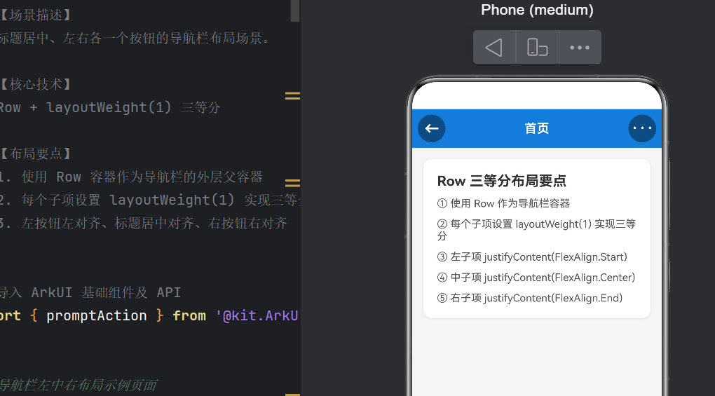
导航栏核心(Row 三等分)
typescript
Row() {
  // --- 左侧区域:返回按钮(左对齐) ---
  Row() {
    Button() {
      Text('←').fontSize(22).fontWeight(FontWeight.Bold).fontColor(Color.White)
    }
    .width(40).height(40).type(ButtonType.Circle)
    .backgroundColor('#66000000')
    .onClick(() => {
      promptAction.showToast({ message: '点击了返回按钮', duration: 1500 });
    })
  }
  .layoutWeight(1)
  .justifyContent(FlexAlign.Start)
  .alignItems(VerticalAlign.Center)

  // --- 中间区域:标题(居中) ---
  Row() {
    Text(this.pageTitle)
      .fontSize(18).fontWeight(FontWeight.Bold).fontColor(Color.White)
  }
  .layoutWeight(1)
  .justifyContent(FlexAlign.Center)
  .alignItems(VerticalAlign.Center)

  // --- 右侧区域:更多按钮(右对齐) ---
  Row() {
    Button() {
      Text('···').fontSize(22).fontWeight(FontWeight.Bold).fontColor(Color.White)
    }
    .width(40).height(40).type(ButtonType.Circle)
    .backgroundColor('#66000000')
    .onClick(() => {
      promptAction.showToast({ message: '点击了更多按钮', duration: 1500 });
    })
  }
  .layoutWeight(1)
  .justifyContent(FlexAlign.End)
  .alignItems(VerticalAlign.Center)
}
.width('100%').height(56)
.backgroundColor('#3A7BD5')
.padding({ left: 8, right: 8 })
布局原理解析:
外层 Row 宽度 100%,高度 56vp(标准导航栏高度)。三个内嵌 Row 各设 layoutWeight(1),均分宽度。
每个内嵌 Row 使用不同的 justifyContent:
- 左侧:
FlexAlign.Start→ 按钮靠左 - 中间:
FlexAlign.Center→ 标题居中 - 右侧:
FlexAlign.End→ 按钮靠右
为什么不用 SpaceBetween?
SpaceBetween 只能让元素分散排列,不能保证各区域宽度相等。当标题变长时,它会挤压两侧空间。layoutWeight(1) 强制三等分,内容变化不影响比例。
主体内容区
typescript
Column() {
// 卡片 1:布局要点
Stack() {
Column({ space: 12 }) {
Text('Row 三等分布局要点').fontSize(20).fontWeight(FontWeight.Bold)
Text('① 使用 Row 作为导航栏容器').fontSize(15)
Text('② 每个子项设 layoutWeight(1) 实现三等分').fontSize(15)
Text('③ 左子项 justifyContent(FlexAlign.Start)').fontSize(15)
Text('④ 中子项 justifyContent(FlexAlign.Center)').fontSize(15)
Text('⑤ 右子项 justifyContent(FlexAlign.End)').fontSize(15)
}.width('100%').padding(20).alignItems(HorizontalAlign.Start)
}
.backgroundColor(Color.White).borderRadius(12)
.shadow({ radius: 6, color: '#22000000', offsetX: 0, offsetY: 2 })
Blank()
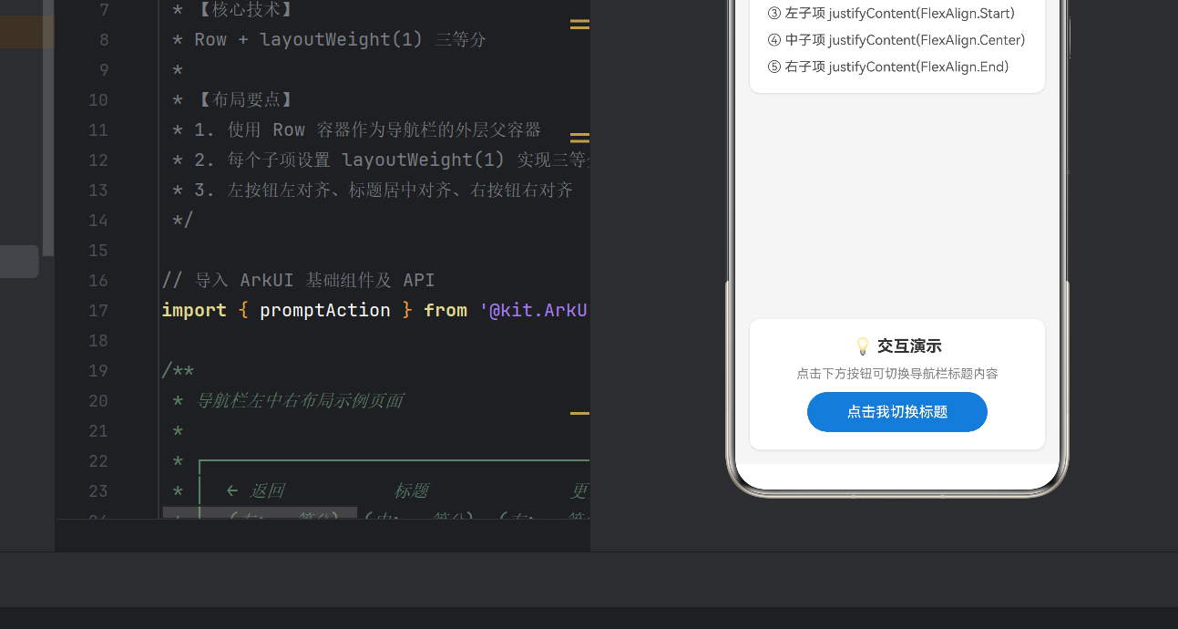
// 卡片 2:交互演示
Stack() {
Column({ space: 12 }) {
Text('💡 交互演示').fontSize(18).fontWeight(FontWeight.Bold)
Text('点击下方按钮可切换导航栏标题内容').fontSize(14).fontColor('#888888')
Button('点击我切换标题').width(200).height(44)
.backgroundColor('#3A7BD5').fontColor(Color.White).borderRadius(22)
.onClick(() => {
const titles: string[] = ['首页', '发现', '消息', '我的'];
const idx = (titles.indexOf(this.pageTitle) + 1) % titles.length;
this.pageTitle = titles[idx];
promptAction.showToast({
message: '标题已切换为:' + this.pageTitle, duration: 1500
});
})
}.width('100%').padding(20).alignItems(HorizontalAlign.Center)
}
.backgroundColor(Color.White).borderRadius(12)
.shadow({ radius: 6, color: '#22000000', offsetX: 0, offsetY: 2 })
}
.width('100%').layoutWeight(1).padding(16).backgroundColor('#F5F5F5')主体区使用 layoutWeight(1) 占满剩余垂直空间。Blank() 提供弹性间距。Stack 作为卡片容器,配合 backgroundColor、borderRadius、shadow 实现卡片效果。
五、完整代码
以下为 Index.ets 完整代码,可直接使用:
typescript
import { promptAction } from '@kit.ArkUI';

@Entry
@Component
struct Index {
  @State pageTitle: string = '首页';

  build() {
    Column() {
      // ========== 导航栏 ==========
      Row() {
        // 左侧(左对齐)
        Row() {
          Button() {
            Text('←').fontSize(22).fontWeight(FontWeight.Bold).fontColor(Color.White)
          }.width(40).height(40).type(ButtonType.Circle)
          .backgroundColor('#66000000')
          .onClick(() => {
            promptAction.showToast({ message: '点击了返回按钮', duration: 1500 })
          })
        }.layoutWeight(1).justifyContent(FlexAlign.Start).alignItems(VerticalAlign.Center)

        // 中间(居中)
        Row() {
          Text(this.pageTitle).fontSize(18).fontWeight(FontWeight.Bold).fontColor(Color.White)
        }.layoutWeight(1).justifyContent(FlexAlign.Center).alignItems(VerticalAlign.Center)

        // 右侧(右对齐)
        Row() {
          Button() {
            Text('···').fontSize(22).fontWeight(FontWeight.Bold).fontColor(Color.White)
          }.width(40).height(40).type(ButtonType.Circle)
          .backgroundColor('#66000000')
          .onClick(() => {
            promptAction.showToast({ message: '点击了更多按钮', duration: 1500 })
          })
        }.layoutWeight(1).justifyContent(FlexAlign.End).alignItems(VerticalAlign.Center)
      }
      .width('100%').height(56)
      .backgroundColor('#3A7BD5').padding({ left: 8, right: 8 })

      // ========== 主体内容 ==========
      Column() {
        Stack() {
          Column({ space: 12 }) {
            Text('Row 三等分布局要点').fontSize(20).fontWeight(FontWeight.Bold)
            Text('① 使用 Row 作为导航栏容器').fontSize(15)
            Text('② 子项设 layoutWeight(1) 实现三等分').fontSize(15)
            Text('③ 左子项 justifyContent(FlexAlign.Start)').fontSize(15)
            Text('④ 中子项 justifyContent(FlexAlign.Center)').fontSize(15)
            Text('⑤ 右子项 justifyContent(FlexAlign.End)').fontSize(15)
          }.width('100%').padding(20).alignItems(HorizontalAlign.Start)
        }.backgroundColor(Color.White).borderRadius(12)
        .shadow({ radius: 6, color: '#22000000', offsetX: 0, offsetY: 2 })

        Blank()

        Stack() {
          Column({ space: 12 }) {
            Text('💡 交互演示').fontSize(18).fontWeight(FontWeight.Bold)
            Text('点击下方按钮可切换导航栏标题').fontSize(14).fontColor('#888888')
            Button('点击我切换标题').width(200).height(44)
              .backgroundColor('#3A7BD5').fontColor(Color.White).borderRadius(22)
              .onClick(() => {
                const t = ['首页', '发现', '消息', '我的'];
                this.pageTitle = t[(t.indexOf(this.pageTitle) + 1) % t.length];
                promptAction.showToast({ message: '标题:' + this.pageTitle, duration: 1500 })
              })
          }.width('100%').padding(20).alignItems(HorizontalAlign.Center)
        }.backgroundColor(Color.White).borderRadius(12)
        .shadow({ radius: 6, color: '#22000000', offsetX: 0, offsetY: 2 })
      }
      .width('100%').layoutWeight(1).padding(16).backgroundColor('#F5F5F5')
    }.width('100%').height('100%')
  }
}
六、运行效果
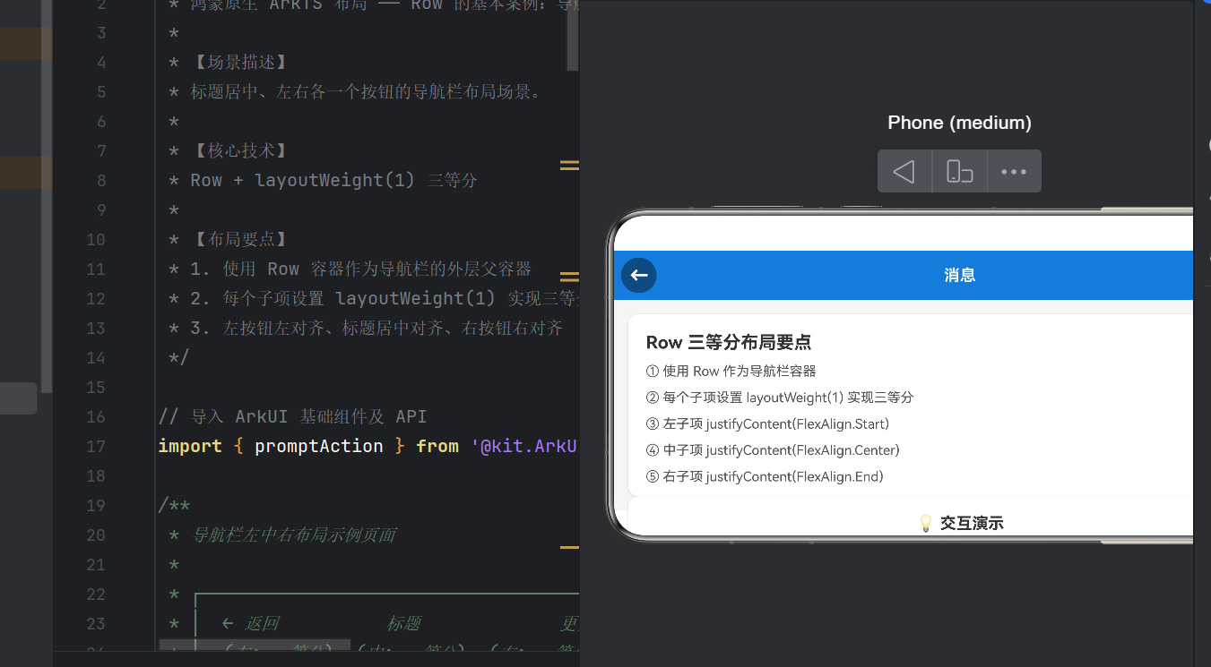
启动后:
- 顶部导航栏 :蓝色背景,左侧
←圆形按钮,中间粗体标题"首页",右侧···圆形按钮 - 主体区域:灰色背景上两张白色圆角卡片,第一张说明布局要点,第二张提供交互按钮
| 操作 | 反馈 |
|---|---|
点击 ← 按钮 |
Toast「点击了返回按钮」 |
点击 ··· 按钮 |
Toast「点击了更多按钮」 |
| 点击「点击我切换标题」 | 标题循环切换(首页→发现→消息→我的),并显示当前标题 |
七、总结与扩展
布局核心公式
Row 三等分 = Row 容器 × 3 × layoutWeight(1) + 不同的 justifyContent常见问题
Q:为什么不直接用 SpaceBetween?
A:SpaceBetween 不保证各区域等宽。标题变长时会挤压两侧。layoutWeight(1) 强制三等分更稳定。
Q:内嵌 Row 是否必需?
A:必需。外层 Row 的 justifyContent 只能统一控制所有子元素,而我们需要对每个区域独立设置不同的对齐方式。
Q:layoutWeight 和 width 能共用吗?
A:不能。设了 layoutWeight 后 width 被忽略。
扩展思路
- 不等分 :
1:2:1权重(左侧 1/4、标题 1/2、右侧 1/4) - 多 Tab 栏:扩展到四等分、五等分
- 搜索框 :中间改为
TextInput - 动效 :配合
animateTo添加标题切换动画
八、写在最后
本文通过导航栏案例,讲解了 Row 组件和 layoutWeight 的核心用法:
Row是横向布局的基础,掌握它等于掌握 ArkUI 布局的一半layoutWeight是实现等分布局的关键 ,比SpaceBetween更可控- 嵌套
Row+ 不同justifyContent实现每个区域的精细控制 - 动手实践是最好的学习方式 ------ 建议修改颜色、尺寸、比例观察变化
HarmonyOS NEXT 的 ArkUI 框架借鉴了 Flutter、SwiftUI 等现代声明式 UI 的优秀思想,同时融合了鸿蒙分布式、多设备适配的原生优势,学习成本低,值得尽早投入。
本文基于 HarmonyOS NEXT API 24,DevEco Studio 5.0 编译通过。