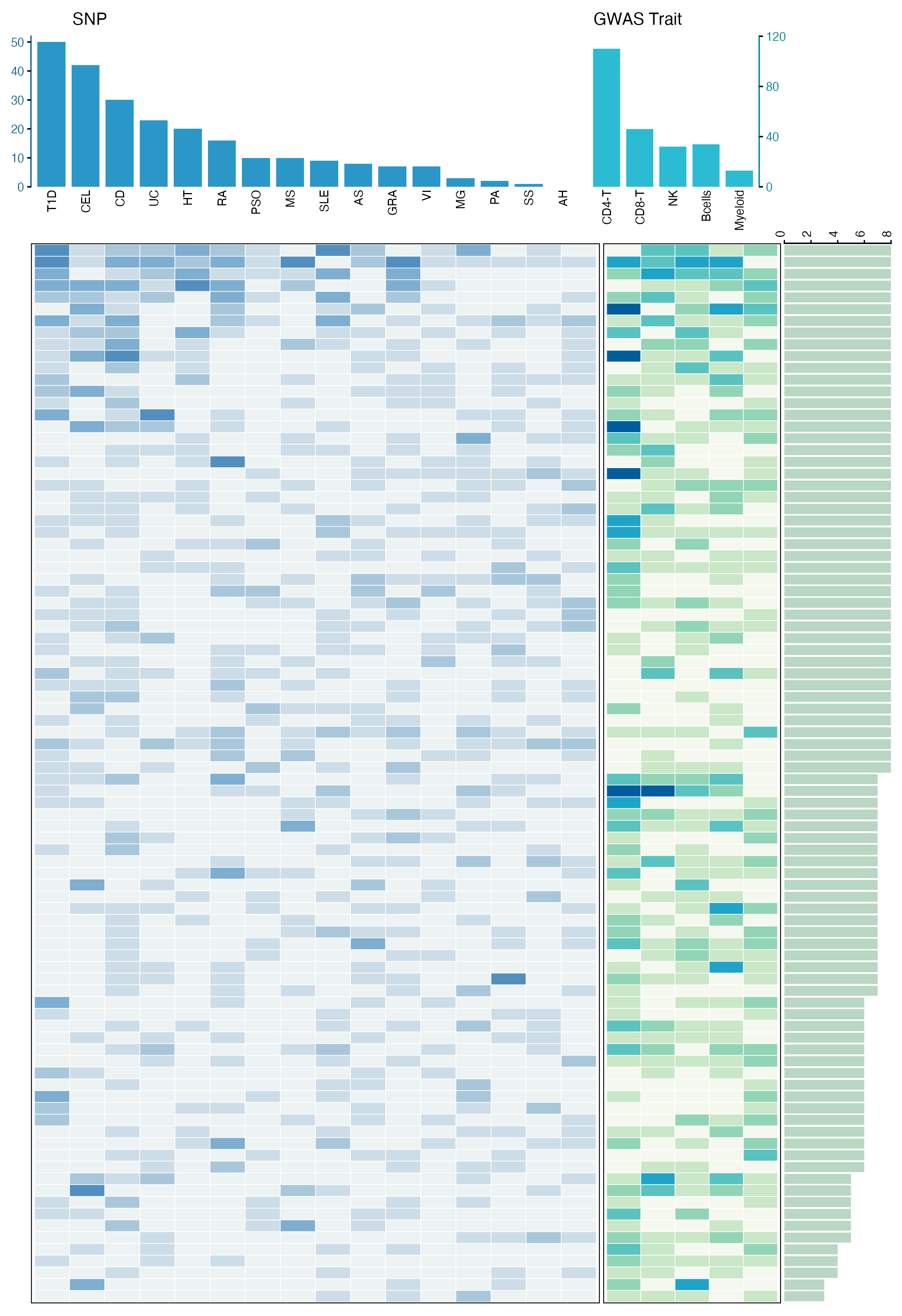
"顶部柱状图 + 主体热图 + 侧边统计条"的复合图,非常适合展示多维关联结果。它可以同时回答三个问题:哪些疾病关联更多,哪些细胞类型关联更多,以及每个 HERV 在不同疾病和细胞类型中的关联分布。
图片来源
| 项目 | 内容 |
|---|---|
| 文章 | Single-cell eQTL mapping of human endogenous retroviruses reveals cell type-specific genetic regulation in autoimmune diseases |
| 期刊/年份 | Nature Communications, 2025 |
| 图号 | Fig. 5c |
这篇文章基于 PBMC 单细胞数据构建 HERV 表达和遗传调控图谱,并进一步结合 GWAS 和 SMR 分析,探索 HERV 与自身免疫疾病之间的遗传关联。Fig. 5c 展示的是 100 个自身免疫疾病相关 HERV 在不同疾病和免疫细胞类型中的关联分布。
图片解读
这是一张典型的 多模块复合热图。
它可以拆成四个部分:
- 顶部左侧柱状图:展示每个自身免疫疾病中显著关联的 SNP 或 HERV 关联数量。
- 左侧主体热图:展示每个 HERV 在不同疾病中的关联计数。
- 中间窄热图:展示每个 HERV 在不同免疫细胞类型中的关联计数。
- 右侧横向柱状图:展示每个 HERV 总共关联到多少个疾病或细胞类型组合。
读图时可以这样理解:
- 顶部柱越高:说明该疾病中检测到的关联越多;
- 热图颜色越深:说明对应 HERV 在该疾病或细胞类型中的关联计数越高;
- 右侧横向条越长:说明该 HERV 具有更广泛的多疾病或多细胞类型关联;
- 左右模块共享同一行顺序,因此每一行都代表同一个 HERV。
这种图的核心不是单个热图,而是把"列统计、行统计和矩阵主体"组合起来,适合展示疾病 × 分子 × 细胞类型这类多维关联结果。
输入数据
这类复合图通常拆成多个输入表来管理,每个表负责一个图层。
| 文件 | 关键列 | 含义 |
|---|---|---|
disease_summary.csv |
disease, snp_count |
顶部左侧疾病柱状图 |
cell_summary.csv |
cell_type, herv_count |
顶部右侧细胞类型柱状图 |
disease_heatmap.csv |
herv_id, disease, count |
左侧疾病-HERV 热图 |
cell_heatmap.csv |
herv_id, cell_type, count |
中间细胞类型-HERV 热图 |
herv_summary.csv |
herv_id, total_count |
右侧每个 HERV 的总关联数 |
数据结构可以理解为:
| herv_id | disease | count |
|---|---|---|
| HERV_001 | T1D | 5 |
| HERV_001 | CEL | 2 |
| HERV_002 | CD | 3 |
以及:
| herv_id | cell_type | count |
|---|---|---|
| HERV_001 | CD4-T | 5 |
| HERV_001 | CD8-T | 2 |
| HERV_002 | NK | 3 |
其中最关键的是 count。它决定热图颜色深浅;顶部和右侧的柱状图则是对疾病、细胞类型或 HERV 维度进行汇总后的结果。
r
library(tidyverse)

disease_summary <- read_csv("disease_summary.csv", show_col_types = FALSE)
cell_summary <- read_csv("cell_summary.csv", show_col_types = FALSE)
disease_heatmap <- read_csv("disease_heatmap.csv", show_col_types = FALSE)
cell_heatmap <- read_csv("cell_heatmap.csv", show_col_types = FALSE)
herv_summary <- read_csv("herv_summary.csv", show_col_types = FALSE)
需要示例数据的后台 添加小编 领取,调整好数据结构,以下代码可以直接复制粘贴运行。
第一步:读取数据并固定显示顺序
复合热图最重要的是对齐。顶部柱状图、主体热图和右侧横向柱状图必须使用同一套疾病顺序、细胞类型顺序和 HERV 顺序。
r
library(tidyverse)
library(patchwork)

disease_summary <- read_csv("disease_summary.csv", show_col_types = FALSE)
cell_summary <- read_csv("cell_summary.csv", show_col_types = FALSE)
disease_heatmap <- read_csv("disease_heatmap.csv", show_col_types = FALSE)
cell_heatmap <- read_csv("cell_heatmap.csv", show_col_types = FALSE)
herv_summary <- read_csv("herv_summary.csv", show_col_types = FALSE)

disease_order <- disease_summary$disease
cell_order <- cell_summary$cell_type

herv_order <- herv_summary |>
  arrange(desc(total_count), herv_id) |>
  pull(herv_id)

disease_summary <- disease_summary |>
  mutate(disease = factor(disease, levels = disease_order))

cell_summary <- cell_summary |>
  mutate(cell_type = factor(cell_type, levels = cell_order))

disease_heatmap <- disease_heatmap |>
  mutate(
    disease = factor(disease, levels = disease_order),
    herv_id = factor(herv_id, levels = rev(herv_order))
  )

cell_heatmap <- cell_heatmap |>
  mutate(
    cell_type = factor(cell_type, levels = cell_order),
    herv_id = factor(herv_id, levels = rev(herv_order))
  )

herv_summary <- herv_summary |>
  mutate(herv_id = factor(herv_id, levels = rev(herv_order)))
这里使用 rev(herv_order),是因为 ggplot2 的 y 轴默认从下往上排列。反转以后,图中从上到下的顺序就会和我们设定的 HERV 顺序一致。
第二步:绘制顶部柱状图
顶部由两个柱状图组成:左侧对应疾病,右侧对应细胞类型。为了复现原图风格,疾病柱状图使用蓝色,细胞类型柱状图使用青色。
r
p_top_disease <- ggplot(disease_summary, aes(disease, snp_count)) +
  geom_col(fill = "#2b97c8", width = 0.82) +
  scale_y_continuous(
    limits = c(0, 52),
    breaks = seq(0, 50, 10),
    expand = c(0, 0)
  ) +
  labs(x = NULL, y = NULL, title = "SNP") +
  theme_classic(base_size = 9) +
  theme(
    plot.title = element_text(hjust = 0.08, size = 10),
    axis.text.x = element_text(
      angle = 90,
      hjust = 1,
      vjust = 0.5,
      color = "black",
      size = 7
    ),
    axis.text.y = element_text(color = "#1b6d8f", size = 7),
    axis.ticks.x = element_blank(),
    axis.line.x = element_blank(),
    axis.line.y = element_line(color = "#1b6d8f", linewidth = 0.4),
    plot.margin = margin(2, 1, 0, 1)
  )

p_top_cell <- ggplot(cell_summary, aes(cell_type, herv_count)) +
  geom_col(fill = "#2bbbd3", width = 0.82) +
  scale_y_continuous(
    limits = c(0, 120),
    breaks = c(0, 40, 80, 120),
    position = "right",
    expand = c(0, 0)
  ) +
  labs(x = NULL, y = NULL, title = "GWAS Trait") +
  theme_classic(base_size = 9) +
  theme(
    plot.title = element_text(hjust = 0.08, size = 10),
    axis.text.x = element_text(
      angle = 90,
      hjust = 1,
      vjust = 0.5,
      color = "black",
      size = 7
    ),
    axis.text.y = element_text(color = "#0b8a9b", size = 7),
    axis.ticks.x = element_blank(),
    axis.line.x = element_blank(),
    axis.line.y = element_line(color = "#0b8a9b", linewidth = 0.4),
    plot.margin = margin(2, 1, 0, 1)
  )

p_top_blank <- ggplot() + theme_void()
这里的 position = "right" 可以把右侧柱状图的 y 轴刻度放到右边,更接近原图。
第三步:绘制疾病-HERV 主体热图
左侧主体热图展示每个 HERV 在不同自身免疫疾病中的关联计数。颜色越深,说明计数越高。
r
p_disease_heat <- ggplot(disease_heatmap, aes(disease, herv_id, fill = count)) +
  geom_tile(color = "white", linewidth = 0.18) +
  scale_fill_gradientn(
    colors = c("#edf2f3", "#b7d0df", "#6ea6cc", "#1f6fa8"),
    limits = c(0, 5),
    breaks = 0:5,
    name = "Count"
  ) +
  labs(x = NULL, y = NULL) +
  theme_minimal(base_size = 8) +
  theme(
    axis.text = element_blank(),
    axis.ticks = element_blank(),
    panel.grid = element_blank(),
    panel.border = element_rect(color = "black", fill = NA, linewidth = 0.5),
    legend.position = "none",
    plot.margin = margin(0, 1, 2, 1)
  )
这里用 geom_tile() 绘制热图,每一个小格子代表一个 HERV × disease 组合。
第四步:绘制细胞类型-HERV 热图和右侧统计条
中间窄热图展示每个 HERV 在不同免疫细胞类型中的关联计数;右侧横向柱状图展示每个 HERV 的总关联数量。
r
p_cell_heat <- ggplot(cell_heatmap, aes(cell_type, herv_id, fill = count)) +
  geom_tile(color = "white", linewidth = 0.18) +
  scale_fill_gradientn(
    colors = c("#f5f8ee", "#bfe3bd", "#6fcbb1", "#21b7d3", "#005d9c"),
    limits = c(0, 5),
    breaks = 0:5,
    name = "Count"
  ) +
  labs(x = NULL, y = NULL) +
  theme_minimal(base_size = 8) +
  theme(
    axis.text = element_blank(),
    axis.ticks = element_blank(),
    panel.grid = element_blank(),
    panel.border = element_rect(color = "black", fill = NA, linewidth = 0.5),
    legend.position = "none",
    plot.margin = margin(0, 1, 2, 1)
  )

p_herv_bar <- ggplot(herv_summary, aes(total_count, herv_id)) +
  geom_col(fill = "#b9d7c2", width = 0.85) +
  scale_x_continuous(
    limits = c(0, 8),
    breaks = c(0, 2, 4, 6, 8),
    position = "top",
    expand = c(0, 0)
  ) +
  labs(x = NULL, y = NULL) +
  theme_classic(base_size = 8) +
  theme(
    axis.text.x = element_text(angle = 90, vjust = 0.5, color = "black", size = 7),
    axis.text.y = element_blank(),
    axis.ticks.y = element_blank(),
    axis.line.y = element_blank(),
    axis.line.x = element_line(color = "black", linewidth = 0.4),
    plot.margin = margin(0, 1, 2, 1)
)这一步的关键是:p_cell_heat 和 p_herv_bar 都使用同一个 herv_id 排序,这样每一行才能严格对齐。
第五步:用 patchwork 拼接所有模块
最后用 patchwork 组合上下两行。上面一行放柱状图,下面一行放热图和右侧统计条。
r
top_row <- p_top_disease + p_top_cell + p_top_blank +
  plot_layout(widths = c(16, 5, 3))

bottom_row <- p_disease_heat + p_cell_heat + p_herv_bar +
  plot_layout(widths = c(16, 5, 3))

fig <- top_row / bottom_row +
  plot_layout(heights = c(1.25, 8.8))

ggsave(
  "herv_disease_composite_heatmap.png",
  fig,
  width = 7.4,
  height = 10.8,
  dpi = 320,
  bg = "white"
)

ggsave(
  "herv_disease_composite_heatmap.pdf",
  fig,
  width = 7.4,
  height = 10.8,
  bg = "white"
)
这里不把论文中的 panel 标号画进结果图。图号只保留在"图片来源"表格中。
完整代码
r
library(tidyverse)
library(patchwork)

disease_summary <- read_csv("disease_summary.csv", show_col_types = FALSE)
cell_summary <- read_csv("cell_summary.csv", show_col_types = FALSE)
disease_heatmap <- read_csv("disease_heatmap.csv", show_col_types = FALSE)
cell_heatmap <- read_csv("cell_heatmap.csv", show_col_types = FALSE)
herv_summary <- read_csv("herv_summary.csv", show_col_types = FALSE)

disease_order <- disease_summary$disease
cell_order <- cell_summary$cell_type

herv_order <- herv_summary |>
  arrange(desc(total_count), herv_id) |>
  pull(herv_id)

disease_summary <- disease_summary |>
  mutate(disease = factor(disease, levels = disease_order))

cell_summary <- cell_summary |>
  mutate(cell_type = factor(cell_type, levels = cell_order))

disease_heatmap <- disease_heatmap |>
  mutate(
    disease = factor(disease, levels = disease_order),
    herv_id = factor(herv_id, levels = rev(herv_order))
  )

cell_heatmap <- cell_heatmap |>
  mutate(
    cell_type = factor(cell_type, levels = cell_order),
    herv_id = factor(herv_id, levels = rev(herv_order))
  )

herv_summary <- herv_summary |>
  mutate(herv_id = factor(herv_id, levels = rev(herv_order)))

p_top_disease <- ggplot(disease_summary, aes(disease, snp_count)) +
  geom_col(fill = "#2b97c8", width = 0.82) +
  scale_y_continuous(
    limits = c(0, 52),
    breaks = seq(0, 50, 10),
    expand = c(0, 0)
  ) +
  labs(x = NULL, y = NULL, title = "SNP") +
  theme_classic(base_size = 9) +
  theme(
    plot.title = element_text(hjust = 0.08, size = 10),
    axis.text.x = element_text(
      angle = 90,
      hjust = 1,
      vjust = 0.5,
      color = "black",
      size = 7
    ),
    axis.text.y = element_text(color = "#1b6d8f", size = 7),
    axis.ticks.x = element_blank(),
    axis.line.x = element_blank(),
    axis.line.y = element_line(color = "#1b6d8f", linewidth = 0.4),
    plot.margin = margin(2, 1, 0, 1)
  )

p_top_cell <- ggplot(cell_summary, aes(cell_type, herv_count)) +
  geom_col(fill = "#2bbbd3", width = 0.82) +
  scale_y_continuous(
    limits = c(0, 120),
    breaks = c(0, 40, 80, 120),
    position = "right",
    expand = c(0, 0)
  ) +
  labs(x = NULL, y = NULL, title = "GWAS Trait") +
  theme_classic(base_size = 9) +
  theme(
    plot.title = element_text(hjust = 0.08, size = 10),
    axis.text.x = element_text(
      angle = 90,
      hjust = 1,
      vjust = 0.5,
      color = "black",
      size = 7
    ),
    axis.text.y = element_text(color = "#0b8a9b", size = 7),
    axis.ticks.x = element_blank(),
    axis.line.x = element_blank(),
    axis.line.y = element_line(color = "#0b8a9b", linewidth = 0.4),
    plot.margin = margin(2, 1, 0, 1)
  )

p_top_blank <- ggplot() + theme_void()

p_disease_heat <- ggplot(disease_heatmap, aes(disease, herv_id, fill = count)) +
  geom_tile(color = "white", linewidth = 0.18) +
  scale_fill_gradientn(
    colors = c("#edf2f3", "#b7d0df", "#6ea6cc", "#1f6fa8"),
    limits = c(0, 5),
    breaks = 0:5,
    name = "Count"
  ) +
  labs(x = NULL, y = NULL) +
  theme_minimal(base_size = 8) +
  theme(
    axis.text = element_blank(),
    axis.ticks = element_blank(),
    panel.grid = element_blank(),
    panel.border = element_rect(color = "black", fill = NA, linewidth = 0.5),
    legend.position = "none",
    plot.margin = margin(0, 1, 2, 1)
  )

p_cell_heat <- ggplot(cell_heatmap, aes(cell_type, herv_id, fill = count)) +
  geom_tile(color = "white", linewidth = 0.18) +
  scale_fill_gradientn(
    colors = c("#f5f8ee", "#bfe3bd", "#6fcbb1", "#21b7d3", "#005d9c"),
    limits = c(0, 5),
    breaks = 0:5,
    name = "Count"
  ) +
  labs(x = NULL, y = NULL) +
  theme_minimal(base_size = 8) +
  theme(
    axis.text = element_blank(),
    axis.ticks = element_blank(),
    panel.grid = element_blank(),
    panel.border = element_rect(color = "black", fill = NA, linewidth = 0.5),
    legend.position = "none",
    plot.margin = margin(0, 1, 2, 1)
  )

p_herv_bar <- ggplot(herv_summary, aes(total_count, herv_id)) +
  geom_col(fill = "#b9d7c2", width = 0.85) +
  scale_x_continuous(
    limits = c(0, 8),
    breaks = c(0, 2, 4, 6, 8),
    position = "top",
    expand = c(0, 0)
  ) +
  labs(x = NULL, y = NULL) +
  theme_classic(base_size = 8) +
  theme(
    axis.text.x = element_text(angle = 90, vjust = 0.5, color = "black", size = 7),
    axis.text.y = element_blank(),
    axis.ticks.y = element_blank(),
    axis.line.y = element_blank(),
    axis.line.x = element_line(color = "black", linewidth = 0.4),
    plot.margin = margin(0, 1, 2, 1)
  )

top_row <- p_top_disease + p_top_cell + p_top_blank +
  plot_layout(widths = c(16, 5, 3))

bottom_row <- p_disease_heat + p_cell_heat + p_herv_bar +
  plot_layout(widths = c(16, 5, 3))

fig <- top_row / bottom_row +
  plot_layout(heights = c(1.25, 8.8))

ggsave(
  "herv_disease_composite_heatmap.png",
  fig,
  width = 7.4,
  height = 10.8,
  dpi = 320,
  bg = "white"
)

ggsave(
  "herv_disease_composite_heatmap.pdf",
  fig,
  width = 7.4,
  height = 10.8,
  bg = "white"
)
复现结果