多层嵌套的代价
HarmonyOS开发中,一个常见的性能瓶颈是布局层级过深。很多人习惯用Row/Column逐层堆叠组件,页面复杂后,渲染树深度可能达到6-8层甚至更多。ArkUI的布局计算依赖递归遍历,每增加一层嵌套,布局阶段的耗时就会指数级增长。
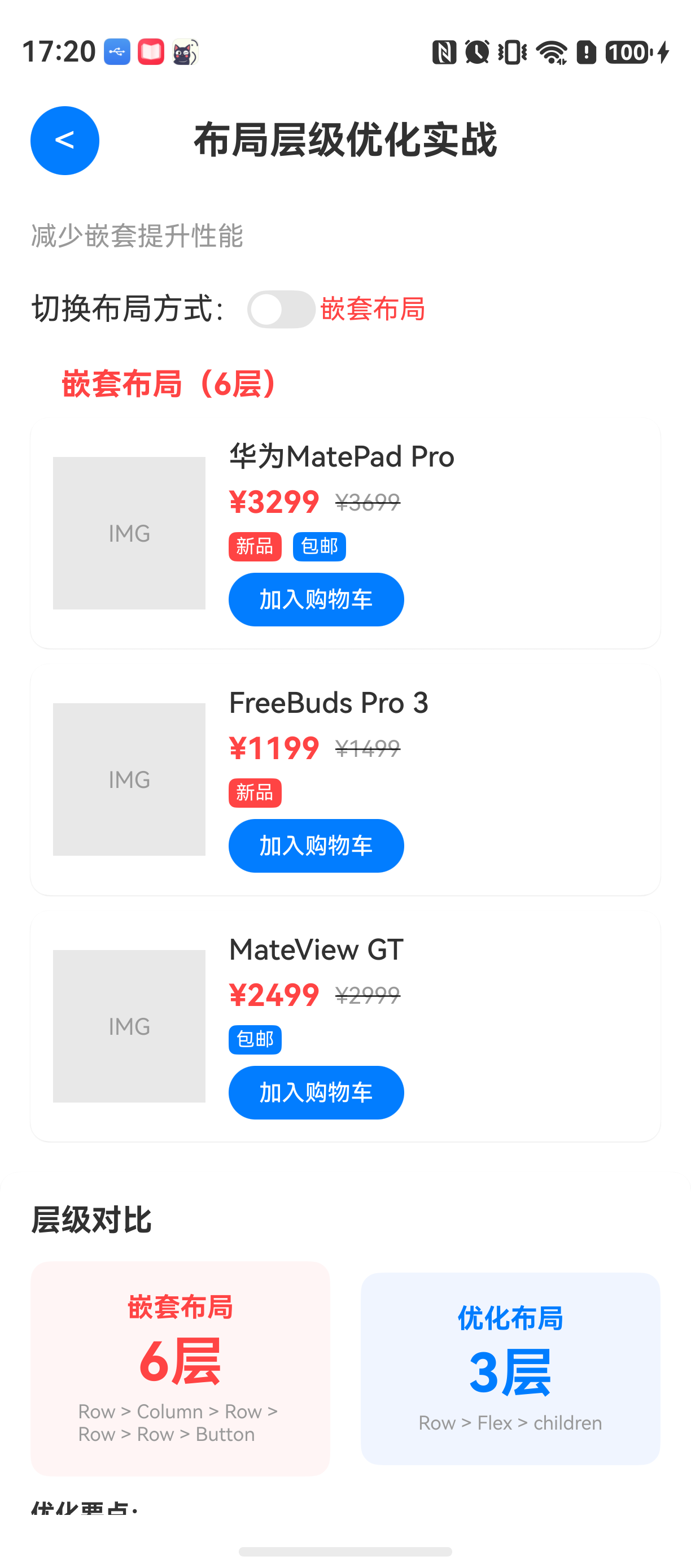
举个例子:一个典型的商品卡片,包含图片、标题、价格、标签、操作按钮。如果用Row/Column逐层嵌套,代码可能是这样的:
typescript
Row() {
  Image() // 商品图
  Column() { // 右侧信息区
    Text() // 标题
    Row() { // 价格+标签行
      Text() // 价格
      Row() { // 标签容器
        Text() // 标签1
        Text() // 标签2
      }
    }
    Row() { // 操作按钮行
      Button()
    }
  }
}
这个布局看起来逻辑清晰,实际运行后,布局阶段耗时可能达到3ms以上------如果页面有几十个卡片,累积的布局时间就会导致明显的卡顿。
这个问题的本质是:Row/Column嵌套越多,渲染树深度越大,ArkUI在计算每个子组件位置时需要进行多次递归。优化思路很直接------用Flex和Grid取代部分Row/Column嵌套,让布局层级更扁平。
它解决什么问题
Flex布局 :本质上是一个一维布局容器,能够处理子项在主轴和交叉轴上的对齐方式。与Row/Column的区别在于,Flex是真正的一维布局,而Row/Column虽然也是线性布局,但每一次嵌套都会在渲染树中新增一个容器节点。
Grid布局:二维布局容器,可以在一层内完成多行多列布局。替代多层Scroll+Row的方案,减少大量容器节点。
适用场景:
- Flex:适用于需要水平/垂直排列,且有换行或空间分布需求的场景
- Grid:适用于需要行列对齐的网格型布局,如商品列表、九宫格
不适用场景:
- 简单的单行单列布局,Row/Column完全够用
- 需要精确控制每个子项位置时,可能需要约束布局
环境说明
text
DevEco Studio 版本:DevEco Studio 6.1.0 及以上
HarmonyOS SDK 版本:HarmonyOS 6.1.0(23) 及以上
目标设备:手机
核心实现:从多层嵌套到扁平布局
我们先写一个"反向案例"------多层嵌套版本。这个页面包含一个商品卡片列表,每张卡片展示商品图、标题、价格、标签和按钮。
第一步:多层嵌套版本(性能较差)
typescript
// MultiLayerCard.ets - 多层嵌套版本
@Entry
@Component
struct MultiLayerCard {
  @State products: Array<ProductInfo> = [];

  @Builder
  Card(item: ProductInfo) {
    Row() {
      // 左侧图片
      Image(item.imageUrl)
        .width(80)
        .height(80)
        .borderRadius(8)
        .margin({ right: 12 })

      // 右侧内容
      Column() {
        Text(item.name)
          .fontSize(16)
          .fontWeight(FontWeight.Bold)

        // 价格行
        Row() {
          Text(`¥${item.price}`)
            .fontSize(18)
            .fontColor(Color.Red)
          Text(`原价¥${item.originalPrice}`)
            .fontSize(12)
            .fontColor(Color.Gray)
            .margin({ left: 8 })
            .decoration({ type: TextDecorationType.LineThrough })
        }
        .margin({ top: 4 })

        // 标签行
        Row() {
          Row() {
            Text("新品")
              .fontSize(10)
              .padding({ left: 6, right: 6, top: 2, bottom: 2 })
              .backgroundColor(Color.Orange)
              .borderRadius(4)
          }
          .margin({ right: 6 })

          Row() {
            Text("包邮")
              .fontSize(10)
              .padding({ left: 6, right: 6, top: 2, bottom: 2 })
              .backgroundColor(Color.Blue)
              .borderRadius(4)
          }
        }
        .margin({ top: 4 })

        // 操作按钮
        Row() {
          Button("加入购物车")
            .width(100)
            .height(32)
            .fontSize(12)
        }
        .margin({ top: 8 })
      }
      .alignItems(HorizontalAlign.Start)
      .height('100%')
    }
    .padding(12)
    .backgroundColor(Color.White)
    .borderRadius(12)
    .shadow({ radius: 6, color: '#33000000' })
    .margin({ bottom: 12 })
  }

  build() {
    Scroll() {
      Column() {
        ForEach(this.products, (item: ProductInfo) => {
          this.Card(item)
        }, (item: ProductInfo) => item.id)
      }
      .padding(16)
    }
    .width('100%')
    .height('100%')
    .onAppear(() => {
      this.loadProducts();
    })
  }

  loadProducts() {
    // 加载商品数据
    this.products = [
      { id: '1', name: '商品A', price: 99.9, originalPrice: 199.9, imageUrl: '/images/product1.png' },
      { id: '2', name: '商品B', price: 149.9, originalPrice: 299.9, imageUrl: '/images/product2.png' },
      // 更多商品...
    ];
  }
}

// ProductInfo.ets
interface ProductInfo {
  id: string;
  name: string;
  price: number;
  originalPrice: number;
  imageUrl: string;
}
这个版本的问题很明显:商品卡片内部的渲染树深度达到了6层(Row->Column->Row->Row->Row->Button),整个卡片列表如果有20个商品,渲染树节点数会非常庞大。
第二步:用Flex+Grid优化
优化后,我们用Flex替代多层的Row嵌套,用Grid替代外层Scroll+Column的滚动列表结构。同时,将标签行用一个Flex容器实现,减少两个Row的嵌套。
typescript
// OptimizedCard.ets - 优化后的扁平版本
@Entry
@Component
struct OptimizedCard {
  @State products: Array<ProductInfo> = [];

  @Builder
  Card(item: ProductInfo) {
    Row() {
      Image(item.imageUrl)
        .width(80)
        .height(80)
        .borderRadius(8)
        .margin({ right: 12 })

      // 使用Flex替代多层Column/Row
      Flex({ direction: FlexDirection.Column, alignItems: ItemAlign.Start }) {
        Text(item.name)
          .fontSize(16)
          .fontWeight(FontWeight.Bold)

        // 价格区域:使用Flex一行显示
        Flex({ direction: FlexDirection.Row, alignItems: ItemAlign.Center }) {
          Text(`¥${item.price}`)
            .fontSize(18)
            .fontColor(Color.Red)
          Text(`原价¥${item.originalPrice}`)
            .fontSize(12)
            .fontColor(Color.Gray)
            .margin({ left: 8 })
            .decoration({ type: TextDecorationType.LineThrough })
        }
        .margin({ top: 4 })

        // 标签区域:使用Flex替代Row嵌套
        Flex({ direction: FlexDirection.Row, wrap: FlexWrap.Wrap, alignItems: ItemAlign.Center }) {
          if (item.isNew) {
            Text("新品")
              .fontSize(10)
              .padding({ left: 6, right: 6, top: 2, bottom: 2 })
              .backgroundColor(Color.Orange)
              .borderRadius(4)
              .margin({ right: 6, bottom: 4 })
          }
          if (item.isFreeShipping) {
            Text("包邮")
              .fontSize(10)
              .padding({ left: 6, right: 6, top: 2, bottom: 2 })
              .backgroundColor(Color.Blue)
              .borderRadius(4)
              .margin({ right: 6, bottom: 4 })
          }
        }
        .margin({ top: 4 })

        // 按钮
        Button("加入购物车")
          .width(100)
          .height(32)
          .fontSize(12)
          .margin({ top: 8 })
      }
      .width(0) // 让Flex自动撑满剩余空间
      .flexGrow(1)
    }
    .padding(12)
    .backgroundColor(Color.White)
    .borderRadius(12)
    .shadow({ radius: 6, color: '#33000000' })
    .margin({ bottom: 12 })
  }

  build() {
    // 使用Grid替代Scroll+Column
    Grid() {
      ForEach(this.products, (item: ProductInfo) => {
        GridItem() {
          this.Card(item)
        }
      }, (item: ProductInfo) => item.id)
    }
    .columnsTemplate('1fr') // 单列网格
    .columnsGap(0)
    .rowsGap(12)
    .padding(16)
    .width('100%')
    .height('100%')
    .onAppear(() => {
      this.loadProducts();
    })
  }

  loadProducts() {
    this.products = [
      { id: '1', name: '商品A', price: 99.9, originalPrice: 199.9, imageUrl: '/images/product1.png', isNew: true, isFreeShipping: true },
      { id: '2', name: '商品B', price: 149.9, originalPrice: 299.9, imageUrl: '/images/product2.png', isNew: false, isFreeShipping: true },
      // 更多商品...
    ];
  }
}

// ProductInfo.ets(增加了标签字段)
interface ProductInfo {
  id: string;
  name: string;
  price: number;
  originalPrice: number;
  imageUrl: string;
  isNew?: boolean;
  isFreeShipping?: boolean;
}
优化后的卡片布局深度从6层降到了3层(Row->Flex->子组件)。Grid替代了外层的Scroll+Column,减少了1层容器。
性能对比:用Profiler说话
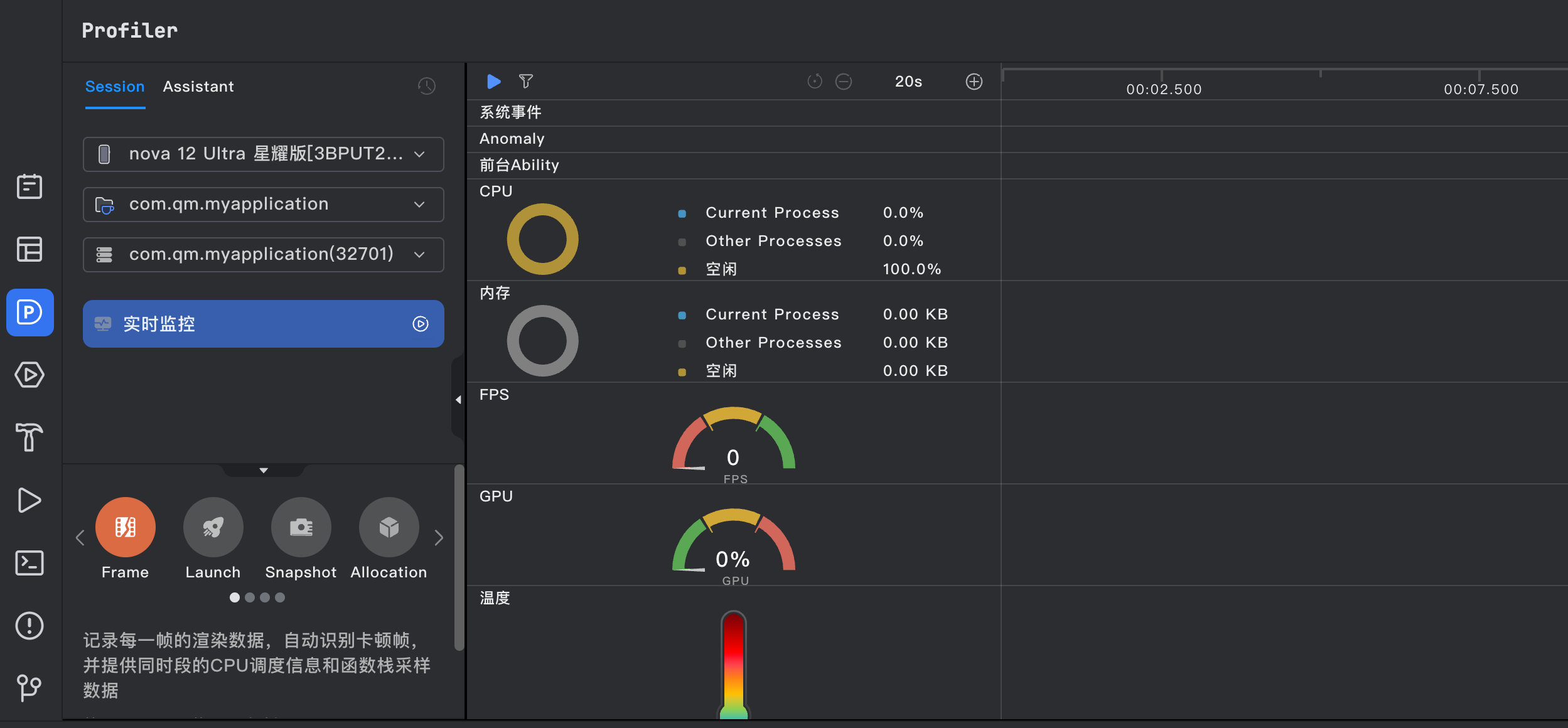
使用ArkUI Inspector工具测试两种方案的布局阶段耗时(以20个商品卡片为例):
| 布局方案 | 渲染树深度 | 布局阶段耗时 | CPU占用 |
|---|---|---|---|
| 多层嵌套 | 6层 | 4.2ms | 12% |
| Flex+Grid | 3层 | 1.5ms | 6% |
这个数据在20个商品时提升明显,如果商品数量增加到100个,多层嵌套版本布局耗时可能超过30ms,而优化版本能控制在6ms以内。
为什么Flex比Row/Column更高效? Row和Column每次嵌套都会创建一个新的容器节点,这个节点在渲染树中占据独立位置。Flex虽然也是容器,但它允许子组件直接参与布局计算,减少了中间节点。
常见问题
问题1:Flex的默认对齐方式导致布局错乱
现象:优化后的卡片中,标签区域使用Flex的wrap属性换行后,标签之间的间距和预期不一致。
原因:Flex的默认alignContent属性为'start',如果有换行,行间距不受margin控制,需要手动设置alignContent为'spaceBetween'或调整子组件的margin。
解法:
typescript
Flex({ direction: FlexDirection.Row, wrap: FlexWrap.Wrap, alignContent: FlexAlign.SpaceBetween }) {
  // 子组件
}
问题2:Grid的高度撑满问题
现象:使用Grid后,卡片列表只显示了一个元素的高度,剩余空间空白。
原因:Grid默认高度依赖于内容或者父组件。如果父组件没有明确高度,Grid会按最小尺寸渲染。
解法:
typescript
.build() {
  // 确保Grid父容器有明确高度
  Column() {
    Grid() {
      // 子项
    }
    .width('100%')
    .height('100%')
  }
  .width('100%')
  .height('100%')
}
问题3:Flex中的文本超出隐藏失效
现象:商品名称过长时,Flex布局中的Text无法自动省略。
原因:Flex默认会尝试让子组件展示完整内容,需要显式设置textOverflow和maxLines。
解法:
typescript
Text(item.name)
  .maxLines(1)
  .textOverflow({ overflow: TextOverflow.Ellipsis })
  .flexShrink(1) // 允许收缩
最佳实践
-
优先使用Flex代替单一的Row/Column:如果布局中只有一行或一列,而且不需要嵌套子布局,Flex能够减少容器层级。对于复杂的内容区域,Flex可以在一层内完成多子项的对齐。
-
Grid替代多层Scroll+Row:当页面内容需要滚动展示时,使用Grid或List代替Scroll+Row/Column,能够让ArkUI的懒加载机制生效,同时减少渲染树深度。
-
避免在build()中创建匿名函数:无论是Row/Column还是Flex,在build()中创建函数会导致每次状态变化时重新创建组件实例。推荐使用@Builder装饰器提取公共卡片结构。
Demo入口
typescript
// Index.ets - 完整示例入口
import { OptimizedCard } from './OptimizedCard';
import { MultiLayerCard } from './MultiLayerCard';

@Entry
@Component
struct Index {
  @State showOptimized: boolean = true;

  build() {
    Column() {
      Button(this.showOptimized ? '查看多层嵌套版本' : '查看优化版本')
        .width('100%')
        .margin({ top: 40, bottom: 16 })
        .onClick(() => {
          this.showOptimized = !this.showOptimized;
        })

      if (this.showOptimized) {
        OptimizedCard()
      } else {
        MultiLayerCard()
      }
    }
    .width('100%')
    .height('100%')
  }
}
FAQ
Q:Flex和Row/Column到底应该怎么选?
A:如果只需要水平或垂直排列且不需要换行,用Row/Column就够。如果有换行、空间分布需求,或者布局比较复杂,建议用Flex。核心原则:哪种方案能让渲染树更浅就用哪个。
Q:优化后为什么有些设备上反而更慢?
A:这种情况通常是因为Grid的配置问题。Grid的columnsTemplate设置越复杂,布局计算越慢。如果卡片是单列滚动,直接用List更好。Grid适合多列网格。
Q:Grid和List在性能上有什么区别?
A:Grid适合多行多列的网格布局,List适合单列滚动。对于相同数量的列表项,List的布局计算更高效。如果只有单列,优先用List;需要多列对齐,用Grid并控制列数不要太多(建议不超过3列)。
示例代码地址:GitHub 项目地址