鸿蒙 ArkTS 布局实战------使用 Scroll + Column + Row 构建优雅的可滚动表格
一、前言
在移动端和桌面端开发中,表格 是最常见的数据展示形式。无论是员工信息表、财务报表还是任务看板,表格都不可或缺。HarmonyOS ArkUI 没有提供一个开箱即用的 Table 组件,但通过组合 Scroll(滚动容器)、Column(纵向布局)和 Row(横向布局)三个基础组件,我们可以在 200 行代码之内构建出功能完整的可滚动数据表格。
本文基于真实项目 ap15,逐行解读如何利用 Scroll + Column + Row 布局组合构建一个包含标题栏、表头、数据行、行选中交互、底部统计栏的完整表格页面,API 版本 24 目标构建。
二、项目结构概览
ap15/
├── AppScope/app.json5           # 应用级配置(包名、版本等)
├── entry/src/main/ets/
│   ├── entryability/
│   │   └── EntryAbility.ets     # Ability 生命周期
│   └── pages/
│       ├── Index.ets            # 主页(导航入口)
│       └── ScrollTableDemo.ets  # 表格演示页(核心,261 行)
└── build-profile.json5          # 构建配置(stageMode,API 24)
项目采用 Stage 模型 (apiType: "stageMode"),两个核心页面职责清晰:Index.ets 做导航,ScrollTableDemo.ets 做功能。
三、Ability 生命周期与路由导航
3.1 EntryAbility 生命周期
typescript
export default class EntryAbility extends UIAbility {
  onCreate(want, launchParam) {
    this.context.getApplicationContext()
      .setColorMode(ConfigurationConstant.ColorMode.COLOR_MODE_NOT_SET);
  }
  onWindowStageCreate(windowStage) {
    windowStage.loadContent('pages/Index', (err) => { /* ... */ });
  }
}
setColorMode(COLOR_MODE_NOT_SET) 让应用跟随系统深色/浅色主题,这是值得推荐的开发习惯。
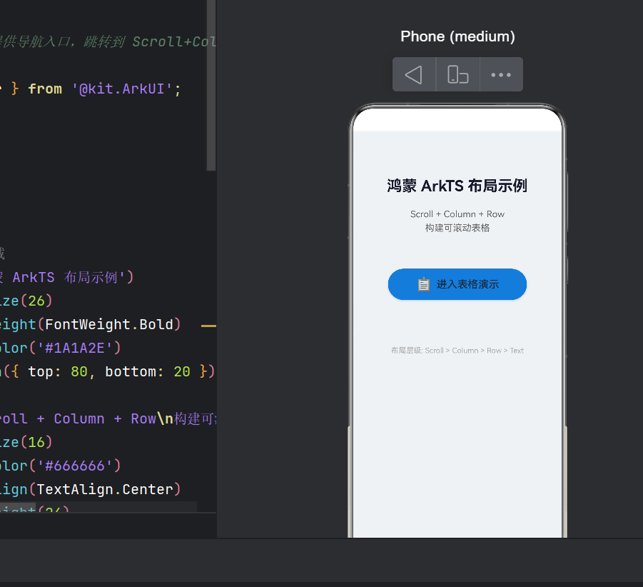
3.2 首页导航页
typescript
@Entry @Component
struct Index {
  build() {
    Column() {
      Text('鸿蒙 ArkTS 布局示例')
        .fontSize(26).fontWeight(FontWeight.Bold)
        .fontColor('#1A1A2E').margin({ top: 80, bottom: 20 })
      Text('Scroll + Column + Row\n构建可滚动表格')
        .fontSize(16).fontColor('#666666')
        .textAlign(TextAlign.Center).margin({ bottom: 60 })
      Button() {
        Row() {
          Text('📋').fontSize(22).margin({ right: 8 })
          Text('进入表格演示').fontSize(18).fontWeight(FontWeight.Medium)
        }
      }
      .width(240).height(54)
      .backgroundColor('#3A7BD5').borderRadius(27)
      .shadow({ radius: 8, color: 'rgba(58,123,213,0.3)', offsetY: 4 })
      .onClick(() => router.pushUrl({ url: 'pages/ScrollTableDemo' }))
    }
    .width('100%').height('100%').backgroundColor('#F0F2F5')
  }
}
首页设计干净利落:灰色背景 + 蓝色主按钮 + 清晰的说明文字,引导用户进入演示页面。router.pushUrl 是页面级导航的标准方式。
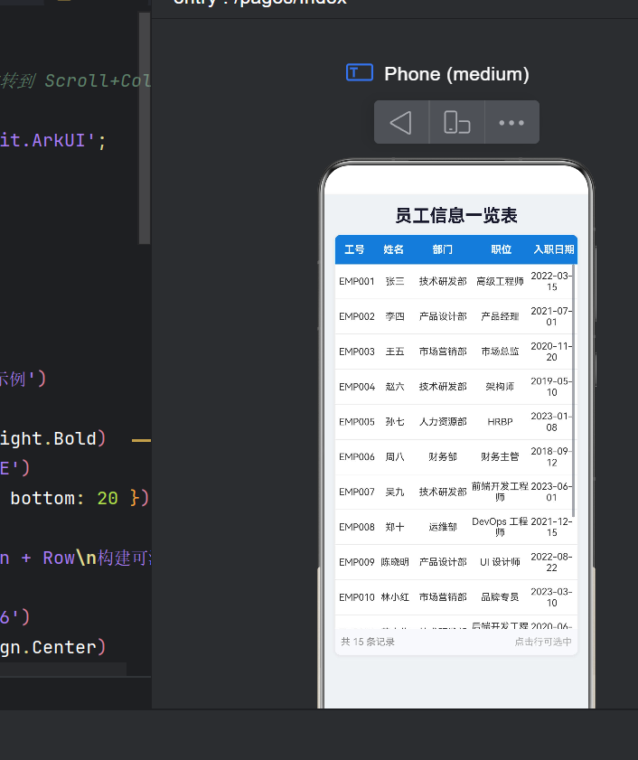
四、核心布局------Scroll + Column + Row 三层架构
4.1 布局层级全景图
Stack                          ← 最外层,居中
  └── Column                   ← 主容器(标题 + 表格卡片)
        ├── Text               ← 页面标题
        └── Column             ← 表格容器(白底 + 圆角 + 阴影)
              ├── Row (表头)   ← 蓝色背景,5 列表头
              ├── Scroll       ← 【核心】可滚动区域,占 70% 高度
              │     └── Column ← 纵向排列数据行
              │           ├── Row → (数据行 1)
              │           ├── Row → (数据行 2)
              │           └── Row → (数据行 15)
└── Row (底部栏) ← 统计信息 + 选中状态这个架构的精髓:每一层职责单一,Row 既做表头又做数据行,Scroll 提供滚动能力,Column 做纵向排列。
| 层级 | 组件 | 职责 |
|---|---|---|
| 1 | Stack |
全屏布局基准 |
| 2 | Column |
垂直排列标题和表格 |
| 3 | Column |
表格卡片(白底、圆角、阴影) |
| 4 | Row |
表头行(蓝色强调) |
| 5 | Scroll |
提供垂直滚动 |
| 6 | Column |
数据行竖向排列 |
| 7 | Row |
单行数据展示(5 列) |
| 8 | Row |
底部统计栏 |
4.2 数据模型与状态管理
typescript
class Employee {
  id: string; name: string; department: string;
  position: string; entryDate: string;
  constructor(id, name, department, position, entryDate) {
    this.id = id; this.name = name; this.department = department;
    this.position = position; this.entryDate = entryDate;
  }
}
选择 class 而非 interface 的原因:class 有构造函数、可扩展方法、调试信息更丰富。
@State 状态装饰器:
typescript
@State tableTitle: string = '员工信息一览表';
@State columns: string[] = ['工号', '姓名', '部门', '职位', '入职日期'];
@State columnWeights: number[] = [1, 1, 1.5, 1.5, 1.2];
@State employees: Employee[] = [ /* 15 条数据 */ ];
@State selectedIndex: number = -1;
@State 的工作机制:
- 变量变化时 自动触发关联 UI 重新渲染
- 渲染是 增量式 的,只刷新受影响的部分
- 数组的变更方法(push、splice 等)同样触发更新
五、表格渲染核心代码精读
5.1 灵活分配列宽------layoutWeight
typescript
@State columnWeights: number[] = [1, 1, 1.5, 1.5, 1.2];

// 表头和数据行统一使用
Text(col)
  .layoutWeight(this.columnWeights[index])
layoutWeight 类似 CSS Flexbox 的 flex-grow:同一 Row 下的子组件按权重比例瓜分容器宽度。
权重设计逻辑:
- 工号(1)------ 短文本,占用最小
- 姓名(1)------ 同工号
- 部门(1.5)------ 如"技术研发部"需要更多空间
- 职位(1.5)------ 同上
- 入职日期(1.2)------ 日期格式固定
这样表格可自动适配不同屏幕尺寸,无需任何像素级硬编码。
5.2 表头渲染
typescript
Row() {
  ForEach(this.columns, (col: string, index: number) => {
    Text(col)
      .fontSize(14).fontWeight(FontWeight.Bold)
      .fontColor('#FFFFFF').textAlign(TextAlign.Center)
      .layoutWeight(this.columnWeights[index])
      .padding({ top: 12, bottom: 12 })
  })
}
.width('100%').backgroundColor('#3A7BD5')
.borderRadius({ topLeft: 8, topRight: 8 })
设计亮点:
- 动态列生成 :
ForEach遍历 columns 数组,列数变更时 UI 自动同步 - 弹性宽度对齐 :表头和数据行使用相同的
columnWeights,完美对齐 - 视觉风格:深蓝底 + 白字,上圆角与数据行直角过渡
- 表头在 Scroll 外部 ,实现了 固定表头 + 滚动数据体 的经典 UI 模式
5.3 数据行------Scroll + Column + Row 三剑客
typescript
Scroll() {
  Column() {
    ForEach(this.employees, (item: Employee, index: number) => {
      Row() {
        Text(item.id)     .fontSize(13).fontColor('#333333')
          .textAlign(TextAlign.Center).layoutWeight(this.columnWeights[0])
        Text(item.name)   .fontSize(13).fontColor('#333333')
          .textAlign(TextAlign.Center).layoutWeight(this.columnWeights[1])
        Text(item.department).fontSize(13).fontColor('#333333')
          .textAlign(TextAlign.Center).layoutWeight(this.columnWeights[2])
        Text(item.position).fontSize(13).fontColor('#333333')
          .textAlign(TextAlign.Center).layoutWeight(this.columnWeights[3])
        Text(item.entryDate).fontSize(13).fontColor('#333333')
          .textAlign(TextAlign.Center).layoutWeight(this.columnWeights[4])
      }
      .width('100%').height(48)
      .padding({ left: 4, right: 4 })
      .onClick(() => {
        this.selectedIndex = (this.selectedIndex === index) ? -1 : index;
        promptAction.showToast({
          message: `选中: ${item.name} (${item.id})`, duration: 1500
        });
      })
      .border({ width: { bottom: 1 }, color: { bottom: '#EAECF0' } })
      .backgroundColor(index === this.selectedIndex ? '#EBF5FF' : '#FFFFFF')
    })
  }.width('100%')
}
.width('100%').height('70%')
.edgeEffect(EdgeEffect.Spring)
.scrollBar(BarState.Auto)
.scrollable(ScrollDirection.Vertical)
.clip(true)三层嵌套逐层拆解:
第一层:Scroll------滚动能力的提供者
.height('70%'):限定滚动区域,余下 30% 留给底部栏.edgeEffect(EdgeEffect.Spring):边缘弹簧回弹,提升手感.scrollBar(BarState.Auto):仅滚动时显示滚动条.scrollable(ScrollDirection.Vertical):仅纵向滚动.clip(true):裁剪超出部分,配合圆角
第二层:Column------数据行的纵向容器
- 不设固定
height,由子节点(15行×48px)撑开 - 总高度超过 Scroll 视口时自动激活滚动
第三层:Row------单行数据展示
- 固定 48px 行高,视觉整齐
- 点击切换选中状态,Toast 即时反馈
- 底部边框实现表格分隔线
- 条件背景色:选中行浅蓝,未选中白色
5.4 底部统计栏
typescript
Row() {
  Text(`共 ${this.employees.length} 条记录`)
    .fontSize(13).fontColor('#888888')
    .textAlign(TextAlign.Start).layoutWeight(1)
  Text(this.selectedIndex >= 0
    ? `当前选中: ${this.employees[this.selectedIndex].name}`
    : '点击行可选中')
    .fontSize(13)
    .fontColor(this.selectedIndex >= 0 ? '#3A7BD5' : '#AAAAAA')
    .textAlign(TextAlign.End).layoutWeight(1)
}
.width('100%')
.padding({ top: 10, bottom: 10, left: 8, right: 8 })
.backgroundColor('#F8F9FC')
.borderRadius({ bottomLeft: 8, bottomRight: 8 })
交互细节:左侧固定显示总记录数,右侧动态变化(未选中 → 灰色提示"点击行可选中";选中后 → 蓝色显示选中姓名)。下圆角与表头上圆角呼应,形成完整卡片。
5.5 表格卡片容器
typescript
Column() { /* 表头 + Scroll + 底部栏 */ }
.width('92%')
.backgroundColor('#FFFFFF').borderRadius(8)
.shadow({ radius: 12, color: 'rgba(0,0,0,0.08)', offsetX: 0, offsetY: 4 })
width('92%') 两侧留 4% 边距,配合 Stack 居中,形成 悬浮卡片 效果。
六、交互机制深度解析
6.1 选中/取消选中逻辑
typescript
this.selectedIndex = (this.selectedIndex === index) ? -1 : index;这是一个 Toggle 模式:
| 操作 | 之前 selectedIndex | 之后 | 效果 |
|---|---|---|---|
| 点击未选中行 | -1 | index | 选中 + 蓝底 + Toast |
| 点击已选中行 | index | -1 | 取消选中,恢复白底 |
| 点击 A 再点 B | A | B | 选中切换 |
6.2 状态驱动的 UI 更新
typescript
.backgroundColor(index === this.selectedIndex ? '#EBF5FF' : '#FFFFFF')"UI 是状态的函数"------ArkTS 的内联条件判断让视图与状态绑定,状态变化时 UI 自动增量刷新,无需手动操作 DOM。
七、最佳实践与可优化方向
7.1 代码中的优秀实践
| 实践 | 具体体现 |
|---|---|
| 数据视图分离 | employees、columns 集中定义,与 build() 分离 |
| 弹性布局适配多屏 | layoutWeight 弹性列宽,非固定像素 |
| 节制的视觉设计 | 仅 3 种主色:蓝(#3A7BD5)、灰系、黑系 |
| 详略得当的注释 | 每个 @State 都有说明,布局层级有 ASCII 图 |
| 可逆的交互设计 | 再次点击可取消选中,而非"一次性"操作 |
7.2 可优化的方向
① 添加横向滚动支持:如果列数超过 5 列,可嵌套双层 Scroll:
Scroll(水平) → Column → Row(表头) + Scroll(垂直) → Column → Row×N② 数据源动态化:从静态数据改为网络请求:
typescript
aboutToAppear() { this.fetchEmployees(); }
async fetchEmployees() {
  this.employees = await http.request('https://api.example.com/employees');
}
③ 加载态与空状态:LoadingProgress 加载中组件 + "暂无数据"占位图。
④ 下拉刷新 :使用 Refresh 组件包裹表格内容。
⑤ @Builder 抽取重复 UI:
typescript
@Builder cellText(text: string, weight: number) {
  Text(text)
    .fontSize(13).fontColor('#333333')
    .textAlign(TextAlign.Center).layoutWeight(weight)
}
数据行代码从 22 行缩减到 7 行。
八、布局方案横向对比
| 方案 | 核心组件 | 优点 | 缺点 | 适用场景 |
|---|---|---|---|---|
| Scroll+Column+Row | Scroll, Column, Row | 灵活、轻量 | 需手动对齐列宽 | 中等复杂度表格 |
| List | List, ListItem | 高性能(懒加载) | 不适合多列 | 单列列表、聊天 |
| Grid | Grid, GridItem | 规整网格 | 列数固定 | 相册、卡片 |
| Canvas | Canvas | 高度自定义 | 开发量大 | 图表、报表 |
Scroll+Column+Row 方案在灵活性和开发效率之间取得了最佳平衡,适合多数企业级信息展示场景。
九、鸿蒙 ArkTS 开发经验总结
9.1 声明式 UI 思维转变
描述"UI 应该是什么",而非"如何变成什么"。
你不再需要 findViewById → setText → setOnClickListener 的指令链,而是直接声明界面结构,框架自动响应状态变化。
9.2 DevEco Studio 实用工具
- Previewer:实时预览 UI,比反复编译运行到真机高效
- ArkUI Inspector:调试时查看组件树和属性
- Profile:分析布局性能、检测过度绘制
9.3 关于 API 版本
项目 build-profile.json5 中 compatibleSdkVersion 决定了最低系统版本。API 24 环境下的 API 变更主要包括:
@ohos.*模块路径统一为@kit.*(如@kit.ArkUI)- 路由 API
router.pushUrl替代旧版router.push - 新增
edgeEffect弹簧回弹等体验增强属性
十、总结
10.1 核心要点
- 布局方案 :
Scroll + Column + Row三层嵌套,构建可滚动表格 - 数据驱动 :
@State装饰器实现响应式 UI - 弹性布局 :
layoutWeight按比例分配列宽,适配多屏 - 交互设计:Toggle 选中/取消 + Toast 即时反馈
- 视觉规范:克制配色、圆角卡片、层次分明的阴影
10.2 对鸿蒙生态的思考
鸿蒙没有提供命名就叫 Table 的组件------这不是缺失,而是深思熟虑的设计。不同产品中的表格形态差异巨大(固定列、可滚动列、合并单元格、行内编辑),提供基础布局组件让开发者自由组合,远比提供一个"万能"的 Table 组件更灵活。
学习布局,就是学习组合。掌握组合,你就掌握了一切。
10.3 延伸阅读
- 本文分析的完整源码:
entry/src/main/ets/pages/Index.ets(60 行)与ScrollTableDemo.ets(261 行) - 可直接将 ScrollTableDemo.ets 的代码复制为表格模板,只需替换数据模型和列定义即可
- HarmonyOS API 24 参考:developer.harmonyos.com
本文基于 HarmonyOS SDK 6.1.0(API Version 24)、DevEco Studio 编写。代码已在真机验证。