【HarmonyOS 6】"人物详情"页面的UI布局拆解
上一篇我们拆了"人物"列表页。这篇来看点击列表项之后进入的------人物详情页。
列表页解决的是"我关心的人有哪些",详情页解决的是"这个人到底怎么样"。信息密度骤然上升:头像、姓名、关系、职称、城市、亲密度、生日、喜好忌讳、关键印象、往来记录......这么多信息怎么排,才能不乱?

一、页面全貌
详情页的结构从上到下分为六个区块:
Stack
 ├─ Column
 │   ├─ 顶栏(返回 + 编辑/删除)
 │   └─ Scroll
 │       └─ Column({ space: 24 })
 │           ├─ 头部区(头像 + 姓名/关系/标签)
 │           ├─ 三指标卡(城市 / 亲密度 / 生日)
 │           ├─ 喜好与忌讳
 │           ├─ 关键印象
 │           └─ 往来记录
 └─ FAB(+ 记录往来)
对应代码骨架:
typescript
build() {
  Stack({ alignContent: Alignment.BottomEnd }) {
    Column() {
      Row() { 返回  编辑  删除 }       // 顶栏
      Scroll() {
        Column({ space: 24 }) {
          头像 + 姓名 + 标签
          Flex({ wrap: FlexWrap.Wrap }) { 城市卡  亲密度卡  生日卡 }
          喜好与忌讳
          关键印象
          往来记录
        }
      }
    }
    Button('+ 记录往来')                // FAB
    if (this.showAddRecordPanel) { 新增面板 }
  }
}
整体用 Stack 包裹,主内容在底层,FAB 悬浮在右下角,新增往来记录面板是覆盖层。三层叠加,互不干扰。
二、顶栏:返回 + 编辑/删除
typescript
Row() {
  Stack() {
    Path()
      .commands('M16 8 L6 18 L16 28')
      .strokeWidth(3)
      .stroke(Theme.getTextPrimary(this.currentMode))
      .fill(Color.Transparent)
      .strokeLineCap(LineCapStyle.Round)
      .strokeLineJoin(LineJoinStyle.Round)
  }
  .width(32)
  .height(32)
  .onClick(() => {
    if (this.isEditMode) {
      this.showSaveConfirmDialog();
    } else {
      if (this.onBack) this.onBack();
    }
  })

  Blank()

  Row({ space: 12 }) {
    Text(this.isEditMode ? '完成' : '编辑')
      .fontSize(15)
      .fontWeight(FontWeight.Medium)
      .fontColor(Theme.primary)
      .padding({ left: 16, right: 16, top: 6, bottom: 6 })
      .backgroundColor(Theme.getPrimarySoft(this.currentMode))
      .borderRadius(14)
      .onClick(...)

    if (!this.isEditMode) {
      Text('删除')
        .fontSize(15)
        .fontWeight(FontWeight.Medium)
        .fontColor('#FA5151')
        .padding({ left: 16, right: 16, top: 6, bottom: 6 })
        .backgroundColor(this.currentMode === ConfigurationConstant.ColorMode.COLOR_MODE_DARK ? '#33FA5151' : '#1AFA5151')
        .borderRadius(14)
        .onClick(...)
    }
  }
}
.width('100%')
.padding({ left: 12, right: 20, top: 12, bottom: 12 })
.backgroundColor(Theme.getBackground(this.currentMode))
2.1 返回箭头:用 Path 绘制
typescript
Path()
  .commands('M16 8 L6 18 L16 28')
  .strokeWidth(3)
  .stroke(Theme.getTextPrimary(this.currentMode))
  .fill(Color.Transparent)
  .strokeLineCap(LineCapStyle.Round)
  .strokeLineJoin(LineJoinStyle.Round)
返回按钮没有用图片或 Text('<'),而是用 Path 画了一个 < 形状的箭头。SVG 路径 M16 8 L6 18 L16 28 表示:移动到 (16,8),画线到 (6,18),再画线到 (16,28)------就是一个标准的左箭头。
strokeLineCap(LineCapStyle.Round) 和 strokeLineJoin(LineJoinStyle.Round) 让线条两端和拐角都是圆的,比直角更柔和。
2.2 编辑态切换
typescript
Text(this.isEditMode ? '完成' : '编辑')正常模式显示"编辑",编辑模式显示"完成"。同一块区域,两种状态,省空间。
编辑模式下,"删除"按钮会隐藏------防止用户在编辑时误删。
2.3 删除按钮:鸿蒙警告红
typescript
.fontColor('#FA5151')
.backgroundColor(this.currentMode === ConfigurationConstant.ColorMode.COLOR_MODE_DARK ? '#33FA5151' : '#1AFA5151')
#FA5151 是鸿蒙设计规范中的警告红。背景色是警告红的低透明度版本:亮色模式 #1AFA5151(约 10% 不透明度),暗色模式 #33FA5151(约 20% 不透明度)。深底浅字 + 浅底,和"编辑"按钮的浅底深字风格呼应,但颜色不同(蓝 vs 红),用户一眼就能区分"安全操作"和"危险操作"。
2.4 返回时的未保存提醒
typescript
.onClick(() => {
  if (this.isEditMode) {
    this.showSaveConfirmDialog();
  } else {
    if (this.onBack) this.onBack();
  }
})
如果在编辑模式下点返回,不会直接退出,而是弹出确认对话框。这是防止用户丢失修改的标准做法。
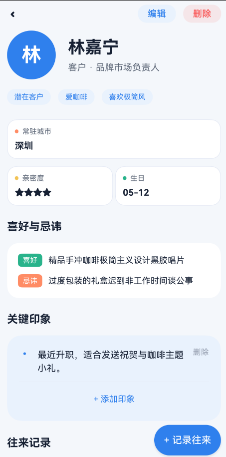
三、头部区:80×80 头像 + 姓名/关系/标签
typescript
Column({ space: 16 }) {
  Row({ space: 20 }) {
    // 头像
    Column() {
      Text(this.contact.name.substring(0, 1))
        .fontSize(32)
        .fontWeight(FontWeight.Bold)
        .fontColor('#FFFFFF')
    }
    .width(80)
    .height(80)
    .backgroundColor(Theme.primary)
    .borderRadius(40)
    .justifyContent(FlexAlign.Center)

    // 右侧信息
    Column({ space: 8 }) { ... }
    .alignItems(HorizontalAlign.Start)
    .layoutWeight(1)
  }
  .width('100%')

  // 标签行
  Row({ space: 12 }) { ... }
  .width('100%')
}
.width('100%')
.padding({ left: 20, right: 20 })
3.1 头像:80×80 正圆
typescript
.width(80)
.height(80)
.borderRadius(40)
这是整个 App 里最大的头像。列表页是 44×44 圆角方块,首页优先人物是 52×52 正圆,详情页直接拉到 80×80。因为详情页的头像是页面的视觉锚点,用户进入详情页的第一眼就应该看到"这个人是谁"。
32 号字的首字名,在 80vp 的蓝色圆形中非常醒目。
3.2 编辑模式下的姓名输入
正常模式和编辑模式下,右侧信息区的布局完全不同:
正常模式:
typescript
Text(this.contact.name)
  .fontSize(28)
  .fontWeight(FontWeight.Bold)
  .fontColor(Theme.getTextPrimary(this.currentMode))
Text(this.contact.relation + (this.contact.title ? ' · ' + this.contact.title : ''))
  .fontSize(15)
  .fontColor(Theme.getTextSecondary(this.currentMode))
姓名 28 号加粗,关系和职称用中圆点 · 拼接,15 号灰色。
编辑模式:
typescript
Column({ space: 4 }) {
  Text('姓名').fontSize(11).fontColor(Theme.getTextSecondary(this.currentMode))
  TextInput({ text: $$this.contact.name, placeholder: '姓名' })
    .fontSize(16).fontWeight(FontWeight.Bold).height(36).padding({ left: 10, right: 10 })
    .backgroundColor(Theme.getSurface(this.currentMode))
    .border({ width: 1, color: Theme.getBorder(this.currentMode), radius: 8 })
}
Row({ space: 8 }) {
  Column({ space: 4 }) {
    Text('关系').fontSize(11)...
    TextInput({ text: $$this.contact.relation, placeholder: '如:朋友、客户' })...
  }.layoutWeight(1)
  Column({ space: 4 }) {
    Text('头衔').fontSize(11)...
    TextInput({ text: $$this.contact.title, placeholder: '如:总监、行业专家' })...
  }.layoutWeight(1)
}
编辑模式下,每个字段上方都有 11 号的灰色标签("姓名"、"关系"、"头衔"),下方是带描边的输入框。关系和头衔用 Row({ space: 8 }) 并排,各占 layoutWeight(1)。
3.3 $$ 双向绑定
typescript
TextInput({ text: $$this.contact.name, placeholder: '姓名' })$$ 是鸿蒙的双向绑定语法。输入框的值和 this.contact.name 实时同步,不需要在 onChange 里手动赋值。这比写 onChange((val) => { this.contact.name = val }) 更简洁。
3.4 标签行:编辑 vs 展示
正常模式------药丸标签:
typescript
if (this.contact.tags && this.contact.tags.length > 0) {
  ForEach(this.contact.tags, (tag: string) => {
    Text(tag)
      .fontSize(12)
      .fontColor(Theme.primary)
      .padding({ left: 12, right: 12, top: 6, bottom: 6 })
      .backgroundColor(Theme.getPrimarySoft(this.currentMode))
      .borderRadius(14)
  })
}
标签用浅底深字药丸,和"首页"优先人物卡片的描边药丸不同。浅底药丸更轻,适合标签数量较多的场景。
编辑模式------空格分隔输入:
typescript
TextInput({ text: $$this.draftTags, placeholder: '如:重要客户 健身达人' })编辑时所有标签合并成一个输入框,用空格分隔。比给每个标签单独做输入框简单得多,也避免了"怎么删除标签"的交互问题。
四、三指标卡:城市 / 亲密度 / 生日
三个卡片用 Flex 排列:
typescript
Flex({ wrap: FlexWrap.Wrap, justifyContent: FlexAlign.SpaceBetween }) {
  this.buildCityCard()       // 全宽
  this.buildIntimacyCard()   // 半宽
  this.buildBirthdayCard()   // 半宽
}
.width('100%')
.padding({ left: 20, right: 20 })
4.1 布局:1 + 2 排列
┌──────────────────────────────────┐
│  常驻城市:深圳                    │
└──────────────────────────────────┘
┌────────────────┐ ┌────────────────┐
│  亲密度:★★★★☆  │ │  生日:05-12   │
└────────────────┘ └────────────────┘城市卡是全宽,margin({ bottom: 12 }) 和下方两张卡分开。亲密度卡和生日卡各占 calc(50% - 6px),中间留 12vp 的间距。
4.2 为什么城市卡用全宽
typescript
// 城市卡
.width('100%')

// 亲密度卡、生日卡
.width('calc(50% - 6px)')
城市名可能比较长("哈尔滨"、"乌鲁木齐"),全宽避免文字截断。而亲密度和生日的内容都很短,半宽就够了。
4.3 每张卡都有彩色圆点标识
typescript
// 城市卡
Column().width(6).height(6).borderRadius(3).backgroundColor(Theme.accent)     // 橙

// 亲密度卡
Column().width(6).height(6).borderRadius(3).backgroundColor(Theme.warning)   // 黄

// 生日卡
Column().width(6).height(6).borderRadius(3).backgroundColor(Theme.success)   // 绿
6×6 的圆形小点,放在标签文字左侧,用不同颜色区分:
| 卡片 | 圆点色 | 色值 |
|---|---|---|
| 常驻城市 | Theme.accent |
#FF8C66 橙 |
| 亲密度 | Theme.warning |
#FFAA00 黄 |
| 生日 | Theme.success |
#27B38A 绿 |
和"首页"三指标行的语义色一脉相承------不同颜色代表不同含义。
4.4 描边卡片
typescript
.border({ width: 1, color: Theme.getBorder(this.currentMode) })三张指标卡用的是描边风格,不是阴影风格。因为这三张卡紧挨在一起,如果都用阴影,相邻的阴影会"打架"------描边更轻薄,适合密集排列的场景。
4.5 亲密度卡:星标 vs Rating
正常模式:
typescript
Text(this.contact.intimacy > 0 ? '★'.repeat(this.contact.intimacy) : '+评定星级')
  .fontSize(15).fontWeight(FontWeight.Bold)
  .fontColor(this.contact.intimacy > 0 ? Theme.getTextPrimary(this.currentMode) : Theme.primary)
用 ★ 字符重复显示星级,简单直接。如果还没评定(intimacy === 0),显示"+评定星级"作为引导操作,颜色用 Theme.primary 蓝色暗示可点击。
编辑模式:
typescript
Rating({ rating: this.contact.intimacy, indicator: false })
  .stars(5).stepSize(1).height(24).width(120)
  .onChange((v) => { this.contact.intimacy = v; })
编辑时切换为鸿蒙官方 Rating 组件,支持滑动评分,indicator: false 表示可交互。
4.6 空值引导:点击自动进入编辑
typescript
.onClick(() => {
  if (!this.isEditMode && !this.contact.city) {
    this.isEditMode = true;
  }
})
城市为空时,文字显示"+添加城市",颜色用蓝色。点击后自动进入编辑模式,用户不需要先点顶栏的"编辑"再找城市输入框------一个点击就能开始编辑。
五、喜好与忌讳:双行偏好卡片
typescript
Column({ space: 16 }) {
  this.buildDetailSectionTitle('喜好与忌讳')
  Column({ space: 12 }) {
    if (this.isEditMode) {
      // 编辑模式:两个 TextInput
    } else {
      if (this.contact.likes && this.contact.likes.length > 0) {
        this.buildPreferenceRow('喜好', this.getPreferenceText(this.contact.likes), Theme.success)
      }
      if (this.contact.dislikes && this.contact.dislikes.length > 0) {
        this.buildPreferenceRow('忌讳', this.getPreferenceText(this.contact.dislikes), Theme.accent)
      }
      if (都没有) {
        Text('暂无记录,建议在互动中观察补充')
      }
    }
  }
  .width('100%')
  .padding(18)
  .backgroundColor(Theme.getSurface(this.currentMode))
  .borderRadius(20)
}
5.1 buildPreferenceRow:标签 + 文字
typescript
@Builder
private buildPreferenceRow(label: string, content: string, color: string) {
  Row({ space: 10 }) {
    Text(label)
      .fontSize(12)
      .fontColor('#FFFFFF')
      .padding({ left: 8, right: 8, top: 4, bottom: 4 })
      .backgroundColor(color)
      .borderRadius(6)
    Text(content)
      .fontSize(14)
      .fontColor(Theme.getTextPrimary(this.currentMode))
      .layoutWeight(1)
      .lineHeight(20)
  }
  .width('100%')
  .alignItems(VerticalAlign.Top)
}[喜好] 精品手冲咖啡极简主义设计黑胶唱片
[忌讳] 过度包装的礼盒迟到非工作时间谈公事"喜好"和"忌讳"的标签是深底白字------和头部区的浅底深字药丸正好相反。因为这里的标签是行内标识,需要比内容文字更醒目,深底才能跳出来。
喜好用 Theme.success(绿),忌讳用 Theme.accent(橙)。绿色=正向,橙色=注意,语义清晰。
5.2 alignItems(VerticalAlign.Top)
typescript
.alignItems(VerticalAlign.Top)标签和内容文字顶部对齐。如果内容是多行文字,标签会贴着第一行顶部,而不是垂直居中------这样阅读时视线更自然。
六、关键印象:浅底卡片 + 内联新增
typescript
Column({ space: 16 }) {
  this.buildDetailSectionTitle('关键印象')
  Column({ space: 12 }) {
    // 印象列表
    ForEach(this.contact.memories, (memory: string, index: number) => {
      Row({ space: 12 }) {
        Text('•')
          .fontSize(18)
          .fontColor(Theme.primary)
        Text(memory)
          .fontSize(15)
          .fontColor(Theme.getTextPrimary(this.currentMode))
          .layoutWeight(1)
          .lineHeight(22)
        Text('删除')
          .fontSize(13)
          .fontColor(Theme.getTextMuted(this.currentMode))
          .onClick(() => { this.deleteMemory(index); })
      }
      .width('100%')
      .alignItems(VerticalAlign.Top)
    })

    Divider().color(Theme.getBorder(this.currentMode)).strokeWidth(0.5)

    // 新增区域
    if (this.isAddingMemory) {
      Row({ space: 10 }) {
        TextInput({ placeholder: '输入新的关键印象', text: this.newMemoryText })
          .layoutWeight(1).height(40).fontSize(14)
          .backgroundColor(Theme.getBackground(this.currentMode))
          .onChange((val) => this.newMemoryText = val)
        Button('保存').height(40).fontSize(14).backgroundColor(Theme.primary)
        Button('取消').height(40).fontSize(14)
          .backgroundColor(Color.Transparent)
          .fontColor(Theme.getTextSecondary(this.currentMode))
      }
    } else {
      Row() {
        Text('+ 添加印象')
          .fontSize(14)
          .fontColor(Theme.primary)
          .padding({ top: 8, bottom: 8 })
          .onClick(() => { this.isAddingMemory = true; })
      }
      .width('100%')
      .justifyContent(FlexAlign.Center)
    }
  }
  .width('100%')
  .padding(20)
  .backgroundColor(Theme.getPrimarySoft(this.currentMode))
  .borderRadius(24)
}
6.1 浅底背景:PrimarySoft
typescript
.backgroundColor(Theme.getPrimarySoft(this.currentMode))关键印象区块用的是 PrimarySoft(亮色模式 #EAF2FD,淡蓝色),而不是其他区块的 Surface(白色)。这个微妙的色差让"关键印象"从页面中"浮"出来------因为这是用户最需要关注的信息。
6.2 圆点列表
typescript
Text('•')
  .fontSize(18)
  .fontColor(Theme.primary)
每条印象前面有一个蓝色圆点 •,18 号字。比用数字序号更轻量,也比用图标更简洁。
6.3 "删除"用灰色而非红色
typescript
Text('删除')
  .fontSize(13)
  .fontColor(Theme.getTextMuted(this.currentMode))
印象的删除用的是灰色 textMuted,而不是顶栏删除按钮的警告红 #FA5151。因为删除印象是"小操作"(删了一条还能再加),而删除人物是"大操作"(不可逆)。颜色深浅暗示了操作的危险程度。
6.4 内联新增:不弹面板,就地展开
typescript
if (this.isAddingMemory) {
  Row({ space: 10 }) {
    TextInput(...)     // 输入框
    Button('保存')     // 保存按钮
    Button('取消')     // 取消按钮
  }
} else {
  Text('+ 添加印象')  // 收起状态
}
点击"+ 添加印象"后,输入框就地展开------不需要弹窗、不需要跳转。这种"内联新增"的模式,在印象这种轻量级内容上比弹面板更高效。用户写完一条,保存后继续写下一条,手不需要离开这个区域。
6.5 取消按钮:透明背景
typescript
Button('取消')
  .height(40)
  .fontSize(14)
  .backgroundColor(Color.Transparent)
  .fontColor(Theme.getTextSecondary(this.currentMode))
取消按钮的背景是透明的,只有文字,视觉上退到"保存"按钮后面。这也是一种暗示------"保存"是主操作,"取消"是次要操作。
七、往来记录:时间轴式列表
typescript
Column({ space: 16 }) {
  Row() {
    Text('往来记录')
      .fontSize(18)
      .fontWeight(FontWeight.Bold)
      .fontColor(Theme.getTextPrimary(this.currentMode))
      .layoutWeight(1)
    Text('新增')
      .fontSize(13)
      .fontColor(Theme.primary)
      .padding({ left: 10, right: 10, top: 5, bottom: 5 })
      .backgroundColor(Theme.getPrimarySoft(this.currentMode))
      .borderRadius(12)
      .onClick(() => { this.showAddRecordPanel = true; })
  }

  Column({ space: 0 }) {
    ForEach(this.contact.interactions, (record: InteractionRecord, index: number) => {
      this.buildInteractionItem(record, index === this.contact.interactions.length - 1)
    })
  }
  .width('100%')
  .backgroundColor(Theme.getSurface(this.currentMode))
  .borderRadius(24)
}
.width('100%')
.padding({ left: 20, right: 20, bottom: 110 })
7.1 "新增"做成药丸按钮
typescript
Text('新增')
  .fontSize(13)
  .fontColor(Theme.primary)
  .padding({ left: 10, right: 10, top: 5, bottom: 5 })
  .backgroundColor(Theme.getPrimarySoft(this.currentMode))
  .borderRadius(12)
和顶栏的"编辑"按钮风格一致------浅底深字药丸。在标题行里放操作按钮,是详情页常见的设计模式。用户不需要滚到页面底部,在标题行就能新增记录。
八、往来记录项:时间轴布局
这是详情页信息密度最高的组件:
┌──────────────────────────────────────────┐
│  03/03    [深度交流]              ¥260   │
│  2026     升职祝贺                       │
│           恭喜她升任 brand manager...     │
│           反馈:很喜欢那款冷萃壶          │
├──────────────────────────────────────────┤
│  02/15    [聚餐/宴请]                    │
│  2026     春节后午餐                     │
│           在万象天地吃了简餐...           │
└──────────────────────────────────────────┘
typescript
@Builder
private buildInteractionItem(record: InteractionRecord, isLast: boolean) {
  Column() {
    Row({ space: 14 }) {
      // 左侧:日期
      Column({ space: 4 }) {
        Text(record.date.split('-')[1] + '/' + record.date.split('-')[2])
          .fontSize(13)
          .fontWeight(FontWeight.Bold)
          .fontColor(Theme.getTextPrimary(this.currentMode))
        Text(record.date.split('-')[0])
          .fontSize(10)
          .fontColor(Theme.getTextMuted(this.currentMode))
      }
      .width(40)

      // 右侧:内容
      Column({ space: 8 }) {
        Row() {
          Text(this.getInteractionTypeText(record.type))
            .fontSize(11)
            .fontColor(Theme.primary)
            .padding({ left: 6, right: 6, top: 2, bottom: 2 })
            .border({ width: 1, color: Theme.primary })
            .borderRadius(6)
          Blank()
          if (record.amount) {
            Text('¥' + record.amount)
              .fontSize(14)
              .fontWeight(FontWeight.Bold)
              .fontColor(Theme.accent)
          }
        }
        .width('100%')

        Text(record.title)
          .fontSize(16)
          .fontWeight(FontWeight.Bold)
          .fontColor(Theme.getTextPrimary(this.currentMode))
        Text(record.content)
          .fontSize(14)
          .fontColor(Theme.getTextSecondary(this.currentMode))
          .lineHeight(20)

        if (record.feedback) {
          Text('反馈:' + record.feedback)
            .fontSize(13)
            .fontColor(Theme.success)
            .fontStyle(FontStyle.Italic)
        }
      }
      .layoutWeight(1)
      .alignItems(HorizontalAlign.Start)
    }
    .width('100%')
    .padding(20)

    if (!isLast) {
      Divider().color(Theme.getBorder(this.currentMode)).strokeWidth(0.5).margin({ left: 74, right: 20 })
    }
  }
}
8.1 左侧日期:月/日 + 年
typescript
Text(record.date.split('-')[1] + '/' + record.date.split('-')[2])  // "03/03"
  .fontSize(13)
  .fontWeight(FontWeight.Bold)
Text(record.date.split('-')[0])                                     // "2026"
  .fontSize(10)
日期格式从 "2026-03-03" 拆成两行:月/日是 13 号加粗(用户最关心的),年是 10 号灰色(辅助信息)。40vp 的宽度刚好够放下 "03/03"。
8.2 互动类型:描边标签
typescript
Text(this.getInteractionTypeText(record.type))
  .fontSize(11)
  .fontColor(Theme.primary)
  .padding({ left: 6, right: 6, top: 2, bottom: 2 })
  .border({ width: 1, color: Theme.primary })
  .borderRadius(6)
互动类型用描边标签,和"首页"优先人物卡片的里程碑标签风格一致。五种类型对应五种文字:
typescript
private getInteractionTypeText(type: string): string {
  const map: Record<string, string> = {
    'gift': '送礼/收礼',
    'meal': '聚餐/宴请',
    'help': '帮忙/托付',
    'visit': '拜访/见面',
    'chat': '深度交流'
  };
  return map[type] || '其他';
}
8.3 金额:橙色加粗
typescript
Text('¥' + record.amount)
  .fontSize(14)
  .fontWeight(FontWeight.Bold)
  .fontColor(Theme.accent)
金额用 Theme.accent(#FF8C66 橙色),和"首页"三指标行的"待问候"同色。橙色在视觉上暗示"需要注意的数字"。
8.4 反馈:绿色斜体
typescript
Text('反馈:' + record.feedback)
  .fontSize(13)
  .fontColor(Theme.success)
  .fontStyle(FontStyle.Italic)
反馈用 Theme.success(#27B38A 绿色)+ 斜体。绿色=正向反馈,斜体=引用语气------"对方说了这样的话"。这是整页唯一使用斜体的地方,视觉上很容易识别。
8.5 Divider 左侧缩进 74vp
typescript
Divider().color(Theme.getBorder(this.currentMode)).strokeWidth(0.5).margin({ left: 74, right: 20 })和"人物"列表页的缩进逻辑一样:左侧 padding 20 + 日期宽度 40 + 间距 14 = 74。分隔线和内容左对齐,不和日期左对齐。
九、FAB:右下角悬浮按钮
typescript
Button('+ 记录往来')
  .height(50)
  .fontSize(16)
  .fontWeight(FontWeight.Medium)
  .fontColor('#FFFFFF')
  .backgroundColor(Theme.primary)
  .borderRadius(25)
  .margin({ right: 20, bottom: 24 })
  .shadow({ radius: 12, color: Theme.getShadow(this.currentMode), offsetX: 0, offsetY: 6 })
  .onClick(() => { this.showAddRecordPanel = true; })
和"人物"列表页的 FAB 不同,详情页的 FAB 是带文字的------+ 记录往来,50vp 高的胶囊形。因为详情页的操作更明确("记录往来" vs "新增"),文字按钮比纯图标更清晰。
Stack({ alignContent: Alignment.BottomEnd }) 让 FAB 定位在右下角,不会随内容滚动。
十、新增往来记录面板:底部抽屉
typescript
@Builder
private buildAddRecordPanel() {
  Column() {
    Blank()
    Column({ space: 16 }) {
      // 标题行
      Row() {
        Text('新增往来记录').fontSize(22).fontWeight(FontWeight.Bold)
        Blank()
        Text('关闭').fontSize(14).fontColor(Theme.getTextSecondary(this.currentMode))
      }

      // 互动类型选择
      Column({ space: 8 }) {
        Text('互动类型').fontSize(13)
        Scroll() {
          Row({ space: 8 }) {
            this.buildTypeOption('chat')
            this.buildTypeOption('visit')
            this.buildTypeOption('meal')
            this.buildTypeOption('gift')
            this.buildTypeOption('help')
          }
        }
        .scrollable(ScrollDirection.Horizontal)
        .scrollBar(BarState.Off)
      }

      // 输入字段
      this.buildRecordInput('标题', '例如:周末聚餐', ...)
      this.buildRecordInput('内容', '记录这次互动的关键细节', ...)
      Row({ space: 12 }) {
        this.buildRecordInput('金额(可选)', '例如:188', ...)
        this.buildRecordInput('反馈(可选)', '对方反馈', ...)
      }

      // 按钮
      Row({ space: 12 }) {
        Button('取消').layoutWeight(1).height(48)...
        Button('保存记录').layoutWeight(1).height(48)...
      }
    }
    .width('100%')
    .padding({ left: 20, right: 20, top: 22, bottom: 28 })
    .backgroundColor(Theme.getSurface(this.currentMode))
    .borderRadius({ topLeft: 28, topRight: 28 })
  }
  .width('100%')
  .height('100%')
  .justifyContent(FlexAlign.End)
  .backgroundColor(Theme.getOverlay(this.currentMode))
}
10.1 底部抽屉形态
typescript
.borderRadius({ topLeft: 28, topRight: 28 })只有顶部两个角是圆角,底部是直角------这是典型的底部抽屉(Bottom Sheet)形态。28vp 的圆角比普通卡片的 16-20vp 都大,因为抽屉是从底部滑出来的大面板,大圆角更柔和。
10.2 遮罩层
typescript
.backgroundColor(Theme.getOverlay(this.currentMode))抽屉背后是半透明遮罩,Theme.overlay 在亮色模式下是 #660C1320(约 40% 不透明度的深色),让用户知道"当前在弹层中,背景内容暂时不可操作"。
10.3 互动类型选择:横向滑动药丸
typescript
@Builder
private buildTypeOption(type: InteractionType) {
  Text(this.getInteractionTypeText(type))
    .fontSize(12)
    .fontColor(this.draftType === type ? '#FFFFFF' : Theme.getTextSecondary(this.currentMode))
    .padding({ left: 12, right: 12, top: 7, bottom: 7 })
    .backgroundColor(this.draftType === type ? Theme.primary : Theme.getSurfaceAlt(this.currentMode))
    .borderRadius(14)
    .onClick(() => { this.draftType = type; })
}选中态是深底白字(Theme.primary 蓝 + 白),未选中态是浅底深字(Theme.surfaceAlt + 灰)。5 个药丸水平排列,用 Scroll 包裹防止窄屏溢出。
10.4 金额和反馈并排
typescript
Row({ space: 12 }) {
  this.buildRecordInput('金额(可选)', ...)
  this.buildRecordInput('反馈(可选)', ...)
}
金额和反馈是可选字段,各占一半宽度。必填字段(标题、内容)独占一行,可选字段缩成半行------这种布局暗示了"哪些是必须填的,哪些可以跳过"。
10.5 双按钮:取消 + 保存
typescript
Button('取消')
  .layoutWeight(1).height(48)
  .fontColor(Theme.getTextSecondary(this.currentMode))
  .backgroundColor(Theme.getSurfaceAlt(this.currentMode))
  .borderRadius(18)

Button('保存记录')
  .layoutWeight(1).height(48)
  .fontColor('#FFFFFF')
  .backgroundColor(Theme.primary)
.borderRadius(18)两个按钮等宽(layoutWeight(1)),48vp 高,18vp 圆角。取消是浅底灰字,保存是深底白字------和顶栏的"编辑"/"删除"按钮一样,用颜色区分主次操作。
十一、编辑模式的统一设计
整个详情页有一个贯穿始终的设计:正常模式和编辑模式的切换。
| 区域 | 正常模式 | 编辑模式 |
|---|---|---|
| 姓名 | 28 号加粗文字 | TextInput + 11 号标签 |
| 关系/职称 | 中圆点拼接文字 | 两个并排 TextInput |
| 标签 | ForEach 药丸 | 空格分隔 TextInput |
| 城市 | 纯文字 | TextInput |
| 亲密度 | ★ 文字 | Rating 组件 |
| 喜好/忌讳 | buildPreferenceRow | 两个 TextInput |
切换逻辑集中在顶栏的一个按钮上:
typescript
Text(this.isEditMode ? '完成' : '编辑')
  .onClick(async () => {
    if (this.isEditMode) {
      // 保存修改
      this.contact.tags = this.draftTags.split(' ').filter(v => v.trim() !== '');
      await this.persistContact();
      this.isEditMode = false;
    } else {
      // 进入编辑
      this.draftTags = (this.contact.tags || []).join(' ');
      this.isEditMode = true;
    }
  })
进入编辑时,把标签数组转成空格分隔的字符串;保存时,再把字符串拆回数组。这种"展示态 ↔ 编辑态"的双模式设计,在详情页中非常实用------不需要单独做一个编辑页面,同一个页面就能完成查看和修改。
十二、页面区块的间距体系
| 区块 | 外层 space | 内层 space | 区块标题字号 |
|---|---|---|---|
| 头部区 | 16 | 8 / 12 | 无 |
| 三指标卡 | --- | 8 / 12 | 12 |
| 喜好与忌讳 | 16 | 12 | 18 |
| 关键印象 | 16 | 12 | 18 |
| 往来记录 | 16 | 0 / 8 | 18 |
整个 Scroll 内的 Column({ space: 24 }) 给了 24vp 的大间距,让六个区块之间有明确的视觉分隔。区块内部用 12-16vp 的间距,信息更紧凑。
三个区块标题用了统一的 buildDetailSectionTitle:
typescript
@Builder
private buildDetailSectionTitle(title: string) {
  Text(title)
    .fontSize(18)
    .fontWeight(FontWeight.Bold)
    .fontColor(Theme.getTextPrimary(this.currentMode))
    .width('100%')
}
18 号加粗,和"首页"区块标题的 17 号接近,保持系列文章的视觉一致性。
十三、总结
这篇我们拆解了"人物详情"页面的 UI 布局,核心要点:
- Stack 三层叠加:主内容 + FAB + 新增面板,互不干扰。
- 80×80 头像:全 App 最大的头像,详情页的视觉锚点。
- **双向绑定∗∗:编辑态下的输入框用' 双向绑定**:编辑态下的输入框用 `双向绑定∗∗:编辑态下的输入框用'` 实时同步,省去手动 onChange。
- 三指标卡:1+2 排列,城市全宽、亲密度和生日半宽,描边风格适合密集排列。
- 空值引导:"+添加城市"、"+评定星级"用蓝色暗示可点击,点击自动进入编辑模式。
- 喜好忌讳:深底白字标签 + 浅底内容文字,绿色=正向、橙色=注意。
- 关键印象:PrimarySoft 浅蓝背景让它"浮"出来,内联新增比弹面板更高效。
- 往来记录:时间轴式布局,日期分两行(月/日 + 年),描边类型标签,金额橙色、反馈绿色斜体。
- Divider 缩进 74vp:和列表页同一逻辑,分隔线和内容对齐。
- 底部抽屉:28vp 顶部圆角 + 遮罩层,类型选择用横向药丸,必填独占一行、可选并排半行。
- 编辑模式统一:一个按钮切换,标签用空格分隔输入,保存时拆回数组。