HarmonyOS 沉浸式光感计算器开发实战指南
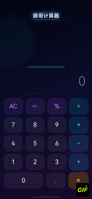
效果
一、项目概述
1.1 设计理念
本计算器采用**"深空光感"**设计语言,区别于传统计算器的扁平白色风格,打造沉浸式的暗色光感界面:
- 深空渐变背景:从深邃夜空到暗紫的渐变,营造宇宙深空感
- 霓虹光感按钮 :不同类型按钮拥有不同的发光色调
- 运算符:霓虹青(Cyan)光晕
- 功能键:极光紫(Purple)光晕
- 等号键:琥珀金(Gold)光晕
- 数字键:深空玻璃(Glass)质感
- 环境光效装饰:左上角青色光晕 + 右下角紫色光晕
- 渐变光带分隔线:青紫渐变的光带替代传统分隔线
- 自适应字号:显示区文本根据内容长度自动调整大小
1.2 技术亮点
| 技术点 | 说明 |
|---|---|
| 状态管理V2 | @ComponentV2、@ObservedV2、@Trace、@Param、@Event、@Local |
| MVVM架构 | 计算引擎与UI完全分离 |
| 沉浸式全屏 | setWindowLayoutFullScreen + 安全区域避让 |
| 光感阴影 | shadow + 透明度实现发光效果 |
| 渐变背景 | linearGradient 多层叠加 |
| 自适应UI | 根据文本长度动态调整字号 |
| 高精度计算 | 手动精度处理避免浮点误差 |
1.3 项目结构
entry/src/main/ets/
├── calc/
│   ├── common/
│   │   └── CalcConstants.ets       # 常量定义、按钮数据模型、主题色
│   ├── engine/
│   │   └── CalcEngine.ets          # 计算引擎核心(运算逻辑)
│   ├── components/
│   │   ├── GlowButton.ets          # 光感按钮组件(@ComponentV2)
│   │   └── DisplayPanel.ets        # 显示面板组件(@ComponentV2)
│   └── CalcPage.ets                # 计算器主页面(@Entry)
├── entryability/
│ └── EntryAbility.ets # 应用入口(全屏+安全区域)架构分层:
┌──────────────────────────────────────────┐
│            CalcPage.ets (@Entry)          │  ← 入口页面(V1 @Component)
│  ┌─────────────┐  ┌───────────────────┐  │
│  │DisplayPanel  │  │  GlowButton × 19  │  │  ← 子组件(@ComponentV2)
│  │(@ComponentV2)│  │  (@ComponentV2)   │  │
│  └─────────────┘  └───────────────────┘  │
│                  ↓ 调用                    │
│         ┌──────────────────┐              │
│         │   CalcEngine     │              │  ← 计算引擎(纯逻辑)
│         └──────────────────┘              │
│         ┌──────────────────┐              │
│         │  CalcConstants   │              │  ← 常量+主题配置
│         └──────────────────┘              │
└──────────────────────────────────────────┘
二、环境配置
2.1 项目配置
build-profile.json5:
json5
{
  "app": {
    "products": [{
      "name": "default",
      "targetSdkVersion": "6.1.0(23)",
      "compatibleSdkVersion": "6.1.0(23)",
      "runtimeOS": "HarmonyOS"
    }]
  }
}
2.2 页面路由配置
main_pages.json:
json
{
  "src": [
    "pages/Index",
    "calc/CalcPage"
  ]
}
2.3 沉浸式全屏配置
在EntryAbility.ets中配置全屏沉浸显示和安全区域避让:
typescript
import { BusinessError } from '@kit.BasicServicesKit';

onWindowStageCreate(windowStage: window.WindowStage): void {
  windowStage.loadContent('calc/CalcPage', (err) => {
    if (err.code) return;

    let windowClass: window.Window = windowStage.getMainWindowSync();
    // 设置全屏
    windowClass.setWindowLayoutFullScreen(true);

    // 获取并存储安全区域高度
    let navArea = windowClass.getWindowAvoidArea(
      window.AvoidAreaType.TYPE_NAVIGATION_INDICATOR
    );
    AppStorage.setOrCreate('bottomRectHeight', navArea.bottomRect.height);

    let sysArea = windowClass.getWindowAvoidArea(
      window.AvoidAreaType.TYPE_SYSTEM
    );
    AppStorage.setOrCreate('topRectHeight', sysArea.topRect.height);

    // 监听安全区域变化
    windowClass.on('avoidAreaChange', (data) => {
      if (data.type === window.AvoidAreaType.TYPE_SYSTEM) {
        AppStorage.setOrCreate('topRectHeight', data.area.topRect.height);
      } else if (data.type === window.AvoidAreaType.TYPE_NAVIGATION_INDICATOR) {
        AppStorage.setOrCreate('bottomRectHeight', data.area.bottomRect.height);
      }
    });
  });
}关键点:
setWindowLayoutFullScreen(true)让内容延伸到状态栏和导航条区域AppStorage存储安全区域高度,页面通过@StorageLink响应式获取avoidAreaChange监听确保折叠屏等动态场景下安全区域正确
三、核心模块详解
3.1 常量与主题配置(CalcConstants.ets)
常量文件定义了所有主题色、尺寸参数和按钮布局数据。
主题色体系:
typescript
export class CalcConstants {
  // 背景渐变三色
  static readonly BG_GRADIENT_START: string = '#060613';  // 深邃夜空
  static readonly BG_GRADIENT_MID: string = '#0d0d2b';    // 深空蓝
  static readonly BG_GRADIENT_END: string = '#1a0a2e';    // 暗紫

  // 按钮光感配色
  static readonly BTN_OP_BG: string = 'rgba(0, 212, 255, 0.12)';   // 运算符背景
  static readonly BTN_OP_GLOW: string = '#00d4ff';                  // 运算符发光
  static readonly BTN_FUNC_BG: string = 'rgba(168, 85, 247, 0.12)'; // 功能键背景
  static readonly BTN_FUNC_GLOW: string = '#a855f7';                // 功能键发光
  static readonly BTN_EQ_BG: string = 'rgba(255, 165, 0, 0.2)';    // 等号背景
  static readonly BTN_EQ_GLOW: string = '#ffa500';                  // 等号发光
}
设计思路 :使用RGBA半透明色作为按钮背景,配合shadow属性产生"光从内部透出"的视觉效果。
按钮数据模型(V2响应式):
typescript
@ObservedV2
export class CalcButtonData {
  @Trace label: string = '';
  @Trace type: ButtonType = ButtonType.NUMBER;
  @Trace span: number = 1;

  constructor(label: string, type: ButtonType, span: number = 1) {
    this.label = label;
    this.type = type;
    this.span = span;
  }
}
使用 @ObservedV2 + @Trace 让按钮数据具备V2细粒度响应式能力。
3.2 计算引擎(CalcEngine.ets)
计算引擎是纯逻辑类,不依赖任何UI框架,负责所有运算和状态管理。
状态机设计:
           inputDigit()
              ┌───┐
              │   ▼
         ┌─────────┐  inputOperator()  ┌─────────┐
         │ 输入数字 │ ───────────────→  │ 待运算符 │
         └─────────┘ ←─────────────── └─────────┘
              │           evaluate()        │
              │        ┌───────────┐        │
              └──────→ │ 显示结果  │ ←──────┘
└───────────┘核心状态变量:
typescript
export class CalcEngine {
  private displayValue: string = '0';        // 当前显示文本
  private previousOperand: number = 0;       // 上一个操作数
  private currentOperand: number = 0;        // 当前操作数
  private pendingOperator: string = '';      // 待执行运算符
  private isNewEntry: boolean = false;       // 是否输入新数字
  private justEvaluated: boolean = false;    // 是否刚完成计算
  private expressionText: string = '';       // 表达式预览
  private engineState: CalcState = CalcState.NORMAL;  // 引擎状态
}高精度运算方法:
typescript
/** 高精度加法 - 通过整数化避免浮点误差 */
private preciseAdd(a: number, b: number): number {
  let dp1: number = this.getDecimalPlaces(a);
  let dp2: number = this.getDecimalPlaces(b);
  let maxDp: number = Math.max(dp1, dp2);
  let factor: number = Math.pow(10, maxDp);
  return (Math.round(a * factor) + Math.round(b * factor)) / factor;
}
原理 :将小数转为整数运算后再除以倍数,避免0.1 + 0.2的精度问题。例如:
0.1 + 0.2
→ (0.1 × 10 + 0.2 × 10) / 10
→ (1 + 2) / 10
→ 0.3 ✓
3.3 光感按钮组件(GlowButton.ets)
这是项目的核心视觉组件,使用@ComponentV2实现。
V2状态管理装饰器运用:
typescript
@ComponentV2
export struct GlowButton {
  @Param label: string = '';          // 父→子单向传入
  @Param buttonType: ButtonType = ButtonType.NUMBER;
  @Param span: number = 1;
  @Param isActive: boolean = false;
  @Event onPress: (label: string) => void = () => {};  // 子→父事件回调
  @Local isPressed: boolean = false;   // 组件内部状态
}光感效果实现原理:
┌──────────────────────────────┐
│  shadow (发光层)              │  ← 大半径、带颜色的阴影模拟发光
│  ┌──────────────────────┐    │
│  │  border (光边)        │    │  ← 0.5px半透明边框
│  │  ┌────────────────┐  │    │
│  │  │  backgroundColor │  │    │  ← RGBA半透明背景
│  │  │    (玻璃层)       │  │    │
│  │  │  ┌──────────┐   │  │    │
│  │  │  │   Text    │   │  │    │  ← 带颜色的文字
│  │  │  └──────────┘   │  │    │
│  │  └────────────────┘  │    │
│  └──────────────────────┘    │
└──────────────────────────────┘发光阴影的关键代码:
typescript
// 运算符按钮的发光效果
private getShadowEffect(): ShadowOptions {
  if (this.isActive) {
    return {
      radius: 20,                              // 大半径扩散
      color: 'rgba(0, 212, 255, 0.5)',         // 青色50%透明度
      offsetX: 0,
      offsetY: 0                               // 无偏移,向四周均匀扩散
    };
  }
  return {
    radius: 12,                                // 普通态较小
    color: 'rgba(0, 212, 255, 0.2)',           // 普通态较低透明度
    offsetX: 0,
    offsetY: 2
  };
}触摸反馈动画:
typescript
.animation({ duration: 150, curve: Curve.EaseOut })
.onTouch((event: TouchEvent) => {
  if (event.type === TouchType.Down) {
    this.isPressed = true;     // 按下态:背景变亮
  } else if (event.type === TouchType.Up || event.type === TouchType.Cancel) {
    this.isPressed = false;    // 释放态:恢复
    if (event.type === TouchType.Up) {
      this.onPress(this.label);  // 触发点击事件
    }
  }
})
3.4 显示面板组件(DisplayPanel.ets)
使用@ComponentV2实现的显示面板,支持自适应字号。
自适应字号算法:
typescript
private getAdaptiveFontSize(): number {
  let len: number = this.display.length;
  if (len <= 8) return 52;    // 短数字:大字
  if (len <= 12) return 40;   // 中等:中字
  if (len <= 16) return 32;   // 较长:小字
  return 26;                   // 超长:最小字
}顶部光晕装饰线:
typescript
Column()
  .width('40%')
  .height(3)
  .borderRadius(2)
  .backgroundColor('rgba(0, 212, 255, 0.3)')
  .shadow({
    radius: 20,
    color: 'rgba(0, 212, 255, 0.4)',  // 发光效果
    offsetX: 0,
    offsetY: 0
  })
3.5 主页面(CalcPage.ets)
主页面是@Entry入口,使用V1的@Component(因为@Entry不支持@ComponentV2),内部组合V2子组件。
三层Stack布局:
typescript
build() {
  Stack() {
    // 第一层:深空渐变背景
    Column()
      .linearGradient({
        angle: 160,
        colors: [
          ['#060613', 0],    // 深邃夜空
          ['#0d0d2b', 0.5],  // 深空蓝
          ['#1a0a2e', 1]     // 暗紫
        ]
      })

    // 第二层:环境光效装饰(左上青色 + 右下紫色)
    Stack() { /* 光晕装饰 */ }

    // 第三层:主内容区(显示面板 + 光带分隔 + 键盘)
    Column() {
      DisplayPanel({ /* 参数 */ })
      // 渐变光带分隔线
      Row().linearGradient({
        direction: GradientDirection.Right,
        colors: [
          ['rgba(0, 212, 255, 0)', 0],     // 透明→
          ['rgba(0, 212, 255, 0.3)', 0.3], // 青色
          ['rgba(168, 85, 247, 0.3)', 0.7], // 紫色
          ['rgba(168, 85, 247, 0)', 1]     // →透明
        ]
      })
      // 键盘区域
      Column({ space: 10 }) {
        ForEach(buttonLayout, (row) => {
          Row({ space: 12 }) {
            ForEach(row, (btn) => {
              GlowButton({ /* 参数 */ })
            })
          }
        })
      }
    }
  }
}统一事件处理:
typescript
private handleButtonPress(label: string): void {
  switch (label) {
    case 'AC':   this.engine.clearAll(); break;
    case '+/-':  this.engine.toggleSign(); break;
    case '%':    this.engine.percentage(); break;
    case '÷':    this.engine.inputOperator(OpEnum.DIV); break;
    case '×':    this.engine.inputOperator(OpEnum.MUL); break;
    case '−':    this.engine.inputOperator(OpEnum.SUB); break;
    case '+':    this.engine.inputOperator(OpEnum.ADD); break;
    case '=':    this.engine.evaluate(); break;
    case '.':    this.engine.inputDigit('.'); break;
    default:     this.engine.inputDigit(label); break;
  }
  this.syncDisplay();  // 每次操作后同步UI状态
}
四、状态管理V2运用详解
4.1 V1与V2混合策略
| 层级 | 装饰器 | 原因 |
|---|---|---|
| CalcPage(入口页) | @Component + @State |
@Entry不支持@ComponentV2 |
| GlowButton(子组件) | @ComponentV2 + @Param/@Event/@Local |
V2细粒度控制 |
| DisplayPanel(子组件) | @ComponentV2 + @Param |
V2细粒度控制 |
| CalcButtonData(数据模型) | @ObservedV2 + @Trace |
V2响应式数据 |
4.2 数据流向
CalcPage (@State displayText)
    │
    ├──→ DisplayPanel (@Param display)     // 父→子单向传递
    │
    └──→ GlowButton (@Param isActive)      // 父→子单向传递
              │
              └──→ @Event onPress          // 子→父事件通知
                        │
                        ↓
                   handleButtonPress()     // 父组件处理
                        │
                        ↓
                   engine.evaluate()       // 引擎计算
                        │
                        ↓
                   syncDisplay()           // 同步回@State
4.3 @ObservedV2 + @Trace 的作用
CalcButtonData 使用 @ObservedV2 标记,每个属性用 @Trace 追踪:
typescript
@ObservedV2
export class CalcButtonData {
  @Trace label: string = '';
  @Trace type: ButtonType = ButtonType.NUMBER;
  @Trace span: number = 1;
}
优势 :当 label 变化时,只有引用了 label 的UI部分会刷新,不影响 type 和 span 相关的UI。
五、视觉设计详解
5.1 配色方案
背景层:
  #060613 → #0d0d2b → #1a0a2e(160° 渐变)

按钮层:
  ┌──────────┬───────────────┬──────────────┐
  │ 类型     │ 背景色         │ 发光色        │
  ├──────────┼───────────────┼──────────────┤
  │ 数字     │ rgba(255,255,  │ 无(深空感)  │
  │          │   255,0.06)   │              │
  │ 运算符   │ rgba(0,212,    │ #00d4ff      │
  │          │   255,0.12)   │ (霓虹青)     │
  │ 功能键   │ rgba(168,85,   │ #a855f7      │
  │          │   247,0.12)   │ (极光紫)     │
  │ 等号     │ rgba(255,165,  │ #ffa500      │
  │          │   0,0.20)     │ (琥珀金)     │
  └──────────┴───────────────┴──────────────┘
5.2 光感效果层级
视觉效果 = 背景色(RGBA) + 边框(0.5px半透明) + 阴影(大半径发光)

运算符激活态:
  背景: rgba(0, 212, 255, 0.3)    ← 透明度提高
  边框: rgba(0, 212, 255, 0.6)    ← 边框变亮
  阴影: radius=20, 50%青色         ← 强光扩散
5.3 环境光效
Stack层叠两个圆形光晕:
  - 左上:200×200px,cyan 4%透明度,shadow半径80
  - 右下:180×180px,purple 4%透明度,shadow半径60
这两个光晕为整个页面添加了微妙的环境光,让暗色背景不会显得死板。
六、功能测试清单
| 测试项 | 操作 | 预期结果 |
|---|---|---|
| 基础加法 | 3 + 5 = | 显示 8 |
| 连续运算 | 3 + 5 + 2 = | 显示 10 |
| 小数精度 | 0.1 + 0.2 = | 显示 0.3(非0.30000...) |
| 除法除零 | 5 ÷ 0 = | 显示"错误",红色字体 |
| 百分比 | 50 % | 显示 0.5 |
| 正负号 | 5 +/- | 显示 -5 |
| 运算符替换 | 5 + 然后按 × | 显示 5 × |
| 清除 | 123 AC | 显示 0 |
| 运算符高亮 | 按 + | + 按钮青色发光 |
| 自适应字号 | 输入超长数字 | 字号自动缩小 |
七、与参考计算器的对比
| 对比维度 | 参考计算器 | 本方案 |
|---|---|---|
| 状态管理 | V1(@State、@Watch) | V2(@ComponentV2、@Param、@Event) |
| UI风格 | 白色扁平 | 深空暗色+霓虹光感 |
| 按钮设计 | Image图标+文字 | 纯文字+发光阴影 |
| 背景 | 纯色/白色 | 三色渐变+环境光晕 |
| 显示区 | TextArea+Text | 自定义DisplayPanel组件 |
| 计算引擎 | 表达式栈解析 | 状态机模式+手动精度 |
| 键盘布局 | ForEach嵌套Grid | ForEach+Row+space |
| 组件复用 | 无 | @ComponentV2子组件 |
八、扩展方向
- 科学计算模式:添加sin/cos/tan/log等科学运算
- 计算历史:使用@StorageProp保存计算历史
- 主题切换:通过AppStorage切换亮暗主题
- 振动反馈:按钮点击时调用vibrator API
- 手势操作:左滑清除、右滑退格
- 单位换算:长度/重量/温度等常用单位转换
九、总结
关键技术收获
| 知识点 | 掌握内容 |
|---|---|
| 状态管理V2 | @ComponentV2、@Param、@Event、@Local、@ObservedV2、@Trace |
| 沉浸式全屏 | setWindowLayoutFullScreen + AvoidArea + @StorageLink |
| 光感UI设计 | shadow发光 + RGBA半透明 + linearGradient渐变 |
| MVVM架构 | 计算引擎与UI完全分离,单一事件入口 |
| 高精度计算 | 整数化运算避免IEEE 754浮点精度问题 |
| 自适应布局 | 动态字号、FlexGrow弹性宽度 |
开发建议
- 先搭引擎后做UI:计算引擎是核心,确保逻辑正确后再开发界面
- V1入口+V2子组件:@Entry页面用V1,子组件全面使用V2
- 统一事件入口:所有按钮事件通过一个switch-case处理,便于维护
- 光感效果关键:shadow的radius和color是控制发光效果的两个核心参数
- 安全区域必须处理:全屏应用一定要处理状态栏和导航条的避让
参考资源:
开发建议
- 先搭引擎后做UI:计算引擎是核心,确保逻辑正确后再开发界面
- V1入口+V2子组件:@Entry页面用V1,子组件全面使用V2
- 统一事件入口:所有按钮事件通过一个switch-case处理,便于维护
- 光感效果关键:shadow的radius和color是控制发光效果的两个核心参数
- 安全区域必须处理:全屏应用一定要处理状态栏和导航条的避让
参考资源: