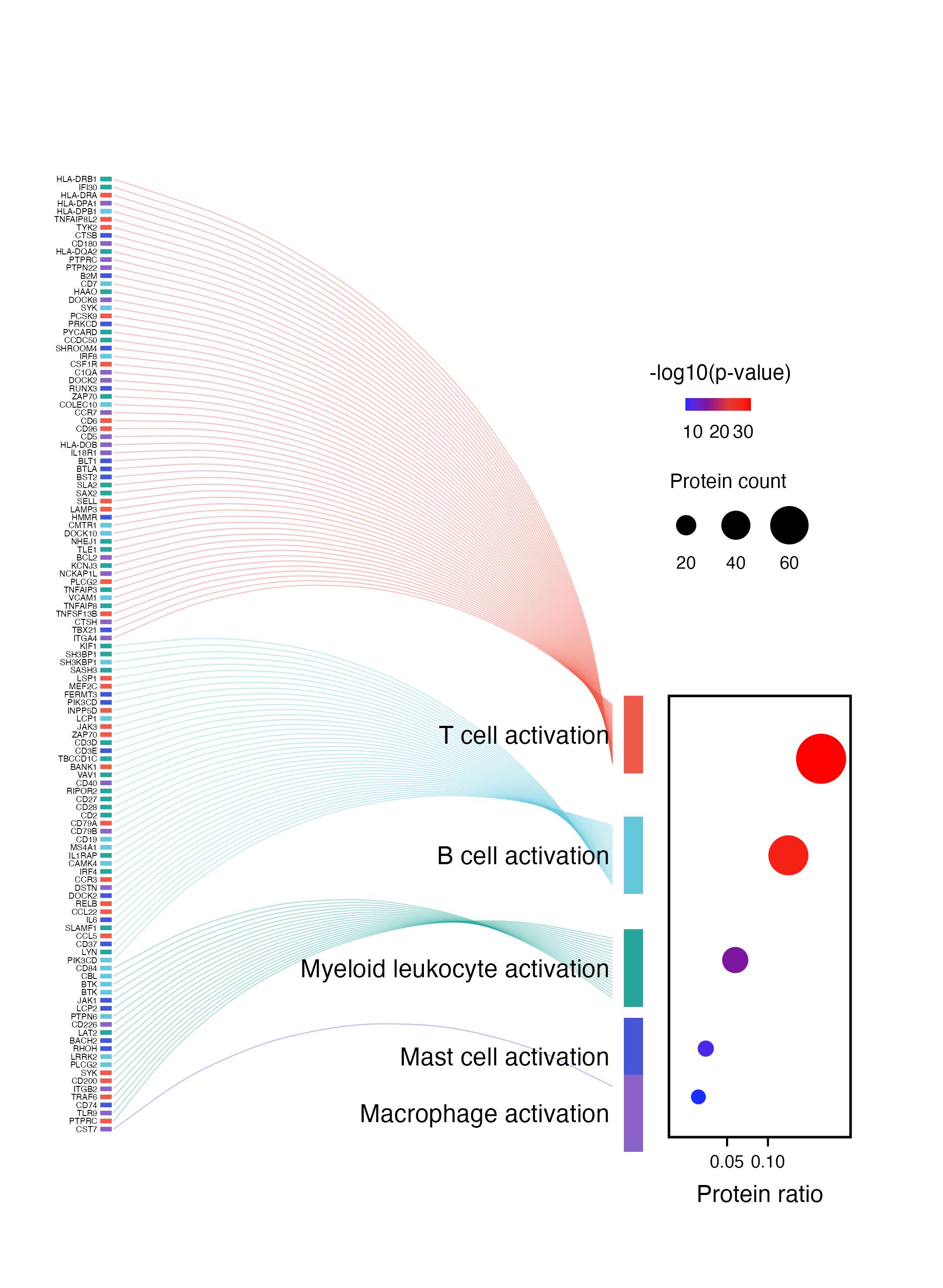
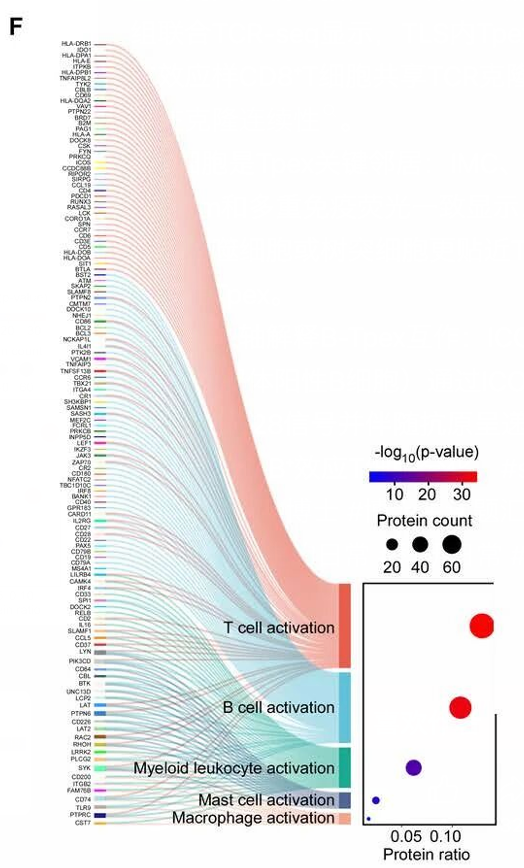
单细胞语境下的"蛋白/基因 → 细胞状态"连接图。左侧展示差异蛋白或 marker,弧线表示这些蛋白归入不同免疫细胞激活状态,右侧气泡图再补充每个细胞状态的比例、显著性和命中数量。
图片来源
| 项目 | 内容 |
|---|---|
| 文章 | Spatial multi-omics implicate the interaction between Tpex and B cells in tertiary lymphoid structures after neoadjuvant therapy |
| 期刊/年份 | Cancer Discovery,2026 OnlineFirst |
| 图号 | 原文截图面板 F |
| DOI/链接 | https://doi.org/10.1158/2159-8290.CD-25-0806 |
这篇文章聚焦新辅助治疗后三级淋巴结构中 Tpex 与 B 细胞互作。截图这个 panel 用蛋白/基因集合连接到不同免疫细胞激活状态,例如 T cell activation、B cell activation、Myeloid leukocyte activation 等。
图片解读
这类图可以拆成三层:
- 左侧蛋白/基因列表:每一行是一个蛋白或基因,旁边短色条可以标记来源、分组或蛋白类别。
- 中间弧线流向:每条弧线表示该蛋白被归入某个单细胞免疫状态。
- 右侧气泡图:横轴是 Protein ratio,颜色表示
-log10(p-value),点大小表示 Protein count。
这里的核心表达是:哪些蛋白集合更集中地指向 T 细胞、B 细胞、髓系细胞、肥大细胞或巨噬细胞相关激活状态。
输入数据
建议准备两张输入表。
1. 蛋白-细胞状态连接表:protein_cellstate_links.csv
| 列名 | 含义 |
|---|---|
protein_label |
左侧展示的蛋白或基因名 |
gene_y |
蛋白在纵轴上的排列位置 |
cell_state |
蛋白对应的单细胞状态 |
cell_state_y_link |
弧线连接到细胞状态色块的位置 |
tick_color |
左侧短色条颜色 |
2. 细胞状态统计表:cellstate_enrichment.csv
| 列名 | 含义 |
|---|---|
cell_state |
细胞状态名称 |
protein_count |
命中蛋白数量 |
protein_ratio |
命中蛋白比例 |
neg_log10_p |
-log10(p-value) |
cell_state_color |
细胞状态颜色 |
cell_state_y |
细胞状态在纵轴上的中心位置 |
r
library(tidyverse)
library(scales)

links <- read_csv("protein_cellstate_links.csv", show_col_types = FALSE)
cell_info <- read_csv("cellstate_enrichment.csv", show_col_types = FALSE)
需要示例数据的后台 添加小编 领取,调整好数据结构,以下代码可以直接复制粘贴运行。
第一步:固定细胞状态顺序和颜色
r
cell_levels <- cell_info$cell_state

links <- links |>
  mutate(cell_state = factor(cell_state, levels = cell_levels))

cell_info <- cell_info |>
  mutate(cell_state = factor(cell_state, levels = cell_levels))

cell_cols <- setNames(cell_info$cell_state_color, cell_info$cell_state)
第二步:定义右侧气泡图区域
这里把气泡图作为整体画布中的一个小区域来画。这样更容易还原原图中"弧线图 + 右侧嵌入气泡图"的版式。
r
panel_xmin <- 6.45
panel_xmax <- 8.35
panel_ymin <- 0
panel_ymax <- max(cell_info$cell_state_y + 4.8)

dot_df <- cell_info |>
  mutate(
    dot_x = rescale(
      protein_ratio,
      to = c(panel_xmin + 0.18, panel_xmax - 0.18),
      from = c(0, 0.18)
    ),
    dot_y = c(47, 35, 22, 11, 5),
    dot_col = col_numeric(
      palette = c("#1d2cff", "#7c169f", "#e23b2e", "#ff0000"),
      domain = c(5, 32)
    )(neg_log10_p),
    dot_size = rescale(protein_count, to = c(2.4, 10.5), from = c(5, 65))
  )
第三步:准备图例和细胞状态色块
r
x_ticks <- tibble(
  ratio = c(0.05, 0.10),
  x = rescale(
    ratio,
    to = c(panel_xmin + 0.18, panel_xmax - 0.18),
    from = c(0, 0.18)
  )
)

color_legend <- tibble(
  x = seq(panel_xmin + 0.18, panel_xmin + 0.85, length.out = 80),
  y = 91,
  value = seq(5, 32, length.out = 80)
) |>
  mutate(
    fill_col = col_numeric(
      palette = c("#1d2cff", "#7c169f", "#e23b2e", "#ff0000"),
      domain = c(5, 32)
    )(value)
  )

size_legend <- tibble(
  x = c(panel_xmin + 0.18, panel_xmin + 0.70, panel_xmin + 1.26),
  y = 76,
  count = c(20, 40, 60),
  point_size = c(3.7, 5.6, 7.6)
)

cell_bar_df <- cell_info |>
  mutate(
    xmin = 5.98,
    xmax = 6.18,
    ymin = cell_state_y - 4.8,
    ymax = cell_state_y + 4.8
  )
第四步:绘制蛋白到细胞状态的弧线
r
p <- ggplot() +
  geom_curve(
    data = links,
    aes(
      x = 0.64,
      y = gene_y,
      xend = 5.86,
      yend = cell_state_y_link,
      color = cell_state
    ),
    curvature = -0.34,
    linewidth = 0.24,
    alpha = 0.36
  ) +
  geom_segment(
    data = links,
    aes(x = 0.50, xend = 0.62, y = gene_y, yend = gene_y, color = tick_color),
    linewidth = 1.0,
    show.legend = FALSE
  ) +
  geom_text(
    data = links,
    aes(x = 0.47, y = gene_y, label = protein_label),
    hjust = 1,
    size = 1.34,
    color = "black"
  )
第五步:添加细胞状态色块和名称
r
p <- p +
  geom_rect(
    data = cell_bar_df,
    aes(xmin = xmin, xmax = xmax, ymin = ymin, ymax = ymax, fill = cell_state),
    color = NA,
    show.legend = FALSE
  ) +
  geom_text(
    data = cell_info,
    aes(x = 5.83, y = cell_state_y, label = cell_state),
    hjust = 1,
    size = 4.0,
    color = "black"
  )
第六步:添加右侧气泡图
r
p <- p +
  annotate(
    "rect",
    xmin = panel_xmin,
    xmax = panel_xmax,
    ymin = panel_ymin,
    ymax = panel_ymax,
    fill = NA,
    color = "black",
    linewidth = 0.55
  ) +
  geom_point(
    data = dot_df,
    aes(x = dot_x, y = dot_y),
    color = dot_df$dot_col,
    size = dot_df$dot_size
  ) +
  geom_segment(
    data = x_ticks,
    aes(x = x, xend = x, y = panel_ymin, yend = panel_ymin - 1.15),
    linewidth = 0.45,
    color = "black"
  ) +
  geom_text(
    data = x_ticks,
    aes(x = x, y = panel_ymin - 3.0, label = sprintf("%.2f", ratio)),
    size = 2.85,
    color = "black"
  ) +
  annotate(
    "text",
    x = mean(c(panel_xmin, panel_xmax)),
    y = panel_ymin - 7.0,
    label = "Protein ratio",
    size = 3.8
  )
第七步:添加图例并导出
r
p <- p +
  geom_tile(
    data = color_legend,
    aes(x = x, y = y),
    fill = color_legend$fill_col,
    width = 0.012,
    height = 1.6
  ) +
  annotate("text", x = panel_xmin + 0.54, y = 95.0, label = "-log10(p-value)", size = 3.4) +
  annotate("text", x = panel_xmin + 0.25, y = 87.7, label = "10", size = 3.0) +
  annotate("text", x = panel_xmin + 0.53, y = 87.7, label = "20", size = 3.0) +
  annotate("text", x = panel_xmin + 0.78, y = 87.7, label = "30", size = 3.0) +
  annotate("text", x = panel_xmin + 0.62, y = 81.5, label = "Protein count", size = 3.2) +
  geom_point(
    data = size_legend,
    aes(x = x, y = y),
    size = size_legend$point_size,
    color = "black"
  ) +
  geom_text(
    data = size_legend,
    aes(x = x, y = y - 4.6, label = count),
    size = 2.85
  ) +
  scale_color_manual(values = c(cell_cols, setNames(cell_info$cell_state_color, cell_info$cell_state_color))) +
  scale_fill_manual(values = cell_cols) +
  coord_cartesian(xlim = c(0, 8.70), ylim = c(-9.5, 132), clip = "off") +
  theme_void() +
  theme(
    legend.position = "none",
    plot.margin = margin(8, 8, 8, 5)
  )

ggsave("protein_cellstate_flow_bubble.png", p, width = 6.0, height = 8.2, dpi = 360, bg = "white")
ggsave("protein_cellstate_flow_bubble.pdf", p, width = 6.0, height = 8.2, bg = "white")
完整代码
r
library(tidyverse)
library(scales)

links <- read_csv("protein_cellstate_links.csv", show_col_types = FALSE)
cell_info <- read_csv("cellstate_enrichment.csv", show_col_types = FALSE)

cell_levels <- cell_info$cell_state

links <- links |>
  mutate(cell_state = factor(cell_state, levels = cell_levels))

cell_info <- cell_info |>
  mutate(cell_state = factor(cell_state, levels = cell_levels))

cell_cols <- setNames(cell_info$cell_state_color, cell_info$cell_state)

panel_xmin <- 6.45
panel_xmax <- 8.35
panel_ymin <- 0
panel_ymax <- max(cell_info$cell_state_y + 4.8)

dot_df <- cell_info |>
  mutate(
    dot_x = rescale(
      protein_ratio,
      to = c(panel_xmin + 0.18, panel_xmax - 0.18),
      from = c(0, 0.18)
    ),
    dot_y = c(47, 35, 22, 11, 5),
    dot_col = col_numeric(
      palette = c("#1d2cff", "#7c169f", "#e23b2e", "#ff0000"),
      domain = c(5, 32)
    )(neg_log10_p),
    dot_size = rescale(protein_count, to = c(2.4, 10.5), from = c(5, 65))
  )

x_ticks <- tibble(
  ratio = c(0.05, 0.10),
  x = rescale(
    ratio,
    to = c(panel_xmin + 0.18, panel_xmax - 0.18),
    from = c(0, 0.18)
  )
)

color_legend <- tibble(
  x = seq(panel_xmin + 0.18, panel_xmin + 0.85, length.out = 80),
  y = 91,
  value = seq(5, 32, length.out = 80)
) |>
  mutate(
    fill_col = col_numeric(
      palette = c("#1d2cff", "#7c169f", "#e23b2e", "#ff0000"),
      domain = c(5, 32)
    )(value)
  )

size_legend <- tibble(
  x = c(panel_xmin + 0.18, panel_xmin + 0.70, panel_xmin + 1.26),
  y = 76,
  count = c(20, 40, 60),
  point_size = c(3.7, 5.6, 7.6)
)

cell_bar_df <- cell_info |>
  mutate(
    xmin = 5.98,
    xmax = 6.18,
    ymin = cell_state_y - 4.8,
    ymax = cell_state_y + 4.8
  )

p <- ggplot() +
  geom_curve(
    data = links,
    aes(
      x = 0.64,
      y = gene_y,
      xend = 5.86,
      yend = cell_state_y_link,
      color = cell_state
    ),
    curvature = -0.34,
    linewidth = 0.24,
    alpha = 0.36
  ) +
  geom_segment(
    data = links,
    aes(x = 0.50, xend = 0.62, y = gene_y, yend = gene_y, color = tick_color),
    linewidth = 1.0,
    show.legend = FALSE
  ) +
  geom_text(
    data = links,
    aes(x = 0.47, y = gene_y, label = protein_label),
    hjust = 1,
    size = 1.34,
    color = "black"
  ) +
  geom_rect(
    data = cell_bar_df,
    aes(xmin = xmin, xmax = xmax, ymin = ymin, ymax = ymax, fill = cell_state),
    color = NA,
    show.legend = FALSE
  ) +
  geom_text(
    data = cell_info,
    aes(x = 5.83, y = cell_state_y, label = cell_state),
    hjust = 1,
    size = 4.0,
    color = "black"
  ) +
  annotate(
    "rect",
    xmin = panel_xmin,
    xmax = panel_xmax,
    ymin = panel_ymin,
    ymax = panel_ymax,
    fill = NA,
    color = "black",
    linewidth = 0.55
  ) +
  geom_point(
    data = dot_df,
    aes(x = dot_x, y = dot_y),
    color = dot_df$dot_col,
    size = dot_df$dot_size
  ) +
  geom_segment(
    data = x_ticks,
    aes(x = x, xend = x, y = panel_ymin, yend = panel_ymin - 1.15),
    linewidth = 0.45,
    color = "black"
  ) +
  geom_text(
    data = x_ticks,
    aes(x = x, y = panel_ymin - 3.0, label = sprintf("%.2f", ratio)),
    size = 2.85,
    color = "black"
  ) +
  annotate(
    "text",
    x = mean(c(panel_xmin, panel_xmax)),
    y = panel_ymin - 7.0,
    label = "Protein ratio",
    size = 3.8
  ) +
  geom_tile(
    data = color_legend,
    aes(x = x, y = y),
    fill = color_legend$fill_col,
    width = 0.012,
    height = 1.6
  ) +
  annotate("text", x = panel_xmin + 0.54, y = 95.0, label = "-log10(p-value)", size = 3.4) +
  annotate("text", x = panel_xmin + 0.25, y = 87.7, label = "10", size = 3.0) +
  annotate("text", x = panel_xmin + 0.53, y = 87.7, label = "20", size = 3.0) +
  annotate("text", x = panel_xmin + 0.78, y = 87.7, label = "30", size = 3.0) +
  annotate("text", x = panel_xmin + 0.62, y = 81.5, label = "Protein count", size = 3.2) +
  geom_point(
    data = size_legend,
    aes(x = x, y = y),
    size = size_legend$point_size,
    color = "black"
  ) +
  geom_text(
    data = size_legend,
    aes(x = x, y = y - 4.6, label = count),
    size = 2.85
  ) +
  scale_color_manual(values = c(cell_cols, setNames(cell_info$cell_state_color, cell_info$cell_state_color))) +
  scale_fill_manual(values = cell_cols) +
  coord_cartesian(xlim = c(0, 8.70), ylim = c(-9.5, 132), clip = "off") +
  theme_void() +
  theme(
    legend.position = "none",
    plot.margin = margin(8, 8, 8, 5)
  )

ggsave("protein_cellstate_flow_bubble.png", p, width = 6.0, height = 8.2, dpi = 360, bg = "white")
ggsave("protein_cellstate_flow_bubble.pdf", p, width = 6.0, height = 8.2, bg = "white")
复现结果