项目演示
目录
引言
在移动应用开发中,流畅的动画效果是提升用户体验的关键。淡入淡出作为最基础且应用广泛的过渡动画,能够使界面切换更加自然、优雅。HarmonyOS NEXT提供了强大的ArkTS声明式UI框架,支持开发者快速构建高性能的应用界面。
本文将深入探讨Stack + Opacity叠加淡入淡出技术,这是HarmonyOS NEXT中实现层叠组件切换动画的核心方案。通过Stack组件实现层叠布局,结合Opacity属性控制透明度,配合animateTo动画API驱动状态变化,开发者可以轻松实现各种复杂的淡入淡出效果。
本文目标
- 深入理解Stack组件的布局原理和使用方法
- 掌握Opacity属性的渲染机制和最佳实践
- 熟练运用animateTo动画API(API 24版本)实现流畅过渡
- 理解叠加淡入淡出的核心原理和实现逻辑
- 学会解决开发过程中的常见问题和性能瓶颈
ArkTS基础概念
2.1 核心装饰器
@Entry装饰器
@Entry装饰器用于标记页面入口组件,被标记的组件将作为页面的根组件。
typescript
@Entry
@Component
struct Index {
  build() {
    Column() {
      Text('Hello HarmonyOS NEXT')
    }
  }
}
@Component装饰器
@Component装饰器用于标记自定义组件,是构建复杂UI的基础单元。
@State装饰器
@State装饰器用于管理组件内部状态。当状态值发生变化时,框架会自动触发UI的重新渲染。
typescript
@Component
struct Counter {
  @State count: number = 0

  build() {
    Column() {
      Text(`Count: ${this.count}`)
      Button('Increment').onClick(() => { this.count++ })
    }
  }
}
2.2 组件构建机制
ArkTS采用声明式UI构建方式,通过build()方法描述组件的UI结构。build()方法中只能包含UI描述代码,业务逻辑应放在成员方法或生命周期回调中。
2.3 响应式更新机制
当@State标记的状态变量发生变化时,框架会自动识别哪些UI组件依赖该状态,并进行局部更新。这种机制避免了不必要的全局重绘,提高了渲染性能。
Stack组件详解
3.1 Stack组件概述
Stack组件是实现层叠布局的核心组件,其布局特点:
- 所有子组件共享同一布局空间
- 子组件默认按添加顺序层叠,后添加的在上方
- 每个子组件可以通过
alignContent属性控制对齐方式
3.2 关键属性
alignContent属性
控制子组件在Stack中的对齐方式,支持Alignment.Center、Alignment.TopStart等多种值。
typescript
Stack({ alignContent: Alignment.Center }) {
  Text('Centered content')
}
width和height属性
设置Stack组件的尺寸,子组件会根据Stack的尺寸进行布局。
typescript
Stack() {
  Column() { Text('Full size') }.width('100%').height('100%')
}
.width(300).height(200)
borderRadius和shadow属性
用于设置圆角和阴影效果,增强视觉层次感。
typescript
Stack() {
  Column() { Text('With shadow') }
}
.width('80%').height(300).borderRadius(16)
.shadow({ radius: 10, color: '#999', offsetY: 5 })
3.3 使用场景
层叠显示
通过控制子组件的可见性或透明度来切换显示内容。
typescript
Stack() {
  Column() { Text('Layer 1') }.opacity(showLayer1 ? 1 : 0)
  Column() { Text('Layer 2') }.opacity(showLayer2 ? 1 : 0)
}
叠加效果
在背景组件上叠加其他组件,实现复杂的视觉效果。
typescript
Stack() {
  Image('background.jpg').width('100%').height(300)
  Text('Caption').fontColor(Color.White)
}
遮罩层
在内容上方添加遮罩层,用于加载状态、弹窗背景等场景。
typescript
Stack() {
  Column() { Text('Main content') }
  Column() { LoadingProgress() }
    .width('100%').height('100%')
    .backgroundColor('rgba(0,0,0,0.6)')
    .opacity(loading ? 1 : 0)
}
3.4 注意事项
- 性能考虑 :Stack中的所有子组件都会被渲染,即使设置了
opacity(0) - 层级管理:子组件的层级由添加顺序决定
- 尺寸匹配:子组件的尺寸需要与Stack的尺寸匹配
- 事件处理:上层组件会优先接收触摸事件
Opacity属性详解
4.1 属性概述
Opacity属性的值范围是0到1:
opacity(0):完全透明,组件不可见opacity(1):完全不透明,组件正常显示opacity(0.5):半透明效果
4.2 渲染机制
Opacity属性会影响组件及其所有子组件的透明度。当设置一个组件的opacity时,该组件的整个渲染树都会应用该透明度。
typescript
Column() {
  Text('Parent')
  Text('Child')
}
.opacity(0.5) // 两个Text组件都会显示为半透明
4.3 与Visibility的区别
| 属性 | 效果 | 占据空间 | 响应事件 |
|---|---|---|---|
| opacity(0) | 完全透明 | 是 | 是 |
| visibility(Hidden) | 不可见 | 否 | 否 |
4.4 性能影响
- GPU加速:opacity变化会触发GPU的合成操作,比CPU渲染更高效
- 重绘区域:opacity变化只会影响透明度,不会改变布局
- 过度使用:同时对多个组件应用opacity动画可能增加GPU负担
4.5 最佳实践
- 避免嵌套opacity,会导致透明度叠加
- 配合animateTo使用,实现平滑过渡动画
- 考虑性能优化,使用
@Watch或RenderTask进行异步渲染
animateTo动画API详解
5.1 API概述
animateTo是实现属性动画的核心API,接受两个参数:
- 动画配置对象:包含时长、缓动曲线等参数
- 状态变化回调:包含需要进行动画的状态变化代码
typescript
animateTo({
  duration: 500,
  curve: Curve.EaseInOut
}, () => {
  this.opacity = 0
})
5.2 参数详解
duration参数
设置动画时长,单位为毫秒,默认值为400毫秒。
curve参数
设置缓动曲线,控制动画速度变化:
Curve.Linear:线性曲线Curve.Ease:默认缓动曲线Curve.EaseIn:缓入曲线Curve.EaseOut:缓出曲线Curve.EaseInOut:缓入缓出曲线Curve.FastOutSlowIn:快速出慢速入
delay参数
设置动画延迟时间,单位为毫秒,默认值为0。
iterations参数
设置动画重复次数,默认值为1,设置为-1表示无限循环。
playMode参数
设置动画播放模式:
PlayMode.Normal:正常播放PlayMode.Reverse:反向播放PlayMode.Alternate:交替播放PlayMode.AlternateReverse:交替反向播放
5.3 支持的动画属性
animateTo支持对以下属性进行动画:
- 透明度:opacity
- 尺寸:width、height
- 位置:translateX、translateY、translateZ
- 旋转:rotate、rotateX、rotateY、rotateZ
- 缩放:scale、scaleX、scaleY
- 背景颜色:backgroundColor
- 边框颜色:borderColor
5.4 使用示例
透明度动画
typescript
@Component
struct FadeAnimation {
  @State opacityValue: number = 1

  build() {
    Column() {
      Text('Fade Animation').fontSize(24).opacity(this.opacityValue)
      Button('Fade Out').onClick(() => {
        animateTo({ duration: 500 }, () => {
          this.opacityValue = 0
        })
      })
    }
  }
}
组合动画
typescript
@Component
struct CombinedAnimation {
  @State opacityValue: number = 1
  @State scaleValue: number = 1

  build() {
    Column() {
      Text('Combined')
        .opacity(this.opacityValue)
        .scale({ x: this.scaleValue, y: this.scaleValue })
      Button('Animate').onClick(() => {
        animateTo({ duration: 800 }, () => {
          this.opacityValue = 0
          this.scaleValue = 0.5
        })
      })
    }
  }
}
叠加淡入淡出原理
6.1 核心原理
- 层叠布局:使用Stack组件将多个子组件层叠在一起
- 透明度控制:通过Opacity属性控制每个子组件的可见性
- 动画驱动:使用animateTo包裹状态变化,实现平滑过渡
6.2 实现步骤
- 定义独立的透明度状态变量(避免数组索引访问问题)
- 构建Stack布局,将多个子组件添加到Stack中
- 将每个子组件的opacity属性绑定到对应的状态变量
- 在切换方法中使用animateTo包裹状态变化
- 添加交互控制触发切换
6.3 状态管理策略
- 独立状态变量 :为每个子组件定义独立的
@State变量 - 状态同步:确保状态变化的一致性
- 动画包裹:所有状态变化都应在animateTo中进行
6.4 动画时序控制
顺序切换
当前组件淡出完成后,下一个组件再淡入。
typescript
switchLayer(targetIndex: number): void {
  animateTo({ duration: 300 }, () => {
    this.setOpacity(this.currentIndex, 0)
  })
  setTimeout(() => {
    animateTo({ duration: 300 }, () => {
      this.setOpacity(targetIndex, 1)
      this.currentIndex = targetIndex
    })
  }, 300)
}
交叉切换
当前组件淡出的同时,下一个组件淡入,视觉效果更好。
typescript
switchLayer(targetIndex: number): void {
  animateTo({ duration: 500 }, () => {
    this.setOpacity(this.currentIndex, 0)
    this.setOpacity(targetIndex, 1)
    this.currentIndex = targetIndex
  })
}
基础示例代码
7.1 完整代码
typescript
@Entry
@Component
struct Index {
  @State currentIndex: number = 0
  @State opacity0: number = 1
  @State opacity1: number = 0
  @State opacity2: number = 0

  build() {
    Column({ space: 20 }) {
      Text('Stack + Opacity 叠加淡入淡出')
        .fontSize(24)
        .fontWeight(FontWeight.Bold)
        .textAlign(TextAlign.Center)
        .margin({ top: 40 })

      Stack() {
        Column() {
          Text('第一层').fontSize(32).fontWeight(FontWeight.Bold).fontColor(Color.White)
          Text('红色背景层').fontSize(18).fontColor(Color.White).opacity(0.8)
        }
        .width('100%')
        .height('100%')
        .backgroundColor('#E53935')
        .justifyContent(FlexAlign.Center)
        .alignItems(HorizontalAlign.Center)
        .opacity(this.opacity0)

        Column() {
          Text('第二层').fontSize(32).fontWeight(FontWeight.Bold).fontColor(Color.White)
          Text('蓝色背景层').fontSize(18).fontColor(Color.White).opacity(0.8)
        }
        .width('100%')
        .height('100%')
        .backgroundColor('#1E88E5')
        .justifyContent(FlexAlign.Center)
        .alignItems(HorizontalAlign.Center)
        .opacity(this.opacity1)

        Column() {
          Text('第三层').fontSize(32).fontWeight(FontWeight.Bold).fontColor(Color.White)
          Text('绿色背景层').fontSize(18).fontColor(Color.White).opacity(0.8)
        }
        .width('100%')
        .height('100%')
        .backgroundColor('#43A047')
        .justifyContent(FlexAlign.Center)
        .alignItems(HorizontalAlign.Center)
        .opacity(this.opacity2)
      }
      .width('80%')
      .height(300)
      .borderRadius(16)
      .shadow({ radius: 10, color: '#999', offsetY: 5 })

      Row({ space: 20 }) {
        Button('显示第一层')
          .width(140)
          .height(44)
          .fontSize(16)
          .backgroundColor(this.currentIndex === 0 ? '#E53935' : '#E0E0E0')
          .fontColor(this.currentIndex === 0 ? Color.White : '#333')
          .borderRadius(8)
          .onClick(() => { this.switchLayer(0) })

        Button('显示第二层')
          .width(140)
          .height(44)
          .fontSize(16)
          .backgroundColor(this.currentIndex === 1 ? '#1E88E5' : '#E0E0E0')
          .fontColor(this.currentIndex === 1 ? Color.White : '#333')
          .borderRadius(8)
          .onClick(() => { this.switchLayer(1) })

        Button('显示第三层')
          .width(140)
          .height(44)
          .fontSize(16)
          .backgroundColor(this.currentIndex === 2 ? '#43A047' : '#E0E0E0')
          .fontColor(this.currentIndex === 2 ? Color.White : '#333')
          .borderRadius(8)
          .onClick(() => { this.switchLayer(2) })
      }

      Button('开始自动轮播')
        .width(200)
        .height(44)
        .fontSize(16)
        .backgroundColor('#6200EE')
        .fontColor(Color.White)
        .borderRadius(8)
        .onClick(() => { this.startAutoPlay() })
    }
    .width('100%')
    .height('100%')
    .padding(20)
    .justifyContent(FlexAlign.Center)
    .backgroundColor('#F5F5F5')
  }

  switchLayer(targetIndex: number): void {
    animateTo({
      duration: 500,
      curve: Curve.EaseInOut
    }, () => {
      this.currentIndex = targetIndex
      if (targetIndex === 0) {
        this.opacity0 = 1; this.opacity1 = 0; this.opacity2 = 0
      } else if (targetIndex === 1) {
        this.opacity0 = 0; this.opacity1 = 1; this.opacity2 = 0
      } else if (targetIndex === 2) {
        this.opacity0 = 0; this.opacity1 = 0; this.opacity2 = 1
      }
    })
  }

  startAutoPlay(): void {
    setInterval(() => {
      const nextIndex = (this.currentIndex + 1) % 3
      this.switchLayer(nextIndex)
    }, 2000)
  }
}
7.2 代码解析
状态定义
typescript
@State currentIndex: number = 0
@State opacity0: number = 1
@State opacity1: number = 0
@State opacity2: number = 0使用独立的@State变量管理每个层的透明度,避免数组索引访问问题。
Stack布局
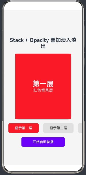
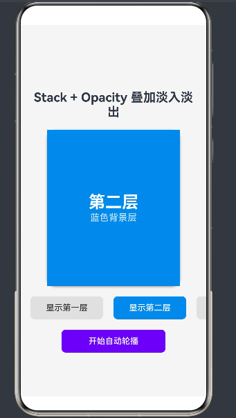
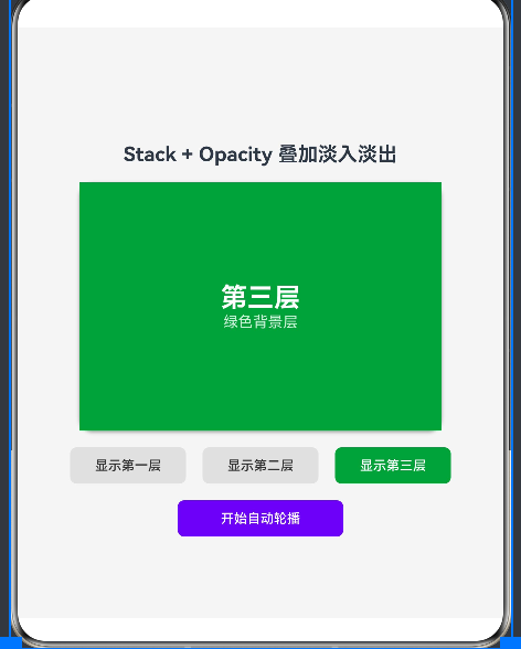
三个Column组件层叠在Stack中,每个组件的透明度绑定到对应的状态变量。
切换方法
使用animateTo包裹状态变化,实现500毫秒的淡入淡出过渡。
自动轮播
每隔2秒自动切换到下一层,形成轮播效果。
进阶示例
8.1 多层级叠加效果
typescript
@Entry
@Component
struct MultiLayerStack {
  @State currentIndex: number = 0
  @State opacity0: number = 1
  @State opacity1: number = 0
  @State opacity2: number = 0
  @State opacity3: number = 0

  private layers = [
    { color: '#E53935', title: '第一层' },
    { color: '#1E88E5', title: '第二层' },
    { color: '#43A047', title: '第三层' },
    { color: '#FB8C00', title: '第四层' }
  ]

  build() {
    Column({ space: 20 }) {
      Text('多层级叠加效果').fontSize(24).fontWeight(FontWeight.Bold)

      Stack() {
        ForEach(this.layers, (item, index) => {
          Column() {
            Text(item.title).fontSize(32).fontWeight(FontWeight.Bold).fontColor(Color.White)
          }
          .width('100%')
          .height('100%')
          .backgroundColor(item.color)
          .justifyContent(FlexAlign.Center)
          .opacity(this.getOpacity(index))
        }, (_, index) => index.toString())
      }
      .width('80%')
      .height(300)
      .borderRadius(16)

      Row({ space: 10 }) {
        ForEach(this.layers, (item, index) => {
          Button(`第${index + 1}层`)
            .width(100)
            .backgroundColor(this.currentIndex === index ? item.color : '#E0E0E0')
            .fontColor(this.currentIndex === index ? Color.White : '#333')
            .onClick(() => { this.switchLayer(index) })
        }, (_, index) => index.toString())
      }
    }
    .width('100%')
    .height('100%')
    .justifyContent(FlexAlign.Center)
  }

  getOpacity(index: number): number {
    const opacities = [this.opacity0, this.opacity1, this.opacity2, this.opacity3]
    return opacities[index] || 0
  }

  switchLayer(targetIndex: number): void {
    animateTo({ duration: 500 }, () => {
      this.currentIndex = targetIndex
      this.opacity0 = targetIndex === 0 ? 1 : 0
      this.opacity1 = targetIndex === 1 ? 1 : 0
      this.opacity2 = targetIndex === 2 ? 1 : 0
      this.opacity3 = targetIndex === 3 ? 1 : 0
    })
  }
}
8.2 带缩放效果的淡入淡出
typescript
@Entry
@Component
struct FadeScaleEffect {
  @State currentIndex: number = 0
  @State opacity0: number = 1; @State scale0: number = 1
  @State opacity1: number = 0; @State scale1: number = 0.8
  @State opacity2: number = 0; @State scale2: number = 0.8

  build() {
    Column({ space: 20 }) {
      Text('带缩放效果的淡入淡出').fontSize(24).fontWeight(FontWeight.Bold)

      Stack() {
        Column() { Text('第一层').fontSize(32).fontColor(Color.White) }
          .width('100%').height('100%').backgroundColor('#E53935')
          .justifyContent(FlexAlign.Center).opacity(this.opacity0).scale(this.scale0)

        Column() { Text('第二层').fontSize(32).fontColor(Color.White) }
          .width('100%').height('100%').backgroundColor('#1E88E5')
          .justifyContent(FlexAlign.Center).opacity(this.opacity1).scale(this.scale1)

        Column() { Text('第三层').fontSize(32).fontColor(Color.White) }
          .width('100%').height('100%').backgroundColor('#43A047')
          .justifyContent(FlexAlign.Center).opacity(this.opacity2).scale(this.scale2)
      }
      .width('80%').height(300).borderRadius(16)

      Row({ space: 20 }) {
        Button('第一层').onClick(() => { this.switchLayer(0) })
        Button('第二层').onClick(() => { this.switchLayer(1) })
        Button('第三层').onClick(() => { this.switchLayer(2) })
      }
    }
    .width('100%').height('100%').justifyContent(FlexAlign.Center)
  }

  switchLayer(targetIndex: number): void {
    animateTo({ duration: 500, curve: Curve.EaseOut }, () => {
      this.currentIndex = targetIndex
      const targets = [
        { o0: 1, s0: 1, o1: 0, s1: 0.8, o2: 0, s2: 0.8 },
        { o0: 0, s0: 0.8, o1: 1, s1: 1, o2: 0, s2: 0.8 },
        { o0: 0, s0: 0.8, o1: 0, s1: 0.8, o2: 1, s2: 1 }
      ]
      const t = targets[targetIndex]
      this.opacity0 = t.o0; this.scale0 = t.s0
      this.opacity1 = t.o1; this.scale1 = t.s1
      this.opacity2 = t.o2; this.scale2 = t.s2
    })
  }
}
性能优化策略
9.1 避免数组索引绑定
在ArkTS中,@State装饰的数组通过索引访问在build()中绑定时,框架的响应式系统无法正确追踪数组元素的变更。
优化方案 :将数组拆分为多个独立的@State变量。
typescript
// 不推荐
@State opacityArray: number[] = [1, 0, 0]
.opacity(this.opacityArray[0])

// 推荐
@State opacity0: number = 1
@State opacity1: number = 0
@State opacity2: number = 0
.opacity(this.opacity0)
9.2 减少不必要的渲染
Stack中的所有子组件都会被渲染,即使设置了opacity(0)。
优化方案:
- 使用条件渲染避免不必要的渲染
- 使用
LazyForEach或@Builder进行延迟加载 - 简化组件结构,减少嵌套层级
9.3 使用GPU加速
opacity变化会触发GPU的合成操作,比CPU渲染更高效。
优化方案:
- 将多个组件的opacity动画合并到一个animateTo中
- 控制动画时长,避免过长的动画
- 确保应用启用了硬件加速
9.4 合理使用状态管理
优化方案:
- 将状态变量定义在最小的作用域内
- 合理使用
@Link和@Prop进行状态传递 - 使用
@Watch装饰器进行精确控制
9.5 避免过度动画
优化方案:
- 同一时间只执行必要的动画
- 合理设置动画时长(推荐200-500毫秒)
- 使用合适的缓动曲线
实战应用场景
10.1 页面切换动画
typescript
@Entry
@Component
struct PageContainer {
  @State currentPage: number = 0
  @State pageOpacity0: number = 1
  @State pageOpacity1: number = 0

  build() {
    Stack() {
      HomePage().opacity(this.pageOpacity0)
      SettingsPage().opacity(this.pageOpacity1)
    }
    .width('100%').height('100%')
  }

  navigateTo(pageIndex: number): void {
    animateTo({ duration: 300 }, () => {
      this.pageOpacity0 = pageIndex === 0 ? 1 : 0
      this.pageOpacity1 = pageIndex === 1 ? 1 : 0
      this.currentPage = pageIndex
    })
  }
}
10.2 弹窗过渡效果
typescript
@Entry
@Component
struct DialogDemo {
  @State showDialog: boolean = false
  @State dialogOpacity: number = 0
  @State maskOpacity: number = 0

  build() {
    Stack() {
      Column() {
        Button('显示弹窗').onClick(() => {
          this.showDialog = true
          animateTo({ duration: 300 }, () => {
            this.dialogOpacity = 1
            this.maskOpacity = 0.6
          })
        })
      }.width('100%').height('100%')

      Column()
        .width('100%').height('100%').backgroundColor('#000000')
        .opacity(this.maskOpacity)
        .onClick(() => { this.closeDialog() })

      if (this.showDialog) {
        Column() {
          Text('弹窗标题').fontSize(20).fontWeight(FontWeight.Bold)
          Text('弹窗内容').fontSize(16).margin({ top: 10 })
          Button('关闭').margin({ top: 20 }).onClick(() => { this.closeDialog() })
        }
        .width(300).height(200).backgroundColor('#FFFFFF')
        .borderRadius(16).padding(20).opacity(this.dialogOpacity)
      }
    }
    .width('100%').height('100%')
  }

  closeDialog(): void {
    animateTo({ duration: 300 }, () => {
      this.dialogOpacity = 0
      this.maskOpacity = 0
    })
    setTimeout(() => { this.showDialog = false }, 300)
  }
}
10.3 图片轮播组件
typescript
@Entry
@Component
struct ImageCarousel {
  @State currentIndex: number = 0
  @State opacity0: number = 1
  @State opacity1: number = 0
  @State opacity2: number = 0

  private images = ['img1.jpg', 'img2.jpg', 'img3.jpg']

  build() {
    Column({ space: 10 }) {
      Stack() {
        ForEach(this.images, (img, index) => {
          Image(img)
            .width('100%').height(200).objectFit(ImageFit.Cover)
            .opacity(this.getOpacity(index))
        }, (_, index) => index.toString())
      }
      .width('80%').height(200).borderRadius(16)

      Row({ space: 8 }) {
        ForEach(this.images, (_, index) => {
          Column()
            .width(8).height(8).borderRadius(4)
            .backgroundColor(this.currentIndex === index ? '#6200EE' : '#CCCCCC')
        }, (_, index) => index.toString())
      }
    }
    .width('100%').height('100%').justifyContent(FlexAlign.Center)
  }

  getOpacity(index: number): number {
    const opacities = [this.opacity0, this.opacity1, this.opacity2]
    return opacities[index] || 0
  }

  aboutToAppear(): void {
    setInterval(() => {
      const nextIndex = (this.currentIndex + 1) % this.images.length
      animateTo({ duration: 500 }, () => {
        this.opacity0 = nextIndex === 0 ? 1 : 0
        this.opacity1 = nextIndex === 1 ? 1 : 0
        this.opacity2 = nextIndex === 2 ? 1 : 0
        this.currentIndex = nextIndex
      })
    }, 3000)
  }
}
10.4 标签页切换
typescript
@Entry
@Component
struct TabSwitch {
  @State currentTab: number = 0
  @State contentOpacity0: number = 1
  @State contentOpacity1: number = 0
  @State contentOpacity2: number = 0

  private tabs = ['首页', '分类', '我的']

  build() {
    Column() {
      Row() {
        ForEach(this.tabs, (tab, index) => {
          Column() {
            Text(tab).fontSize(16)
              .fontColor(this.currentTab === index ? '#6200EE' : '#666')
            Column()
              .width(20).height(3).backgroundColor('#6200EE')
              .opacity(this.currentTab === index ? 1 : 0).margin({ top: 5 })
          }
          .flexGrow(1).height(50).justifyContent(FlexAlign.Center)
          .onClick(() => { this.switchTab(index) })
        }, (tab, index) => index.toString())
      }.width('100%')

      Stack() {
        Column() { Text('首页内容').fontSize(24) }
          .width('100%').height('100%').justifyContent(FlexAlign.Center)
          .opacity(this.contentOpacity0)

        Column() { Text('分类内容').fontSize(24) }
          .width('100%').height('100%').justifyContent(FlexAlign.Center)
          .opacity(this.contentOpacity1)

        Column() { Text('我的内容').fontSize(24) }
          .width('100%').height('100%').justifyContent(FlexAlign.Center)
          .opacity(this.contentOpacity2)
      }
      .width('100%').flexGrow(1)
    }
    .width('100%').height('100%')
  }

  switchTab(targetIndex: number): void {
    animateTo({ duration: 300 }, () => {
      this.contentOpacity0 = targetIndex === 0 ? 1 : 0
      this.contentOpacity1 = targetIndex === 1 ? 1 : 0
      this.contentOpacity2 = targetIndex === 2 ? 1 : 0
      this.currentTab = targetIndex
    })
  }
}
总结
11.1 本文总结
本文深入探讨了HarmonyOS NEXT中Stack+Opacity叠加淡入淡出的实现原理和应用场景:
- 基础概念:介绍了ArkTS的核心装饰器和响应式更新机制
- Stack组件:详细讲解了Stack组件的布局原理和使用场景
- Opacity属性:分析了Opacity属性的渲染机制和最佳实践
- animateTo API:深入解析了animateTo动画API的参数配置
- 核心原理:阐述了叠加淡入淡出的实现原理和状态管理策略
- 示例代码:提供了基础示例和进阶示例
- 性能优化:总结了性能优化策略
- 实战应用:介绍了在页面切换、弹窗过渡、图片轮播、标签页切换等场景中的应用
11.2 技术要点
- 状态管理 :使用独立的
@State变量管理每个子组件的透明度 - 动画驱动:使用animateTo包裹状态变化,实现平滑过渡
- 布局层叠:使用Stack组件实现多个子组件的层叠布局
- 时序控制:合理控制动画时序,实现顺序或交叉切换效果
11.3 结语
Stack+Opacity叠加淡入淡出是HarmonyOS NEXT中实现层叠组件切换动画的经典方案。通过掌握本文介绍的技术要点和最佳实践,开发者可以轻松实现各种复杂的淡入淡出效果,提升应用的用户体验。