摘要:介绍 Label 与 Text 的选型区别、Label 的常用属性,以及背景、内边距、文本选择等实战用法,帮助你根据场景选对组件。
QML 里显示文本最常用的两个组件是 Text 和 Label。它们看起来都能显示文字,但使用场景并不一样:Text 更轻量、更底层;Label 则继承了 Controls 主题的字体和颜色,还能设置背景。很多新手会在该用 Label 的地方写成 Text,结果字体和主题对不上,又要手动调一堆属性。
这篇把 Label 的三个核心能力讲透------基础样式、内边距和背景支持,最后再用一个对比 demo 帮你快速决定该用哪个组件。
什么时候应该用 Label
如果你只是想在一块区域里显示一段文字,不关心主题一致性,Text 完全够用。但遇到下面这些情况,Label 会更省心:
- 做表单、设置页,需要文字和 Switch、Slider、ComboBox 等 Controls 组件风格统一
- 需要给文字加背景色、边框、圆角,做成标签或徽章
- 项目使用了
Material、Fusion、Universal等 Controls 主题,希望文字自动跟随主题字体
Label 本质上是对 Text 的封装,增加了主题继承和 background 属性,所以 API 大部分通用,学习成本很低。
Label 基础用法
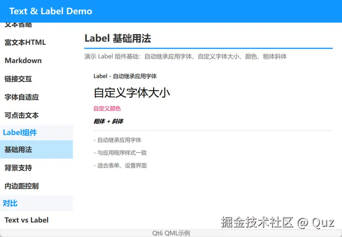
Label 来自 QtQuick.Controls,默认会继承应用字体。你可以把它理解为"带主题加持的 Text"。这个 demo 展示了最常用的字体样式设置:默认字体、大小、颜色、粗体和斜体。
演示代码
qml
import QtQuick
import QtQuick.Controls
import QtQuick.Layouts

FadeInAnimation {
    ColumnLayout {
        anchors.fill: parent
        anchors.margins: 20
        spacing: 15

        // ... 省略标题组件 TitleSeparator ...

        ColumnLayout {
            Layout.leftMargin: 20
            spacing: 12

            Label {
                text: "Label - 自动继承应用字体"
            }

            Label {
                text: "自定义字体大小"
                font.pixelSize: 24
            }

            Label {
                text: "自定义颜色"
                color: "#E91E63"
            }

            Label {
                text: "粗体 + 斜体"
                font.bold: true
                font.italic: true
            }

            // ... 省略说明文本 ...
        }

        Item { Layout.fillHeight: true }
    }
}
关键逻辑解析
Label 的 API 和 Text 很像,但默认会跟随 Controls 主题。如果你用了 Material 或 Fusion 风格,Label 的字体会自动适配,而 Text 不会。
- 想改大小:用
font.pixelSize或font.pointSize - 想改颜色:直接用
color - 想加粗斜体:
font.bold、font.italic
适用场景
这种基础用法最适合做设置页的标签、列表项标题、按钮旁边的说明文字。比如"用户名"、"音量"、"主题"这类文字,用 Label 可以直接和界面其他 Controls 组件保持一致的视觉风格,不需要额外指定字体。
注意点
font.pixelSize 和 font.pointSize 不要同时设置,否则实际显示大小会按最后一个生效,容易让人困惑。建议在项目里统一用一种单位。
Label 内边距控制
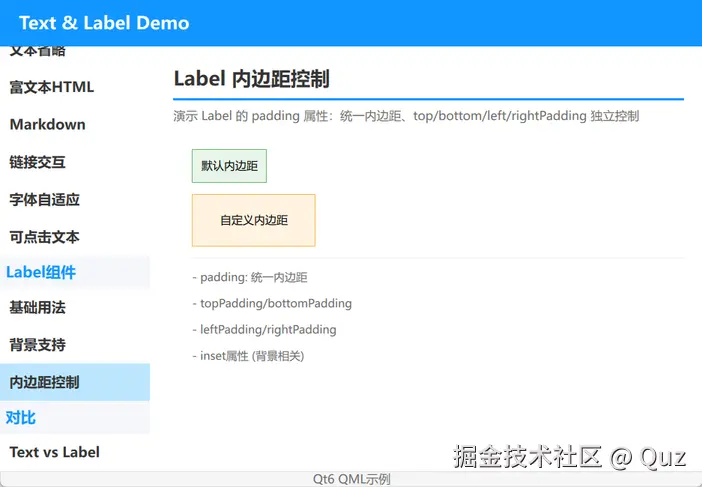
给 Label 加背景时,内边距决定了文字和背景边界的距离。如果 padding 设得太小,文字会贴边;设得太大,背景又会显得臃肿。这个 demo 展示了统一内边距和四边独立控制两种方式。
演示代码
qml
import QtQuick
import QtQuick.Controls
import QtQuick.Layouts

FadeInAnimation {
    ColumnLayout {
        anchors.fill: parent
        anchors.margins: 20
        spacing: 15

        // ... 省略标题组件 TitleSeparator ...

        ColumnLayout {
            Layout.leftMargin: 20
            spacing: 12

            Label {
                text: "默认内边距"
                padding: 10
                background: Rectangle { color: "#e8f5e9"; border.color: "#66bb6a" }
            }

            Label {
                text: "自定义内边距"
                padding: 10
                topPadding: 20
                bottomPadding: 20
                leftPadding: 30
                rightPadding: 30
                background: Rectangle { color: "#fff3e0"; border.color: "#ffb74d" }
            }

            // ... 省略说明文本 ...
        }

        Item { Layout.fillHeight: true }
    }
}
关键逻辑解析
padding:统一设置四边topPadding/bottomPadding/leftPadding/rightPadding:单独控制某一边- 背景大小会跟着内边距自动撑开
适用场景
内边距控制在做按钮式标签、状态徽章、提示条时特别有用。比如一个"已完成"的绿色标签,上下左右各留一点空间,视觉会更舒服。如果四个方向需要的留白不一样,就用独立内边距属性。
注意点
单独设置 topPadding 等属性时,它们会覆盖 padding 在对应方向的值。所以代码里常见写法是先给一个基础 padding: 10,再用 leftPadding: 30 把某一边加大。
Label 背景支持
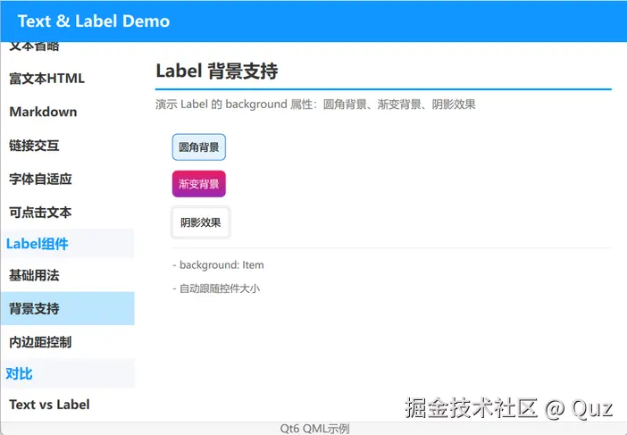
Label 支持 background 属性,这是 Text 没有的。你可以给文字加纯色背景、渐变背景,甚至模拟阴影效果。做标签、徽章、提示条时非常方便。
演示代码
qml
import QtQuick
import QtQuick.Controls
import QtQuick.Layouts

FadeInAnimation {
    ColumnLayout {
        anchors.fill: parent
        anchors.margins: 20
        spacing: 15

        // ... 省略标题组件 TitleSeparator ...

        ColumnLayout {
            Layout.leftMargin: 20
            spacing: 12

            Label {
                text: "圆角背景"
                padding: 8
                background: Rectangle {
                    color: "#e3f2fd"
                    border.color: "#1976D2"
                    border.width: 1
                    radius: 6
                }
            }

            Label {
                text: "渐变背景"
                padding: 8
                background: Rectangle {
                    gradient: Gradient {
                        GradientStop { position: 0.0; color: "#E91E63" }
                        GradientStop { position: 1.0; color: "#9C27B0" }
                    }
                    radius: 6
                }
                color: "white"
            }

            Label {
                text: "阴影效果"
                padding: 10
                background: Rectangle {
                    color: "white"
                    border.color: "#ddd"
                    radius: 4
                    Rectangle {
                        anchors.fill: parent
                        anchors.margins: -2
                        color: "transparent"
                        border.color: "#e0e0e0"
                        radius: 6
                        z: -1
                    }
                }
            }

            // ... 省略说明文本 ...
        }

        Item { Layout.fillHeight: true }
    }
}
关键逻辑解析
background 接受任意 Item,通常放 Rectangle。你可以做圆角、渐变、阴影,甚至嵌套更复杂的组件。
- 圆角背景:给
Rectangle设置radius - 渐变背景:用
Gradient定义两个或多个颜色停止点 - 阴影效果:QML 没有内置阴影,这里用了一个稍大、居后的透明
Rectangle边框来模拟
适用场景
背景支持让 Label 可以直接当徽章、标签、提示气泡用。比如消息列表里的"未读"小红点、任务状态标签、表单里的必填提示,都可以用它实现,不需要再套一层 Rectangle。
注意点
渐变背景上的文字颜色要自己保证可读性。demo 里把渐变文字设成白色,是因为粉色/紫色背景上白色对比度足够。如果你的背景偏浅,文字就要用深色。
Text vs Label 对比
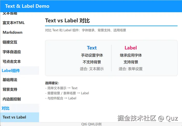
最后用一个对比页总结选型。这个 demo 把两种组件的字体继承、背景支持和推荐场景放在同一页,方便直观比较。
演示代码
qml
import QtQuick
import QtQuick.Controls
import QtQuick.Layouts

FadeInAnimation {
    ColumnLayout {
        anchors.fill: parent
        anchors.margins: 20
        spacing: 15

        // ... 省略标题组件 TitleSeparator ...

        Rectangle {
            Layout.fillWidth: true
            Layout.topMargin: 5
            Layout.bottomMargin: 5
            color: "#f8f9fa"
            border.color: "#e0e0e0"
            border.width: 1
            radius: 8
            implicitHeight: compareRow.implicitHeight + 40

            RowLayout {
                id: compareRow
                anchors.centerIn: parent
                spacing: 30

                ColumnLayout {
                    spacing: 8
                    Layout.alignment: Qt.AlignHCenter

                    Text {
                        text: "Text"
                        font.pointSize: 14
                        font.bold: true
                        color: "#1976D2"
                        Layout.alignment: Qt.AlignHCenter
                    }

                    Text { text: "手动设置字体"; font.pointSize: 11; Layout.alignment: Qt.AlignHCenter }
                    Text { text: "不支持背景"; font.pointSize: 11; Layout.alignment: Qt.AlignHCenter }
                    Text { text: "适合: 文本展示"; font.pointSize: 11; color: "#666"; Layout.alignment: Qt.AlignHCenter }
                }

                Rectangle {
                    width: 1
                    Layout.fillHeight: true
                    color: "#ccc"
                }

                ColumnLayout {
                    spacing: 8
                    Layout.alignment: Qt.AlignHCenter

                    Text {
                        text: "Label"
                        font.pointSize: 14
                        font.bold: true
                        color: "#E91E63"
                        Layout.alignment: Qt.AlignHCenter
                    }

                    Label { text: "继承应用字体"; font.pointSize: 11; Layout.alignment: Qt.AlignHCenter }
                    Label { text: "支持背景"; font.pointSize: 11; Layout.alignment: Qt.AlignHCenter }
                    Label { text: "适合: 表单设置"; font.pointSize: 11; color: "#666"; Layout.alignment: Qt.AlignHCenter }
                }
            }
        }

        // ... 省略底部建议文本 ...

        Item { Layout.fillHeight: true }
    }
}
关键逻辑解析
| 场景 | 推荐 |
|---|---|
| 简单文本展示,不需要主题一致 | Text |
| 需要背景 / 表单场景 | Label |
| 与 Controls 组件配合使用 | Label |
选型建议
可以记住一条简单规则:如果这段文字旁边都是 Button、Switch、Slider 这类 Controls 组件,或者需要背景装饰,优先用 Label;如果只是纯展示、做动画效果、或者在自定义组件内部显示文字,用 Text 更轻量。
运行验证
- Qt Creator 打开
qml_text/CMakeLists.txt - 按
Ctrl+R运行 - 在左侧导航切换 Label 基础用法、内边距控制、背景支持、Text vs Label
扩展复用方向
- 把 Label 背景做成 Badge 组件,支持 success、warning、error 等状态色
- 用 Label 做设置项标题,配合 Switch、Slider 使用,保持主题一致
- 给 Label 加
MouseArea实现可点击标签,比如筛选标签、分类标签 - 把带渐变背景的 Label 封装成标题组件,用在卡片头部
小结
Label 不是 Text 的替代品,而是 Text 在 Controls 场景下的增强版。它解决了三个实际问题:主题字体继承、内边距控制、背景支持。掌握了这三点,再配合 Text vs Label 的选型思路,就能在 QML 项目里合理地使用文本组件。
已验证环境:
- Qt 版本:Qt 6.11.1
- 操作系统:Windows 11
- GitHub:QML-Minimal-Demos/qml_text