系列:鸿蒙 HarmonyOS 6.1 新特性实战 · 第 35 篇
Slider(滑块)和 Rating(评分)是两个高频使用的数值选择组件。Slider 适合连续值(音量、亮度、进度),Rating 适合离散评分(1-5 星)。本篇涵盖 OutSet/InSet 两种 Slider 样式、垂直方向、提示气泡和 Rating 的 0.5 步进评分。
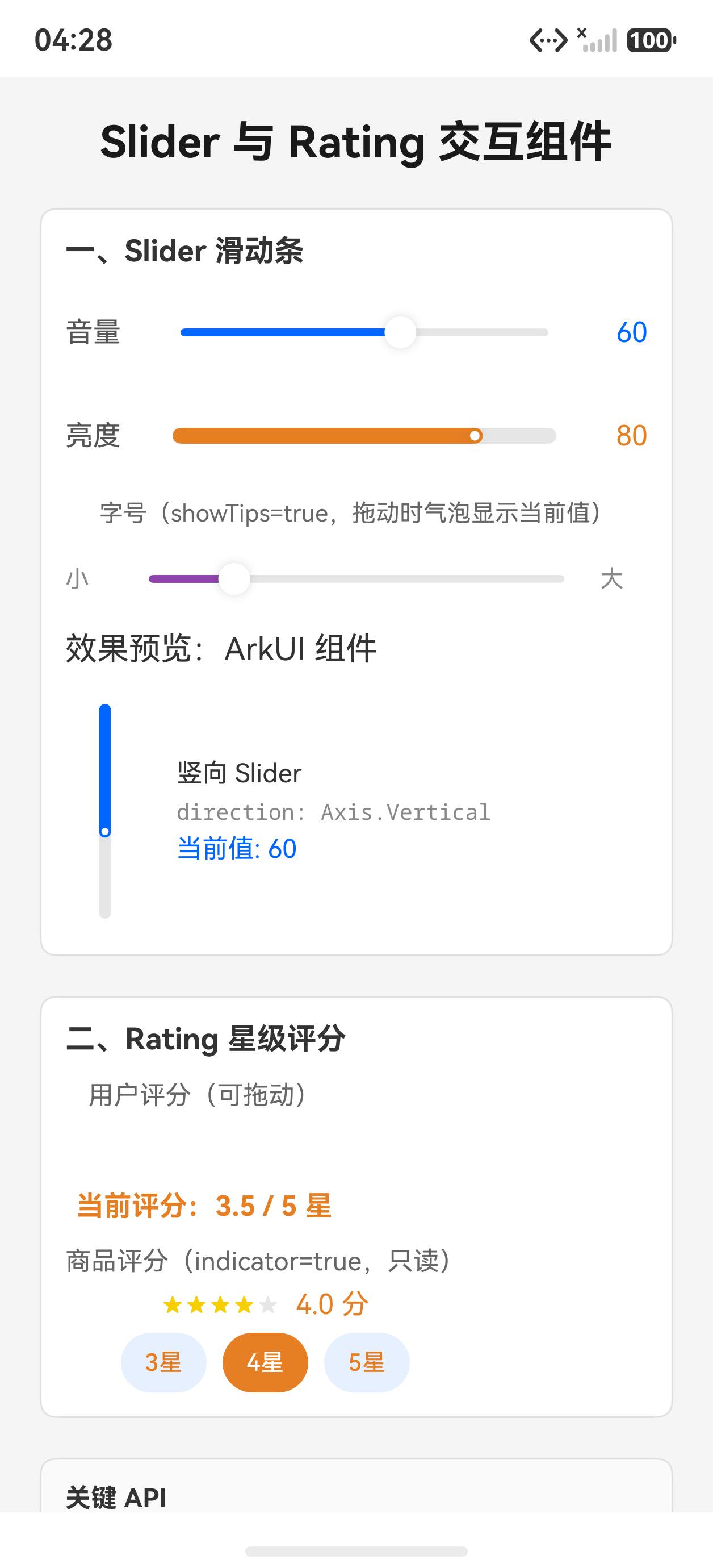
运行效果
初始状态,展示各种 Slider 和 Rating:
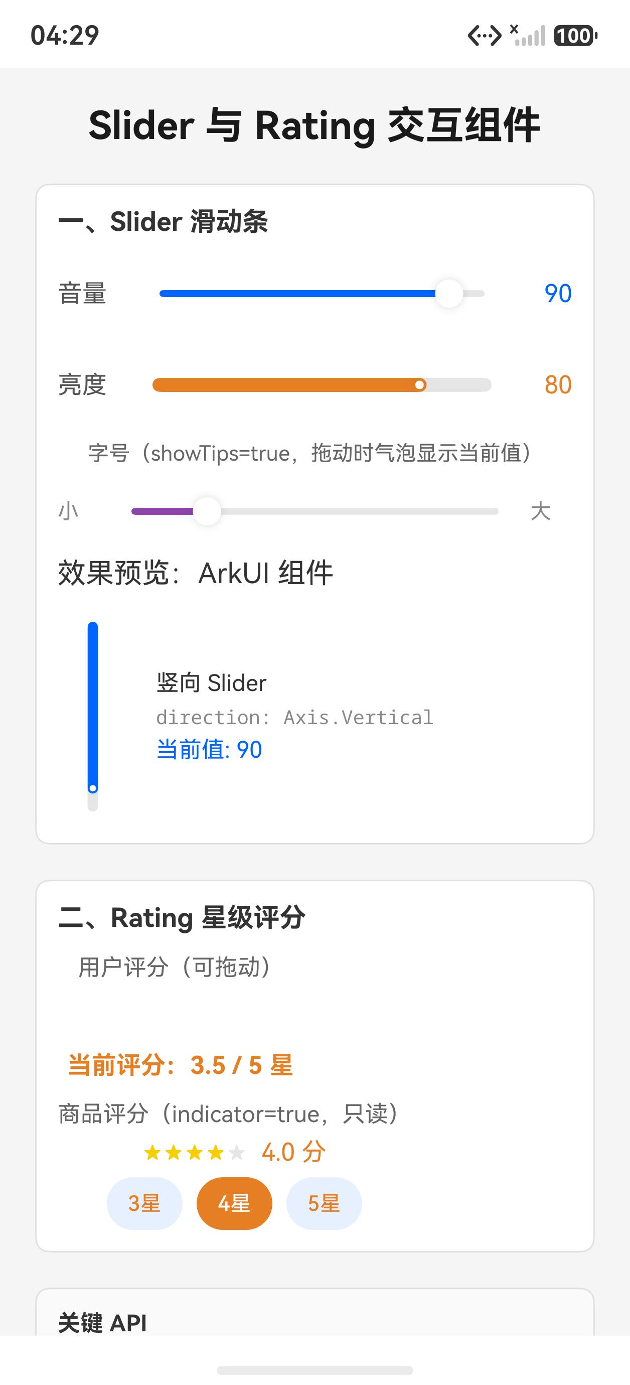
拖动音量 Slider 后的状态:
一、Slider 基础用法
typescript
@State volume: number = 60

Slider({
  value: this.volume,
  min: 0,
  max: 100,
  step: 1,
  style: SliderStyle.OutSet  // 滑块在轨道外侧
})
.width('100%')
.selectedColor('#0066ff')
.trackColor('#e0e0e0')
.trackThickness(4)
.showTips(true)  // 拖动时显示数值气泡
.onChange((val: number) => {
  this.volume = Math.round(val)
})
OutSet vs InSet
typescript
// OutSet(默认):滑块突出轨道,视觉更明显
Slider({ style: SliderStyle.OutSet, ... })

// InSet:滑块内嵌轨道,更紧凑
Slider({ style: SliderStyle.InSet, ... })
二、垂直 Slider
typescript
@State brightnessVal: number = 80

Slider({
  value: this.brightnessVal,
  min: 0, max: 100, step: 1,
  style: SliderStyle.OutSet,
  direction: Axis.Vertical,  // 垂直方向
  reverse: false             // false=从下到上增加(亮度/音量的直觉方向)
})
.height(200)
.selectedColor('#f39c12')
.onChange((val: number) => { this.brightnessVal = Math.round(val) })
注意 :@State 属性名不能叫 brightness,这与 ArkUI 的内置 .brightness() 方法同名会引发类型冲突,应命名为 brightnessVal 等。
三、showTips 提示气泡
typescript
Slider({ value: this.progress, ... })
  .showTips(true)   // 拖动时在滑块上方显示当前值
气泡会自动格式化显示数值,适合需要精确数值反馈的场景(音量、进度条等)。
四、Rating 评分组件
typescript
@State starScore: number = 3.5
@State readonlyScore: number = 4.0

// 可交互评分(0.5 步进)
Rating({ rating: this.starScore, indicator: false })
  .stars(5)
  .stepSize(0.5)   // 每次调整 0.5 颗星
  .starStyle({
    backgroundUri: 'common/star_off.svg',
    foregroundUri: 'common/star_on.svg',
  })
  .onChange((val: number) => { this.starScore = val })

// 只读指示器(用于展示评分)
Rating({ rating: this.readonlyScore, indicator: true })
  .stars(5)
indicator: true 时用户无法修改,适合评论列表展示场景。
完整代码
typescript
@Entry
@Component
struct Index {
  @State volume: number = 60
  @State brightnessVal: number = 80
  @State progress: number = 45
  @State starScore: number = 3.5
  @State readonlyScore: number = 4.0

  build() {
    Scroll() {
      Column({ space: 20 }) {
        Text('Slider 与 Rating 完全指南')
          .fontSize(22).fontWeight(FontWeight.Bold).fontColor('#1a1a1a')

        // 1. OutSet 水平 Slider(音量)
        Column({ space: 10 }) {
          Text('一、Slider OutSet(水平)').fontSize(15).fontWeight(FontWeight.Bold).fontColor('#333')
          Row({ space: 12 }) {
            Text('🔊').fontSize(20)
            Slider({ value: this.volume, min: 0, max: 100, step: 1, style: SliderStyle.OutSet })
              .layoutWeight(1).selectedColor('#0066ff').trackColor('#e0e0e0')
              .trackThickness(4).showTips(true)
              .onChange((val: number) => { this.volume = Math.round(val) })
            Text(this.volume.toString() + '%').fontSize(13).fontColor('#555').width(40)
          }
          .alignItems(VerticalAlign.Center).width('100%')
        }
        .padding(12).backgroundColor('#fff').borderRadius(8).width('100%')
        .border({ width: 1, color: '#e0e0e0' }).alignItems(HorizontalAlign.Start)

        // 2. InSet 样式
        Column({ space: 10 }) {
          Text('二、Slider InSet(进度)').fontSize(15).fontWeight(FontWeight.Bold).fontColor('#333')
          Slider({ value: this.progress, min: 0, max: 100, step: 5, style: SliderStyle.InSet })
            .width('100%').selectedColor('#27ae60').trackColor('#e0e0e0')
            .trackThickness(8).showTips(true)
            .onChange((val: number) => { this.progress = Math.round(val) })
          Text('进度:' + this.progress.toString() + '%')
            .fontSize(13).fontColor('#27ae60').fontWeight(FontWeight.Bold)
        }
        .padding(12).backgroundColor('#fff').borderRadius(8).width('100%')
        .border({ width: 1, color: '#e0e0e0' }).alignItems(HorizontalAlign.Start)

        // 3. 垂直 Slider(亮度)
        Column({ space: 10 }) {
          Text('三、Slider 垂直(亮度)').fontSize(15).fontWeight(FontWeight.Bold).fontColor('#333')
          Row({ space: 20 }) {
            Slider({
              value: this.brightnessVal, min: 0, max: 100, step: 1,
              style: SliderStyle.OutSet, direction: Axis.Vertical, reverse: false
            })
            .height(160).selectedColor('#f39c12').trackColor('#e0e0e0').trackThickness(4)
            .onChange((val: number) => { this.brightnessVal = Math.round(val) })

            Column({ space: 8 }) {
              Text('☀️').fontSize(32)
              Text(this.brightnessVal.toString() + '%').fontSize(14).fontColor('#f39c12').fontWeight(FontWeight.Bold)
              Text('亮度').fontSize(12).fontColor('#888')
            }
          }
          .alignItems(VerticalAlign.Center)
        }
        .padding(12).backgroundColor('#fff').borderRadius(8).width('100%')
        .border({ width: 1, color: '#e0e0e0' }).alignItems(HorizontalAlign.Start)

        // 4. Rating
        Column({ space: 10 }) {
          Text('四、Rating 星级评分').fontSize(15).fontWeight(FontWeight.Bold).fontColor('#333')
          Text('可交互(0.5 步进):').fontSize(13).fontColor('#555')
          Row({ space: 12 }) {
            Rating({ rating: this.starScore, indicator: false })
              .stars(5).stepSize(0.5)
              .onChange((val: number) => { this.starScore = val })
            Text(this.starScore.toFixed(1) + ' ★').fontSize(14).fontColor('#f39c12').fontWeight(FontWeight.Bold)
          }
          .alignItems(VerticalAlign.Center)

          Text('只读展示(indicator=true):').fontSize(13).fontColor('#555')
          Row({ space: 12 }) {
            Rating({ rating: this.readonlyScore, indicator: true })
              .stars(5)
            Text(this.readonlyScore.toFixed(1) + ' / 5.0').fontSize(13).fontColor('#888')
          }
          .alignItems(VerticalAlign.Center)
        }
        .padding(12).backgroundColor('#fff').borderRadius(8).width('100%')
        .border({ width: 1, color: '#e0e0e0' }).alignItems(HorizontalAlign.Start)
      }
      .padding(20).width('100%')
    }
    .width('100%').height('100%').backgroundColor('#f5f5f5')
  }
}
API 速查
| 属性/方法 | 说明 |
|---|---|
Slider({ value, min, max, step, style, direction }) |
创建滑块 |
.selectedColor('#0066ff') |
已选轨道颜色 |
.trackColor('#e0e0e0') |
未选轨道颜色 |
.trackThickness(4) |
轨道粗细 |
.showTips(true) |
拖动时显示数值气泡 |
SliderStyle.OutSet / InSet |
外突 / 内嵌样式 |
Axis.Vertical / Horizontal |
滑动方向 |
Rating({ rating, indicator }) |
创建评分组件 |
.stars(5) |
总星数 |
.stepSize(0.5) |
最小步进值 |
小结
@State属性避开 ArkUI 内置名 :brightness、opacity、scale等与 ArkUI 方法同名,会引发类型冲突showTips适合精确值反馈:音量、进度等场景开启,告知用户当前精确数值- 垂直 Slider 要设高度 :水平设
width,垂直设height - Rating
indicator=true只读:评论列表展示用只读模式,防止误操作
上一篇:Checkbox、Radio、Toggle 选择组件实战 | 下一篇:Progress 进度条:5 种类型与动画演示