Tabs组件自带TabBar,但说实话,默认样式基本不能直接上生产。圆角背景、指示器动画、图标颜色切换、Badge红点------这些都得自己画。自定义TabBar的核心思路是:隐藏默认TabBar,用自定义布局替代,通过@Link或@Prop与Tabs联动。
隐藏默认TabBar
typescript
Tabs({ barPosition: BarPosition.End }) {
  TabContent() { Text('首页') }
  TabContent() { Text('发现') }
  TabContent() { Text('我的') }
}
.barHeight(0) // 隐藏默认TabBar
barHeight(0)是最干净的方式。.barOpacity(0)也行,但还是会占空间。
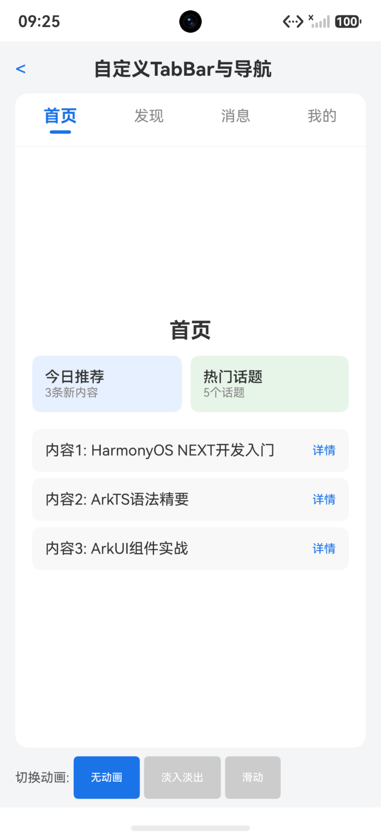
自定义TabBar布局
typescript
import { curves } from '@kit.ArkUI';

interface TabItem {
  title: string
  icon: Resource
  selectedIcon: Resource
}

@Component
struct CustomTabBar {
  @Prop currentIndex: number = 0
  @Link tabs: TabItem[]
  onTabClick: (index: number) => void = () => {}

  build() {
    Row() {
      ForEach(this.tabs, (item: TabItem, index: number) => {
        Column() {
          Image(this.currentIndex === index ? item.selectedIcon : item.icon)
            .width(24)
            .height(24)
            .objectFit(ImageFit.Contain)
          Text(item.title)
            .fontSize(12)
            .fontColor(this.currentIndex === index ? '#007DFF' : '#999999')
            .margin({ top: 4 })
        }
        .layoutWeight(1)
        .height(56)
        .justifyContent(FlexAlign.Center)
        .onClick(() => this.onTabClick(index))
      }, (item: TabItem, index: number) => index.toString())
    }
    .width('100%')
    .height(56)
    .backgroundColor(Color.White)
    .shadow({ radius: 8, color: '#1F000000', offsetY: -1 })
  }
}
onTabClick回调需要在父组件里切换Tabs的currentIndex:
typescript
@Component
struct IndexPage {
  @State currentIndex: number = 0
  @State tabItems: TabItem[] = [
    { title: '首页', icon: $r('app.media.ic_home'), selectedIcon: $r('app.media.ic_home_selected') },
    { title: '发现', icon: $r('app.media.ic_discover'), selectedIcon: $r('app.media.ic_discover_selected') },
    { title: '我的', icon: $r('app.media.ic_me'), selectedIcon: $r('app.media.ic_me_selected') }
  ]

  build() {
    Column() {
      Tabs({ index: this.currentIndex }) {
        TabContent() { HomePage() }
        TabContent() { DiscoverPage() }
        TabContent() { MePage() }
      }
      .barHeight(0)
      .scrollable(false)
      .onChange((index: number) => {
        this.currentIndex = index
      })

      CustomTabBar({
        currentIndex: this.currentIndex,
        tabs: $tabItems,
        onTabClick: (index: number) => {
          this.currentIndex = index
        }
      })
    }
  }
}
要点:Tabs的index绑定@State变量,自定义TabBar的点击修改这个变量,Tabs的onChange同步回来。 双向同步是关键。
scrollable(false)禁止左右滑动切换------很多应用要求TabBar和滑动不联动。
指示器动画
在选中Tab下方加一条横线,带弹簧动画:
typescript
@Component
struct AnimatedTabBar {
  @Prop currentIndex: number = 0
  @Link tabTitles: string[]
  onTabClick: (index: number) => void = () => {}

  build() {
    Stack({ alignContent: Alignment.Bottom }) {
      Row() {
        ForEach(this.tabTitles, (title: string, index: number) => {
          Column() {
            Text(title)
              .fontSize(16)
              .fontWeight(this.currentIndex === index ? FontWeight.Bold : FontWeight.Normal)
              .fontColor(this.currentIndex === index ? '#333333' : '#999999')
          }
          .layoutWeight(1)
          .height(44)
          .justifyContent(FlexAlign.Center)
          .onClick(() => this.onTabClick(index))
        }, (title: string, index: number) => index.toString())
      }
      .width('100%')

      // 指示器
      Row() {
        Divider()
          .width(20)
          .height(3)
          .color('#007DFF')
          .borderRadius(2)
      }
      .width('100%')
      .justifyContent(FlexAlign.Start)
      .margin({ left: this.currentIndex * (100 / this.tabTitles.length) + '%' })
      .animation({
        duration: 300,
        curve: Curve.EaseOut
      })
    }
    .height(44)
  }
}
margin的百分比计算基于Tab数量均分。animation修饰器让margin变化产生动画。但百分比+动画的组合在某些场景不够精确,更可靠的方式是用具体px值。
用px的方式需要先获取每个Tab的宽度,可以通过onAreaChange获取:
typescript
@State tabWidths: number[] = []
@State indicatorLeft: number = 0

// 在每个Tab的Column上
.onAreaChange((oldArea: Area, newArea: Area) => {
  let width = Number(newArea.width)
  this.tabWidths[index] = width
  this.updateIndicator()
})

updateIndicator() {
  let offset: number = 0
  for (let i = 0; i < this.currentIndex; i++) {
    offset += this.tabWidths[i]
  }
  let currentWidth = this.tabWidths[this.currentIndex]
  this.indicatorLeft = offset + (currentWidth - 20) / 2
}
中间凸起Tab
很多应用中间Tab是凸起的发布按钮:
typescript
Row() {
  ForEach(this.tabItems, (item: TabItem, index: number) => {
    if (index === 2) {
      // 中间凸起
      Column() {
        Image(item.selectedIcon)
          .width(40)
          .height(40)
      }
      .width(56)
      .height(56)
      .borderRadius(28)
      .backgroundColor('#007DFF')
      .margin({ top: -28 })
      .justifyContent(FlexAlign.Center)
      .onClick(() => this.onTabClick(index))
    } else {
      Column() {
        Image(this.currentIndex === index ? item.selectedIcon : item.icon)
          .width(24)
          .height(24)
        Text(item.title)
          .fontSize(12)
          .fontColor(this.currentIndex === index ? '#007DFF' : '#999999')
      }
      .layoutWeight(1)
      .height(56)
      .justifyContent(FlexAlign.Center)
      .onClick(() => this.onTabClick(index))
    }
  }, (item: TabItem, index: number) => index.toString())
}
.width('100%')
.height(56)
.backgroundColor(Color.White)
margin({ top: -28 })让中间按钮向上凸出半个高度。外层容器用Stack可以防止遮挡。
Badge红点
TabBar上未读消息红点:
typescript
import { Badge } from '@kit.ArkUI';

Badge({ count: this.unreadCount, maxCount: 99, position: BadgePosition.RightTop }) {
  Image(this.currentIndex === index ? item.selectedIcon : item.icon)
    .width(24)
    .height(24)
}
Badge组件包裹图标,count为0时自动隐藏。maxCount超过显示99+。
颜色过渡动画
选中/未选中的颜色切换加transition效果:
typescript
Text(item.title)
  .fontSize(12)
  .fontColor(this.currentIndex === index ? '#007DFF' : '#999999')
  .animation({ duration: 200, curve: Curve.EaseInOut })
animation修饰器加在fontColor所在组件上,颜色变化就会动画过渡。但如果用的是@Prop currentIndex的ternary判断,颜色是直接切换的,animation不会生效------因为ternary的结果是两个不同值直接替换。
更好的方式是用属性动画:
typescript
Text(item.title)
  .fontSize(12)
  .fontColor(this.currentIndex === index ? '#007DFF' : '#999999')
  .animation({ duration: 200, curve: Curve.EaseInOut })
实际上在ArkUI中,@Prop变化触发UI刷新时,如果组件属性有animation修饰,属性值的变化会自动产生动画。ternary两端的颜色值变化确实可以产生过渡动画------前提是两个颜色在色相上相近,系统可以做插值。
完整联动模式
typescript
@Component
struct TabHost {
  @State currentIndex: number = 0

  build() {
    Column() {
      Tabs({ index: this.currentIndex }) {
        TabContent() { /* 页面A */ }
        TabContent() { /* 页面B */ }
        TabContent() { /* 页面C */ }
      }
      .barHeight(0)
      .scrollable(false)
      .onChange((index: number) => {
        this.currentIndex = index
      })

      CustomTabBar({
        currentIndex: this.currentIndex,
        onTabClick: (index: number) => {
          this.currentIndex = index
        }
      })
    }
    .height('100%')
  }
}
自定义TabBar点击 → 修改currentIndex → Tabs自动切换TabContent → Tabs的onChange同步currentIndex回CustomTabBar。这个循环保证滑动和点击两种操作都能正确同步。
踩坑清单
| 问题 | 原因 | 解决 |
|---|---|---|
| 点击Tab没反应 | onTabClick没修改currentIndex | 回调里赋值this.currentIndex = index |
| 滑动切换后TabBar没更新 | 没监听Tabs.onChange | onChange里同步currentIndex |
| 指示器位置不准 | 百分比计算偏差 | 用onAreaChange获取实际宽度 |
| animation不生效 | 修饰器位置不对 | animation必须紧跟需要动画的属性 |
| 凸起按钮被裁剪 | 外层overflow:hidden | 用Stack或设置clip(false) |
| Badge不显示 | count为0或负数 | count必须大于0 |
| Tab切换闪烁 | scrollable+手动index冲突 | 设scrollable(false)禁滑动 |
自定义TabBar不算复杂,但联动逻辑容易出bug。核心就一条:currentIndex是唯一真相源,点击和滑动都修改它,UI根据它渲染。