系列:鸿蒙 HarmonyOS 6.1 新特性实战 · 第 45 篇
弹窗是移动应用中最高频的交互模式之一。ArkUI 提供三个层次的弹窗方案:promptAction.showToast 用于轻提示,AlertDialog 用于标准确认对话框,CustomDialog 则支持完全自定义布局。本篇将三者串联演示,并封装 CustomDialog 为可复用组件,展示生产级写法。
运行效果
初始状态(各类弹窗按钮排列): 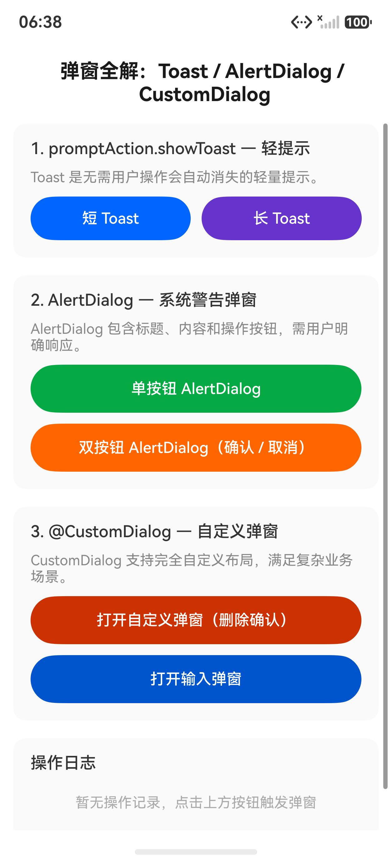
点击 Toast 后显示轻提示,点击 AlertDialog 弹出确认框: 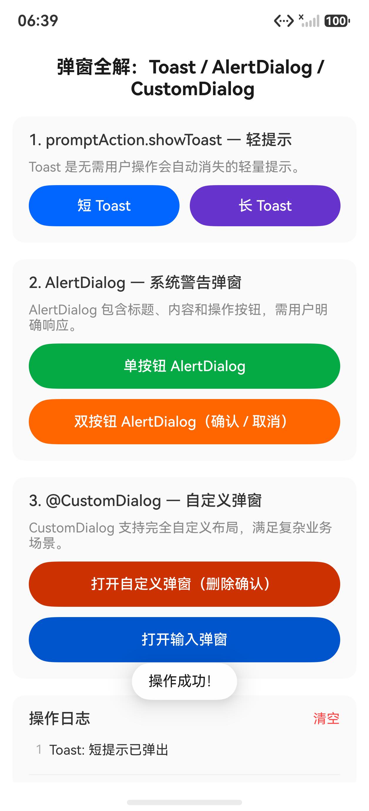
Toast 轻提示
Toast 通过 promptAction 模块调用,无需组件定义,一行代码即可显示。需要在文件顶部导入模块。
typescript
import promptAction from '@ohos.promptAction'

// 短时提示(2 秒)
promptAction.showToast({ message: '操作成功', duration: 2000 })

// 长时提示(3.5 秒)
promptAction.showToast({ message: '数据已保存', duration: 3500 })
duration 单位为毫秒,系统对最大时长有限制(一般不超过 3500ms)。Toast 显示期间不阻断用户操作,适合非阻塞的操作反馈。
带底部偏移的 Toast,避免被底部 Tab 遮挡:
typescript
promptAction.showToast({
  message: '已加入收藏',
  duration: 2000,
  bottom: 80
})
AlertDialog 确认对话框
AlertDialog.show() 是静态方法,无需控制器,直接调用即可弹出系统风格的确认对话框。
单按钮写法:
typescript
AlertDialog.show({
  title: '提示',
  message: '确认提交吗?',
  confirm: {
    value: '确认',
    action: () => { this.addLog('已确认提交') }
  }
})
双按钮写法(含危险操作警示色):
typescript
AlertDialog.show({
  title: '删除确认',
  message: '删除后无法恢复,确认删除吗?',
  primaryButton: {
    value: '取消',
    action: () => { this.addLog('已取消删除') }
  },
  secondaryButton: {
    value: '删除',
    fontColor: '#e74c3c',
    action: () => { this.addLog('已执行删除') }
  }
})
secondaryButton 的 fontColor 设为红色,符合危险操作的视觉惯例。系统会根据按钮数量自动调整布局。
CustomDialog 自定义弹窗
CustomDialog 装饰器将普通 struct 声明为弹窗组件,通过 CustomDialogController 控制显示和关闭。
弹窗组件定义:
typescript
@CustomDialog
struct MyDialog {
  controller: CustomDialogController = new CustomDialogController({ builder: MyDialog() })
  onConfirm: () => void = () => {}
  onCancel: () => void = () => {}
  title: string = '提示'
  content: string = ''

  build() {
    Column({ space: 20 }) {
      Text(this.title)
        .fontSize(18)
        .fontWeight(FontWeight.Bold)
        .fontColor('#333333')

      Text(this.content)
        .fontSize(14)
        .fontColor('#666666')
        .textAlign(TextAlign.Center)
        .lineHeight(22)

      Row({ space: 16 }) {
        Button('取消')
          .width(100)
          .backgroundColor('#f5f5f5')
          .fontColor('#333333')
          .onClick(() => {
            this.onCancel()
            this.controller.close()
          })
        Button('确认')
          .width(100)
          .onClick(() => {
            this.onConfirm()
            this.controller.close()
          })
      }
    }
    .padding(24)
    .width('100%')
    .alignItems(HorizontalAlign.Center)
  }
}
在主组件中创建控制器并使用:
typescript
private myDialogCtrl: CustomDialogController = new CustomDialogController({
  builder: MyDialog({
    title: '自定义弹窗',
    content: '这是完全自定义布局的弹窗,支持任意组件嵌套。',
    onConfirm: () => { this.addLog('自定义弹窗:已确认') },
    onCancel: () => { this.addLog('自定义弹窗:已取消') }
  }),
  alignment: DialogAlignment.Center,
  offset: { dx: 0, dy: 0 },
  autoCancel: true
})

Button('打开自定义弹窗').onClick(() => { this.myDialogCtrl.open() })
autoCancel: true 允许点击弹窗外部区域关闭;alignment 控制弹窗位置,DialogAlignment.Bottom 可实现底部弹出效果。
操作日志
typescript
@State logs: string[] = []

addLog(msg: string): void {
  const now = new Date()
  const time = `${now.getHours()}:${String(now.getMinutes()).padStart(2, '0')}:${String(now.getSeconds()).padStart(2, '0')}`
  this.logs = [`[${time}] ${msg}`, ...this.logs].slice(0, 15)
}
完整代码
typescript
import promptAction from '@ohos.promptAction'

@CustomDialog
struct MyDialog {
  controller: CustomDialogController = new CustomDialogController({ builder: MyDialog() })
  onConfirm: () => void = () => {}
  onCancel: () => void = () => {}
  title: string = '提示'
  content: string = ''

  build() {
    Column({ space: 20 }) {
      Text(this.title)
        .fontSize(18).fontWeight(FontWeight.Bold).fontColor('#333333')
      Text(this.content)
        .fontSize(14).fontColor('#666666')
        .textAlign(TextAlign.Center).lineHeight(22)
      Row({ space: 16 }) {
        Button('取消').width(100)
          .backgroundColor('#f5f5f5').fontColor('#333333')
          .onClick(() => { this.onCancel(); this.controller.close() })
        Button('确认').width(100)
          .onClick(() => { this.onConfirm(); this.controller.close() })
      }
    }
    .padding(24).width('100%').alignItems(HorizontalAlign.Center)
  }
}

@Entry
@Component
struct DialogPage {
  @State logs: string[] = []

  private myDialogCtrl: CustomDialogController = new CustomDialogController({
    builder: MyDialog({
      title: '自定义弹窗',
      content: '这是完全自定义布局的弹窗,\n支持任意组件嵌套与回调传参。',
      onConfirm: () => { this.addLog('自定义弹窗:已确认') },
      onCancel: () => { this.addLog('自定义弹窗:已取消') }
    }),
    alignment: DialogAlignment.Center,
    autoCancel: true
  })

  addLog(msg: string): void {
    const now = new Date()
    const time = `${now.getHours()}:${String(now.getMinutes()).padStart(2, '0')}:${String(now.getSeconds()).padStart(2, '0')}`
    this.logs = [`[${time}] ${msg}`, ...this.logs].slice(0, 15)
  }

  build() {
    Column({ space: 0 }) {
      Text('弹窗组件演示').fontSize(18).fontWeight(FontWeight.Bold).fontColor('#333333')
        .width('100%').padding({ left: 16, top: 20, bottom: 16 })

      Scroll() {
        Column({ space: 12 }) {
          // Toast 区域
          Column({ space: 8 }) {
            Text('Toast 轻提示').fontSize(13).fontColor('#999999').width('100%')
            Button('成功提示 Toast').width('100%')
              .onClick(() => {
                promptAction.showToast({ message: '操作成功!', duration: 2000 })
                this.addLog('显示 Toast:操作成功')
              })
            Button('长时 Toast(3.5s)').width('100%')
              .backgroundColor('#f5f5f5').fontColor('#333333')
              .onClick(() => {
                promptAction.showToast({ message: '数据已保存,稍后生效', duration: 3500 })
                this.addLog('显示长时 Toast')
              })
          }
          .padding(16).backgroundColor('#ffffff').borderRadius(8)

          // AlertDialog 区域
          Column({ space: 8 }) {
            Text('AlertDialog 确认对话框').fontSize(13).fontColor('#999999').width('100%')
            Button('单按钮 AlertDialog').width('100%')
              .onClick(() => {
                AlertDialog.show({
                  title: '提示',
                  message: '确认提交吗?',
                  confirm: {
                    value: '确认',
                    action: () => { this.addLog('AlertDialog:已确认提交') }
                  }
                })
              })
            Button('双按钮 AlertDialog(危险操作)').width('100%')
              .backgroundColor('#fff0f0').fontColor('#e74c3c')
              .onClick(() => {
                AlertDialog.show({
                  title: '删除确认',
                  message: '删除后无法恢复,确认删除吗?',
                  primaryButton: {
                    value: '取消',
                    action: () => { this.addLog('AlertDialog:取消删除') }
                  },
                  secondaryButton: {
                    value: '删除',
                    fontColor: '#e74c3c',
                    action: () => { this.addLog('AlertDialog:确认删除') }
                  }
                })
              })
          }
          .padding(16).backgroundColor('#ffffff').borderRadius(8)

          // CustomDialog 区域
          Column({ space: 8 }) {
            Text('CustomDialog 自定义弹窗').fontSize(13).fontColor('#999999').width('100%')
            Button('打开自定义弹窗').width('100%')
              .onClick(() => { this.myDialogCtrl.open() })
          }
          .padding(16).backgroundColor('#ffffff').borderRadius(8)

          // 操作日志
          Column({ space: 0 }) {
            Row() {
              Text('操作日志').fontSize(13).fontColor('#999999').layoutWeight(1)
              Text('清空').fontSize(13).fontColor('#0066ff')
                .onClick(() => { this.logs = [] })
            }
            .padding({ left: 12, right: 12, top: 10, bottom: 8 })

            if (this.logs.length === 0) {
              Text('点击上方按钮后,日志将显示在此处')
                .fontSize(12).fontColor('#cccccc')
                .padding(16).width('100%').textAlign(TextAlign.Center)
            } else {
              List() {
                ForEach(this.logs, (log: string) => {
                  ListItem() {
                    Text(log).fontSize(12).fontColor('#444444')
                      .width('100%')
                      .padding({ left: 12, right: 12, top: 6, bottom: 6 })
                  }
                })
              }
              .width('100%')
              .divider({ strokeWidth: 0.5, color: '#f0f0f0' })
            }
          }
          .backgroundColor('#ffffff').borderRadius(8)
        }
        .padding({ left: 16, right: 16, bottom: 24 })
      }
      .layoutWeight(1)
    }
    .width('100%')
    .height('100%')
    .backgroundColor('#f8f8f8')
  }
}
API 速查
| 属性/方法 | 说明 |
|---|---|
import promptAction from '@ohos.promptAction' |
导入 Toast 所需模块 |
promptAction.showToast({ message, duration, bottom }) |
显示 Toast,duration 单位毫秒 |
AlertDialog.show({ title, message, confirm }) |
显示单按钮确认框(静态方法) |
AlertDialog.show({ primaryButton, secondaryButton }) |
显示双按钮确认框 |
@CustomDialog |
装饰器,将 struct 声明为自定义弹窗 |
CustomDialogController({ builder, alignment, autoCancel }) |
创建弹窗控制器 |
controller.open() |
显示弹窗 |
controller.close() |
关闭弹窗 |
DialogAlignment.Center |
弹窗居中对齐 |
DialogAlignment.Bottom |
弹窗底部弹出 |
autoCancel: true |
点击弹窗外部自动关闭 |
小结
promptAction.showToast需要单独 import,不是 ArkUI 组件,而是 API 模块调用- Toast 的
duration超过系统上限(约 3500ms)后会被截断,不会无限显示 AlertDialog是静态调用,无需控制器,是最轻量的确认弹窗方案@CustomDialogstruct 中的controller字段是必须声明的,类型固定为CustomDialogController- 向
CustomDialog传递回调函数时,在controller的builder中通过属性传参 controller.close()应在回调执行后调用,确保业务逻辑先于弹窗关闭完成autoCancel: true改善用户体验;对于不可撤销的操作,应设为false强制用户明确选择