摘要:对比 Row/RowLayout 和 Column/ColumnLayout 的用法与差异,帮你根据是否需要自适应和权重分配选对线性布局组件。
QML 里最常见的布局就是水平和垂直排列。Row 和 Column 是简单的位置器,RowLayout 和 ColumnLayout 则是基于约束的布局系统,支持自适应大小和空白分配。很多新手会把它们混用,结果在窗口缩小时出现重叠或留白。这篇把两组组件的核心差异一次讲清楚。
两组线性布局总览
| 组件 | 类型 | 特点 | 适用场景 |
|---|---|---|---|
| Row / Column | Positioner | 简单排列,子项固定大小 | 固定尺寸图标、按钮组 |
| RowLayout / ColumnLayout | Layout | 自适应大小,支持 fill 和比例 | 响应式界面、表单、列表 |
核心原则:子项尺寸固定用 Row/Column,需要自适应或填充用 RowLayout/ColumnLayout。
Row 与 RowLayout
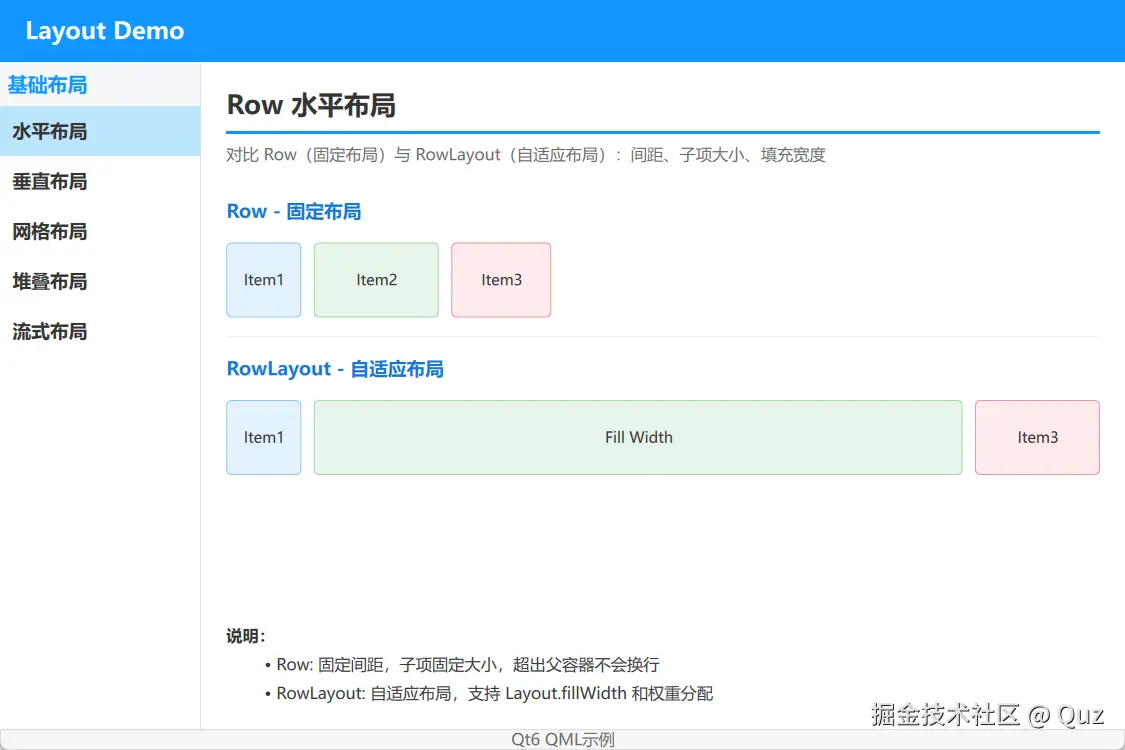
这个 demo 左侧用 Row 展示固定尺寸子项,右侧用 RowLayout 展示自适应宽度效果。
演示代码
qml
import QtQuick
import QtQuick.Layouts

FadeInAnimation {
    ColumnLayout {
        anchors.fill: parent
        anchors.margins: 20
        spacing: 15

        // ... 省略标题组件 TitleSeparator ...

        // Row - 固定布局
        Text {
            text: "Row - 固定布局"
            font.pointSize: 11
            font.bold: true
            color: "#1976D2"
        }

        Row {
            spacing: 10
            Rectangle {
                width: 60; height: 60
                color: "#e3f2fd"; border.color: "#90CAF9"; radius: 4
                Text { anchors.centerIn: parent; text: "Item1"; color: "#333" }
            }
            Rectangle {
                width: 100; height: 60
                color: "#e8f5e9"; border.color: "#A5D6A7"; radius: 4
                Text { anchors.centerIn: parent; text: "Item2"; color: "#333" }
            }
            Rectangle {
                width: 80; height: 60
                color: "#ffebee"; border.color: "#EF9A9A"; radius: 4
                Text { anchors.centerIn: parent; text: "Item3"; color: "#333" }
            }
        }

        Rectangle {
            Layout.fillWidth: true
            height: 1
            color: "#eee"
        }

        // RowLayout - 自适应布局
        Text {
            text: "RowLayout - 自适应布局"
            font.pointSize: 11
            font.bold: true
            color: "#1976D2"
        }

        RowLayout {
            spacing: 10
            Layout.fillWidth: true

            Rectangle {
                Layout.preferredWidth: 60; Layout.preferredHeight: 60
                color: "#e3f2fd"; border.color: "#90CAF9"; radius: 4
                Text { anchors.centerIn: parent; text: "Item1"; color: "#333" }
            }
            Rectangle {
                Layout.fillWidth: true; Layout.preferredHeight: 60
                color: "#e8f5e9"; border.color: "#A5D6A7"; radius: 4
                Text { anchors.centerIn: parent; text: "Fill Width"; color: "#333" }
            }
            Rectangle {
                Layout.preferredWidth: 100; Layout.preferredHeight: 60
                color: "#ffebee"; border.color: "#EF9A9A"; radius: 4
                Text { anchors.centerIn: parent; text: "Item3"; color: "#333" }
            }
        }

        Item { Layout.fillHeight: true }

        // 说明
        Note {
            text: "**说明:**\n- Row: 固定间距,子项固定大小,超出父容器不会换行\n- RowLayout: 自适应布局,支持 Layout.fillWidth 和权重分配"
        }
    }
}
关键逻辑解析
Row:子项直接用width/height,按顺序水平排列RowLayout:子项用Layout.preferredWidth/Layout.preferredHeight,可用Layout.fillWidth分配剩余空间RowLayout需要自身或父容器有明确宽度才能正确计算比例
适用场景
Row 适合固定尺寸的工具栏图标、步骤指示器;RowLayout 适合表单输入框 + 按钮组合、自适应按钮组、需要撑满宽度的卡片头部。
注意点
Row 里的子项如果总宽度超过父容器,会直接溢出,不会自动换行或压缩。如果窗口可能缩小,一定要用 RowLayout 或给子项设置最大宽度。
Column 与 ColumnLayout
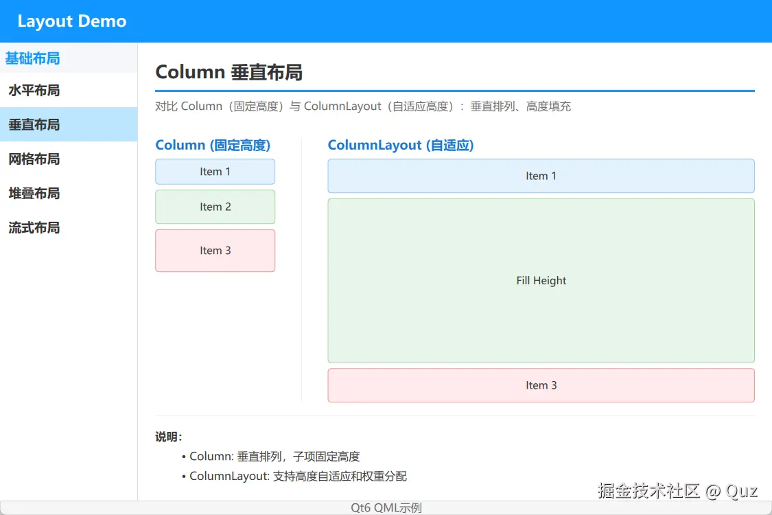
这个 demo 左侧用 Column 展示固定高度子项,右侧用 ColumnLayout 展示高度自适应和填充效果。
演示代码
qml
import QtQuick
import QtQuick.Layouts

FadeInAnimation {
    ColumnLayout {
        anchors.fill: parent
        anchors.margins: 20
        spacing: 15

        // ... 省略标题组件 TitleSeparator ...

        RowLayout {
            Layout.fillWidth: true
            Layout.fillHeight: true
            spacing: 30

            // Column - 垂直排列
            ColumnLayout {
                spacing: 6
                Layout.alignment: Qt.AlignTop
                Layout.preferredWidth: 140

                Text {
                    text: "Column (固定高度)"
                    font.pointSize: 11
                    font.bold: true
                    color: "#1976D2"
                }

                Rectangle {
                    Layout.preferredWidth: 140; Layout.preferredHeight: 30
                    color: "#e3f2fd"; border.color: "#90CAF9"; radius: 4
                    Text { anchors.centerIn: parent; text: "Item 1"; color: "#333" }
                }
                Rectangle {
                    Layout.preferredWidth: 140; Layout.preferredHeight: 40
                    color: "#e8f5e9"; border.color: "#A5D6A7"; radius: 4
                    Text { anchors.centerIn: parent; text: "Item 2"; color: "#333" }
                }
                Rectangle {
                    Layout.preferredWidth: 140; Layout.preferredHeight: 50
                    color: "#ffebee"; border.color: "#EF9A9A"; radius: 4
                    Text { anchors.centerIn: parent; text: "Item 3"; color: "#333" }
                }
            }

            // 分隔线
            Rectangle {
                Layout.fillHeight: true
                width: 1
                color: "#eee"
            }

            // ColumnLayout - 自适应高度
            ColumnLayout {
                spacing: 6
                Layout.fillWidth: true
                Layout.fillHeight: true
                Layout.preferredWidth: 140

                Text {
                    text: "ColumnLayout (自适应)"
                    font.pointSize: 11
                    font.bold: true
                    color: "#1976D2"
                }

                Rectangle {
                    Layout.fillWidth: true; Layout.preferredHeight: 40
                    color: "#e3f2fd"; border.color: "#90CAF9"; radius: 4
                    Text { anchors.centerIn: parent; text: "Item 1"; color: "#333" }
                }
                Rectangle {
                    Layout.fillWidth: true; Layout.fillHeight: true
                    color: "#e8f5e9"; border.color: "#A5D6A7"; radius: 4
                    Text { anchors.centerIn: parent; text: "Fill Height"; color: "#333" }
                }
                Rectangle {
                    Layout.fillWidth: true; Layout.preferredHeight: 40
                    color: "#ffebee"; border.color: "#EF9A9A"; radius: 4
                    Text { anchors.centerIn: parent; text: "Item 3"; color: "#333" }
                }
            }
        }

        // 说明
        Note {
            text: "**说明:**\n- Column: 垂直排列,子项固定高度\n- ColumnLayout: 支持高度自适应和权重分配"
        }
    }
}
关键逻辑解析
Column:子项固定高度,简单堆叠ColumnLayout:子项可用Layout.fillHeight填充剩余空间,多个子项同时设置时会按比例分配ColumnLayout适合需要其中一个区域撑满剩余高度的布局,比如标题 + 可滚动内容 + 底部按钮
适用场景
Column 适合固定高度的设置项列表;ColumnLayout 适合聊天界面(头部 + 消息列表 + 输入框)、表单页、Dashboard 卡片。
注意点
ColumnLayout 嵌套 RowLayout 是很常见的模式,但要注意每层布局的 spacing 和 margins,否则会出现unexpected空白。建议把复杂布局拆成小组件,每层只负责一个方向。
选型建议
| 场景 | 推荐组件 | 理由 |
|---|---|---|
| 固定尺寸图标/按钮组 | Row / Column | 简单直接,无额外计算开销 |
| 需要填充剩余空间 | RowLayout / ColumnLayout | 支持 fill 和比例 |
| 窗口缩放时自适应 | RowLayout / ColumnLayout | 自动重新计算尺寸 |
| 复杂表单或卡片 | 嵌套 RowLayout + ColumnLayout | 每个方向独立控制 |
运行验证
- Qt Creator 打开
qml_layout/CMakeLists.txt - 按
Ctrl+R运行 - 在左侧导航切换水平布局和垂直布局
- 拖动窗口大小,观察 RowLayout/ColumnLayout 的自适应效果
扩展复用方向
- 封装
FormRow组件:左侧固定宽度标签 + 右侧填充输入框 - 用
ColumnLayout+RowLayout搭建通用卡片模板 - 把固定尺寸的装饰性元素用
Row/Column,把主体内容区用RowLayout/ColumnLayout - 结合
Layout.minimumWidth/Layout.maximumWidth做响应式断点
小结
线性布局是 QML 界面的基础。Row 和 Column 负责简单排列,RowLayout 和 ColumnLayout 负责自适应和填充。记住一个简单规则:固定尺寸用位置器,自适应填充用布局器。合理组合两者,再配合嵌套,就能覆盖大部分常规界面布局需求。
已验证环境:
- Qt 版本:Qt 6.8.2、Qt 6.11.1
- 操作系统:Windows 11
- GitHub:QML-Minimal-Demos/qml_layout