前言
在移动应用开发中,层叠布局是实现复杂 UI 的核心能力------从头像角标到全屏蒙层,从浮动按钮到图片水印,都离不开精确的层叠控制。HarmonyOS ArkUI 提供了 Stack 组件与 .overlay() 修饰符来应对这类场景。本文通过完整可运行的代码,逐一演示它们的核心用法。
运行效果
初始状态
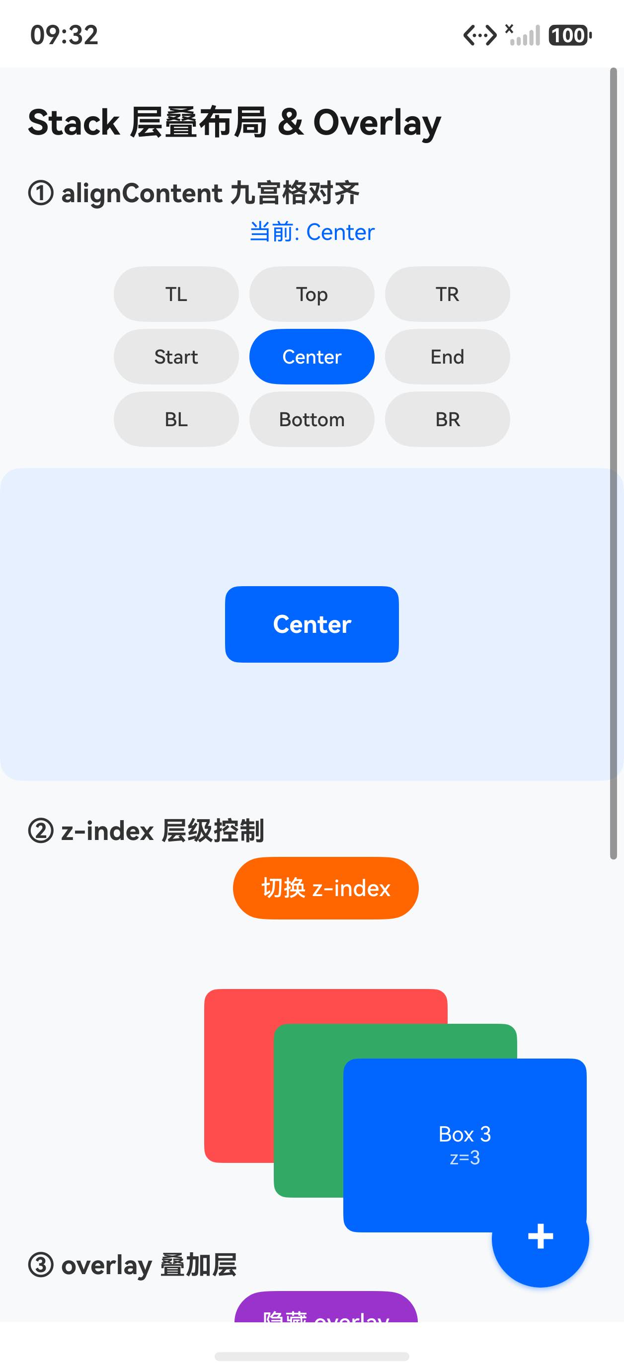
交互后(切换对齐 + z-index)
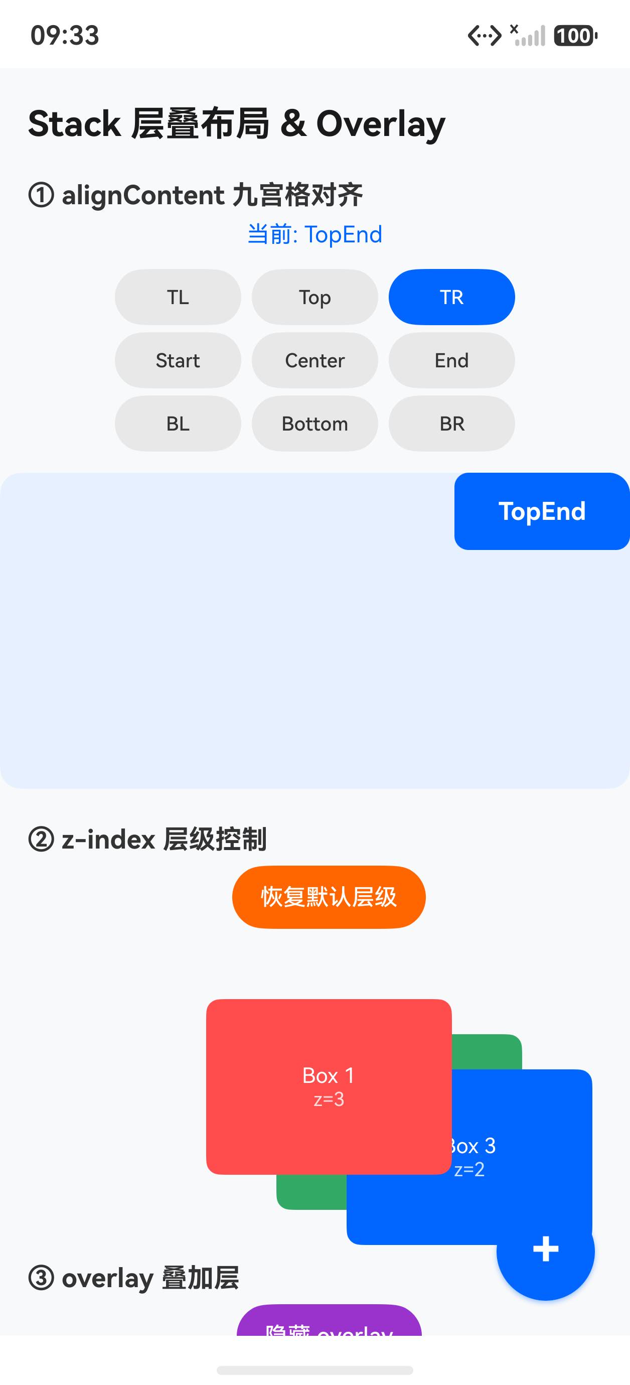
核心 API 概览
| API | 作用 |
|---|---|
Stack({ alignContent }) |
子组件全部叠放,alignContent 控制默认对齐点 |
.zIndex(n) |
调整单个子组件的层叠顺序,数值越大越靠前 |
.overlay(builder, options) |
在组件上方浮置内容,不占布局空间 |
.offset({ x, y }) |
相对自身默认位置平移,常与 Stack 配合使用 |
完整示例代码
typescript
// Stack 层叠布局与 Overlay 浮层 Demo

class AlignOption {
  label: string = ''
  value: Alignment = Alignment.Center
}

@Entry
@Component
struct Index {
  @State alignIndex: number = 4  // default Center
  @State zToggle: boolean = false
  @State showOverlay: boolean = true

  private alignOptions: AlignOption[] = [
    { label: 'TopStart', value: Alignment.TopStart },
    { label: 'Top', value: Alignment.Top },
    { label: 'TopEnd', value: Alignment.TopEnd },
    { label: 'Start', value: Alignment.Start },
    { label: 'Center', value: Alignment.Center },
    { label: 'End', value: Alignment.End },
    { label: 'BottomStart', value: Alignment.BottomStart },
    { label: 'Bottom', value: Alignment.Bottom },
    { label: 'BottomEnd', value: Alignment.BottomEnd },
  ]

  // overlay 内容需要用 @Builder 封装,不能内联组件表达式
  @Builder
  overlayContent() {
    if (this.showOverlay) {
      Column() {
        Text('🎨 overlay 叠加层')
          .fontSize(18)
          .fontColor('#fff')
          .fontWeight(FontWeight.Bold)
        Text('半透明背景效果')
          .fontSize(12)
          .fontColor('rgba(255,255,255,0.8)')
          .margin({ top: 4 })
      }
      .width('100%')
      .height('100%')
      .backgroundColor('rgba(0,0,0,0.45)')
      .justifyContent(FlexAlign.Center)
      .borderRadius(12)
    }
  }

  @Builder
  overlayBadgeHot() {
    Text('HOT 🔥')
      .fontSize(11)
      .fontColor('#fff')
      .backgroundColor('#ff3300')
      .borderRadius(4)
      .padding({ left: 6, right: 6, top: 2, bottom: 2 })
  }

  @Builder
  overlayBadgeNew() {
    Text('NEW ✨')
      .fontSize(11)
      .fontColor('#fff')
      .backgroundColor('#0066ff')
      .borderRadius(4)
      .padding({ left: 6, right: 6, top: 2, bottom: 2 })
  }

  build() {
    Stack({ alignContent: Alignment.BottomEnd }) {
      Scroll() {
        Column({ space: 0 }) {
          Text('Stack 层叠布局 & Overlay')
            .fontSize(20)
            .fontWeight(FontWeight.Bold)
            .fontColor('#1a1a1a')
            .width('100%')
            .padding({ left: 16, right: 16, top: 20, bottom: 8 })

          // ① alignContent 九宫格选择器
          Text('① alignContent 九宫格对齐')
            .fontSize(15)
            .fontWeight(FontWeight.Bold)
            .fontColor('#333')
            .width('100%')
            .padding({ left: 16, top: 12, bottom: 6 })

          Column({ space: 4 }) {
            Text('当前: ' + this.alignOptions[this.alignIndex].label)
              .fontSize(13).fontColor('#0066ff').margin({ bottom: 8 })

            Row({ space: 6 }) {
              Button('TL').fontSize(11).width(72).height(32)
                .backgroundColor(this.alignIndex === 0 ? '#0066ff' : '#e8e8e8')
                .fontColor(this.alignIndex === 0 ? '#fff' : '#333')
                .onClick(() => { this.alignIndex = 0 })
              Button('Top').fontSize(11).width(72).height(32)
                .backgroundColor(this.alignIndex === 1 ? '#0066ff' : '#e8e8e8')
                .fontColor(this.alignIndex === 1 ? '#fff' : '#333')
                .onClick(() => { this.alignIndex = 1 })
              Button('TR').fontSize(11).width(72).height(32)
                .backgroundColor(this.alignIndex === 2 ? '#0066ff' : '#e8e8e8')
                .fontColor(this.alignIndex === 2 ? '#fff' : '#333')
                .onClick(() => { this.alignIndex = 2 })
            }
            Row({ space: 6 }) {
              Button('Start').fontSize(11).width(72).height(32)
                .backgroundColor(this.alignIndex === 3 ? '#0066ff' : '#e8e8e8')
                .fontColor(this.alignIndex === 3 ? '#fff' : '#333')
                .onClick(() => { this.alignIndex = 3 })
              Button('Center').fontSize(11).width(72).height(32)
                .backgroundColor(this.alignIndex === 4 ? '#0066ff' : '#e8e8e8')
                .fontColor(this.alignIndex === 4 ? '#fff' : '#333')
                .onClick(() => { this.alignIndex = 4 })
              Button('End').fontSize(11).width(72).height(32)
                .backgroundColor(this.alignIndex === 5 ? '#0066ff' : '#e8e8e8')
                .fontColor(this.alignIndex === 5 ? '#fff' : '#333')
                .onClick(() => { this.alignIndex = 5 })
            }
            Row({ space: 6 }) {
              Button('BL').fontSize(11).width(72).height(32)
                .backgroundColor(this.alignIndex === 6 ? '#0066ff' : '#e8e8e8')
                .fontColor(this.alignIndex === 6 ? '#fff' : '#333')
                .onClick(() => { this.alignIndex = 6 })
              Button('Bottom').fontSize(11).width(72).height(32)
                .backgroundColor(this.alignIndex === 7 ? '#0066ff' : '#e8e8e8')
                .fontColor(this.alignIndex === 7 ? '#fff' : '#333')
                .onClick(() => { this.alignIndex = 7 })
              Button('BR').fontSize(11).width(72).height(32)
                .backgroundColor(this.alignIndex === 8 ? '#0066ff' : '#e8e8e8')
                .fontColor(this.alignIndex === 8 ? '#fff' : '#333')
                .onClick(() => { this.alignIndex = 8 })
            }
          }
          .width('100%')
          .alignItems(HorizontalAlign.Center)
          .padding({ left: 16, right: 16 })

          // Stack 预览
          Stack({ alignContent: this.alignOptions[this.alignIndex].value }) {
            Column()
              .width('100%').height(180)
              .backgroundColor('#e8f0ff').borderRadius(12)
            Column() {
              Text(this.alignOptions[this.alignIndex].label)
                .fontSize(14).fontColor('#fff').fontWeight(FontWeight.Bold)
            }
            .width(100).height(44)
            .backgroundColor('#0066ff').borderRadius(8)
            .justifyContent(FlexAlign.Center)
          }
          .width('100%').height(180)
          .margin({ left: 16, right: 16, top: 12 })
          .borderRadius(12).clip(true)

          // ② z-index 层级
          Text('② z-index 层级控制')
            .fontSize(15).fontWeight(FontWeight.Bold).fontColor('#333')
            .width('100%').padding({ left: 16, top: 20, bottom: 6 })

          Button(this.zToggle ? '恢复默认层级' : '切换 z-index')
            .fontSize(13).height(36).backgroundColor('#ff6600')
            .margin({ left: 16, bottom: 10 })
            .onClick(() => { this.zToggle = !this.zToggle })

          Stack() {
            Column() {
              Text('Box 1').fontSize(12).fontColor('#fff')
              Text('z=' + (this.zToggle ? '3' : '1')).fontSize(11).fontColor('rgba(255,255,255,0.8)')
            }
            .width(140).height(100).backgroundColor('#ff4d4d')
            .borderRadius(8).justifyContent(FlexAlign.Center)
            .zIndex(this.zToggle ? 3 : 1).offset({ x: 0, y: 0 })

            Column() {
              Text('Box 2').fontSize(12).fontColor('#fff')
              Text('z=' + (this.zToggle ? '1' : '2')).fontSize(11).fontColor('rgba(255,255,255,0.8)')
            }
            .width(140).height(100).backgroundColor('#33aa66')
            .borderRadius(8).justifyContent(FlexAlign.Center)
            .zIndex(this.zToggle ? 1 : 2).offset({ x: 40, y: 20 })

            Column() {
              Text('Box 3').fontSize(12).fontColor('#fff')
              Text('z=' + (this.zToggle ? '2' : '3')).fontSize(11).fontColor('rgba(255,255,255,0.8)')
            }
            .width(140).height(100).backgroundColor('#0066ff')
            .borderRadius(8).justifyContent(FlexAlign.Center)
            .zIndex(this.zToggle ? 2 : 3).offset({ x: 80, y: 40 })
          }
          .width('100%').height(160).padding({ left: 16 })

          // ③ overlay 叠加层
          Text('③ overlay 叠加层')
            .fontSize(15).fontWeight(FontWeight.Bold).fontColor('#333')
            .width('100%').padding({ left: 16, top: 20, bottom: 6 })

          Button(this.showOverlay ? '隐藏 overlay' : '显示 overlay')
            .fontSize(13).height(36).backgroundColor('#9933cc')
            .margin({ left: 16, bottom: 10 })
            .onClick(() => { this.showOverlay = !this.showOverlay })

          Column()
            .width('100%').height(150)
            .backgroundColor('#3366cc').borderRadius(12)
            .margin({ left: 16, right: 16 })
            // overlay 必须传 @Builder 引用,不能传内联组件
            .overlay(this.overlayContent, { align: Alignment.Center })

          // ④ 图片卡片角标
          Text('④ 图片卡片 overlay 角标')
            .fontSize(15).fontWeight(FontWeight.Bold).fontColor('#333')
            .width('100%').padding({ left: 16, top: 20, bottom: 6 })

          Row({ space: 10 }) {
            Column()
              .width(150).height(100)
              .backgroundColor('#ff9900').borderRadius(10)
              .overlay(this.overlayBadgeHot, { align: Alignment.TopEnd })

            Column()
              .width(150).height(100)
              .backgroundColor('#00aa55').borderRadius(10)
              .overlay(this.overlayBadgeNew, { align: Alignment.TopStart })
          }
          .padding({ left: 16 })

          Column().height(100)
        }
        .width('100%')
      }
      .scrollable(ScrollDirection.Vertical)
      .scrollBar(BarState.Auto)
      .width('100%').height('100%')

      // 悬浮 FAB(利用 Stack alignContent.BottomEnd)
      Stack({ alignContent: Alignment.Center }) {
        Column()
          .width(56).height(56)
          .backgroundColor('#0066ff').borderRadius(28)
          .shadow({ radius: 8, color: 'rgba(0,102,255,0.4)', offsetX: 0, offsetY: 4 })
        Text('+')
          .fontSize(28).fontColor('#fff').fontWeight(FontWeight.Bold)
          .margin({ bottom: 2 })
      }
      .width(56).height(56)
      .margin({ right: 20, bottom: 20 })
      .onClick(() => {
        this.alignIndex = (this.alignIndex + 1) % 9
      })
    }
    .width('100%').height('100%')
    .backgroundColor('#f8f9fa')
  }
}
关键知识点
1. overlay() 必须传 @Builder 引用
.overlay() 的类型签名是 string | CustomBuilder | ComponentContent<Object>。不能 将内联组件表达式(如 Column() { ... } 结果、Text(...) 结果)直接传入,必须封装为 @Builder 方法再传引用:
typescript
// 错误:直接传内联 Column 表达式
.overlay(Column() { Text('hello') }, { align: Alignment.Center })

// 正确:用 @Builder 封装后传引用
@Builder myOverlay() {
  Column() { Text('hello') }
}

.overlay(this.myOverlay, { align: Alignment.Center })
2. @Builder 内可以有 if 判断
@Builder 内允许 if/else 控制流,但不允许 let/const 变量声明 。通过 @State 响应式变量 + if 来控制浮层的显隐:
typescript
@Builder
overlayContent() {
  if (this.showOverlay) {
    Column() { ... }
      .backgroundColor('rgba(0,0,0,0.45)')
  }
}
3. overlay 不占布局空间
overlay 内容浮于组件之上,不影响父容器的布局计算,这与在 Stack 中额外增加子组件不同:
| 方式 | 占布局空间 | 适合场景 |
|---|---|---|
| Stack 子组件 | 是(占用 Stack 尺寸) | 多层交叠时需要 z-index 精确控制 |
| overlay | 否 | 角标、蒙层、水印,不影响周围布局 |
4. zIndex 改变渲染顺序
默认情况下 Stack 子组件按声明顺序叠放(后声明的在上层)。.zIndex(n) 可打破这一规则:
typescript
Stack() {
  Column().zIndex(3)  // 虽然先声明,但层级最高,显示在最上面
  Column().zIndex(1)
  Column().zIndex(2)
}
常见应用场景
| 场景 | 实现方式 |
|---|---|
| 头像右下角角标 | overlay(badgeBuilder, { align: Alignment.BottomEnd }) |
| 全屏蒙层 | overlay(maskBuilder) + 宽高 100%,backgroundColor 半透明 |
| 悬浮操作按钮 | Stack + 按钮子组件 + alignContent: Alignment.BottomEnd |
| 图片水印 | overlay(watermarkBuilder, { align: Alignment.BottomStart }) |
| 卡片角标(HOT/NEW) | overlay(badgeBuilder, { align: Alignment.TopEnd }) |
小结
Stack让所有子组件叠放在同一区域,alignContent控制默认对齐点,.zIndex()控制层叠顺序.overlay()是轻量浮层方案,不占布局空间,内容必须以@Builder引用传入@Builder方法内允许if/else,但不允许let/const变量声明- 悬浮 FAB 直接利用最外层
Stack的alignContent.BottomEnd,无需额外定位