本文是「Android 应用性能优化」系列第一篇。该系列将介绍工作中常年累月积累的优化知识和经验,算是对过往的工作内容做一个梳理和总结,以及在AI时代方便蒸馏成可无限复制的技能。
读完本文你将掌握:用工具精准定位渲染问题 → 理解 Overdraw 和层级深度两大根因 → ConstraintLayout 全套特性彻底根治 → 顺带搞定 Android 屏幕碎片化适配。
一、问题提出:你的列表,有多少帧在白白浪费?
产品找过来说:"首页商品列表在低端机上滑起来很卡,用户投诉了好几次了。"
你拿起一台红米 Note 8(搭载骁龙 665,3GB 内存),打开 App 划了几下,果然------手感像在泥里游泳。
打开 HWUI 呈现模式分析 ^1^(开发者选项 → HWUI 呈现模式分析 → 在屏幕上显示为条形图),一眼就看到问题:
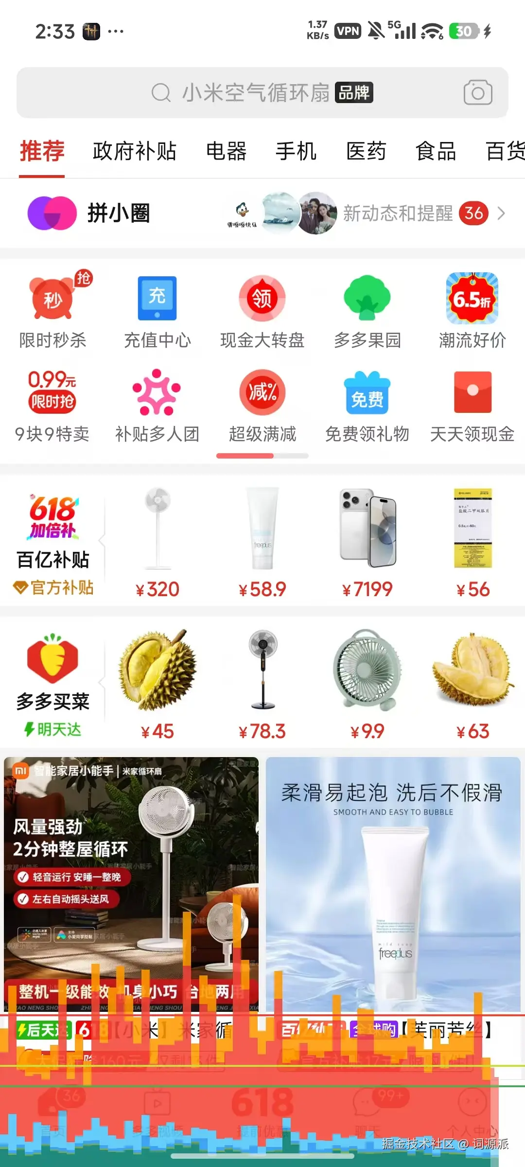
屏幕底部出现了密密麻麻的彩色柱状图,三条横线贯穿其中,你的柱状图有一半以上都冲破了它们。
条形图解读速查
每根竖条 = 一帧的渲染耗时。从左到右是时间顺序(最新的帧在最右边)。
横向参考线(时间预算线)
三根横线并非对应不同刷新率,而是以 16ms 为基准的三个健康等级 (源自 AOSP 源码 FrameInfoVisualizer.cpp):
| 横线颜色 | 百分比 | 等价耗时 | 含义 |
|---|---|---|---|
| 绿线 | 80% | ~13ms | 健康线,在此之下说明帧渲染很从容 |
| 黄线 | 100% | ~16ms | 临界线,超过即丢帧(Jank) |
| 红线 | 150% | ~24ms | 严重超标线,用户明显感知到卡顿 |
三条线在所有刷新率的设备上都处于同一物理位置(源码用 16ms / mFrameInterval 校准后约掉了实际刷新率)。120Hz 设备上所有三线都出现,是因为系统一直显示这三档,和屏幕 120Hz 与否无关。
柱子超过绿线不一定丢帧,超过黄线才是正式开始丢帧。 柱子在绿和黄之间属于"及格但不够从容",柱子冲破红线说明这一帧耗时超过 24ms,用户必然感知到。
柱子内部的颜色分块(渲染管线各阶段耗时)
一根柱子从下到上,每个颜色代表渲染管线的不同阶段(H 源码 FrameInfoVisualizer.cpp 定义的 7 段):
| 颜色 | 阶段 | 源码中的含义 | 过高代表什么 |
|---|---|---|---|
| 🟦 青色 | Misc / VSYNC Delay | 两帧之间的间隙,VSYNC 信号到达后主线程被阻塞的时间 | 主线程过载,前序帧积压 |
| 🟢 深绿 | Input Handling | 处理用户输入事件(触摸、按键)的耗时 | 输入回调中有耗时操作 |
| 🟢 浅绿 | Animation | 执行动画求值(Animator)的耗时 | 动画性能差,或 onBindViewHolder 过重 |
| 🟢 亮绿 | Measure / Layout | onMeasure 和 onLayout 的耗时 |
层级太深,需要拍平 |
| 🔵 蓝色 | Draw | 创建和更新 View 的 DisplayList(onDraw 方法耗时) |
OnDraw 做了太多工作 |
| 🔵 浅蓝 | Sync & Upload | 将 Bitmap 等图形资源上传到 GPU | 大量图片加载,或图片尺寸过大 |
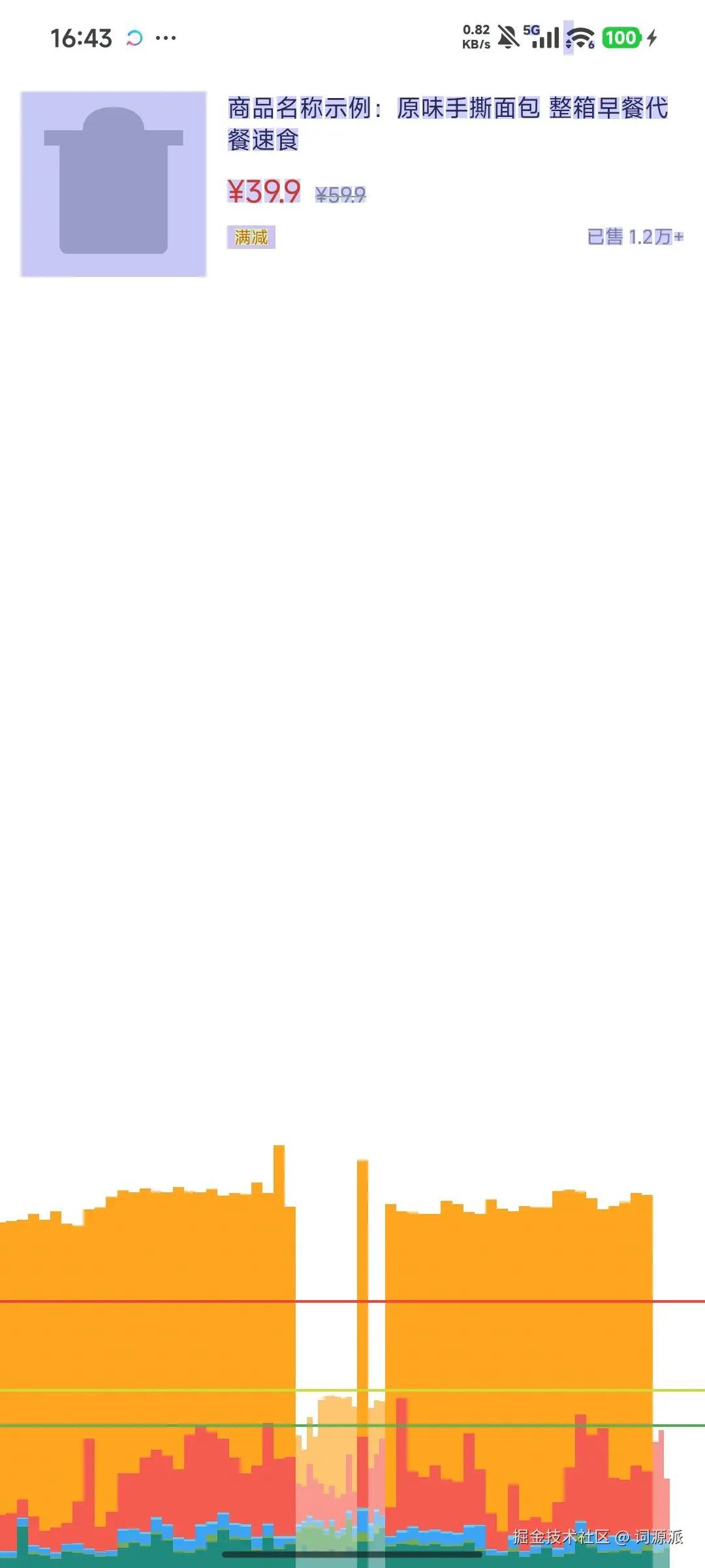
| 🔴 红色 | Command Issue | 向 OpenGL 发出绘制/重绘命令的耗时 | View 过多或过于复杂,Overdraw 导致多余命令 |
| 🟧 橙色 | Swap Buffers | GPU 完成渲染并交换缓冲区的耗时 | GPU 过载,复杂绘制或离屏渲染瓶颈 |
柱子越高 = 这一帧耗时越长 = 越可能丢帧。 拼多多的截图里大部分柱子都越过黄线,说明首页的渲染压力很大。
来看一个对比------微信聊天窗口:
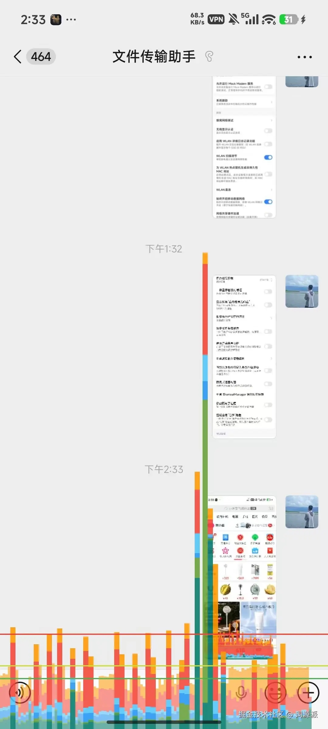
可以看到,聊天窗口大部分时间柱子比较矮(流畅),但偶尔出现几根极高的柱子(特别是中间那根贯穿整个屏幕高度的),那几帧就是用户感知到的"突然卡了一下"------典型的高 P99 延迟场景。
诊断口诀:绿色段(浅绿/亮绿)占比大 → 拍平层级;蓝色段占比大 → 简化 onDraw;浅蓝占比大 → 减少图片上传量;红色占比大 → 减少 View 数量或 Overdraw;橙色占比大 → 排查 GPU 瓶颈 / 离屏渲染;柱子整体高 → 逐个阶段定位瓶颈。
这条 16ms 的线,背后是一个铁律:
60fps 的屏幕,每秒需要渲染 60 帧,留给每一帧的时间窗口只有 1000ms ÷ 60 = 16.67ms 。 如果你的一帧超过了这个时间,它会错过当前 VSYNC 的提交窗口。渲染工作仍会完成,但只能在下一个 VSYNC 信号到来时才被提交显示(源码中 Choreographer 会计算
skippedFrames,将帧时间戳对齐到最近的 VSYNC 边界后继续执行所有回调)。 用户看到的效果是:上一帧在屏幕上多停留了一倍时间(约 33ms)。 这就是「Jank」(卡顿)。
更糟的是,现在高刷屏已经普及:
| 屏幕刷新率 | 每帧时间预算 |
|---|---|
| 60Hz(标准) | 16.67ms |
| 90Hz(中端旗舰) | 11.11ms |
| 120Hz(高端旗舰) | 8.33ms |
你在 60fps 设备上勉强及格的代码,在 90Hz 屏幕上可能天然卡顿。
用 adb shell dumpsys gfxinfo <包名> 把数据量化出来:
yaml
adb shell dumpsys gfxinfo com.example.shop

# 关注这几行:
Total frames rendered: 120
Janky frames: 64 (53.33%)   # 超过一半的帧都卡了
50th percentile: 28ms        # 中位帧耗时已经接近 2 倍预算
90th percentile: 47ms
99th percentile: 89ms
53% 的掉帧率。 这不是"有点卡",这是"基本残废"。
根因在哪里?本文接下来会系统性地给你讲清楚。
二、相关知识点讲解
2.1 渲染管线:每一帧都在赶一趟末班车
每一帧的渲染,Android 要完成以下流程:
sql
VSYNC 信号到来
     │
     ▼
① Measure(测量)
   └─ 从根 View 开始,递归计算每个 View 的尺寸
     │
     ▼
② Layout(布局)
   └─ 确定每个 View 在屏幕上的位置坐标
     │
     ▼
③ Draw(绘制)
   └─ 把 View 的内容记录进 DisplayList
     │
     ▼
④ RenderThread → GPU 合成
   └─ 将 DisplayList 提交给 GPU,光栅化输出到屏幕
     │
     ▼
画面出现在屏幕上
这整条链路,必须在 16ms 内跑完。任何一环超时,当前帧就被丢弃。
你的代码在这条流水线里能"拖后腿"的地方主要有两个:Overdraw(过度绘制) 拖慢 GPU,层级过深 拖慢 Measure/Layout。
2.2 Overdraw:GPU 在做无用功
Overdraw(过度绘制) ,指的是同一块屏幕区域,在一帧内被绘制了不止一次。
Android 的渲染遵循"画家算法"------从后往前画,后画的层覆盖先画的层。如果一个 View 完全被另一个 View 遮住,它依然会被绘制,只是最终对用户不可见。GPU 做了这些功,结果全被浪费了。
举个最典型的例子:
xml
<!-- Window 背景:白色(第 1 层) -->
<FrameLayout android:background="#FFFFFF">

    <!-- Activity 根布局背景:白色(第 2 层,完全覆盖第 1 层,第 1 层变废弃) -->
    <LinearLayout android:background="#FFFFFF">

        <!-- 列表项背景:白色(第 3 层,又覆盖了第 2 层) -->
        <LinearLayout android:background="#FFFFFF">

            <!-- TextView 本身还有背景(第 4 层) -->
            <TextView android:background="#FFFFFF" ... />

        </LinearLayout>
    </LinearLayout>
</FrameLayout>
GPU 在这块区域画了 4 次白色。用户看到的结果和画 1 次完全一样。多出来的 3 次,纯属浪费。
如何诊断:Debug GPU Overdraw
在手机上打开:设置 → 开发者选项 → 调试 GPU 过度绘制 → 显示过度绘制区域。
Android 用颜色标出每个像素的过度绘制程度:
| 颜色 | 含义 | 是否可接受 |
|---|---|---|
| 原色(无覆盖) | 1x 绘制(最优) | ✅ 理想状态 |
| 🔵 蓝色 | 2x 绘制 | ✅ 可接受 |
| 🟢 绿色 | 3x 绘制 | ⚠️ 需要关注 |
| 🩷 粉色 | 4x 绘制 | ❌ 必须优化 |
| 🔴 红色 | 5x 及以上 | ❌ 必须优化 |
目标:界面整体呈现蓝/绿,粉色区域不超过屏幕 1/4,红色区域一旦出现立刻处理。
来看看真实 App 的 Overdraw 诊断效果。
拼多多首页:
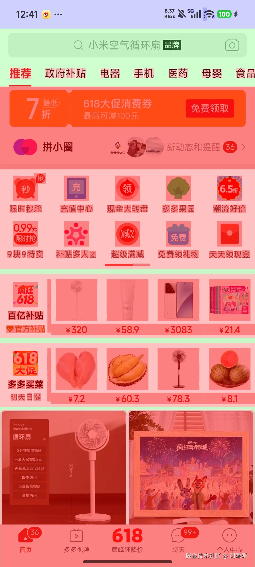
整屏大面积红色/粉色,说明几乎每个像素都被绘制了 4-5 次以上。导航栏、商品卡片、底部 Tab 都有明显的多层背景叠加。
京东首页:
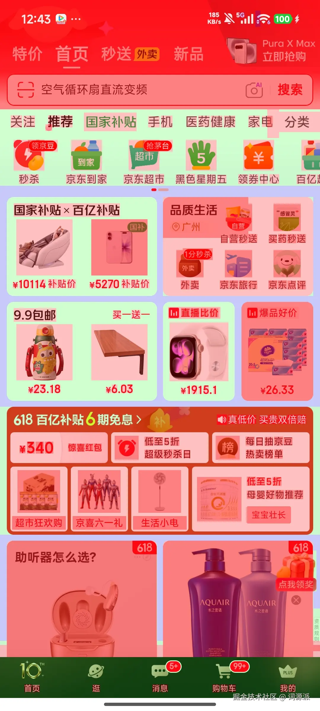
同样的问题:红色区域覆盖了大部分屏幕,618 活动卡片、底部导航等区域尤为严重。这两张图直观地展示了商业 App 中 Overdraw 的普遍程度。
两大常见 Overdraw 来源:
① 多层背景叠加(上面例子已展示)
② 透明度滥用
xml
<!-- 错误写法:用半透明实现灰色文字 -->
<TextView
    android:textColor="#000000"
    android:alpha="0.5" />

<!-- 正确写法:直接设置灰色,GPU 只需绘制一次 -->
<TextView
    android:textColor="#808080" />
当 alpha 设置为 0 到 1 之间的半透明值 时(如上面例子的 0.5),会触发离屏渲染(Offscreen Rendering)。系统先把这层内容渲染到一个临时缓冲区,再以指定透明度合成回来,代价远比直接设置颜色高。如果 View 内部没有子元素重叠,可以通过重写 hasOverlappingRendering() 返回 false 来跳过离屏缓冲。
2.3 View 层级:每多一层,都是一笔税
渲染管线里的 Measure 和 Layout 阶段,系统需要从根 View 开始,递归遍历整棵 View 树。层级越深,遍历的节点越多,耗时越长。
但更要命的是某些布局容器的"双重测量税":
RelativeLayout 的双重税
RelativeLayout 为了处理子 View 之间的位置依赖关系,会对子 View 进行两次 measure:第一次确定每个子 View 的初始尺寸,第二次在所有子 View 尺寸确定后重新验证相对位置。嵌套越深,总的测量次数随层级呈指数上升。
python
RelativeLayout
└─ 第一次 measure pass(确定子 View 尺寸)
└─ 第二次 measure pass(确认相对位置)
LinearLayout 权重的双重税
如果你用了 layout_weight,LinearLayout 同样需要两次 measure:第一次量出所有子 View 的尺寸,第二次按权重比例重新分配剩余空间。
xml
<!-- 这个写法会触发双重测量 -->
<LinearLayout android:orientation="horizontal">
    <View android:layout_weight="1" ... />
    <View android:layout_weight="2" ... />
</LinearLayout>
当这两类布局相互嵌套时,测量次数会随层级深度显著增加。RelativeLayout 的双重测量在每一层都可能触发(当子 View 之间存在相互依赖的位置关系时),嵌套越深,累积的测量开销越高,在低端设备上这种差异非常明显。
如何诊断:两种工具各有侧重
方法一:Layout Inspector(可视化,适合深度分析)
Android Studio → View → Tool Windows → Layout Inspector(也可以在help 里面搜索Layout Inspector),App 运行时连接:
- Component Tree:完整的 View 层级树,一眼看出嵌套深度
- 3D 视图(Rotate 模式):把层级展开成立体图,重叠区域一目了然
- Recomposition 计数(Compose 场景):哪个节点被重复渲染
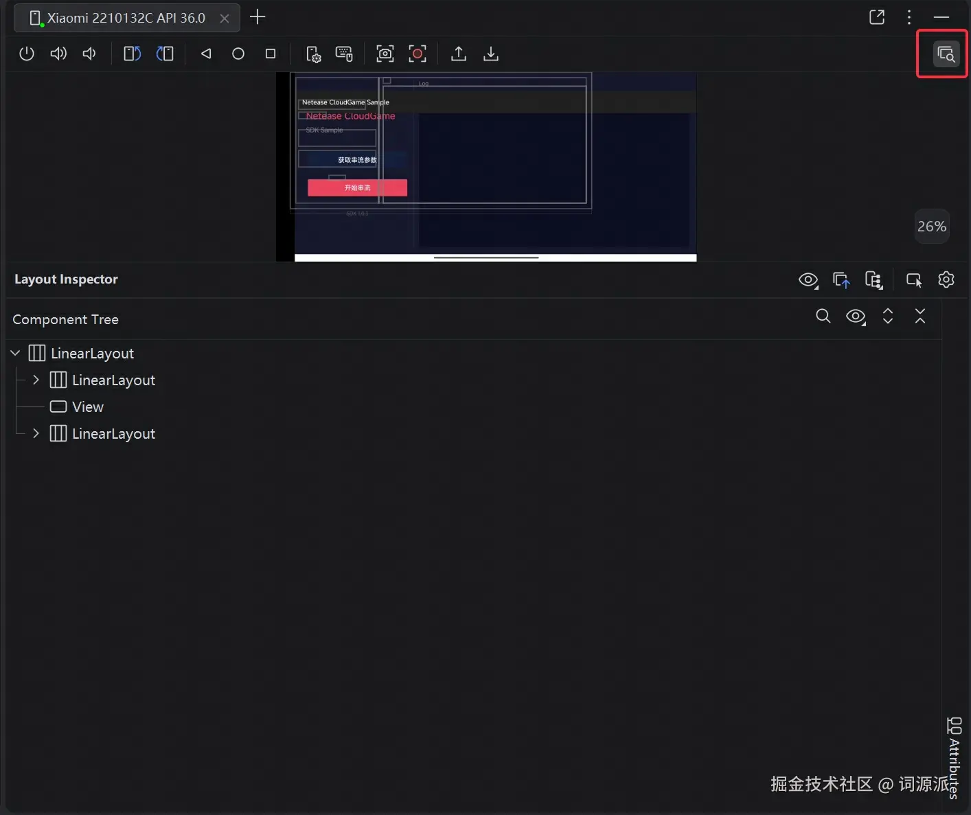
Layout Inspector 要求 App 进程处于 debuggable 状态(H: 官方文档 "automatically connects to the debuggable processes")。对于 release 版 App,需要在 AndroidManifest.xml 中声明 <profileable android:shell="true" />,并通过 adb shell settings put global debug_view_attributes 1 开启全局视图属性检查后才能使用。纯生产环境 release 包无法直接 attach。
方法二:adb 命令行(轻量,适合快速检查,针对已上架 App,它们是release包,非debuggable)
不需要打开 Android Studio,一条命令即可导出当前页面的完整 View 树:
bash
# 导出当前前台 Activity 的 View 层级到 XML
adb shell uiautomator dump /sdcard/dump.xml
adb pull /sdcard/dump.xml .

# 或者直接输出到终端查看
adb shell uiautomator dump /dev/stdout
uiautomator dump 走的是无障碍服务通道,对已上架的 release 版 App 完全可用,不受签名限制。输出的是缩进格式 XML,层级深度一目了然。
两者对比速查:
| 维度 | uiautomator dump |
Layout Inspector |
|---|---|---|
| 环境 | 纯命令行,有 adb 即可 | 需 Android Studio + USB |
| 速度 | 秒级出结果,可脚本化 | 需 attach 进程,加载数秒 |
| 层级树 | ✅ 完整 | ✅ 完整 |
| 属性详情 | ⚠️ 仅基础(位置/尺寸/文字) | ✅ 全部(padding/margin/background) |
| 3D 视图 | ❌ | ✅ |
| release 版 App | ✅ 无障碍通道,不受签名限制 | ❌ 需 debuggable 或 profileable + debug_view_attributes |
| 典型场景 | 快速检查、竞品分析、CI 集成 | 深度分析、属性调试、3D 重叠排查 |
当你看到某个列表 Item 有 6-7 层嵌套时,基本可以确定这里需要动刀了。日常排查先用 uiautomator dump 快速定位问题页面,再用 Layout Inspector 深入分析具体属性。
2.4 ConstraintLayout 全功能解析:XML 时代的终极武器
前面说的两个问题------Overdraw 和层级过深------官方给出的根治方案就是 ConstraintLayout。
它不只是"RelativeLayout 的升级版",它是一套完全不同的布局思想:用约束关系描述位置,而不是用嵌套容器组合位置。
一句话理解:RelativeLayout 和 LinearLayout 是用"盒子套盒子"来布局,ConstraintLayout 是用"View 之间的连线关系"来布局,不需要盒子,天然扁平。
下面逐一拆解它的核心特性:
① 基础约束:替代嵌套的核心能力
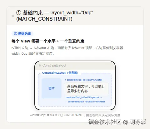
每个 View 至少需要一个水平方向约束和一个垂直方向约束。约束的对象可以是父容器边缘、另一个 View 的边缘,或者后面介绍的 Guideline/Barrier。
xml
<TextView
    android:id="@+id/tvTitle"
    android:layout_width="0dp"
    android:layout_height="wrap_content"
    app:layout_constraintStart_toEndOf="@id/ivAvatar"   <!-- 左边紧贴头像右边 -->
    app:layout_constraintTop_toTopOf="@id/ivAvatar"      <!-- 顶部对齐头像顶部 -->
    app:layout_constraintEnd_toEndOf="parent" />          <!-- 右边延伸到父容器右边 -->
layout_width="0dp" 在 ConstraintLayout 里意味着 MATCH_CONSTRAINT------由约束来决定这个方向上的尺寸,这是最常用的写法,等价于"填满约束范围"。
② 对立约束 + Bias:百分比定位,天然适配碎片化屏幕
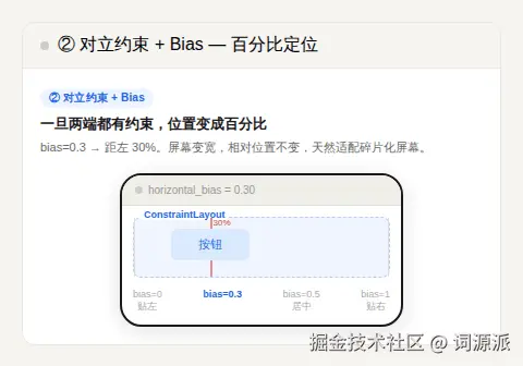
当一个 View 在同一方向上有两个相互对立的约束时(比如同时约束了 start 和 end),它默认居中,Bias 可以控制偏向比例。
ini
<Button
    android:layout_width="wrap_content"
    android:layout_height="wrap_content"
    app:layout_constraintStart_toStartOf="parent"
    app:layout_constraintEnd_toEndOf="parent"
    app:layout_constraintHorizontal_bias="0.3" />
    <!--
      bias=0.0 → 贴左边
      bias=0.5 → 居中(默认)
      bias=1.0 → 贴右边
      bias=0.3 → 距左边 30% 的位置
-->关键洞察:一旦使用对立约束,这个 View 的定位就变成了百分比,而非坐标。 屏幕变宽变窄,它的相对位置保持不变。这是适配不同屏幕宽度最优雅的方式。
③ Guideline(参考线):一套布局适配所有屏幕
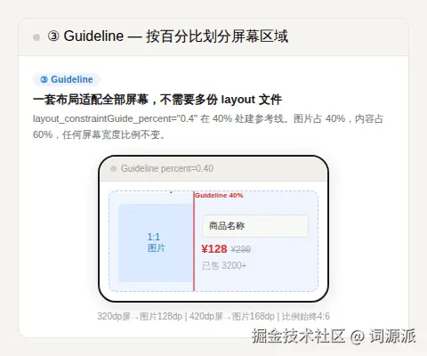
Guideline 是一条不可见的辅助线,可以用 dp 或百分比来定位,其他 View 可以约束到这条线上。
ini
<!-- 在屏幕 40% 宽度处建立一条垂直参考线 -->
<androidx.constraintlayout.widget.Guideline
    android:id="@+id/glCenter"
    android:layout_width="wrap_content"
    android:layout_height="wrap_content"
    android:orientation="vertical"
    app:layout_constraintGuide_percent="0.4" />

<!-- 左侧图片:从父容器左边到参考线 -->
<ImageView
    android:id="@+id/ivProduct"
    android:layout_width="0dp"
    android:layout_height="0dp"
    app:layout_constraintStart_toStartOf="parent"
    app:layout_constraintEnd_toStartOf="@id/glCenter"
    app:layout_constraintTop_toTopOf="parent"
    app:layout_constraintBottom_toBottomOf="parent"
    app:layout_constraintDimensionRatio="1:1" />

<!-- 右侧内容:从参考线到父容器右边 -->
<TextView
    android:id="@+id/tvName"
    android:layout_width="0dp"
    android:layout_height="wrap_content"
    app:layout_constraintStart_toEndOf="@id/glCenter"
    app:layout_constraintEnd_toEndOf="parent"
    app:layout_constraintTop_toTopOf="parent" />
在 320dp 宽的小屏手机上,图片占 128dp;在 420dp 宽的大屏手机上,图片占 168dp------布局比例始终是 4:6,一套 XML 适配全部机型,不需要 layout-sw360dp、layout-sw400dp 这些文件夹。

④ Barrier(动态屏障):解决动态内容导致的布局错位
Barrier 是一条根据引用 View 的实际尺寸动态移动的辅助线。
典型场景:一个表单有两个标签("用户名"和"收货地址"),右侧输入框需要对齐到标签的右边缘。但多语言环境下,"Username" 和 "Shipping Address" 的宽度完全不同。用固定宽度会截断,用 Barrier 就能优雅解决:
xml
<!-- Barrier 跟踪两个 TextView 中较宽的那个的右边缘 -->
<androidx.constraintlayout.widget.Barrier
    android:id="@+id/barrier"
    android:layout_width="wrap_content"
    android:layout_height="wrap_content"
    app:barrierDirection="end"
    app:constraint_referenced_ids="tvLabel1,tvLabel2" />

<!-- 输入框约束到 Barrier 的右边,永远不会和标签重叠 -->
<EditText
    android:layout_width="0dp"
    android:layout_height="wrap_content"
    app:layout_constraintStart_toEndOf="@id/barrier"
    app:layout_constraintEnd_toEndOf="parent" />
无论哪国语言,布局都能正确对齐,不需要任何代码逻辑介入。
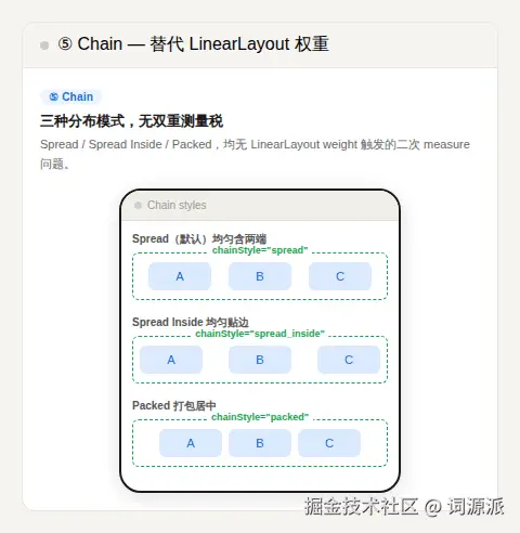
⑤ Chain(链式分布):替代 LinearLayout 权重
Chain 把一组 View 在同一方向上串联起来,统一管理它们之间的间距分布,有三种模式:
scss
Spread(默认):  |--[A]--[B]--[C]--|   均匀分布,包含两端间距
Spread Inside:  |[A]----[B]----[C]|   均匀分布,两端贴边
Packed:         |----[A][B][C]----|   打包居中,可用 bias 控制偏移
ini
<!-- 三个按钮水平均匀分布,chainStyle 设在第一个元素上 -->
<Button
    android:id="@+id/btn1"
    app:layout_constraintStart_toStartOf="parent"
    app:layout_constraintEnd_toStartOf="@id/btn2"
    app:layout_constraintHorizontal_chainStyle="spread" />

<Button
    android:id="@+id/btn2"
    app:layout_constraintStart_toEndOf="@id/btn1"
    app:layout_constraintEnd_toStartOf="@id/btn3" />

<Button
    android:id="@+id/btn3"
    app:layout_constraintStart_toEndOf="@id/btn2"
    app:layout_constraintEnd_toEndOf="parent" />
Chain 还支持权重分配(类似 LinearLayout 的 weight),但不会触发双重测量税:
ini
<!-- btn1 占 1 份,btn2 占 2 份 -->
<Button android:id="@+id/btn1"
    android:layout_width="0dp"
    app:layout_constraintHorizontal_weight="1" ... />
<Button android:id="@+id/btn2"
    android:layout_width="0dp"
    app:layout_constraintHorizontal_weight="2" ... />
Chain 还支持垂直方向权重,对应属性为 layout_constraintVertical_weight。
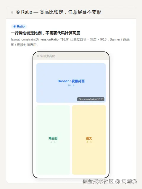
⑥ Ratio(宽高比锁定):图片/Banner 在任意屏幕不变形
设置 app:layout_constraintDimensionRatio,让 View 的尺寸严格按比例缩放:
ini
<!-- 宽度铺满父容器,高度自动等于宽度的 56.25%(16:9 比例) -->
<ImageView
    android:layout_width="0dp"
    android:layout_height="0dp"
    app:layout_constraintStart_toStartOf="parent"
    app:layout_constraintEnd_toEndOf="parent"
    app:layout_constraintTop_toTopOf="parent"
    app:layout_constraintDimensionRatio="16:9" />
Banner 图、商品主图、视频封面,统统用这个。从 320dp 宽的老机器到 480dp 宽的大屏,比例永远正确,一行代码,不需要用代码动态计算 layoutParams.height。
⑦ Group:批量控制 View 可见性
xml
<!-- 定义一个 Group,包含加载态的几个 View -->
<androidx.constraintlayout.widget.Group
    android:id="@+id/groupLoading"
    app:constraint_referenced_ids="progressBar,tvLoading" />
ini
// 一行代码控制多个 View 的可见性,不需要逐个 findViewById
binding.groupLoading.visibility = View.GONE
注意:Group 只管 visibility,不影响布局层级,被引用的 View 仍然是 ConstraintLayout 的直接子 View。

⑧ Flow(2.0 新增):标签流式布局,不需要第三方库
Flow 可以把一组 View 自动排列成多行,超出宽度时自动换行:
ini
<androidx.constraintlayout.helper.widget.Flow
    android:layout_width="0dp"
    android:layout_height="wrap_content"
    app:layout_constraintStart_toStartOf="parent"
    app:layout_constraintEnd_toEndOf="parent"
    app:flow_wrapMode="chain"
    app:flow_horizontalGap="8dp"
    app:flow_verticalGap="8dp"
    app:constraint_referenced_ids="tag1,tag2,tag3,tag4,tag5" />
商品标签、话题 Tag、功能 Chip 列表,都可以用 Flow 替代第三方 FlowLayout 库,减少依赖。
ConstraintLayout 核心特性速查
| 特性 | 解决的问题 | 关键属性 |
|---|---|---|
| 基础约束 | 消灭嵌套,扁平化层级 | constraintStart/End/Top/Bottom_to*Of |
| 对立约束+Bias | 百分比定位,适配不同屏幕宽度 | layout_constraintHorizontal_bias |
| Guideline | 按比例划分区域,一套布局全机型 | layout_constraintGuide_percent |
| Barrier | 动态内容(多语言/用户数据)自动适配 | barrierDirection + constraint_referenced_ids |
| Chain | 替代带权重 LinearLayout,无双重测量税 | layout_constraintHorizontal_chainStyle |
| Ratio | 图片/Banner 固定宽高比,不变形 | layout_constraintDimensionRatio |
| Group | 批量控制多 View 可见性 | constraint_referenced_ids |
| Flow | 标签流式换行布局 | flow_wrapMode |
三、具体实例应用展示
理论讲完,来看一个真实的案例。
场景:电商 App 商品列表 Item

UI 结构如下:商品主图(左侧,1:1 比例)+ 右侧信息区(商品名称、价格、原价删除线、促销标签、销量文字)。这是最常见的电商卡片结构,几乎每个 App 都有。
Step 0:问题现场
先看最初的实现(这是很多人的第一直觉写法):
❌ 问题版本 item_product_bad.xml
xml
<?xml version="1.0" encoding="utf-8"?>
<!-- 层级1:根容器,白色背景 -->
<LinearLayout
    android:layout_width="match_parent"
    android:layout_height="wrap_content"
    android:orientation="horizontal"
    android:background="#FFFFFF"
    android:padding="12dp">

    <!-- 层级2:图片容器(为了加圆角背景单独套了一层) -->
    <FrameLayout
        android:layout_width="96dp"
        android:layout_height="96dp"
        android:background="#F5F5F5">

        <!-- 层级3:商品主图 -->
        <ImageView
            android:id="@+id/ivProduct"
            android:layout_width="match_parent"
            android:layout_height="match_parent"
            android:scaleType="centerCrop" />

    </FrameLayout>

    <!-- 层级2:右侧信息区(垂直排列) -->
    <LinearLayout
        android:layout_width="0dp"
        android:layout_height="match_parent"
        android:layout_weight="1"
        android:orientation="vertical"
        android:background="#FFFFFF"      <!-- ⚠️ 和根容器重复的白色背景 -->
        android:layout_marginStart="12dp">

        <!-- 层级3:商品名称 -->
        <TextView
            android:id="@+id/tvName"
            android:layout_width="match_parent"
            android:layout_height="wrap_content"
            android:background="#FFFFFF"  <!-- ⚠️ 又一层重复白色背景 -->
            android:maxLines="2"
            android:textSize="14sp"
            android:textColor="#333333" />

        <!-- 层级3:价格行(价格+原价并排) -->
        <LinearLayout
            android:layout_width="match_parent"
            android:layout_height="wrap_content"
            android:orientation="horizontal"
            android:layout_marginTop="8dp">

            <!-- 层级4:现价 -->
            <TextView
                android:id="@+id/tvPrice"
                android:layout_width="wrap_content"
                android:layout_height="wrap_content"
                android:textSize="18sp"
                android:textColor="#FF4400" />

            <!-- 层级4:原价(删除线) -->
            <TextView
                android:id="@+id/tvOriginalPrice"
                android:layout_width="wrap_content"
                android:layout_height="wrap_content"
                android:layout_marginStart="8dp"
                android:textSize="12sp"
                android:textColor="#999999" />

        </LinearLayout>

        <!-- 层级3:底部行(促销标签+销量文字) -->
        <LinearLayout
            android:layout_width="match_parent"
            android:layout_height="wrap_content"
            android:orientation="horizontal"
            android:layout_marginTop="8dp">

            <!-- 层级4:促销标签背景 -->
            <FrameLayout
                android:layout_width="wrap_content"
                android:layout_height="wrap_content"
                android:background="#FFEEEE"
                android:paddingStart="4dp"
                android:paddingEnd="4dp">

                <!-- 层级5:促销标签文字 -->
                <TextView
                    android:id="@+id/tvPromoTag"
                    android:layout_width="wrap_content"
                    android:layout_height="wrap_content"
                    android:textSize="10sp"
                    android:textColor="#FF4400" />

            </FrameLayout>

            <!-- 层级4:销量 -->
            <TextView
                android:id="@+id/tvSales"
                android:layout_width="0dp"
                android:layout_height="wrap_content"
                android:layout_weight="1"
                android:layout_marginStart="8dp"
                android:textSize="11sp"
                android:textColor="#999999"
                android:gravity="end" />

        </LinearLayout>

    </LinearLayout>
</LinearLayout>
诊断结果:
- 层级深度:5 层(LinearLayout → LinearLayout + FrameLayout → LinearLayout → LinearLayout → FrameLayout → TextView)
- 触发双重测量的地方:外层 LinearLayout 使用了
layout_weight="1",内层销量 TextView 也用了layout_weight="1" - Overdraw:白色背景出现 3 次叠加(根容器 + 右侧 LinearLayout + tvName),中心区域呈绿色(2x)到粉色(3x)
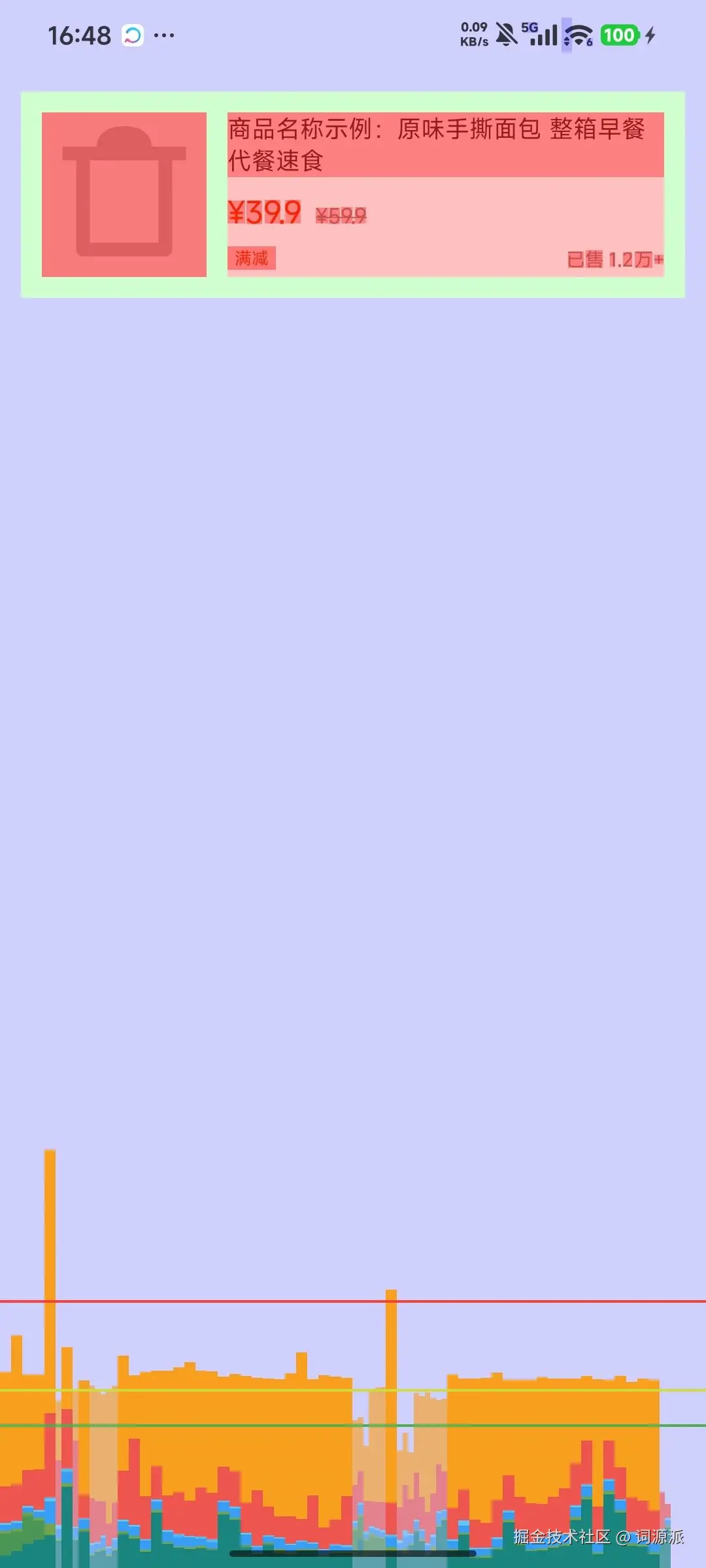
yaml
adb shell dumpsys gfxinfo 优化前:
Janky frames: 64 (53.33%)
50th percentile: 28ms
Step 1:第一刀------移除冗余背景(治 Overdraw)
问题很清晰:右侧 LinearLayout 和 tvName 的 android:background="#FFFFFF" 完全是冗余的,整个卡片本来就是白底,完全不需要子 View 重复声明。
xml
<!-- ❌ 删除这些多余的背景 -->
<LinearLayout
    android:background="#FFFFFF"   <!-- 删掉 -->
    ...>

<TextView
    android:id="@+id/tvName"
    android:background="#FFFFFF"   <!-- 删掉 -->
    ...>
同时,检查 Theme 里 Window 的默认背景(很多开发者忽略这层):
xml
<!-- res/values/styles.xml -->
<style name="AppTheme" parent="Theme.MaterialComponents.Light">
    <!--
        把 Window 背景和根布局背景统一成同一个颜色,
        避免两层重复绘制。
        ⚠️ 不要设置为 @null,会导致 Activity 切换动画期间出现黑屏闪烁。
        正确做法是让 windowBackground 与根布局背景一致,这样即使两层都被绘制,
        视觉上也只是一次纯色填充的效果,不会因色差暴露冗余层。
    -->
    <item name="android:windowBackground">@color/white</item>
</style>
优化后效果:
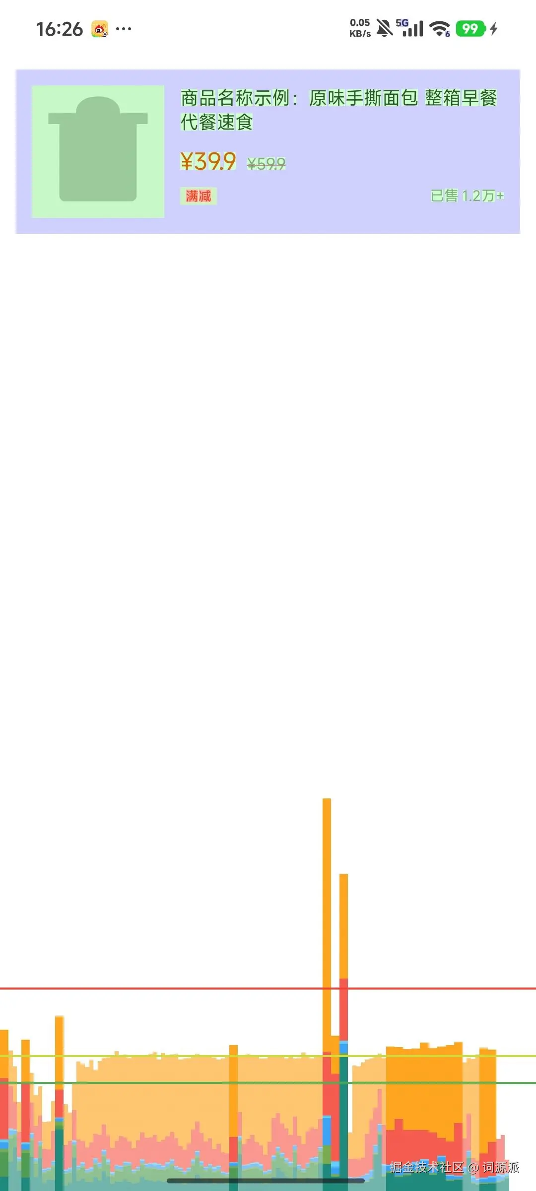
但层级问题还在,继续动刀。
Step 2:第二刀------ConstraintLayout 扁平化(治层级)
把整个 Item 用 ConstraintLayout 重写。目标:所有 View 都是 ConstraintLayout 的直接子 View,层级深度从 5 层降至 1 层。
✅ 优化版本 item_product_good.xml
ini
<?xml version="1.0" encoding="utf-8"?>
<androidx.constraintlayout.widget.ConstraintLayout
    xmlns:android="http://schemas.android.com/apk/res/android"
    xmlns:app="http://schemas.android.com/apk/res-auto"
    android:layout_width="match_parent"
    android:layout_height="wrap_content"
    android:background="#FFFFFF"
    android:padding="12dp">

    <!--
        商品主图:
        - 宽度 = 高度(1:1 比例)
        - 高度由 Ratio + 约束决定,不需要硬编码 dp
        - 用 app:layout_constraintDimensionRatio 替代外层 FrameLayout
    -->
    <ImageView
        android:id="@+id/ivProduct"
        android:layout_width="0dp"
        android:layout_height="0dp"
        android:background="#F5F5F5"
        android:scaleType="centerCrop"
        app:layout_constraintDimensionRatio="1:1"
        app:layout_constraintStart_toStartOf="parent"
        app:layout_constraintTop_toTopOf="parent"
        app:layout_constraintBottom_toBottomOf="parent"
        app:layout_constraintWidth_percent="0.28" />
    <!--
        layout_constraintWidth_percent="0.28"(需 ConstraintLayout 2.0+):
        图片宽度 = 父容器宽度 × 28%,在不同屏幕上比例保持一致。
        配合 Ratio 1:1,高度自动等于宽度,不需要任何代码计算。
    -->

    <!--
        商品名称:
        - 左边约束图片右边(+12dp margin)
        - 右边约束父容器右边
        - 顶部对齐图片顶部
    -->
    <TextView
        android:id="@+id/tvName"
        android:layout_width="0dp"
        android:layout_height="wrap_content"
        android:layout_marginStart="12dp"
        android:maxLines="2"
        android:textSize="14sp"
        android:textColor="#333333"
        app:layout_constraintStart_toEndOf="@id/ivProduct"
        app:layout_constraintEnd_toEndOf="parent"
        app:layout_constraintTop_toTopOf="@id/ivProduct" />

    <!--
        现价:
        - 左边对齐商品名
        - 顶部在商品名下方(8dp 间距)
    -->
    <TextView
        android:id="@+id/tvPrice"
        android:layout_width="wrap_content"
        android:layout_height="wrap_content"
        android:layout_marginStart="12dp"
        android:layout_marginTop="8dp"
        android:textSize="18sp"
        android:textColor="#FF4400"
        app:layout_constraintStart_toEndOf="@id/ivProduct"
        app:layout_constraintTop_toBottomOf="@id/tvName" />

    <!--
        原价(删除线):
        - Baseline 对齐现价(文字基线对齐,视觉上更专业)
        - 左边紧贴现价右边(8dp margin)
        - 删除线效果无法在 XML 中直接设置(android:textStyle 仅支持 normal/bold/italic),需在代码中通过 paintFlags 添加
    -->
    <TextView
        android:id="@+id/tvOriginalPrice"
        android:layout_width="wrap_content"
        android:layout_height="wrap_content"
        android:layout_marginStart="8dp"
        android:textSize="12sp"
        android:textColor="#999999"
        app:layout_constraintStart_toEndOf="@id/tvPrice"
        app:layout_constraintBaseline_toBaselineOf="@id/tvPrice" />
    <!--
        layout_constraintBaseline_toBaselineOf:
        文字基线对齐是让不同字号的文字看起来在同一行的正确方式,
        比 Top/Bottom 对齐视觉效果好很多,这是 ConstraintLayout 独有的能力。
    -->

    <!--
        促销标签:
        - 直接给 TextView 设 background(圆角 drawable),
          不需要 FrameLayout 包装
        - 左边对齐商品名
        - 顶部在价格行下方
    -->
    <TextView
        android:id="@+id/tvPromoTag"
        android:layout_width="wrap_content"
        android:layout_height="wrap_content"
        android:layout_marginStart="12dp"
        android:layout_marginTop="8dp"
        android:background="@drawable/bg_promo_tag"
        android:paddingStart="4dp"
        android:paddingEnd="4dp"
        android:textSize="10sp"
        android:textColor="#FF4400"
        app:layout_constraintStart_toEndOf="@id/ivProduct"
        app:layout_constraintTop_toBottomOf="@id/tvPrice" />
    <!--
        关键:把之前的 FrameLayout+TextView 两层合并成一个 TextView,
        background 直接用 shape drawable 实现背景色,减少一层节点。
    -->

    <!--
        销量:
        - 右边对齐父容器右边
        - Baseline 对齐促销标签(同行视觉对齐)
    -->
    <TextView
        android:id="@+id/tvSales"
        android:layout_width="0dp"
        android:layout_height="wrap_content"
        android:layout_marginStart="8dp"
        android:gravity="end"
        android:textSize="11sp"
        android:textColor="#999999"
        app:layout_constraintStart_toEndOf="@id/tvPromoTag"
        app:layout_constraintEnd_toEndOf="parent"
        app:layout_constraintBaseline_toBaselineOf="@id/tvPromoTag" />

</androidx.constraintlayout.widget.ConstraintLayout>
这次重写做了什么:
- 图片宽高比 :用
layout_constraintDimensionRatio="1:1"+layout_constraintWidth_percent="0.28"替代硬编码 96dp,在不同屏幕上比例自适应 - 删除 FrameLayout:原来图片外面套了一层 FrameLayout 只是为了加灰色背景,现在直接给 ImageView 加 background,省掉一层
- 促销标签:原来用 FrameLayout 包 TextView 来实现背景色,现在直接给 TextView 设置 shape drawable,又省掉一层
- Baseline 对齐:现价和原价的文字基线对齐,比 centerVertical 视觉效果更专业
踩坑记录: 第一次替换后,促销标签和销量文字跑到了图片下面而不是在信息区内。原因是约束写成了 constraintStart_toEndOf="@id/ivProduct" 但是 top 约束写的是 constraintTop_toBottomOf="@id/tvPrice" 而 tvPrice 的约束链没有写对。在 ConstraintLayout 里,一旦约束链断裂,View 会跑到 (0,0) 位置。修复方法:用 Layout Inspector 的 3D 视图逐一检查每个 View 的约束连接是否完整,找到断点后补全。
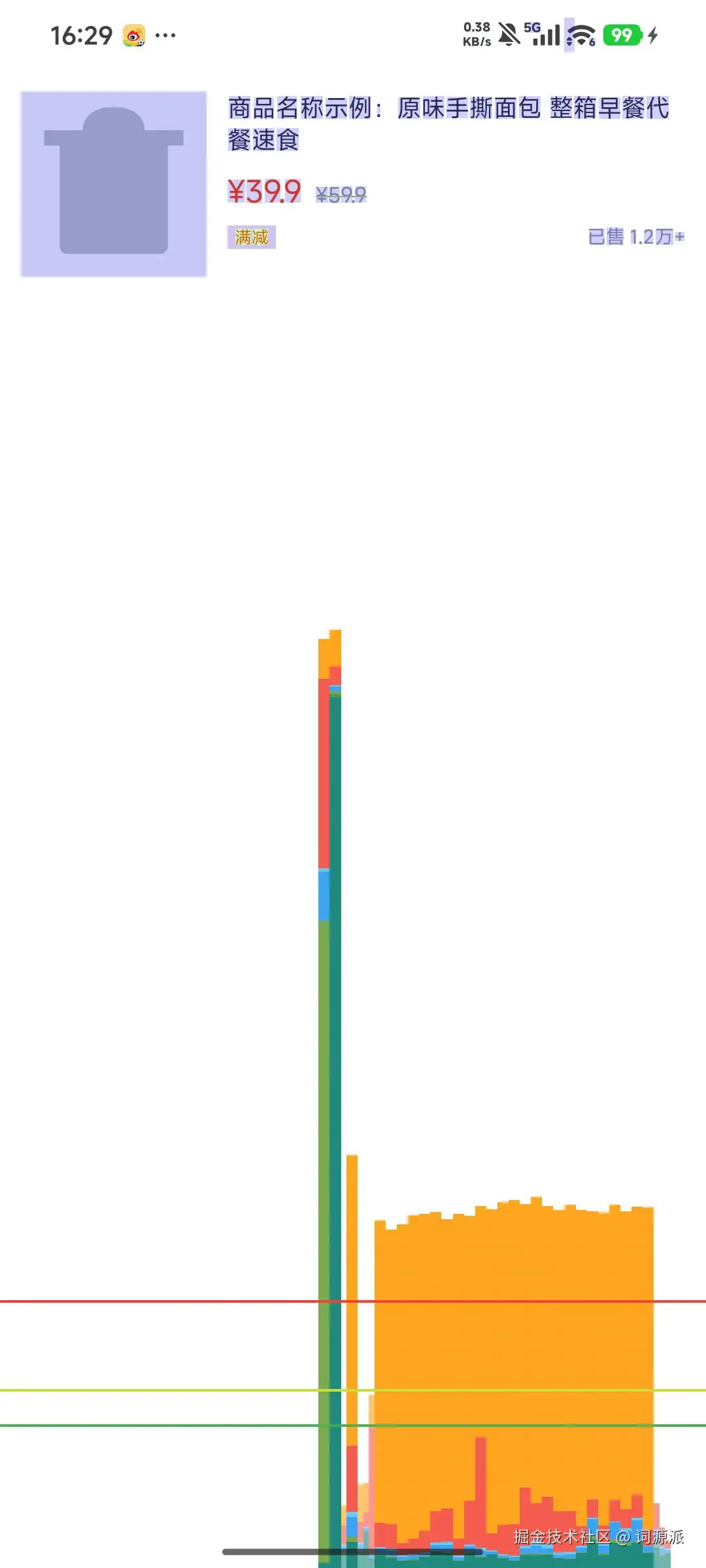
优化后效果:
Step 3:第三刀------<merge> 标签消除 inflate 根节点
这一刀适用于把 item_product_good.xml 封装成自定义 View 的场景。
kotlin
class ProductItemView @JvmOverloads constructor(
    context: Context,
    attrs: AttributeSet? = null
) : ConstraintLayout(context, attrs) {

    init {
        // inflate 时如果根节点是 ConstraintLayout,
        // 而 ProductItemView 本身也是 ConstraintLayout,
        // 就会出现一层多余的 ConstraintLayout 包裹
        LayoutInflater.from(context).inflate(R.layout.item_product_good, this, true)
    }
}
把布局文件的根节点改成 <merge>:
xml
<!-- item_product_good.xml 自定义 View 版本 -->
<?xml version="1.0" encoding="utf-8"?>
<merge xmlns:android="http://schemas.android.com/apk/res/android"
    xmlns:app="http://schemas.android.com/apk/res-auto"
    xmlns:tools="http://schemas.android.com/tools"
    tools:parentTag="androidx.constraintlayout.widget.ConstraintLayout">
    <!--
        tools:parentTag 告诉 Layout Editor 把这个 merge 当作
        ConstraintLayout 来预览,这样约束关系才能正确显示
    -->

    <!-- 所有子 View 保持不变,去掉根 ConstraintLayout 标签 -->
    <ImageView android:id="@+id/ivProduct" ... />
    <TextView android:id="@+id/tvName" ... />
    <!-- ... 其余 View ... -->

</merge>
<merge> 的作用:inflate 时,merge 标签本身不会创建 View 节点,它的子 View 直接被添加到 this(ProductItemView,即 ConstraintLayout)下。消除了一层多余的容器节点。
优化后效果:
四、总结
速查表:5 条渲染优化原则(可截图保存)
ini
✅ 1. 永远不要在父子 View 上重复设置相同背景
      根容器有白色背景,子 View 不需要再声明白色背景

✅ 2. 层级超过 4 层,优先考虑 ConstraintLayout 重构
      复杂嵌套 = 高测量成本,扁平化是根治手段

✅ 3. 用 Guideline 百分比替代硬编码 dp
      app:layout_constraintGuide_percent="0.4"
      一套布局适配所有屏幕,不需要多份 layout 文件

✅ 4. 动态内容用 Barrier,不用固定宽度
      多语言、动态文本长度变化,Barrier 自动跟随

✅ 5. 固定比例的图片/Banner 用 Ratio,不要代码计算
      app:layout_constraintDimensionRatio="16:9"
      任何屏幕宽度下比例始终正确
方法论升华
这次优化的本质,是把"嵌套的命令式位置描述"改成了"扁平的相对关系声明"。
旧的思路是:我需要一个右侧区域,所以我需要一个容器;这个区域内需要垂直排列,所以我需要一个垂直 LinearLayout;里面有一行并排的元素,所以我还需要一个水平 LinearLayout......层级就是这样一层层"需要"出来的。
ConstraintLayout 的思路是:每个 View 直接说清楚自己和谁的哪条边对齐------不需要容器,只需要关系。层级天然扁平。
这个思想转变值得记住,因为它和后来 Jetpack Compose 的声明式 UI 一脉相承:描述"是什么",而不是描述"怎么做" 。
下篇预告
当 XML + ConstraintLayout 的布局体系已经做到最优,很多团队开始迁移到 Jetpack Compose。
进入 Compose 时代后,你会发现一件让人意外的事:过度绘制和层级深度,不再是主要的性能问题了。官方文档明确写道------Compose 能高效处理深层 UI 树,不需要像 XML 时代那样费心拍平层级。你在这篇文章里花时间掌握的扁平化技巧,在 Compose 里几乎用不上。
但这不意味着 Compose 就没有性能问题,恰恰相反------新的性能杀手悄悄换了一张脸,有了一个新名字:Recomposition(重组) 。它和 Overdraw 一样,本质上都是"让 GPU/CPU 做了不必要的工作",只是触发条件完全不同,排查工具也完全不同。
下一篇,我们来讲 Android 渲染优化在 Compose 时代的范式转变------你会看到,同样一个"减少无效渲染"的目标,在两个时代里走的是完全不同的路。
Footnotes
- 名称变更说明 :从 Android 12 开始,该选项从"GPU 呈现模式分析"更名为"HWUI 呈现模式分析" 。原因是 Android 的 2D 渲染实际由 HWUI(Hardware UI)库负责,而非直接操作 GPU,Google 修正了术语。在澎湃 OS、HyperOS 等基于 Android 12+ 的系统中,请在开发者选项中搜索「HWUI 呈现」即可找到。 ↩