项目演示
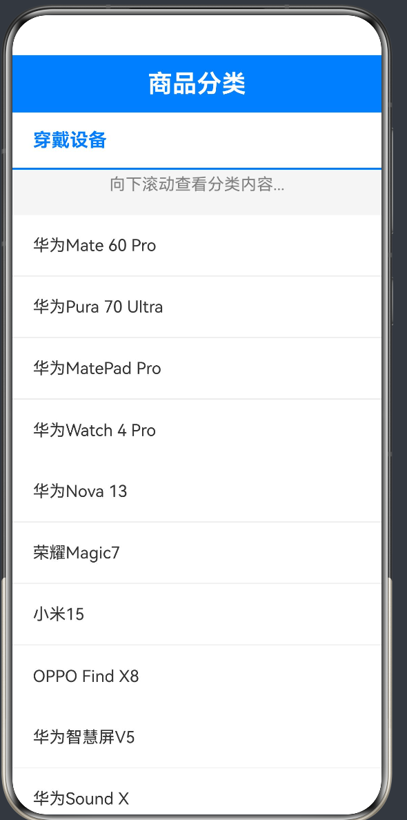
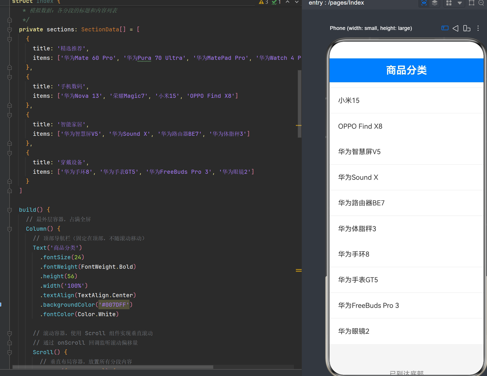
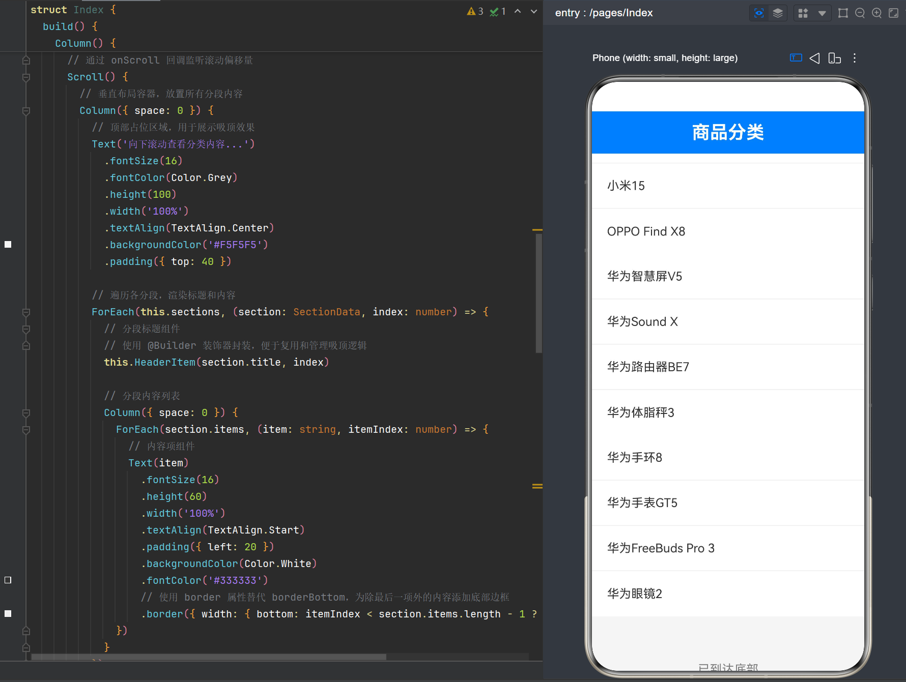
目录
引言
1.1 粘性布局的应用场景
在移动应用开发中,粘性布局(Sticky Layout)是一种非常常见的UI交互模式,它允许页面元素在滚动到特定位置时固定在视口顶部或底部。这种布局方式在以下场景中尤为实用:
- 列表分类导航:如电商应用的商品分类列表,当用户滚动浏览时,当前分类标题始终显示在顶部,方便用户了解所在分类
- 多段内容阅读:如新闻资讯应用,每段内容有独立标题,滚动时标题自动吸附到顶部
- 表单多步骤引导:长表单页面中,当前步骤标题固定在顶部,便于用户了解进度
- 数据表格表头:横向滚动时,表头固定,提升数据阅读体验
1.2 鸿蒙ArkUI的布局现状
与Web开发中的CSS position: sticky 不同,鸿蒙HarmonyOS NEXT的ArkUI框架并未提供原生的粘性布局属性。开发者需要通过组合使用Scroll、Column组件和position属性来手动实现这一效果。这种实现方式虽然增加了开发复杂度,但也提供了更高的灵活性和可控性。
1.3 本文目标
本文将详细介绍如何使用鸿蒙ArkTS语言,通过Scroll + Column + position的组合方式实现粘性布局效果。我们将从基础概念出发,深入分析实现原理,提供完整的代码示例,并探讨常见问题与优化方案。
Scroll与Column组件基础
2.1 Scroll组件概述
Scroll组件是鸿蒙ArkUI中用于实现滚动功能的核心组件,它允许内容在超出容器尺寸时进行滚动。
2.1.1 Scroll组件的基本用法
typescript
Scroll() {
    Column() {
        // 滚动内容
    }
}
.scrollBar(BarState.Auto)
2.1.2 Scroll组件的常用属性
| 属性 | 类型 | 说明 |
|---|---|---|
| scrollBar | BarState | 滚动条显示状态(Auto/On/Off) |
| onScroll | (xOffset: number, yOffset: number) => void | 滚动事件回调,返回水平和垂直偏移量 |
2.1.3 Scroll组件的特性
- 默认滚动方向:Scroll组件默认支持垂直滚动,无需额外配置
- 滚动事件监听 :通过
onScroll回调可以实时获取滚动偏移量 - 滚动条控制 :可以通过
scrollBar属性控制滚动条的显示与隐藏
2.2 Column组件概述
Column组件是鸿蒙ArkUI中的垂直布局容器,它将子组件按垂直方向排列。
2.2.1 Column组件的基本用法
typescript
Column({ space: 10 }) {
    Text('Item 1')
    Text('Item 2')
    Text('Item 3')
}
.width('100%')
2.2.2 Column组件的常用属性
| 属性 | 类型 | 说明 |
|---|---|---|
| space | number | 子组件之间的间距 |
| alignItems | HorizontalAlign | 子组件的水平对齐方式 |
| justifyContent | FlexAlign | 子组件的垂直对齐方式 |
2.2.3 Column组件的特性
- 垂直排列:子组件按从上到下的顺序排列
- 间距控制 :通过
space属性可以统一设置子组件之间的间距 - 灵活对齐:支持多种水平和垂直对齐方式
2.3 Scroll与Column的组合使用
在实际开发中,Scroll和Column通常配合使用,形成"滚动容器+垂直布局"的经典组合:
typescript
Scroll() {
    Column({ space: 0 }) {
        // 多个分段内容
        Text('标题1')
        Column() {
            // 内容项
        }
        Text('标题2')
        Column() {
            // 内容项
        }
    }
}
这种组合方式是实现粘性布局的基础,因为它提供了滚动能力和垂直排列的结构。
Sticky粘性布局概念与原理
3.1 粘性布局的核心概念
粘性布局的核心思想是:当页面元素滚动到特定位置时,将其固定在视口的某个位置(通常是顶部),直到被下一个同类元素替代。
3.2 实现粘性布局的关键要素
要实现粘性布局,需要以下三个关键要素:
- 滚动监听:能够实时获取滚动位置
- 位置判断:判断元素是否需要进入粘性状态
- 定位切换:动态切换元素的定位方式
3.3 鸿蒙ArkUI中的实现思路
由于ArkUI没有提供原生的position: sticky属性,我们需要采用以下策略:
- 使用Scroll组件的
onScroll回调监听滚动位置 - 通过
@State状态管理当前滚动偏移量和粘性元素索引 - 使用
position属性控制元素的定位方式:- 非粘性状态:元素在正常文档流中,跟随内容滚动
- 粘性状态:元素固定在指定位置,不随内容滚动
3.4 坐标系分析
在实现粘性布局时,需要理解以下坐标系概念:
- 滚动偏移量:内容相对于视口顶部的偏移距离
- 元素初始位置:元素在文档流中的原始Y坐标
- 粘性阈值:元素开始进入粘性状态的滚动偏移量临界值
当滚动偏移量超过粘性阈值时,元素应该切换为粘性状态。
实现方案设计
4.1 整体架构设计
基于以上分析,我们设计如下实现方案:
┌─────────────────────────────────┐
│         固定导航栏 (56px)        │
├─────────────────────────────────┤
│                                 │
│    ┌─────────────────────────┐  │
│    │      Scroll 容器        │  │
│    │                         │  │
│    │  ┌─────────────────────┐│  │
│    │  │     Column 布局     ││  │
│    │  │                     ││  │
│    │  │  [标题1] ─sticky─▶ ││  │
│    │  │  [内容项]           ││  │
│    │  │  [内容项]           ││  │
│    │  │                     ││  │
│    │  │  [标题2]            ││  │
│    │  │  [内容项]           ││  │
│    │  │                     ││  │
│    │  └─────────────────────┘│  │
│    └─────────────────────────┘  │
│                                 │
└─────────────────────────────────┘
4.2 状态管理设计
我们需要管理以下状态:
| 状态变量 | 类型 | 说明 |
|---|---|---|
| scrollOffset | number | 当前垂直滚动偏移量 |
| stickyHeaderIndex | number | 当前处于粘性状态的标题索引(-1表示无) |
| headerPositions | number\[\] | 各标题的初始Y坐标 |
4.3 滚动事件处理流程
用户滚动 → onScroll回调 → handleScroll() → 更新scrollOffset → 判断粘性状态 → 更新stickyHeaderIndex → 触发UI重渲染4.4 粘性判断逻辑
粘性判断的核心逻辑如下:
- 遍历所有标题的初始位置
- 计算每个标题的粘性阈值(标题初始位置 - 导航栏高度)
- 找到第一个滚动偏移量超过阈值的标题
- 将该标题设为当前粘性标题
完整代码实现与逐行解析
5.1 完整代码
typescript
/**
 * 鸿蒙ArkTS Scroll + Column + Sticky粘性布局示例
 * 核心技术:Scroll组件 + Column布局 + position定位实现吸顶效果
 */

@Entry
@Component
struct Index {
  @State scrollOffset: number = 0
  @State stickyHeaderIndex: number = -1
  private headerPositions: number[] = [100, 500, 900, 1300]
  private headerHeight: number = 56

  private sections: SectionData[] = [
    {
      title: '精选推荐',
      items: ['华为Mate 60 Pro', '华为Pura 70 Ultra', '华为MatePad Pro', '华为Watch 4 Pro']
    },
    {
      title: '手机数码',
      items: ['华为Nova 13', '荣耀Magic7', '小米15', 'OPPO Find X8']
    },
    {
      title: '智能家居',
      items: ['华为智慧屏V5', '华为Sound X', '华为路由器BE7', '华为体脂秤3']
    },
    {
      title: '穿戴设备',
      items: ['华为手环8', '华为手表GT5', '华为FreeBuds Pro 3', '华为眼镜2']
    }
  ]

  build() {
    Column() {
      Text('商品分类')
        .fontSize(24)
        .fontWeight(FontWeight.Bold)
        .height(56)
        .width('100%')
        .textAlign(TextAlign.Center)
        .backgroundColor('#007DFF')
        .fontColor(Color.White)

      Scroll() {
        Column({ space: 0 }) {
          Text('向下滚动查看分类内容...')
            .fontSize(16)
            .fontColor(Color.Grey)
            .height(100)
            .width('100%')
            .textAlign(TextAlign.Center)
            .backgroundColor('#F5F5F5')
            .padding({ top: 40 })

          ForEach(this.sections, (section: SectionData, index: number) => {
            this.HeaderItem(section.title, index)

            Column({ space: 0 }) {
              ForEach(section.items, (item: string, itemIndex: number) => {
                Text(item)
                  .fontSize(16)
                  .height(60)
                  .width('100%')
                  .textAlign(TextAlign.Start)
                  .padding({ left: 20 })
                  .backgroundColor(Color.White)
                  .fontColor('#333333')
                  .border({ width: { bottom: itemIndex < section.items.length - 1 ? 1 : 0 }, color: '#EEEEEE' })
              })
            }
          })

          Text('已到达底部')
            .fontSize(16)
            .fontColor(Color.Grey)
            .height(100)
            .width('100%')
            .textAlign(TextAlign.Center)
            .backgroundColor('#F5F5F5')
            .padding({ top: 40 })
        }
        .width('100%')
      }
      .scrollBar(BarState.Auto)
      .onScroll((_xOffset: number, yOffset: number) => {
        this.handleScroll(yOffset)
      })
      .height('100%')
      .width('100%')
    }
    .height('100%')
    .width('100%')
    .backgroundColor('#F5F5F5')
  }

  @Builder
  HeaderItem(title: string, index: number) {
    Text(title)
      .fontSize(18)
      .fontWeight(FontWeight.Bold)
      .height(this.headerHeight)
      .width('100%')
      .textAlign(TextAlign.Start)
      .padding({ left: 20 })
      .backgroundColor('#FFFFFF')
      .fontColor('#007DFF')
      .border({ width: { bottom: 2 }, color: '#007DFF' })
      .position({
        y: this.stickyHeaderIndex === index ? 56 : 0,
        x: this.stickyHeaderIndex === index ? 0 : 0
      })
      .zIndex(this.stickyHeaderIndex === index ? 100 : 1)
  }

  handleScroll(offset: number) {
    this.scrollOffset = offset

    let shouldStick = -1
    for (let i = this.headerPositions.length - 1; i >= 0; i--) {
      const threshold = this.headerPositions[i] - 56

      if (offset >= threshold) {
        shouldStick = i
        break
      }
    }

    this.stickyHeaderIndex = shouldStick
  }
}

interface SectionData {
  title: string
  items: string[]
}
5.2 代码逐行解析
5.2.1 组件声明与状态定义
typescript
@Entry
@Component
struct Index {
  @State scrollOffset: number = 0
  @State stickyHeaderIndex: number = -1
  private headerPositions: number[] = [100, 500, 900, 1300]
private headerHeight: number = 56@Entry:声明该组件为页面入口组件@Component:声明该组件为ArkUI组件@State scrollOffset:管理当前滚动偏移量,初始值为0@State stickyHeaderIndex:管理当前粘性标题索引,-1表示没有标题处于粘性状态headerPositions:存储各标题的初始Y坐标,用于判断粘性状态headerHeight:标题高度,用于计算布局
5.2.2 模拟数据定义
typescript
private sections: SectionData[] = [
    {
      title: '精选推荐',
      items: ['华为Mate 60 Pro', '华为Pura 70 Ultra', '华为MatePad Pro', '华为Watch 4 Pro']
    },
    ...
]- 使用
SectionData接口定义分段数据结构 - 每个分段包含标题和内容项列表
- 共定义4个分段,用于展示粘性布局效果
5.2.3 构建方法
typescript
build() {
    Column() {
      // 顶部导航栏
      Text('商品分类')
        .fontSize(24)
        .fontWeight(FontWeight.Bold)
        .height(56)
        .width('100%')
        .textAlign(TextAlign.Center)
        .backgroundColor('#007DFF')
.fontColor(Color.White)build()方法是组件的核心渲染方法- 最外层使用
Column容器占满全屏 - 顶部导航栏使用固定高度(56px),不随滚动移动
5.2.4 滚动容器
typescript
Scroll() {
        Column({ space: 0 }) {
          // 顶部占位区域
          Text('向下滚动查看分类内容...')
            .fontSize(16)
            .fontColor(Color.Grey)
            .height(100)
            .width('100%')
            .textAlign(TextAlign.Center)
            .backgroundColor('#F5F5F5')
.padding({ top: 40 })Scroll组件作为滚动容器- 内部使用
Column进行垂直布局 - 顶部占位区域用于引导用户滚动
5.2.5 分段渲染
typescript
ForEach(this.sections, (section: SectionData, index: number) => {
            this.HeaderItem(section.title, index)

            Column({ space: 0 }) {
              ForEach(section.items, (item: string, itemIndex: number) => {
                Text(item)
                  .fontSize(16)
                  .height(60)
                  .width('100%')
                  .textAlign(TextAlign.Start)
                  .padding({ left: 20 })
                  .backgroundColor(Color.White)
                  .fontColor('#333333')
                  .border({ width: { bottom: itemIndex < section.items.length - 1 ? 1 : 0 }, color: '#EEEEEE' })
              })
            }
})- 使用
ForEach遍历分段数据 - 每个分段包含标题(通过
HeaderItem构建器渲染)和内容列表 - 内容项之间使用底部边框分隔
5.2.6 滚动事件监听
typescript
})
      .scrollBar(BarState.Auto)
      .onScroll((_xOffset: number, yOffset: number) => {
        this.handleScroll(yOffset)
      })
      .height('100%')
.width('100%')scrollBar(BarState.Auto):自动显示滚动条onScroll:监听滚动事件,回调参数为(xOffset, yOffset)- 只关注垂直滚动,所以使用
yOffset
5.2.7 HeaderItem构建器
typescript
@Builder
HeaderItem(title: string, index: number) {
    Text(title)
      .fontSize(18)
      .fontWeight(FontWeight.Bold)
      .height(this.headerHeight)
      .width('100%')
      .textAlign(TextAlign.Start)
      .padding({ left: 20 })
      .backgroundColor('#FFFFFF')
      .fontColor('#007DFF')
      .border({ width: { bottom: 2 }, color: '#007DFF' })
      .position({
        y: this.stickyHeaderIndex === index ? 56 : 0,
        x: this.stickyHeaderIndex === index ? 0 : 0
      })
      .zIndex(this.stickyHeaderIndex === index ? 100 : 1)
}@Builder:装饰器,用于封装可复用的UI片段position:控制标题定位方式,粘性时固定在导航栏下方(y=56)zIndex:粘性时设置较高层级,确保显示在最上层
5.2.8 滚动处理函数
typescript
handleScroll(offset: number) {
    this.scrollOffset = offset

    let shouldStick = -1
    for (let i = this.headerPositions.length - 1; i >= 0; i--) {
      const threshold = this.headerPositions[i] - 56

      if (offset >= threshold) {
        shouldStick = i
        break
      }
    }

    this.stickyHeaderIndex = shouldStick
}- 更新滚动偏移量状态
- 从后向前遍历标题位置,找到应该粘性的标题
- 计算粘性阈值:标题初始位置 - 导航栏高度
编译错误排查与解决方案
在实现粘性布局的过程中,我们遇到了多个编译错误。这些错误反映了ArkTS语言的严格类型检查和ArkUI组件的API规范。下面逐一分析这些错误及其解决方案。
6.1 错误一:对象字面量必须绑定到显式声明的接口/类
错误信息:
Object literal must correspond to some explicitly declared class or interface (arkts-no-untyped-obj-literals)
At File: Index.ets:91:29错误代码:
typescript
this.HeaderItem({ title: section.title, index: index })原因分析 :
ArkTS的严格类型检查要求所有对象字面量必须有明确的类型声明。在调用HeaderItem时使用了对象字面量作为参数,但没有对应的接口声明。
解决方案 :
将对象字面量参数改为独立参数:
typescript
this.HeaderItem(section.title, index)同时修改@Builder的签名:
typescript
@Builder
HeaderItem(title: string, index: number) {
6.2 错误二:不支持解构参数声明
错误信息:
Destructuring parameter declarations are not supported (arkts-no-destruct-params)
At File: Index.ets:146:14错误代码:
typescript
@Builder
HeaderItem({ title, index }: { title: string; index: number }) {
原因分析 :
ArkTS不支持在函数参数中使用解构语法,这是与JavaScript/TypeScript的一个重要区别。
解决方案 :
使用独立参数替代解构参数:
typescript
@Builder
HeaderItem(title: string, index: number) {
6.3 错误三:对象字面量不能用作类型声明
错误信息:
Object literals cannot be used as type declarations (arkts-no-obj-literals-as-types)
At File: Index.ets:146:32错误代码:
typescript
HeaderItem({ title, index }: { title: string; index: number })原因分析 :
ArkTS不允许在类型注解位置使用对象字面量。必须使用显式声明的接口或类型别名。
解决方案 :
使用独立参数,避免在类型注解中使用对象字面量。
6.4 错误四:Text组件不支持borderBottom属性
错误信息:
Property 'borderBottom' does not exist on type 'TextAttribute'.
At File: Index.ets:106:20错误代码:
typescript
.borderBottom({ width: itemIndex < section.items.length - 1 ? 1 : 0, color: '#EEEEEE' })原因分析 :
在HarmonyOS NEXT API 24中,Text组件的属性链中不存在borderBottom方法。需要使用border属性来设置边框。
解决方案 :
使用border属性替代borderBottom:
typescript
.border({ width: { bottom: itemIndex < section.items.length - 1 ? 1 : 0 }, color: '#EEEEEE' })6.5 错误五:Scroll组件不支持scrollDirection属性
错误信息:
Property 'scrollDirection' does not exist on type 'ScrollAttribute'.
At File: Index.ets:124:8错误代码:
typescript
.scrollDirection(ScrollDirection.Vertical)原因分析 :
在HarmonyOS NEXT API 24中,Scroll组件默认就是垂直滚动,scrollDirection属性已被移除。
解决方案 :
删除该属性设置,Scroll默认支持垂直滚动。
6.6 错误六:@Builder中只能写UI组件语法
错误信息:
Only UI component syntax can be written here.
At File: Index.ets:148:5错误代码:
typescript
@Builder
HeaderItem(title: string, index: number) {
    const isSticky = this.stickyHeaderIndex === index  // 错误位置

    Text(title)
      ...
}
原因分析 :
@Builder装饰器的函数体只能包含UI组件的构建语句,不能包含普通的变量声明语句。
解决方案 :
将变量声明内联到属性表达式中:
typescript
@Builder
HeaderItem(title: string, index: number) {
    Text(title)
      ...
      .position({
        y: this.stickyHeaderIndex === index ? 56 : 0,
        x: this.stickyHeaderIndex === index ? 0 : 0
      })
      .zIndex(this.stickyHeaderIndex === index ? 100 : 1)
}
6.7 错误排查总结
| 错误代码 | 错误类型 | 根本原因 | 解决方案 |
|---|---|---|---|
| 10605038 | 类型检查 | 对象字面量无显式类型 | 使用独立参数 |
| 10605091 | 语法限制 | 不支持解构参数 | 使用独立参数 |
| 10605040 | 类型检查 | 对象字面量不能作类型 | 使用接口或独立参数 |
| 10505001 | API不存在 | borderBottom方法不存在 | 使用border属性 |
| 10505001 | API不存在 | scrollDirection属性不存在 | 删除该属性 |
| 10905209 | 语法限制 | @Builder中不能声明变量 | 内联表达式 |
进阶优化与最佳实践
7.1 动态计算标题位置
当前实现中,标题位置是硬编码的:
typescript
private headerPositions: number[] = [100, 500, 900, 1300]这种方式在实际开发中不够灵活,因为标题位置可能会随着内容变化而变化。我们可以通过以下方式动态计算标题位置:
7.1.1 使用onAreaChange回调
typescript
@Builder
HeaderItem(title: string, index: number) {
    Text(title)
      ...
      .onAreaChange((oldValue: Area, newValue: Area) => {
        if (oldValue.width !== newValue.width || oldValue.height !== newValue.height) {
          // 更新标题位置
          this.headerPositions[index] = newValue.globalPosition.y
        }
      })
}
7.1.2 使用组件测量工具
typescript
import { componentUtils } from '@ohos.arkui.componentUtils'

// 在aboutToAppear生命周期中测量标题位置
aboutToAppear() {
    // 测量各标题的位置
    this.headerPositions = this.sections.map((_, index) => {
      const headerElement = componentUtils.getElementById(`header-${index}`)
      if (headerElement) {
        const rect = headerElement.getBoundingRect()
        return rect.top
      }
      return 0
    })
}
7.2 性能优化
7.2.1 减少不必要的重渲染
当前实现中,每次滚动都会触发handleScroll方法,进而更新scrollOffset状态,可能导致不必要的UI重渲染。我们可以通过以下方式优化:
typescript
handleScroll(offset: number) {
    // 只有当滚动偏移量变化超过一定阈值时才更新状态
    if (Math.abs(offset - this.scrollOffset) > 1) {
      this.scrollOffset = offset

      let shouldStick = -1
      for (let i = this.headerPositions.length - 1; i >= 0; i--) {
        const threshold = this.headerPositions[i] - 56

        if (offset >= threshold) {
          shouldStick = i
          break
        }
      }

      // 只有当粘性状态改变时才更新
      if (shouldStick !== this.stickyHeaderIndex) {
        this.stickyHeaderIndex = shouldStick
      }
    }
  }
7.2.2 使用LazyForEach优化列表渲染
当内容项较多时,使用ForEach可能导致性能问题。可以考虑使用LazyForEach实现懒加载:
typescript
Scroll() {
    Column({ space: 0 }) {
      ForEach(this.sections, (section: SectionData, index: number) => {
        this.HeaderItem(section.title, index)

        Column({ space: 0 }) {
          LazyForEach(new MyDataSource(section.items), (item: string, itemIndex: number) => {
            Text(item)
              ...
          })
        }
      })
    }
  }
}

class MyDataSource implements IDataSource {
  private items: string[]

  constructor(items: string[]) {
    this.items = items
  }

  totalCount(): number {
    return this.items.length
  }

  getData(index: number): string {
    return this.items[index]
  }

  registerDataChangeListener(listener: DataChangeListener): void {
    // 注册监听器
  }

  unregisterDataChangeListener(listener: DataChangeListener): void {
    // 取消注册
  }
}
7.3 使用Stack叠加层实现更稳定的粘性效果
当前实现中,粘性标题仍然在Scroll容器内部,可能会受到滚动容器裁剪的影响。我们可以使用Stack组件在Scroll外部叠加一个独立的粘性标题层:
typescript
build() {
    Stack() {
      Column() {
        Text('商品分类')
          ...
          .height(56)

        Scroll() {
          Column({ space: 0 }) {
            // 内容区域
          }
        }
        .height('100%')
      }
      .height('100%')

      // 粘性标题叠加层
      if (this.stickyHeaderIndex >= 0) {
        Text(this.sections[this.stickyHeaderIndex].title)
          .fontSize(18)
          .fontWeight(FontWeight.Bold)
          .height(56)
          .width('100%')
          .textAlign(TextAlign.Start)
          .padding({ left: 20 })
          .backgroundColor('#FFFFFF')
          .fontColor('#007DFF')
          .border({ width: { bottom: 2 }, color: '#007DFF' })
          .position({ y: 56, x: 0 })
          .zIndex(100)
      }
    }
    .height('100%')
    .width('100%')
    .backgroundColor('#F5F5F5')
  }
这种方式的优点:
- 粘性标题不受Scroll容器裁剪影响
- 布局更稳定,不会出现抖动或闪烁
- 性能更好,粘性标题独立渲染
7.4 处理边界情况
7.4.1 滚动到顶部
当滚动到顶部时,粘性标题应该恢复到正常文档流位置:
typescript
handleScroll(offset: number) {
    this.scrollOffset = offset

    if (offset <= 0) {
      this.stickyHeaderIndex = -1
      return
    }

    let shouldStick = -1
    for (let i = this.headerPositions.length - 1; i >= 0; i--) {
      const threshold = this.headerPositions[i] - 56

      if (offset >= threshold) {
        shouldStick = i
        break
      }
    }

    this.stickyHeaderIndex = shouldStick
  }
7.4.2 滚动到底部
当滚动到底部时,最后一个标题应该保持粘性直到完全离开视口:
typescript
handleScroll(offset: number) {
    this.scrollOffset = offset

    let shouldStick = -1
    for (let i = this.headerPositions.length - 1; i >= 0; i--) {
      const threshold = this.headerPositions[i] - 56

      if (offset >= threshold) {
        shouldStick = i
        break
      }
    }

    // 检查是否滚动过最后一个标题
    const lastHeaderThreshold = this.headerPositions[this.headerPositions.length - 1] - 56
    const contentHeight = this.headerPositions[this.headerPositions.length - 1] + 400 // 估算内容高度
    if (offset >= contentHeight - 56) {
      shouldStick = -1
    }

    this.stickyHeaderIndex = shouldStick
  }
常见问题与解答
8.1 Q:为什么不直接使用List组件的粘性效果?
A:虽然List组件在某些版本中支持粘性标题,但使用Scroll+Column的方式更加灵活,可以实现更复杂的布局效果。此外,List组件的粘性效果可能存在平台兼容性问题,而手动实现的方式可以确保在所有平台上一致的表现。
8.2 Q:position属性设置后,元素为什么会重叠?
A :当使用position属性定位元素时,该元素会脱离正常文档流,可能导致与其他元素重叠。解决方案是:
- 在非粘性状态时,不设置
position属性 - 使用
zIndex控制元素的层级 - 考虑使用Stack叠加层方式
8.3 Q:如何处理动态添加的分段?
A :当分段数据动态变化时,需要重新计算标题位置。可以在数据更新后调用测量方法,或者使用onAreaChange回调动态更新位置。
8.4 Q:粘性标题在滚动时出现抖动怎么办?
A:抖动通常是由于滚动事件频繁触发导致的。解决方案:
- 使用节流函数限制事件触发频率
- 使用Stack叠加层方式,减少重渲染
- 优化状态更新逻辑,只在必要时更新状态
8.5 Q:如何实现水平方向的粘性效果?
A:水平方向的粘性效果实现原理类似,只需要:
- 将Scroll的滚动方向改为水平
- 使用Row组件替代Column组件
- 监听
onScroll的xOffset参数 - 使用
position的x属性控制水平定位
8.6 Q:粘性标题如何支持动画过渡?
A:可以使用ArkUI的动画API实现过渡效果:
typescript
@State stickyY: number = 0

handleScroll(offset: number) {
    // 计算目标位置
    const targetY = this.stickyHeaderIndex >= 0 ? 56 : 0

    // 使用动画过渡
    animateTo({ duration: 100 }, () => {
      this.stickyY = targetY
    })
}
总结
本文详细介绍了如何使用鸿蒙ArkTS语言,通过Scroll + Column + position的组合方式实现粘性布局效果。我们从基础概念出发,深入分析了实现原理,提供了完整的代码示例,并探讨了常见问题与优化方案。
核心要点回顾
- Scroll组件 :提供滚动能力,通过
onScroll回调监听滚动位置 - Column组件:提供垂直布局能力,组织分段内容
- position属性:控制元素的定位方式,实现粘性效果
- @State状态管理:管理滚动偏移量和粘性状态
- @Builder构建器:封装可复用的UI片段
最佳实践建议
- 使用Stack叠加层方式实现更稳定的粘性效果
- 动态计算标题位置,避免硬编码
- 优化滚动事件处理,减少不必要的重渲染
- 处理边界情况,确保良好的用户体验
未来展望
随着鸿蒙HarmonyOS的不断发展,相信未来会提供更强大的布局能力和原生的粘性布局支持。但在当前版本下,通过本文介绍的方式,开发者仍然可以实现高质量的粘性布局效果。
希望本文能够帮助开发者深入理解鸿蒙ArkTS的布局机制,为构建优秀的移动应用提供参考。