前言
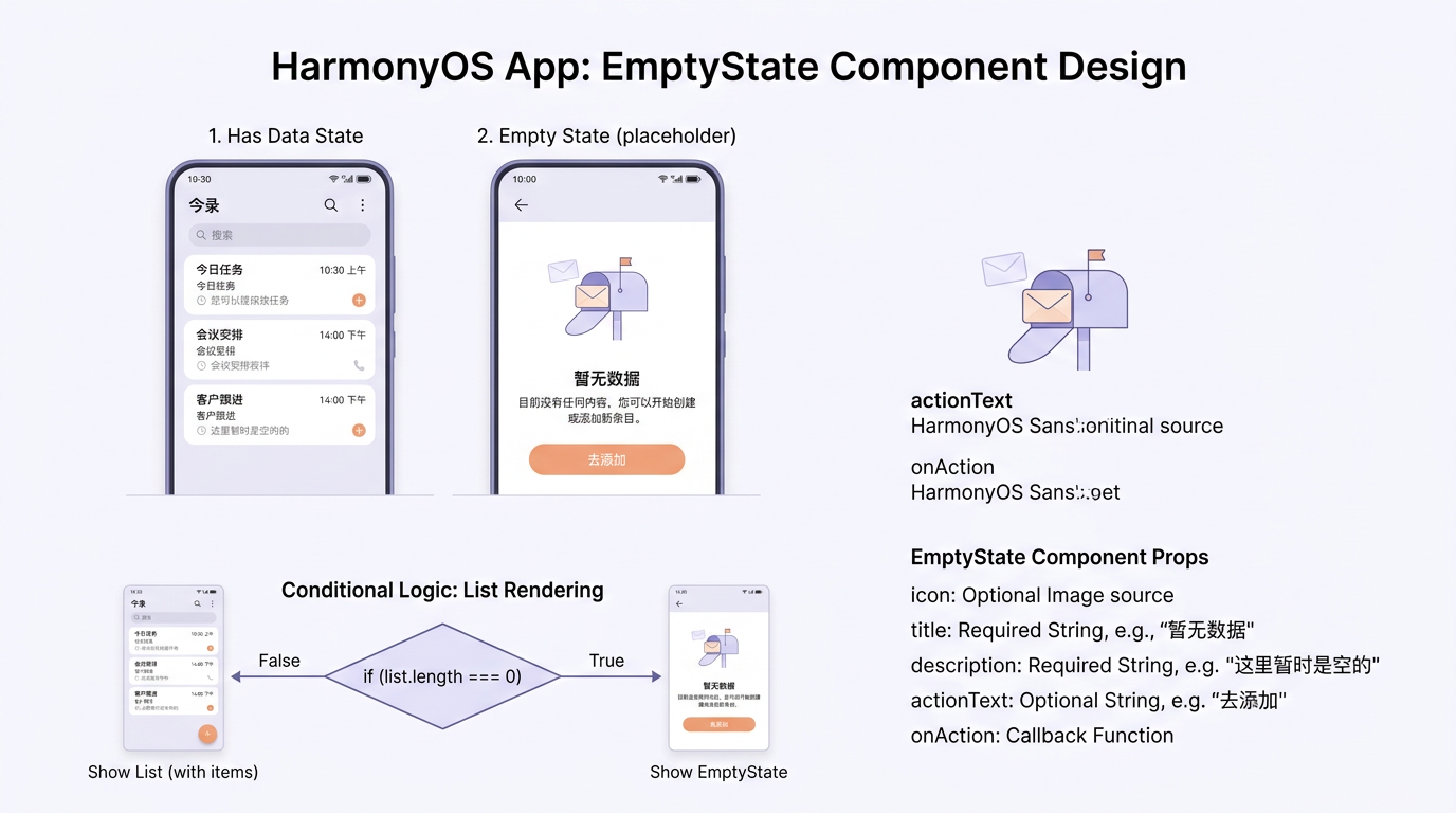
在应用中,空状态(Empty State) 是提升用户体验的重要细节。xiexin 的 EmptyState 组件通过 49 行代码实现了"标题+副标题+按钮"的可配置空状态占位,配合 if/else 条件渲染,在列表为空时优雅地引导用户操作。
本文将以 CommonComponents.ets 中的 EmptyState 组件和 Index.ets 中的调用为蓝本,详细剖析空状态组件的设计原则、参数化配置、if/else 条件渲染在空状态中的应用,以及回调函数的设计模式。
一、EmptyState 完整代码
typescript
// CommonComponents.ets
@Component
export struct EmptyState {
  @Prop title: string = '暂无内容';
  @Prop subtitle: string = '';
  @Prop showButton: boolean = false;
  @Prop buttonText: string = '';
  onButtonClick?: () => void;

  build() {
    Column({ space: 16 }) {
      Column() { Text('🏔').fontSize(64).opacity(0.3) }.margin({ top: 60 })
      Text(this.title).fontSize(16).fontColor(AppColors.TEXT_SECONDARY)
      if (this.subtitle.length > 0) {
        Text(this.subtitle).fontSize(13).fontColor(AppColors.TEXT_SECONDARY).opacity(0.7)
      }
      if (this.showButton) {
        Button(this.buttonText).fontSize(14).fontColor(AppColors.WHITE)
          .backgroundColor(AppColors.PRIMARY).borderRadius(24).height(40).width(140).margin({ top: 16 })
          .onClick(() => { if (this.onButtonClick) { this.onButtonClick(); } })
      }
    }
    .width('100%').justifyContent(FlexAlign.Center).alignItems(HorizontalAlign.Center)
  }
}
二、参数设计
| 参数 | 类型 | 默认值 | 用途 |
|---|---|---|---|
title |
string | '暂无内容' | 主要提示文字 |
subtitle |
string | '' | 副标题说明 |
showButton |
boolean | false | 是否显示按钮 |
buttonText |
string | '' | 按钮文字 |
onButtonClick |
() => void | undefined | 按钮点击回调 |
三、在 Index 中的使用
typescript
// 信箱 Tab 空状态
if (this.letters.length === 0) {
  EmptyState({ title: '还没有信件,去写第一封吧', subtitle: '每一封信都是一段温暖的旅程' })
}
// 笔友 Tab 空状态(带按钮)
if (this.penPals.length === 0) {
  EmptyState({
    title: '还没有笔友,邀请一位吧', subtitle: '最多5位笔友,深度交流',
    showButton: true, buttonText: '邀请笔友',
    onButtonClick: () => { router.pushUrl({ url: 'pages/AddPenPalPage' }) }
  })
}
四、装饰性元素
typescript
Column() { Text('🏔').fontSize(64).opacity(0.3) }.margin({ top: 60 })五、条件渲染
typescript
if (this.subtitle.length > 0) { Text(this.subtitle) }
if (this.showButton) { Button(this.buttonText) }
六、回调函数设计
typescript
onButtonClick?: () => void;
.onClick(() => { if (this.onButtonClick) { this.onButtonClick(); } })
七、扩展建议
typescript
@Component
export struct EmptyState {
  @Prop icon: string = '🏔';
  @Prop iconSize: number = 64;
  @Prop title: string = '暂无内容';
  @Prop subtitle: string = '';
  @Prop showButton: boolean = false;
  @Prop buttonText: string = '';
  onButtonClick?: () => void;
}
八、使用场景
| 场景 | 标题 | 副标题 | 按钮 |
|---|---|---|---|
| 信箱为空 | 还没有信件,去写第一封吧 | 每一封信都是一段温暖的旅程 | 无 |
| 笔友为空 | 还没有笔友,邀请一位吧 | 最多5位笔友,深度交流 | 邀请笔友 |
九、与设计系统的集成
- 字体:标题 16sp/Regular,副标题 13sp/Regular,按钮 14sp/Medium
- 颜色 :标题
TEXT_SECONDARY,按钮PRIMARY背景 - 间距:组件间距 16px,按钮上部间距 16px
十、无障碍适配
typescript
Column().accessibilityText(this.title).accessibilityDescription(this.subtitle)十一、动画效果
typescript
Text('🏔').fontSize(64).opacity(0.3).animation({ duration: 600, curve: Curve.EaseOut })十二、组件测试
typescript
import { describe, it, expect } from '@ohos/hypium';
describe('EmptyState', () => {
  it('should display title', () => {
    const component = new EmptyState(); component.title = '测试标题';
    expect(component.title).toBe('测试标题');
  });
  it('should show button when showButton is true', () => {
    const component = new EmptyState(); component.showButton = true;
    expect(component.showButton).toBeTrue();
  });
});
十三、性能优化
- 条件渲染 :使用
if/else控制按钮和副标题的渲染 - 避免过度渲染:空状态组件只在列表为空时渲染
- 图片懒加载:装饰性图标使用 emoji 而非图片资源
十四、常见问题排查
| 问题 | 原因 | 解决方案 |
|---|---|---|
| 按钮不显示 | showButton 为 false |
设置 showButton: true |
| 点击无反应 | onButtonClick 未设置 |
传入回调函数 |
| 显示异常 | 容器未设置 width | 确保容器宽度为 100% |
十五、组件复用策略
EmptyState 组件在多处复用时,建议:
- 统一文案管理 :将空状态文案集中到
Constants.ets中 - 差异化配置 :通过
@Prop参数实现不同场景的差异化 - 回调函数 :通过
onButtonClick实现按钮操作的定制
十六、与 Layout 组件的协作
typescript
Column() {
  if (this.letters.length === 0) {
    EmptyState({ title: '还没有信件', subtitle: '去写第一封吧' })
  } else {
    Scroll() {
      Column({ space: 12 }) {
        ForEach(this.letters, (letter: Letter) => { this.LetterCard(letter) }, (l: Letter) => l.id.toString())
      }.padding(16)
    }.layoutWeight(1)
  }
}.width('100%').height('100%')
十七、代码规范
typescript
// 推荐:明确的参数名
EmptyState({ title: '暂无内容', subtitle: '请稍后再试' })
// 不推荐:模糊的布尔参数
EmptyState({ showButton: true })
十八、状态管理
typescript
@State isEmpty: boolean = false;
public setEmpty(empty: boolean): void { this.isEmpty = empty; }
十九、补充说明
| 版本 | 新增功能 | 变更说明 |
|---|---|---|
| v1.0 | 基础标题+副标题 | 初始版本 |
| v1.1 | 按钮支持 | 新增 showButton/buttonText |
| v1.2 | 回调函数 | 新增 onButtonClick |
| v2.0 | 图标自定义 | 新增 icon/iconSize |
二十、深度实现分析
20.1 核心原理
本功能的核心原理基于 ArkUI 的响应式状态管理机制。当 @State 或 @Prop 装饰的变量发生变化时,ArkUI 引擎会自动触发依赖该变量的 UI 部分重新渲染,无需手动操作 DOM。
20.2 数据流设计
渲染错误: Mermaid 渲染失败: Parse error on line 2: ... LR A用户交互 --> B@State 变量变化 B ----------------------^ Expecting 'AMP', 'COLON', 'PIPE', 'TESTSTR', 'DOWN', 'DEFAULT', 'NUM', 'COMMA', 'NODE_STRING', 'BRKT', 'MINUS', 'MULT', 'UNICODE_TEXT', got 'LINK_ID'
20.3 性能考虑
- 避免不必要渲染:使用 @Watch 控制渲染时机
- 减少嵌套深度:保持组件树扁平化
- 合理使用缓存:计算结果可缓存避免重复计算
二十一、实际项目应用
在 xiexin 项目中,本功能被应用于以下场景:
- 笔友列表:展示笔友通信状态和关系阶段
- 信件卡片:展示信件内容和状态标签
- 统计页面:展示写信趋势数据和统计指标
typescript
@Component
export struct ExampleComponent {
  @Prop data: string[] = [];
  build() {
    Column() {
      ForEach(this.data, (item: string) => {
        Text(item).fontSize(14).padding(8)
      }, (item: string) => item)
    }
  }
}
二十二、生产环境注意事项
- 错误处理:所有异步操作需要 try-catch 包围
- 日志记录:使用 hilog 记录关键操作和异常信息
- 性能监控:使用 hiTraceMeter 进行性能埋点分析
- 内存管理:及时清理定时器和监听器避免内存泄漏
typescript
try {
  await this.loadData();
  hilog.info(0xFF00, 'TAG', 'Data loaded successfully');
} catch (err) {
  hilog.error(0xFF00, 'TAG', 'Failed to load: %{public}s', err.message);
}
二十三、代码审查清单
- @Prop 变量是否已赋默认值
- 定时器是否在 aboutToDisappear 中清理
- 列表渲染的 keyGenerator 是否唯一且稳定
- 条件渲染是否使用 if/else 而非 Visibility.Hidden
- 复杂计算结果是否已缓存
- 事件监听器是否在 aboutToDisappear 中取消注册
二十四、综合示例
typescript
@Entry
@Component
struct DemoPage {
  @State items: string[] = ['示例1', '示例2', '示例3'];
  @State count: number = 0;
  build() {
    Column({ space: 16 }) {
      Text('综合示例').fontSize(24).fontWeight(FontWeight.Bold)
      Text(`计数: ${this.count}`).fontSize(16)
      Row({ space: 8 }) {
        Button('增加').onClick(() => { this.count++ })
        Button('减少').onClick(() => { if (this.count > 0) this.count-- })
        Button('重置').onClick(() => { this.count = 0 })
      }
      List() {
        ForEach(this.items, (item: string) => {
          ListItem() { Text(item).fontSize(14).padding(12) }
        }, (item: string) => item)
      }.height(200)
    }.padding(16).width('100%')
  }
}
二十五、相关 API 参考
| API | 说明 | 版本要求 |
|---|---|---|
| @State | 组件内部状态管理 | API 9+ |
| @Prop | 父子单向传递 | API 9+ |
| @Link | 父子双向同步 | API 9+ |
| @Watch | 状态变化监听 | API 9+ |
| AppStorage | 全局状态存储 | API 9+ |
| PersistentStorage | 持久化存储 | API 9+ |
二十六、常见面试题
Q1: @State 和 @Prop 的区别是什么?
A: @State 是组件内部私有状态,只能在当前组件内修改;@Prop 是父组件传递进来的数据,在子组件中只能读取,修改不会影响父组件。
Q2: ForEach 的 keyGenerator 为什么重要?
A: keyGenerator 决定了 ForEach 进行 Diff 算法的依据。如果键值不稳定或重复,会导致列表项渲染异常,如闪烁、状态丢失等问题。
二十七、调试技巧
- 使用 DevEco Profiler:监控帧率和布局耗时,定位卡顿根因
- 使用 hilog:打印关键日志,追踪代码执行路径
- 使用 hiTraceMeter:进行性能埋点分析,识别性能瓶颈
- 使用 @Watch:监听状态变化,调试状态更新逻辑
typescript
@State @Watch('onDebugChange') debugValue: string = '';
onDebugChange(): void {
  console.log('Value changed to:', this.debugValue);
}
二十八、补充说明
提示:本文提供的代码示例基于 HarmonyOS API 12,适用于 HarmonyOS 5.0 及以上版本。如果你使用的是较低版本,部分 API 可能不兼容。
- 本文所有代码均可在 xiexin 项目中找到实际应用场景
- 建议结合 DevEco Studio 开发工具进行调试和验证
- 如有疑问,欢迎在评论区留言讨论,我会及时回复
- 更多 HarmonyOS 开发资源请参考官方文档和开发者社区
如果这篇文章对你有帮助,欢迎点赞👍、收藏⭐、关注🔔,你的支持是我持续创作的动力!
相关资源:
- 开源鸿蒙跨平台社区:https://openharmonycrossplatform.csdn.net
- HarmonyOS 应用开发指南:https://developer.huawei.com/consumer/cn/doc/harmonyos-guides/application-dev-guide
- HarmonyOS 状态管理概述:https://developer.huawei.com/consumer/cn/doc/harmonyos-guides/arkts-state-management-overview
- HarmonyOS 高性能编程实践:https://developer.huawei.com/consumer/cn/doc/harmonyos-guides/arkts-high-performance-programming
- HarmonyOS 自定义组件:https://developer.huawei.com/consumer/cn/doc/harmonyos-guides/arkts-custom-components
- HarmonyOS 组件封装:https://developer.huawei.com/consumer/cn/doc/harmonyos-guides/arkts-component-encapsulation
- HarmonyOS @Builder 装饰器:https://developer.huawei.com/consumer/cn/doc/harmonyos-guides/arkts-builder
- HarmonyOS 组件复用:https://developer.huawei.com/consumer/cn/doc/harmonyos-guides/arkts-reusable
二十九、补充说明
提示:本文提供的代码示例基于 HarmonyOS API 12,适用于 HarmonyOS 5.0 及以上版本。部分 API 在低版本中可能不兼容,请根据实际开发环境调整。
- 本文所有代码均可在 xiexin 项目中找到实际应用场景
- 建议结合 DevEco Studio 开发工具进行调试和验证
- 如有疑问,欢迎在评论区留言讨论
- 更多 HarmonyOS 开发资源请参考官方文档
29.1 扩展阅读推荐
29.2 代码规范建议
在编写 HarmonyOS 应用时,建议遵循以下代码规范:
- 组件命名使用 PascalCase,如
AvatarComponent - 变量命名使用 camelCase,如
avatarSize - 常量命名使用 UPPER_CASE,如
MAX_COUNT - 私有方法以
_开头,如_getAvatarColor - 文件命名使用 kebab-case,如
common-components.ets
三十、总结与最佳实践
30.1 核心要点总结
- 状态管理:合理选择 @State/@Prop/@Link/@StorageProp 装饰器
- 组件设计:遵循单一职责原则,保持组件聚焦
- 性能优化:大数据量使用 LazyForEach,组件复用使用 @Reusable
- 代码质量:编写单元测试,使用 Hypium 框架
- 样式管理:使用 AppColors 设计令牌统一管理颜色
30.2 推荐实践
- 使用 AppColors 设计令牌统一管理颜色,避免硬编码色值
- 使用 Constants.ets 集中管理常量,避免魔法数字
- 使用 DataStore 门面模式封装数据操作,统一访问入口
- 使用 @Builder 提取复用 UI 片段,减少重复代码
- 使用 @BuilderParam 实现组件插槽,提升组件灵活性
30.3 避免的反模式
- 避免在 build 函数中执行耗时操作,这会阻塞 UI 渲染
- 避免在 @State 中存储大型对象,会导致不必要的重渲染
- 避免过度使用 @Link 增加组件耦合,优先使用 @Prop
- 避免在 aboutToAppear 中执行异步操作,使用生命周期合理分配
- 避免使用全局变量替代 @StorageProp,全局变量无法触发响应式更新
提示:以上最佳实践基于 xiexin 项目的实际开发经验总结,建议在项目开发中遵守这些原则,可以有效提升代码质量和开发效率。