项目演示
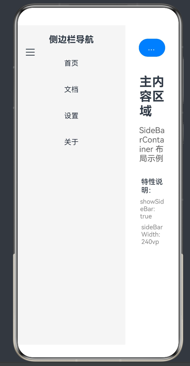
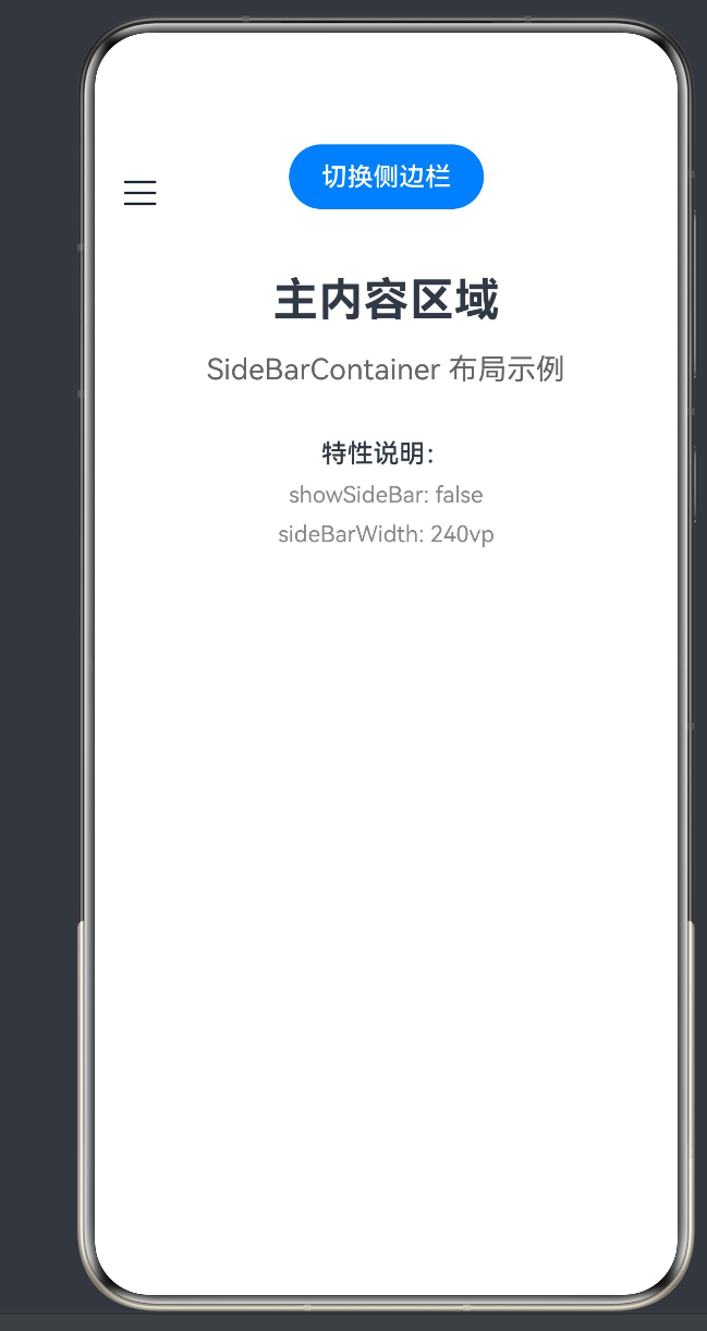
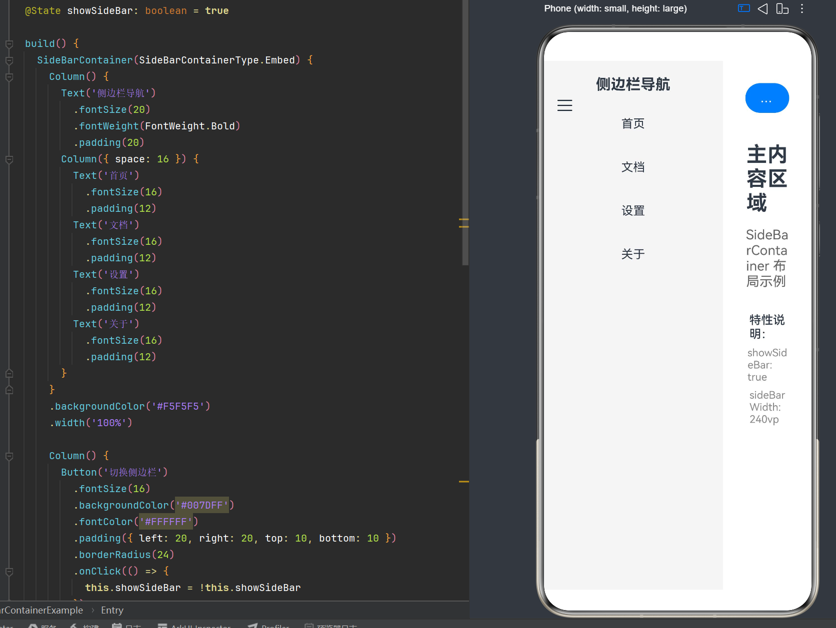
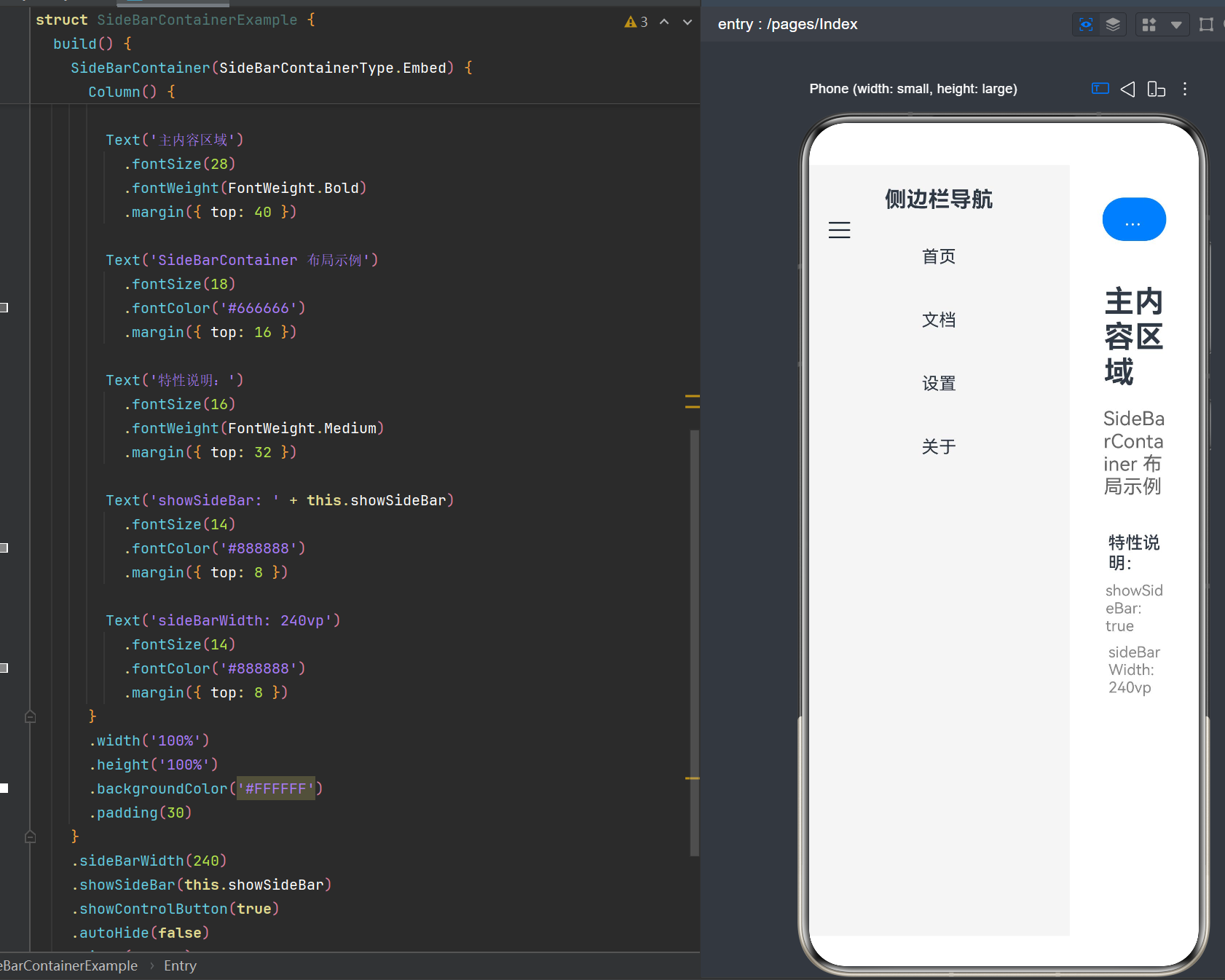
目录
- 引言:侧边栏布局的时代意义
- SideBarContainer组件概述
- 核心概念与架构设计
- [API 24完整接口详解](#API 24完整接口详解)
- 三种布局模式深度剖析
- 实战案例:企业级应用开发
- 多端适配策略
- 性能优化最佳实践
- 常见问题与解决方案
- 未来展望与发展趋势
1. 引言:侧边栏布局的时代意义
1.1 全场景体验的需求演进
在移动互联网时代,用户界面设计经历了从单一屏幕适配到多设备协同的演进过程。随着折叠屏、平板、PC等多形态设备的普及,传统的手机端设计理念已无法满足用户的多样化需求。侧边栏布局作为一种经典的UI模式,因其高效的空间利用和灵活的交互方式,成为全场景应用开发的首选方案。
HarmonyOS作为面向全场景的分布式操作系统,提出了"一次开发,多端部署"的理念。SideBarContainer组件正是这一理念的典型体现------通过统一的API设计,开发者可以轻松实现从手机到平板、从折叠屏到PC的无缝适配。
1.2 SideBarContainer的设计哲学
SideBarContainer的设计遵循以下核心原则:
- 空间效率:侧边栏与内容区的组合布局,最大化屏幕利用率
- 交互便捷:支持多种切换方式(按钮、手势、状态绑定)
- 自适应能力:根据设备尺寸自动选择最佳布局模式
- 可定制性:提供丰富的属性接口,满足个性化需求
1.3 本文学习路线
本文将从基础概念出发,逐步深入到高级特性,通过理论讲解与实战案例相结合的方式,帮助开发者全面掌握SideBarContainer的使用方法。
2. SideBarContainer组件概述
2.1 组件定义
SideBarContainer是鸿蒙ArkUI框架提供的专用侧边栏布局容器,用于构建"侧边栏+内容区"的经典布局模式。
typescript
SideBarContainer(type?: SideBarContainerType)核心特征:
- 双组件结构:必须且仅包含两个子组件
- 智能布局:根据配置自动管理侧边栏与内容区的空间分配
- 交互内置:提供控制按钮、手势拖拽等交互能力
2.2 发展历程
| API版本 | 新增特性 | 重要改进 |
|---|---|---|
| API 8 | 基础功能 | 首次引入SideBarContainer组件 |
| API 9 | 增强属性 | 支持sideBarPosition、autoHide等属性 |
| API 10 | 智能模式 | 新增AUTO模式、minContentWidth属性 |
| API 18 | 双向绑定 | showSideBar支持$$双向绑定 |
| API 24 | 性能优化 | 优化渲染性能,支持更多动画效果 |
2.3 应用场景
SideBarContainer适用于以下典型场景:
- 文件管理器:左侧目录导航 + 右侧文件预览
- 邮件应用:左侧邮件列表 + 右侧邮件详情
- 办公软件:左侧功能菜单 + 右侧文档编辑
- 音乐应用:左侧歌单列表 + 右侧播放界面
- 设置页面:左侧分类导航 + 右侧设置项
3. 核心概念与架构设计
3.1 组件架构
SideBarContainer采用双层架构设计:
┌─────────────────────────────────────────────────────┐
│              SideBarContainer                       │
│  ┌──────────────┐  ┌──────────────────────────────┐ │
│  │   侧边栏      │  │        内容区                 │ │
│  │  (SideBar)   │  │      (Content)               │ │
│  │              │  │                              │ │
│  │  - 导航菜单  │  │  - 主要内容展示               │ │
│  │  - 功能列表  │  │  - 交互操作区                 │ │
│  │  - 设置选项  │  │  - 数据可视化                 │ │
│  └──────────────┘  └──────────────────────────────┘ │
│         │                   │                       │
│         └─────── 分割线 ────┘                       │
│                  (可选)                             │
└─────────────────────────────────────────────────────┘
3.2 子组件规则
SideBarContainer对子组件有严格要求:
| 规则 | 说明 |
|---|---|
| 组件数量 | 必须且仅包含2个子组件 |
| 第一个子组件 | 自动识别为侧边栏 |
| 第二个子组件 | 自动识别为内容区 |
| 异常处理 | 3个及以上子组件仅显示前两个;1个子组件时侧边栏独占,内容区空白 |
| 渲染限制 | 不支持if/else、ForEach、LazyForEach等渲染控制类型直接作为子组件 |
3.3 状态管理机制
SideBarContainer的状态管理基于ArkTS的响应式系统:
typescript
@State showSideBar: boolean = true

SideBarContainer() {
  // 子组件...
}
.showSideBar(this.showSideBar)  // 单向绑定
.showSideBar($$this.showSideBar) // 双向绑定(API 18+)状态变化触发流程:
- 用户点击控制按钮 / 拖拽分割线
- SideBarContainer内部状态更新
- 触发onChange事件回调
- 更新绑定的@State变量
- 触发UI重新渲染
4. API 24完整接口详解
4.1 构造函数
typescript
SideBarContainer(type?: SideBarContainerType)参数说明:
| 参数名 | 类型 | 必填 | 默认值 | 说明 |
|---|---|---|---|---|
| type | SideBarContainerType | 否 | Embed | 侧边栏显示模式 |
4.2 枚举类型
4.2.1 SideBarContainerType
typescript
enum SideBarContainerType {
  Embed = 0,    // 嵌入式布局
  Overlay = 1,  // 覆盖式布局
  AUTO = 2      // 自动模式(API 10+)
}模式对比:
| 模式 | 特点 | 适用场景 | 空间占用 |
|---|---|---|---|
| Embed | 侧边栏与内容区并排显示 | 大屏设备、平板、PC | 共享容器空间 |
| Overlay | 侧边栏覆盖在内容区上方 | 小屏设备、手机 | 不占用内容区空间 |
| AUTO | 根据容器尺寸自动切换 | 响应式布局、多端适配 | 动态调整 |
4.2.2 SideBarPosition(API 9+)
typescript
enum SideBarPosition {
  Start = 0,  // 侧边栏位于左侧
  End = 1     // 侧边栏位于右侧
}
4.3 属性详解
4.3.1 showSideBar
typescript
showSideBar(value: boolean)功能:控制侧边栏的显示与隐藏
参数:
| 参数名 | 类型 | 必填 | 默认值 | 说明 |
|---|---|---|---|---|
| value | boolean | 是 | true | 是否显示侧边栏 |
双向绑定示例(API 18+):
typescript
@State isSideBarVisible: boolean = true

SideBarContainer() {
  // 子组件...
}
.showSideBar($$this.isSideBarVisible)
4.3.2 sideBarWidth
typescript
sideBarWidth(value: number | Length) // API 9+支持Length类型功能:设置侧边栏宽度
参数:
| 参数名 | 类型 | 必填 | 默认值 | 说明 |
|---|---|---|---|---|
| value | number / Length | 是 | 240vp | 侧边栏宽度 |
示例:
typescript
// 数字形式(单位:vp)
.sideBarWidth(240)

// 字符串形式(API 9+)
.sideBarWidth('240vp')
.sideBarWidth('20%')
.sideBarWidth('180fp')
4.3.3 minSideBarWidth & maxSideBarWidth
typescript
minSideBarWidth(value: number | Length)
maxSideBarWidth(value: number | Length)功能:限制侧边栏宽度范围
参数:
| 参数名 | 类型 | 必填 | 默认值 | 说明 |
|---|---|---|---|---|
| value | number / Length | 是 | 240vp / 280vp | 最小/最大宽度 |
约束关系 :minSideBarWidth ≤ sideBarWidth ≤ maxSideBarWidth
4.3.4 showControlButton
typescript
showControlButton(value: boolean)功能:控制是否显示系统默认的侧边栏切换按钮
参数:
| 参数名 | 类型 | 必填 | 默认值 | 说明 |
|---|---|---|---|---|
| value | boolean | 是 | true | 是否显示控制按钮 |
4.3.5 controlButton
typescript
controlButton(value: ButtonStyle)功能:自定义控制按钮样式
ButtonStyle结构:
| 属性名 | 类型 | 必填 | 默认值 | 说明 |
|---|---|---|---|---|
| left | number | 否 | 16vp | 按钮距容器左边界的距离 |
| top | number | 否 | 48vp | 按钮距容器上边界的距离 |
| width | number | 否 | 24vp | 按钮宽度(API 10+) |
| height | number | 否 | 24vp | 按钮高度(API 10+) |
| icons | ButtonIconOptions | 否 | - | 按钮图标配置 |
ButtonIconOptions结构(API 18+):
| 属性名 | 类型 | 必填 | 说明 |
|---|---|---|---|
| shown | string / PixelMap / Resource | 是 | 侧边栏显示时的图标 |
| hidden | string / PixelMap / Resource | 是 | 侧边栏隐藏时的图标 |
| switching | string / PixelMap / Resource | 否 | 切换过程中的图标 |
示例:
typescript
.controlButton({
  left: 16,
  top: 48,
  width: 24,
  height: 24,
  icons: {
    shown: $r('app.media.icon_close'),
    hidden: $r('app.media.icon_menu')
  }
})
4.3.6 autoHide(API 9+)
typescript
autoHide(value: boolean)功能:设置侧边栏拖拽到小于最小宽度后是否自动隐藏
参数:
| 参数名 | 类型 | 必填 | 默认值 | 说明 |
|---|---|---|---|---|
| value | boolean | 是 | true | 是否自动隐藏 |
工作原理:
- 拖拽过程中实时判断宽度
- 小于minSideBarWidth时,继续拖拽越界一定距离后触发自动隐藏
- 具有阻尼效果,避免误操作
4.3.7 sideBarPosition(API 9+)
typescript
sideBarPosition(value: SideBarPosition)功能:设置侧边栏显示位置
示例:
typescript
// 侧边栏位于左侧(默认)
.sideBarPosition(SideBarPosition.Start)

// 侧边栏位于右侧
.sideBarPosition(SideBarPosition.End)
4.3.8 divider(API 10+)
typescript
divider(value: DividerStyle | null)功能:设置分割线样式
DividerStyle结构:
| 属性名 | 类型 | 必填 | 默认值 | 说明 |
|---|---|---|---|---|
| strokeWidth | Length | 是 | 1vp | 分割线宽度 |
| color | ResourceColor | 是 | - | 分割线颜色 |
示例:
typescript
.divider({
  strokeWidth: 1,
  color: '#E0E0E0'
})
4.3.9 minContentWidth(API 10+)
typescript
minContentWidth(value: Dimension)功能:设置内容区可显示的最小宽度
参数:
| 参数名 | 类型 | 必填 | 默认值 | 说明 |
|---|---|---|---|---|
| value | Dimension | 是 | 360vp | 内容区最小宽度 |
作用机制:
容器尺寸变化时的调整策略:
1. 增大容器 → 仅增大内容区尺寸
2. 缩小组件 → 先缩小内容区至minContentWidth
3. 继续缩小 → 保持内容区宽度,缩小侧边栏至minSideBarWidth
4. 继续缩小 → 根据autoHide决定是否隐藏侧边栏
4.4 事件接口
4.4.1 onChange
typescript
onChange(callback: (isVisible: boolean) => void)功能:侧边栏显示/隐藏状态变化时触发的回调
参数:
| 参数名 | 类型 | 说明 |
|---|---|---|
| isVisible | boolean | 侧边栏当前状态(true显示,false隐藏) |
触发条件:
- showSideBar属性值变化时
- showSideBar属性自适应行为变化时
- 分割线拖拽触发autoHide时
示例:
typescript
.onChange((isVisible: boolean) => {
  console.info(`侧边栏状态变化: ${isVisible ? '显示' : '隐藏'}`)
  // 执行状态同步逻辑
})
5. 三种布局模式深度剖析
5.1 Embed模式:嵌入式布局
5.1.1 核心特点
Embed模式是SideBarContainer的默认模式,侧边栏与内容区并排显示,共享容器空间。
布局示意图:
┌──────────────┬──────────────────────────────┐
│              │                              │
│   SideBar    │           Content            │
│   (240vp)    │       (剩余空间自适应)        │
│              │                              │
└──────────────┴──────────────────────────────┘
5.1.2 适用场景
- 平板、PC等大屏设备
- 需要同时展示侧边栏和内容区的场景
- 办公软件、IDE工具等专业应用
5.1.3 空间分配机制
typescript
// Embed模式下的空间分配
总宽度 = sideBarWidth + 内容区宽度

// 当容器尺寸变化时
- 显示侧边栏:内容区宽度 = 容器宽度 - sideBarWidth
- 隐藏侧边栏:内容区宽度 = 容器宽度
5.1.4 完整示例
typescript
@Entry
@Component
struct EmbedModeExample {
  @State showSideBar: boolean = true
  @State selectedMenu: string = '首页'

  build() {
    SideBarContainer(SideBarContainerType.Embed) {
      // 侧边栏
      Column({ space: 8 }) {
        Text('导航菜单')
          .fontSize(20)
          .fontWeight(FontWeight.Bold)
          .padding({ top: 20, bottom: 16 })
          .width('100%')
          .textAlign(TextAlign.Center)

        this.MenuItem('首页')
        this.MenuItem('文档')
        this.MenuItem('设置')
        this.MenuItem('关于')
      }
      .width('100%')
      .backgroundColor('#F5F7FA')

      // 内容区
      Column() {
        Text('主内容区域')
          .fontSize(28)
          .fontWeight(FontWeight.Bold)
          .padding({ top: 30, left: 30 })

        Text('当前选中: ' + this.selectedMenu)
          .fontSize(18)
          .fontColor('#666666')
          .padding({ left: 30, top: 16 })

        Button('切换侧边栏')
          .fontSize(16)
          .backgroundColor('#007DFF')
          .fontColor('#FFFFFF')
          .padding({ left: 20, right: 20, top: 10, bottom: 10 })
          .borderRadius(24)
          .margin({ left: 30, top: 30 })
          .onClick(() => {
            this.showSideBar = !this.showSideBar
          })
      }
      .width('100%')
      .height('100%')
      .backgroundColor('#FFFFFF')
    }
    .sideBarWidth(240)
    .showSideBar(this.showSideBar)
    .showControlButton(true)
    .autoHide(false)
    .width('100%')
    .height('100%')
  }

  @Builder MenuItem(title: string) {
    Text(title)
      .fontSize(16)
      .fontColor(this.selectedMenu === title ? '#007DFF' : '#333333')
      .fontWeight(this.selectedMenu === title ? FontWeight.Bold : FontWeight.Normal)
      .padding({ left: 20, top: 12, bottom: 12 })
      .width('100%')
      .backgroundColor(this.selectedMenu === title ? '#E8F4FD' : '#FFFFFF')
      .onClick(() => {
        this.selectedMenu = title
      })
  }
}
5.2 Overlay模式:覆盖式布局
5.2.1 核心特点
Overlay模式下,侧边栏覆盖在内容区上方,不占用内容区的布局空间。
布局示意图:
侧边栏隐藏时:
┌──────────────────────────────────────────────┐
│                                              │
│              Content (全屏)                  │
│                                              │
└──────────────────────────────────────────────┘

侧边栏显示时:
┌──────────────┬──────────────────────────────┐
│              │                              │
│   SideBar    │           Content            │
│   (覆盖层)   │         (被部分遮挡)          │
│              │                              │
└──────────────┴──────────────────────────────┘
5.2.2 适用场景
- 手机等小屏设备
- 需要临时展示侧边栏的场景
- 移动端导航菜单、筛选面板
5.2.3 空间分配机制
typescript
// Overlay模式下的空间分配
- 内容区始终占据整个容器宽度
- 侧边栏覆盖在内容区上方,不影响内容区布局
- 内容区可设置蒙层效果,增强层次感
5.2.4 完整示例
typescript
@Entry
@Component
struct OverlayModeExample {
  @State isSideBarShow: boolean = false
  @State currentIndex: number = 0

  private menuItems: Array<string> = ['首页', '消息', '收藏', '设置', '关于']

  build() {
    SideBarContainer(SideBarContainerType.Overlay) {
      // 侧边栏内容
      Column() {
        // 用户信息区域
        Column() {
          Text('用户头像')
            .fontSize(40)
            .margin({ top: 60, bottom: 16 })
          Text('用户名')
            .fontSize(18)
            .fontWeight(FontWeight.Bold)
          Text('user@example.com')
            .fontSize(14)
            .fontColor('#666666')
            .margin({ top: 4 })
        }
        .width('100%')
        .alignItems(HorizontalAlign.Center)

        // 菜单列表
        Column({ space: 4 }) {
          ForEach(this.menuItems, (item: string, index: number) => {
            Text(item)
              .fontSize(16)
              .fontColor(this.currentIndex === index ? '#007DFF' : '#333333')
              .padding({ left: 24, top: 14, bottom: 14 })
              .width('100%')
              .backgroundColor(this.currentIndex === index ? '#E8F4FD' : '#FFFFFF')
              .onClick(() => {
                this.currentIndex = index
                this.isSideBarShow = false
              })
          }, (item: string) => item)
        }
        .margin({ top: 40 })
      }
      .width('100%')
      .height('100%')
      .backgroundColor('#FFFFFF')

      // 主内容区
      Column() {
        // 顶部导航栏
        Row() {
          Button('菜单')
            .fontSize(16)
            .backgroundColor('#FFFFFF')
            .fontColor('#333333')
            .borderWidth(1)
            .borderColor('#E0E0E0')
            .padding({ left: 16, right: 16, top: 8, bottom: 8 })
            .borderRadius(8)
            .onClick(() => {
              this.isSideBarShow = true
            })

          Text('主标题')
            .fontSize(20)
            .fontWeight(FontWeight.Bold)
            .margin({ left: 20 })
        }
        .width('100%')
        .padding({ top: 30, left: 20 })
        .justifyContent(FlexAlign.Start)

        // 内容区域
        Column() {
          Text('当前页面: ' + this.menuItems[this.currentIndex])
            .fontSize(24)
            .fontWeight(FontWeight.Bold)
            .margin({ top: 40 })

          Text('这是Overlay模式的内容区域')
            .fontSize(16)
            .fontColor('#666666')
            .margin({ top: 16 })
        }
        .width('100%')
        .alignItems(HorizontalAlign.Center)
      }
      .width('100%')
      .height('100%')
      .backgroundColor('#F5F7FA')
    }
    .sideBarWidth(280)
    .showSideBar(this.isSideBarShow)
    .showControlButton(false)
    .autoHide(true)
    .width('100%')
    .height('100%')
  }
}
5.3 AUTO模式:智能自适应布局(API 10+)
5.3.1 核心特点
AUTO模式根据容器尺寸自动选择Embed或Overlay模式,实现真正的响应式布局。
模式切换逻辑:
容器宽度 >= minSideBarWidth + minContentWidth → Embed模式
容器宽度 < minSideBarWidth + minContentWidth → Overlay模式

默认临界值:600vp(未设置minSideBarWidth和minContentWidth时)
5.3.2 适用场景
- 需要同时适配手机和大屏设备的应用
- 折叠屏设备(展开时Embed,折叠时Overlay)
- 响应式Web应用迁移到鸿蒙平台
5.3.3 切换机制
typescript
// AUTO模式切换流程
1. 监测容器尺寸变化
2. 计算当前尺寸是否满足Embed模式条件
3. 根据条件自动切换布局模式
4. 触发onChange事件通知状态变化
5.3.4 完整示例
typescript
@Entry
@Component
struct AutoModeExample {
  @State showSideBar: boolean = true
  @State layoutMode: string = 'Embed'

  build() {
    Column() {
      Text('当前布局模式: ' + this.layoutMode)
        .fontSize(14)
        .fontColor('#666666')
        .padding({ top: 16, left: 16 })
        .width('100%')

      SideBarContainer(SideBarContainerType.AUTO) {
        // 侧边栏
        Column({ space: 12 }) {
          Text('导航')
            .fontSize(20)
            .fontWeight(FontWeight.Bold)
            .padding({ top: 20, bottom: 12 })
            .width('100%')
            .textAlign(TextAlign.Center)

          Text('首页').fontSize(16).padding(12)
          Text('文档').fontSize(16).padding(12)
          Text('设置').fontSize(16).padding(12)
        }
        .width('100%')
        .backgroundColor('#FFFFFF')

        // 内容区
        Column() {
          Text('AUTO模式演示')
            .fontSize(24)
            .fontWeight(FontWeight.Bold)
            .padding({ top: 30, left: 30 })

          Text('调整窗口大小可观察模式切换')
            .fontSize(16)
            .fontColor('#666666')
            .padding({ left: 30, top: 12 })

          Button('切换侧边栏')
            .fontSize(16)
            .backgroundColor('#007DFF')
            .fontColor('#FFFFFF')
            .padding({ left: 20, right: 20, top: 10, bottom: 10 })
            .borderRadius(24)
            .margin({ left: 30, top: 24 })
            .onClick(() => {
              this.showSideBar = !this.showSideBar
            })
        }
        .width('100%')
        .height('100%')
        .backgroundColor('#F5F7FA')
      }
      .sideBarWidth(240)
      .minSideBarWidth(200)
      .maxSideBarWidth(280)
      .minContentWidth(360)
      .showSideBar(this.showSideBar)
      .showControlButton(true)
      .autoHide(true)
      .onChange((isVisible: boolean) => {
        this.showSideBar = isVisible
        // 可在此处添加模式切换后的业务逻辑
      })
      .width('100%')
      .flexGrow(1)
    }
    .width('100%')
    .height('100%')
  }
}
6. 实战案例:企业级应用开发
6.1 案例一:企业邮箱应用
6.1.1 需求分析
企业邮箱应用需要实现:
- 左侧文件夹导航(收件箱、已发送、草稿、垃圾箱)
- 右侧邮件列表和邮件详情
- 支持未读邮件计数
- 邮件已读/未读状态切换
6.1.2 数据模型设计
typescript
class MailFolder {
  id: string = ''
  name: string = ''
  icon: string = ''
  unreadCount: number = 0

  constructor(id: string, name: string, icon: string, unreadCount: number = 0) {
    this.id = id
    this.name = name
    this.icon = icon
    this.unreadCount = unreadCount
  }
}

class MailItem {
  id: string = ''
  folderId: string = ''
  sender: string = ''
  subject: string = ''
  preview: string = ''
  time: string = ''
  isRead: boolean = false

  constructor(id: string, folderId: string, sender: string, subject: string, preview: string, time: string) {
    this.id = id
    this.folderId = folderId
    this.sender = sender
    this.subject = subject
    this.preview = preview
    this.time = time
    this.isRead = false
  }
}
6.1.3 完整实现
typescript
@Entry
@Component
struct EmailApp {
  @State selectedFolder: string = 'inbox'
  @State showSideBar: boolean = true

  private folders: Array<MailFolder> = [
    new MailFolder('inbox', '收件箱', '📥', 5),
    new MailFolder('sent', '已发送', '📤', 0),
    new MailFolder('draft', '草稿', '📝', 2),
    new MailFolder('trash', '垃圾箱', '🗑️', 1)
  ]

  private mails: Array<MailItem> = [
    new MailItem('1', 'inbox', '张三', '项目进度汇报', '本周项目进度已完成80%...', '10:30'),
    new MailItem('2', 'inbox', '李四', '会议邀请', '下周一上午9点召开项目例会...', '09:15'),
    new MailItem('3', 'inbox', '王五', '需求变更通知', '根据客户反馈,需求有如下变更...', '昨天'),
    new MailItem('4', 'sent', '我', '周报提交', '本周工作内容如下...', '昨天'),
    new MailItem('5', 'draft', '我', '项目方案', '项目实施方案初稿...', '前天')
  ]

  build() {
    SideBarContainer(SideBarContainerType.Embed) {
      // 侧边栏:文件夹导航
      Column() {
        Text('📧 企业邮箱')
          .fontSize(20)
          .fontWeight(FontWeight.Bold)
          .padding({ top: 24, bottom: 20 })
          .width('100%')
          .textAlign(TextAlign.Center)
          .backgroundColor('#007DFF')
          .fontColor('#FFFFFF')

        Column({ space: 8 }) {
          ForEach(this.folders, (folder: MailFolder) => {
            Row({ space: 12 }) {
              Text(folder.icon)
                .fontSize(20)

              Column({ space: 4 }) {
                Text(folder.name)
                  .fontSize(15)
                  .fontColor(this.selectedFolder === folder.id ? '#007DFF' : '#333333')
                  .fontWeight(this.selectedFolder === folder.id ? FontWeight.Bold : FontWeight.Normal)

                if (folder.unreadCount > 0) {
                  Text(folder.unreadCount.toString())
                    .fontSize(12)
                    .fontColor('#FFFFFF')
                    .backgroundColor('#FF4081')
                    .padding({ left: 6, right: 6, top: 2, bottom: 2 })
                    .borderRadius(10)
                }
              }
            }
            .padding({ left: 20, top: 14, bottom: 14 })
            .width('100%')
            .backgroundColor(this.selectedFolder === folder.id ? '#E8F4FD' : '#FFFFFF')
            .onClick(() => {
              this.selectedFolder = folder.id
            })
          }, (folder: MailFolder) => folder.id)
        }
        .padding({ top: 16 })
      }
      .width('100%')
      .backgroundColor('#FFFFFF')

      // 内容区:邮件列表
      Column() {
        // 顶部工具栏
        Row() {
          Text('邮件列表')
            .fontSize(20)
            .fontWeight(FontWeight.Bold)

          Button('新建邮件')
            .fontSize(14)
            .backgroundColor('#007DFF')
            .fontColor('#FFFFFF')
            .padding({ left: 16, right: 16, top: 8, bottom: 8 })
            .borderRadius(20)
        }
        .width('100%')
        .padding({ top: 20, left: 24, right: 24 })
        .justifyContent(FlexAlign.SpaceBetween)

        // 邮件列表
        List({ space: 8 }) {
          ForEach(this.getFilteredMails(), (mail: MailItem) => {
            ListItem() {
              Column({ space: 8 }) {
                Row({ space: 12 }) {
                  Text(mail.sender)
                    .fontSize(16)
                    .fontWeight(FontWeight.Bold)
                    .fontColor(mail.isRead ? '#666666' : '#333333')

                  Text(mail.time)
                    .fontSize(12)
                    .fontColor('#999999')
                }
                .width('100%')
                .justifyContent(FlexAlign.SpaceBetween)

                Text(mail.subject)
                  .fontSize(15)
                  .fontWeight(mail.isRead ? FontWeight.Normal : FontWeight.Medium)
                  .fontColor(mail.isRead ? '#666666' : '#333333')

                Text(mail.preview)
                  .fontSize(14)
                  .fontColor('#999999')
                  .maxLines(2)
              }
              .padding(16)
              .backgroundColor('#FFFFFF')
              .borderRadius(8)
              .onClick(() => {
                this.markAsRead(mail.id)
              })
            }
          }, (mail: MailItem) => mail.id)
        }
        .width('100%')
        .padding({ left: 24, right: 24, top: 16 })
      }
      .width('100%')
      .height('100%')
      .backgroundColor('#F5F7FA')
    }
    .sideBarWidth(220)
    .showSideBar(this.showSideBar)
    .showControlButton(true)
    .autoHide(false)
    .divider({
      strokeWidth: 1,
      color: '#E0E0E0'
    })
    .width('100%')
    .height('100%')
  }

  getFilteredMails(): Array<MailItem> {
    return this.mails.filter((mail: MailItem) => mail.folderId === this.selectedFolder)
  }

  markAsRead(mailId: string): void {
    const index = this.mails.findIndex((mail: MailItem) => mail.id === mailId)
    if (index !== -1) {
      this.mails[index].isRead = true
      // 更新文件夹未读计数
      const folderIndex = this.folders.findIndex((folder: MailFolder) => folder.id === this.mails[index].folderId)
      if (folderIndex !== -1 && this.folders[folderIndex].unreadCount > 0) {
        this.folders[folderIndex].unreadCount--
      }
    }
  }
}
6.2 案例二:文档管理应用
6.2.1 需求分析
文档管理应用需要实现:
- 左侧目录树导航
- 右侧文件列表
- 文件搜索功能
- 文件操作(新建、删除、重命名)
6.2.2 完整实现
typescript
@Entry
@Component
struct FileManager {
  @State currentPath: string = '/根目录'
  @State searchText: string = ''
  @State showSideBar: boolean = true

  private directories: Array<string> = ['文档', '图片', '视频', '下载', '音乐']
  private files: Record<string, Array<{ name: string; type: string; size: string }>> = {
    '文档': [
      { name: '项目方案.docx', type: 'document', size: '2.3 MB' },
      { name: '会议记录.txt', type: 'text', size: '12 KB' },
      { name: '报表.xlsx', type: 'spreadsheet', size: '1.5 MB' }
    ],
    '图片': [
      { name: '截图1.png', type: 'image', size: '512 KB' },
      { name: '照片.jpg', type: 'image', size: '2.1 MB' },
      { name: '图标.svg', type: 'vector', size: '32 KB' }
    ],
    '视频': [
      { name: '演示视频.mp4', type: 'video', size: '50 MB' },
      { name: '教程.webm', type: 'video', size: '15 MB' }
    ],
    '下载': [
      { name: '安装包.apk', type: 'package', size: '45 MB' },
      { name: '资料.pdf', type: 'pdf', size: '8 MB' }
    ],
    '音乐': [
      { name: '歌曲.mp3', type: 'audio', size: '4 MB' },
      { name: '铃声.wav', type: 'audio', size: '512 KB' }
    ]
  }

  build() {
    SideBarContainer(SideBarContainerType.Embed) {
      // 侧边栏:目录导航
      Column() {
        Text('📁 文件管理')
          .fontSize(18)
          .fontWeight(FontWeight.Bold)
          .padding({ top: 20, bottom: 16 })
          .width('100%')
          .textAlign(TextAlign.Center)
          .backgroundColor('#4CAF50')
          .fontColor('#FFFFFF')

        Column({ space: 4 }) {
          ForEach(this.directories, (dir: string) => {
            Row({ space: 10 }) {
              Text(this.getIconByType('folder'))
                .fontSize(18)

              Text(dir)
                .fontSize(15)
                .fontColor(this.currentPath === '/' + dir ? '#4CAF50' : '#333333')
                .fontWeight(this.currentPath === '/' + dir ? FontWeight.Bold : FontWeight.Normal)
            }
            .padding({ left: 16, top: 12, bottom: 12 })
            .width('100%')
            .backgroundColor(this.currentPath === '/' + dir ? '#E8F5E9' : '#FFFFFF')
            .onClick(() => {
              this.currentPath = '/' + dir
            })
          }, (dir: string) => dir)
        }
        .padding({ top: 12 })
      }
      .width('100%')
      .backgroundColor('#FFFFFF')

      // 内容区:文件列表
      Column() {
        // 搜索栏
        Row({ space: 12 }) {
          TextInput({ placeholder: '搜索文件...' })
            .fontSize(14)
            .width('100%')
            .height(40)
            .padding({ left: 16 })
            .backgroundColor('#FFFFFF')
            .borderRadius(8)
            .onChange((value: string) => {
              this.searchText = value
            })

          Button('搜索')
            .fontSize(14)
            .backgroundColor('#4CAF50')
            .fontColor('#FFFFFF')
            .padding({ left: 16, right: 16 })
            .borderRadius(8)
        }
        .width('100%')
        .padding({ top: 20, left: 24, right: 24 })

        // 路径显示
        Text('当前位置: ' + this.currentPath)
          .fontSize(14)
          .fontColor('#666666')
          .padding({ left: 24, top: 12 })
          .width('100%')

        // 文件列表
        Grid() {
          ForEach(this.getFilteredFiles(), (file: { name: string; type: string; size: string }) => {
            GridItem() {
              Column({ space: 8 }) {
                Text(this.getIconByType(file.type))
                  .fontSize(40)

                Text(file.name)
                  .fontSize(13)
                  .fontColor('#333333')
                  .maxLines(1)
                  .width('100%')
                  .textAlign(TextAlign.Center)

                Text(file.size)
                  .fontSize(12)
                  .fontColor('#999999')
              }
              .padding(16)
              .width('100%')
              .height(120)
              .backgroundColor('#FFFFFF')
              .borderRadius(8)
              .alignItems(HorizontalAlign.Center)
              .justifyContent(FlexAlign.Center)
            }
          }, (file: { name: string; type: string; size: string }) => file.name)
        }
        .columnsTemplate('1fr 1fr 1fr 1fr')
        .columnsGap(16)
        .rowsGap(16)
        .width('100%')
        .padding({ left: 24, right: 24, top: 16 })
      }
      .width('100%')
      .height('100%')
      .backgroundColor('#F5F7FA')
    }
    .sideBarWidth(200)
    .showSideBar(this.showSideBar)
    .showControlButton(true)
    .autoHide(false)
    .width('100%')
    .height('100%')
  }

  getIconByType(type: string): string {
    const icons: Record<string, string> = {
      'folder': '📂',
      'document': '📄',
      'text': '📝',
      'spreadsheet': '📊',
      'image': '🖼️',
      'vector': '📐',
      'video': '🎬',
      'package': '📦',
      'pdf': '📕',
      'audio': '🎵'
    }
    return icons[type] || '📄'
  }

  getFilteredFiles(): Array<{ name: string; type: string; size: string }> {
    const currentDir = this.currentPath.substring(1)
    const files = this.files[currentDir] || []

    if (this.searchText === '') {
      return files
    }

    return files.filter((file: { name: string }) =>
      file.name.toLowerCase().includes(this.searchText.toLowerCase())
    )
  }
}
7. 多端适配策略
7.1 设备分类与适配方案
| 设备类型 | 屏幕尺寸 | 推荐布局模式 | 侧边栏宽度 |
|---|---|---|---|
| 手机(竖屏) | < 600vp | Overlay | 280-300vp |
| 手机(横屏) | 600-800vp | AUTO | 240-260vp |
| 平板(竖屏) | 800-1000vp | AUTO/Embed | 240-280vp |
| 平板(横屏) | > 1000vp | Embed | 260-300vp |
| 折叠屏(展开) | > 1200vp | Embed | 280-320vp |
| PC | > 1200vp | Embed | 280-320vp |
7.2 使用断点系统
typescript
@Entry
@Component
struct ResponsiveSideBar {
  @State currentBreakpoint: string = 'md'

  build() {
    SideBarContainer(this.getContainerType()) {
      // 侧边栏内容
      Column() {
        // ...
      }

      // 内容区
      Column() {
        // ...
      }
    }
    .sideBarWidth(this.getSideBarWidth())
    .minContentWidth(this.getMinContentWidth())
    .showSideBar(this.shouldShowSideBar())
  }

  getContainerType(): SideBarContainerType {
    switch (this.currentBreakpoint) {
      case 'sm':
        return SideBarContainerType.Overlay
      case 'md':
        return SideBarContainerType.AUTO
      case 'lg':
      case 'xl':
        return SideBarContainerType.Embed
      default:
        return SideBarContainerType.AUTO
    }
  }

  getSideBarWidth(): number {
    switch (this.currentBreakpoint) {
      case 'sm':
        return 280
      case 'md':
        return 240
      case 'lg':
        return 260
      case 'xl':
        return 280
      default:
        return 240
    }
  }

  getMinContentWidth(): number {
    return 360
  }

  shouldShowSideBar(): boolean {
    return this.currentBreakpoint !== 'sm'
  }
}
7.3 动态调整策略
typescript
@Entry
@Component
struct DynamicSideBar {
  @State showSideBar: boolean = true
  @State windowWidth: number = 0

  aboutToAppear() {
    this.updateWindowWidth()
  }

  build() {
    SideBarContainer(this.getLayoutMode()) {
      // 侧边栏
      Column() {
        // ...
      }

      // 内容区
      Column() {
        // ...
      }
    }
    .sideBarWidth(this.getSideBarWidth())
    .showSideBar(this.showSideBar)
    .onChange((isVisible: boolean) => {
      this.showSideBar = isVisible
    })
  }

  getLayoutMode(): SideBarContainerType {
    if (this.windowWidth < 600) {
      return SideBarContainerType.Overlay
    } else if (this.windowWidth < 1000) {
      return SideBarContainerType.AUTO
    } else {
      return SideBarContainerType.Embed
    }
  }

  getSideBarWidth(): number {
    if (this.windowWidth < 600) {
      return Math.min(280, this.windowWidth * 0.85)
    } else if (this.windowWidth < 1000) {
      return 240
    } else {
      return Math.min(280, this.windowWidth * 0.25)
    }
  }

  updateWindowWidth() {
    // 获取窗口宽度
    // 实际项目中需要使用window API
  }
}
8. 性能优化最佳实践
8.1 渲染性能优化
8.1.1 避免不必要的重渲染
typescript
// 错误做法:每次状态变化都会触发整个组件重渲染
@State selectedIndex: number = 0

// 正确做法:使用@Local或@Prop隔离状态变化影响范围
@Local selectedIndex: number = 0
8.1.2 使用@Builder提取公共组件
typescript
@Entry
@Component
struct OptimizedSideBar {
  @State showSideBar: boolean = true

  build() {
    SideBarContainer(SideBarContainerType.Embed) {
      // 使用@Builder提取侧边栏内容
      this.SideBarContent()

      // 使用@Builder提取内容区
      this.MainContent()
    }
    .showSideBar(this.showSideBar)
  }

  @Builder SideBarContent() {
    Column() {
      // 侧边栏内容...
    }
  }

  @Builder MainContent() {
    Column() {
      // 内容区内容...
    }
  }
}
8.2 内存管理优化
8.2.1 合理使用资源
typescript
// 错误做法:直接使用字符串图标
Text('🎯')

// 正确做法:使用资源文件
Image($r('app.media.icon_home'))
  .width(24)
  .height(24)
8.2.2 按需加载组件
typescript
@Entry
@Component
struct LazySideBar {
  @State showSideBar: boolean = false

  build() {
    SideBarContainer(SideBarContainerType.Overlay) {
      // 侧边栏仅在显示时加载
      if (this.showSideBar) {
        Column() {
          // 侧边栏内容...
        }
      }

      Column() {
        // 内容区...
      }
    }
    .showSideBar(this.showSideBar)
  }
}
8.3 动画性能优化
8.3.1 使用内置动画
typescript
// 推荐:使用SideBarContainer内置动画
SideBarContainer() {
  // ...
}
.showSideBar($$this.showSideBar)  // 自动带动画效果
8.3.2 避免复杂动画叠加
typescript
// 避免:同时使用多个动画效果
SideBarContainer() {
  // ...
}
.showSideBar(this.showSideBar)
// 不要同时添加额外的translate/scale动画
9. 常见问题与解决方案
9.1 问题一:侧边栏宽度不生效
现象 :设置了sideBarWidth但侧边栏宽度没有变化
原因分析:
sideBarWidth的值受minSideBarWidth和maxSideBarWidth限制- 如果设置的值超出范围,会自动取最近的边界值
解决方案:
typescript
SideBarContainer() {
  // ...
}
.minSideBarWidth(200)   // 设置最小宽度
.sideBarWidth(240)      // 设置目标宽度
.maxSideBarWidth(280)   // 设置最大宽度
9.2 问题二:控制按钮不显示
现象 :设置了showControlButton(true)但按钮不显示
原因分析:
controlButton的left属性值可能超出了容器范围- Overlay模式下控制按钮默认显示在侧边栏上
解决方案:
typescript
SideBarContainer(SideBarContainerType.Overlay) {
  // ...
}
.showControlButton(true)
.controlButton({
  left: 16,    // 确保在可见范围内
  top: 48,
  width: 24,
  height: 24
})
9.3 问题三:侧边栏状态不同步
现象:通过按钮切换侧边栏后,状态变量没有更新
原因分析:
- 使用了单向绑定而非双向绑定
- 没有监听
onChange事件
解决方案:
typescript
// 方案一:使用双向绑定(API 18+)
@State showSideBar: boolean = true

SideBarContainer() {
  // ...
}
.showSideBar($$this.showSideBar)  // 双向绑定

// 方案二:监听onChange事件
@State showSideBar: boolean = true

SideBarContainer() {
  // ...
}
.showSideBar(this.showSideBar)
.onChange((isVisible: boolean) => {
  this.showSideBar = isVisible  // 同步状态
})
9.4 问题四:内容区被截断
现象:在小屏幕设备上,内容区显示不完整
原因分析:
- 没有设置
minContentWidth - 容器尺寸小于内容区最小宽度
解决方案:
typescript
SideBarContainer() {
  // ...
}
.minContentWidth(360)   // 确保内容区最小宽度
.autoHide(true)         // 允许自动隐藏侧边栏
9.5 问题五:拖拽体验不佳
现象:拖拽侧边栏时感觉卡顿或不流畅
原因分析:
- 侧边栏内容过于复杂,渲染性能不足
- 没有开启硬件加速
解决方案:
typescript
// 简化侧边栏内容
SideBarContainer() {
  Column() {
    // 使用简单组件,避免复杂嵌套
    ForEach(this.menuItems, (item: string) => {
      Text(item).padding(12)
    }, (item: string) => item)
  }
}
10. 未来展望与发展趋势
10.1 API演进方向
根据HarmonyOS的发展路线,SideBarContainer未来可能会新增以下特性:
- 3D视觉效果:支持侧边栏阴影、渐变等立体视觉效果
- 智能布局建议:基于设备参数自动推荐最佳侧边栏宽度
- 跨设备同步:多端设备间保持侧边栏状态一致性
- 手势增强:支持更多自定义手势操作
- 动画定制:提供更丰富的过渡动画选项
10.2 HdsSideBar组件(API 23+)
HarmonyOS 6.0引入了HdsSideBar组件,提供更高级的侧边栏功能:
typescript
import { HdsSideBar } from '@kit.UIDesignKit'

@Entry
@Component
struct HdsSideBarExample {
  @State isShowSideBar: boolean = true

  build() {
    HdsSideBar({
      isShowSideBar: this.isShowSideBar,
      $isShowSideBar: (isShow: boolean) => {
        this.isShowSideBar = isShow
      },
      sideBarWidth: 240,
      sideBarContainerType: SideBarContainerType.Embed,
      sideBarPanelBuilder: this.SideBarBuilder,
      contentPanelBuilder: this.ContentBuilder,
      onChange: (isShow: boolean) => {
        console.info('Side bar changed: ' + isShow)
      }
    })
  }

  @Builder SideBarBuilder() {
    Column() {
      // 侧边栏内容
    }
  }

  @Builder ContentBuilder() {
    Column() {
      // 内容区内容
    }
  }
}HdsSideBar新增特性:
- 支持蒙层效果(contentAreaMask)
- 支持侧边栏模糊效果(isSideBarBlur)
- 支持内容缩放(scaleContentEnabled)
- 支持滑动手势(swipeEnabled)
10.3 总结
SideBarContainer作为鸿蒙ArkUI框架的核心布局组件,为开发者提供了强大而灵活的侧边栏布局解决方案。通过掌握其三种布局模式、丰富的属性接口和事件系统,开发者可以轻松构建出适应多种设备形态的高质量应用。
随着HarmonyOS NEXT的不断演进,SideBarContainer将继续增强其功能和性能,为全场景应用开发提供更完善的支持。建议开发者持续关注官方文档更新,及时掌握最新特性。
附录:完整示例代码
以下是本文所有示例的完整代码,可直接复制使用:
A.1 Embed模式完整示例
typescript
@Entry
@Component
struct SideBarContainerGuide {
  @State showSideBar: boolean = true
  @State selectedMenu: string = '首页'

  private menus: Array<string> = ['首页', '文档', '设置', '关于']

  build() {
    SideBarContainer(SideBarContainerType.Embed) {
      Column({ space: 8 }) {
        Text('导航菜单')
          .fontSize(20)
          .fontWeight(FontWeight.Bold)
          .padding({ top: 20, bottom: 16 })
          .width('100%')
          .textAlign(TextAlign.Center)
          .backgroundColor('#007DFF')
          .fontColor('#FFFFFF')

        ForEach(this.menus, (menu: string) => {
          Text(menu)
            .fontSize(16)
            .fontColor(this.selectedMenu === menu ? '#007DFF' : '#333333')
            .fontWeight(this.selectedMenu === menu ? FontWeight.Bold : FontWeight.Normal)
            .padding({ left: 20, top: 14, bottom: 14 })
            .width('100%')
            .backgroundColor(this.selectedMenu === menu ? '#E8F4FD' : '#FFFFFF')
            .onClick(() => {
              this.selectedMenu = menu
            })
        }, (menu: string) => menu)
      }
      .width('100%')
      .backgroundColor('#FFFFFF')

      Column() {
        Text('主内容区域')
          .fontSize(28)
          .fontWeight(FontWeight.Bold)
          .padding({ top: 30, left: 30 })

        Text('当前选中: ' + this.selectedMenu)
          .fontSize(18)
          .fontColor('#666666')
          .padding({ left: 30, top: 16 })

        Button('切换侧边栏')
          .fontSize(16)
          .backgroundColor('#007DFF')
          .fontColor('#FFFFFF')
          .padding({ left: 20, right: 20, top: 10, bottom: 10 })
          .borderRadius(24)
          .margin({ left: 30, top: 30 })
          .onClick(() => {
            this.showSideBar = !this.showSideBar
          })

        Text('侧边栏状态: ' + (this.showSideBar ? '显示' : '隐藏'))
          .fontSize(14)
          .fontColor(this.showSideBar ? '#007DFF' : '#FF6B6B')
          .margin({ left: 30, top: 16 })
      }
      .width('100%')
      .height('100%')
      .backgroundColor('#F5F7FA')
    }
    .sideBarWidth(240)
    .showSideBar(this.showSideBar)
    .showControlButton(true)
    .autoHide(false)
    .divider({
      strokeWidth: 1,
      color: '#E0E0E0'
    })
    .width('100%')
    .height('100%')
  }
}
本文结束
文档版本:v1.0
适用版本:HarmonyOS NEXT / API 24
最后更新:2026年7月