前言
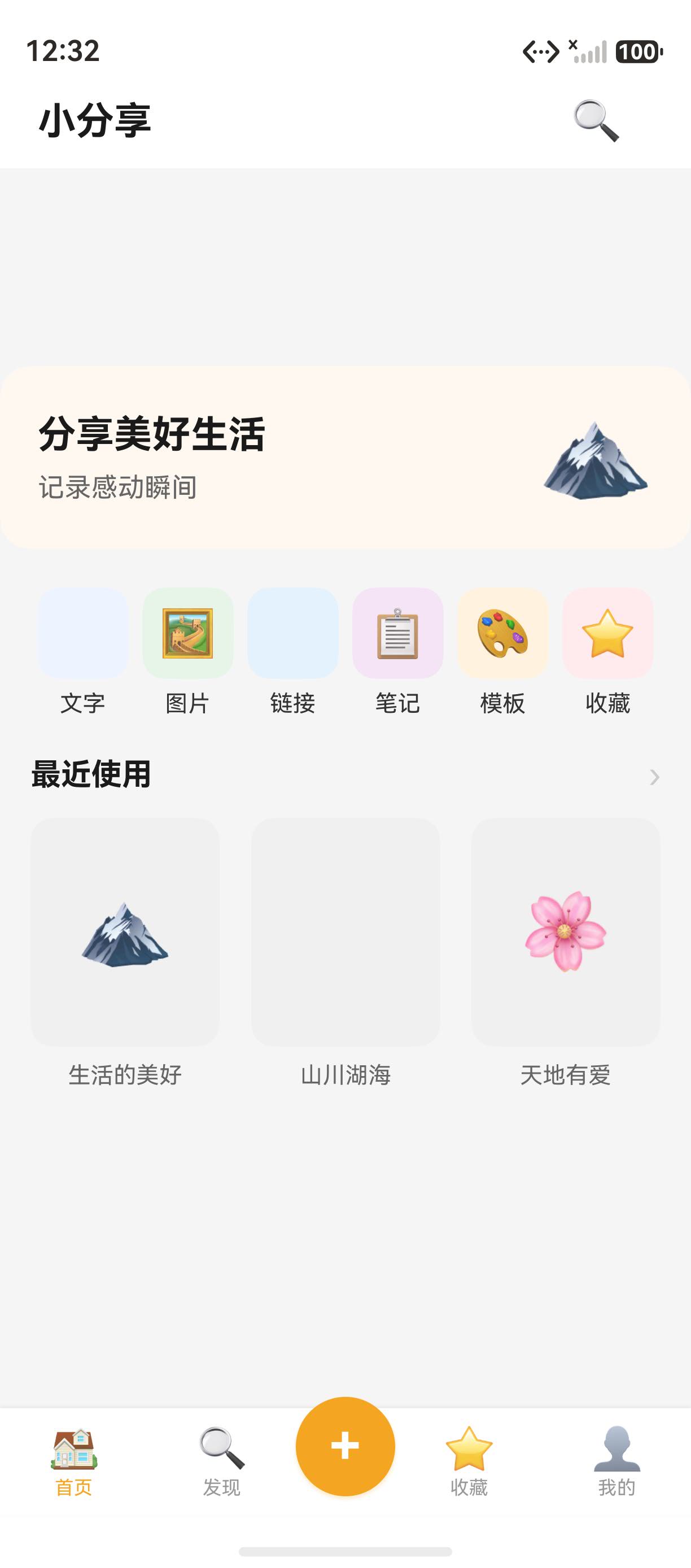
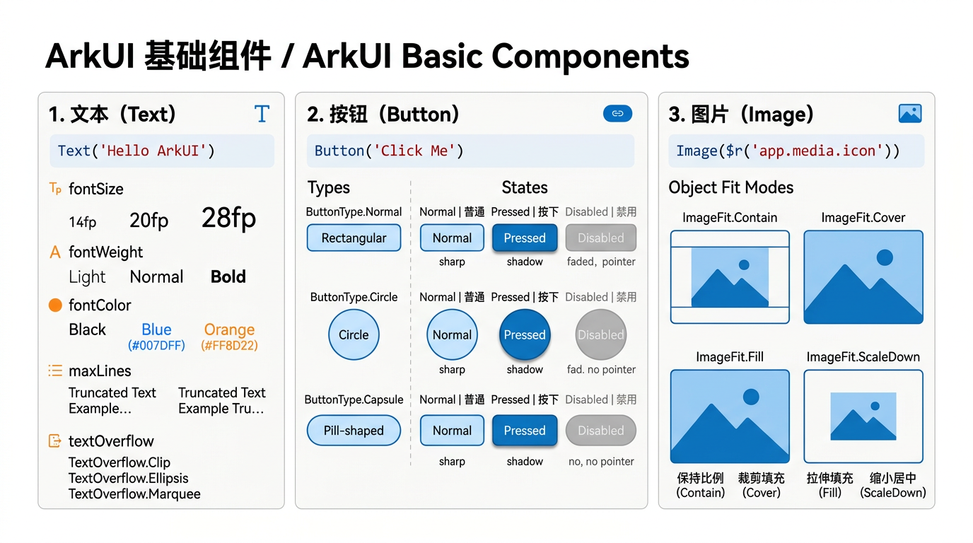
Text 、Button 、Image 是 ArkUI 最基础的三大组件,几乎每个页面都离不开它们。小分享 App 大量使用了这些组件。本篇集中讲解它们的核心属性和常见用法。详细 API 可参考 HarmonyOS Text 官方文档。
一、Text 组件
1.1 基本用法
typescript
Text('小分享')
  .fontSize(20)
  .fontWeight(FontWeight.Bold)
  .fontColor('#1A1A1A')
1.2 Text 常用属性
| 属性 | 作用 | 示例 |
|---|---|---|
fontSize |
字号 | 20 |
fontWeight |
字重 | FontWeight.Bold |
fontColor |
颜色 | '#1A1A1A' |
textAlign |
对齐 | TextAlign.Center |
maxLines |
最大行数 | 1 |
textOverflow |
溢出处理 | TextOverflow.Ellipsis |
lineHeight |
行高 | 28 |
letterSpacing |
字间距 | 2 |
1.3 文字省略
typescript
Text(item.title)
  .maxLines(1)
  .textOverflow({ overflow: TextOverflow.Ellipsis })
二、Button 组件
2.1 基本用法
typescript
Button('小分享')
  .fontSize(16)
  .fontColor(Color.White)
  .backgroundColor('#F5A623')
  .width('60%')
  .height(48)
  .borderRadius(24)
  .onClick(() => { router.replaceUrl({ url: 'pages/HomePage' }) })
2.2 Button 常用属性
| 属性 | 作用 | 示例 |
|---|---|---|
width |
宽度 | '90%' / 200 |
height |
高度 | 48 |
backgroundColor |
背景色 | '#F5A623' |
borderRadius |
圆角 | 24 |
fontSize |
字号 | 16 |
fontColor |
文字颜色 | Color.White |
onClick |
点击事件 | () => {} |
2.3 透明按钮
typescript
Button('退出登录')
  .fontSize(16)
  .fontColor('#F44336')
  .backgroundColor(Color.Transparent)
  .width('100%')
  .height(48)
  .borderRadius(12)
三、Image 组件
3.1 基本用法
typescript
Image($r('app.media.app_icon'))
  .width(64)
  .height(64)
  .borderRadius(32)
  .objectFit(ImageFit.Cover)
3.2 Image 常用属性
| 属性 | 作用 | 示例 |
|---|---|---|
width |
宽度 | 64 |
height |
高度 | 64 |
borderRadius |
圆角 | 32 |
objectFit |
填充模式 | ImageFit.Cover |
src |
图片来源 | 资源/网络/本地 |
3.3 三种图片来源
typescript
// 1. 资源文件
Image($r('app.media.app_icon'))

// 2. 网络图片
Image('https://example.com/image.png')

// 3. 本地文件
Image('/data/storage/el2/base/haps/entry/files/image.png')
四、Text、Button、Image 对比
| 组件 | 用途 | 核心属性 |
|---|---|---|
| Text | 文字展示 | fontSize, fontColor, textAlign |
| Button | 点击操作 | backgroundColor, borderRadius, onClick |
| Image | 图片展示 | objectFit, src |
五、本文核心知识点
5.1 基础组件核心要点
- Text:字数限制、溢出省略、行高
- Button:圆角、背景色、点击事件
- Image:三种图片来源、填充模式
5.2 实战开发要点
- 文字溢出用 maxLines + textOverflow
- 按钮圆角 = 高度/2 时为胶囊形
- 图片资源用 $r 引用
相关资源
附录:基础组件的完整实现细节
1. Text 组件完整属性
| 属性 | 作用 | 示例 |
|---|---|---|
fontSize |
字号 | 20 |
fontWeight |
字重 | FontWeight.Bold |
fontColor |
颜色 | '#1A1A1A' |
textAlign |
对齐 | TextAlign.Center |
maxLines |
最大行数 | 1 |
textOverflow |
溢出处理 | TextOverflow.Ellipsis |
lineHeight |
行高 | 28 |
letterSpacing |
字间距 | 2 |
2. Button 组件完整属性
typescript
Button('小分享')
  .fontSize(16).fontColor(Color.White).backgroundColor('#F5A623')
  .width('60%').height(48).borderRadius(24)
  .onClick(() => { router.replaceUrl({ url: 'pages/HomePage' }) })
3. Image 组件完整用法
typescript
// 资源文件
Image($r('app.media.app_icon')).width(64).height(64).borderRadius(32).objectFit(ImageFit.Cover)

// 网络图片
Image('https://example.com/image.png').width('100%').height(200).objectFit(ImageFit.Cover)

// 本地文件
Image('/data/storage/el2/base/haps/entry/files/image.png')
4. 三种图片来源
| 来源 | 语法 | 示例 |
|---|---|---|
| 资源文件 | $r('app.media.xxx') |
应用内置图标 |
| 网络图片 | URL 字符串 | 在线图片 |
| 本地文件 | 文件路径 | 沙箱文件 |
5. 完整代码文件索引
| 文件路径 | 说明 |
|---|---|
| 所有页面文件 | 使用 Text/Button/Image |
6. 总结
本文详细讲解了 ArkUI 三大基础组件 Text、Button、Image 的完整属性和用法。
相关资源
- HarmonyOS Text 官方文档 :Text Reference
- HarmonyOS Button 组件 :Button Reference
- HarmonyOS Image 组件 :Image Reference
- HarmonyOS 图片加载 :Image Loading
- HarmonyOS 资源管理 :Resource Management
- HarmonyOS 样式指南 :Styling Guide
- HarmonyOS 文字溢出 :Text Overflow
- 开源鸿蒙跨平台社区 :https://openharmonycrossplatform.csdn.net
- ArkUI 表单组件
本文涉及的所有 API 索引
| API | 类别 | 用途 |
|---|---|---|
| Column | 布局容器 | 垂直排列子组件 |
| Row | 布局容器 | 水平排列子组件 |
| Text | 基础组件 | 显示文本 |
| ForEach | 渲染控制 | 循环渲染列表 |
| @State | 装饰器 | 组件内状态管理 |
| @Builder | 装饰器 | 封装可复用 UI 片段 |
| router.pushUrl | 路由 | 页面跳转 |
| router.back | 路由 | 返回上一页 |
总结
本文详细讲解了小分享 App 中对应页面的完整实现。核心知识点涵盖布局容器、组件封装、状态管理、路由跳转等关键技术。通过本文的学习,读者可以掌握 HarmonyOS ArkUI 声明式开发的核心技能,并能够独立实现类似的页面功能。
相关资源
- HarmonyOS 官方文档 :https://developer.huawei.com/consumer/cn/doc/
- ArkTS 语法指南 :ArkTS Introduction
- 状态管理指南 :State Management
- ArkUI 组件参考 :ArkUI Components
- 路由 API :Router API
- 开源鸿蒙跨平台社区 :https://openharmonycrossplatform.csdn.net
6. Text 组件完整用法
typescript
// 基本文字
Text('小分享').fontSize(20).fontWeight(FontWeight.Bold).fontColor('#1A1A1A')

// 多行文字省略
Text(item.title).maxLines(1).textOverflow({ overflow: TextOverflow.Ellipsis })

// 行高设置
Text('正文内容').fontSize(14).fontColor('#666666').lineHeight(28)

// 对齐方式
Text('居中标题').fontSize(18).textAlign(TextAlign.Center).width('100%')
7. Button 组件完整用法
typescript
// 主按钮 - 胶囊形
Button('小分享').fontSize(16).fontColor(Color.White).backgroundColor('#F5A623').width('60%').height(48).borderRadius(24)

// 透明按钮 - 红色文字
Button('退出登录').fontSize(16).fontColor('#F44336').backgroundColor(Color.Transparent).width('100%').height(48).borderRadius(12)

// 功能按钮 - 使用此模板
Button('使用此模板').fontSize(16).fontColor(Color.White).backgroundColor('#F5A623').width('90%').height(48).borderRadius(24).margin({ bottom: 20 })
8. Image 组件完整用法
typescript
// 资源图片
Image($r('app.media.app_icon')).width(64).height(64).borderRadius(32).objectFit(ImageFit.Cover)

// 网络图片
Image('https://example.com/image.png').width('100%').height(200).objectFit(ImageFit.Cover)

// 本地文件图片
Image('/data/storage/el2/base/haps/entry/files/image.png')
9. 三种图片来源对比
| 来源 | 语法 | 示例 | 适用场景 |
|---|---|---|---|
| 资源文件 | $r('app.media.xxx') |
应用内置图标 | 固定图标、启动图 |
| 网络图片 | URL 字符串 | 在线图片 URL | 用户头像、内容图 |
| 本地文件 | 文件路径 | 沙箱文件路径 | 用户拍摄的照片 |
10. 小分享 App 中的使用
| 组件 | 使用场景 | 示例 |
|---|---|---|
| Text | 标题、正文、标签 | 所有页面的文字 |
| Button | 操作按钮、分享按钮 | 导航栏、底部按钮 |
| Image | 图片展示 | 头像、预览图、Banner |
11. 完整代码文件索引
| 文件路径 | 说明 |
|---|---|
| 所有页面文件 | 使用 Text/Button/Image |
12. 本文涉及的所有 API
| API/组件 | 用途 | 文档链接 |
|---|---|---|
| Text | 文本组件 | Text |
| Button | 按钮组件 | Button |
| Image | 图片组件 | Image |
| ImageFit | 图片填充模式 | Image |
| TextOverflow | 文字溢出处理 | Text |
| TextAlign | 文字对齐 | Text |
| FontWeight | 字重 | Text |
13. 实现要点总结
基础组件核心要点:
- Text:支持 fontSize、fontWeight、fontColor、textAlign、maxLines、textOverflow、lineHeight 等属性
- Button:支持 backgroundColor、borderRadius、fontSize、fontColor、onClick 等属性
- Image:支持三种图片来源(资源、网络、本地),objectFit 控制填充模式
14. 总结
本文详细讲解了 ArkUI 三大基础组件 Text、Button、Image 的完整属性和用法。
相关资源
- HarmonyOS Text 官方文档 :Text Reference
- HarmonyOS Button 组件 :Button Reference
- HarmonyOS Image 组件 :Image Reference
- HarmonyOS 图片加载 :Image Loading
- HarmonyOS 资源管理 :Resource Management
- HarmonyOS 样式指南 :Styling Guide
- HarmonyOS 文字溢出 :Text Overflow
- 开源鸿蒙跨平台社区 :https://openharmonycrossplatform.csdn.net
-
ArkUI 表单组件
-
@Builder 与 @Component 对比
-
ArkUI 表单组件
-
@Builder 与 @Component 对比
-
ArkUI 表单组件
-
@Builder 与 @Component 对比
-
ArkUI 表单组件
- @Builder 与 @Component 对比
如果这篇文章对你有帮助,欢迎点赞👍、收藏⭐、关注🔔,你的支持是我持续创作的动力!