阅读时长:约 19 分钟 | 难度:★★★★☆ | 篇章:第 3 篇 · 首页与功能导航
对应源码:
entry/src/main/ets/pages/HomePage.ets
前言
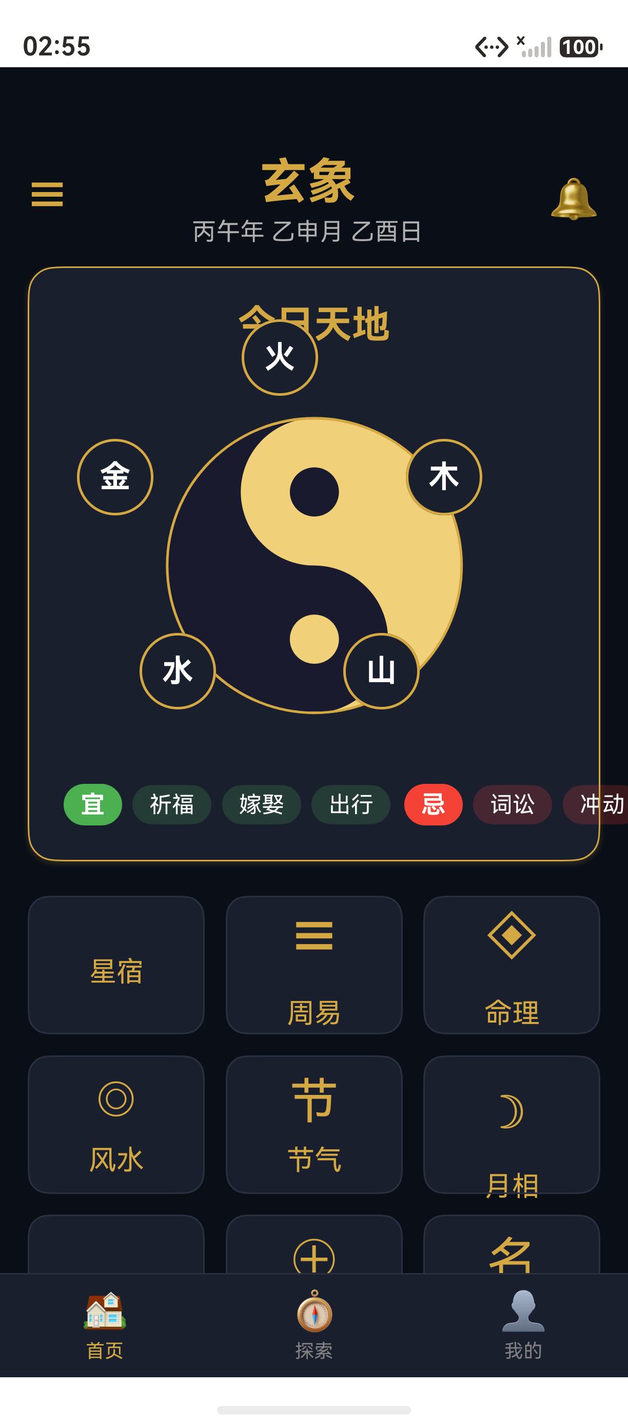
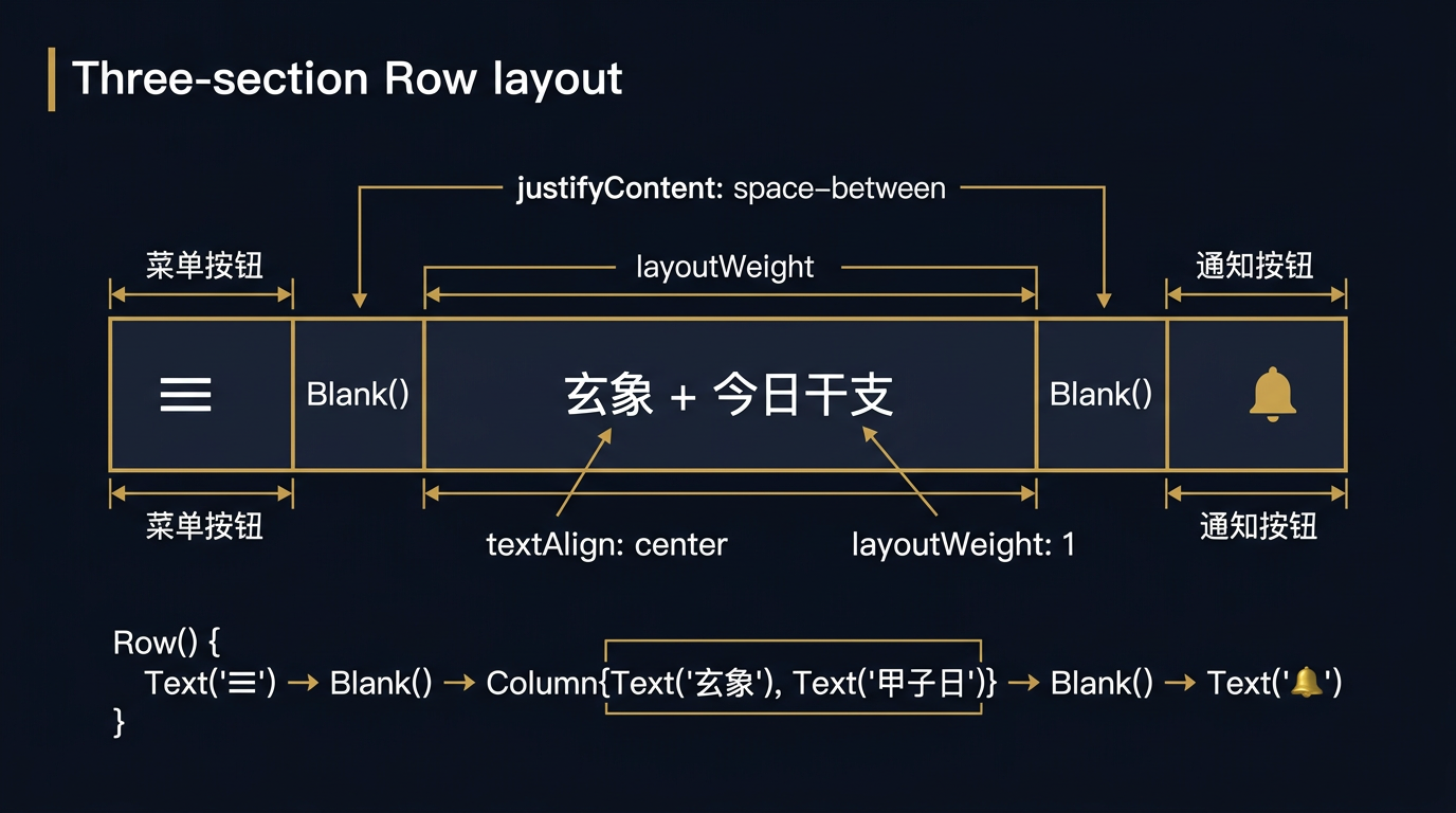
首页顶部标题栏是用户进入应用后最先看到的功能性区域。玄象项目首页采用 Row + Blank 三段式布局 :左侧"☰"菜单按钮、中间"玄象"标题与今日干支、右侧"🔔"通知按钮。这种布局结构在 ArkUI 中极为常见,掌握 Row 横向布局、Blank 弹性占位、Column 嵌套居中三大技巧,您就能为任何 HarmonyOS 应用打造标准化的顶部标题栏。
提示:三段式布局是移动端顶部导航的"事实标准"------左侧返回/菜单、中间标题、右侧操作按钮。玄象项目用最简代码实现了这一标准布局。
一、HomePage 完整源码概览
1.1 顶部标题栏源码
typescript
build() {
  Column() {
    // 顶部标题栏
    Row() {
      Text('☰')
        .fontSize(24)
        .fontColor(Colors.PRIMARY_GOLD)

      Blank()

      Column({ space: 4 }) {
        Text('玄象')
          .fontSize(28)
          .fontWeight(FontWeight.Bold)
          .fontColor(Colors.PRIMARY_GOLD)
        Text(this.todayGanZhi)
          .fontSize(14)
          .fontColor(Colors.TEXT_SECONDARY)
      }

      Blank()

      Text('🔔')
        .fontSize(24)
        .fontColor(Colors.PRIMARY_GOLD)
    }
    .width('100%')
    .padding({ left: 16, right: 16, top: 50, bottom: 12 })
  }
}
1.2 三段式布局结构
text
┌──────────────────────────────────────────────┐
│  ☰          玄象                 🔔          │
│             甲辰年│肖龙                      │
└──────────────────────────────────────────────┘
   ↑           ↑                          ↑
左侧菜单 中间标题 右侧通知| 段位 | 组件 | 内容 |
|---|---|---|
| 左侧 | Text |
"☰" 菜单图标 |
| 中间 | Column |
"玄象" + 今日干支 |
| 右侧 | Text |
"🔔" 通知图标 |
二、Row 横向布局容器
2.1 Row 基本用法
typescript
Row() {
  Text('左')
  Text('中')
  Text('右')
}
.width('100%')
Row 容器让子元素按从左到右的顺序横向排列。
2.2 Row 关键属性
| 属性 | 类型 | 含义 | 玄象项目值 |
|---|---|---|---|
width |
Length | 容器宽度 | '100%' |
height |
Length | 容器高度 | 默认(包裹内容) |
padding |
Padding | 内边距 | { left: 16, right: 16, top: 50, bottom: 12 } |
justifyContent |
FlexAlign | 主轴对齐 | - |
alignItems |
VerticalAlign | 交叉轴对齐 | - |
2.3 padding 内边距详解
玄象项目顶部标题栏的 padding:
typescript
.padding({ left: 16, right: 16, top: 50, bottom: 12 })| 方向 | 值 | 含义 |
|---|---|---|
left |
16 | 左侧 16vp 内边距 |
right |
16 | 右侧 16vp 内边距 |
top |
50 | 顶部 50vp 内边距 |
bottom |
12 | 底部 12vp 内边距 |
提示:玄象项目
top: 50是为了避开状态栏(手机顶部约 24-50vp 是状态栏区域)。在生产环境,应通过window.getWindowAvoidArea动态获取安全区域。
三、Blank 弹性占位
3.1 Blank 的作用
Blank 是 ArkUI 的弹性占位组件 ,在 Row 或 Column 中填充剩余空间。
typescript
Row() {
  Text('左')
  Blank()      // ← 弹性占位
  Text('右')
}
Blank 让"左"贴左、"右"贴右,中间被 Blank 撑开。
3.2 玄象项目双 Blank 布局
typescript
Row() {
  Text('☰')           // 左侧
  Blank()             // 弹性占位 1
  Column() { ... }    // 中间
  Blank()             // 弹性占位 2
  Text('🔔')          // 右侧
}
两个 Blank 平均分配剩余空间,让中间 Column 居中。
3.3 Blank vs justifyContent
实现"三段均分"的两种方式:
方式 1:Blank(玄象项目方案)
typescript
Row() {
  Text('左')
  Blank()
  Text('中')
  Blank()
  Text('右')
}
方式 2:justifyContent
typescript
Row() {
  Text('左')
  Text('中')
  Text('右')
}
.justifyContent(FlexAlign.SpaceEvenly)
玄象项目选择 Blank 的原因:
- 中间
Column内容垂直,需独立居中。 Blank方案对中间内容的水平居中更精确。
提示:若中间内容是简单
Text,两种方案效果一致。若中间是Column多行内容,Blank方案更可控。
四、Column 嵌套居中
4.1 中间 Column 结构
typescript
Column({ space: 4 }) {
  Text('玄象')
    .fontSize(28)
    .fontWeight(FontWeight.Bold)
    .fontColor(Colors.PRIMARY_GOLD)
  Text(this.todayGanZhi)
    .fontSize(14)
    .fontColor(Colors.TEXT_SECONDARY)
}
4.2 Column 关键参数
| 参数 | 类型 | 含义 | 玄象项目值 |
|---|---|---|---|
space |
Length | 子元素间距 | 4 |
Column({ space: 4 }) 让主标题"玄象"与副标题"甲辰年│肖龙"间距为 4vp。
4.3 嵌套 Column 的设计意图
text
Row
  ├── Text "☰"
  ├── Blank
  ├── Column            ← 嵌套 Column
  │     ├── Text "玄象"
  │     └── Text "甲辰年│肖龙"
  ├── Blank
  └── Text "🔔"
玄象项目使用嵌套 Column 的设计意图:
- 主标题与副标题垂直堆叠。
- 副标题字号更小,颜色更淡,形成视觉层次。
- 整个
Column在Row中水平居中。
五、状态变量 todayGanZhi
5.1 状态定义
typescript
@State todayGanZhi: string = '';玄象项目用 todayGanZhi 存储今日干支字符串。
5.2 aboutToAppear 中初始化
typescript
aboutToAppear(): void {
  this.todayGanZhi = LunarCalendar.getTodayGanZhi();
  // ...
}
玄象项目在 aboutToAppear 中调用 LunarCalendar.getTodayGanZhi() 初始化今日干支。
5.3 数据流
text
aboutToAppear
   ↓
LunarCalendar.getTodayGanZhi()
   ↓
this.todayGanZhi = '甲辰年│肖龙'
   ↓
@State 变化触发 build 重新渲染
   ↓
Text(this.todayGanZhi) 显示 "甲辰年│肖龙"
提示:玄象项目首页标题栏的"今日干支"是首页与历法模块的视觉纽带。用户看到"甲辰年"会自然联想到干支推算功能。
六、emoji 图标的兼容性
6.1 玄象项目使用的 emoji
typescript
Text('☰')    // 菜单(八卦中的乾卦符号)
Text('🔔')   // 通知
玄象项目顶部标题栏使用两个 emoji:
- "☰":八卦中的乾卦符号,象征天
- "🔔":通知铃铛
6.2 emoji 字体兼容性
emoji 的显示依赖系统字体:
| 平台 | emoji 字体 |
|---|---|
| HarmonyOS | Noto Color Emoji |
| iOS | Apple Color Emoji |
| Android | Noto Color Emoji |
6.3 emoji 渲染优化
emoji 是彩色字体,渲染开销高于普通文本。玄象项目仅在标题栏使用 emoji,数量少,性能无忧。
提示:玄象项目首页九宫格的"星宿""乐律"图标位置为空字符串,可能是设计稿中尚未确定的图标占位。
七、字体属性详解
7.1 主标题字体属性
typescript
Text('玄象')
  .fontSize(28)
  .fontWeight(FontWeight.Bold)
.fontColor(Colors.PRIMARY_GOLD)| 属性 | 值 | 含义 |
|---|---|---|
fontSize |
28 | 字号 28vp |
fontWeight |
FontWeight.Bold |
加粗 |
fontColor |
Colors.PRIMARY_GOLD |
金色 |
7.2 副标题字体属性
typescript
Text(this.todayGanZhi)
  .fontSize(14)
.fontColor(Colors.TEXT_SECONDARY)| 属性 | 值 | 含义 |
|---|---|---|
fontSize |
14 | 字号 14vp |
fontColor |
Colors.TEXT_SECONDARY |
次要文字色 |
7.3 视觉层次
玄象项目顶部标题栏的视觉层次:
| 层级 | 元素 | 字号 | 颜色 |
|---|---|---|---|
| 主 | "玄象" | 28 | 金色 |
| 次 | "甲辰年│肖龙" | 14 | 灰色 |
| 辅 | "☰" / "🔔" | 24 | 金色 |
八、顶部标题栏的扩展方向
8.1 添加搜索框
typescript
Row() {
  Text('☰')
  TextInput({ placeholder: '搜索星宿/卦象' })
    .layoutWeight(1)
    .backgroundColor(Colors.BG_CARD)
    .borderRadius(20)
  Text('🔔')
}
8.2 添加返回按钮
typescript
Row() {
  Text('←')
    .onClick(() => router.back())
  Blank()
  Text('星宿详情')
  Blank()
  Text('⋯')
}
8.3 添加下拉菜单
typescript
Row() {
  Text('☰')
    .onClick(() => this.showSideMenu())
  Blank()
  Text('玄象')
  Blank()
  Text('🔔')
    .onClick(() => this.showNotifications())
}
九、玄象项目标题栏设计原则
9.1 简约原则
玄象项目顶部标题栏仅 3 个元素(菜单 + 标题 + 通知),符合"少即是多"的设计哲学。
9.2 对称原则
text
[☰] [Blank] [Column] [Blank] [🔔]
  左   占位    中      占位   右
左右两侧元素等宽(24vp 字号),视觉对称。
9.3 一致原则
玄象项目所有页面的标题栏遵循统一规范:
- 高度 50vp(顶部安全距离)
- 字号 28vp(主标题)
- 颜色
Colors.PRIMARY_GOLD
总结
本篇以玄象项目首页顶部标题栏为蓝本,深入剖析了 ArkUI Row + Blank 三段式布局:从 Row 横向布局、Blank 弹性占位、Column 嵌套居中,到 padding 内边距、状态变量绑定、emoji 兼容性、字体属性详解。掌握这套三段式布局方法论,您就能为任何 HarmonyOS 应用打造标准化的顶部标题栏。
下一篇:《22 · "今日天地"卡片:border + shadow + borderRadius 的金边卡片范式》,将带您深入玄象项目首页"今日天地"卡片的实现细节。
如果这篇文章对你有帮助,欢迎点赞👍、收藏⭐、关注🔔,你的支持是我持续创作的动力!
相关资源:
- HarmonyOS 官方文档:Row 组件
- HarmonyOS 官方文档:Blank 组件
- HarmonyOS 官方文档:Column 组件
- HarmonyOS 官方文档:Padding 类型
- 开源鸿蒙跨平台社区:https://openharmonycrossplatform.csdn.net