<!--
  @file MultiSelect 多选下拉组件
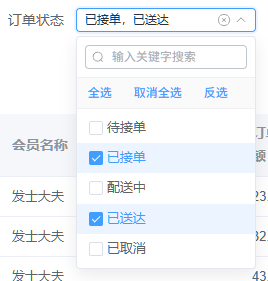
  @description 支持模糊搜索、全选/取消全选/反选的多选下拉组件,参考 xm-select 风格
  @module components/MultiSelect/MultiSelect

  @example 基础用法
  <template>
    <MultiSelect
      v-model="selectedValues"
      :options="options"
      placeholder="请选择"
    />
  </template>

  <script setup>
  import MultiSelect from '@/components/MultiSelect'

  const selectedValues = ref([])
  const options = [
    { label: '选项1', value: 1 },
    { label: '选项2', value: 2 },
    { label: '选项3', value: 3 }
  ]
  </script>

  @example 完整功能(全选/反选/搜索/清空)
  <MultiSelect
    v-model="selected"
    :options="options"
    show-toolbar
    filterable
    clearable
    placeholder="请选择"
    @change="handleChange"
  />

  @description 已选项以逗号分隔的文本形式展示,超出宽度自动显示省略号;hover 触发器可查看完整内容
-->
<template>
  <div class="multi-select-wrapper" ref="wrapperRef">
    <el-popover
      v-model:visible="popoverVisible"
      placement="bottom-start"
      :width="dropdownWidth"
      trigger="click"
      :show-arrow="false"
      :offset="4"
      :disabled="props.disabled"
      popper-class="multi-select-popper"
      @show="handlePopoverShow"
      @hide="handlePopoverHide"
    >
      <!-- 触发器:输入框样式的展示区域 -->
      <template #reference>
        <div
          class="multi-select-trigger"
          :class="[
            `multi-select-trigger--${props.size}`,
            {
              'is-disabled': props.disabled,
              'is-focus': popoverVisible,
              'is-empty': isEmpty
            }
          ]"
          @click="handleTriggerClick"
        >
          <!-- 已选项展示区域:使用逗号分隔的文本形式展示,超出省略号 -->
          <div class="multi-select-display">
            <span v-if="displayText" class="multi-select-display-text" :title="displayText">
              {{ displayText }}
            </span>
            <!-- 占位文字 -->
            <span v-else class="multi-select-placeholder">
              {{ props.placeholder }}
            </span>
          </div>

          <!-- 右侧图标区域 -->
          <div class="multi-select-icons">
            <!-- 清空图标 -->
            <el-icon
              v-if="props.clearable && !isEmpty && !props.disabled"
              class="multi-select-clear-icon"
              @click.stop="handleClear"
            >
              <CircleClose />
            </el-icon>
            <!-- 下拉箭头 -->
            <el-icon class="multi-select-arrow-icon" :class="{ 'is-reverse': popoverVisible }">
              <ArrowDown />
            </el-icon>
          </div>
        </div>
      </template>

      <!-- 下拉面板内容 -->
      <div class="multi-select-dropdown">
        <!-- 搜索框 -->
        <div v-if="props.filterable" class="multi-select-search">
          <el-input
            v-model="searchQuery"
            size="small"
            placeholder="输入关键字搜索"
            clearable
            :prefix-icon="Search"
          />
        </div>

        <!-- 操作工具栏:全选 / 取消全选 / 反选 -->
        <div v-if="props.showToolbar" class="multi-select-toolbar">
          <el-button
            type="primary"
            link
            size="small"
            :disabled="filteredOptions.length === 0"
            @click="handleSelectAll"
          >
            全选
          </el-button>
          <el-button
            type="primary"
            link
            size="small"
            :disabled="filteredOptions.length === 0"
            @click="handleDeselectAll"
          >
            取消全选
          </el-button>
          <el-button
            type="primary"
            link
            size="small"
            :disabled="filteredOptions.length === 0"
            @click="handleInvert"
          >
            反选
          </el-button>
        </div>

        <!-- 选项列表 -->
        <div
          class="multi-select-options"
          :style="{ maxHeight: (props.maxHeight || 260) + 'px' }"
        >
          <!-- 空状态 -->
          <div v-if="filteredOptions.length === 0" class="multi-select-empty">
            无匹配数据
          </div>
          <!-- 选项渲染 -->
          <div
            v-for="option in filteredOptions"
            :key="option.value"
            class="multi-select-option"
            :class="{
              'is-selected': isSelected(option),
              'is-disabled': option.disabled
            }"
            @click="handleOptionClick(option)"
          >
            <el-checkbox
              :model-value="isSelected(option)"
              :disabled="option.disabled"
              @click.stop
              @change="handleOptionClick(option)"
            />
            <span class="multi-select-option-label">{{ option.label }}</span>
          </div>
        </div>
      </div>
    </el-popover>
  </div>
</template>

<script setup lang="ts">
/**
 * MultiSelect 多选下拉组件
 * @description 参考 xm-select 风格,基于 element-plus 实现
 *   - 支持模糊搜索过滤
 *   - 支持全选 / 取消全选 / 反选
 *   - 支持折叠 tag 展示
 *   - 支持清空、禁用
 */
import { ref, computed, watch, nextTick, onMounted, onUnmounted } from 'vue'
import { Search, ArrowDown, CircleClose } from '@element-plus/icons-vue'
import type { MultiSelectProps, MultiSelectOption } from './types'

/**
 * 组件属性定义
 */
const props = withDefaults(defineProps<MultiSelectProps>(), {
  modelValue: () => [],
  options: () => [],
  placeholder: '请选择',
  disabled: false,
  showToolbar: true,
  filterable: true,
  size: 'small',
  clearable: true,
  maxHeight: 260
})

/**
 * 组件事件定义
 */
const emit = defineEmits<{
  'update:modelValue': [value: (string | number)[]]
  'change': [value: (string | number)[], items: MultiSelectOption[]]
  'clear': []
  'visibleChange': [visible: boolean]
}>()

/** 包装容器引用 */
const wrapperRef = ref<HTMLElement>()
/** 弹出层显示状态 */
const popoverVisible = ref(false)
/** 搜索关键字 */
const searchQuery = ref('')
/** 下拉面板宽度 */
const dropdownWidth = ref(240)

/** 当前选中的值(内部维护) */
const selectedValues = ref<(string | number)[]>([...props.modelValue])

/**
 * 监听外部 modelValue 变化,同步到内部
 */
watch(
  () => props.modelValue,
  (val) => {
    selectedValues.value = [...val]
  },
  { deep: true }
)

/**
 * 是否为空(未选择任何项)
 */
const isEmpty = computed(() => selectedValues.value.length === 0)

/**
 * 过滤后的选项列表
 * @description 根据搜索关键字进行模糊匹配
 */
const filteredOptions = computed(() => {
  if (!searchQuery.value) return props.options
  const query = searchQuery.value.toLowerCase()
  return props.options.filter((option) => {
    if (props.filterMethod) {
      return props.filterMethod(searchQuery.value, option)
    }
    return (
      String(option.label).toLowerCase().includes(query) ||
      String(option.value).toLowerCase().includes(query)
    )
  })
})

/**
 * 已选项对象列表
 */
const selectedItems = computed(() => {
  return selectedValues.value
    .map((val) => props.options.find((opt) => opt.value === val))
    .filter(Boolean) as MultiSelectOption[]
})

/**
 * 触发器展示文本
 * @description 将所有已选项 label 用逗号拼接,超出宽度时由 CSS 显示省略号
 */
const displayText = computed(() => {
  return selectedItems.value.map((item) => item.label).join(',')
})

/**
 * 判断选项是否被选中
 * @param option - 选项对象
 */
const isSelected = (option: MultiSelectOption) => {
  return selectedValues.value.includes(option.value)
}

/**
 * 同步选中值到外部
 */
const emitChange = () => {
  emit('update:modelValue', [...selectedValues.value])
  const items = selectedValues.value
    .map((val) => props.options.find((opt) => opt.value === val))
    .filter(Boolean) as MultiSelectOption[]
  emit('change', [...selectedValues.value], items)
}

/**
 * 处理选项点击
 * @param option - 被点击的选项
 */
const handleOptionClick = (option: MultiSelectOption) => {
  if (option.disabled) return
  const index = selectedValues.value.indexOf(option.value)
  if (index > -1) {
    selectedValues.value.splice(index, 1)
  } else {
    selectedValues.value.push(option.value)
  }
  emitChange()
}

/**
 * 全选:选中当前过滤后的所有未禁用选项
 */
const handleSelectAll = () => {
  const selectableValues = filteredOptions.value
    .filter((opt) => !opt.disabled)
    .map((opt) => opt.value)
  // 合并原有选中值与新选中值(去重)
  const merged = Array.from(new Set([...selectedValues.value, ...selectableValues]))
  selectedValues.value = merged
  emitChange()
}

/**
 * 取消全选:取消当前过滤后的所有选项
 */
const handleDeselectAll = () => {
  const filteredValues = filteredOptions.value.map((opt) => opt.value)
  selectedValues.value = selectedValues.value.filter((val) => !filteredValues.includes(val))
  emitChange()
}

/**
 * 反选:在当前过滤后的选项范围内反转选中状态
 */
const handleInvert = () => {
  const filteredValues = filteredOptions.value.map((opt) => opt.value)
  const newSelected = filteredValues.filter((val) => !selectedValues.value.includes(val))
  // 保留未在过滤结果中的原有选中值
  const retained = selectedValues.value.filter((val) => !filteredValues.includes(val))
  selectedValues.value = [...retained, ...newSelected]
  emitChange()
}

/**
 * 清空所有选中
 */
const handleClear = () => {
  selectedValues.value = []
  emitChange()
  emit('clear')
}

/**
 * 触发器点击
 */
const handleTriggerClick = () => {
  if (props.disabled) return
}

/**
 * 弹出层显示时
 */
const handlePopoverShow = () => {
  // 重置搜索关键字
  searchQuery.value = ''
  // 计算下拉宽度,最小与触发器同宽
  nextTick(() => {
    if (wrapperRef.value) {
      const width = wrapperRef.value.offsetWidth
      dropdownWidth.value = Math.max(width, 0)
    }
  })
  emit('visibleChange', true)
}

/**
 * 弹出层隐藏时
 */
const handlePopoverHide = () => {
  searchQuery.value = ''
  emit('visibleChange', false)
}

/**
 * 挂载时初始化下拉宽度
 */
onMounted(() => {
  nextTick(() => {
    if (wrapperRef.value) {
      dropdownWidth.value = Math.max(wrapperRef.value.offsetWidth, 0)
    }
  })
})
</script>

<style scoped lang="scss">
/**
 * 多选下拉组件样式
 * @description 参考 xm-select 风格,与 element-plus 主题色保持一致
 */
.multi-select-wrapper {
  width: 100%;
}

.multi-select-trigger {
  display: flex;
  align-items: center;
  width: 100%;
  min-height: 32px;
  padding: 0 8px;
  border: 1px solid #dcdfe6;
  border-radius: 4px;
  background-color: #fff;
  cursor: pointer;
  box-sizing: border-box;
  font-size: 14px;
  transition: border-color 0.2s ease, box-shadow 0.2s ease;
  overflow: hidden;

  &:hover {
    border-color: #c0c4cc;
  }

  &.is-focus {
    border-color: #409eff;
    box-shadow: 0 0 0 2px rgba(64, 158, 255, 0.1);
  }

  &.is-disabled {
    background-color: #f5f7fa;
    border-color: #e4e7ed;
    color: #c0c4cc;
    cursor: not-allowed;
  }

  /** 尺寸变体:高度与字号对齐 element-plus 同尺寸 el-input */
  &--large {
    min-height: 40px;
    padding: 4px 10px;
    font-size: 16px;
  }

  &--small {
    min-height: 24px;
    padding: 0 8px;
    font-size: 12px;
  }
}

.multi-select-display {
  flex: 1;
  min-width: 0;
  display: flex;
  align-items: center;
  height: 100%;
  overflow: hidden;

  .multi-select-display-text {
    flex: 1;
    min-width: 0;
    font-size: inherit;
    color: #303133;
    line-height: 1.4;
    white-space: nowrap;
    overflow: hidden;
    text-overflow: ellipsis;
  }
}

.multi-select-placeholder {
  color: #a8abb2;
  font-size: inherit;
  line-height: 1.4;
  user-select: none;
  white-space: nowrap;
  overflow: hidden;
  text-overflow: ellipsis;
}

.multi-select-icons {
  display: flex;
  align-items: center;
  gap: 4px;
  flex-shrink: 0;
  margin-left: 4px;
  color: #a8abb2;
}

.multi-select-clear-icon {
  cursor: pointer;
  font-size: 14px;
  transition: color 0.2s;

  &:hover {
    color: #909399;
  }
}

.multi-select-arrow-icon {
  font-size: 12px;
  transition: transform 0.3s ease;

  &.is-reverse {
    transform: rotate(180deg);
  }
}
</style>

<style lang="scss">
/**
 * 下拉面板全局样式(popper 渲染在 body 上,需要非 scoped)
 */
.multi-select-popper.el-popover.el-popper {
  padding: 0 !important;
  border: 1px solid #e4e7ed;
  border-radius: 4px;
  box-shadow: 0 6px 16px rgba(0, 0, 0, 0.08);
}

.multi-select-dropdown {
  .multi-select-search {
    padding: 8px;
    border-bottom: 1px solid #f0f0f0;
  }

  .multi-select-toolbar {
    display: flex;
    align-items: center;
    gap: 4px;
    padding: 6px 8px;
    border-bottom: 1px solid #f0f0f0;
    background-color: #fafafa;
  }

  .multi-select-options {
    overflow-y: auto;
    padding: 4px 0;

    &::-webkit-scrollbar {
      width: 6px;
    }

    &::-webkit-scrollbar-thumb {
      background-color: #c0c4cc;
      border-radius: 3px;
    }
  }

  .multi-select-option {
    display: flex;
    align-items: center;
    padding: 6px 12px;
    cursor: pointer;
    font-size: 13px;
    color: #606266;
    transition: background-color 0.2s;
    user-select: none;

    &:hover {
      background-color: #f5f7fa;
    }

    &.is-selected {
      color: #409eff;
      background-color: #ecf5ff;
    }

    &.is-disabled {
      color: #c0c4cc;
      cursor: not-allowed;
      background-color: transparent;
    }

    /** 覆盖 el-checkbox 默认的 margin-right: 30px,缩小与 label 的间距 */
    .el-checkbox {
      margin-right: 4px;
      height: auto;
    }

    .multi-select-option-label {
      margin-left: 0;
      flex: 1;
      overflow: hidden;
      text-overflow: ellipsis;
      white-space: nowrap;
    }
  }

  .multi-select-empty {
    padding: 16px;
    text-align: center;
    color: #909399;
    font-size: 13px;
  }
}
</style>

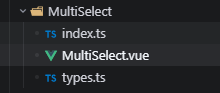
import MultiSelect from './MultiSelect.vue'

export { MultiSelect }
export default MultiSelect

// 导出类型
export type { MultiSelectOption, MultiSelectProps, MultiSelectEmits } from './types'

/**
 * @file MultiSelect 多选下拉组件类型定义
 * @description 定义多选下拉组件的选项、属性、事件等类型
 * @module components/MultiSelect/types
 */

/**
 * 选项数据结构
 */
export interface MultiSelectOption {
  /** 选项标签(显示文字) */
  label: string
  /** 选项值 */
  value: string | number
  /** 是否禁用该选项 */
  disabled?: boolean
  /** 其他自定义属性 */
  [key: string]: any
}

/**
 * 组件属性接口
 */
export interface MultiSelectProps {
  /** v-model 绑定值(选中值的数组) */
  modelValue: (string | number)[]
  /** 下拉选项列表 */
  options: MultiSelectOption[]
  /** 占位提示文字 */
  placeholder?: string
  /** 是否禁用整个组件 */
  disabled?: boolean
  /** 是否显示全选/取消全选/反选操作栏 */
  showToolbar?: boolean
  /** 是否显示模糊搜索框 */
  filterable?: boolean
  /** 自定义尺寸:large / default / small */
  size?: 'large' | 'default' | 'small'
  /** 是否清空支持 */
  clearable?: boolean
  /** 下拉面板最大高度(px) */
  maxHeight?: number
  /** 自定义过滤方法,返回 true 表示匹配 */
  filterMethod?: (query: string, option: MultiSelectOption) => boolean
}

/**
 * 组件事件接口
 */
export interface MultiSelectEmits {
  /** 更新 v-model */
  'update:modelValue': [value: (string | number)[]]
  /** 选中值变化时触发 */
  change: [value: (string | number)[], items: MultiSelectOption[]]
  /** 清空时触发 */
  clear: []
  /** 下拉框显示/隐藏切换 */
  visibleChange: [visible: boolean]
}