Vue3 横向滚动组件:利用 CSS 旋转实现优雅的图片画廊
效果图
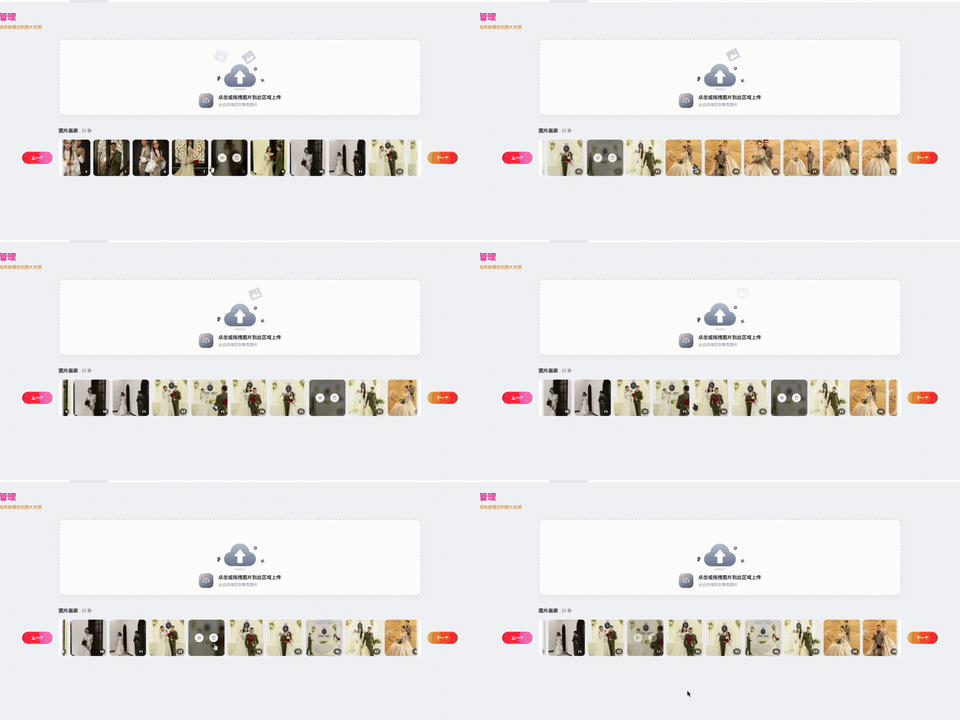
前言
在移动端和桌面端项目中,横向滚动展示图片或卡片是一种常见的交互模式。最直接的方式是使用 overflow-x: auto,但这种方式滚动条在底部,视觉体验不够优雅,用户需要用鼠标横向拖动,操作不够自然。
本文介绍一种利用 CSS transform: rotate(-90deg) 实现横向滚动的方案,滚动条在右侧,滚轮操作符合用户习惯,适合展示固定尺寸的图片或卡片列表。
一、核心思路
将容器旋转 -90 度,利用纵向滚动(overflow-y: auto)来模拟横向滚动效果。
原理:
- 容器旋转后,原本的纵向滚动变成了横向滚动
- 滚动条出现在右侧,而不是底部
- 用户滚动鼠标滚轮时,内容横向移动
优缺点分析:
优点:
- 滚动条在右侧,符合用户操作习惯
- 鼠标滚轮即可滚动,操作自然
- 无需复杂的 JavaScript 计算
- 纯 CSS 实现,性能好
缺点:
- 所有元素必须统一尺寸
- 代码可读性稍差,需要注释说明
- 屏幕阅读器无法理解旋转后的结构
二、HTML 结构
组件采用三层结构:外层容器、旋转滚动层、内容轨道。
html
<div class="waike">
  <div class="zhong">
    <div class="fileList">
      <div class="file-item" v-for="item in fileList">
        <img :src="item.url" />
        <span class="inums">{{ index + 1 }}</span>
      </div>
    </div>
  </div>
</div>
各层作用:
waike:外层容器,固定高度,控制可见区域zhong:旋转容器,核心滚动层fileList:内容轨道,flex 纵向排列file-item:每个内容项,回正显示
三、CSS 实现详解
3.1 外层容器
外层容器固定高度,作为内容的显示窗口。添加左右渐变遮罩,提示用户还有更多内容。
scss
.waike {
  position: relative;
  width: 100%;
  height: 130px;

  // 左渐隐遮罩
  &::after {
    position: absolute;
    top: 5px;
    left: 0;
    z-index: 2;
    width: 20px;
    height: 120px;
    content: '';
    background: linear-gradient(90deg, rgb(255 255 255) 50%, transparent);
    border-radius: 10px 0 0 10px;
  }

  // 右渐隐遮罩
  &::before {
    position: absolute;
    top: 5px;
    right: 0;
    z-index: 2;
    width: 20px;
    height: 120px;
    content: '';
    background: linear-gradient(90deg, transparent, rgb(255 255 255) 50%);
    border-radius: 0 10px 10px 0;
  }
}
3.2 旋转容器
这是整个方案的核心,通过旋转将纵向滚动变为横向滚动。
scss
.zhong {
  width: 120px;
  height: var(--container-width, 800px);
  padding: 20px 0;
  overflow-y: scroll;
  scrollbar-width: none;
  border-radius: 20px;
  transform: rotate(-90deg) translateX(-125px);
  transform-origin: top left;
  -ms-overflow-style: none;

  &::-webkit-scrollbar {
    display: none;
    width: 0;
    height: 0;
  }
}
关键属性解析:
| 属性 | 作用 |
|---|---|
width: 120px |
固定宽度,旋转后变成视觉高度 |
height: var(--container-width) |
动态高度,等于父容器宽度 |
transform: rotate(-90deg) |
逆时针旋转,纵向滚动变横向滚动 |
transform-origin: top left |
旋转锚点在左上角,保证位置可控 |
transform: translateX(-125px) |
向左平移,垂直居中校准 |
overflow-y: scroll |
纵向滚动,旋转后变成横向滚动 |
scrollbar-width: none |
隐藏滚动条 |
尺寸计算说明:
父容器高度:130px
容器宽度:120px(旋转后变成高度)
多余空间:130 - 120 = 10px
居中偏移:10 / 2 = 5px
平移距离:-(120 + 5) = -125px
3.3 内容轨道
内容轨道采用 flex 纵向排列,旋转后自动变成横向排列。
scss
.fileList {
  display: flex;
  flex-direction: column;
  gap: 10px;
  width: 120px;
}
由于父容器旋转了 -90 度:
flex-direction: column视觉上变成row- 元素纵向排列变成横向排列
gap成为元素之间的横向间距
3.4 每个内容项
每个内容项需要回正显示。
scss
.file-item {
  width: 120px;
  height: 120px;
  flex-shrink: 0;
  transform: rotate(90deg);
  border-radius: 10px;
  overflow: hidden;
  box-shadow: 0 2px 8px rgba(0, 0, 0, 0.08);

  img {
    width: 100%;
    height: 100%;
    object-fit: cover;
    display: block;
  }
}
父容器旋转了 -90 度,子元素也跟着旋转了,每个子元素再旋转 +90 度回正显示。
四、JavaScript 控制
Vue3 组件中需要动态更新容器尺寸,因为父容器宽度可能变化。
typescript
import { ref, onMounted, onBeforeUnmount, nextTick } from 'vue';

const waikeRef = ref<HTMLElement | null>(null);
const zhongRef = ref<HTMLElement | null>(null);

// 更新容器尺寸
const updateContainerWidth = () => {
  const el = waikeRef.value;
  if (!el) return;
  const width = el.offsetWidth;
  el.style.setProperty('--container-width', `${width}px`);
};

// 滚动到底部加载更多
const handleScroll = () => {
  const el = zhongRef.value;
  if (!el) return;
  if (el.scrollTop + el.clientHeight >= el.scrollHeight - 50) {
    // 触发加载更多
    emit('loadMore');
  }
};

onMounted(() => {
  nextTick(updateContainerWidth);
  window.addEventListener('resize', updateContainerWidth);
});

onBeforeUnmount(() => {
  window.removeEventListener('resize', updateContainerWidth);
});
注意: 这里控制的是 scrollTop(纵向滚动),因为容器旋转后,纵向滚动就是视觉上的横向移动。
五、完整组件代码
5.1 组件文件
ts
<!-- src/components/HorizontalScroll/index.vue -->
<script lang="ts" setup>
import { ref, onMounted, onBeforeUnmount, nextTick } from 'vue';

interface Props {
  itemSize?: number;
  gap?: number;
  parentHeight?: number;
}

const props = withDefaults(defineProps<Props>(), {
  itemSize: 120,
  gap: 10,
  parentHeight: 130,
});

const emit = defineEmits<{
  (e: 'loadMore'): void;
}>();

const wrapperRef = ref<HTMLElement | null>(null);
const scrollRef = ref<HTMLElement | null>(null);

// 计算平移距离
const offset = (props.parentHeight - props.itemSize) / 2;
const translateX = -(props.itemSize + offset);

// 更新容器尺寸
const updateSize = () => {
  const el = wrapperRef.value;
  if (!el) return;
  el.style.setProperty('--container-width', `${el.offsetWidth}px`);
};

// 滚动监听
const onScroll = () => {
  const el = scrollRef.value;
  if (!el) return;
  if (el.scrollTop + el.clientHeight >= el.scrollHeight - 50) {
    emit('loadMore');
  }
};

onMounted(() => {
  nextTick(updateSize);
  window.addEventListener('resize', updateSize);
});

onBeforeUnmount(() => {
  window.removeEventListener('resize', updateSize);
});
</script>

<template>
  <div ref="wrapperRef" class="hs-wrapper" :style="{ height: `${parentHeight}px` }">
    <div
      ref="scrollRef"
      class="hs-scroll"
      :style="{
        width: `${itemSize}px`,
        transform: `rotate(-90deg) translateX(${translateX}px)`,
        '--item-size': `${itemSize}px`,
        '--gap': `${gap}px`,
      }"
      @scroll="onScroll"
    >
      <div class="hs-track">
        <div v-for="(item, index) in $slots.default?.()" :key="index" class="hs-item">
          <slot :item="item" :index="index" />
        </div>
      </div>
    </div>
  </div>
</template>

<style lang="scss" scoped>
.hs-wrapper {
  position: relative;
  width: 100%;
  overflow: hidden;

  &::after,
  &::before {
    position: absolute;
    top: 5px;
    z-index: 2;
    width: 20px;
    height: calc(100% - 10px);
    content: '';
    pointer-events: none;
  }

  &::after {
    left: 0;
    background: linear-gradient(90deg, white 50%, transparent);
    border-radius: 10px 0 0 10px;
  }

  &::before {
    right: 0;
    background: linear-gradient(90deg, transparent, white 50%);
    border-radius: 0 10px 10px 0;
  }
}

.hs-scroll {
  height: var(--container-width, 800px);
  padding: 20px 0;
  overflow-y: scroll;
  scrollbar-width: none;
  transform-origin: top left;
  -ms-overflow-style: none;

  &::-webkit-scrollbar {
    display: none;
    width: 0;
    height: 0;
  }
}

.hs-track {
  display: flex;
  flex-direction: column;
  gap: var(--gap);
  width: var(--item-size);
}

.hs-item {
  width: var(--item-size);
  height: var(--item-size);
  flex-shrink: 0;
  transform: rotate(90deg);
  border-radius: 10px;
  overflow: hidden;

  :deep(*) {
    width: 100%;
    height: 100%;
    display: block;
    object-fit: cover;
  }
}
</style>
5.2 使用示例
vue
<template>
  <HorizontalScroll :item-size="150" :gap="16" @load-more="loadMore">
    <div v-for="img in images" :key="img.id">
      <img :src="img.url" :alt="img.name" />
    </div>
  </HorizontalScroll>
</template>

<script setup>
import HorizontalScroll from '@/components/HorizontalScroll/index.vue';

const images = ref([
  { id: 1, url: 'https://example.com/image1.jpg' },
  { id: 2, url: 'https://example.com/image2.jpg' },
]);

const loadMore = () => {
  console.log('滚动到底部,加载更多数据');
};
</script>
六、参数说明
| 参数 | 类型 | 默认值 | 说明 |
|---|---|---|---|
| itemSize | number | 120 | 每个元素的尺寸(正方形) |
| gap | number | 10 | 元素之间的间距 |
| parentHeight | number | 130 | 外层容器高度 |
| loadMore | event | - | 滚动到底部时触发 |
七、关键数值对照表
| 参数 | 数值 | 计算方式 |
|---|---|---|
| 父容器高度 | 130px | 固定值 |
| 元素尺寸 | 120px | 固定值 |
| 居中偏移 | 5px | (130 - 120) / 2 |
| translateX | -125px | -(120 + 5) |
| 容器宽度 | 120px | 等于元素尺寸 |
| 容器高度 | 父容器宽度 | 动态计算 |
| 旋转角度 | -90deg | 容器旋转 |
| 回正角度 | 90deg | 子元素回正 |
八、注意事项
- 所有元素必须统一尺寸:因为旋转后布局基于固定尺寸计算,不同尺寸会导致错位
- 父容器宽度变化时需要重新计算:使用 ResizeObserver 或 window resize 事件更新
- 滚动条被隐藏:如果需要滚动条指示,可以自定义滚动条样式或添加进度指示器
- 屏幕阅读器无法理解:如果项目需要无障碍支持,请考虑其他方案
结语
这个方案的核心思想是用 CSS transform 改变滚动方向,让纵向滚动呈现横向滚动的视觉效果。虽然有一些局限性(固定尺寸、可访问性),但在展示图片、卡片等固定尺寸内容的场景中,提供了良好的用户体验。
组件封装后开箱即用,只需传入内容即可实现横向滚动,适合图片画廊、商品展示、横向卡片列表等场景。