
Rust+Slint 实现侧滑菜单栏源码分享
- 一、效果展示
- 二、源码分享
- 三、实现原理
-
- [1、状态驱动 UI 更新](#1、状态驱动 UI 更新)
- [2、 动画与过渡效果](#2、 动画与过渡效果)
- [3、 手势交互实现](#3、 手势交互实现)
-
- [3.1 、按钮点击打开](#3.1 、按钮点击打开)
- [3.2、 右边缘拖拽](#3.2、 右边缘拖拽)
- [3.3、 遮罩点击关闭](#3.3、 遮罩点击关闭)
- [4、 位置计算与约束](#4、 位置计算与约束)
- [5、 数据绑定与列表渲染](#5、 数据绑定与列表渲染)
-
- [5.1、 数据结构定义](#5.1、 数据结构定义)
- [5.2、 列表动态渲染](#5.2、 列表动态渲染)
- 6、组件化设计
- 7、响应式布局
- 8、视觉层次与交互反馈
- 9、总结
一、效果展示
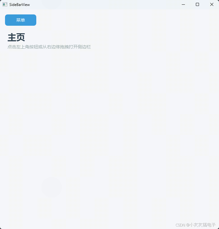
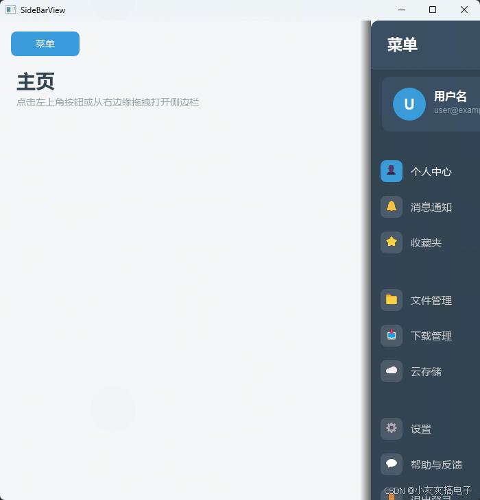
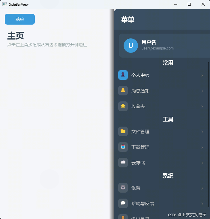
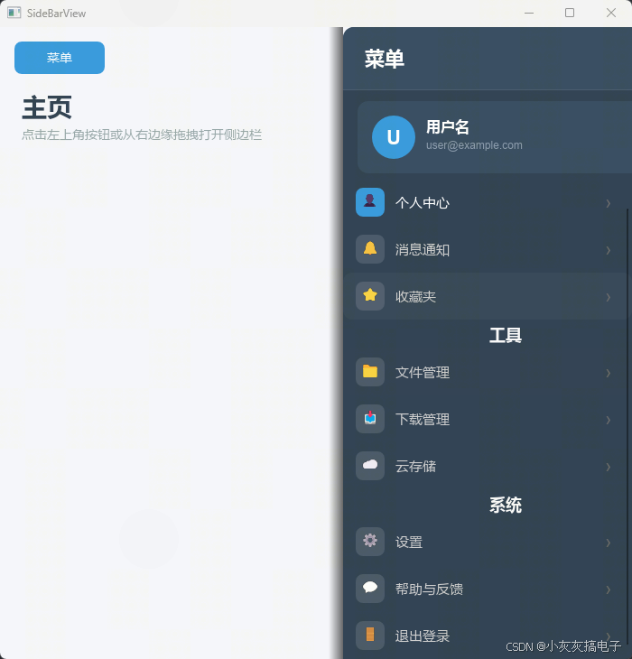
二、源码分享
1、工程结构
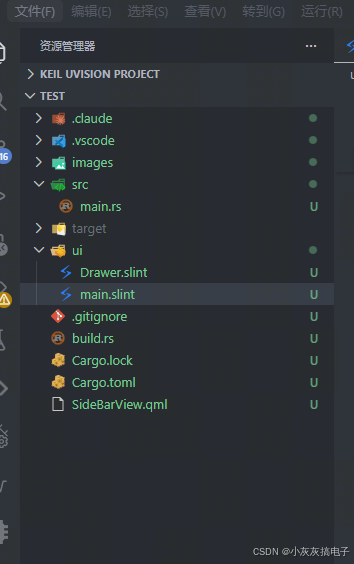
2、main.rs
rust
slint::include_modules!();

fn main() -> Result<(), slint::PlatformError> {
    let main_window = MainWindow::new()?;


    main_window.run()
}3、build.rs
rust
fn main(){
    slint_build::compile("ui/main.slint")
        .unwrap()
}
4、main.slint
rust
import { Drawer } from "Drawer.slint";


export component MainWindow inherits Window {
    preferred-width: 700px;
    preferred-height: 700px;
    title: "SideBarView";

    // ====== 主内容背景 ======
    Rectangle {
        x: 0;
        y: 0;
        width: root.width;
        height: root.height;
        background: #f5f6fa;

        Text {
            x: 24px;
            y: 70px;
            text: "主页";
            font-size: 28px;
            font-weight: 700;
            color: #2c3e50;
        }

        Text {
            x: 24px;
            y: 110px;
            text: "点击左上角按钮或从右边缘拖拽打开侧边栏";
            font-size: 14px;
            color: #95a5a6;
        }

        Rectangle {
            x: 16px;
            y: 16px;
            width: 100px;
            height: 36px;
            background: btn-touch.pressed ? #2980b9 : #3498db;
            border-radius: 8px;
            animate background { duration: 150ms; }

            btn-touch := TouchArea {
                clicked => { drawer.open = true; }
            }

            Text {
                text: "菜单";
                horizontal-alignment: center;
                vertical-alignment: center;
                color: white;
                font-size: 14px;
            }
        }
    }

    // ====== 抽屉组件 ======
    drawer := Drawer {
        x: 0;
        y: 0;
        width: root.width;
        height: root.height;
        drawer-width: 320px;

        // 菜单数据(扁平化:分组标题 + 菜单项混合)
        menu-data: [
            // 常用
            { is-header: true,  title: "常用",   label: "",        icon-text: "", is-active: false },
            { is-header: false, title: "",       label: "个人中心", icon-text: "👤", is-active: true  },
            { is-header: false, title: "",       label: "消息通知", icon-text: "🔔", is-active: false },
            { is-header: false, title: "",       label: "收藏夹",  icon-text: "⭐", is-active: false },
            // 工具
            { is-header: true,  title: "工具",   label: "",        icon-text: "", is-active: false },
            { is-header: false, title: "",       label: "文件管理", icon-text: "📁", is-active: false },
            { is-header: false, title: "",       label: "下载管理", icon-text: "📥", is-active: false },
            { is-header: false, title: "",       label: "云存储",  icon-text: "☁", is-active: false },
            // 系统
            { is-header: true,  title: "系统",   label: "",        icon-text: "", is-active: false },
            { is-header: false, title: "",       label: "设置",    icon-text: "⚙", is-active: false },
            { is-header: false, title: "",       label: "帮助与反馈", icon-text: "💬", is-active: false },
            { is-header: false, title: "",       label: "退出登录", icon-text: "🚪", is-active: false },
        ];

        // ---- 用户卡片(通过 @children 注入到 Drawer 内容区顶部)----
        Rectangle {
            x: 16px;
            y: 12px;
            width: parent.width - 32px;
            height: 80px;
            background: #34495e;
            border-radius: 12px;

            Rectangle {
                x: 16px;
                y: (parent.height - 48px) / 2;
                width: 48px;
                height: 48px;
                background: #3498db;
                border-radius: 24px;

                Text {
                    text: "U";
                    font-size: 22px;
                    font-weight: 700;
                    color: white;
                    horizontal-alignment: center;
                    vertical-alignment: center;
                }
            }

            Text {
                x: 76px;
                y: 18px;
                text: "用户名";
                font-size: 16px;
                font-weight: 600;
                color: white;
            }

            Text {
                x: 76px;
                y: 42px;
                text: "user@example.com";
                font-size: 12px;
                color: #8899aa;
            }
        }
    }
}
6、Drawer.slint
rust
// 右侧滑出抽屉组件 --- 使用 ListView 实现可滚动菜单
import { ListView } from "std-widgets.slint";

export struct MenuEntry {
    is-header: bool,
    title: string,
    label: string,
    icon-text: string,
    is-active: bool,
}

export component Drawer {
    in-out property <bool> open: false;
    in-out property <length> drawer-width: root.width / 2;
    in property <[MenuEntry]> menu-data: [];

    property <bool> dragging: false;
    property <length> drag-start-x: 0px;
    property <length> drag-start-drawer-x: 0px;
    property <length> current-pointer-x: 0px;

    property <length> panel-x: dragging
        ? clamp(
              drag-start-drawer-x + (current-pointer-x - drag-start-x),
              root.width - drawer-width,
              root.width,
          )
        : (open ? root.width - drawer-width : root.width);

    out property <float> open-fraction: clamp(
        (root.width - panel-x) / drawer-width * 1.0,
        0,
        1,
    );

    container := Rectangle {
        x: 0;
        y: 0;
        width: root.width;
        height: root.height;
        background: transparent;
        clip: true;

        // ====== 遮罩层 ======
        Rectangle {
            x: 0;
            y: 0;
            width: open ? max(0px, root.width - drawer-width) : 0px;
            height: root.height;
            background: black;
            opacity: open-fraction * 0.5;
            animate opacity { duration: 250ms; }

            overlay-touch := TouchArea {
                width: parent.width;
                height: parent.height;
                clicked => { open = false; }
            }
        }

        // ====== 抽屉面板 ======
        Rectangle {
            y: 0;
            width: drawer-width;
            height: root.height;
            x: panel-x;
            background: #2c3e50;
            border-top-left-radius: 12px;
            border-bottom-left-radius: 12px;
            visible: panel-x < root.width - 1px;
            animate x { duration: dragging ? 0ms : 280ms; easing: ease-in-out; }

            // 左侧阴影
            Rectangle {
                x: -16px;
                y: 0;
                width: 16px;
                height: parent.height;
                background: @linear-gradient(90deg, rgba(0,0,0,0), rgba(0,0,0,0.6));
            }

            // 标题栏
            Rectangle {
                x: 0;
                y: 0;
                width: drawer-width;
                height: 70px;
                background: #34495e;
                border-top-left-radius: 12px;

                Text {
                    x: 24px;
                    text: "菜单";
                    font-size: 22px;
                    font-weight: 600;
                    color: white;
                    vertical-alignment: center;
                }

                Rectangle {
                    x: 0;
                    y: parent.height - 1px;
                    width: drawer-width;
                    height: 1px;
                    background: #ffffff15;
                }
            }

            // 内容区域
            Rectangle {
                x: 0;
                y: 70px;
                width: drawer-width;
                height: root.height - 70px;
                background: #2c3e50;
                clip: true;

                // 用户卡片(@children 注入,放在 ListView 上方)
                @children

                // 可滚动菜单列表
                ListView {
                    x: 0;
                    y: 92px;
                    width: parent.width;
                    height: parent.height - 92px;

                    for entry[index] in menu-data: Rectangle {
                        height: entry.is-header ? 32px : 52px;
                        background: entry.is-header
                            ? transparent
                            : (item-touch.pressed
                                ? #ffffff30
                                : (item-touch.has-hover ? #ffffff20 : transparent));
                        border-radius: entry.is-header ? 0px : 10px;
                        animate background { duration: 150ms; }

                        item-touch := TouchArea {
                            x: 0;
                            y: 0;
                            width: parent.width;
                            height: parent.height;
                        }

                        // ---- 分组标题 ----
                        if entry.is-header : Rectangle {
                            y: 4px;
                            x: 20px;
                            height: 24px;
                            background: transparent;

                            Text {
                                width: parent.width;
                                text: entry.title;
                                font-size: 18px;
                                font-weight: 600;
                                color: #f8f8f8;
                                vertical-alignment: center;
                                horizontal-alignment: center;
                            }
                        }

                        // ---- 菜单项 ----
                        if !entry.is-header : Rectangle {
                            x: 14px;
                            width: 32px;
                            height: 32px;
                            y: (parent.height - 32px) / 2;
                            background: entry.is-active ? #3498db : #ffffff20;
                            border-radius: 8px;

                            Text {
                                text: entry.icon-text;
                                font-size: 16px;
                                color: entry.is-active ? white : #aaa;
                                horizontal-alignment: center;
                                vertical-alignment: center;
                            }
                        }

                        if !entry.is-header : Text {
                            x: 58px;
                            text: entry.label;
                            font-size: 15px;
                            color: entry.is-active ? white : #ccc;
                            vertical-alignment: center;
                        }

                        if !entry.is-header : Text {
                            x: parent.width - 36px;
                            text: "›";
                            font-size: 20px;
                            color: #666;
                            vertical-alignment: center;
                            horizontal-alignment: center;
                            width: 20px;
                        }
                    }
                }
            }
        }

        // ====== 右边缘拖拽条 ======
        Rectangle {
            x: root.width - 20px;
            y: 0;
            width: 20px;
            height: root.height;
            visible: !open;

            edge-touch := TouchArea {
                pointer-event(event) => {
                    if event.kind == PointerEventKind.down {
                        if !dragging {
                            dragging = true;
                            drag-start-x = self.mouse-x + (root.width - 20px);
                            drag-start-drawer-x = root.width;
                            current-pointer-x = self.mouse-x + (root.width - 20px);
                        }
                    }
                    if event.kind == PointerEventKind.move {
                        if dragging {
                            current-pointer-x = self.mouse-x + (root.width - 20px);
                        }
                    }
                    if event.kind == PointerEventKind.up {
                        if dragging {
                            if panel-x < root.width - drawer-width / 2 {
                                open = true;
                            } else {
                                open = false;
                            }
                            dragging = false;
                        }
                    }
                }
            }
        }
    }
}
7、Cargo.toml
rust
[package]
name = "chart"
version = "0.1.0"
edition = "2024"

[dependencies]
slint = { version = "1.16.1", features = ["renderer-winit-femtovg"] }

[build-dependencies]
slint-build = "1.16.1"
三、实现原理
本项目的抽屉式侧边栏实现基于 Rust + Slint 框架,主要包含以下几个核心原理:
1、状态驱动 UI 更新
Slint 采用声明式 UI 编程模型,所有界面变化都由状态(property)驱动。在本项目中:
open属性:控制抽屉的打开/关闭状态dragging属性:跟踪用户是否正在拖拽panel-x属性:计算抽屉面板的实时 X 坐标位置
这些属性通过绑定表达式相互关联,当任一属性变化时,UI 会自动更新。
2、 动画与过渡效果
抽屉的平滑动画通过 Slint 的 animate 关键字实现:
rust
animate x { duration: dragging ? 0ms : 280ms; easing: ease-in-out; }- 拖拽时 :
duration: 0ms,实现实时跟随手指移动 - 释放时 :
duration: 280ms,使用缓动函数实现平滑过渡 - 遮罩透明度 :
animate opacity { duration: 250ms; }实现淡入淡出效果
3、 手势交互实现
3.1 、按钮点击打开
rust
btn-touch := TouchArea {
    clicked => { drawer.open = true; }
}
点击左上角按钮时,直接将 open 属性设为 true。
3.2、 右边缘拖拽
rust
edge-touch := TouchArea {
    pointer-event(event) => {
        if event.kind == PointerEventKind.down {
            // 开始拖拽,记录起始位置
        }
        if event.kind == PointerEventKind.move {
            // 实时更新面板位置
        }
        if event.kind == PointerEventKind.up {
            // 根据位置决定最终状态
            if panel-x < root.width - drawer-width / 2 {
                open = true;
            } else {
                open = false;
            }
        }
    }
}
3.3、 遮罩点击关闭
rust
overlay-touch := TouchArea {
    clicked => { open = false; }
}
4、 位置计算与约束
抽屉面板的位置通过数学计算实现:
rust
property <length> panel-x: dragging
    ? clamp(
          drag-start-drawer-x + (current-pointer-x - drag-start-x),
          root.width - drawer-width,
          root.width,
      )
: (open ? root.width - drawer-width : root.width);clamp()函数 :确保面板位置在[root.width - drawer-width, root.width]范围内- 拖拽时:基于起始位置和偏移量计算实时位置
- 非拖拽时 :根据
open状态决定最终位置
5、 数据绑定与列表渲染
5.1、 数据结构定义
rust
export struct MenuEntry {
    is-header: bool,
    title: string,
    label: string,
    icon-text: string,
    is-active: bool,
}
5.2、 列表动态渲染
rust
ListView {
    for entry[index] in menu-data: Rectangle {
        // 根据 entry.is-header 渲染不同样式
        if entry.is-header : Rectangle { ... }
        if !entry.is-header : Rectangle { ... }
    }
}
6、组件化设计
项目采用模块化设计,将抽屉功能封装为独立组件:
Drawer.slint:独立的抽屉组件,可复用MainWindow:主窗口,通过import { Drawer }引入@children插槽:允许主窗口向抽屉注入自定义内容(如用户卡片)
7、响应式布局
- 相对定位 :使用
root.width、root.height实现自适应 - 百分比计算 :
open-fraction属性计算打开比例 - 动态宽度 :
drawer-width属性可配置,默认root.width / 2
8、视觉层次与交互反馈
- 状态反馈:按钮按下状态、菜单项悬停/激活状态
- 阴影效果:左侧渐变阴影增强层次感
- 圆角设计:面板圆角提升视觉友好度
- 颜色系统:使用 Material Design 风格的配色方案
9、总结
本实现的核心优势:
- 性能高效:Rust 编译为原生代码,无 GC 停顿
- 声明式 UI:状态变化自动驱动界面更新
- 手势友好:支持点击、拖拽多种交互方式
- 组件化:抽屉组件可独立复用
- 动画流畅:硬件加速的平滑过渡效果
这种实现方式既保证了性能,又提供了良好的用户体验,适合需要高性能 GUI 的桌面应用场景。
