Rust+Slint 实现点击水波纹扩散效果按钮源码分享
- 一、效果展示
- 二、源码分享
- 三、实现原理
-
- 1、组件结构与属性设计
- [2、 水波纹的绘制与动画](#2、 水波纹的绘制与动画)
- [3、 交互与动画触发](#3、 交互与动画触发)
- [4、 视觉细节优化](#4、 视觉细节优化)
- [5、 整体工作流程](#5、 整体工作流程)
一、效果展示
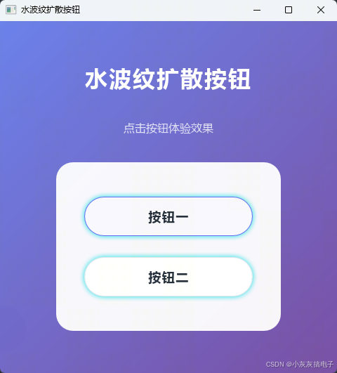
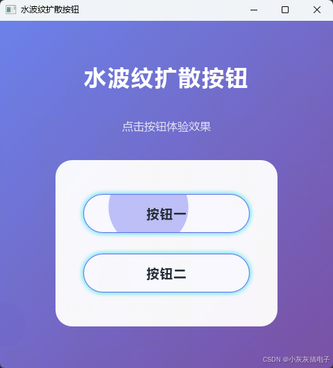
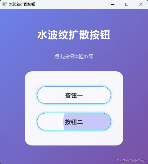
二、源码分享
1、工程结构
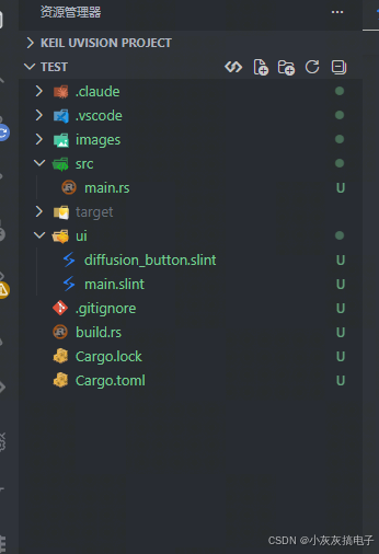
2、main.rs
rust
slint::include_modules!();

fn main() -> Result<(), slint::PlatformError> {
    let main_window = MainWindow::new()?;
    main_window.run()
}3、build.rs
rust
fn main() {
    // 编译 Slint UI
    slint_build::compile("ui/main.slint").unwrap();
}
4、main.slint
rust
import { DiffusionButton } from "./diffusion_button.slint";

export component MainWindow inherits Window {
    preferred-width: 600px;
    preferred-height: 500px;
    title: "水波纹扩散按钮";
    background: @linear-gradient(135deg, #667eea 0%, #764ba2 100%);

    VerticalLayout {
        alignment: center;
        spacing: 40px;
        padding-left: 80px;
        padding-right: 80px;
        padding-top: 60px;
        padding-bottom: 60px;

        // 标题
        Text {
            text: "水波纹扩散按钮";
            font-size: 32px;
            font-weight: 700;
            color: white;
            horizontal-alignment: center;
            letter-spacing: 2px;
        }

        // 副标题
        Rectangle {
            height: 20px;
            background: transparent;
            Text {
                text: "点击按钮体验效果";
                font-size: 16px;
                color: rgba(255, 255, 255, 0.8);
                horizontal-alignment: center;
                vertical-alignment: center;
            }
        }

        // 按钮容器
        Rectangle {
            background: rgba(255, 255, 255, 0.95);
            border-radius: 24px;
            height: 240px;
            width: 320px;

            VerticalLayout {
                alignment: center;
                spacing: 30px;
                padding: 40px;

                DiffusionButton {
                    text: "按钮一";
                    button-width: 240px;
                    button-height: 56px;
                }

                DiffusionButton {
                    text: "按钮二";
                    button-width: 240px;
                    button-height: 56px;
                }
            }
        }
    }
}
5、diffusion_button.slint
rust
export component DiffusionButton inherits Rectangle {
    // 输入属性
    in property <string> text;
    in property <length> button-width: 220px;
    in property <length> button-height: 60px;
    in property <color> button-bg: #ffffff;
    in property <color> ripple-color: #6366f1;  // 靛蓝色,更现代
    in property <color> text-color: #1f2937;  // 深灰色文字

    // 动画状态(内部属性)
    property <length> ripple-center-x: 0px;
    property <length> ripple-center-y: 0px;
    property <float> anim-progress: 0.0;
    property <bool> animating: false;
    property <bool> hovered: false;

    drop-shadow-color:#0edde4;
    drop-shadow-blur: 10px;

    // 派生属性
    property <length> ripple-size: root.button-width * 1.5 * root.anim-progress;
    property <float> ripple-opacity: 0.6 - (0.6 * root.anim-progress);

    // 按钮主体
    width: root.button-width;
    height: root.button-height;
    border-radius: root.button-height / 2;
    background: root.button-bg;
    border-width: 1px;
    border-color: hovered ? root.ripple-color : #e5e7eb;
    clip: true;

    // 悬停时的背景高亮
    Rectangle {
        width: root.width;
        height: root.height;
        border-radius: root.height / 2;
        background: root.hovered ? rgba(99, 102, 241, 0.05) : transparent;
    }

    // 水波纹圆形
    Rectangle {
        x: root.ripple-center-x - root.ripple-size / 2;
        y: root.ripple-center-y - root.ripple-size / 2;
        width: root.ripple-size;
        height: root.ripple-size;
        border-radius: root.ripple-size / 2;
        background: root.ripple-color;
        opacity: root.ripple-opacity;
    }

    // 按钮文字
    Text {
        text: root.text;
        font-size: 18px;
        font-weight: 600;
        letter-spacing: 1.5px;
        horizontal-alignment: center;
        vertical-alignment: center;
        color: root.text-color;
    }

    // 触摸区域
    touch := TouchArea {
        width: root.width;
        height: root.height;
        mouse-cursor: pointer;

        clicked => {
            root.ripple-center-x = self.mouse-x;
            root.ripple-center-y = self.mouse-y;
            root.anim-progress = 0.0;
            root.animating = true;
        }

        pointer-event => {
            root.hovered = self.has-hover;
        }
    }

    // 动画定时器
    Timer {
        interval: 16ms;
        running: root.animating;
        triggered => {
            root.anim-progress = root.anim-progress + (16.0 / 400.0);
            if root.anim-progress >= 1.0 {
                root.anim-progress = 1.0;
                root.animating = false;
            }
        }
    }
}
6、Cargo.toml
rust
[package]
name = "sokoban"
version = "0.1.0"
edition = "2024"

[dependencies]
slint = "1.16.1"

[build-dependencies]
slint-build = "1.16.1"
三、实现原理
本水波纹扩散效果按钮的实现基于 Slint UI 框架 的声明式语法和动画系统,核心原理可分为以下几个部分:
1、组件结构与属性设计
DiffusionButton 组件继承自 Rectangle,通过属性(property)系统管理状态:
- 输入属性 :如
text(按钮文字)、button-width、button-height、button-bg、ripple-color(水波纹颜色)、text-color,用于外部定制样式。 - 内部动画状态属性 :
ripple-center-x、ripple-center-y:记录点击位置的坐标,决定水波纹扩散的中心点。anim-progress:动画进度值(0.0 ~ 1.0),驱动水波纹大小和透明度的变化。animating:布尔值,控制动画定时器的启停。hovered:记录鼠标悬停状态,用于切换边框颜色和显示背景高亮。
- 视觉增强属性 :
drop-shadow-color和drop-shadow-blur:为按钮添加投影效果,提升立体感。
2、 水波纹的绘制与动画
水波纹本身是一个 Rectangle(圆形),其关键属性由派生属性(property binding)实时计算:
rust
property <length> ripple-size: root.button-width * 1.5 * root.anim-progress;
property <float> ripple-opacity: 0.6 - (0.6 * root.anim-progress);ripple-size:水波纹直径随anim-progress线性增大,最大可达按钮宽度的 1.5 倍,确保波纹能完全覆盖按钮区域。ripple-opacity:透明度随进度从 0.6 线性衰减到 0,实现波纹逐渐淡出的视觉效果。
圆形的位置通过 x 和 y 绑定到 ripple-center-x/y 并减去半径,确保圆心始终位于点击点。
3、 交互与动画触发
- 点击事件 :
TouchArea的clicked回调中,将当前鼠标坐标(self.mouse-x/y)赋值给ripple-center-x/y,重置anim-progress为 0,并设置animating = true启动动画。 - 悬停反馈 :
pointer-event回调更新hovered状态,用于切换边框颜色和显示半透明背景,提升交互感知。 - 动画驱动 :
Timer以 16ms(约 60 FPS)的间隔运行,每次触发将anim-progress增加16.0 / 400.0(即 400ms 完成整个动画)。当进度达到 1.0 时,停止定时器。
4、 视觉细节优化
- 裁剪(clip) :根矩形设置
clip: true,确保水波纹不会溢出按钮的圆角边界。 - 边框交互:悬停时边框颜色变为水波纹颜色,非悬停时为浅灰色,增强状态反馈。
- 背景高亮 :悬停时添加一个半透明背景层(
rgba(99, 102, 241, 0.05)),使按钮在鼠标移入时略有"浮起"感。 - 投影效果 :通过
drop-shadow-color和drop-shadow-blur为按钮添加柔和投影,增强立体感和现代感。
5、 整体工作流程
- 用户点击 → 记录点击坐标,重置动画进度,启动定时器。
- 定时器每帧更新 →
anim-progress增加,ripple-size和ripple-opacity自动重新计算。 - UI 重绘 → 水波纹圆形的位置、大小、透明度随之变化,形成扩散并淡出的动画。
- 动画结束 →
anim-progress达到 1.0,定时器停止,水波纹保持最大尺寸并完全透明(不可见)。
这种实现方式完全在 Slint 的声明式系统 中完成,无需手动操作 DOM 或 CSS,体现了现代 UI 框架数据驱动 和响应式的设计优势。
