整理旧电脑上的一些笔记
【前言】
今天继续整理 ConstraintLayout。
ConstraintLayout 的特点:
- 扁平布局,无嵌套,一个层级就可以绘制复杂布局;
- 渲染性能高;
- 集合了线性布局、相对布局、百分比布局的特点和大多数功能;
- 支持可视化环境下拖拽绘制约束布局;
- 轻松地为应用中使用的 UI 组件添加动画效果。
1. 引导线约束(Guideline)
APP 开发过程中经常遇到一个场景就是为了保证控件和设计图对齐,会手动绘制一条或多条其他颜色的水平(竖直)线,来方便统一边界。而 ConstraintLayout 中的 Guideline 引导线(辅助线)同样具有相同功能,但用户看不到该线。
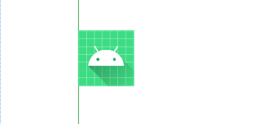
Guideline 设计出来仅用于布局目的,而且它仅可以在 ConstraintLayout 布局内生效。
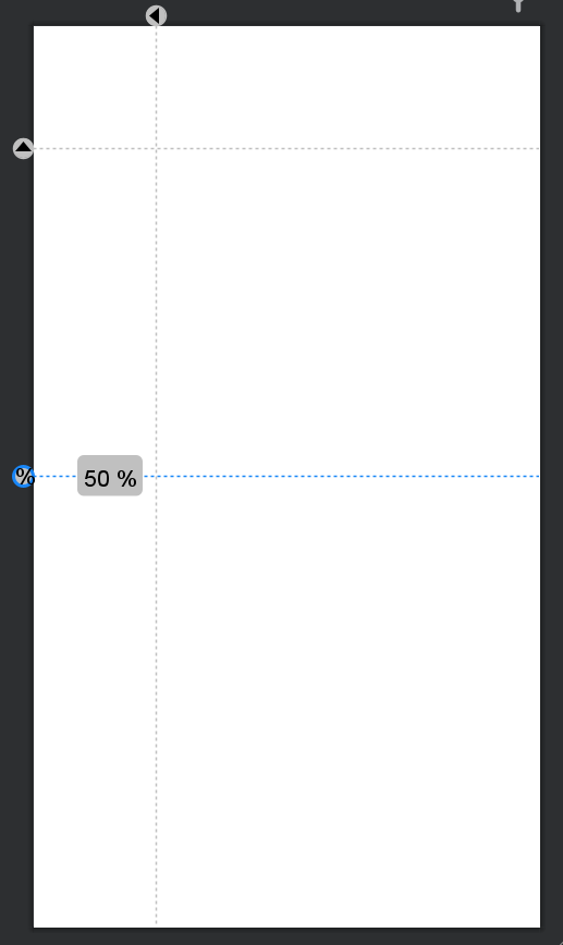
Guideline 分为水平 和垂直两种,支持三种定位方式:
- layout_constraintGuide_begin:指定引导线距父布局左侧或顶部的固定距离;
- layout_constraintGuide_end:指定引导线距父布局右侧或底部的固定距离;
- layout_constraintGuide_percent:指定引导线距父布局宽度或高度的百分比位置。
xml
<androidx.constraintlayout.widget.ConstraintLayout xmlns:android="http://schemas.android.com/apk/res/android"
    xmlns:app="http://schemas.android.com/apk/res-auto"
    android:layout_width="match_parent"
    android:layout_height="match_parent">

    <androidx.constraintlayout.widget.Guideline
        android:id="@+id/guideline_ver"
        android:layout_width="wrap_content"
        android:layout_height="wrap_content"
        android:orientation="vertical"
        app:layout_constraintGuide_begin="100dp" />

    <androidx.constraintlayout.widget.Guideline
        android:id="@+id/guideline_hor"
        android:layout_width="wrap_content"
        android:layout_height="wrap_content"
        android:orientation="horizontal"
        app:layout_constraintGuide_begin="100dp" />

    <androidx.constraintlayout.widget.Guideline
        android:id="@+id/guideline_percent"
        android:layout_width="wrap_content"
        android:layout_height="wrap_content"
        android:orientation="horizontal"
        app:layout_constraintGuide_percent="0.5" />

</androidx.constraintlayout.widget.ConstraintLayout>
预览图如下:
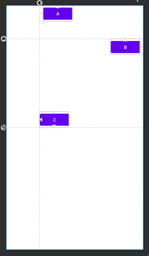
控件可以通过约束关系绑定 Guideline,如下面代码所示:
xml
<androidx.constraintlayout.widget.ConstraintLayout xmlns:android="http://schemas.android.com/apk/res/android"
    xmlns:app="http://schemas.android.com/apk/res-auto"
    android:layout_width="match_parent"
    android:layout_height="match_parent">

    <androidx.constraintlayout.widget.Guideline
        android:id="@+id/guideline_ver"
        android:layout_width="wrap_content"
        android:layout_height="wrap_content"
        android:orientation="vertical"
        app:layout_constraintGuide_begin="100dp" />

    <androidx.constraintlayout.widget.Guideline
        android:id="@+id/guideline_hor"
        android:layout_width="wrap_content"
        android:layout_height="wrap_content"
        android:orientation="horizontal"
        app:layout_constraintGuide_begin="100dp" />

    <androidx.constraintlayout.widget.Guideline
        android:id="@+id/guideline_percent"
        android:layout_width="wrap_content"
        android:layout_height="wrap_content"
        android:orientation="horizontal"
        app:layout_constraintGuide_percent="0.5" />

    <Button
        android:layout_width="wrap_content"
        android:layout_height="wrap_content"
        android:layout_marginStart="10dp"
        android:text="A"
        app:layout_constraintStart_toStartOf="@id/guideline_ver"
        app:layout_constraintTop_toTopOf="parent" />

    <Button
        android:layout_width="wrap_content"
        android:layout_height="wrap_content"
        android:layout_marginEnd="10dp"
        android:text="B"
        app:layout_constraintEnd_toEndOf="parent"
        app:layout_constraintTop_toBottomOf="@+id/guideline_hor" />

    <Button
        android:layout_width="wrap_content"
        android:layout_height="wrap_content"
        android:layout_marginEnd="10dp"
        android:text="C"
        app:layout_constraintBottom_toTopOf="@id/guideline_percent"
        app:layout_constraintStart_toEndOf="@id/guideline_ver" />

</androidx.constraintlayout.widget.ConstraintLayout>
预览图如下:
2.屏障约束(Barrier)
Barrier 和 Guideline 一样都是不可见,都是用来帮助定位的控件。但在使用场景上不一样。比如有下面这样一种布局:
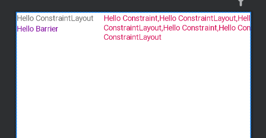
有三个TextView,
- TextView_1显示"Hello ConstraintLayout";
- TextView_2显示"Hello Barrier";
- TextView_3显示多条"Hello ConstraintLayout,Hello ConstraintLayout..."。
很明显 TextView_1 中显示的内容宽度比 TexView_2 中内容宽度大,TextView_3 和 TextView_1 有约束 (layout_constraintStart_toEndOf="@id/tv_1") ,当前界面三个 TextView 显示都是正常的,但是当我们点击按钮【改变文字内容】就会出现下面视频中的问题。
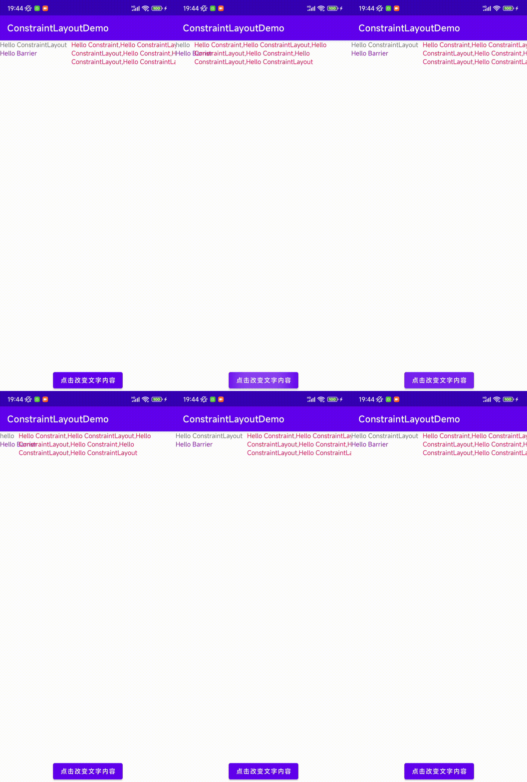
TextView_1文字内容变少,TextView_3遮挡了TextView_2。
如何解决?我们可以使用 LinearLayout 把 TextView_1 和 TextView_2 作为子 view,然后让TextView_3 和 LinearLayout 有约束。但是这意味着我们增加了新的层级布局。这不是我们希望的,这种时候就是 Barrier 大显身手的时候了。
Barrier 属性包括:
- barrierDirection="start|end|top|bottom|left|right":必选属性,设置barrier相对于view(referenced_ids设置的)的位置(屏障的方向);
- constraint_referenced_ids="id1,id2,id3...":必选属性,view的id;
- barrierAllowsGoneWidgets="true|false":可选属性,是否包含GONE状态下的View;
- barrierMargin="具体值":设置barrier外边距。
仅看文字可能不好理解,我们直接看代码演示:
xml
<androidx.constraintlayout.widget.ConstraintLayout xmlns:android="http://schemas.android.com/apk/res/android"
    xmlns:app="http://schemas.android.com/apk/res-auto"
    android:layout_width="match_parent"
    android:layout_height="match_parent">

    <TextView
        android:id="@+id/tv_1"
        android:layout_width="wrap_content"
        android:layout_height="wrap_content"
        android:text="Hello ConstraintLayout"
        app:layout_constraintStart_toStartOf="parent"
        app:layout_constraintTop_toTopOf="parent" />

    <TextView
        android:id="@+id/tv_2"
        android:layout_width="wrap_content"
        android:layout_height="wrap_content"
        android:text="Hello Barrier"
        android:textColor="#8E24AA"
        app:layout_constraintStart_toStartOf="parent"
        app:layout_constraintTop_toBottomOf="@id/tv_1" />

    <androidx.constraintlayout.widget.Barrier
        android:id="@+id/barrier"
        android:layout_width="wrap_content"
        android:layout_height="wrap_content"
        app:barrierAllowsGoneWidgets="true"
        app:barrierDirection="end"
        app:barrierMargin="10dp"
        app:constraint_referenced_ids="tv_1,tv_2" />

    <TextView
        android:id="@+id/tv_3"
        android:layout_width="wrap_content"
        android:layout_height="wrap_content"
        android:layout_marginStart="10dp"
        android:text="Hello Constraint,Hello ConstraintLayout,Hello ConstraintLayout,Hello Constraint,Hello ConstraintLayout,Hello ConstraintLayout"
        android:textColor="#D81B60"
        app:layout_constraintStart_toEndOf="@id/barrier"
        app:layout_constraintTop_toTopOf="parent" />

    <Button
        android:id="@+id/btn_change"
        android:layout_width="wrap_content"
        android:layout_height="wrap_content"
        android:text="点击改变文字内容"
        app:layout_constraintBottom_toBottomOf="parent"
        app:layout_constraintEnd_toEndOf="parent"
        app:layout_constraintStart_toStartOf="parent" />
</androidx.constraintlayout.widget.ConstraintLayout>
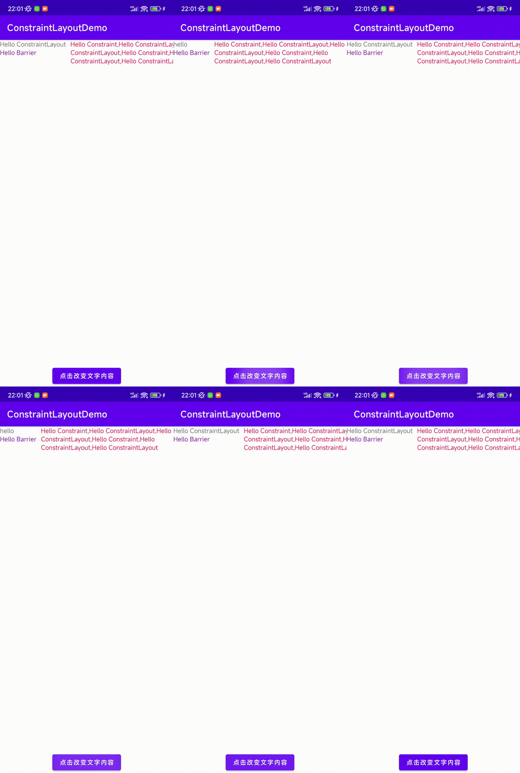
示例中 barrierDirection="end"、constraint_referenced_ids="tv_1,tv_2",代表的就是我们把 barrier设置到 tv_1 和 tv_2 两个 View 的 end 位置,如果改为 start,就代表把 barrier 设置到 tv_1 和 tv_2两个 View 的开始位置,即 barrier 紧贴屏幕左侧。
使用 Barrier 效果:
3. 组(Group)
ConstraintLayout 没有层级嵌套,大大提高了UI性能和减少卡顿,但是也带了一个新的使用问题。在LinearLayout 或 RelativeLayout 布局中,当我们需要让多个 View 隐藏时候,我们可以直接隐藏父布局。ConstraintLayout 下,则需要针对每个 view 进行 setVisible(View.INVISIBLE|View.VISIBLE) !如此简单又多见的场景,Android 不可能没有想到------Group 正是用来解决这个问题的。
This class controls the visibility of a set of referenced widgets. Widgets are referenced by being added to a comma separated list of ids, The visibility of the group will be applied to the referenced widgets. It's a convenient way to easily hide/show a set of widgets without having to maintain this set programmatically.
Group 被用来控制一组被引用控件的可见性,将控件ID添加到以逗号分隔的列表中。代码如下:
xml
    <ImageView
        android:id="@+id/iv_loading"
        android:layout_width="wrap_content"
        android:layout_height="wrap_content"
        android:src="@drawable/icon_loading"
        app:layout_constraintBottom_toBottomOf="parent"
        app:layout_constraintEnd_toEndOf="parent"
        app:layout_constraintStart_toStartOf="parent"
        app:layout_constraintTop_toTopOf="parent" />

    <TextView
        android:id="@+id/tv_loading"
        android:layout_width="wrap_content"
        android:layout_height="wrap_content"
        android:text="正在加载..."
        app:layout_constraintEnd_toEndOf="parent"
        app:layout_constraintStart_toStartOf="parent"
        app:layout_constraintTop_toBottomOf="@+id/iv_loading" />

    <androidx.constraintlayout.widget.Group
        android:id="@+id/group_loading"
        android:layout_width="wrap_content"
        android:layout_height="wrap_content"
        android:visibility="visible"
app:constraint_referenced_ids="iv_loading,tv_loading" />当想要将ImageView 和 TextView 都隐藏时,我们可以这样写:
kotlin
val group = findViewById<Group>(R.id.group_loading)
val btn = findViewById<Button>(R.id.btn_1)
btn.setOnClickListener {
if (group.visibility == View.VISIBLE) {
    	group.visibility = View.INVISIBLE
	} else {
   		group.visibility = View.VISIBLE
	}
}

//没有Group的话,需要将每个View设置可见、不可见
loadingImg.visibility = View.INVISIBLE
loadingTxt.visibility = View.INVISIBLE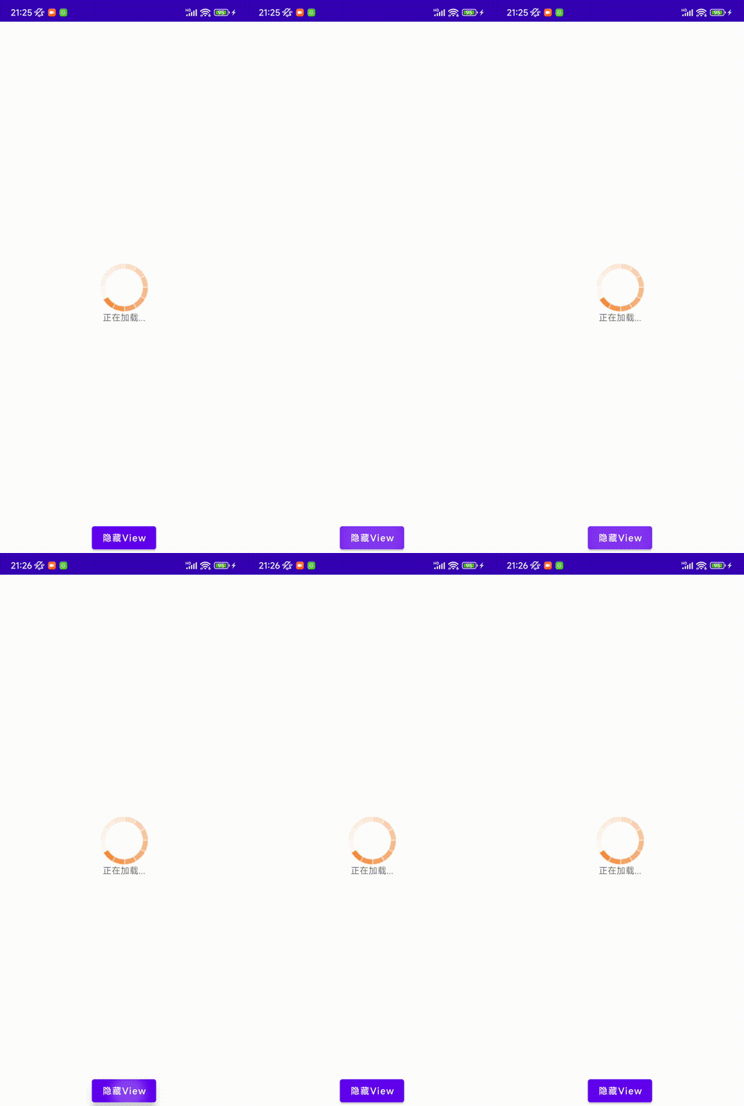
4. 占位符(Placeholder)
ConstraintLayout 还提供一个新的控件叫 Placeholder,它是一个空的,可定位的占位区域,很好的解决了某些场景下布局动态改变和复用问题。
A
Placeholderprovides a virtual object which can position an existing object.
Placeholder 的核心概念:
- 虚拟定位:
Placeholder本身不显示任何内容,仅在布局中占据位置; - 内容替换:
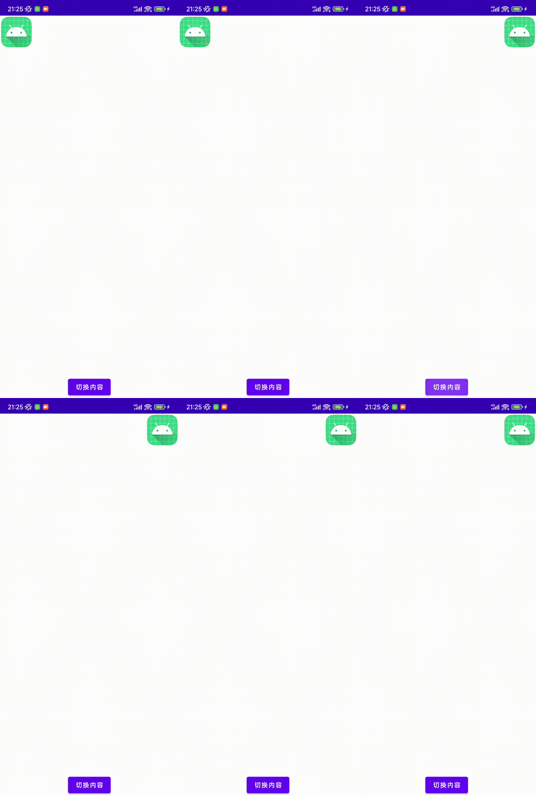
Placeholder提供方法setContent(viewId),viewId是新视图ID,Placeholder占据的位置就会显示传入的viewId; - 位置迁移:旧位置的viewId会消失(GONE)。
Placeholder 可以在XML布局中使用属性 app:content="view_id" 来直接指定视图,也可以使用方法 setContentId(view_id) 在运行的Kotlin/Java代码中动态更改。
xml
    <ImageView
        android:id="@+id/iv_android"
        android:layout_width="wrap_content"
        android:layout_height="wrap_content"
        android:src="@mipmap/ic_launcher"
        app:layout_constraintStart_toStartOf="parent"
        app:layout_constraintTop_toTopOf="parent" />

    <androidx.constraintlayout.widget.Placeholder
        android:id="@+id/placeholder"
        android:layout_width="wrap_content"
        android:layout_height="wrap_content"
        app:content="@id/iv_android"
        app:layout_constraintEnd_toEndOf="parent"
        app:layout_constraintTop_toTopOf="parent" />

    <Button
        android:id="@+id/btn_change"
        android:layout_width="wrap_content"
        android:layout_height="wrap_content"
        android:text="切换内容"
        app:layout_constraintBottom_toBottomOf="parent"
        app:layout_constraintEnd_toEndOf="parent"
        app:layout_constraintStart_toStartOf="parent" />
在Kotlin代码中动态改变:
kotlin
        val image = findViewById<ImageView>(R.id.iv_android)
        val placeholder = findViewById<Placeholder>(R.id.placeholder)
        val btn = findViewById<Button>(R.id.btn_change)
        btn.setOnClickListener {
            placeholder.setContentId(R.id.iv_android)
        }
5. 参考资料
-
ConstraintLayout Developers:https://developer.android.google.cn/develop/ui/views/layout/constraint-layout?hl=zh_cn
-
GitHub资料:https://github.com/android/views-widgets-samples/tree/main/ConstraintLayoutExamples
-
Group:https://developer.android.google.cn/reference/androidx/constraintlayout/widget/Group?hl=en
-
Placeholder:https://developer.android.google.cn/reference/kotlin/androidx/constraintlayout/widget/Placeholder?hl=en