图片遮罩
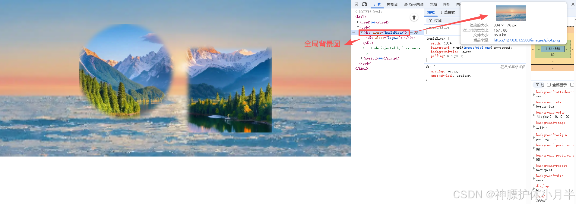
- hasBgBlock 盒子,背景图为 pic4,仅用于观察渐变过渡效果,可忽略
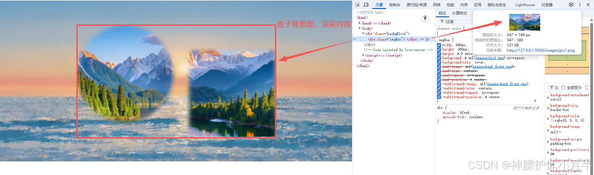
- imgBox 盒子
- 背景图为 pic1
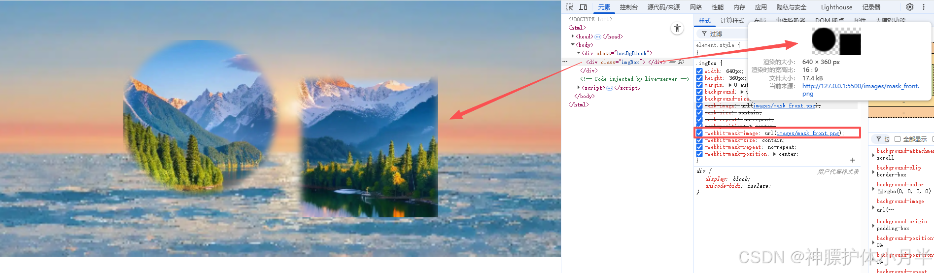
- 遮罩图层为 mask_front
- mask-image 的 url 属性生效后,会按照 url 中图片的形状来遮罩背景图
html
<div class="hasBgBlock">
  <div class="imgBox"></div>
</div>
<style>
  html,
  body {
    margin: 0;
    padding: 0;
  }

  .hasBgBlock {
    width: 100%;
    background: url("images/pic4.png") no-repeat;
    background-size: cover;
    padding: 80px 0;
  }

  .imgBox {
    width: 640px;
    height: 360px;
    margin: 0 auto;
    background: url("images/pic1.png") no-repeat;
    background-size: cover;

    /* 标准属性 */
    mask-image: url('images/mask_front.png');
    mask-size: contain;
    mask-repeat: no-repeat;
    mask-position: center;

    /* 旧版适配 */
    -webkit-mask-image: url('images/mask_front.png');
    -webkit-mask-size: contain;
    -webkit-mask-repeat: no-repeat;
    -webkit-mask-position: center;
  }
</style>
渐变效果
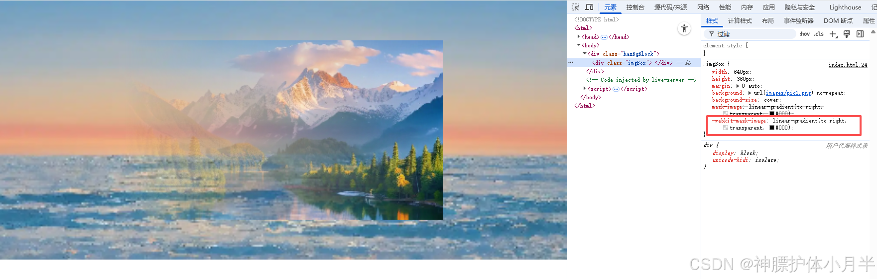
- hasBgBlock 盒子,背景图为 pic4,仅用于观察渐变过渡效果,可忽略
- imgBox 盒子
- 背景图为 pic1
- 遮罩图层设置为线性渐变从右到左,从透明到显示
- 色号 #000,可以替换为其他任何非透明颜色
html
<div class="hasBgBlock">
  <div class="imgBox"></div>
</div>
<style>
  html,
  body {
    margin: 0;
    padding: 0;
  }

  .hasBgBlock {
    width: 100%;
    background: url("images/pic4.png") no-repeat;
    background-size: cover;
    padding: 80px 0;
  }

  .imgBox {
    width: 640px;
    height: 360px;
    margin: 0 auto;
    background: url("images/pic1.png") no-repeat;
    background-size: cover;

    mask-image: linear-gradient(to right, transparent, #000);
    -webkit-mask-image: linear-gradient(to right, transparent, #000);
  }
</style>
demo
- 线性渐变 demo
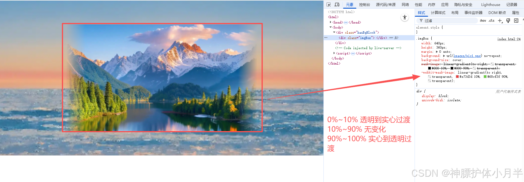
css
mask-image: linear-gradient(to right, transparent, #e73d3d 10%, #68cf3f 90%, transparent);
-webkit-mask-image: linear-gradient(to right, transparent, #e73d3d 10%, #68cf3f 90%, transparent);- 径向渐变 demo
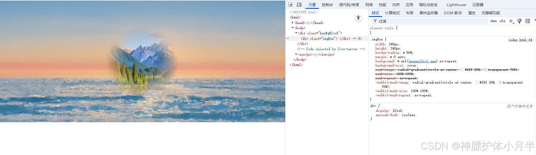
css
mask-image: radial-gradient(circle at center, #fff 30%, transparent 70%);
mask-size: 100% 100%;
mask-repeat: no-repeat;
-webkit-mask-image: radial-gradient(circle at center, #fff 30%, transparent 70%);
-webkit-mask-size: 100% 100%;
-webkit-mask-repeat: no-repeat;