<!DOCTYPE html>
<html lang="zh-CN">
<head>
<meta charset="UTF-8">
<meta name="viewport" content="width=device-width, initial-scale=1.0">
<title>智慧文旅数字人体验平台 - 3D透视版</title>
<style>
* {
margin: 0;
padding: 0;
box-sizing: border-box;
font-family: "Microsoft Yahei", sans-serif;
}
body {
background: #0a1a24;
color: #d0f0ff;
min-height: 100vh;
background-image:
radial-gradient(circle at 20% 30%, rgba(0, 200, 255, 0.05) 0%, transparent 50%),
radial-gradient(circle at 80% 70%, rgba(0, 200, 255, 0.05) 0%, transparent 50%);
overflow: hidden;
}
.app-container {
width: 100%;
min-height: 100vh;
padding: 20px;
}
/* ========== 顶部标题栏 ========== */
.top-header {
display: flex;
justify-content: space-between;
align-items: center;
padding: 0 20px 20px;
position: relative;
}
.header-title {
font-size: 28px;
font-weight: bold;
color: #00e5ff;
text-shadow: 0 0 10px rgba(0, 229, 255, 0.5);
position: absolute;
left: 50%;
transform: translateX(-50%);
padding: 8px 40px;
border-top: 2px solid rgba(0, 229, 255, 0.3);
border-bottom: 2px solid rgba(0, 229, 255, 0.3);
}
.header-title::before,
.header-title::after {
content: "";
position: absolute;
top: 50%;
transform: translateY(-50%);
width: 0;
height: 0;
border-top: 8px solid transparent;
border-bottom: 8px solid transparent;
}
.header-title::before { left: 0; border-right: 12px solid #00e5ff; }
.header-title::after { right: 0; border-left: 12px solid #00e5ff; }
.header-left, .header-right {
display: flex;
flex-direction: column;
gap: 4px;
font-size: 14px;
color: #7dd3fc;
}
.header-right { align-items: flex-end; }
.time {
font-size: 20px;
font-weight: bold;
color: #00e5ff;
}
.console-btn {
padding: 4px 12px;
border: 1px solid rgba(0, 229, 255, 0.5);
border-radius: 4px;
font-size: 12px;
cursor: pointer;
transition: all 0.3s ease;
}
.console-btn:hover {
background: rgba(0, 229, 255, 0.15);
box-shadow: 0 0 8px rgba(0, 229, 255, 0.4);
}
/* ========== 核心:3D透视三栏布局 ========== */
.main-grid {
display: grid;
grid-template-columns: 1fr 1.4fr 0.9fr;
gap: 24px;
height: calc(100vh - 100px);
/* 搭建3D透视空间,数值越小透视越强 */
perspective: 1800px;
perspective-origin: 50% 50%;
}
.panel-title {
font-size: 20px;
color: #fff;
margin-bottom: 16px;
padding-left: 12px;
border-left: 4px solid #00e5ff;
display: flex;
align-items: center;
gap: 8px;
}
.right-title {
justify-content: flex-end;
padding-left: 0;
padding-right: 12px;
border-left: none;
border-right: 4px solid #00e5ff;
}
/* ========== 左侧面板:向右旋转,向中间聚拢 ========== */
.left-panel {
transform-origin: left center; /* 沿左边旋转 */
transform: rotateY(8deg); /* 绕Y轴向右转8度 */
transition: transform 0.3s ease;
}
.left-panel:hover {
transform: rotateY(5deg); /* 悬浮时回正一点 */
}
/* ========== 右侧面板:向左旋转,向中间聚拢 ========== */
.right-panel {
transform-origin: right center; /* 沿右边旋转 */
transform: rotateY(-8deg); /* 绕Y轴向左转8度 */
transition: transform 0.3s ease;
}
.right-panel:hover {
transform: rotateY(-5deg); /* 悬浮时回正一点 */
}
/* ========== 基础卡片样式 ========== */
.card {
background: rgba(0, 50, 70, 0.55);
backdrop-filter: blur(4px);
margin-bottom: 16px;
padding: 16px 20px;
position: relative;
border: 1px solid rgba(0, 229, 255, 0.2);
box-shadow: inset 0 0 20px rgba(0, 229, 255, 0.05);
transition: all 0.3s ease;
}
/* 卡片轻微切角做装饰,核心聚拢靠3D旋转 */
.card-left {
clip-path: polygon(
0 0,
calc(100% - 8px) 0,
100% 8px,
100% calc(100% - 8px),
calc(100% - 8px) 100%,
0 100%
);
}
.card-right {
clip-path: polygon(
8px 0,
100% 0,
100% 100%,
8px 100%,
0 calc(100% - 8px),
0 8px
);
padding: 12px 16px;
margin-bottom: 12px;
display: flex;
align-items: center;
gap: 12px;
cursor: pointer;
}
/* 卡片外发光 */
.card::before {
content: "";
position: absolute;
inset: -1px;
background: linear-gradient(135deg, rgba(0, 229, 255, 0.5), rgba(0, 170, 255, 0.2));
filter: blur(3px);
opacity: 0.2;
z-index: -1;
transition: opacity 0.3s ease;
}
.card:hover::before {
opacity: 0.5;
}
.card:hover {
background: rgba(0, 65, 90, 0.65);
box-shadow: 0 0 15px rgba(0, 229, 255, 0.15);
}
/* ========== 左侧卡片内容 ========== */
.card-title {
font-size: 16px;
color: #fff;
margin-bottom: 12px;
padding-left: 8px;
border-left: 3px solid #00e5ff;
}
.card-text {
font-size: 13px;
line-height: 1.6;
color: #a0d8ef;
margin-bottom: 10px;
}
.header-card {
padding: 0 24px;
height: 120px;
background: linear-gradient(135deg, rgba(0, 100, 120, 0.6), rgba(0, 40, 60, 0.8));
display: flex;
flex-direction: column;
justify-content: center;
}
.scenic-name {
font-size: 22px;
font-weight: bold;
color: #4ade80;
margin-bottom: 8px;
text-shadow: 0 0 8px rgba(74, 222, 128, 0.4);
}
.weather-tag {
display: flex;
gap: 12px;
font-size: 14px;
color: #fcd34d;
}
.card-row {
display: grid;
grid-template-columns: 1fr 1fr;
gap: 16px;
}
.label {
font-size: 12px;
color: #7dd3fc;
margin-bottom: 8px;
}
.price {
font-size: 24px;
font-weight: bold;
color: #fbbf24;
text-shadow: 0 0 6px rgba(251, 191, 36, 0.3);
}
.price span {
font-size: 12px;
color: #7dd3fc;
font-weight: normal;
}
.time-val {
font-size: 20px;
color: #fff;
}
.card-header {
display: flex;
justify-content: space-between;
align-items: center;
margin-bottom: 12px;
}
.live-tag {
font-size: 10px;
color: #ef4444;
border: 1px solid #ef4444;
padding: 2px 6px;
border-radius: 4px;
animation: blink 1.5s ease-in-out infinite;
}
@keyframes blink {
0%, 100% { opacity: 1; }
50% { opacity: 0.5; }
}
.passenger-row {
display: flex;
justify-content: space-between;
align-items: center;
margin-bottom: 12px;
}
.passenger-num {
font-size: 24px;
font-weight: bold;
color: #4ade80;
text-shadow: 0 0 6px rgba(74, 222, 128, 0.3);
}
.comfort-tag {
display: flex;
align-items: center;
gap: 6px;
font-size: 12px;
color: #4ade80;
background: rgba(74, 222, 128, 0.1);
padding: 4px 8px;
border-radius: 12px;
}
.comfort-tag .dot {
width: 8px;
height: 8px;
border-radius: 50%;
background: #fbbf24;
box-shadow: 0 0 4px #fbbf24;
}
.chart-bar {
display: flex;
align-items: flex-end;
gap: 4px;
height: 40px;
}
.chart-bar > div {
flex: 1;
background: linear-gradient(to top, #00e5ff, #0ea5e9);
border-radius: 2px 2px 0 0;
opacity: 0.7;
transition: all 0.3s ease;
}
.chart-bar > div:hover {
opacity: 1;
box-shadow: 0 0 6px #00e5ff;
}
/* ========== 中间全息展示舱 ========== */
.center-panel {
display: flex;
flex-direction: column;
transform-style: preserve-3d;
}
.holo舱 {
flex: 1;
border: 2px solid rgba(0, 229, 255, 0.3);
border-radius: 8px;
position: relative;
background: rgba(0, 30, 50, 0.4);
display: flex;
flex-direction: column;
overflow: hidden;
background-image:
linear-gradient(rgba(0, 229, 255, 0.03) 1px, transparent 1px),
linear-gradient(90deg, rgba(0, 229, 255, 0.03) 1px, transparent 1px);
background-size: 20px 20px;
animation: borderBreath 3s ease-in-out infinite alternate;
}
@keyframes borderBreath {
from { border-color: rgba(0, 229, 255, 0.2); box-shadow: 0 0 10px rgba(0, 229, 255, 0.1); }
to { border-color: rgba(0, 229, 255, 0.45); box-shadow: 0 0 20px rgba(0, 229, 255, 0.2); }
}
.holo-title {
position: absolute;
top: 0;
left: 50%;
transform: translate(-50%, -50%);
background: #00e5ff;
color: #0a1a24;
padding: 4px 20px;
border-radius: 4px;
font-size: 14px;
font-weight: bold;
z-index: 5;
box-shadow: 0 0 10px rgba(0, 229, 255, 0.5);
}
.holo-content {
flex: 1;
display: flex;
flex-direction: column;
justify-content: center;
align-items: center;
position: relative;
}
.scan-line {
position: absolute;
left: 0;
top: 0;
width: 100%;
height: 2px;
background: linear-gradient(90deg, transparent, #00e5ff, transparent);
filter: blur(1px);
opacity: 0.6;
animation: scanMove 3s linear infinite;
z-index: 3;
}
@keyframes scanMove {
0% { top: 0; opacity: 0; }
10% { opacity: 0.8; }
90% { opacity: 0.8; }
100% { top: 100%; opacity: 0; }
}
.digital-human {
height: 300px;
display: flex;
align-items: center;
justify-content: center;
position: relative;
z-index: 2;
}
.human-placeholder {
width: 120px;
height: 280px;
border: 1px solid rgba(0, 229, 255, 0.4);
display: flex;
align-items: center;
justify-content: center;
color: #7dd3fc;
font-size: 14px;
border-radius: 4px;
background: linear-gradient(180deg, rgba(0, 229, 255, 0.05), rgba(0, 229, 255, 0.1));
box-shadow: inset 0 0 20px rgba(0, 229, 255, 0.1);
}
.holo-base {
width: 60%;
height: 20px;
background: radial-gradient(ellipse, rgba(0, 229, 255, 0.6), transparent 70%);
border-radius: 50%;
filter: blur(4px);
margin-top: 20px;
animation: glow 2s ease-in-out infinite alternate;
position: relative;
}
.holo-base::after {
content: "";
position: absolute;
top: 50%;
left: 50%;
transform: translate(-50%, -50%);
width: 80%;
height: 1px;
background: #00e5ff;
border-radius: 50%;
animation: rotate 4s linear infinite;
}
@keyframes glow {
from { opacity: 0.4; transform: scale(1); }
to { opacity: 0.9; transform: scale(1.05); }
}
@keyframes rotate {
from { transform: translate(-50%, -50%) rotate(0deg); }
to { transform: translate(-50%, -50%) rotate(360deg); }
}
.side-btns {
position: absolute;
top: 50%;
transform: translateY(-50%);
display: flex;
flex-direction: column;
gap: 16px;
z-index: 4;
}
.left-btns { left: 20px; }
.right-btns { right: 20px; }
.holo-btn {
width: 36px;
height: 36px;
border: 1px solid rgba(0, 229, 255, 0.5);
background: rgba(0, 50, 70, 0.8);
color: #00e5ff;
border-radius: 50%;
cursor: pointer;
display: flex;
align-items: center;
justify-content: center;
font-size: 16px;
transition: all 0.3s ease;
}
.holo-btn:hover {
background: rgba(0, 229, 255, 0.2);
box-shadow: 0 0 12px rgba(0, 229, 255, 0.5);
transform: scale(1.1);
}
/* ========== 右侧景点列表 ========== */
.scenic-list {
margin-bottom: 20px;
}
.item-img {
width: 48px;
height: 48px;
background: rgba(0, 100, 120, 0.5);
border-radius: 4px;
display: flex;
align-items: center;
justify-content: center;
font-size: 24px;
flex-shrink: 0;
border: 1px solid rgba(0, 229, 255, 0.2);
}
.item-info { flex: 1; }
.item-name {
font-size: 15px;
color: #fff;
margin-bottom: 4px;
}
.item-desc {
font-size: 12px;
color: #7dd3fc;
}
.status-tag {
font-size: 11px;
padding: 2px 8px;
border-radius: 4px;
flex-shrink: 0;
}
.status-tag.crowded {
color: #f87171;
background: rgba(248, 113, 113, 0.1);
border: 1px solid rgba(248, 113, 113, 0.3);
}
.status-tag.moderate {
color: #fbbf24;
background: rgba(251, 191, 36, 0.1);
border: 1px solid rgba(251, 191, 36, 0.3);
}
.status-tag.smooth {
color: #4ade80;
background: rgba(74, 222, 128, 0.1);
border: 1px solid rgba(74, 222, 128, 0.3);
}
.chat-input {
display: flex;
gap: 8px;
padding: 8px;
background: rgba(0, 50, 70, 0.5);
border: 1px solid rgba(0, 229, 255, 0.2);
border-radius: 4px;
transition: all 0.3s ease;
}
.chat-input:focus-within {
border-color: rgba(0, 229, 255, 0.5);
box-shadow: 0 0 8px rgba(0, 229, 255, 0.2);
}
.chat-input input {
flex: 1;
background: transparent;
border: none;
outline: none;
color: #d0f0ff;
font-size: 14px;
}
.chat-input input::placeholder { color: #5ba3c7; }
.send-btn {
width: 32px;
height: 32px;
background: rgba(0, 229, 255, 0.2);
border: 1px solid rgba(0, 229, 255, 0.5);
color: #00e5ff;
border-radius: 4px;
cursor: pointer;
transition: all 0.3s ease;
}
.send-btn:hover {
background: rgba(0, 229, 255, 0.4);
box-shadow: 0 0 8px rgba(0, 229, 255, 0.4);
}
</style>
</head>
<body>
<div class="app-container">
<header class="top-header">
<div class="header-left">
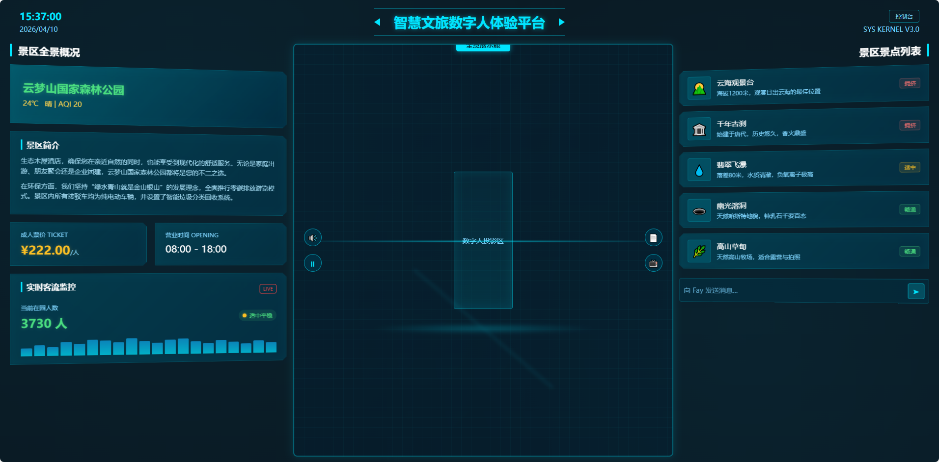
<span class="time">15:37:00</span>
<span class="date">2026/04/10</span>
</div>
<div class="header-title">智慧文旅数字人体验平台</div>
<div class="header-right">
<span class="console-btn">控制台</span>
<span class="version">SYS KERNEL V3.0</span>
</div>
</header>
<main class="main-grid">
<!-- 左侧面板(3D向右旋转聚拢) -->
<section class="left-panel">
<h2 class="panel-title">景区全景概况</h2>
<div class="card card-left header-card">
<div class="scenic-name">云梦山国家森林公园</div>
<div class="weather-tag">
<span>24℃</span>
<span>晴 | AQI 20</span>
</div>
</div>
<div class="card card-left">
<h3 class="card-title">景区简介</h3>
<p class="card-text">
生态木屋酒店,确保您在亲近自然的同时,也能享受到现代化的舒适服务。无论是家庭出游、朋友聚会还是企业团建,云梦山国家森林公园都将是您的不二之选。
</p>
<p class="card-text">
在环保方面,我们坚持"绿水青山就是金山银山"的发展理念,全面推行零碳排放游览模式。景区内所有接驳车均为纯电动车辆,并设置了智能垃圾分类回收系统。
</p>
</div>
<div class="card-row">
<div class="card card-left">
<div class="label">成人票价 TICKET</div>
<div class="price">¥222.00<span>/人</span></div>
</div>
<div class="card card-left">
<div class="label">营业时间 OPENING</div>
<div class="time-val">08:00 - 18:00</div>
</div>
</div>
<div class="card card-left">
<div class="card-header">
<h3 class="card-title">实时客流监控</h3>
<span class="live-tag">LIVE</span>
</div>
<div class="passenger-row">
<div>
<div class="label">当前在园人数</div>
<div class="passenger-num">3730 人</div>
</div>
<div class="comfort-tag">
<span class="dot"></span>
适中平稳
</div>
</div>
<div class="chart-bar">
<div style="height: 40%"></div>
<div style="height: 55%"></div>
<div style="height: 45%"></div>
<div style="height: 70%"></div>
<div style="height: 60%"></div>
<div style="height: 80%"></div>
<div style="height: 75%"></div>
<div style="height: 65%"></div>
<div style="height: 85%"></div>
<div style="height: 70%"></div>
<div style="height: 60%"></div>
<div style="height: 75%"></div>
<div style="height: 80%"></div>
<div style="height: 65%"></div>
<div style="height: 55%"></div>
<div style="height: 70%"></div>
<div style="height: 60%"></div>
<div style="height: 50%"></div>
<div style="height: 65%"></div>
<div style="height: 55%"></div>
</div>
</div>
</section>
<!-- 中间全息舱(保持正面) -->
<section class="center-panel">
<div class="holo舱">
<div class="holo-title">全息展示舱</div>
<div class="scan-line"></div>
<div class="holo-content">
<div class="digital-human">
<div class="human-placeholder">数字人投影区</div>
</div>
<div class="holo-base"></div>
</div>
<div class="side-btns left-btns">
<button class="holo-btn">🔊</button>
<button class="holo-btn">⏸</button>
</div>
<div class="side-btns right-btns">
<button class="holo-btn">📄</button>
<button class="holo-btn">📺</button>
</div>
</div>
</section>
<!-- 右侧面板(3D向左旋转聚拢) -->
<section class="right-panel">
<h2 class="panel-title right-title">景区景点列表</h2>
<div class="scenic-list">
<div class="scenic-item card card-right">
<div class="item-img">🌄</div>
<div class="item-info">
<div class="item-name">云海观景台</div>
<div class="item-desc">海拔1200米,观赏日出云海的最佳位置</div>
</div>
<span class="status-tag crowded">拥挤</span>
</div>
<div class="scenic-item card card-right">
<div class="item-img">🏛️</div>
<div class="item-info">
<div class="item-name">千年古刹</div>
<div class="item-desc">始建于唐代,历史悠久,香火鼎盛</div>
</div>
<span class="status-tag crowded">拥挤</span>
</div>
<div class="scenic-item card card-right">
<div class="item-img">💧</div>
<div class="item-info">
<div class="item-name">翡翠飞瀑</div>
<div class="item-desc">落差80米,水质清澈,负氧离子极高</div>
</div>
<span class="status-tag moderate">适中</span>
</div>
<div class="scenic-item card card-right">
<div class="item-img">🕳️</div>
<div class="item-info">
<div class="item-name">幽光溶洞</div>
<div class="item-desc">天然喀斯特地貌,钟乳石千姿百态</div>
</div>
<span class="status-tag smooth">畅通</span>
</div>
<div class="scenic-item card card-right">
<div class="item-img">🌿</div>
<div class="item-info">
<div class="item-name">高山草甸</div>
<div class="item-desc">天然高山牧场,适合露营与拍照</div>
</div>
<span class="status-tag smooth">畅通</span>
</div>
</div>
<div class="chat-input">
<input type="text" placeholder="向 Fay 发送消息..." />
<button class="send-btn">➤</button>
</div>
</section>
</main>
</div>
</body>
</html>