4. CSS布局
4.1 弹性布局
主流布局方式,市场使用率高
- 浮动布局存在的问题
- 很难合理的实现元素在垂直方向的居中
- 使用
margin-top设置上外边距是可以实现的,但是元素占用的位置发生变化,导致不能写在外边距占用的位置- 当屏幕或设备发生变化时,使用外边距设置的值是固定的,不能达到自适应的的结果
- 父容器(
flex-container)常见属性
| 属性 | 作用 | 常用取值 |
|---|---|---|
display |
开启弹性布局 | flex(块级弹性容器)、inline-flex(行内弹性容器) |
flex-direction |
主轴方向 | row 默认横向、row-reverse反向横向、column纵向、column-reverse反向纵向 |
flex-wrap |
是否自动换行 | nowrap不换行、wrap自动换行、wrap-reverse反向换行 |
flex-flow |
简写:flex-direction + flex-wrap |
flex-flow: row wrap; |
justify-content |
主轴对齐方式 | flex-start起点、flex-end终点、center居中、space-between两端均分、space-around两侧留白均分、space-evenly完全等分 |
align-items |
交叉轴单行对齐 | stretch默认拉伸、flex-start、flex-end、center、baseline基线对齐 |
align-content |
交叉轴多行对齐(只有换行 flex-wrap:wrap 才生效) | stretch、flex-start、flex-end、center、space-between、space-around |
- 子元素(
flex-item)属性
| 属性 | 作用 | 常用取值 |
|---|---|---|
flex-grow |
剩余空间放大比例 ,默认0 |
数字,0 不放大;1 均分剩余空间 |
flex-shrink |
空间不足缩小比例 ,默认1 |
0禁止缩小,数字越大缩得越多 |
flex-basis |
项目基础尺寸(主轴方向) | auto、像素200px、百分比,优先级高于 width |
flex |
简写 flex-grow flex-shrink flex-basis |
flex:1 → 1 1 0%;flex:0 0 150px固定宽度不伸缩 |
align-self |
单独控制当前项目交叉轴对齐,覆盖父align-items |
auto、stretch、center、flex-start、flex-end |
order |
控制子元素排列顺序,默认0 |
数字,数值越小越靠前,支持负数 |
4.2 *栅格布局(高级表格布局)
之前的浮动 / 弹性盒子都是一维,而二维的布局形式采用表格或者栅格
栅格布局技巧
设置容器高度
设置内部 div 的边框 (测试时不显示)
设置容器的布局方式(栅格)
设置容器的行和列模板(等分)
做布局如下:
① 选择目标元素
② 分析索引 开始索引到结束索引+1
③ 删除无效 div 及背景边框
| 属性 | 说明 |
|---|---|
display:grid |
设置栅格布局 |
grid-temple-columns |
设置列:repeat(6,1fr) / 像素 /百分比 |
grid-temple-rows |
设置行:repeat(6,1fr) / 像素 /百分比 |
grid-column |
跨列:列起始索引 / 列结束索引+1 |
grid-row |
跨行:行起始索引 / 行结束索引+1 |
grid-gap |
栅格间距 |
grid-area |
复合写法:行起始 / 列起始 /行结束 /列结束 |
grid-temple-area |
模板布局方式 |
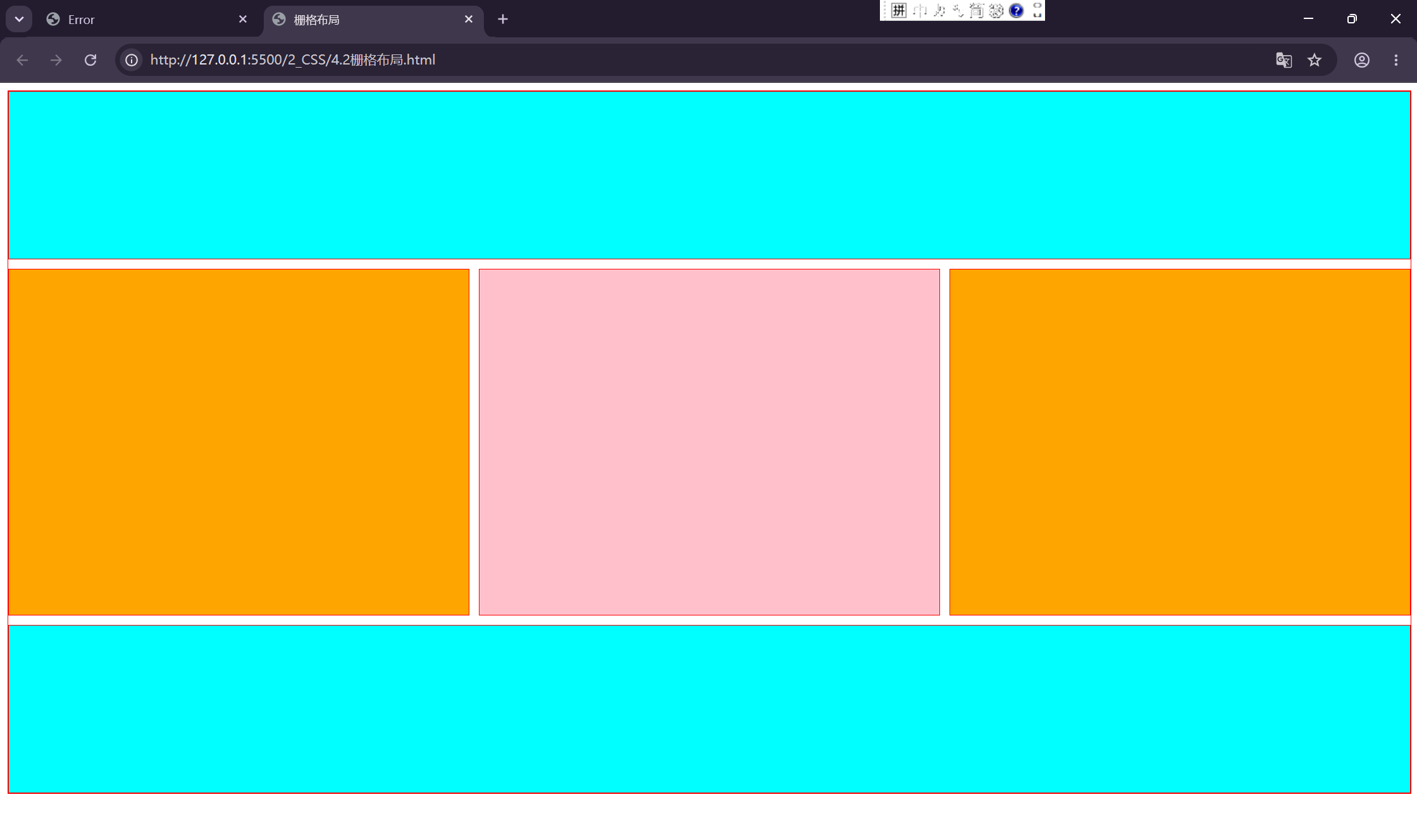
html
<!DOCTYPE html>
<html lang="en">
<head>
    <meta charset="UTF-8">
    <meta name="viewport" content="width=device-width, initial-scale=1.0">
    <title>栅格布局</title>
    <style>
        /* 工字布局 */
        .box{
            width: 100%;
            height: 740px;
            margin: auto;
            border: 1px solid red;
            display: grid;
            grid-template-columns: repeat(3,1fr);
            grid-template-rows: repeat(4,1fr);
            grid-gap: 10px;
        }
        div>div{
            border: 1px solid red;
        }
        div>div:nth-child(1),div>div:nth-child(5){
            grid-column: 1 / 4;
            background-color: aqua;
        }
        div>div:nth-child(2),div>div:nth-child(4){
            grid-row: 2 / 4;
            background-color: orange;
        }
        div>div:nth-child(3){
            grid-row: 2 / 4;
            background-color: pink;
        }
    </style>
</head>
<body>
    <div class="box">
        <div></div>
        <div></div>
        <div></div>
        <div></div>
        <div></div>
        <!-- <div></div>
        <div></div>
        <div></div>
        <div></div>
        <div></div>
        <div></div>
        <div></div> -->
    </div>
</body>
</html>