import React, { useEffect, useRef } from "react";
import { Animated, StyleSheet, View } from "react-native";
import { pxToPd } from "../../../common/js/device";
const Skeleton = ({ }) => {
const progressBarWidth = useRef(new Animated.Value(0)).current;
const animationFun = () => {
Animated.timing(progressBarWidth, {
toValue: 1, // 目标值
duration: 1000, // 动画持续时间(毫秒)
useNativeDriver: false // 必须设置为 false,因为布局动画不能使用原生驱动
}).start(({ finished }) => {
if (finished) {
progressBarWidth.setValue(0); // 重置为初始值
animationFun(); // 重新触发动画
}
});;
}
const widthValue = progressBarWidth.interpolate({
inputRange: [0, 1],
outputRange: ['0%', '100%']
});
useEffect(() => {
animationFun();
return () => { }
}, []);
return (
<>
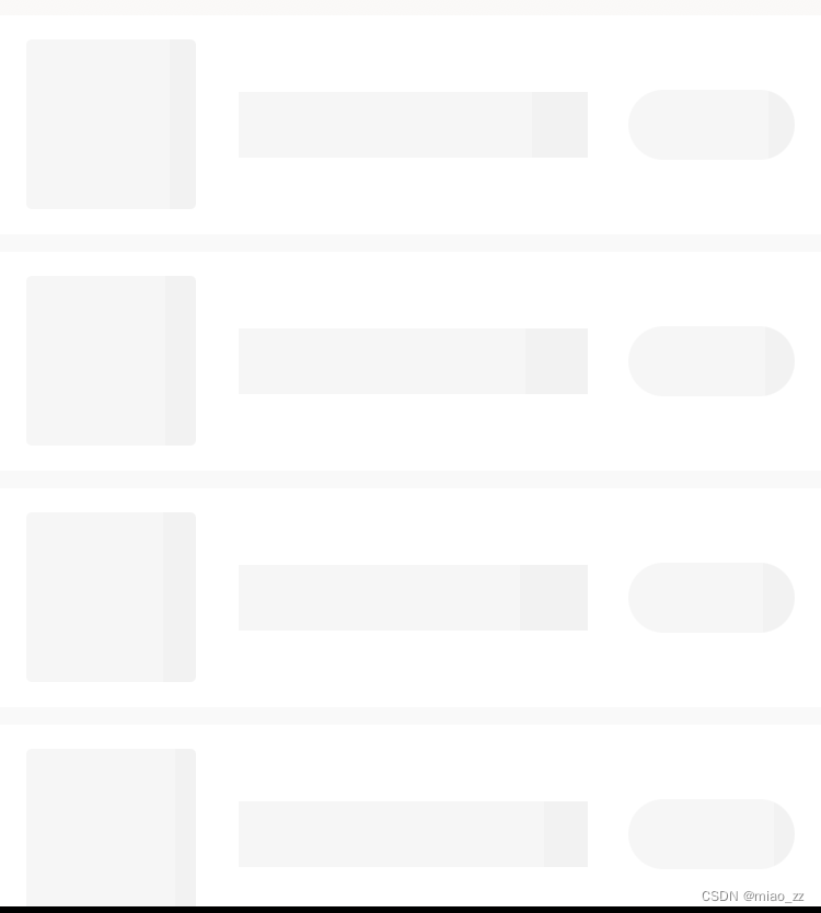
<View style={styles.skeleton}>
<View style={styles.skeletonLogo}>
<Animated.View style={[styles.progress, { width: widthValue }]} />
</View>
<View style={styles.skeletonName}>
<Animated.View style={[styles.progress, { width: widthValue }]} />
</View>
<View style={styles.skeletonBtn}>
<Animated.View style={[styles.progress, { width: widthValue }]} />
</View>
</View>
</>
)
}
const styles = StyleSheet.create({
skeleton: {
width: '100%',
height: pxToPd(200),
position: "relative",
backgroundColor: "#fff",
marginBottom: pxToPd(16)
},
skeletonLogo: {
height: pxToPd(155),
width: pxToPd(155),
backgroundColor: '#f2f2f2',
borderRadius: pxToPd(5),
overflow: 'hidden',
position: 'absolute',
left: '3.2%',
top: pxToPd(22)
},
skeletonName: {
height: pxToPd(60),
width: pxToPd(319),
backgroundColor: '#f2f2f2',
overflow: 'hidden',
position: 'absolute',
left: '29%',
top: pxToPd(70)
},
skeletonBtn: {
height: pxToPd(64),
width: pxToPd(152),
backgroundColor: '#f2f2f2',
borderRadius: pxToPd(32),
overflow: 'hidden',
position: 'absolute',
right: '3.2%',
top: pxToPd(68)
},
progress: {
height: '100%',
backgroundColor: 'rgba(255, 255, 255, 0.3)'
}
})
export default Skeleton