基本样式
| Class | Properties |
|---|---|
| size-0 | width: 0px; height: 0px; |
| size-px | width: 1px; height: 1px; |
| size-0.5 | width: 0.125rem; /* 2px / height: 0.125rem; / 2px */ |
| size-1 | width: 0.25rem; /* 4px / height: 0.25rem; / 4px */ |
| size-1.5 | width: 0.375rem; /* 6px / height: 0.375rem; / 6px */ |
| size-2 | width: 0.5rem; /* 8px / height: 0.5rem; / 8px */ |
| size-2.5 | width: 0.625rem; /* 10px / height: 0.625rem; / 10px */ |
| size-3 | width: 0.75rem; /* 12px / height: 0.75rem; / 12px */ |
| size-3.5 | width: 0.875rem; /* 14px / height: 0.875rem; / 14px */ |
| size-4 | width: 1rem; /* 16px / height: 1rem; / 16px */ |
| size-5 | width: 1.25rem; /* 20px / height: 1.25rem; / 20px */ |
| size-6 | width: 1.5rem; /* 24px / height: 1.5rem; / 24px */ |
| size-7 | width: 1.75rem; /* 28px / height: 1.75rem; / 28px */ |
| size-8 | width: 2rem; /* 32px / height: 2rem; / 32px */ |
| size-9 | width: 2.25rem; /* 36px / height: 2.25rem; / 36px */ |
| size-10 | width: 2.5rem; /* 40px / height: 2.5rem; / 40px */ |
| size-11 | width: 2.75rem; /* 44px / height: 2.75rem; / 44px */ |
| size-12 | width: 3rem; /* 48px / height: 3rem; / 48px */ |
| size-14 | width: 3.5rem; /* 56px / height: 3.5rem; / 56px */ |
| size-16 | width: 4rem; /* 64px / height: 4rem; / 64px */ |
| size-20 | width: 5rem; /* 80px / height: 5rem; / 80px */ |
| size-24 | width: 6rem; /* 96px / height: 6rem; / 96px */ |
| size-28 | width: 7rem; /* 112px / height: 7rem; / 112px */ |
| size-32 | width: 8rem; /* 128px / height: 8rem; / 128px */ |
| size-36 | width: 9rem; /* 144px / height: 9rem; / 144px */ |
| size-40 | width: 10rem; /* 160px / height: 10rem; / 160px */ |
| size-44 | width: 11rem; /* 176px / height: 11rem; / 176px */ |
| size-48 | width: 12rem; /* 192px / height: 12rem; / 192px */ |
| size-52 | width: 13rem; /* 208px / height: 13rem; / 208px */ |
| size-56 | width: 14rem; /* 224px / height: 14rem; / 224px */ |
| size-60 | width: 15rem; /* 240px / height: 15rem; / 240px */ |
| size-64 | width: 16rem; /* 256px / height: 16rem; / 256px */ |
| size-72 | width: 18rem; /* 288px / height: 18rem; / 288px */ |
| size-80 | width: 20rem; /* 320px / height: 20rem; / 320px */ |
| size-96 | width: 24rem; /* 384px / height: 24rem; / 384px */ |
| size-auto | width: auto; height: auto; |
| size-1/2 | width: 50%; height: 50%; |
| size-1/3 | width: 33.333333%; height: 33.333333%; |
| size-2/3 | width: 66.666667%; height: 66.666667%; |
| size-1/4 | width: 25%; height: 25%; |
| size-2/4 | width: 50%; height: 50%; |
| size-3/4 | width: 75%; height: 75%; |
| size-1/5 | width: 20%; height: 20%; |
| size-2/5 | width: 40%; height: 40%; |
| size-3/5 | width: 60%; height: 60%; |
| size-4/5 | width: 80%; height: 80%; |
| size-1/6 | width: 16.666667%; height: 16.666667%; |
| size-2/6 | width: 33.333333%; height: 33.333333%; |
| size-3/6 | width: 50%; height: 50%; |
| size-4/6 | width: 66.666667%; height: 66.666667%; |
| size-5/6 | width: 83.333333%; height: 83.333333%; |
| size-1/12 | width: 8.333333%; height: 8.333333%; |
| size-2/12 | width: 16.666667%; height: 16.666667%; |
| size-3/12 | width: 25%; height: 25%; |
| size-4/12 | width: 33.333333%; height: 33.333333%; |
| size-5/12 | width: 41.666667%; height: 41.666667%; |
| size-6/12 | width: 50%; height: 50%; |
| size-7/12 | width: 58.333333%; height: 58.333333%; |
| size-8/12 | width: 66.666667%; height: 66.666667%; |
| size-9/12 | width: 75%; height: 75%; |
| size-10/12 | width: 83.333333%; height: 83.333333%; |
| size-11/12 | width: 91.666667%; height: 91.666667%; |
| size-full | width: 100%; height: 100%; |
| size-min | width: min-content; height: min-content; |
| size-max | width: max-content; height: max-content; |
| size-fit | width: fit-content; height: fit-content; |
基本样式总结
1到12是连续的数字,间隔1。
12到64间隔4。
最大的是96。
支持2,3,4,5,6,12百分比。
案例:不同尺寸的盒子
需求:创建3行3列的网格布局,然后通过size设置不同尺寸的盒子,观察效果。
vue3示例:
html
<script setup>
</script>
<template>
  <div class="grid grid-cols-3 gap-3 bg-indigo-50 p-8">
    <div class="min-w-12 min-h-12 bg-indigo-500 size-12"></div>
    <div class="min-w-12 min-h-12 bg-indigo-500 size-24"></div>
    <div class="min-w-12 min-h-12 bg-indigo-500 size-32"></div>
    <div class="min-w-12 min-h-12 bg-indigo-500 size-40"></div>
    <div class="min-w-12 min-h-12 bg-indigo-500 size-44"></div>
    <div class="min-w-12 min-h-12 bg-indigo-500 size-48"></div>
    <div class="min-w-12 min-h-12 bg-indigo-500 size-52"></div>
    <div class="min-w-12 min-h-12 bg-indigo-500 size-56"></div>
    <div class="min-w-12 min-h-12 bg-indigo-500 size-60"></div>
  </div>
</template>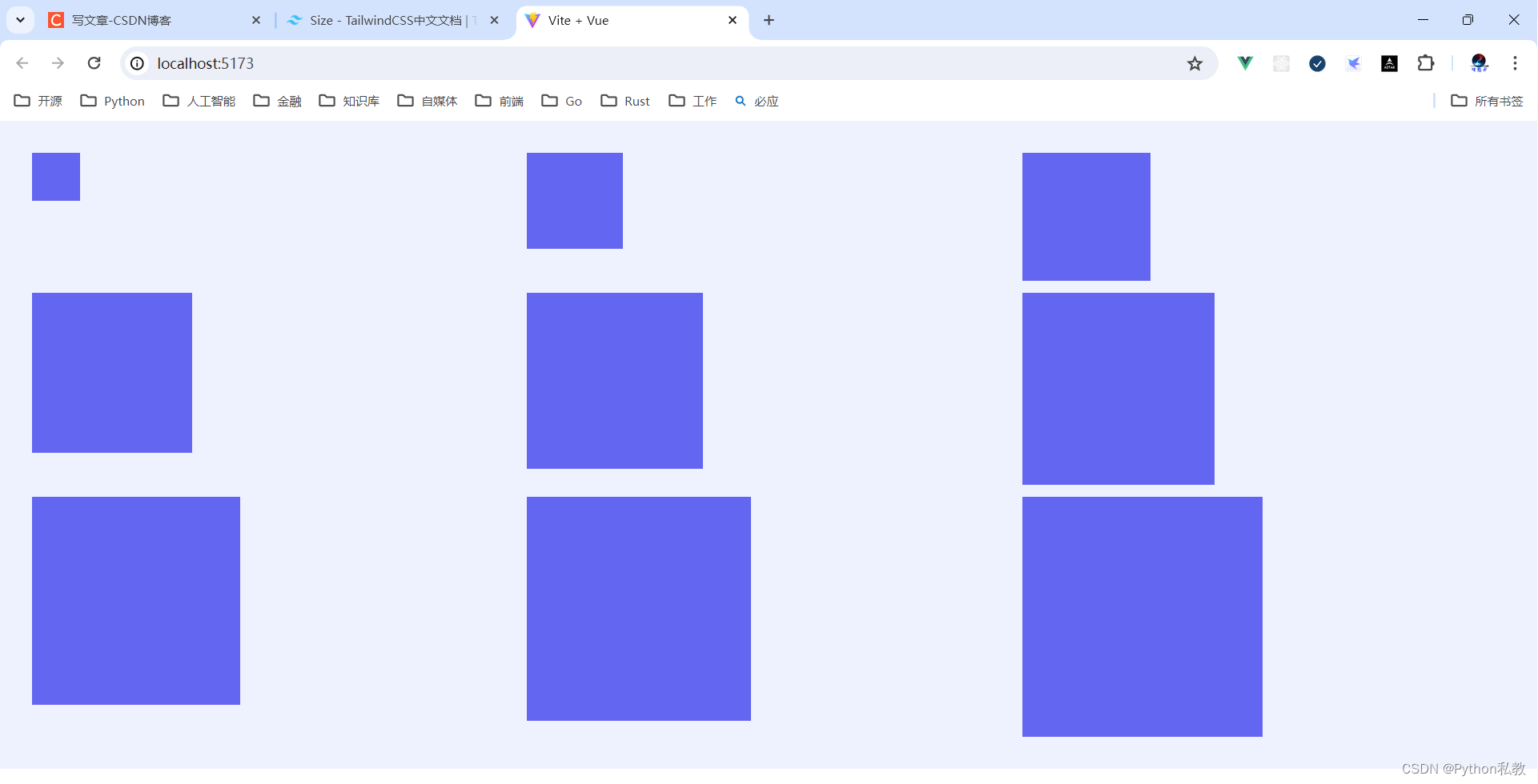
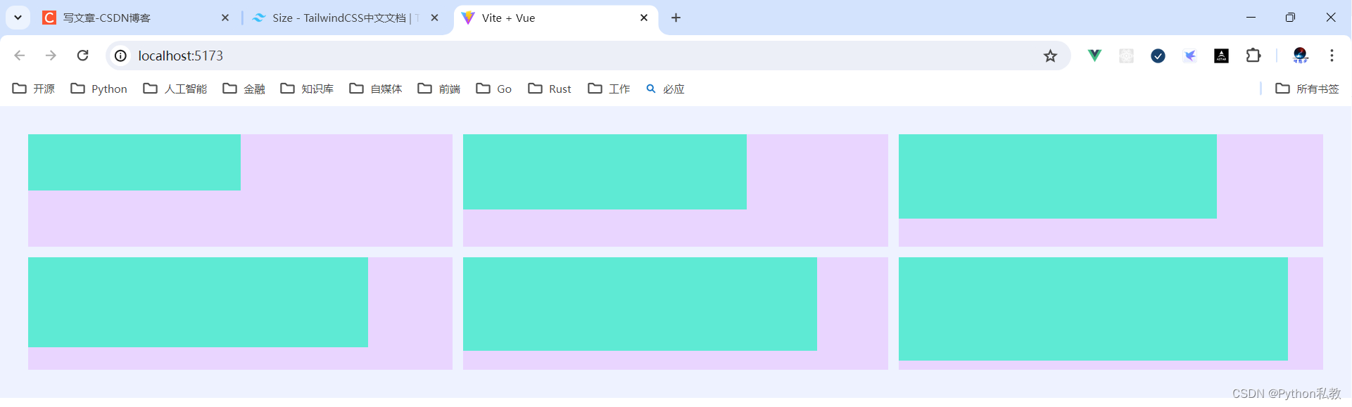
案例:不同百分比大小的盒子
需求:分别创建不同size大小的盒子,这些size分别是1/2,2/3,3/4,4/5,5/6,11/12。
vue3示例:
html
<script setup>
</script>
<template>
  <div class="grid grid-cols-3 gap-3 bg-indigo-50 p-8">
      <div class="h-32 bg-purple-200">
        <div class="size-1/2 bg-teal-300"></div>
      </div>
      <div class="h-32 bg-purple-200">
        <div class="size-2/3 bg-teal-300"></div>
      </div>
      <div class="h-32 bg-purple-200">
        <div class="size-3/4 bg-teal-300"></div>
      </div>
      <div class="h-32 bg-purple-200">
        <div class="size-4/5 bg-teal-300"></div>
      </div>
      <div class="h-32 bg-purple-200">
        <div class="size-5/6 bg-teal-300"></div>
      </div>
      <div class="h-32 bg-purple-200">
        <div class="size-11/12 bg-teal-300"></div>
      </div>
  </div>
</template>