WPF布局元素有如下几个:
- Grid:网格。可以自定义行和列并通过行列的数量、行高和列宽来调整控件的布局。
- StackPanel:栈式面板。可将包含的元素在竖直或水平方向上排成一条直线,当移除一个元素后,后面的元素会自动向前移动以填补空缺。
- Canvas:画布。内部元素可以使用以像素为单位的绝对坐标进行定位,类似Windows Form编程的布局方式。
- DockPanel:泊靠式面板。内部元素可以选择泊靠方向,类似于在Windows Form编程中设置控件的Dock属性。
- WrapPanel:自动折行面板。内部元素在拍满一行后能够自动拆行。
Grid
特点
- 可定义任意数量的行和列
- 行列的高宽可以使用绝对值、相对值或自动调整方式进行设定,并可设置最大和最小值
- 内部元素可以设置自己所在的行和列的位置,从索引0开始,还可设置跨度多少行或列
- 可是设置Children元素的对齐方向
行列的宽高单位
计算机图形设计的标注单位是像素(Pixel),因此Grid的宽高单位就是像素,除了像素作为单位外还可以接受英寸(Inch)、里面(CM)和点(Point)。
对于Grid的行高列宽,我们可以设置三类值:
- 绝对值:double数值加单位后缀(像素单位可以省略)
- 比例值:double数值后加一个星号(" * ")
- 自动值:字符串Auto
比例值像素计算方式:解析器会把所以的比例值得数值加起来作为分母,把每个比例值得数值作为分子,在用这个分数乘以未被占用得像素数,得到得结果就是分配给这个比列值得最终像素。例如:一个总高度为200px的Grid,它包含5行,其中两行采用绝对值50px,其它三行分别为1*,2*,2*。则剩下为100px,其三行分配的像素数分别为20px,40px,40px。
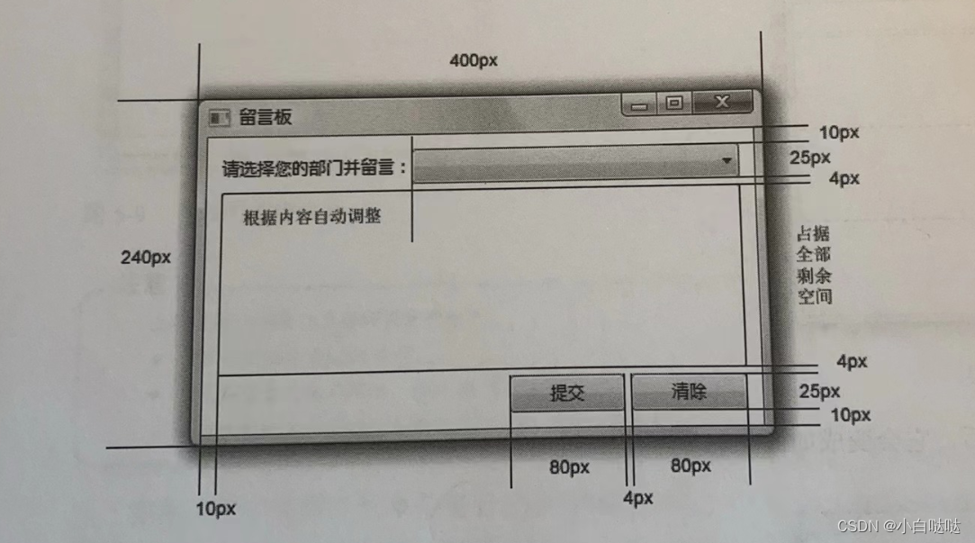
案列
xml
<Window x:Class="Grid_01.MainWindow"
        xmlns="http://schemas.microsoft.com/winfx/2006/xaml/presentation"
        xmlns:x="http://schemas.microsoft.com/winfx/2006/xaml"
        xmlns:d="http://schemas.microsoft.com/expression/blend/2008"
        xmlns:mc="http://schemas.openxmlformats.org/markup-compatibility/2006"
        xmlns:local="clr-namespace:Grid_01"
        mc:Ignorable="d"
        Title="留言板" Height="240" Width="440">

    <Grid Margin="10">
        <Grid.RowDefinitions>
            <RowDefinition Height="20" />
            <RowDefinition Height="4"/>
            <RowDefinition Height="*"/>
            <RowDefinition Height="4"/>
            <RowDefinition Height="25"/>
        </Grid.RowDefinitions>
        <Grid.ColumnDefinitions>
            <ColumnDefinition Width="Auto" />
            <ColumnDefinition Width="*"/>
            <ColumnDefinition Width="80"/>
            <ColumnDefinition Width="4"/>
            <ColumnDefinition Width="80"/>
        </Grid.ColumnDefinitions>
        <TextBlock Text="请选择您的部门并留言:" Grid.Column="0" Grid.Row="0" VerticalAlignment="Center"/>
        <ComboBox Grid.Column="1" Grid.Row="0" Grid.ColumnSpan="4"/>
        <TextBox Grid.Column="0" Grid.Row="2" Grid.ColumnSpan="5" BorderBrush="Black"/>
        <Button Content="提交" Grid.Column="2" Grid.Row="4"/>
        <Button Content="清楚" Grid.Column="4" Grid.Row="4"/>


    </Grid>
</Window>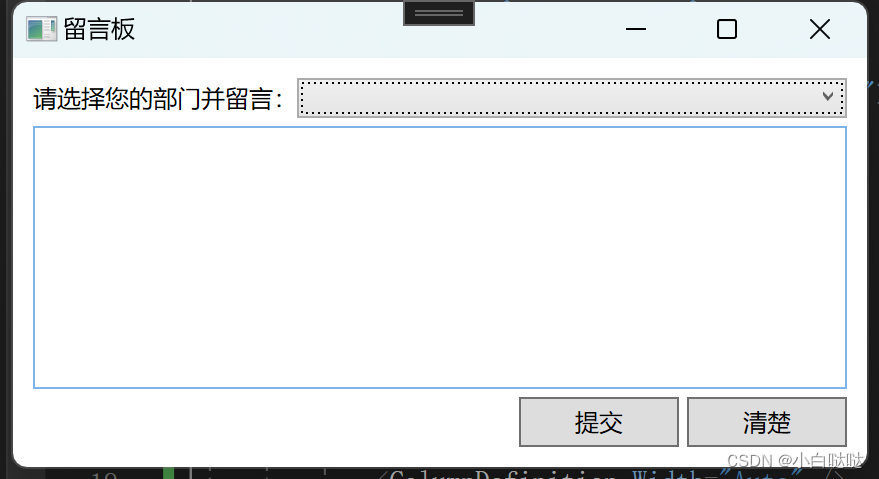
StackPanel
StackPanel可以把内部元素在纵向或横向紧凑排列,当排在前面的元素抽掉之后,排在它后面的元素会整体向前移动、补占原有元素的空间。
应用场景
- 同类元素需要紧凑排列(如制作菜单或者列表)
- 移除其中的元素后能够自动补缺的布局或动画
属性
Orientation 决定内部元素是横向累积还是纵向累积
HorizontalAlignment 决定内部元素水平方向的排列方式
VerticalAlignment 决定内部元素竖直方向的排列方式
Canvas
Canvas布局就像在画布上画控件一样,Winform开发时外面通过设置控件的Left和Top等属性来确定控件在窗体上的位置,而WPF的控件没有Left和Top等属性,因此当控件放在Canvas会添加位置信息。
应用场景
- 一经设计基本上不会再有改动的小型布局(如图标)
- 需要大量使用横纵坐标进行绝对点定位的布局
WrapPanel
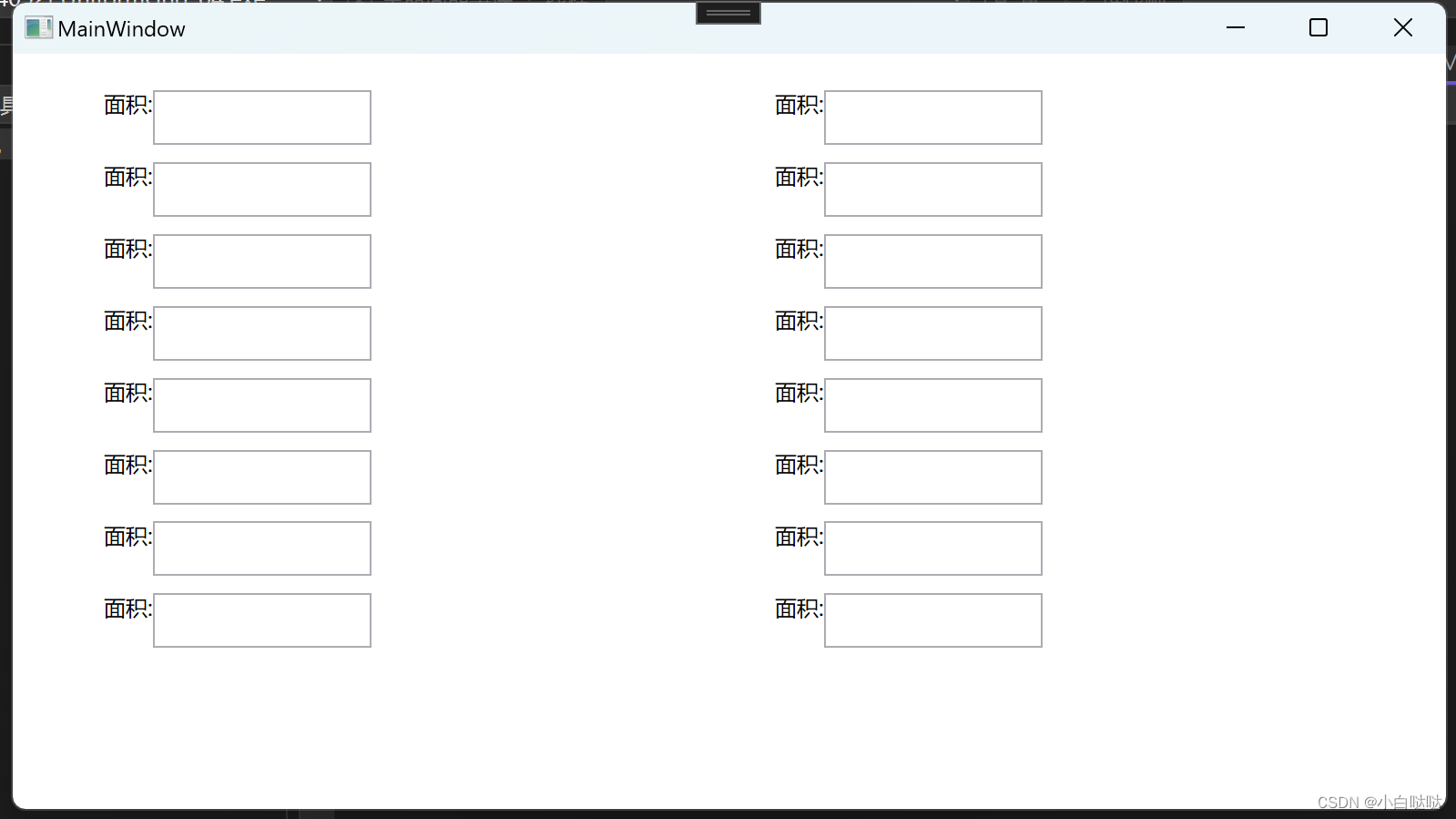
WrapPanel内部采用的是流式布局,可以使用Orientation属性来控制流延伸的方向,使用HorizontalAlignment和VerticalAlignment 两个属性控制内部控件的对齐。在流延伸的方向上,WrapPanel会排列尽可能多的控件,排不下的控件将会新起一行或一列继续排列。通常在上位机卡控页面会结合UniformGrid进行使用。
案例
xml
<Window x:Class="UniformGrid_04.MainWindow"
        xmlns="http://schemas.microsoft.com/winfx/2006/xaml/presentation"
        xmlns:x="http://schemas.microsoft.com/winfx/2006/xaml"
        xmlns:d="http://schemas.microsoft.com/expression/blend/2008"
        xmlns:mc="http://schemas.openxmlformats.org/markup-compatibility/2006"
        xmlns:local="clr-namespace:UniformGrid_04"
        mc:Ignorable="d"
        Title="MainWindow" Height="450" Width="800">
    <UniformGrid Columns="2" Rows="10" Margin="50,20,0,0">
        <WrapPanel>
            <TextBlock Text="面积:" />
            <TextBox Width="120" Height="30" />
        </WrapPanel>
        <WrapPanel>
            <TextBlock Text="面积:" />
            <TextBox Width="120" Height="30" />
        </WrapPanel>
        <WrapPanel>
            <TextBlock Text="面积:" />
            <TextBox Width="120" Height="30" />
        </WrapPanel>
        <WrapPanel>
            <TextBlock Text="面积:" />
            <TextBox Width="120" Height="30" />
        </WrapPanel>
        <WrapPanel>
            <TextBlock Text="面积:" />
            <TextBox Width="120" Height="30" />
        </WrapPanel>
        <WrapPanel>
            <TextBlock Text="面积:" />
            <TextBox Width="120" Height="30" />
        </WrapPanel>
        <WrapPanel>
            <TextBlock Text="面积:" />
            <TextBox Width="120" Height="30" />
        </WrapPanel>
        <WrapPanel>
            <TextBlock Text="面积:" />
            <TextBox Width="120" Height="30" />
        </WrapPanel>
        <WrapPanel>
            <TextBlock Text="面积:" />
            <TextBox Width="120" Height="30" />
        </WrapPanel>
        <WrapPanel>
            <TextBlock Text="面积:" />
            <TextBox Width="120" Height="30" />
        </WrapPanel>
        <WrapPanel>
            <TextBlock Text="面积:" />
            <TextBox Width="120" Height="30" />
        </WrapPanel>
        <WrapPanel>
            <TextBlock Text="面积:" />
            <TextBox Width="120" Height="30" />
        </WrapPanel>
        <WrapPanel>
            <TextBlock Text="面积:" />
            <TextBox Width="120" Height="30" />
        </WrapPanel>
        <WrapPanel>
            <TextBlock Text="面积:" />
            <TextBox Width="120" Height="30" />
        </WrapPanel>
        <WrapPanel>
            <TextBlock Text="面积:" />
            <TextBox Width="120" Height="30" />
        </WrapPanel>
        <WrapPanel>
            <TextBlock Text="面积:" />
            <TextBox Width="120" Height="30" />
        </WrapPanel>
    </UniformGrid>
</Window>