目录
[1. 文本组件 Text](#1. 文本组件 Text)
[1.1 基础用法](#1.1 基础用法)
[1.2 Text 定义](#1.2 Text 定义)
[1.3 Text 示例](#1.3 Text 示例)
[1.4 Text.rich、RichText 、TextSpan](#1.4 Text.rich、RichText 、TextSpan)
[1.5 RichText 示例](#1.5 RichText 示例)
[2. 导入资源](#2. 导入资源)
[2.1 加入资源](#2.1 加入资源)
[2.2 加入图片](#2.2 加入图片)
[3. 图片组件 image](#3. 图片组件 image)
[3.1 colorBlendMode 混合参数](#3.1 colorBlendMode 混合参数)
[3.2 fit 图片大小适配](#3.2 fit 图片大小适配)
[3.3 ImageProvider 图片对象](#3.3 ImageProvider 图片对象)
[4. 图标组件 Icon](#4. 图标组件 Icon)
[4.1 定义](#4.1 定义)
[4.2 开启 pubspec.yaml](#4.2 开启 pubspec.yaml)
[4.3 icon 预览](#4.3 icon 预览)
[4.4 示例](#4.4 示例)
[4.5 苹果 Icon](#4.5 苹果 Icon)
[5. 按钮组件](#5. 按钮组件)
[5.1 ElevatedButton](#5.1 ElevatedButton)
[5.2 ButtonStyle 样式定义](#5.2 ButtonStyle 样式定义)
[5.3 其它按钮](#5.3 其它按钮)
[6. 路由管理v1 Navigator](#6. 路由管理v1 Navigator)
[6.1 匿名路由](#6.1 匿名路由)
[6.1.1 Navigator 路由管理对象](#6.1.1 Navigator 路由管理对象)
[6.1.2 MaterialPageRoute 定义](#6.1.2 MaterialPageRoute 定义)
[6.1.3 路由传值](#6.1.3 路由传值)
[6.1.4 示例](#6.1.4 示例)
[6.2 命名路由](#6.2 命名路由)
[6.3 onGenerateRoute 手动解析](#6.3 onGenerateRoute 手动解析)
[6.3.1 定义路由](#6.3.1 定义路由)
[6.3.2 导航页完整代码](#6.3.2 导航页完整代码)
[7. 样式管理](#7. 样式管理)
[7.1 ThemeData 样式对象](#7.1 ThemeData 样式对象)
[7.2 Color 与 MaterialColor](#7.2 Color 与 MaterialColor)
[8. 手势事件](#8. 手势事件)
[8.1 GestureDetector](#8.1 GestureDetector)
[8.2 InkWell](#8.2 InkWell)
[9. 输入框 TextField](#9. 输入框 TextField)
[9.1 定义](#9.1 定义)
[9.2 示例](#9.2 示例)
**博主wx:**yuanlai45_csdn **博主qq:**2777137742
后期会创建粉丝群,为同学们提供分享交流平台以及提供官方发送的福利奖品~
1. 文本组件 Text
Text Widget,从名字也可以看出,在 Flutter 里是用来负责显示文本信息的一个组件,功能类似于 Android 的 TextView、HTML 的一些文本标签等等,属于基础组件
Text class - widgets library - Dart API
1.1 基础用法
Dart
Text('hello word!');1.2 Text 定义
Dart
const Text(
    //要显示的文字内容
    this.data,
   {
    //key类似于id
    Key key,
    //文字显示样式和属性
    this.style,
    this.strutStyle,
    //文字对齐方式
    this.textAlign,
    //文字显示方向
    this.textDirection,
    //设置语言环境
    this.locale,
    //是否自动换行
    this.softWrap,
    //文字溢出后处理方式
    this.overflow,
    //字体缩放
    this.textScaleFactor,
    //最大显示行数
    this.maxLines,
    //图像的语义描述,用于向Andoid上的TalkBack和iOS上的VoiceOver提供图像描述
    this.semanticsLabel,
  })
TextStyle 定义
style 属性比较常用,传入的是 TextStyle 对象,我们细看下它可以配置哪些属性样式
Dart
const TextStyle({
    //是否继承父类组件属性
    this.inherit = true,
    //字体颜色
    this.color,
    //文字大小,默认14px
    this.fontSize,
    //字体粗细
    this.fontWeight,
    //字体样式,normal或italic
    this.fontStyle,
    //字母间距,默认为0,负数间距缩小,正数间距增大
    this.letterSpacing,
    //单词间距,默认为0,负数间距缩小,正数间距增大
    this.wordSpacing,
    //字体基线
    this.textBaseline,
    //行高
    this.height,
    //设置区域
    this.locale,
    //前景色
    this.foreground,
    //背景色
    this.background,
    //阴影
    this.shadows,
    //文字划线,下换线等等装饰
    this.decoration,
    //划线颜色
    this.decorationColor,
    //划线样式,虚线、实线等样式
    this.decorationStyle,
    //描述信息
    this.debugLabel,
    //字体
    String fontFamily,
    List<String> fontFamilyFallback,
    String package,
  })
1.3 Text 示例
TextStyle class - painting library - Dart API
颜色、大小、样式
Dart
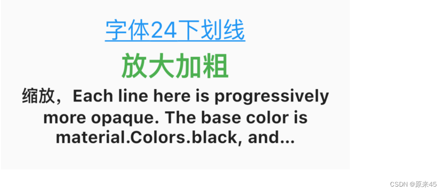
Text('字体24下划线',
     style: TextStyle(
       color: Colors.blue, // 蓝色
       fontSize: 24,				// 24 号字体
       decoration: TextDecoration.underline, // 下划线
     )),
缩放、加粗
Dart
Text('放大加粗',
     textScaleFactor: 1.2, // 放大 1.2
     style: TextStyle(
       fontWeight: FontWeight.bold,	// 加粗 bold
       fontSize: 24,								// 24 号字体
       color: Colors.green,				// 绿色
       decoration: TextDecoration.none, // 不要下滑线
     )),
文字溢出
Dart
Text(
  '缩放,Each line here is progressively more opaque. The base color is material.Colors.black, and Color.withOpacity is used to create a derivative color with the desired opacity. The root TextSpan for this RichText widget is explicitly given the ambient DefaultTextStyle, since RichText does not do that automatically. The inner TextStyle objects are implicitly mixed with the parent TextSpans TextSpan.style.',
  textScaleFactor: 1.0,
  textAlign: TextAlign.center,
  softWrap: true,
  maxLines: 3, // 3 行
  overflow: TextOverflow.ellipsis, // 剪切 加省略号
  style: TextStyle(
    fontWeight: FontWeight.bold,
    fontSize: 18,
  )),
输出
1.4 Text.rich、RichText 、TextSpan
可以在 Text 里加入一些 Span 标签,对某部分文字进行个性化改变样式,如加入 @ 符号,加入超链接、变色、加表情等等。Text.rich(...) 等价于 RichText(...),用哪个都可以。
https://api.flutter.dev/flutter/widgets/RichText-class.html
定义
Dart
const Text.rich(
    // 样式片段标签TextSpan
    this.textSpan,
  {
    Key key,
    this.style,
    this.strutStyle,
    this.textAlign,
    this.textDirection,
    this.locale,
    this.softWrap,
    this.overflow,
    this.textScaleFactor,
    this.maxLines,
    this.semanticsLabel,
  })

const RichText({
    Key key,
    // 样式片段标签TextSpan
    @required this.text,
    this.textAlign = TextAlign.start,
    this.textDirection,
    this.softWrap = true,
    this.overflow = TextOverflow.clip,
    this.textScaleFactor = 1.0,
    this.maxLines,
    this.locale,
    this.strutStyle,
  })
textSpan 类型是 TextSpan ,其它参数同上
Dart
const TextSpan({
    //样式片段
    this.style,
    //要显示的文字
    this.text,
    //样式片段TextSpan数组,可以包含多个TextSpan
    this.children,
    //用于手势进行识别处理,如点击跳转
    this.recognizer,
  })
1.5 RichText 示例
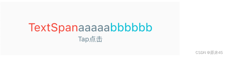
拼接字符
Dart
Text.rich(TextSpan(
  text: 'TextSpan',
  style: TextStyle(
    color: Colors.red,
    fontSize: 24.0,
  ),
  children: <TextSpan>[
    new TextSpan(
      text: 'aaaaa',
      style: new TextStyle(
        color: Colors.blueGrey,
      ),
    ),
    new TextSpan(
      text: 'bbbbbb',
      style: new TextStyle(
        color: Colors.cyan,
      ),
    ),
  ],
)),
添加交互
Dart
Text.rich(TextSpan(
  children: <TextSpan>[
    TextSpan(
      text: 'Tap点击',
      style: const TextStyle(
        color: Colors.blueGrey,
      ),
      // 点击手势
      recognizer: TapGestureRecognizer()
      ..onTap = () {
        //增加一个点击事件
        print('被点击了');
      },
    ),
  ],
)),
2. 导入资源
2.1 加入资源
创建 assets 目录
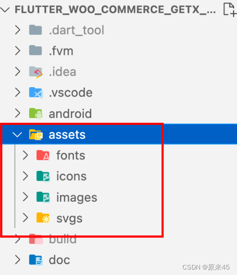
在更目录下创建 asssets,然后按资源类型,分别创建目录
编辑 pubspec.yaml 文件
Dart
# The following section is specific to Flutter.
flutter:
	...

  # To add assets to your application, add an assets section, like this:
  assets:
    - assets/images/
    - assets/svgs/
    - assets/json/
如果你想整个目录导入可以这样 - assets/images/
只是导入指定图片 - assets/images/abc.png
读取资源
Dart
File.json(
  'assets/json/app.json',
  ...
)
路径是从 assets 开始,指定文件位置
2.2 加入图片
自动适配屏幕 1x 2x 3x
为了适配不同的屏幕规格,设计了三种分辨率 Flutter 自动适配
目录排列上有个规则, images 目录下是 1x , 2x 3x 分别是单独目录
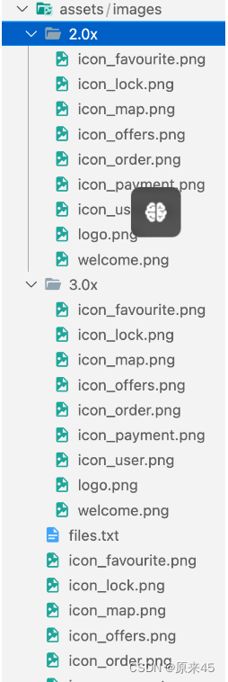
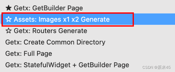
用猫哥 vscode 插件自动生成
猫哥提供了一个便捷的方式
首先下载插件 <Flutter GetX Generator - 猫哥>
Flutter GetX Generator - 猫哥 - Visual Studio Marketplace
右键自动生成图片,如果已有图片不覆盖
生成资源索引文件
会生成一个 files.txt 文件
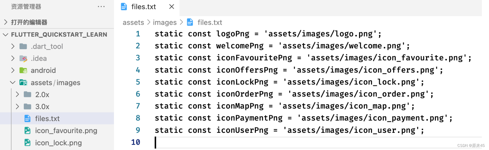
创建你自己的资源 dart 文件, 复制下就行
Dart
/// 图片资源
class AssetsImages {
  static const logoPng = 'assets/images/logo.png';
  static const welcomePng = 'assets/images/welcome.png';
  static const iconFavouritePng = 'assets/images/icon_favourite.png';
  static const iconOffersPng = 'assets/images/icon_offers.png';
  static const iconLockPng = 'assets/images/icon_lock.png';
  static const iconOrderPng = 'assets/images/icon_order.png';
  static const iconMapPng = 'assets/images/icon_map.png';
  static const iconPaymentPng = 'assets/images/icon_payment.png';
  static const iconUserPng = 'assets/images/icon_user.png';
}
读取图片
Dart
...
  Image.asset(
    AssetsImages.iconUserPng,
    ...
  ),
直接用你的 AssetsImages 管理,这样不会应拼写错误造成错误
3. 图片组件 image
Image 是一个图像的 Widget ,提供了一些类方法来快捷使用来自内存、本地、网络、Assets 的图片
下面是入口参数说明
Dart
//通过ImageProvider来加载图片
const Image({
Key key,
// ImageProvider,图像显示源
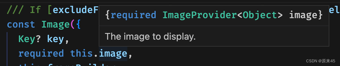
@required this.image,
this.semanticLabel,
this.excludeFromSemantics = false,
//显示宽度
this.width,
//显示高度
this.height,
//图片的混合色值
this.color,
//混合模式
this.colorBlendMode,
//缩放显示模式
this.fit,
//对齐方式
this.alignment = Alignment.center,
//重复方式
this.repeat = ImageRepeat.noRepeat,
//当图片需要被拉伸显示的时候,centerSlice定义的矩形区域会被拉伸,类似.9图片
this.centerSlice,
//类似于文字的显示方向
this.matchTextDirection = false,
//图片发生变化后,加载过程中原图片保留还是留白
this.gaplessPlayback = false,
//图片显示质量
this.filterQuality = FilterQuality.low,
})
// 加载网络图片,封装类:NetworkImage
Image.network(
//路径
String src,
{
Key key,
//缩放
double scale = 1.0,
this.semanticLabel,
this.excludeFromSemantics = false,
this.width,
this.height,
this.color,
this.colorBlendMode,
this.fit,
this.alignment = Alignment.center,
this.repeat = ImageRepeat.noRepeat,
this.centerSlice,
this.matchTextDirection = false,
this.gaplessPlayback = false,
this.filterQuality = FilterQuality.low,
Map<String, String> headers,
})
// 加载本地File文件图片,封装类:FileImage
Image.file(
//File对象
File file,
{
Key key,
double scale = 1.0,
this.semanticLabel,
this.excludeFromSemantics = false,
this.width,
this.height,
this.color,
this.colorBlendMode,
this.fit,
this.alignment = Alignment.center,
this.repeat = ImageRepeat.noRepeat,
this.centerSlice,
this.matchTextDirection = false,
this.gaplessPlayback = false,
this.filterQuality = FilterQuality.low,
})
// 加载本地资源图片,例如项目内资源图片
// 需要把图片路径在pubspec.yaml文件中声明一下,如:
// assets:
// - packages/fancy_backgrounds/backgrounds/background1.png
// 封装类有:AssetImage、ExactAssetImage
Image.asset(
//文件名称,包含路径
String name,
{
Key key,
// 用于访问资源对象
AssetBundle bundle,
this.semanticLabel,
this.excludeFromSemantics = false,
double scale,
this.width,
this.height,
this.color,
this.colorBlendMode,
this.fit,
this.alignment = Alignment.center,
this.repeat = ImageRepeat.noRepeat,
this.centerSlice,
this.matchTextDirection = false,
this.gaplessPlayback = false,
String package,
this.filterQuality = FilterQuality.low,
})
// 加载Uint8List资源图片/从内存中获取图片显示
// 封装类:MemoryImage
Image.memory(
// Uint8List资源图片
Uint8List bytes,
{
Key key,
double scale = 1.0,
this.semanticLabel,
this.excludeFromSemantics = false,
this.width,
this.height,
this.color,
this.colorBlendMode,
this.fit,
this.alignment = Alignment.center,
this.repeat = ImageRepeat.noRepeat,
this.centerSlice,
this.matchTextDirection = false,
this.gaplessPlayback = false,
this.filterQuality = FilterQuality.low,
})3.1 colorBlendMode 混合参数
枚举 BlendMode 定义
Dart
enum BlendMode {
  clear,src,dst,srcOver,dstOver,srcIn,dstIn,srcOut,dstOut,srcATop,dstATop,xor,plus,modulate,screen,overlay,darken,lighten,colorDodge,colorBurn,hardLight,softLight,difference,exclusion,multiply,hue,saturation,color,luminosity,
}
效果图
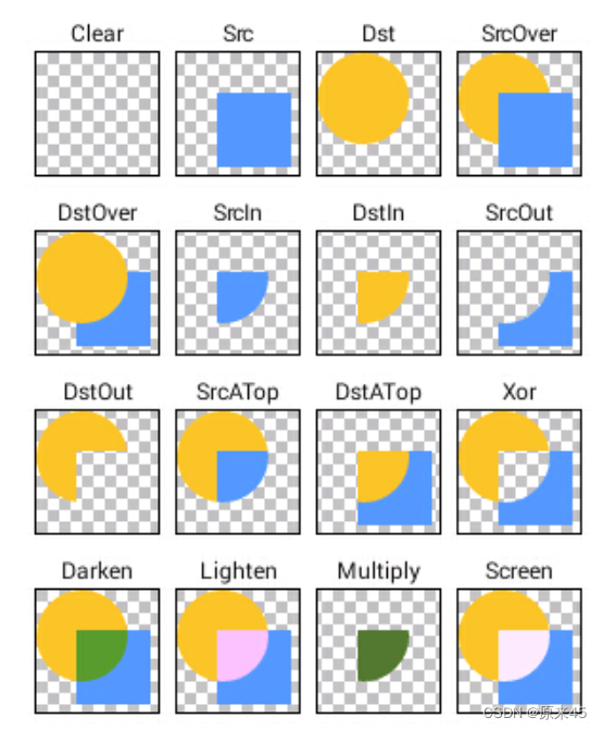
代码
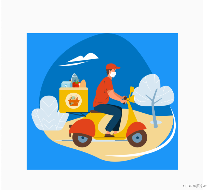
图片色彩 Colors.blue ,混合模式 BlendMode.dstOver
Dart
import 'package:flutter/material.dart';

class ImagesPage extends StatelessWidget {
  const ImagesPage({Key? key}) : super(key: key);

  // BlendMode
  Widget _buildBlendMode() {
    return Image.asset(
      'assets/images/welcome.png',
      color: Colors.blue,
      colorBlendMode: BlendMode.dstOver,
    );
  }

  @override
  Widget build(BuildContext context) {
    return Scaffold(
      body: Center(
        child: _buildBlendMode(),
      ),
    );
  }
}
输出
可以发现底色蓝色,图片浮在上层
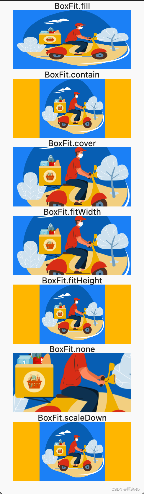
3.2 fit 图片大小适配
BoxFit 枚举定义
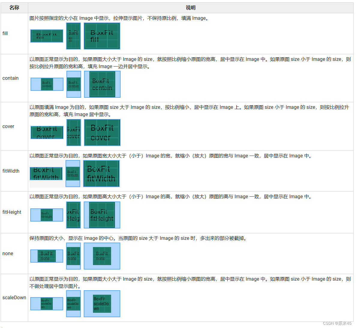
代码
Dart
import 'package:flutter/material.dart';

class ImagesPage extends StatelessWidget {
  const ImagesPage({Key? key}) : super(key: key);

  // fit
  Widget _buildFit(fit) {
    return Column(
      children: [
        Text("$fit"),
        Container(
          color: Colors.amber,
          child: SizedBox(
            width: 200,
            height: 100,
            child: Image.asset(
              'assets/images/welcome.png',
              color: Colors.blue,
              colorBlendMode: BlendMode.dstOver,
              fit: fit,
            ),
          ),
        ),
      ],
    );
  }

  @override
  Widget build(BuildContext context) {
    return Scaffold(
      body: SingleChildScrollView(
        child: Center(
          child: Column(
            children: [
              for (var it in BoxFit.values) _buildFit(it),
            ],
          ),
        ),
      ),
    );
  }
}
输出
3.3 ImageProvider 图片对象
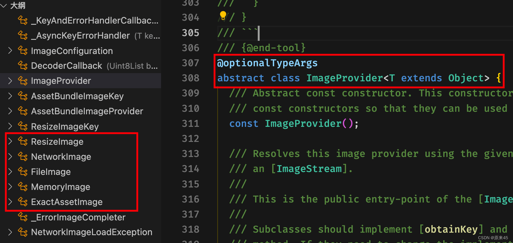
Image 组件的 image 参数是一个 ImageProvider, 这样的设计好处是你的图片对象可以来自于各种方式
ImageProvider 是一个抽象类,实现类有 FileImage MemoryImage NetWorkImage
/flutter/lib/src/widgets/image.dart
代码
Dart
import 'package:flutter/material.dart';

class ImagesPage extends StatelessWidget {
  const ImagesPage({Key? key}) : super(key: key);

  // ImageProvider
  Widget _buildImageProvider() {
    return const Image(
      image: AssetImage('assets/images/welcome.png'),
    );
  }

  @override
  Widget build(BuildContext context) {
    return Scaffold(
      body: Center(child: _buildImageProvider()),
    );
  }
}
输出
4. 图标组件 Icon
Icon 组件用来显示可缩放的图标,不会像图片一样失真,还能设置颜色
4.1 定义
Dart
  const Icon(

    // IconData 图标数据
    this.icon, {
    Key? key,

    // 尺寸
    this.size,

    // 颜色
    this.color,

    // 方向
    this.textDirection,

    this.semanticLabel,
  }) : super(key: key);
4.2 开启 pubspec.yaml
Dart
# The following section is specific to Flutter.
flutter:
  # The following line ensures that the Material Icons font is
  # included with your application, so that you can use the icons in
  # the material Icons class.
  uses-material-design: true
4.3 icon 预览
https://fonts.google.com/icons?selected=Material+Icons
4.4 示例
代码
Dart
import 'package:flutter/material.dart';

class IconPage extends StatelessWidget {
  const IconPage({Key? key}) : super(key: key);

  @override
  Widget build(BuildContext context) {
    return const Scaffold(
      body: Icon(
        Icons.campaign,
        size: 200,
        color: Colors.amber,
      ),
    );
  }
}
输出
4.5 苹果 Icon
苹果风格 icon 需要用 CupertinoIcons 对象来访问
CupertinoIcons class - cupertino library - Dart API
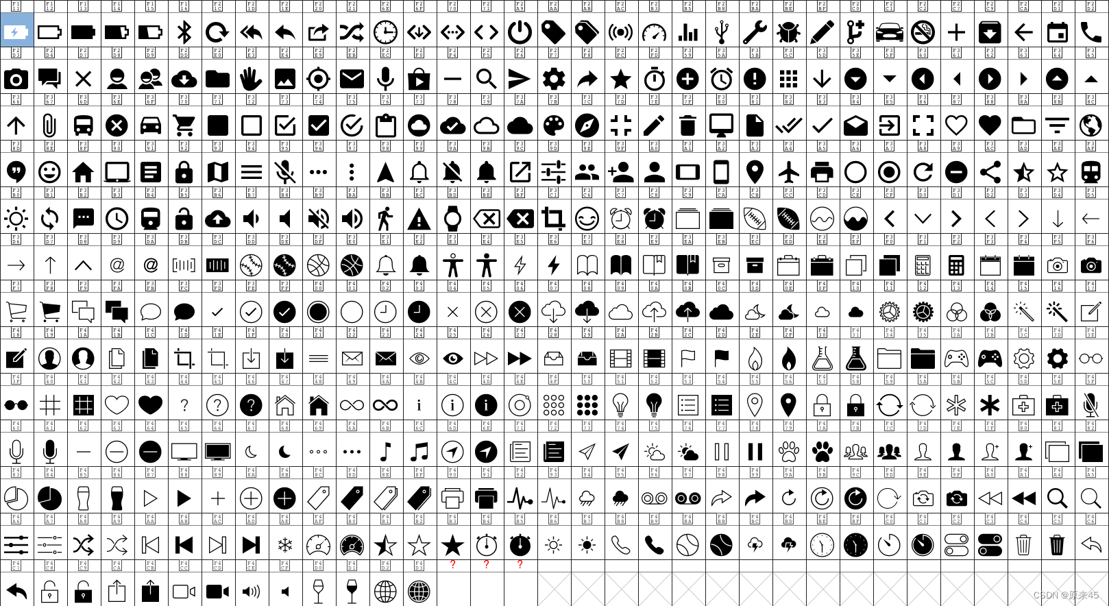
Icon 地图
5. 按钮组件
5.1 ElevatedButton
定义
Dart
 const ElevatedButton({
    Key? key,
    // 点击事件
    required VoidCallback? onPressed,
    // 长按
    VoidCallback? onLongPress,
    // hover
    ValueChanged<bool>? onHover,
    ValueChanged<bool>? onFocusChange,

    // 样式
    ButtonStyle? style,

    // 焦点
    FocusNode? focusNode,
    bool autofocus = false,
    Clip clipBehavior = Clip.none,

    // 按钮内容
    required Widget? child,
  })
5.2 ButtonStyle 样式定义
Dart
class ButtonStyle with Diagnosticable {
  /// Create a [ButtonStyle].
  const ButtonStyle({
    // 文字
    this.textStyle,
    // 背景色
    this.backgroundColor,
    // 前景色
    this.foregroundColor,
    // 鼠标滑过颜色
    this.overlayColor,
    // 阴影
    this.shadowColor,
    // 阴影高度
    this.elevation,
    // 内边距
    this.padding,
    // 最小尺寸
    this.minimumSize,
		// 固定 size
    this.fixedSize,
    // 最大最小尺寸
    this.maximumSize,
    // 边框
    this.side,
    // 形状
    this.shape,
    // 鼠标光标
    this.mouseCursor,
    // 紧凑程度
    this.visualDensity,
    // 配置可以按下按钮的区域的尺寸
    this.tapTargetSize,
    // 定义 [shape] 和 [elevation] 的动画更改的持续时间
    this.animationDuration,
    // 检测到的手势是否应该提供声音和/或触觉反馈
    this.enableFeedback,
    // 子元素对齐方式
    this.alignment,
    // 墨水效果
    this.splashFactory,
  });
代码
Dart
import 'package:flutter/material.dart';

class ButtonPage extends StatelessWidget {
  const ButtonPage({Key? key}) : super(key: key);

  @override
  Widget build(BuildContext context) {
    return Scaffold(
      body: Center(
        child: Column(
          mainAxisAlignment: MainAxisAlignment.center,
          children: [
            // ElevatedButton
            ElevatedButton(
              onPressed: () {},
              child: const Text('ElevatedButton'),
              style: ButtonStyle(
                // 背景色
                backgroundColor: MaterialStateProperty.all(Colors.yellow),
                // 前景色
                foregroundColor: MaterialStateProperty.all(Colors.red),
                // 鼠标滑过颜色
                overlayColor: MaterialStateProperty.all(Colors.blue),
                // 阴影颜色
                shadowColor: MaterialStateProperty.all(Colors.red),
                // 阴影高度
                elevation: MaterialStateProperty.all(8),
                // 边框
                side: MaterialStateProperty.all(const BorderSide(
                  width: 5,
                  color: Colors.cyan,
                )),
                // 固定尺寸
                fixedSize: MaterialStateProperty.all(const Size(200, 100)),
              ),
            ),
          ],
        ),
      ),
    );
  }
}
输出


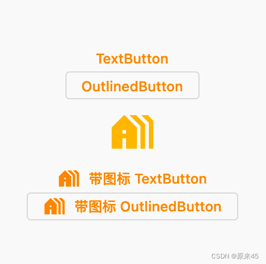
5.3 其它按钮
- TextButton 文字按钮
- OutlinedButton 边框按钮
- IconButton 图标按钮
代码
Dart
import 'package:flutter/material.dart';

class ButtonPage extends StatelessWidget {
  const ButtonPage({Key? key}) : super(key: key);

  @override
  Widget build(BuildContext context) {
    return Scaffold(
      body: Center(
        child: Column(
          mainAxisAlignment: MainAxisAlignment.center,
          children: [
            // 文字按钮
            TextButton(
              onPressed: () {},
              child: const Text('TextButton'),
            ),

            // 边框按钮
            OutlinedButton(
              onPressed: () {},
              child: const Text('OutlinedButton'),
            ),

            // 图标按钮
            IconButton(
              onPressed: () {},
              icon: const Icon(
                Icons.holiday_village,
              ),
              iconSize: 50,
              color: Colors.amber,
            ),

            // 带图标 TextButton
            TextButton.icon(
              onPressed: () {},
              icon: const Icon(Icons.holiday_village),
              label: const Text('带图标 TextButton'),
            ),

            // 带图标 OutlinedButton
            OutlinedButton.icon(
              onPressed: () {},
              icon: const Icon(Icons.holiday_village),
              label: const Text('带图标 OutlinedButton'),
            ),
          ],
        ),
      ),
    );
  }
}
注意 TextButton.icon OutlinedButton.icon 可以输出带图标文字的按钮
输出
6. 路由管理v1 Navigator
如果对 路由v2 感兴趣的可以去看下面链接, 这里不做讨论 Flutter 导航 Navgiator 2.0 Page Router 说明 -猫哥_哔哩哔哩_bilibili
6.1 匿名路由
主要是通过 Push() Pop() 来操作路由,简单场景也能满足业务
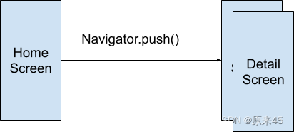
6.1.1 Navigator 路由管理对象
Navigator是一个路由管理的组件,它提供了打开和退出路由页方
Future push(BuildContext context, Route route) 压入一个新页面到路由堆栈
bool pop(BuildContext context, [ result ]) 压出一个页面出堆栈
6.1.2 MaterialPageRoute 定义
MaterialPageRoute继承自PageRoute类,PageRoute类是一个抽象类,表示占有整个屏幕空间的一个模态路由页面,它还定义了路由构建及切换时过渡动画的相关接口及属性
Dart
  MaterialPageRoute({
    // 是一个WidgetBuilder类型的回调函数,它的作用是构建路由页面的具体内容,返回值是一个widget。我们通常要实现此回调,返回新路由的实例。
    WidgetBuilder builder,

    // 包含路由的配置信息,如路由名称、是否初始路由(首页)。
    RouteSettings settings,

    // 默认情况下,当入栈一个新路由时,原来的路由仍然会被保存在内存中,如果想在路由没用的时候释放其所占用的所有资源,可以设置maintainState为 false。
    bool maintainState = true,

    // 表示新的路由页面是否是一个全屏的模态对话框,在 iOS 中,如果fullscreenDialog为true,新页面将会从屏幕底部滑入(而不是水平方向)。
    bool fullscreenDialog = false,
  })
6.1.3 路由传值
传递可以在初始新界面对象时通过构造函数压入
新界面退出后的返回值通过 Navigator.pop 的参数返回
6.1.4 示例
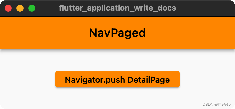
首页 NavPaged
Dart
import 'package:flutter/material.dart';
class NavPaged extends StatelessWidget {
const NavPaged({Key? key}) : super(key: key);
@override
Widget build(BuildContext context) {
return Scaffold(
appBar: AppBar(
title: const Text('NavPaged'),
),
body: Center(
child: ElevatedButton(
onPressed: () async {
var result = await Navigator.push(
context,
MaterialPageRoute(builder: (context) {
return const DetailPaged(
title: "ducafecat",
);
}),
);
print("路由返回值: $result");
},
child: const Text("Navigator.push DetailPage"),
),
),
);
}
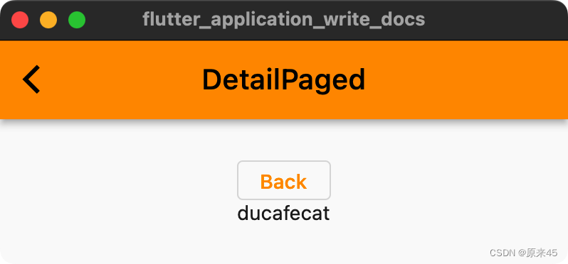
}详情页 DetailPaged
Dart
class DetailPaged extends StatelessWidget {
  const DetailPaged({Key? key, this.title}) : super(key: key);

  // 参数
  final String? title;

  @override
  Widget build(BuildContext context) {
    return Scaffold(
      appBar: AppBar(
        title: const Text('DetailPaged'),
      ),
      body: Center(
        child: Column(
          mainAxisAlignment: MainAxisAlignment.center,
          children: [
            // 按钮
            OutlinedButton(
              onPressed: () {
                Navigator.pop(context, "ok");
              },
              child: const Text('Back'),
            ),
            // 显示传值
            Text(title ?? ""),
          ],
        ),
      ),
    );
  }
}
6.2 命名路由
这种方式就优雅了很多,事先定义好路由名字
lib/main.dart
Dart
 @override
  Widget build(BuildContext context) {
    return MaterialApp(
      ...
      routes: {
        '/': (context) => const NavPaged(),
        '/details': (context) => const DetailPaged(),
      },
pushNamed 路由请求, 输入名称即可
Dart
onPressed: () async {
  var result = await Navigator.pushNamed(
    context,
    "/details",
    arguments: {'title': "ducafecat"},
  );

  print("路由返回值: $result");
},
取值显示
Dart
@override
Widget build(BuildContext context) {
  // 取值
  final arguments = (ModalRoute.of(context)?.settings.arguments ?? <String, dynamic>{}) as Map;
  var title = arguments['title'];

  ...

  // 显示传值
  Text(title ?? ""),
6.3 onGenerateRoute 手动解析
上面的命名路由是好,但是 传参数 不灵活,所以采用 onGenerateRoute 来动态处理
6.3.1 定义路由
lib/main.dart
Dart
    return MaterialApp(
      ...
      onGenerateRoute: (settings) {
        // Handle '/'
        if (settings.name == '/') {
          return MaterialPageRoute(builder: (context) => const NavPaged());
        }

        // Handle '/details/:id'
        var uri = Uri.parse(settings.name!);
        if (uri.pathSegments.length == 2 &&
            uri.pathSegments.first == 'details') {
          String uid = uri.pathSegments[1];
          return MaterialPageRoute(
            builder: (context) => DetailPaged(
              uid: uid,
            ),
          );
        }

        return MaterialPageRoute(builder: (context) => const UnknownPage());
      },
如果没有命中,返回 UnknownPage 界面
6.3.2 导航页完整代码
lib/pages/nav.dart
Dart
import 'package:flutter/material.dart';
class NavPaged extends StatelessWidget {
const NavPaged({Key? key}) : super(key: key);
@override
Widget build(BuildContext context) {
return Scaffold(
appBar: AppBar(
title: const Text('NavPaged'),
),
body: Center(
child: ElevatedButton(
onPressed: () async {
var result = await Navigator.pushNamed(
context,
"/details/312312312312",
);
print("路由返回值: $result");
},
child: const Text("Navigator.push DetailPage"),
),
),
);
}
}
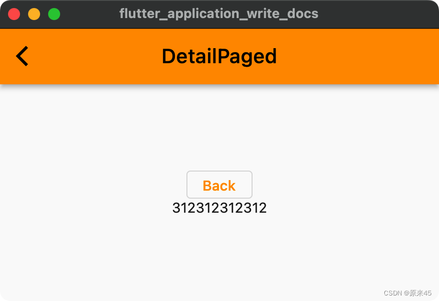
class DetailPaged extends StatelessWidget {
const DetailPaged({Key? key, this.uid}) : super(key: key);
final String? uid;
@override
Widget build(BuildContext context) {
return Scaffold(
appBar: AppBar(
title: const Text('DetailPaged'),
),
body: Center(
child: Column(
mainAxisAlignment: MainAxisAlignment.center,
children: [
// 按钮
OutlinedButton(
onPressed: () {
Navigator.pop(context, "ok");
},
child: const Text('Back'),
),
// 显示传值
Text(uid ?? ""),
],
),
),
);
}
}
class UnknownPage extends StatelessWidget {
const UnknownPage({Key? key}) : super(key: key);
@override
Widget build(BuildContext context) {
return const Scaffold(
body: Text('UnknownPage'),
);
}
}路由传值
var result = await Navigator.pushNamed( context, "/details/312312312312", );
运行
7. 样式管理
7.1 ThemeData 样式对象
定义
Dart
  factory ThemeData({
    // 全局配置
    AndroidOverscrollIndicator? androidOverscrollIndicator,
    bool? applyElevationOverlayColor,
    NoDefaultCupertinoThemeData? cupertinoOverrideTheme,
    InputDecorationTheme? inputDecorationTheme,
    MaterialTapTargetSize? materialTapTargetSize,
    PageTransitionsTheme? pageTransitionsTheme,
    TargetPlatform? platform,
    ScrollbarThemeData? scrollbarTheme,
    InteractiveInkFeatureFactory? splashFactory,
    VisualDensity? visualDensity,
    bool? useMaterial3,

    // 颜色管理
    ColorScheme? colorScheme,
    Color? colorSchemeSeed,
    Brightness? brightness,
    MaterialColor? primarySwatch,
    Color? primaryColor,
    Color? primaryColorLight,
    Color? primaryColorDark,
    Color? focusColor,
    Color? hoverColor,
    Color? shadowColor,
    Color? canvasColor,
    Color? scaffoldBackgroundColor,
    Color? bottomAppBarColor,
    Color? cardColor,
    Color? dividerColor,
    Color? highlightColor,
    Color? splashColor,
    Color? selectedRowColor,
    Color? unselectedWidgetColor,
    Color? disabledColor,
    Color? secondaryHeaderColor,
    Color? backgroundColor,
    Color? dialogBackgroundColor,
    Color? indicatorColor,
    Color? hintColor,
    Color? errorColor,
    Color? toggleableActiveColor,

    // 字体和图标
    String? fontFamily,
    Typography? typography,
    TextTheme? textTheme,
    TextTheme? primaryTextTheme,
    IconThemeData? iconTheme,
    IconThemeData? primaryIconTheme,

    // 各种组件样式
    AppBarTheme? appBarTheme,
    MaterialBannerThemeData? bannerTheme,
    BottomAppBarTheme? bottomAppBarTheme,
    BottomNavigationBarThemeData? bottomNavigationBarTheme,
    BottomSheetThemeData? bottomSheetTheme,
    ButtonBarThemeData? buttonBarTheme,
    ButtonThemeData? buttonTheme,
    CardTheme? cardTheme,
    CheckboxThemeData? checkboxTheme,
    ChipThemeData? chipTheme,
    DataTableThemeData? dataTableTheme,
    DialogTheme? dialogTheme,
    DividerThemeData? dividerTheme,
    DrawerThemeData? drawerTheme,
    ElevatedButtonThemeData? elevatedButtonTheme,
    FloatingActionButtonThemeData? floatingActionButtonTheme,
    ListTileThemeData? listTileTheme,
    NavigationBarThemeData? navigationBarTheme,
    NavigationRailThemeData? navigationRailTheme,
    OutlinedButtonThemeData? outlinedButtonTheme,
    PopupMenuThemeData? popupMenuTheme,
    ProgressIndicatorThemeData? progressIndicatorTheme,
    RadioThemeData? radioTheme,
    SliderThemeData? sliderTheme,
    SnackBarThemeData? snackBarTheme,
    SwitchThemeData? switchTheme,
    TabBarTheme? tabBarTheme,
    TextButtonThemeData? textButtonTheme,
    TextSelectionThemeData? textSelectionTheme,
    TimePickerThemeData? timePickerTheme,
    ToggleButtonsThemeData? toggleButtonsTheme,
    TooltipThemeData? tooltipTheme,
我们在 MaterialApp.theme 中初始
lib/main.dart
Dart
import 'package:flutter/material.dart';
import 'package:flutter_application_write_docs/pages/theme.dart';

void main() {
  runApp(const MyApp());
}

class MyApp extends StatelessWidget {
  const MyApp({Key? key}) : super(key: key);

  @override
  Widget build(BuildContext context) {
    return MaterialApp(
      title: 'Flutter Quick Start',

      // 样式
      theme: ThemeData(
        // 主题颜色
        primarySwatch: Colors.brown,
        // appBar颜色
        appBarTheme: ThemeData.light().appBarTheme.copyWith(
              backgroundColor: Colors.green,
              foregroundColor: Colors.white,
            ),
        // 按钮颜色
        elevatedButtonTheme: ElevatedButtonThemeData(
          style: ElevatedButton.styleFrom(
            onPrimary: Colors.white,
            primary: Colors.amber,
          ),
        ),
      ),

      // page
      home: const ThemePage(),

      // 关闭 debug 标签
      debugShowCheckedModeBanner: false,
    );
  }
}
lib/pages/theme.dart
Dart
import 'package:flutter/material.dart';
class ThemePage extends StatelessWidget {
const ThemePage({Key? key}) : super(key: key);
@override
Widget build(BuildContext context) {
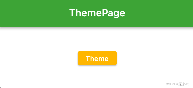
return Scaffold(
appBar: AppBar(
title: const Text('ThemePage'),
),
body: Center(
child: ElevatedButton(
onPressed: () {},
child: const Text('Theme'),
),
),
);
}
}输出
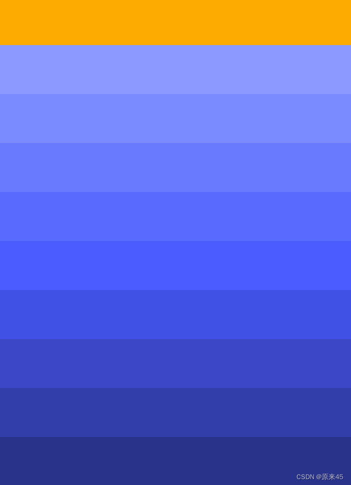
7.2 Color 与 MaterialColor
Color 颜色
Colors class - material library - Dart API
如设计稿的颜色是 #40c254, 转换成 16 进制颜色
Dart
// 字符串转 Color
Color stringToColor(String source) {
return Color(int.parse(source, radix: 16) | 0xFF000000);
}
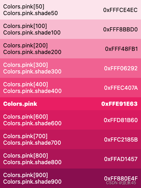
Color c = stringToColor("40c254");MaterialColor 色彩表
MaterialColor class - material library - Dart API
Dart
// 字符串转 MaterialColor
MaterialColor stringToMaterialColor(String source) {
  Color color = stringToColor(source);

  List<double> strengths = <double>[.05];
  Map<int, Color> swatch = <int, Color>{};
  final int r = color.red, g = color.green, b = color.blue;

  for (int i = 1; i < 10; i++) {
    strengths.add(0.1 * i);
  }
  for (var strength in strengths) {
    final double ds = 0.5 - strength;
    swatch[(strength * 1000).round()] = Color.fromRGBO(
      r + ((ds < 0 ? r : (255 - r)) * ds).round(),
      g + ((ds < 0 ? g : (255 - g)) * ds).round(),
      b + ((ds < 0 ? b : (255 - b)) * ds).round(),
      1,
    );
  }
  return MaterialColor(color.value, swatch);
}

MaterialColor mc = stringToColor("40c254");
代码
Dart
import 'package:flutter/material.dart';

// 字符串转 Color
Color stringToColor(String source) {
  return Color(int.parse(source, radix: 16) | 0xFF000000);
}

// 字符串转 MaterialColor
MaterialColor stringToMaterialColor(String source) {
  Color color = stringToColor(source);

  List<double> strengths = <double>[.05];
  Map<int, Color> swatch = <int, Color>{};
  final int r = color.red, g = color.green, b = color.blue;

  for (int i = 1; i < 10; i++) {
    strengths.add(0.1 * i);
  }
  for (var strength in strengths) {
    final double ds = 0.5 - strength;
    swatch[(strength * 1000).round()] = Color.fromRGBO(
      r + ((ds < 0 ? r : (255 - r)) * ds).round(),
      g + ((ds < 0 ? g : (255 - g)) * ds).round(),
      b + ((ds < 0 ? b : (255 - b)) * ds).round(),
      1,
    );
  }
  return MaterialColor(color.value, swatch);
}

class ColorPage extends StatelessWidget {
  const ColorPage({Key? key}) : super(key: key);

  @override
  Widget build(BuildContext context) {
    var c = stringToColor("FFB822");
    var mc = stringToMaterialColor("5C78FF");

    return Scaffold(
      body: SizedBox.expand(
        child: Column(
          children: [
            // Color
            Container(
              color: c,
              height: 50,
            ),

            // MaterialColor
            for (var i = 1; i < 10; i++)
              Container(
                color: mc[i * 100],
                height: 50,
              ),
          ],
        ),
      ),
    );
  }
}
输出
8. 手势事件
8.1 GestureDetector
GestureDetector是一个用于手势识别的功能性组件,我们通过它可以来识别各种手势
定义
Dart
GestureDetector({
    Key? key,
    this.child,
  	// 单击
    this.onTapDown,
    this.onTapUp,
    this.onTap,
    this.onTapCancel,
  	// 双指
    this.onSecondaryTap,
    this.onSecondaryTapDown,
    this.onSecondaryTapUp,
    this.onSecondaryTapCancel,
  	// 三点
    this.onTertiaryTapDown,
    this.onTertiaryTapUp,
    this.onTertiaryTapCancel,
  	// 双击
    this.onDoubleTapDown,
    this.onDoubleTap,
    this.onDoubleTapCancel,
  	// 长按
    this.onLongPressDown,
    this.onLongPressCancel,
    this.onLongPress,
    this.onLongPressStart,
    this.onLongPressMoveUpdate,
    this.onLongPressUp,
    this.onLongPressEnd,
  	// 两点 三点 长按
    this.onSecondaryLongPressDown,
    this.onSecondaryLongPressCancel,
    this.onSecondaryLongPress,
    this.onSecondaryLongPressStart,
    this.onSecondaryLongPressMoveUpdate,
    this.onSecondaryLongPressUp,
    this.onSecondaryLongPressEnd,
    this.onTertiaryLongPressDown,
    this.onTertiaryLongPressCancel,
    this.onTertiaryLongPress,
    this.onTertiaryLongPressStart,
    this.onTertiaryLongPressMoveUpdate,
    this.onTertiaryLongPressUp,
    this.onTertiaryLongPressEnd,
  	// 垂直 水平 Drag
    this.onVerticalDragDown,
    this.onVerticalDragStart,
    this.onVerticalDragUpdate,
    this.onVerticalDragEnd,
    this.onVerticalDragCancel,
    this.onHorizontalDragDown,
    this.onHorizontalDragStart,
    this.onHorizontalDragUpdate,
    this.onHorizontalDragEnd,
    this.onHorizontalDragCancel,
    this.onForcePressStart,
    this.onForcePressPeak,
    this.onForcePressUpdate,
    this.onForcePressEnd,
  	// 点击滑动
    this.onPanDown,
    this.onPanStart,
    this.onPanUpdate,
    this.onPanEnd,
    this.onPanCancel,
    this.onScaleStart,
    this.onScaleUpdate,
    this.onScaleEnd,
    this.behavior,
    this.excludeFromSemantics = false,
    this.dragStartBehavior = DragStartBehavior.start,
包含了大量的交互操作
代码
Dart
import 'package:flutter/material.dart';

class GesturePage extends StatefulWidget {
  const GesturePage({Key? key}) : super(key: key);

  @override
  State<GesturePage> createState() => _GesturePageState();
}

class _GesturePageState extends State<GesturePage> {
  double? dx, dy;

  Widget _buildView() {
    return GestureDetector(
      child: Container(
        color: Colors.amber,
        width: 200,
        height: 200,
      ),
      // 点击
      onTap: () {
        print('点击 onTap');
      },
      // 长按
      onLongPress: () {
        print('长按 onLongPress');
      },
      // 双击
      onDoubleTap: () {
        print('双击 onLongPress');
      },

      // 按下
      onPanDown: (DragDownDetails e) {
        print("按下 ${e.globalPosition}");
      },
      // 按下滑动
      onPanUpdate: (DragUpdateDetails e) {
        setState(() {
          dx = e.delta.dx;
          dy = e.delta.dy;
        });
      },
      // 松开
      onPanEnd: (DragEndDetails e) {
        print(e.velocity);
      },
    );
  }

  @override
  Widget build(BuildContext context) {
    return Scaffold(
      body: SizedBox.expand(
        child: Column(
          mainAxisAlignment: MainAxisAlignment.center,
          children: [
            _buildView(),

            // 显示
            Text('x: $dx, y: $dy'),
          ],
        ),
      ),
    );
  }
}
输出
Dart
flutter: 用户手指按下:Offset(127.7, 218.0)
flutter: Velocity(0.0, 0.0)
Reloaded 1 of 585 libraries in 171ms.
Reloaded 2 of 585 libraries in 205ms.
flutter: 按下 Offset(128.0, 188.2)
flutter: 长按 onLongPress
flutter: 按下 Offset(145.0, 214.2)
flutter: Velocity(-44.4, -45.0)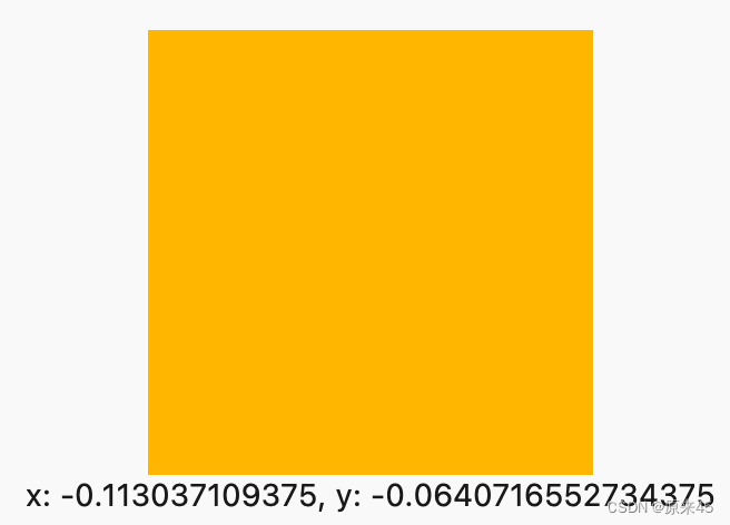
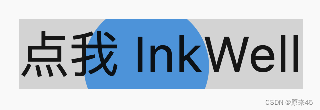
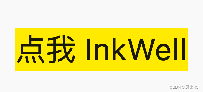
8.2 InkWell
InkWell 是带有水波纹的点击事件的组件
定义
Dart
  const InkWell({
    Key? key,
    Widget? child,
    // 点击
    GestureTapCallback? onTap,
    GestureTapCallback? onDoubleTap,
    // 长按
    GestureLongPressCallback? onLongPress,
    GestureTapDownCallback? onTapDown,
    GestureTapCancelCallback? onTapCancel,
    ValueChanged<bool>? onHighlightChanged,
    ValueChanged<bool>? onHover,
    // 光标样式
    MouseCursor? mouseCursor,
    // 颜色
    Color? focusColor,
    Color? hoverColor,
    Color? highlightColor,
    MaterialStateProperty<Color?>? overlayColor,
    Color? splashColor,
    InteractiveInkFeatureFactory? splashFactory,
    double? radius,
    BorderRadius? borderRadius,
    ShapeBorder? customBorder,
    bool? enableFeedback = true,
    bool excludeFromSemantics = false,
    FocusNode? focusNode,
    bool canRequestFocus = true,
    ValueChanged<bool>? onFocusChange,
    bool autofocus = false,
  })
代码
Dart
import 'package:flutter/material.dart';

class InkWellPage extends StatelessWidget {
  const InkWellPage({Key? key}) : super(key: key);

  Widget _buildView() {
    return InkWell(
      // 点击
      onTap: () {},
      // 水波纹颜色
      splashColor: Colors.blue,
      // 高亮颜色
      highlightColor: Colors.yellow,
      // 鼠标滑过颜色
      hoverColor: Colors.brown,
      //
      child: const Text(
        '点我 InkWell',
        style: TextStyle(
          fontSize: 50,
        ),
      ),
    );
  }

  @override
  Widget build(BuildContext context) {
    return Scaffold(
      body: Center(
        child: _buildView(),
      ),
    );
  }
}
输出

9. 输入框 TextField
TextField用于文本输入, 有着丰富的属性,定义如下
9.1 定义
Dart
  const TextField({
    Key? key,
    // 控制器
    this.controller,
    // 焦点管理
    this.focusNode,
    // 装饰器 背景 颜色 边框 ...
    this.decoration = const InputDecoration(),
    // 键盘输入类型
    // text	文本输入键盘
		// multiline	多行文本,需和maxLines配合使用(设为null或大于1)
		// number	数字;会弹出数字键盘
		// phone	优化后的电话号码输入键盘;会弹出数字键盘并显示"* #"
		// datetime	优化后的日期输入键盘;Android上会显示": -"
		// emailAddress	优化后的电子邮件地址;会显示"@ ."
		// url	优化后的url输入键盘; 会显示"/ ."
    TextInputType? keyboardType,
    // 键盘动作按钮图标
    // TextInputAction.search 搜索
    this.textInputAction,
    this.textCapitalization = TextCapitalization.none,
    // 正在编辑的文本样式
    this.style,
    this.strutStyle,
    // 输入框内编辑文本在水平方向的对齐方式
    this.textAlign = TextAlign.start,
    this.textAlignVertical,
    // 文字反向
    this.textDirection,
    // 只读
    this.readOnly = false,
    ToolbarOptions? toolbarOptions,
    // 显示光标
    this.showCursor,
    // 自动焦点
    this.autofocus = false,
    // 密文显示
    this.obscuringCharacter = '•',
    this.obscureText = false,
    this.autocorrect = true,
    SmartDashesType? smartDashesType,
    SmartQuotesType? smartQuotesType,
    // 启用提示
    this.enableSuggestions = true,
    // 输入框的最大行数,默认为1;如果为null,则无行数限制。
    this.maxLines = 1,
    this.minLines,
    this.expands = false,
    // 代表输入框文本的最大长度,设置后输入框右下角会显示输入的文本计数。
    this.maxLength,
    @Deprecated(
      'Use maxLengthEnforcement parameter which provides more specific '
      'behavior related to the maxLength limit. '
      'This feature was deprecated after v1.25.0-5.0.pre.',
    )
    this.maxLengthEnforced = true,
    this.maxLengthEnforcement,
    // 输入框内容改变时的回调函数;注:内容改变事件也可以通过controller来监听。
    this.onChanged,
    // 编辑完成
    this.onEditingComplete,
    // 确认输入内容
    this.onSubmitted,
    this.onAppPrivateCommand,
    // 指定输入格式;当用户输入内容改变时,会根据指定的格式来校验。
    this.inputFormatters,
    // 如果为false,则输入框会被禁用,禁用状态不接收输入和事件,同时显示禁用态样式(在其decoration中定义)。
    this.enabled,
    // 光标样式
    // 自定义输入框光标宽度、圆角和颜色
    this.cursorWidth = 2.0,
    this.cursorHeight,
    this.cursorRadius,
    this.cursorColor,
    this.selectionHeightStyle = ui.BoxHeightStyle.tight,
    this.selectionWidthStyle = ui.BoxWidthStyle.tight,
    this.keyboardAppearance,
    this.scrollPadding = const EdgeInsets.all(20.0),
    this.dragStartBehavior = DragStartBehavior.start,
    this.enableInteractiveSelection = true,
    this.selectionControls,
    // 点击
    this.onTap,
    // 鼠标
    this.mouseCursor,
    this.buildCounter,
    this.scrollController,
    this.scrollPhysics,
    this.autofillHints = const <String>[],
    this.clipBehavior = Clip.hardEdge,
    this.restorationId,
    this.enableIMEPersonalizedLearning = true,
  })
9.2 示例
代码
Dart
import 'package:flutter/material.dart';
class InputPage extends StatefulWidget {
const InputPage({Key? key}) : super(key: key);
@override
State<InputPage> createState() => _InputPageState();
}
class _InputPageState extends State<InputPage> {
// 文本消息
String _message = "";
// 输入框控制器
final TextEditingController _controllerName = TextEditingController();
final TextEditingController _controllerPassword = TextEditingController();
// 管理焦点
FocusNode focusNodeName = FocusNode();
FocusNode focusNodePassword = FocusNode();
FocusScopeNode? focusScopeNode;
// 输入框 - 用户名
Widget _buildName() {
return TextField(
// 控制器
controller: _controllerName,
// 焦点
autofocus: true,
// 焦点管理
focusNode: focusNodeName,
// 输入框的样式
decoration: const InputDecoration(
labelText: '用户名',
hintText: '请输入',
prefixIcon: Icon(Icons.person),
suffixIcon: Icon(Icons.edit),
border: OutlineInputBorder(),
),
// 输入改变事件
onChanged: (String value) {
setState(() {
_message = value;
});
},
// 提交回车事件
onSubmitted: (String value) {
focusScopeNode ??= FocusScope.of(context);
focusScopeNode?.requestFocus(focusNodePassword);
},
);
}
// 输入框 - 密码
Widget _buildPassword() {
return TextField(
controller: _controllerPassword,
// 密码显示
obscureText: true,
// 焦点管理
focusNode: focusNodePassword,
// 输入框的样式
decoration: const InputDecoration(
labelText: '密码',
hintText: '请输入',
prefixIcon: Icon(Icons.person),
suffixIcon: Icon(Icons.edit),
border: OutlineInputBorder(),
),
);
}
// 按钮
Widget _buildButton() {
return ElevatedButton(
child: const Text('登录 Now!'),
onPressed: () {
setState(() {
_message =
'name:${_controllerName.text}, pass:${_controllerPassword.text}';
});
},
);
}
// 显示
Widget _buildMessage() {
return Text(_message);
}
@override
void dispose() {
// 释放控制器
_controllerName.dispose();
_controllerPassword.dispose();
super.dispose();
}
@override
Widget build(BuildContext context) {
return Scaffold(
body: Padding(
padding: const EdgeInsets.all(8.0),
child: Column(
children: [
_buildName(),
const SizedBox(height: 10),
_buildPassword(),
const SizedBox(height: 10),
_buildButton(),
const SizedBox(height: 10),
_buildMessage(),
],
),
),
);
}
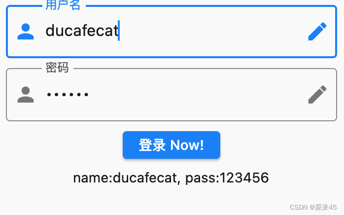
}输出
创作不易,希望读者三连支持 💖
赠人玫瑰,手有余香 💖