菜单页面
++开篇(请大家看完):此网站写给挚爱,后续页面还会慢慢更新,大家敬请期待~ ~ ~++
轻舟所编写这个前端框架的设计初衷,纯粹是为了哄对象开心。除此之外,并无其它任何用途或目的。
此前端框架,主要侧重于前端页面的视觉效果和交互体验。通过运用各种前端技术和创意,精心打造了一系列引人入胜的页面特效,会为大家带来全新的浏览体验。
同时,我非常支持和鼓励大家对这个框架进行二次创作或修改。您可以根据自己的需求和喜好,对框架进行个性化的定制和扩展,以打造出更符合自己品味的页面效果。
但请注意,如果您打算将这个框架转发给其他人或用于其他场合,请务必注明原创来源。让我们一起维护一个良好的创作环境。
最后,轻舟会继续更新和完善这个前端页面特效框架,为大家带来更多有趣、实用的功能和效果。感谢您的支持和关注!
页面效果:代码可直接拿去使用,复制粘贴即可
星空是可动的哦~~~毒药水的颜色搭配,每一次的按钮点击都是惊喜
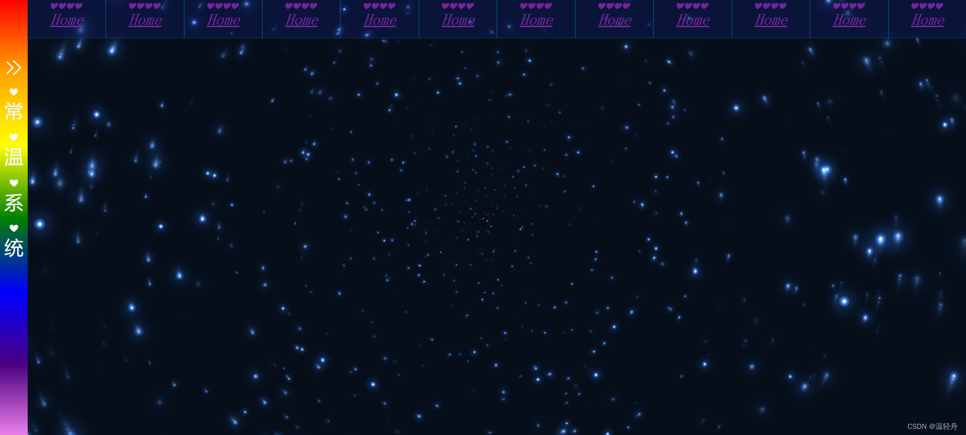
一:caidan.html
html
<!DOCTYPE html>
<html lang="en" >
<head>
<meta charset="UTF-8">
<meta name="viewport"content="width=device-width, user-scalable=no, initial-scale=1.0, maximum-scale=1.0, minimum-scale=1.0">
<meta http-equiv="X-UA-Compatible" content="ie=edge">
<script src="JS/adapter.js"></script>
<link rel="stylesheet" href="CSS/base.css">
<link rel="stylesheet" href="CSS/menu.css">
<title>111</title>
<!--导航栏-->
<style>
.caidan {
height: 48px;
background-color: rgba(20, 33, 125, 0.3);
}
.lj{
height: 100%;
display: flex;
justify-content: flex-start;
align-items: center;
}
.lop{
width: 100px;
height: 100%;
list-style-type: none;
position: relative;
transform-style: preserve-3d;
transition: all 0.6s;
}
.lop a{
display: inline-block;
text-decoration: underline;
width: 100%;
height: 100%;
text-align: center;
line-height: 48px;
color: #72249c;
font-family: "新宋体";
font-size:20px;
font-weight: bold;
font-style: oblique;
text-emphasis: '❤';
}
.en {
width: 100%;
height: 100%;
outline: 1px solid rgba(0, 111, 170, 0.45);
position: absolute;
z-index: 2;
transform: translateZ(24px);
}
.zh {
width: 100%;
height: 100%;
background: linear-gradient(to bottom,green, greenyellow,lawngreen, lightgreen, mediumseagreen,deepskyblue,cadetblue);
outline: 1px solid #00aa7f;
color: #fff;
position: absolute;
z-index: 2;
transform: translateY(24px) rotateX(-90deg);
}
.lop:hover {
transform: rotateX(90deg);
}
</style>
</head>
<body>
<!--星空背景-->
<div>
<canvas id="canvas"></canvas>
<canvas id="snow"></canvas>
<div class="am-g" style="position: fixed; bottom: 0px;">
<div class="am-u-sm-12">
<div style="z-index: 9999" id="player" class="aplayer">
</div>
</div>
</div>
</div>
<style type="text/css">
canvas {
position: fixed;
width: 100%;
height: 100%;
z-index: -1;
}
</style>
<script type="text/javascript">
var canvas = document.getElementById('canvas'),
ctx = canvas.getContext('2d'),
w = canvas.width = window.innerWidth,
h = canvas.height = window.innerHeight,
hue = 217,
stars = [],
count = 0,
maxStars = 1300; //星星数量
var canvas2 = document.createElement('canvas'),
ctx2 = canvas2.getContext('2d');
canvas2.width = 100;
canvas2.height = 100;
var half = canvas2.width / 2,
gradient2 = ctx2.createRadialGradient(half, half, 0, half, half, half);
gradient2.addColorStop(0.025, '#CCC');
gradient2.addColorStop(0.1, 'hsl(' + hue + ', 61%, 33%)');
gradient2.addColorStop(0.25, 'hsl(' + hue + ', 64%, 6%)');
gradient2.addColorStop(1, 'transparent');
ctx2.fillStyle = gradient2;
ctx2.beginPath();
ctx2.arc(half, half, half, 0, Math.PI * 2);
ctx2.fill();
function random(min, max) {
if (arguments.length < 2) {
max = min;
min = 0;
}
if (min > max) {
var hold = max;
max = min;
min = hold;
}
return Math.floor(Math.random() * (max - min + 1)) + min;
}
function maxOrbit(x, y) {
var max = Math.max(x, y),
diameter = Math.round(Math.sqrt(max * max + max * max));
return diameter / 2;
//星星移动范围,值越大范围越小,
}
var Star = function () {
this.orbitRadius = random(maxOrbit(w, h));
this.radius = random(60, this.orbitRadius) / 8;
//星星大小
this.orbitX = w / 2;
this.orbitY = h / 2;
this.timePassed = random(0, maxStars);
this.speed = random(this.orbitRadius) / 50000;
//星星移动速度
this.alpha = random(2, 10) / 10;
count++;
stars[count] = this;
}
Star.prototype.draw = function () {
var x = Math.sin(this.timePassed) * this.orbitRadius + this.orbitX,
y = Math.cos(this.timePassed) * this.orbitRadius + this.orbitY,
twinkle = random(10);
if (twinkle === 1 && this.alpha > 0) {
this.alpha -= 0.05;
} else if (twinkle === 2 && this.alpha < 1) {
this.alpha += 0.05;
}
ctx.globalAlpha = this.alpha;
ctx.drawImage(canvas2, x - this.radius / 2, y - this.radius / 2, this.radius, this.radius);
this.timePassed += this.speed;
}
for (var i = 0; i < maxStars; i++) {
new Star();
}
function animation() {
ctx.globalCompositeOperation = 'source-over';
ctx.globalAlpha = 0.5; //尾巴
ctx.fillStyle = 'hsla(' + hue + ', 64%, 6%, 2)';
ctx.fillRect(0, 0, w, h)
ctx.globalCompositeOperation = 'lighter';
for (var i = 1, l = stars.length; i < l; i++) {
stars[i].draw();
canvas2.style.cssText = "display:none";
};
window.requestAnimationFrame(animation);
}
animation();
</script>
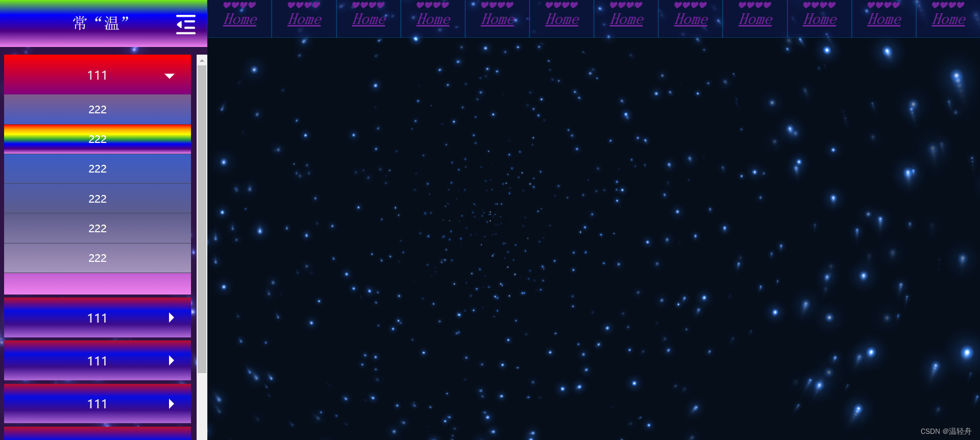
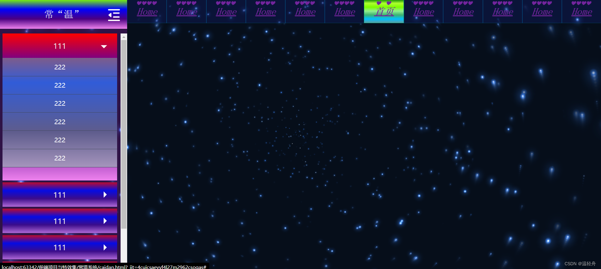
<!--左侧隐藏栏-->
<div id="menu">
<!--隐藏菜单-->
<div id="ensconce">
<h2>
<img src="images/show.png" alt="">
常温系统
</h2>
</div>
<!--显示菜单-->
<div id="open">
<div class="navH">
常"温"
<span><img class="obscure" src="images/obscure.png" alt=""></span>
</div>
<div class="navBox">
<ul>
<li>
<h2 class="obtain">111<i></i></h2>
<div class="secondary">
<h3>222</h3>
<h3>222</h3>
<h3>222</h3>
<h3>222</h3>
<h3>222</h3>
<h3>222</h3>
</div>
</li>
<li>
<h2 class="obtain">111<i></i></h2>
<div class="secondary">
<h3>222</h3>
<h3>222</h3>
<h3>222</h3>
<h3>222</h3>
<h3>222</h3>
<h3>222</h3>
</div>
</li>
<li>
<h2 class="obtain">111<i></i></h2>
<div class="secondary">
<h3>222</h3>
<h3>222</h3>
<h3>222</h3>
<h3>222</h3>
<h3>222</h3>
<h3>222</h3>
</div>
</li>
<li>
<h2 class="obtain">111<i></i></h2>
<div class="secondary">
<h3>222</h3>
<h3>222</h3>
<h3>222</h3>
<h3>222</h3>
<h3>222</h3>
<h3>222</h3>
</div>
</li>
<li>
<h2 class="obtain">111<i></i></h2>
<div class="secondary">
<h3>222</h3>
<h3>222</h3>
<h3>222</h3>
<h3>222</h3>
<h3>222</h3>
<h3>222</h3>
</div>
</li>
<li>
<h2 class="obtain">111<i></i></h2>
<div class="secondary">
<h3>222</h3>
<h3>222</h3>
<h3>222</h3>
<h3>222</h3>
<h3>222</h3>
<h3>222</h3>
</div>
</li>
<li>
<h2 class="obtain">111<i></i></h2>
<div class="secondary">
<h3>222</h3>
<h3>222</h3>
<h3>222</h3>
<h3>222</h3>
<h3>222</h3>
<h3>222</h3>
</div>
</li>
<li>
<h2 class="obtain">111<i></i></h2>
<div class="secondary">
<h3>222</h3>
<h3>222</h3>
<h3>222</h3>
<h3>222</h3>
<h3>222</h3>
<h3>222</h3>
</div>
</li>
<li>
<h2 class="obtain">111<i></i></h2>
<div class="secondary">
<h3>222</h3>
<h3>222</h3>
<h3>222</h3>
<h3>222</h3>
<h3>222</h3>
<h3>222</h3>
</div>
</li>
</ul>
</div>
</div>
</div>
<!--上方导航栏-->
<nav class="caidan">
<ul class="lj">
<li class="lop">
<a href="#" class="en">Home</a>
<a href="#" class="zh">首页</a>
</li>
<li class="lop">
<a href="#" class="en">Home</a>
<a href="#" class="zh">首页</a>
</li>
<li class="lop">
<a href="#" class="en">Home</a>
<a href="#" class="zh">首页</a>
</li>
<li class="lop">
<a href="#" class="en">Home</a>
<a href="#" class="zh">首页</a>
</li>
<li class="lop">
<a href="#" class="en">Home</a>
<a href="#" class="zh">首页</a>
</li>
<li class="lop">
<a href="#" class="en">Home</a>
<a href="#" class="zh">首页</a>
</li>
<li class="lop">
<a href="#" class="en">Home</a>
<a href="#" class="zh">首页</a>
</li>
<li class="lop">
<a href="#" class="en">Home</a>
<a href="#" class="zh">首页</a>
</li>
<li class="lop">
<a href="#" class="en">Home</a>
<a href="#" class="zh">首页</a>
</li>
<li class="lop">
<a href="#" class="en">Home</a>
<a href="#" class="zh">首页</a>
</li>
<li class="lop">
<a href="#" class="en">Home</a>
<a href="#" class="zh">首页</a>
</li>
<li class="lop">
<a href="#" class="en">Home</a>
<a href="#" class="zh">首页</a>
</li>
</ul>
</nav>
<script src="JS/menu.js"></script>
</body>
</html>二:CSS文件包
(1)base.css
css
body, ul, li, ol, dl, dd, dt, p, h1, h2, h3, h4, h5, h6, form, img {
    margin: 0;
    padding: 0;
}

body, html {
    font-size: 16px;
    font-family: "微软雅黑";
    height: 100%;
    width: 100%;
    box-sizing: border-box;
}

/*定位居中*/
.middle {
    position: absolute;
    left: 50%;
    top: 50%;
    -webkit-transform: translate(-50%, -50%);
    -moz-transform: translate(-50%, -50%);
    -ms-transform: translate(-50%, -50%);
    -o-transform: translate(-50%, -50%);
    transform: translate(-50%, -50%);
}

a {
    color: #3e3e3e;
    text-decoration: none;
}

img, input, button, textarea {
    border: none;
    padding: 0;
    margin: 0;
    outline-style: none;
}

ul {
    list-style: none;
}

input {
    padding-top: 0;
    padding-bottom: 0;
    font-family: "SimSun", "宋体";
}

/*去掉行内替换元素空白缝隙*/
img {
    border: 0;
    vertical-align: middle;
}

h1, h2, h3, h4, h5, h6 {
    text-decoration: none;
    font-weight: normal;
    font-size: 100%;
}

s, i, em, u {
    font-style: normal;
    text-decoration: none;
}

.fl {
    float: left;
}

.fr {
    float: right;
}

/*清除浮动*/
.clearfix:before,
.clearfix:after {
    content: "";
    display: table;
}

.clearfix:after {
    clear: both;
}

.clearfix {
    *zoom: 1;
    /*IE/7/6*/
}(2)menu.css
css
#menu {
  overflow: hidden;
  height: 100%;
  float: left;
  -webkit-touch-callout: none;
  -webkit-user-select: none;
  -khtml-user-select: none;
  -moz-user-select: none;
  -ms-user-select: none;
  user-select: none;
}

#menu #ensconce {
  /*隐藏菜单样式*/
  width: 0.35rem;
  height: 100%;
  background: linear-gradient(to bottom, red, orange, yellow, green, blue, indigo, violet);
  float: left;
  text-align: center;
  position: relative;
  display: none;
}
#menu #ensconce h2 {
  cursor: pointer;
  color: #f7f9fa;
  font-size: 0.24rem;
   text-emphasis: '❤';
  line-height: 0.5rem;
  width: 100%;
  position: absolute;
  top: 35%;
  -webkit-transform: translate(-50%, -50%);
  -moz-transform: translate(-50%, -50%);
  -ms-transform: translate(-50%, -50%);
  -o-transform: translate(-50%, -50%);
  transform: translate(0%, -50%);
}
#menu #ensconce h2 img {
  width: 52%;
}
#menu #open {
  /*显示菜单样式*/
  width: 2.6rem;
  height: 100%;
  background-color: rgba(182, 34, 215, 0.23);
  padding-bottom: 0.1rem;
  box-sizing: border-box;
  -webkit-transition: all 0.8s ease;
  -moz-transition: all 0.8s ease;
  -o-transition: all 0.8s ease;
  -ms-transition: all 0.8s ease;
}
#menu #open .navH {
  height: 0.6rem;
  background: linear-gradient(to bottom,lawngreen, blue, indigo, violet);
  line-height: 0.6rem;
  text-align: center;
  font-size: 0.2rem;
  color: #e8eff1;
  position: relative;
  box-sizing: border-box;
  font-family: "新宋体";
}
#menu #open .navH span {
  position: absolute;
  top: 49%;
  right: 0;
  padding: 0 0.15rem;
  cursor: pointer;
  -webkit-transform: translate(0, -50%);
  -moz-transform: translate(0, -50%);
  -ms-transform: translate(0, -50%);
  -o-transform: translate(0, -50%);
  transform: translate(0, -50%);
  display: inline-block;
}
#menu #open .navH span .obscure {
  width: 0.24rem;
}
#menu #open .navBox {
  height: 100%;
  overflow-y: auto;
  padding-left: 0.05rem;
  padding-right: 0.07rem;
  margin-top: 0.1rem;
}
#menu #open .navBox ul li {
  background: linear-gradient(to bottom, red, blue, indigo, violet);
  cursor: pointer;
  margin-bottom: 4px;
}
#menu #open .navBox ul li .obtain {
	background-color: rgba(22, 40, 158, 0.29);
}
#menu #open .navBox ul li .obtain:hover {
	 background: linear-gradient(to bottom,yellow,yellowgreen, greenyellow,darkgray,dimgray);
}
#menu #open .navBox ul li h2 {
  position: relative;
  width: 100%;
  height: 100%;
  text-align: center;
  color: #ece3e3;
  font-size: 0.15rem;
  padding: 0.15rem 0;
  -webkit-transition: all 0.6s ease;
  -moz-transition: all 0.6s ease;
  -o-transition: all 0.6s ease;
  -ms-transition: all 0.6s ease;
}
#menu #open .navBox ul li h2 i {
  position: absolute;
  top: 50%;
  right: 0.15rem;
  border-top: 0.07rem transparent dashed;
  border-left: 0.07rem solid #fff;
  border-right: 0.07rem transparent dashed;
  border-bottom: 0.07rem transparent dashed;
  display: inline-block;
  -webkit-transition: -webkit-transform 0.6s ease;
  -moz-transition: -moz-transform 0.6s ease;
  -o-transition: -o-transform 0.6s ease;
  -ms-transition: -ms-transform 0.6s ease;
  transform-origin: 4px 3px;
  -webkit-transform: translate(0, -50%);
  -moz-transform: translate(0, -50%);
  -ms-transform: translate(0, -50%);
  -o-transform: translate(0, -50%);
  transform: translate(0, -50%);
}
#menu #open .navBox ul li h2 .arrowRot {
  -webkit-transform: rotate(90deg);
  -moz-transform: rotate(90deg);
  -o-transform: rotate(90deg);
  -ms-transform: rotate(90deg);
  transform: rotate(90deg);
}
#menu #open .navBox ul li .secondary {
  overflow: hidden;
  height: 0;
  -webkit-transition: all 0.6s ease;
  -moz-transition: all 0.6s ease;
  -o-transition: all 0.6s ease;
  -ms-transition: all 0.6s ease;
}
#menu #open .navBox ul li .secondary h3 {
  padding: 0.1rem 0;
    text-align: center;
    font-size: 0.13rem;
    background-color: rgba(123, 229, 158, 0.4);
    color: #ffffff;
    border-bottom: 0.8px solid #42495d;
  -webkit-transition: all 0.4s ease;
  -moz-transition: all 0.4s ease;
  -o-transition: all 0.4s ease;
  -ms-transition: all 0.4s ease;
}
#menu #open .navBox ul li .secondary h3:hover {
  background: linear-gradient(to bottom, #ff0000, orange, yellow, rgba(49, 173, 49, 0.99), blue, indigo, violet);
}
#menu #open .navBox ul li .secondary .seconFocus {
  background-color: #c363d9;
  -webkit-box-shadow: 3px 3px 3px #aa8c51;
  -moz-box-shadow: 3px 3px 3px #aa8c51;
  box-shadow: 3px 3px 3px #aa8c51;
}三:JS文件包 - adapter.js
js
var html = document.getElementsByTagName('html')[0];
var width = window.innerWidth;
if (width > 1080) {
    width = 1080;
}
else if (width < 320 ) {
    width = 320 ;
}
var fontSize = 100/1080*width;
html.style.fontSize = fontSize +'px';
window.onresize = function(){
    var html = document.getElementsByTagName('html')[0];
    var width = window.innerWidth;
    if (width > 1080) {
        width = 1080;
    }
    else if (width < 320 ) {
        width = 320 ;
    }
    var fontSize = 100/1080 * width;
    html.style.fontSize = fontSize +'px';
}四:images
(1)show.png

(2)obscure.png
