一、传统网页布局
网页布局的本质:用 CSS 来摆放盒子,把盒子摆放到相应位置。CSS 提供了三种传统布局方式(这里指的只是传统布局,其实还有一些特殊高级的布局方式):
- 标准流
- 浮动
- 定位
1、所谓的标准流:就是标签按照规定好的默认方式排列。
- 块级元素会独占一行,从上向下顺序排列。
- 行内元素会按照顺序,从左到右顺序排列,碰到父元素边缘则自动换行。
2、所谓的定位,可以看一下我的这篇文章,是利用Position属性来控制盒子在文档中位置:CSS之Position定位(一)-CSDN博客
3、为什么需要浮动:**因为浮动可以改变元素标签默认的排列方式。**这句话不好直观理解,我们下面将结合代码和案例做进一步的详细说明。
二、什么是浮动
float 属性用于创建浮动框,将其移动到一边,直到左边缘或右边缘触及包含块或另一个浮动框的边缘。
选择器 { float: 属性值;}
| 属性值 | 描述 |
|---|---|
| none | 元素不浮动(默认值) |
| left | 元素向左浮动 |
| right | 元素向右浮动 |
代码案例欣赏:
<!DOCTYPE html>
<html lang="en">
<head>
<meta charset="UTF-8">
<meta http-equiv="X-UA-Compatible" content="IE=edge">
<meta name="viewport" content="width=device-width, initial-scale=1.0">
<title>Document</title>
<style>
/* 浮动的标签 顶对齐 */
/* 浮动: 在一行排列, 宽高生效 -- 浮动后的标签具备行内块特点 */
.one {
width: 100px;
height: 100px;
background-color: pink;
float: left;
margin-top: 50px;
}
.two {
width: 200px;
height: 200px;
background-color: skyblue;
float: left;
/* 因为有浮动, 不能生效 - 盒子无法水平居中 */
margin: 0 auto;
}
.three {
width: 300px;
height: 300px;
background-color: orange;
}
</style>
</head>
<body>
<div class="one">one</div>
<div class="two">two</div>
<div class="three">three</div>
</body>
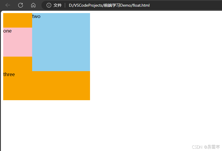
</html>效果如下:可以看到one和two脱离文档往左浮动,three是一个文档流的布局
三、浮动特性(重难点)
加了浮动之后的元素,会具有很多特性,需要我们掌握。
- 浮动元素会脱离标准流(脱标)
- 浮动的元素会一行内显示并且元素顶部对齐
- 浮动的元素会具有行内块元素的特性
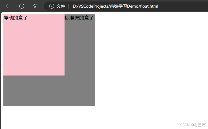
1、浮动元素会脱离标准流
脱离标准普通流的控制移动到指定位置(俗称脱标),浮动的盒子不再保留原先的位置。
<!doctype html>
<html lang="en">

<head>
    <meta charset="UTF-8">
    <meta name="viewport" content="width=device-width, initial-scale=1.0">
    <meta http-equiv="X-UA-Compatible" content="ie=edge">
    <title>浮动特性1</title>
    <style>
        /* 设置了浮动(float)的元素会:
        1.脱离标准普通流的控制(浮)移动到指定位置(动)。
        2.浮动的盒子不再保留原先的位置 */
        .box1 {
            float: left;
            width: 200px;
            height: 200px;
            background-color: pink;
        }

        .box2 {
            width: 300px;
            height: 300px;
            background-color: gray;
        }
    </style>
</head>

<body>
    <div class="box1">浮动的盒子</div>
    <div class="box2">标准流的盒子</div>
</body>

</html>
效果如下:
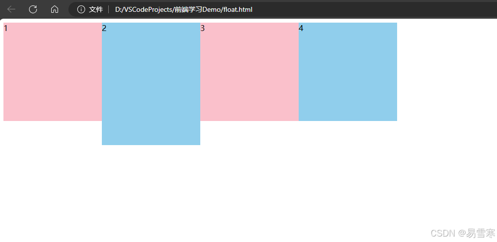
2、浮动的元素会一行内显示并且元素顶部对齐
如果多个盒子都设置了浮动,则它们会按照属性值一行内显示并且顶端对齐排列。浮动的元素是互相贴靠在一起的(不会有缝隙),如果父级宽度装不下这些浮动的盒子,多出的盒子会另起一行对齐。
<!doctype html>
<html lang="en">

<head>
    <meta charset="UTF-8">
    <meta name="viewport" content="width=device-width, initial-scale=1.0">
    <meta http-equiv="X-UA-Compatible" content="ie=edge">
    <title>浮动元素特性-浮动元素一行显示</title>
    <style>
        div {
            float: left;
            width: 200px;
            height: 200px;
            background-color: pink;
        }

        .two {
            background-color: skyblue;
            height: 249px;
        }

        .four {
            background-color: skyblue;
        }
    </style>
</head>

<body>
    <div>1</div>
    <div class="two">2</div>
    <div>3</div>
    <div class="four">4</div>
</body>

</html>
效果如下:
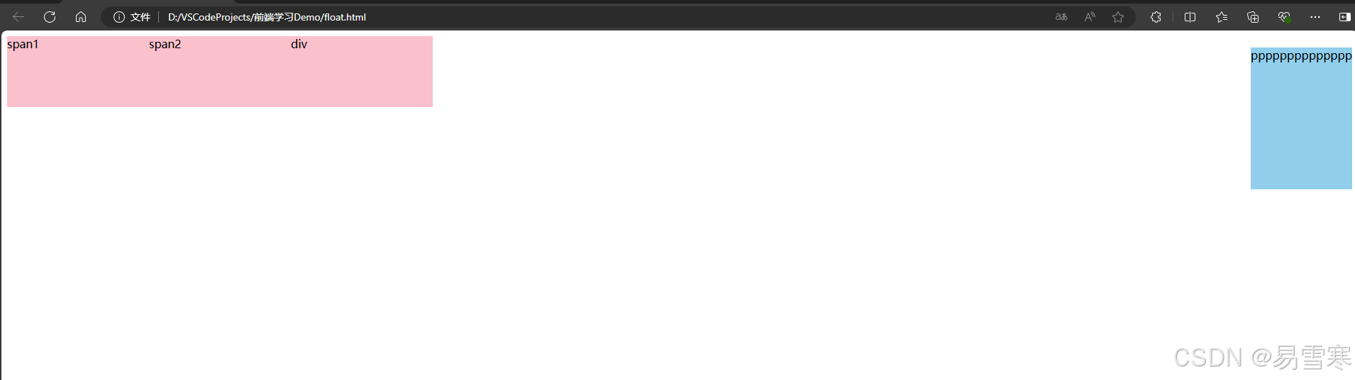
3、浮动的元素会具有行内块元素的特性
任何元素都可以浮动。不管原先是什么模式的元素,添加浮动之后具有行内块元素相似的特性:
默认宽度由内容决定,同时支持指定高宽,盒子之间无空隙。
<!doctype html>
<html lang="en">

<head>
    <meta charset="UTF-8">
    <meta name="viewport" content="width=device-width, initial-scale=1.0">
    <meta http-equiv="X-UA-Compatible" content="ie=edge">
    <title>浮动的元素具有行内块元素特点</title>
    <style>
        /* 任何元素都可以浮动。不管原先是什么模式的元素,添加浮动之后具有行内块元素相似的特性。 */
        span,
        div {
            float: left;
            width: 200px;
            height: 100px;
            background-color: pink;
        }

        /* 如果行内元素有了浮动,则不需要转换块级\行内块元素就可以直接给高度和宽度 */
        p {
            float: right;
            height: 200px;
            background-color: skyblue;
        }
    </style>
</head>

<body>
    <span>span1</span>
    <span>span2</span>
    <div>div</div>
    <p>pppppppppppppp</p>
</body>

</html>
注意:之所以顶部没有对齐,原因是 p 标签自带的外边距大于 span div 自带的外边距。
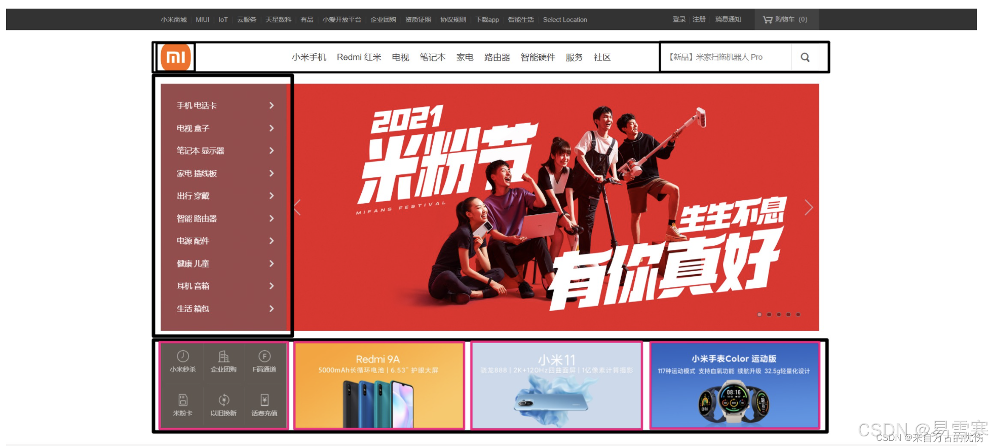
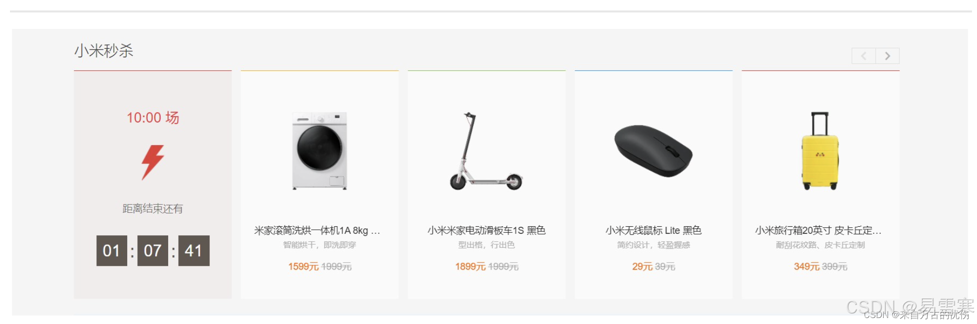
四、浮动元素经常和标准流父级搭配使用
为了约束浮动元素位置,我们网页布局一般采取的策略是:先用标准流的父元素排列上下位置,之后内部子元素采取浮动排列左右位置。符合网页布局第一准侧。
效果一: 
<!doctype html>
<html lang="en">

<head>
    <meta charset="UTF-8">
    <meta name="viewport" content="width=device-width, initial-scale=1.0">
    <meta http-equiv="X-UA-Compatible" content="ie=edge">
    <title>浮动元素搭配标准流父盒子1</title>
    <style>
        .box {
            width: 1200px;
            height: 460px;
            background-color: black;
            margin: 0 auto;
        }

        .left {
            float: left;
            width: 230px;
            height: 460px;
            background-color: pink;
        }

        .right {
            float: left;
            width: 970px;
            height: 460px;
            background-color: skyblue;
        }
    </style>
</head>

<body>
    <div class="box">
        <div class="left">左侧</div>
        <div class="right">右侧</div>
    </div>
</body>

</html>
效果二:
<!doctype html>
<html lang="en">

<head>
    <meta charset="UTF-8">
    <meta name="viewport" content="width=device-width, initial-scale=1.0">
    <meta http-equiv="X-UA-Compatible" content="ie=edge">
    <title>浮动元素搭配标准流父盒子2</title>
    <style>
        * {
            margin: 0;
            padding: 0;
        }

        /* 取消 li 前的圆点 */
        li {
            list-style: none;
        }

        .box {
            width: 1226px;
            height: 285px;
            background-color: pink;
            /* 让大盒子水平居中 */
            margin: 0 auto;
        }

        .box li {
            width: 296px;
            height: 285px;
            background-color: gray;
            float: left;
            /* 每个小盒子用右边距隔开 */
            margin-right: 14px;
        }

        /* 取消最后一个小盒子的右外边距 */
        /* 这里必须写 .box .last 要注意权重的问题  20 */
        .box .last {
            margin-right: 0;
        }
    </style>
</head>

<body>
    <ul class="box">
        <li>1</li>
        <li>2</li>
        <li>3</li>
        <li class="last">4</li>
    </ul>
</body>

</html>
效果三:
<!doctype html>
<html lang="en">

<head>
    <meta charset="UTF-8">
    <meta name="viewport" content="width=device-width, initial-scale=1.0">
    <meta http-equiv="X-UA-Compatible" content="ie=edge">
    <title>浮动布局练习3</title>
    <style>
        .box {
            width: 1226px;
            height: 615px;
            background-color: pink;
            margin: 0 auto;
        }

        .left {
            float: left;
            width: 234px;
            height: 615px;
            background-color: gray;
        }

        .right {
            float: left;
            width: 992px;
            height: 615px;
            background-color: skyblue;
        }

        .right>div {
            float: left;
            width: 234px;
            height: 300px;
            background-color: pink;
            margin-left: 14px;
            margin-bottom: 14px;
        }
    </style>
</head>

<body>
    <div class="box">
        <div class="left">左青龙</div>
        <div class="right">
            <div>1</div>
            <div>2</div>
            <div>3</div>
            <div>4</div>
            <div>5</div>
            <div>6</div>
            <div>7</div>
            <div>8</div>
        </div>
    </div>
</body>

</html>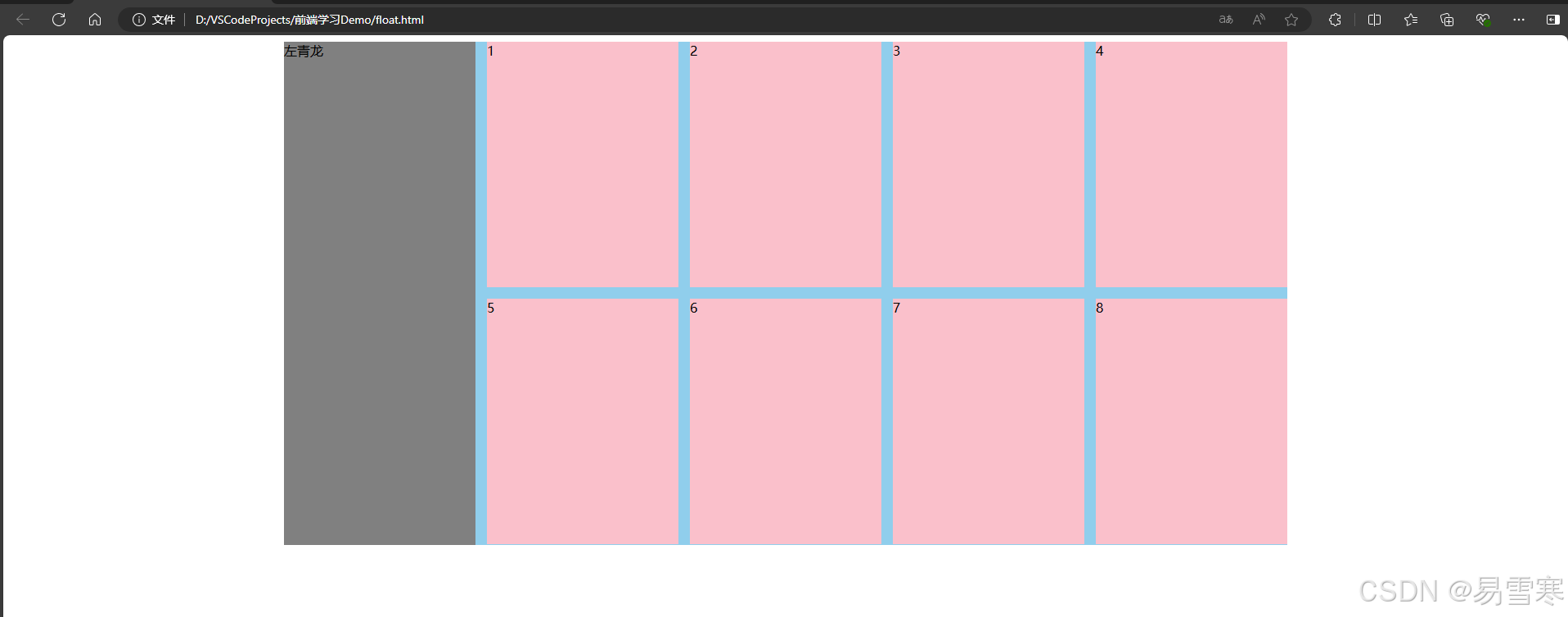
关于浮动的一些基本理解就先说到这里,更多新的知识和技能我们将在后续逐步探究和讲解,感谢你的观看和订阅。