
目录
[display:flex 弹性盒子,实现水平排列,在父盒子设置,适用于单行/单列](#display:flex 弹性盒子,实现水平排列,在父盒子设置,适用于单行/单列)
[4.flex组合属性 flex:flex-grow flex-shrink flex-basis;](#4.flex组合属性 flex:flex-grow flex-shrink flex-basis;)
[6.align-self 单独控制某个元素](#6.align-self 单独控制某个元素)
一、flex容器的样式属性(父元素属性)
display:flex 弹性盒子,实现水平排列,在父盒子设置,适用于单行/单列
默认子盒子宽高度超过父盒子时,按父盒子宽高度均分,再多则会溢出

flex和上面的block,inline,inline-block并列, display只能设置一个属性,display和float不能出现在同一个盒子的属性里。

flex-direction: column;flex-wrap:wrap; 等于 flex-flow: row wrap;
使用F12可快速调试各属性的页面效果
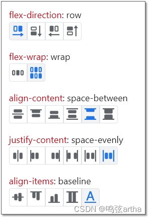
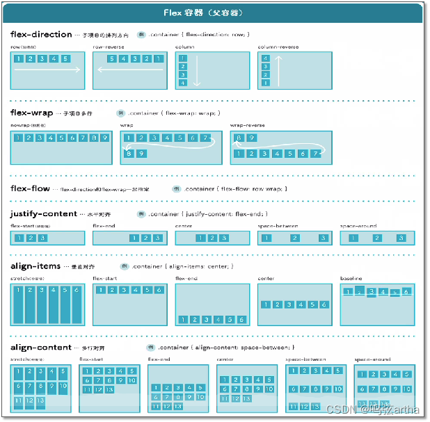
justify-content
justify-content:space-evenly;

justify-content:space-between;
justify-content: space-around;两侧的空间是中间元素间隔空间的一半

stretch(默认值)
align-items:baseline;
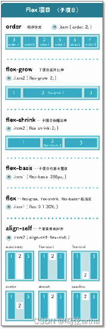
二、flex元素的样式属性(子元素属性)
1.flex-grow
单个盒子范围0~1 延伸至剩余空间的0~1
<!DOCTYPE html>
<html lang="en">
<head>
    <meta charset="UTF-8">
    <meta name="viewport" content="width=device-width, initial-scale=1.0">
    <title>flex-grow</title>
    <style>
        .box{
            width: 500px;
            height: 300px;
            background-color: skyblue;
            display: flex;
        }
        .box div{
            width: 100px;
            height: 100px;
            background-color: pink;
            flex-grow: 0.6;
        }
    </style>
</head>
<body>
    <div class="box">
        <div>1</div>
    </div>
</body>
</html>
多个子盒子设置超过1时,剩余空间分成n份
<!DOCTYPE html>
<html lang="en">
<head>
    <meta charset="UTF-8">
    <meta name="viewport" content="width=device-width, initial-scale=1.0">
    <title>flex-grow</title>
    <style>
        .box{
            width: 500px;
            height: 300px;
            background-color: skyblue;
            display: flex;
        }
        .box div:nth-of-type(1){
            width: 100px;
            height: 100px;
            background-color: pink;
            flex-grow: 3;
        }
        .box div:nth-of-type(2){
            width: 200px;
            height: 100px;
            background-color: green;
            flex-grow: 2;
        }
    </style>
</head>
<body>
    <div class="box">
        <div>1</div>
        <div>2</div>
    </div>
</body>
</html>
2.flex-shrink
收缩超出部分的0~1
<!DOCTYPE html>
<html lang="en">
<head>
    <meta charset="UTF-8">
    <meta name="viewport" content="width=device-width, initial-scale=1.0">
    <title>flex-grow</title>
    <style>
        .box{
            width: 500px;
            height: 300px;
            background-color: skyblue;
            display: flex;
        }
        .box div:nth-of-type(1){
            width: 600px;
            height: 100px;
            background-color: pink;
            flex-shrink: 0.5;
        }
        /* .box div:nth-of-type(2){
            width: 200px;
            height: 100px;
            background-color: green;
        } */
    </style>
</head>
<body>
    <div class="box">
        <div>1</div>
        <!-- <div>2</div> -->
    </div>
</body>
</html>
3.flex-basis
设置主轴初始尺寸,0%(不起作用),n px
<!DOCTYPE html>
<html lang="en">
<head>
    <meta charset="UTF-8">
    <meta name="viewport" content="width=device-width, initial-scale=1.0">
    <title>flex-grow</title>
    <style>
        .box{
            width: 500px;
            height: 500px;
            background-color: skyblue;
            display: flex;
        }
        .box div:nth-of-type(1){
            width: 100px;
            height: 100px;
            background-color: pink;
            /* flex-shrink: 0.5; */
            flex-basis: 200px;
        }
        /* .box div:nth-of-type(2){
            width: 200px;
            height: 100px;
            background-color: green;
            flex-grow: 0.5;
        } */
    </style>
</head>
<body>
    <div class="box">
        <div>1</div>
        <!-- <div>2</div> -->
    </div>
</body>
</html>
4.flex组合属性 flex:flex-grow flex-shrink flex-basis;
flex:1; 表示1 1 0%
flex:0.5; 表示0.5 1 0%
5.order
顺序
<!DOCTYPE html>
<html lang="en">
<head>
    <meta charset="UTF-8">
    <meta name="viewport" content="width=device-width, initial-scale=1.0">
    <title>flex-grow</title>
    <style>
        .box{
            width: 500px;
            height: 500px;
            background-color: skyblue;
            display: flex;
            /* flex-direction: column; */
        }
        .box div{
            width: 100px;
            height: 100px;
            background-color: pink;
            border: 1px solid black;
        }
        .box div:nth-of-type(1){
            order:1;
        }
        .box div:nth-of-type(1){
            order:-1;
        }
    </style>
</head>
<body>
    <div class="box">
        <div>1</div>
        <div>2</div>
        <div>3</div>
        <div>4</div>
    </div>
</body>
</html>
6.align-self 单独控制某个元素
<!DOCTYPE html>
<html lang="en">
<head>
    <meta charset="UTF-8">
    <meta name="viewport" content="width=device-width, initial-scale=1.0">
    <title>flex-grow</title>
    <style>
        .box{
            width: 500px;
            height: 300px;
            background-color: skyblue;
            display: flex;
            /* flex-direction: column; */
        }
        /* .box div:nth-of-type(1){
            width: 100px;
            height: 100px;
            background-color: pink;
            flex-shrink: 0.5;
            flex-basis: 200px;
            flex:1;
        } */
        /* .box div:nth-of-type(2){
            width: 200px;
            height: 100px;
            background-color: green;
            flex-grow: 0.5;
        } */
        .box div{
            width: 100px;
            height: 100px;
            background-color: pink;
            border: 1px solid black;
        }
        /* .box div:nth-of-type(1){
            order:1;
        } */
        .box div:nth-of-type(4){
            align-self: flex-end;
        }
    </style>
</head>
<body>
    <div class="box">
        <div>1</div>
        <div>2</div>
        <div>3</div>
        <div>4</div>
    </div>
</body>
</html>