前述学习过程中,已经知晓普通直方图绘制和堆叠直方图绘制,参考链接如下:
有时候,我们还会遇到并列直方图绘制的需求,今天就探索一下。
【1】官网教程
按照惯例,我们先来到官网:

++图1++
找到grouped bar chart with labels后。直奔示例。
然后进入学习模式。
【2】代码解读
官网代码前两行依旧岿然不动,引入计算模块numpy用于数值运算,画图模块matplotlib用于绘图。
# data from https://allisonhorst.github.io/palmerpenguins/

import matplotlib.pyplot as plt
import numpy as np
然后定义了类别和对应的数据:
species = ("Adelie", "Chinstrap", "Gentoo") #类别,3种
penguin_means = {                           #这里实际上给给每种类别定义了3个数据
    'Bill Depth': (18.35, 18.43, 14.98),
    'Bill Length': (38.79, 48.83, 47.50),
    'Flipper Length': (189.95, 195.82, 217.19),
}
之后定义了要画图,使用ax控制坐标轴属性:
x = np.arange(len(species))  # the label locations,按照顺序排列species
width = 0.25  # the width of the bars #直方图方块宽度
multiplier = 0 #定义乘法因子
fig, ax = plt.subplots(layout='constrained') #定义一个带坐标轴的图,坐标轴属性用ax控制
之后开始画直方图,用for循环实现方块输出,调整multiplier实现方块位移:
for attribute, measurement in penguin_means.items(): #for函数用于遍历penguin_means内部数组
    offset = width * multiplier #直方图间距偏移量定义
    rects = ax.bar(x + offset, measurement, width, label=attribute)
    #画直方图,x+offset代表(类别的位置+偏移量),偏移之后才能并列放置,都则就会重叠;
    # measurement指将penguin_means中的数据按顺序赋值给x+offset对应的类别;
    # width为方块宽度
    # label就是将penguin_means中的数据类别作为标签
    ax.bar_label(rects, padding=3) #输出标签,padding指和方块顶部的距离,一个三个类别,所以设定值为3
    multiplier += 1 #乘法因子扩大,带来每个类别内部方块的移动
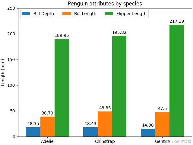
最后设置坐标轴属性,输出图形:
# Add some text for labels, title and custom x-axis tick labels, etc.
ax.set_ylabel('Length (mm)') #设定Y轴标签
ax.set_title('Penguin attributes by species') #设定图名
ax.set_xticks(x + width, species) #设定x轴,允许放多个类别
ax.legend(loc='upper left', ncols=3) #设定图例,位置为左上upper left,图例的颜色数量是ncols=3
ax.set_ylim(0, 250) #设定y轴范围是(0,250)

plt.show() #输出图形
ax.set_xticks允许一个类别多个数据,这是并列直方图出现的直接推手。
++图2++
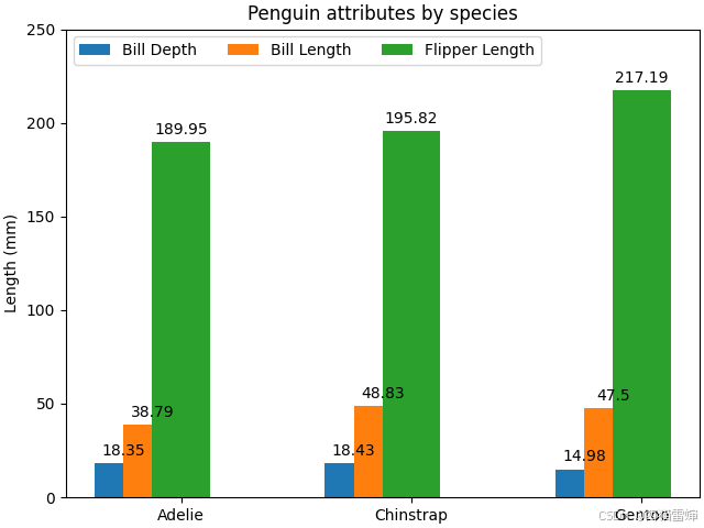
【3】代码改写-修改padding
尝试把padding从3改为50后,各类被数据都往上漂移了:
++图3++
【4】代码改写-修改multiplier
multiplier控制各方块的间隙,尝试把multiplier在for循环中的增量减小到0.5:
multiplier += 0.5 #乘法因子扩大,带来每个类别内部方块的移动
++图4++
由图4可见,方块大小不再一致。
实际上这是因为:新的方块只移动了一半(multiplier=1),所以被旧方块盖住了,最佳的移动还是要按照multiplier=1,让整个方块都显示出来,这样才会让图片更好看。
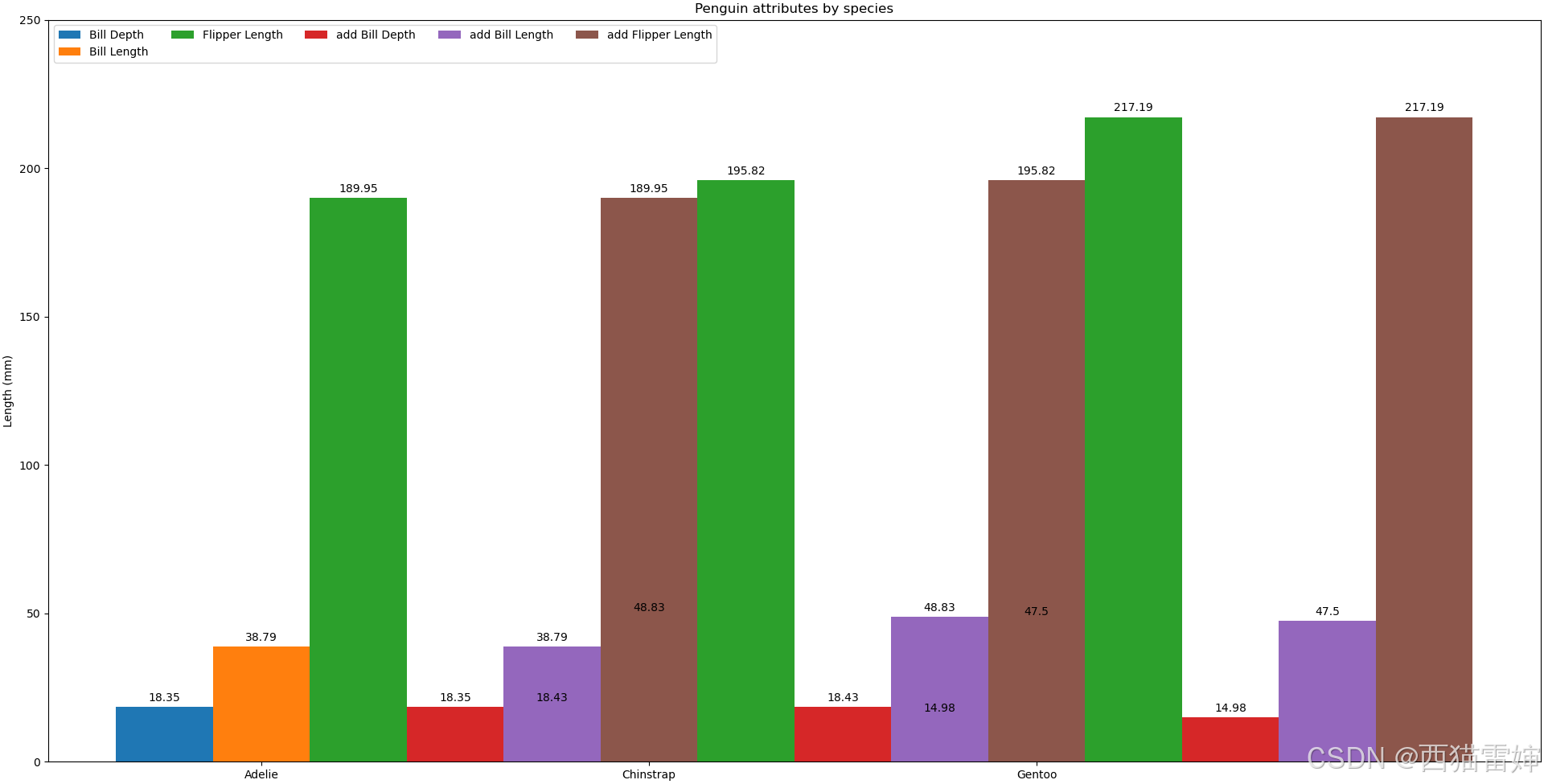
【5】代码改写-修改penguin_means和ncols
要想把并列方块数量增多,因修改penguin_means中的一维数组列数,每一列方块要使用不同的颜色区分,所以ncols也要跟随变化。某一类别下有几个并列方块,就有几种颜色。
改后:
penguin_means = {#这里实际上给每种类别定义了3个数据,现在增加了3行,一共6行
    'Bill Depth': (18.35, 18.43, 14.98),
    'Bill Length': (38.79, 48.83, 47.50),
    'Flipper Length': (189.95, 195.82, 217.19),
    'add Bill Depth': (18.35, 18.43, 14.98),
    'add Bill Length': (38.79, 48.83, 47.50),
    'add Flipper Length': (189.95, 195.82, 217.19),
}
ax.legend(loc='upper left', ncols=6) #设定图例,位置为左上upper left,图例的颜色数量由ncols=3更新为ncols=6
运行后:
++图5++
我们很难过的发现所有方块挤在了一起,所以我们要去需改方块宽度:由0.25改为0.1
x = np.arange(len(species))  # the label locations,按照顺序排列species
width = 0.1  # the width of the bars 直方图方块宽度
multiplier = 0 #定义乘法因子
运行后:
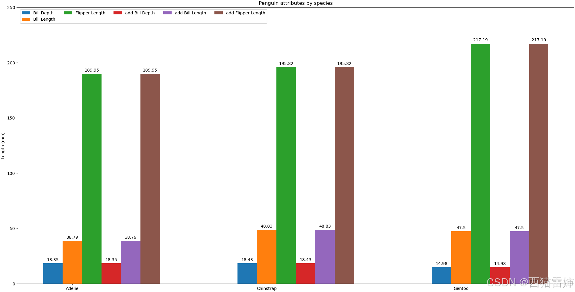
++图6++
可见,图形没有挤在一起,出现了6个颜色图例。
本次改写完整代码如下:
python
# data from https://allisonhorst.github.io/palmerpenguins/

import matplotlib.pyplot as plt
import numpy as np

species = ("Adelie", "Chinstrap", "Gentoo")#类别,3种
penguin_means = {#这里实际上给每种类别定义了3个数据
    'Bill Depth': (18.35, 18.43, 14.98),
    'Bill Length': (38.79, 48.83, 47.50),
    'Flipper Length': (189.95, 195.82, 217.19),
    'add Bill Depth': (18.35, 18.43, 14.98),
    'add Bill Length': (38.79, 48.83, 47.50),
    'add Flipper Length': (189.95, 195.82, 217.19),
}

x = np.arange(len(species))  # the label locations,按照顺序排列species
width = 0.1  # the width of the bars 直方图方块宽度
multiplier = 0 #定义乘法因子

fig, ax = plt.subplots(layout='constrained')#定义一个带坐标轴的图,坐标轴属性用ax控制

for attribute, measurement in penguin_means.items():#for函数用于遍历penguin_means内部数组
    offset = width * multiplier #直方图间距偏移量定义
    rects = ax.bar(x + offset, measurement, width, label=attribute)
    # 画直方图,x+offset代表(类别的位置+偏移量),偏移之后才能并列放置,都则就会重叠;
    # measurement指将penguin_means中的数据按顺序赋值给x+offset对应的类别;
    # width为方块宽度
    # label就是将penguin_means中的数据类别作为标签
    ax.bar_label(rects, padding=3) #输出标签,padding指和方块顶部的距离,一个三个类别,所以设定值为3
    multiplier += 1 #乘法因子扩大,带来每个类别内部方块的移动

# Add some text for labels, title and custom x-axis tick labels, etc.
ax.set_ylabel('Length (mm)') #设定Y轴标签
ax.set_title('Penguin attributes by species') #设定图名
ax.set_xticks(x + width, species) #设定x轴,允许放多个类别
ax.legend(loc='upper left', ncols=6) #设定图例,位置为左上upper left,图例的颜色数量是ncols=3
ax.set_ylim(0, 250) #设定y轴范围是(0,250)

plt.show() #输出图形
【6】总结
本次学习探讨了并列直方图的for循环画法,并学会了修改各类别标签的位置、各类别方块的移动和多个方块的设定。