概述
本文讲解 css 属性 perspective ,这个属性的作用是设置 透视效果的观察距离。这个属性需要写在父级,数值越大,意味着你看到的页面就会越远,透视效果越弱。
下面是个示例:
html
<!DOCTYPE html>
<html lang="en">

<head>
    <meta charset="UTF-8">
    <meta name="viewport" content="width=device-width, initial-scale=1.0">
    <title>视觉冲击</title>
    <style>
        * {
            margin: 0;
            padding: 0;
        }

        body {
            height: 100vh;
            display: grid;
            place-content: center;
        }

        .container {
            perspective: 800px;
        }

        .child {
            width: 300px;
            height: 300px;
            background: #38f;
            transform: rotateY(0);
            transition: all 1s;
        }

        .child:hover {
            transform: rotateY(45deg)
        }
    </style>
</head>

<body>
    <div class="container">
        <div class="child">111</div>
    </div>
</body>

</html>
其实 perspective 属性看对于谁来说,对于父级的及对于子级来说是存在区别的,下面直接上示例,你就能看出其中不同之处。(我们平时给元素设置视距,增加其3D效果。但是给父元素设置perspective属性和给自身直接设置transform:perspective属性有时候效果一样,有时候效果差别却很大)。
代码和效果图如下:
页面中只有一个元素时,给父元素加perspective:800px;(此处设置的值为800px)的效果和给自身加transform:perspective(800px);的效果是一样的。
html
<!doctype html>
<html lang="en">
<head>
    <meta charset="UTF-8">
    <title>Document</title>
    <style>
        body {
            /*perspective: 800px;*/
        }
        div {
            width: 200px;
            height: 200px;
            background-color: red;
            margin: 100px auto;
            transform: perspective(800px) rotateY(50deg);
            /*transform: rotateY(50deg);*/
        }
    </style>
</head>
<body>
<div></div>
</body>
</html>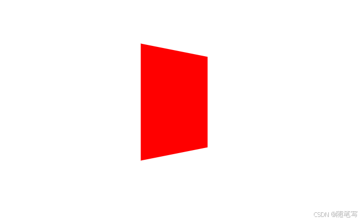
上面效果只存在于一个div元素的时候,跟多个元素,在父级设置这个属性后,会存在差异。
给父元素添加属性 perspective:800px;(会以父元素的某个点为视点,看所有的子元素,所以看到的每个子元素的样式是不一样的。)
html
<!doctype html>
<html lang="en">
<head>
    <meta charset="UTF-8">
    <title>Document</title>
    <style>
        body {
            perspective: 800px;
        }
        div {
            width: 200px;
            height: 200px;
            background-color: red;
            float: left;
            margin: 50px 20px 0 0;
            transform: rotateY(-40deg);
        }
    </style>
</head>
<body>
<div></div>
<div></div>
<div></div>
<div></div>
<div></div>
<div></div>
</body>
</html>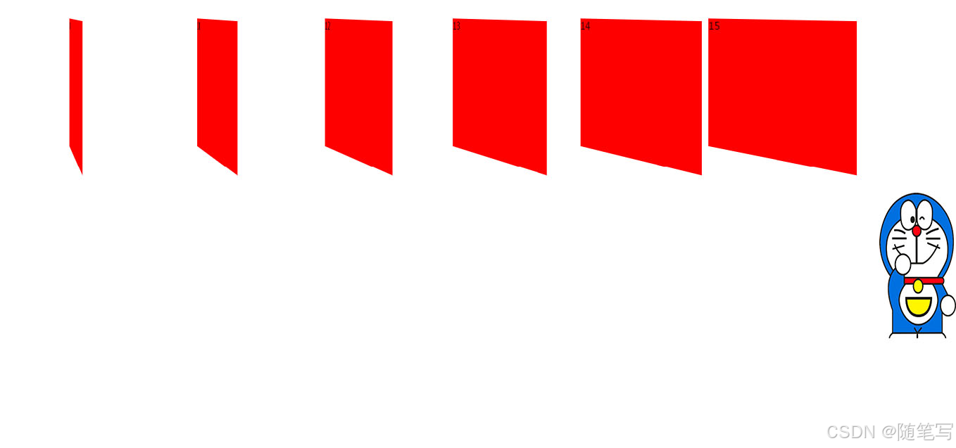
在分别给子元素加transform:perspective(800px);属性的时候,会以元素自身的某个点作为视点,所以呈现出的效果还是一样的。
html
<!doctype html>
<html lang="en">
<head>
    <meta charset="UTF-8">
    <title>Document</title>
    <style>
        body {
            /*perspective: 800px;*/
        }
        div {
            width: 200px;
            height: 200px;
            background-color: red;
            float: left;
            margin: 50px 20px 0 0;
            transform: perspective(800px) rotateY(-40deg);

        }
    </style>
</head>
<body>
<div></div>
<div></div>
<div></div>
<div></div>
<div></div>
<div></div>
</body>
</html>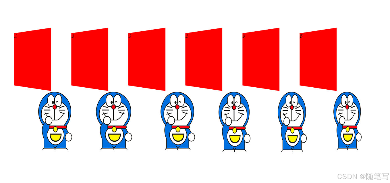
以上就是 有关于 perspective 属性的示例及介绍。感谢点赞。