抽屉布局SideBarContainer
提供侧边栏可以显示和隐藏的侧边栏容器,通过子组件定义侧边栏和内容区,第一个子组件表示侧边栏,第二个子组件表示内容区。
并且侧边栏可以出现在左侧也可以出现在右侧,侧边栏可以并列跟内容区一起展示,也可以浮动在内容区展示。
常用属性
showSideBar(value: boolean)设置是否显示侧边栏。注意:必须使用$$装饰,否则无效。
showControlButton(value: boolean)设置是否显示控制按钮。
controlButton(value: ButtonStyle)设置控制按钮样式。
sideBarWidth(value: number)设置侧边栏宽度,默认240vp。
SideBarContainer( type?: SideBarContainerType )| 名称 | 描述 |
|---|---|
| Embed | 侧边栏嵌入到组件内,和内容区并列显示。组件尺寸小于minContentWidth + minSideBarWidth,并且未设置showSideBar时,侧边栏自动隐藏。未设置minSideBarWidth或者minContentWidth采用未设置接口的默认值进行计算。组件在自动隐藏后,如果通过点击控制按钮唤出侧边栏,则侧边栏悬浮在内容区上显示。 |
| Overlay | 侧边栏浮在内容区上面。 |
| AUTO10+ | 组件尺寸大于等于minSideBarWidth+minContentWidth时,采用Embed模式显示。组件尺寸小于minSideBarWidth+minContentWidth时,采用Overlay模式显示。未设置minSideBarWidth或minContentWidth时,会使用未设置接口的默认值进行计算,若计算的值小于600vp,则使用600vp做为模式切换的断点值。 |
开发步骤:
构建侧边栏:
javascript
Column() { //侧边栏内容区默认宽度240vp
  ForEach(this.datas, (item: Data, index: number) => {
    ListItem() {
      Text(item.txt)
        .fontSize(24)
        .fontWeight(FontWeight.Bold)
        .textAlign(TextAlign.Center)
        .border({ width: 2, style: BorderStyle.Dotted })
        .width('100%')
        .padding(20)
        .onClick(() => { //点击列表项
          this.ckitem = index //更新点击下标 进而重新渲染内容区背景颜色
          animateTo({curve:curves.springMotion()},()=>{this.isshowing = false}) //动画关闭侧边栏
        })
    }
  }, (item: Data) => JSON.stringify(item))
}.width('100%')
.height('100%')
.backgroundColor(Color.Gray)
.borderRadius(10)
构建内容区:
javascript
Column() { //内容区
   Text(this.datas[this.ckitem].txt).fontSize(30).fontWeight(FontWeight.Bold)
}.width('100%')
.height('100%')
.backgroundColor(this.datas[this.ckitem].color)
.justifyContent(FlexAlign.Center)
.onTouch((event) => { //监听手指右边滑动和点击事件
  if (event.type == TouchType.Move) {
    this.movex = event.touches[0].x
    if ((this.movex - this.downx) > 50) { //产生了右侧滑动 打开抽屉
      animateTo({curve:curves.springMotion()},()=>{this.isshowing = true})
    }
  } else if (event.type == TouchType.Down) {
    this.downx = event.touches[0].x
    // 点击内容区就会关闭抽屉
    animateTo({curve:curves.springMotion()},()=>{this.isshowing = false})
  }
})
注意: 我们通过切换控制变量来控制侧边栏是否显示,为了显示出抽屉效果,我们给变量的变化都加入了动画。并且组件默认不支持手指滑动显示或关闭侧边栏,所以我们给内容区加入了手指右侧滑动的监听来自定义效果。
完整的代码:
typescript
import { curves } from '@kit.ArkUI';
interface Data {
color: Color
txt: string
}
@Entry
@Component
struct SlideBarContainerPage {
// 侧边栏数据源
@State datas: Data[] = []
// 点击item
@State ckitem: number = 0
// 侧边栏显示控制器
@State isshowing: boolean = false
// 手指按下x坐标
private downx: number = 0
// 手指移动x坐标
private movex: number = 0
aboutToAppear(): void {
this.datas = [//数据源
{
txt: '白色',
color: Color.White
},
{
txt: '黑色',
color: Color.Black
},
{
txt: '红色',
color: Color.Red
},
{
txt: '绿色',
color: Color.Green
},
{
txt: '蓝色',
color: Color.Blue
},
]
}
build() {
SideBarContainer(SideBarContainerType.Overlay) {
Column() { //侧边栏内容区默认宽度240vp
ForEach(this.datas, (item: Data, index: number) => {
ListItem() {
Text(item.txt)
.fontSize(24)
.fontWeight(FontWeight.Bold)
.textAlign(TextAlign.Center)
.border({ width: 2, style: BorderStyle.Dotted })
.width('100%')
.padding(20)
.onClick(() => { //点击列表项
this.ckitem = index //更新点击下标 进而重新渲染内容区背景颜色
animateTo({curve:curves.springMotion()},()=>{this.isshowing = false}) //动画关闭侧边栏
})
}
}, (item: Data) => JSON.stringify(item))
}.width('100%')
.height('100%')
.backgroundColor(Color.Gray)
.borderRadius(10)
Column() { //内容区
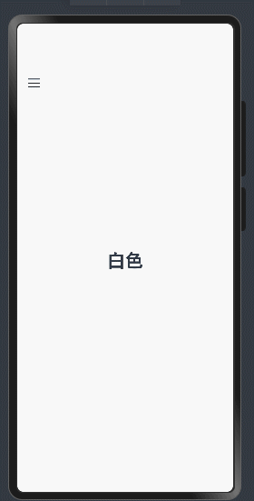
Text(this.datas[this.ckitem].txt).fontSize(30).fontWeight(FontWeight.Bold)
}.width('100%')
.height('100%')
.backgroundColor(this.datas[this.ckitem].color)
.justifyContent(FlexAlign.Center)
.onTouch((event) => { //监听手指右边滑动和点击事件
if (event.type == TouchType.Move) {
this.movex = event.touches[0].x
if ((this.movex - this.downx) > 50) { //产生了右侧滑动 打开抽屉
animateTo({curve:curves.springMotion()},()=>{this.isshowing = true})
}
} else if (event.type == TouchType.Down) {
this.downx = event.touches[0].x
// 点击内容区就会关闭抽屉
animateTo({curve:curves.springMotion()},()=>{this.isshowing = false})
}
})
}
.height('100%')
.width('100%')
.showSideBar($$this.isshowing) //双向绑定 控制抽屉的开和关
}
}