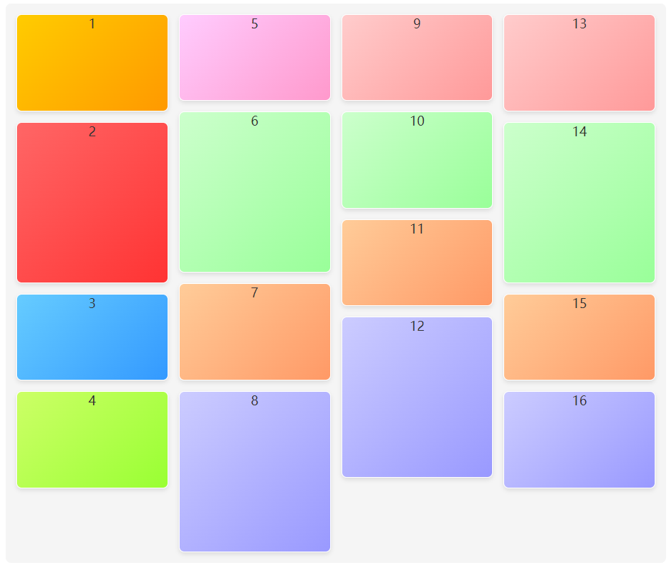
瀑布流用于展示图片信息,我这里用的背景颜色来代替图片
PC端效果
源码(直接复制粘贴就可以运行了!!!)
<!DOCTYPE html>
<html lang="en">

<head>
    <meta charset="UTF-8">
    <title>PC端瀑布流</title>
    <style>
        .box {
            width: 1200px;
            margin: 0 auto;
            /* 几列 */
            column-count: 4;
            /* 列间距 */
            column-gap: 20px;
            /* 添加背景颜色 */
            background-color: #f5f5f5;
            padding: 20px;
            border-radius: 10px;
        }

        .box div {
            height: 160px;
            margin-bottom: 20px; /* 增加底部间距 */
            /* 避免在该元素内部发生分页或者分栏 如果不够 排在下一列*/
            break-inside: avoid;
            color: #333333; /* 更改文字颜色 */
            text-align: center;
            font-size: 24px; /* 调整字体大小 */
            border: 2px solid #ffffff; /* 添加边框 */
            box-shadow: 0 4px 8px rgba(0, 0, 0, 0.1); /* 添加阴影效果 */
            border-radius: 10px; /* 圆角 */
        }

        .box div:nth-child(1) {
            background: linear-gradient(135deg, #ffcc00, #ff9900);
        }

        .box div:nth-child(2) {
            background: linear-gradient(135deg, #ff6666, #ff3333);
        }

        .box div:nth-child(3) {
            background: linear-gradient(135deg, #66ccff, #3399ff);
        }

        .box div:nth-child(4) {
            background: linear-gradient(135deg, #ccff66, #99ff33);
        }

        .box div:nth-child(5) {
            background: linear-gradient(135deg, #ffccff, #ff99cc);
        }

        .box div:nth-child(6) {
            background: linear-gradient(135deg, #ccffcc, #99ff99);
        }

        .box div:nth-child(7) {
            background: linear-gradient(135deg, #ffcc99, #ff9966);
        }

        .box div:nth-child(8) {
            background: linear-gradient(135deg, #ccccff, #9999ff);
        }

        .box div:nth-child(9) {
            background: linear-gradient(135deg, #ffcccc, #ff9999);
        }

        .box div:nth-child(10) {
            background: linear-gradient(135deg, #ccffcc, #99ff99);
        }

        .box div:nth-child(11) {
            background: linear-gradient(135deg, #ffcc99, #ff9966);
        }

        .box div:nth-child(12) {
            background: linear-gradient(135deg, #ccccff, #9999ff);
        }

        .box div:nth-child(13) {
            background: linear-gradient(135deg, #ffcccc, #ff9999);
        }

        .box div:nth-child(14) {
            background: linear-gradient(135deg, #ccffcc, #99ff99);
        }

        .box div:nth-child(15) {
            background: linear-gradient(135deg, #ffcc99, #ff9966);
        }

        .box div:nth-child(16) {
            background: linear-gradient(135deg, #ccccff, #9999ff);
        }

        .box div:nth-child(2n) {
            height: 300px;
        }

        .box div:nth-child(3n+1) {
            height: 180px;
        }
    </style>
</head>

<body>
    <div class="box">
        <div>1</div>
        <div>2</div>
        <div>3</div>
        <div>4</div>
        <div>5</div>
        <div>6</div>
        <div>7</div>
        <div>8</div>
        <div>9</div>
        <div>10</div>
        <div>11</div>
        <div>12</div>
        <div>13</div>
        <div>14</div>
        <div>15</div>
        <div>16</div>
    </div>
</body>

</html>
扫码进群领前端资料

移动端效果

源码(直接复制粘贴就可以运行了!!!)
<!DOCTYPE html>
<html lang="en">

<head>
    <meta charset="UTF-8">
    <title>H5 瀑布流</title>
    <style>
        .lists {
            padding: 20px;
            box-sizing: border-box;
            column-count: 2;
            column-gap: 10px;
        }

        .item {
            break-inside: avoid;
            width: auto;
            height: 200px;
            background-color: #eee;
            line-height: 200px;
            text-align: center;
            margin-bottom: 10px;
        }

        .lists .item:nth-child(2n+1) {
            height: 240px;
        }

        .lists .item:nth-child(3n+1) {
            height: 320px;
        }

        .lists .item:nth-child(1) {
            background: linear-gradient(135deg, #ffcc00, #ff9900);
        }

        .lists .item:nth-child(2) {
            background: linear-gradient(135deg, #ff6666, #ff3333);
        }

        .lists .item:nth-child(3) {
            background: linear-gradient(135deg, #66ccff, #3399ff);
        }

        .lists .item:nth-child(4) {
            background: linear-gradient(135deg, #ccff66, #99ff33);
        }

        .lists .item:nth-child(5) {
            background: linear-gradient(135deg, #ffccff, #ff99cc);
        }

        .lists .item:nth-child(6) {
            background: linear-gradient(135deg, #ccffcc, #99ff99);
        }

        .lists .item:nth-child(7) {
            background: linear-gradient(135deg, #ffcc99, #ff9966);
        }

        .lists .item:nth-child(8) {
            background: linear-gradient(135deg, #ccccff, #9999ff);
        }

        .lists .item:nth-child(9) {
            background: linear-gradient(135deg, #ffcccc, #ff9999);
        }

        .lists .item:nth-child(10) {
            background: linear-gradient(135deg, #ccffcc, #99ff99);
        }

        .lists .item:nth-child(11) {
            background: linear-gradient(135deg, #ffcc99, #ff9966);
        }

        .lists .item:nth-child(12) {
            background: linear-gradient(135deg, #ccccff, #9999ff);
        }

        .lists .item:nth-child(13) {
            background: linear-gradient(135deg, #ffcccc, #ff9999);
        }

        .lists .item:nth-child(14) {
            background: linear-gradient(135deg, #ccffcc, #99ff99);
        }

        .lists .item:nth-child(15) {
            background: linear-gradient(135deg, #ffcc99, #ff9966);
        }
    </style>
</head>

<body>
    <div class="lists">
        <div class="item">1</div>
        <div class="item">2</div>
        <div class="item">3</div>
        <div class="item">4</div>
        <div class="item">5</div>
        <div class="item">6</div>
        <div class="item">7</div>
        <div class="item">8</div>
        <div class="item">9</div>
        <div class="item">10</div>
        <div class="item">11</div>
        <div class="item">12</div>
        <div class="item">13</div>
        <div class="item">14</div>
        <div class="item">15</div>
    </div>
</body>

</html>