Qml-Button的使用
Button属性
- Button的继承关系: Button -- AbstractButton -- Control -- Item; Button的属性主要继承于AbstractButton。
- AbstractButton属性主要如下:
a.action :是一个Action类型属性,与QAction类似,用于提供快捷键,图标。
b.autoRepeat :长按时,重复发送pressed()、released()、clicked()信号;此属性设置为true, onPressAndHold()信号不会发送;配套两个属性:autoRepeatDelay autoRepeatInterval
c.autoRepeatDelay :长按时,第一次重复延迟时间,单位毫秒(ms),默认300ms
d.autoRepeatInterval :长按时,重复间隔
e.checkable :按钮是否使能checkable。
f.checked : 按钮是否checked.
g.icon:控制图标的属性组,需要特别注意 icon.source 和 icon.color *;icon.color 如果未设置透明,icon.source 设置了正确的图片,会被color颜色覆盖。
h.display :用于控制图标和文本显示位置,值和效果图对比图如下:

Button的实例代码
c
import QtQuick
import QtQuick.Controls
//
Item{
height: 480
width: 320
Row{
anchors.top: parent.top
anchors.left: parent.left
anchors.margins: 10
spacing:10
Button{
id:idBut1
text:"Button"
height: 30
onClicked: {
console.log("idBut1 Clicked");
}
onPressed: {
console.log("idBut1 onPressed");
}
onReleased: {
console.log("idBut1 onReleased");
}
onToggled: {
console.log("idBut1 onToggled");
}
//按下,在按钮区域外释放(release)会触发 canceled 信号
onCanceled: {
console.log("idBut1 onCanceled");
}
onPressAndHold: {
console.log("idBut1 onPressAndHold");
}
}
Button{
id:idButRepeat
text:"Repeate"
autoRepeat: true //autoRepeat 为true,pressAndHold 信号不得触发
autoRepeatDelay: 500 //初次一直按下,重复的延迟时间 ms,默认是300
autoRepeatInterval: 300 //按下后,重复的间隔时间 ms 默认是200 ms
height: 30
onClicked: {
console.log("idButRepeat Clicked");
}
onPressed: {
console.log("idButRepeat onPressed");
}
onReleased: {
console.log("idButRepeat onReleased");
}
onToggled: {
console.log("idButRepeat onToggled");
}
onCanceled: {
console.log("idButRepeat onCanceled");
}
onPressAndHold: {
console.log("idButRepeat onPressAndHold");
}
}
Button{
id:idButCheckable
text:"Checkable"
height: 30
checkable: true
onClicked: {
console.log("idButCheckable Clicked");
}
onPressed: {
console.log("idButCheckable onPressed");
}
onReleased: {
console.log("idButCheckable onReleased");
}
//属性checkable:true,在clicked时,checked状态发生改变,触发toggled信号
onToggled: {
console.log("idButCheckable onToggled ",idButCheckable.checked ? " checked " : " unchecked ");
}
onCanceled: {
console.log("idButCheckable onCanceled");
}
onPressAndHold: {
console.log("idButCheckable onPressAndHold");
}
}
Button{
id:idButIcon
text:"ButtonIcon"
//flat:true //flat为true,不绘制背景外观
//highlighted: true
// height: 30
icon.source: "qrc:/qt/qml/text/qmlDemo/Resource/face-smile.png" //使用qrc资源,格式"qrc:前缀/前缀后相对路径"
icon.color: "transparent" //如果qrc路径没问题,color未设置,是个黑色圆圈
//display: AbstractButton.IconOnly //枚举值一般首字母大写
display: AbstractButton.TextBesideIcon
}
}
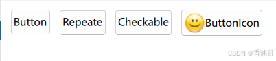
}Button实例代码运行结果如下:
结论:
1.信号发生顺序: pressed -- (pressAndHold) -- (toggled)-- release -- clicked(canceled);如果有checkable:true,会有toggled信号。鼠标释放时,信号发射顺序:(toggled) -- release -- clicked(canceled)。
2.icon.color 和 icon.source:如果要设置Button显示图标,在保证icon.souce 图片路径正确前提下, icon.color 需要为"transparent";